Client: From Wikipedia: “Ad hoc is a Latin phrase meaning ’for this.’ In English, it generally signifies a solution designed for a specific problem or task, non-generalizable, and not intended to be able to be adapted to other purposes.” The issue is to make an emphasis on “for this” and move away from “not intended to be able to be adapted to other purposes.”
The text on the website will say (roughly) that we are a boutique software development firm, which means we develop solutions that ideally fit our clients and are unsuitable for anyone else. In our understanding, ad hoc means bespoke: something made exclusively for you and no one else. People ordering a suit from a tailor will never understand how others can purchase a readymade one, since it won’t be tailored exclusively for them.
Here’s what we want others to think about our company:
—We are intellectuals to the point of being snobs: we know Latin phrases and do not hesitate to use them;
—We are (self-)ironic and have a postmodernist name;
—We always satisfy the deadline, the task, the client, the expectations, the moment, etc.
Here are some ideas we have for graphic symbols illustrating the “always satisfy” part:
—Tangram game with rectangular white pieces on the sides leaving a space for one very complex geometric piece in the middle. That’s us.
—A side view of a lock where sprung pins of different height are evened with a key.
In both cases the logic is the same: simple pieces bring chaos which can be mended with a single complex, carefully chosen (and rather complex) solution.
If you are going to use a color scheme, we would like to see a “slightly offbeat” color combination, one that would be slightly dazzling. The colors themselves can be quiet but their combination is odd but memorable.
We write our name as ad hoc. In print this phrase is rarely capitalized (since it almost never starts a sentence), which means that styling it as Ad hoc or even Ad Hoc won’t be justified. In Russian, Latin phrases are traditionally written in Latin, so a Russian version of the logo is irrelevant to us.
If you were to compare our company to a person (they say it helps designers), we would like to see ourselves as:
—male, 30–35 years old;
—sporty, fit;
—business-casual style;
—a creative engineer.
Designer: How about this?
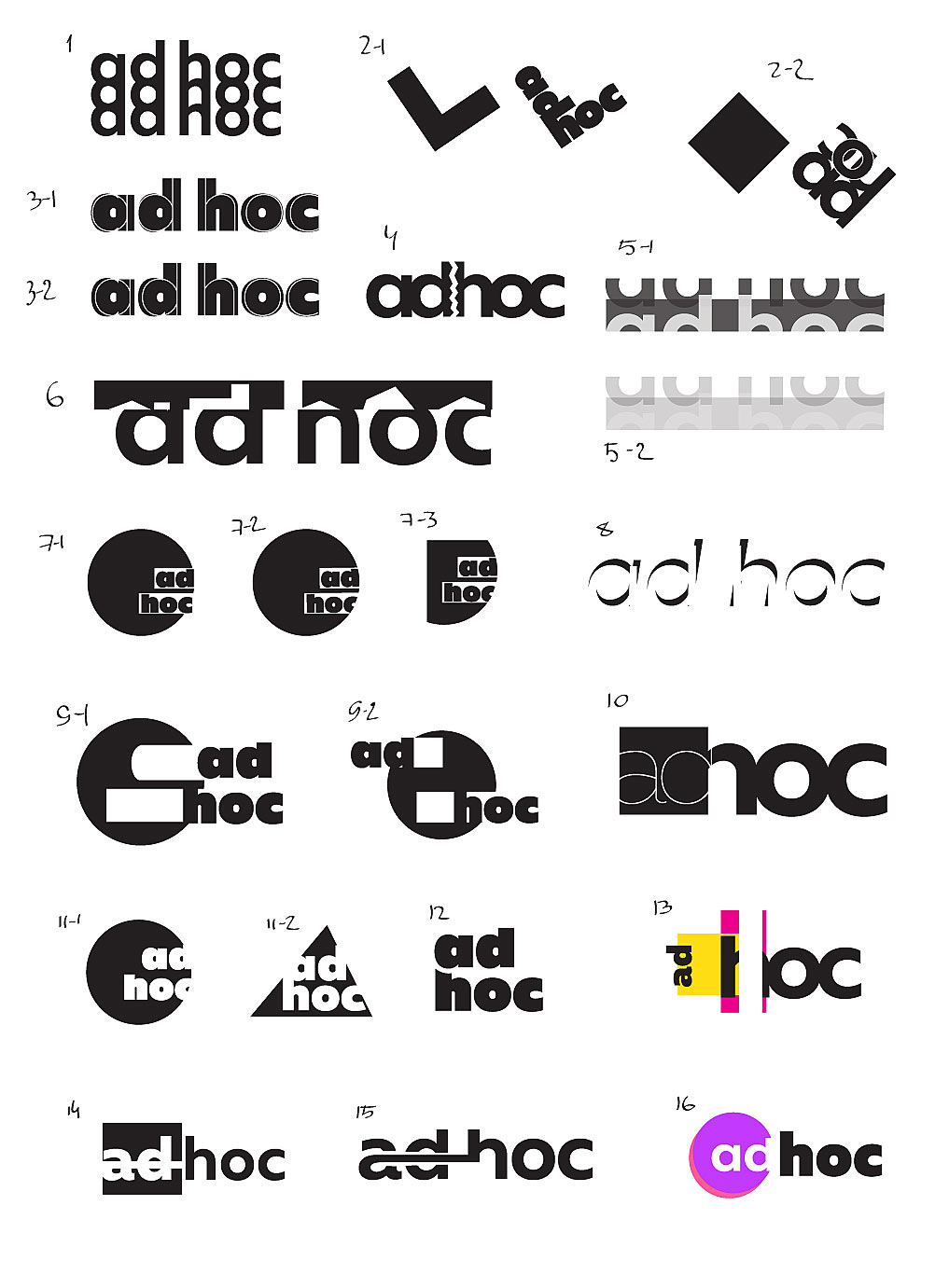
Art director: You can combine 7-2 and 9-1. And look for something else.
Designer: Maybe this?
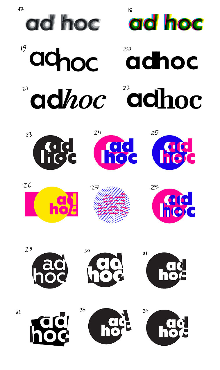
Art director: Let’s go with 22 but make the serifs bolder so that the entrance looks better.
Designer: I tried various counterforms. What do you think?
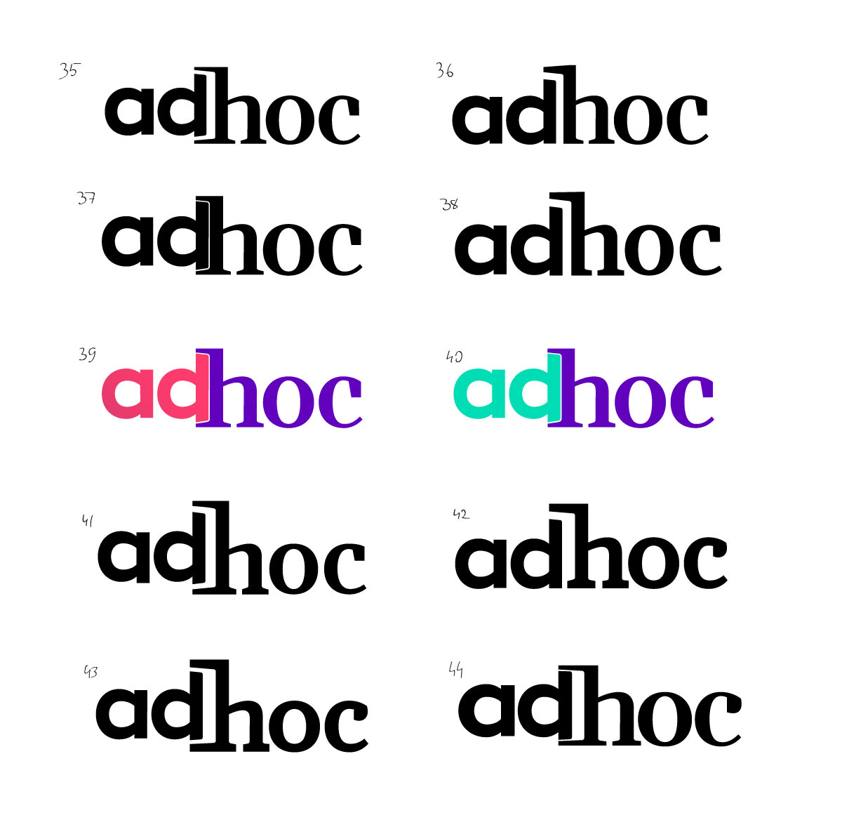
Art director: 37 is OK. Just make the d more natural and the colors brighter.
Designer: Fixed the D, tried new colors. Anything good here?
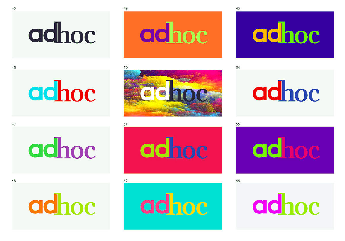
Art director: Let’s go with 45-46.
