Client: We are opening a multibrand swimming gear store. Our range of products is aimed at all age groups of pool goers as well as athletes who swim professionally. The store will be operating both offline and online.
We believe the main ideological aim of the logo is to demonstrate our attitude towards our clients, to make them trust the store and see it as a friend that will help them achieve their objectives.
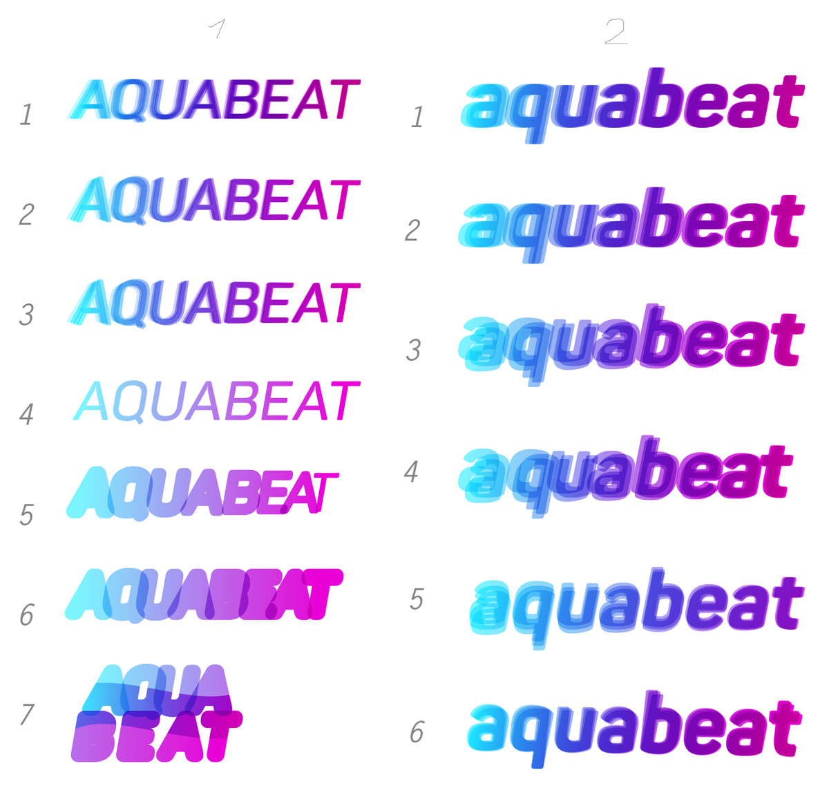
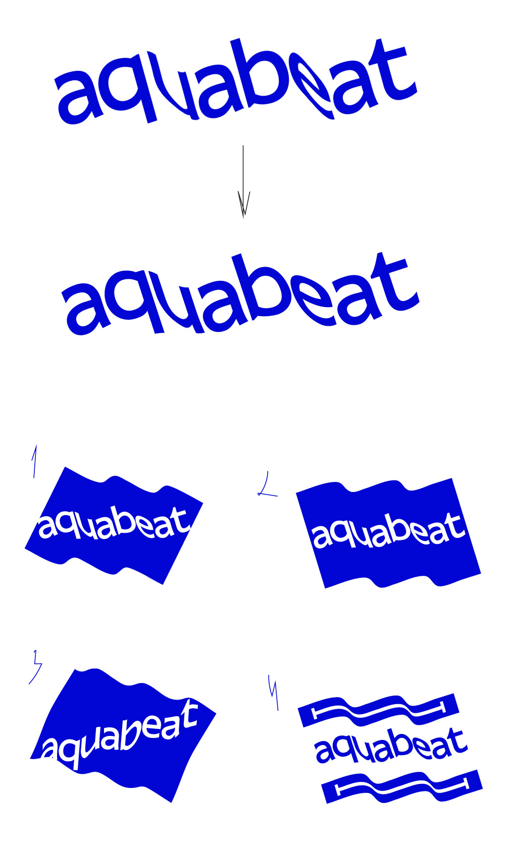
As for the real tasks: we would like to get a readable logo, that is one with text and, if we can say so, one that would be associated with sport in the way it’s written (with no emphasis on any specific type of sport). For colors, we’re looking at blue and navy. We see aquabeat as a name that isn’t capitalized, we also probably wouldn’t separate it into two words with color, but can probably allow it in theory. We would also prefer not to be in a situation where customers think that the “beat” part is somehow connected to music (which is why we think it’s better not to divide the word into two with color or any other means), in our minds “beat” is more about active and dynamic lifestyle.
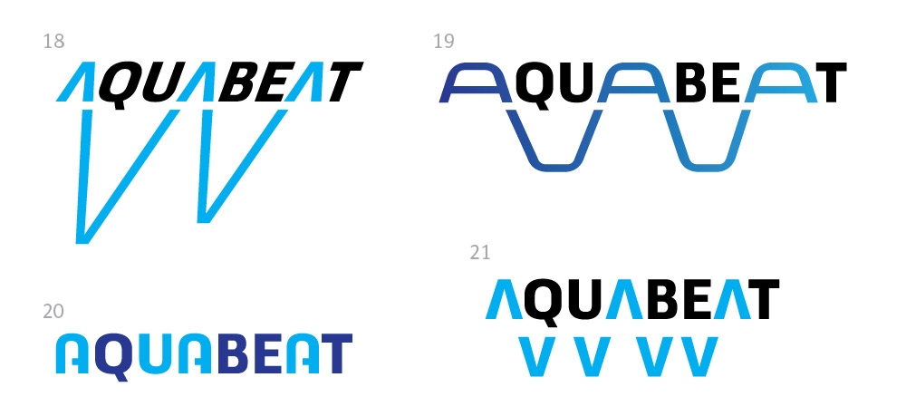
Designer: The first ideas. Everything around lines at the bottom of the pool. The lines help swim straight and the T is located two meters away from the wall.
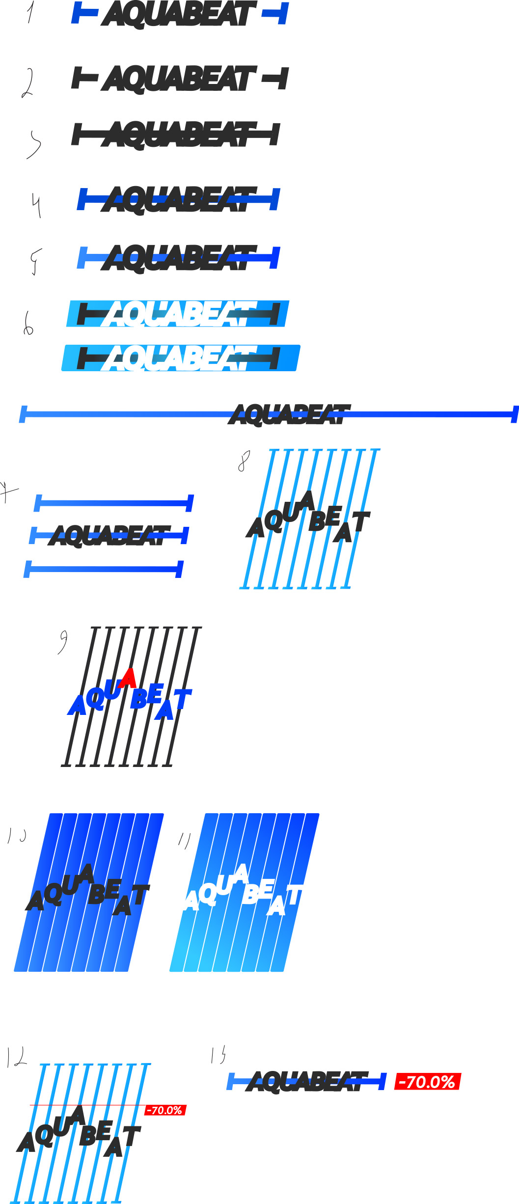
Art director: 11 is OK as a potential direction.
Second designer: First ideas.
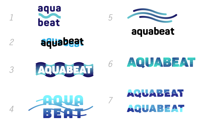
Art director: 2 is OK in theory.
Second designer: Yeah.
Art director: Nope.
Third designer:
Art director: 5 is interesting but unreadable.
Second designer: 7: sport and speed.
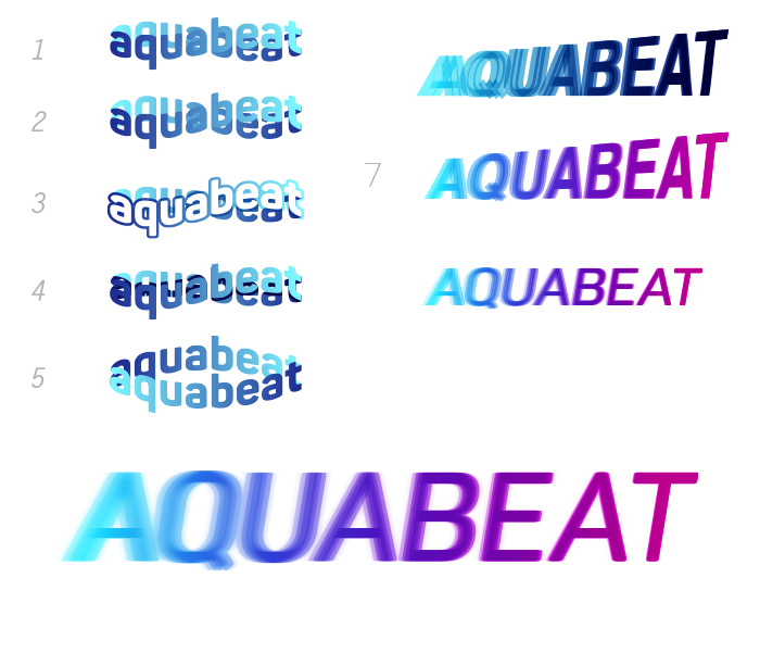
Art director: Be careful not to make “eat” stand out, this will turn it into a food brand.
Third designer:
Art director: Nope.
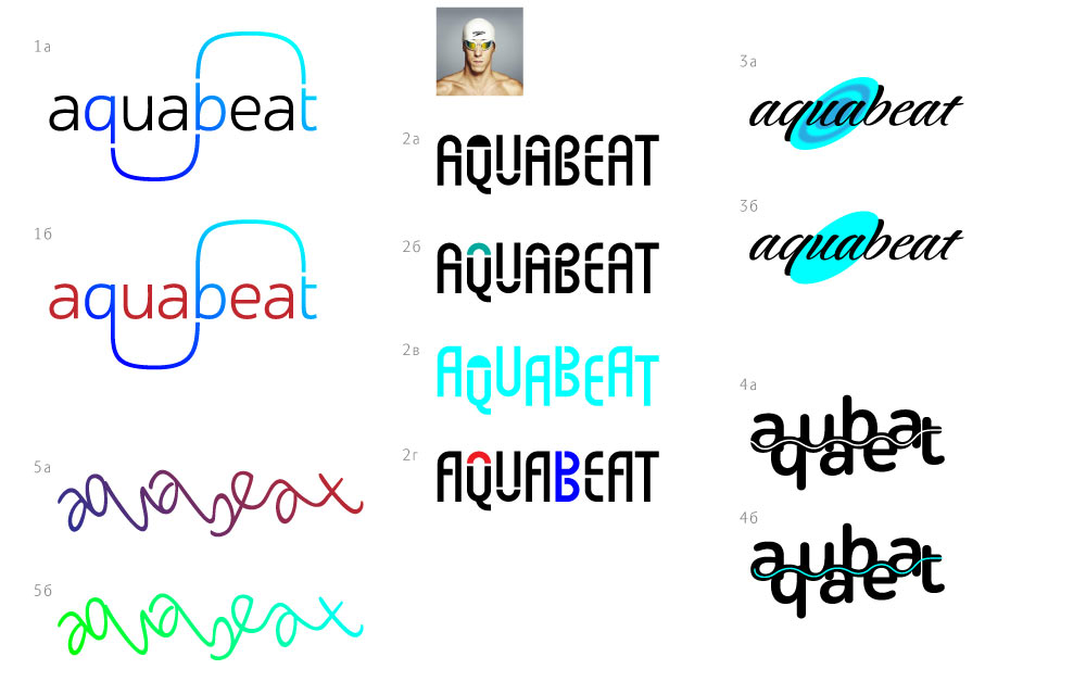
Designer:
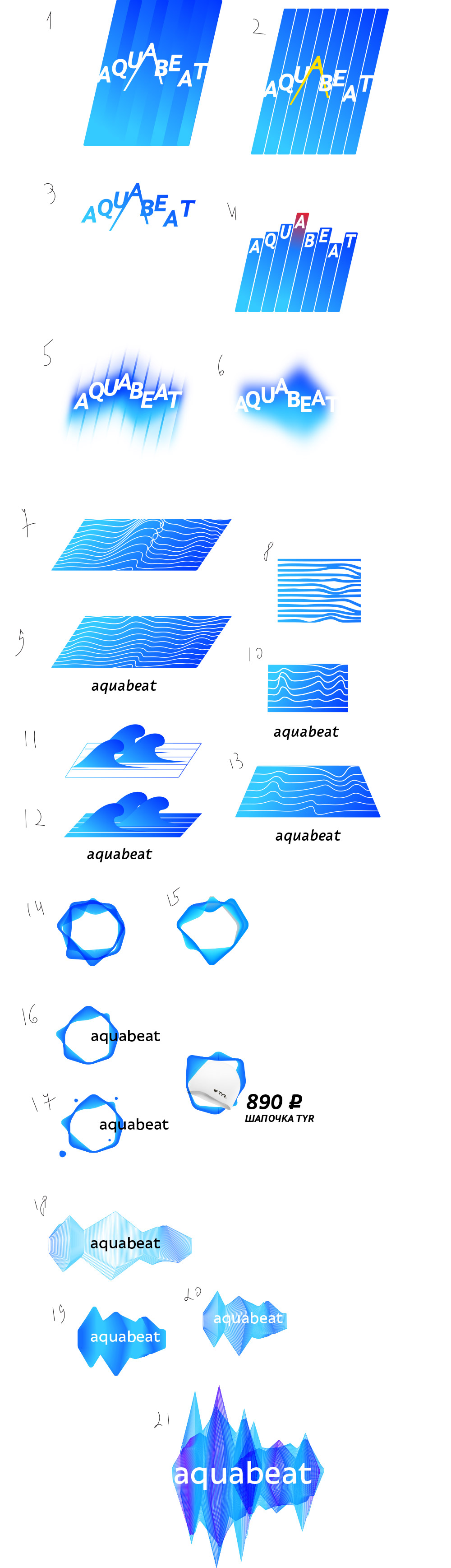
Art director: Kinda sorta, but not something you would send to a contest.
Designer: A flag, a wave and a pool.
Art director: The first one is OK. Would be great to work it into a cool logo.
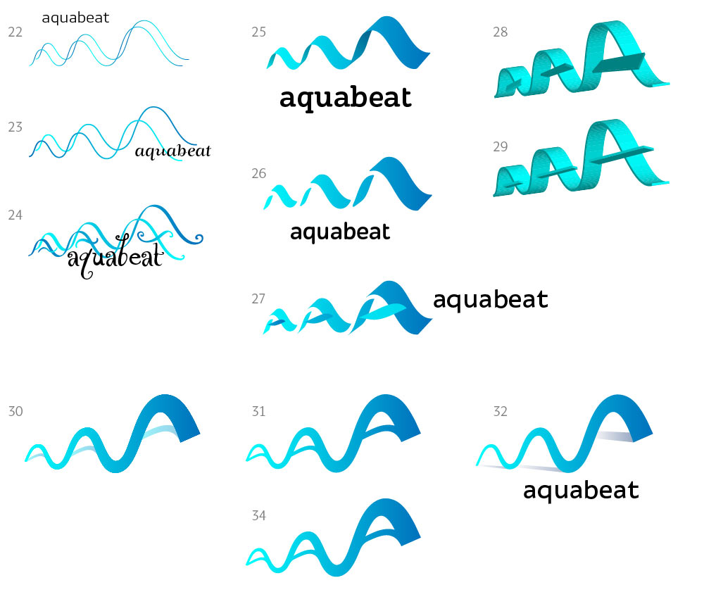
Third designer: I tried to develop 5 more. Is it worth any more effort?
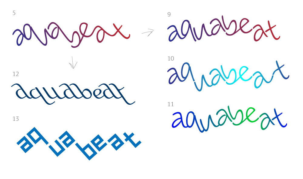
Art director: 10 is OK but is still unreadable. It also isn’t very pleasant aesthetically.
Third designer:
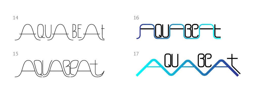
Art director: 16 is interesting. 15 can also be.
Third designer: More in the same vein...
Art director: 18 is very nice.
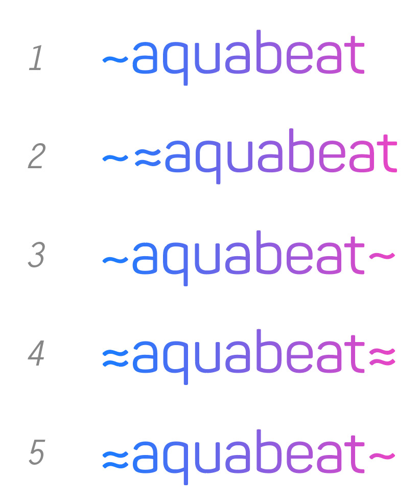
Second designer: ≈aquabeat
swim≈aquabeat
Art director: What if you add waves to the letters in 4?
Second designer: Or something similar to what I was drawing before.
Art director: Nope.
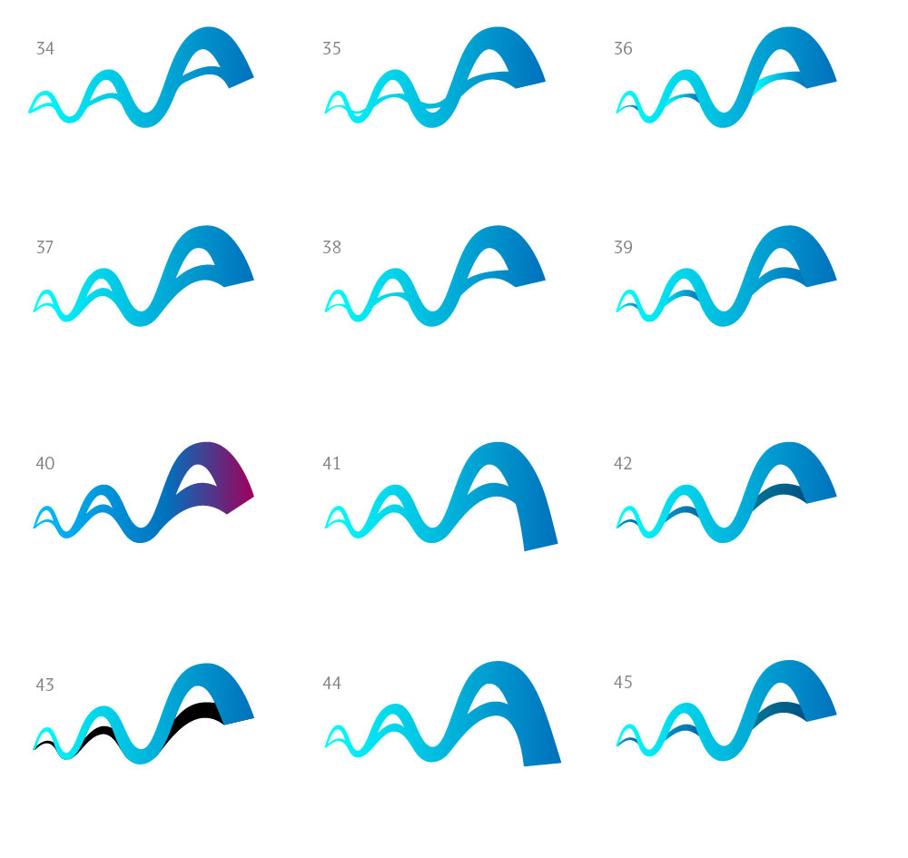
Third designer: Some more with the wave created by AAA. I’ll try to draw and develop 15 and 16.
Art director: No, better spend some time on 18.
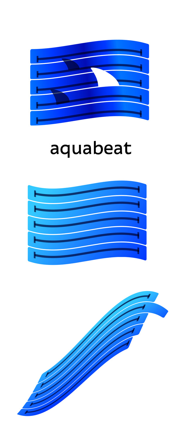
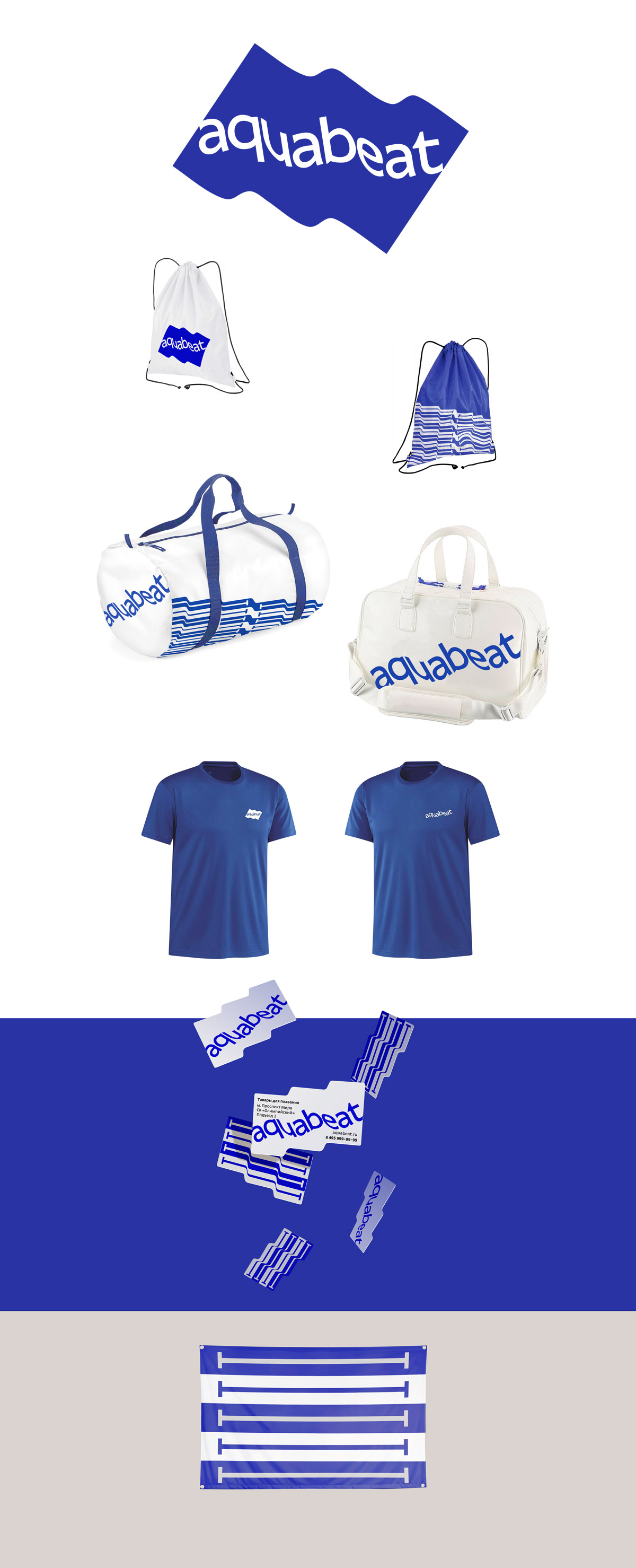
Designer: Now the flags.
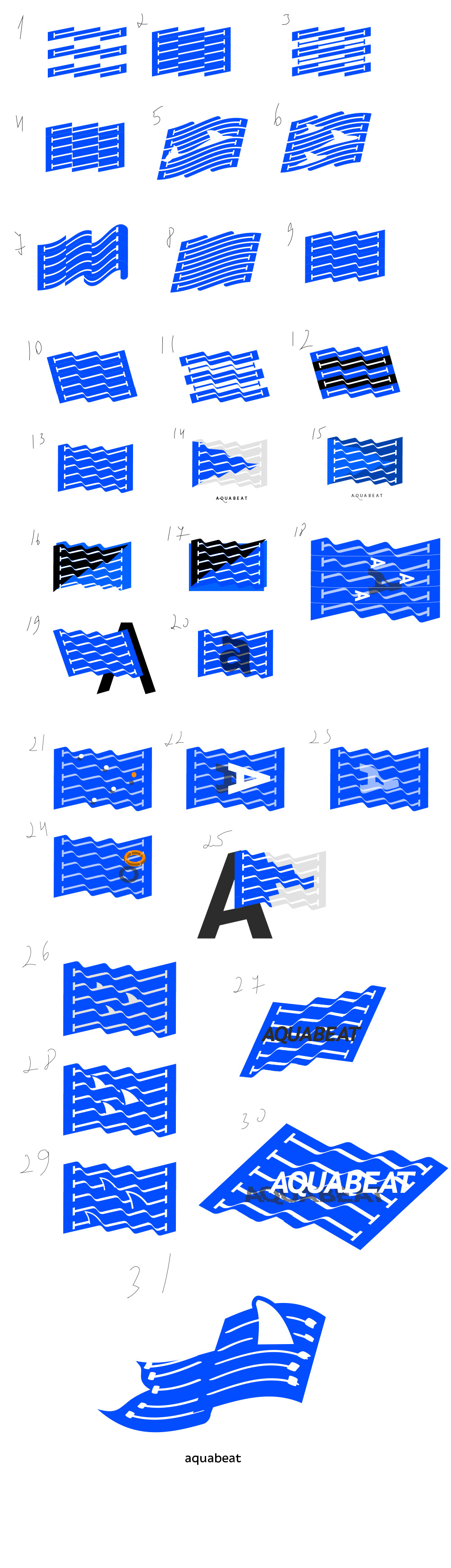
Art director: 11.
Designer: Examples with number 11 and variations of shape and color. We can also bend the text and use it where the logo won’t fit (on a sign, for example) and on various designer prints.
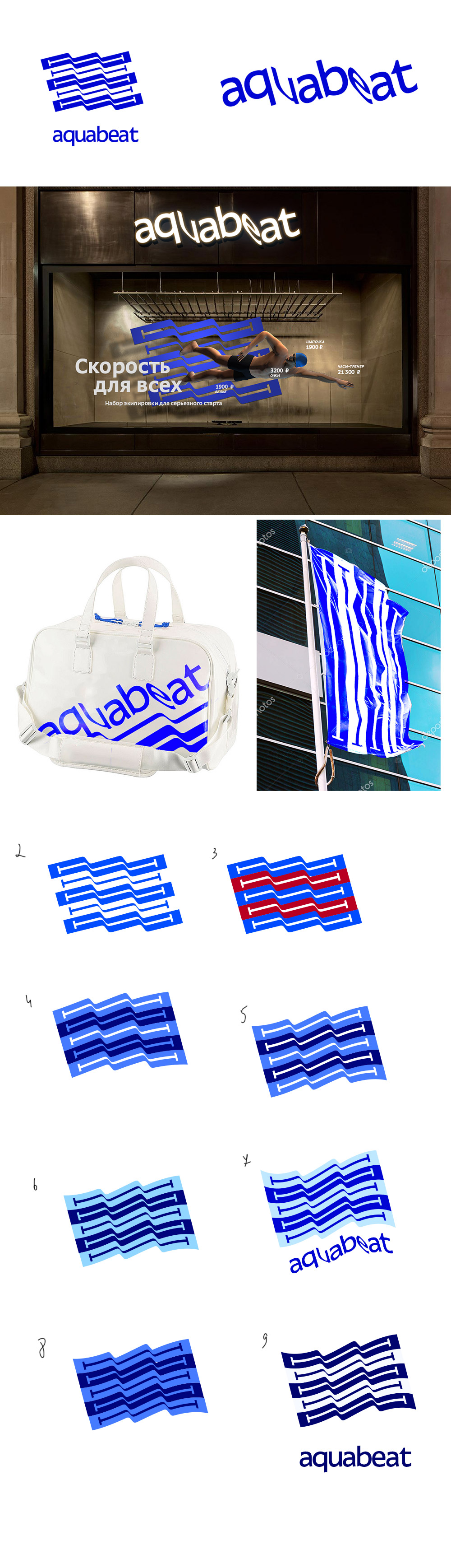
Art director: This is great with text. Let’s go with this.
Third designer: 18. Or is it too late?
Art director: 34.
Third designer: I’ll do the text a tiny bit later.
Third designer: Colors, text. Used 44 as the basis.
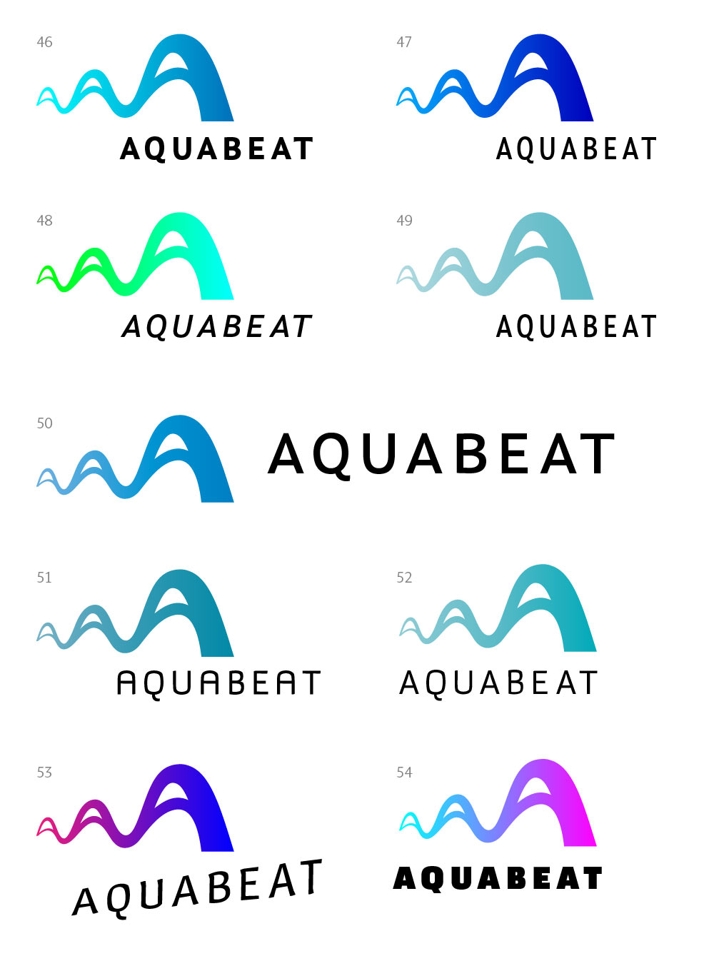
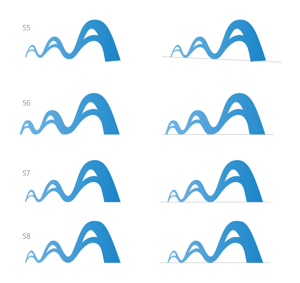
Art director: The color in 50 is OK. Lower the left part of the logo to make it horizontal to add perspective.
Third designer:
Art director: Let’s wrap this direction up, we’ll go with Mark’s design.
Designer: I think that’s it for stripes. Flag, pool, waves. I made the letters a bit smoother.
Art director: 1 and 4.
Art director: OK.
Designer: Adjusted the shape and added a gradient. What do you think?
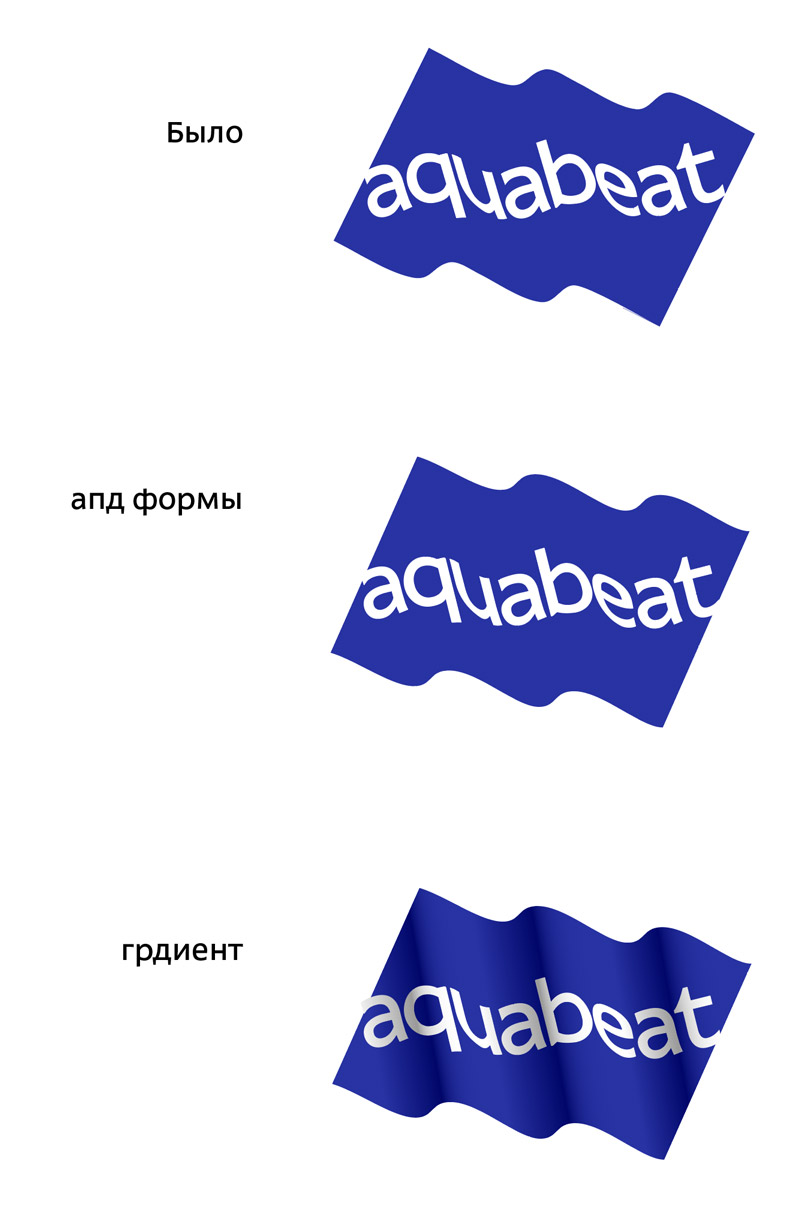
Art director: Perfect is the enemy of good. But you can keep the design with the gradient just in case.
