Light Worlds The Invisible Maiden Girl in Bloom Felt Age Kys
The making of the cover design for Light Worlds by Tatyana Tolstaya
Overview Process
Receiving from the publishing house the text in Word format together with all available data: format, number of chapters and half titles, a list of basic elements that would require their own styles, even a list of typefaces the publishing house can use along with a request to choose one of them.
Quickly creating a rough layout, adding the text, going through the list of available typefaces and trying them one after another.
SchoolBook. Too boring.
Bodoni. Nice but old-school.
Caslon. Also old-fashioned.
Newton. Also known as Times New Roman. The typesetter winces: “It looks as if it was typeset in Word. No doubt, it’s the best Cyrillic version of Times New Roman, but no, no and no!”
Octava. It was used to typeset the Bible—so, no.
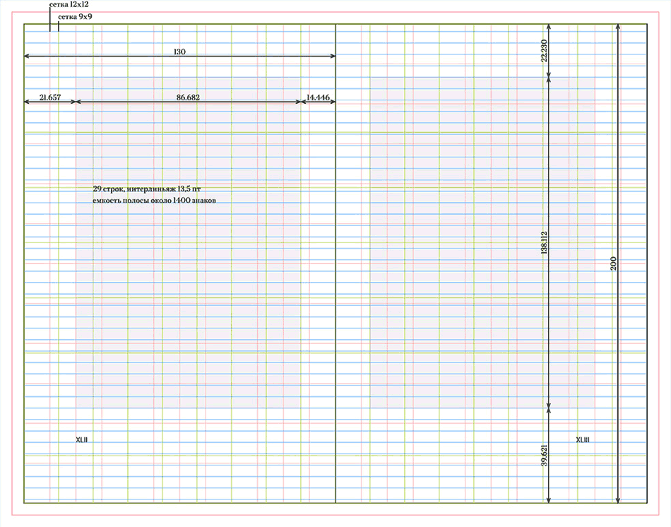
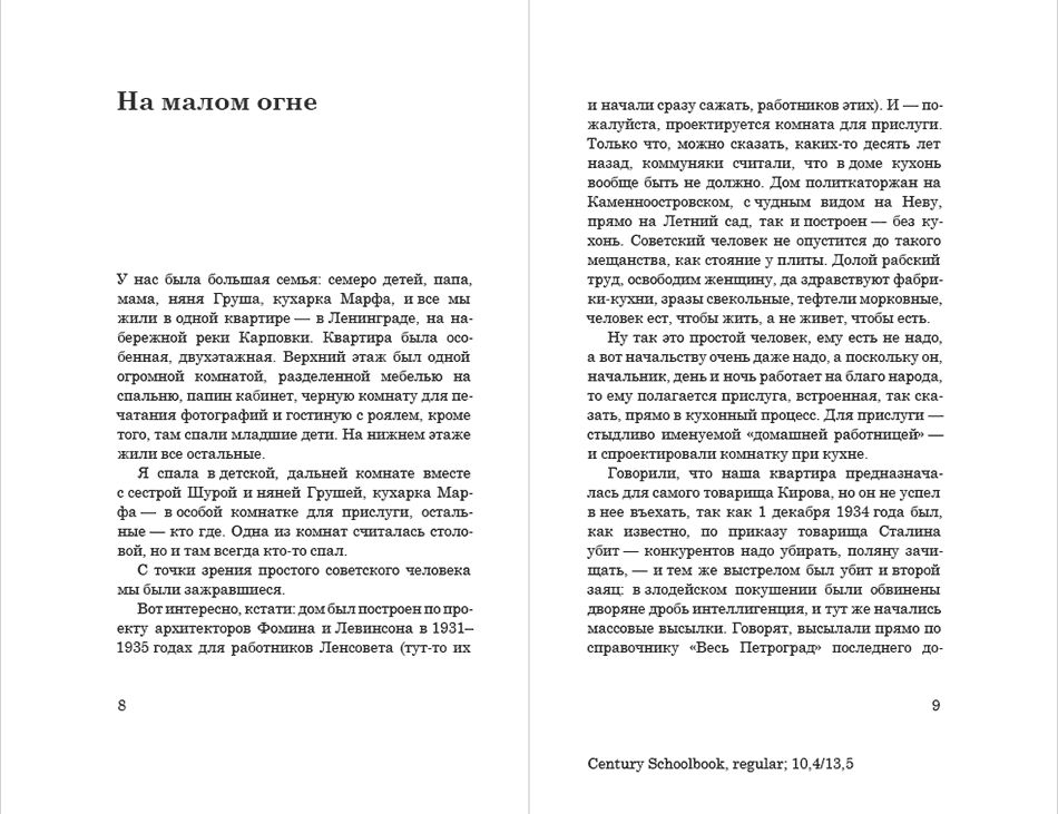
Out of all the faces the publishing house has to offer, SchoolBook and Bodoni look best, but it would be much better to use a more modern version of one of these typefaces. Offering the publishing house to purchase a more modern face. The publishing house refuses, chooses to go with SchoolBook and asks to send a grid layout. Our typesetter is eager to get to work. Sending the layout based on SchoolBook.
While the publishing house takes its time to make the decision, we quickly make another attempt: retypesetting the layout using the studio’s Mirta typeface.
Hurray! The publishing house approves Mirta. Adjusting the layout, making the margins a bit smaller, slightly increasing the point size and the leading, fine-tuning the kerning and interword spacing. Done. Sending the layout with all the text elements to the publishing house.
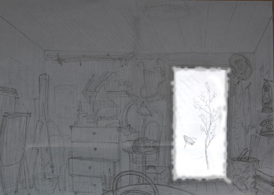
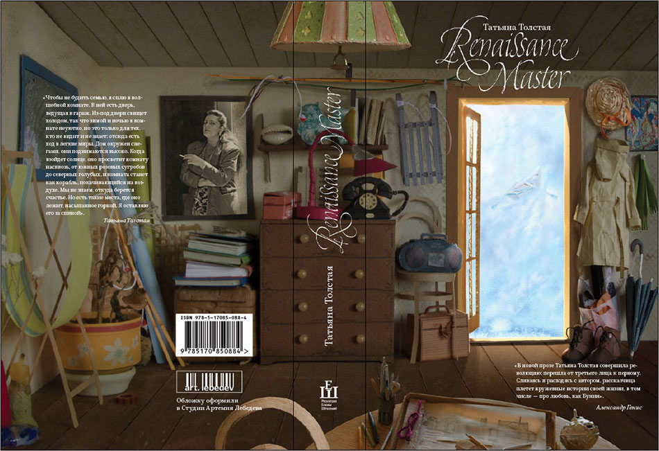
Time to work on the cover. Drawing the sketches.
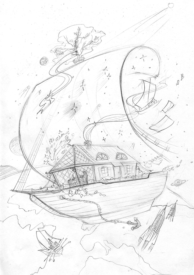
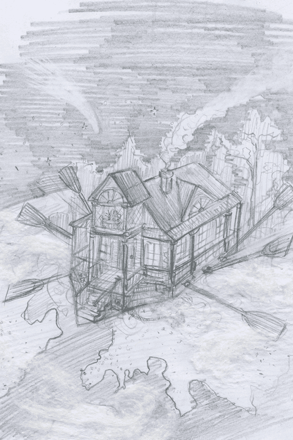
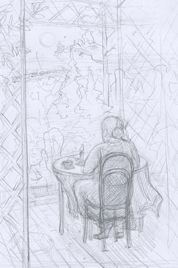
The author of the book does not approve any of them and asks to find a metaphor. Searching for a different solution and finding it.
The client likes the draft. The illustrator starts to realize the composition in the paper plastique technique.
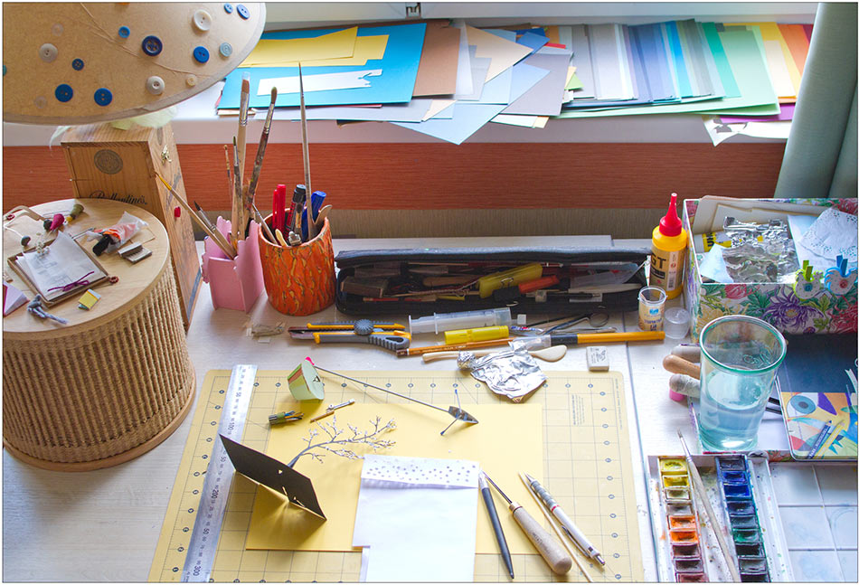
Cutting out composition details out of colored paper and gluing them together.
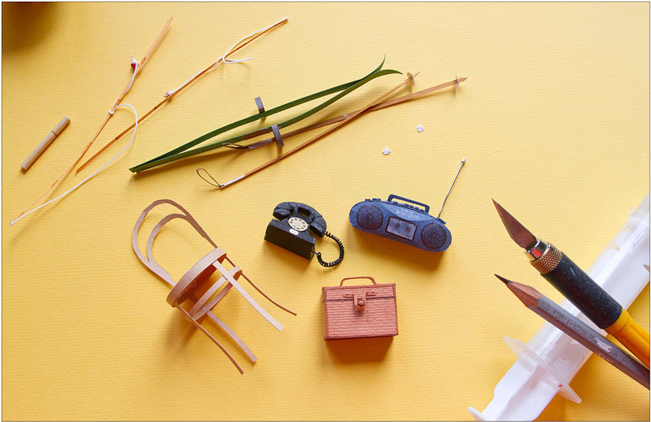
The author sends the artist photographs of some of her personal items that were mentioned in the text, such as the spinning top (on the table, made of tin foil).
Placing and hanging the pieces in a paper room.
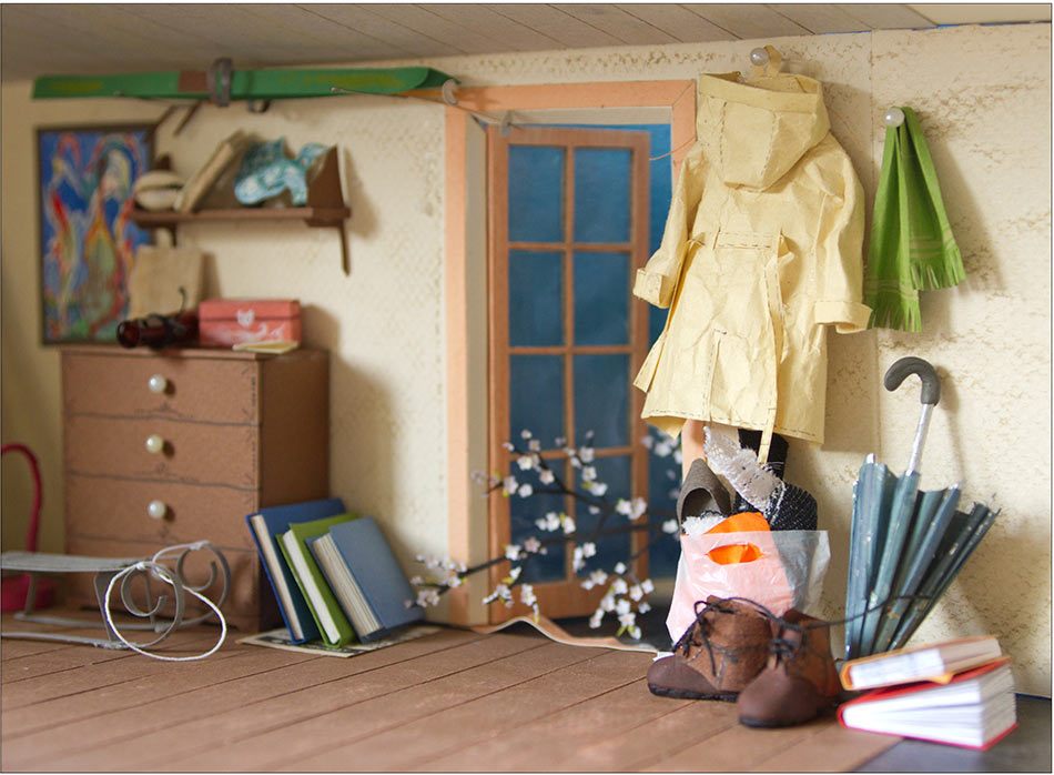
The illustrator takes photographs and combines the foreground and the background in Photoshop.
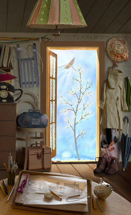
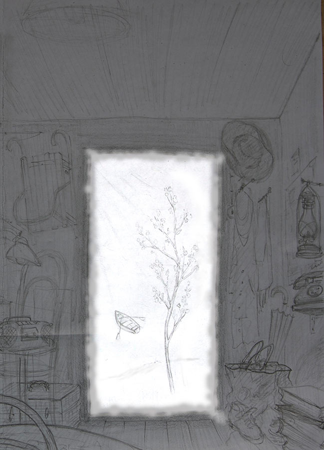
The client asks to make the image behind the open door lighter by removing the blooming tree.
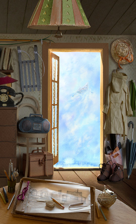
Using acrylic paint to color the boat light blue, photographing it again and adding to the final image. Just what we need!
Typesetting. The chief typesetter suggests to use calligraphy to write the name of the book on the title and on the spine.
The calligrapher calligraphs ink calligraphy.
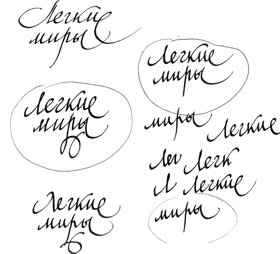
Scanning, painting, arranging in one line, placing on the cover. To the press!

Order a design...