The making of the Belaya Vorona school logo
Overview Process
The client sends us the logo for which we have to create a suitable text.
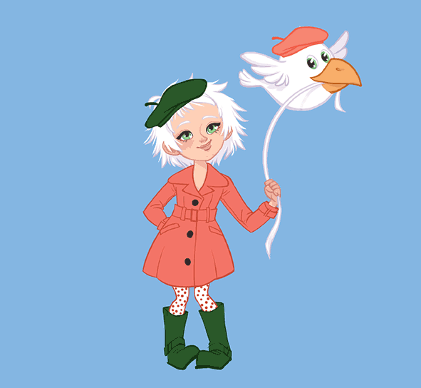
Going to the type designer and explaining the task at hand. The letters have to be simple, not italics and not too thin.
The type designer makes the first attempts.
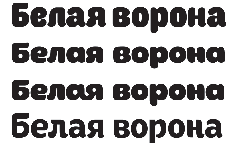
Art director: Go with the last one, but be sure to add a ligature.

Searching for the best way to arrange the text.

The client says that the design has fallen out of favor. Making another attempt.
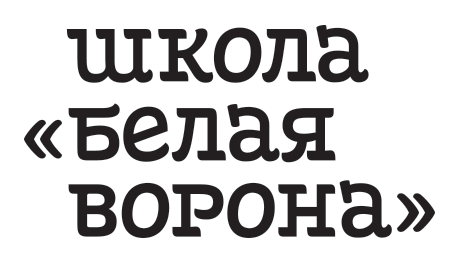
The client likes the result but asks to remove the quotation marks and work on the б and the в.
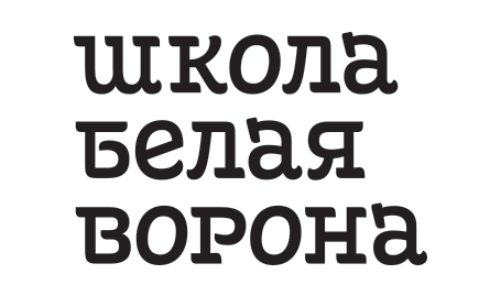
Art director: Sure, just make sure the Б is uppercase.
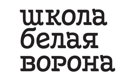
Art director: I love it when this happens. Not cursive, uppercase :-)
Type designer: Oh. OK.
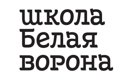
Artistic director: Looks too much like Hebrew writing.
Fixing.
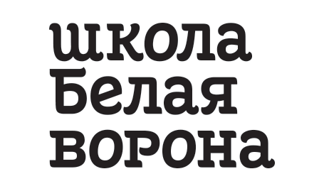
Art director: I don’t like the stressed vowels.
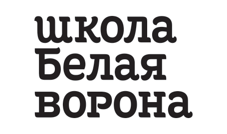
Art director: No, let’s make them drastically different.
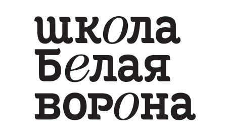
Art director: Nope.
Experimenting with the letter е.
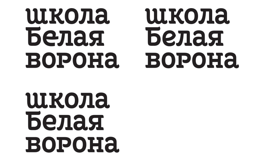
Ultimately choosing the design on the right.