The making of the Beeline single web environment
After refreshing the mobile services account page we begin thinking about propagating new visual styles and interface solutions onto the Home Beeline account page. Looking at its current version.
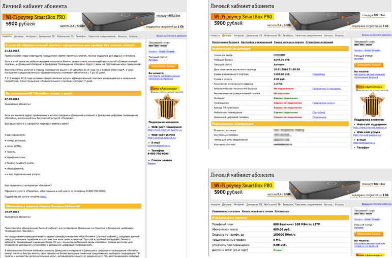
Considering the task and realizing that a customer with two accounts for mobile and home services will have trouble switching between two account pages. We need a shared account page for all contracts, mobile numbers and services with unified settings, notifications and personal details.
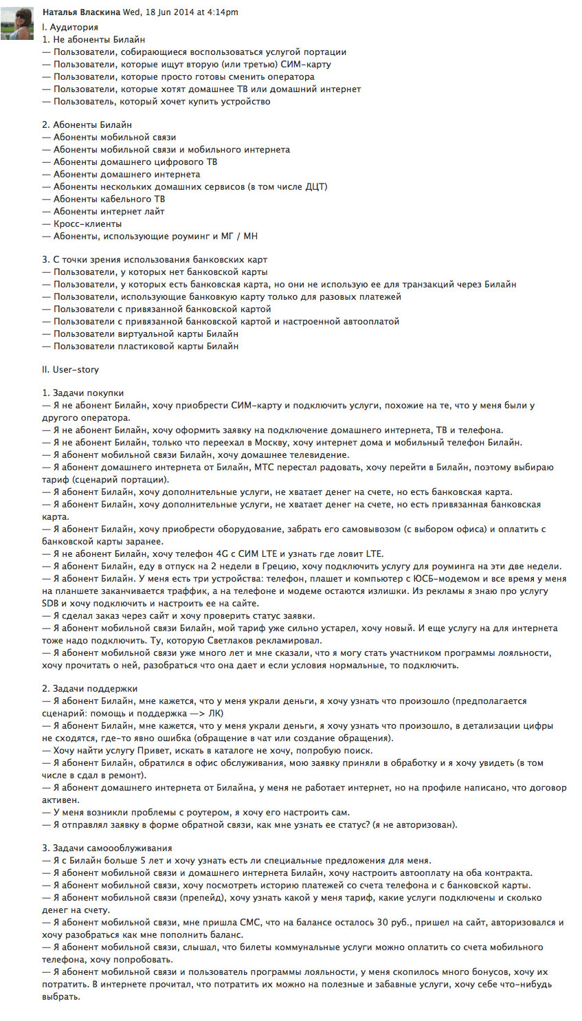
We start by creating user scenarios, describing types of users and their needs.
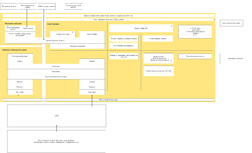
Creating the structure of the unified account page.
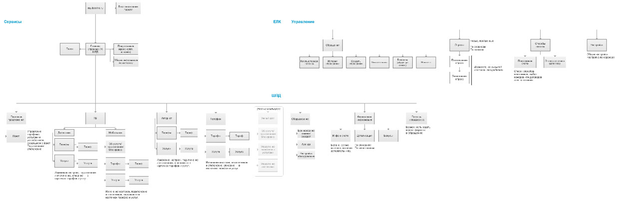
Settings, help, support request history and notifications will be shared across all accounts, while lists of enabled services and financial information will depend on the chosen contract.
Discussing the new structure with the client and together coming to the conclusion that while combining account pages is a good idea, it isn’t enough. Changing plans and enabling new services would remain on the account page, as well as personalized offers and recommendations. However, all these tasks should be available right on the main website, not hidden on some internal pages. Deciding to fully combine the website with the account page. The managing of plans and services, promotions and personalized offers will be moved into the site’s catalog while account details and financial information will be available in the new section called My Beeline.
Creating an information model of the new website.
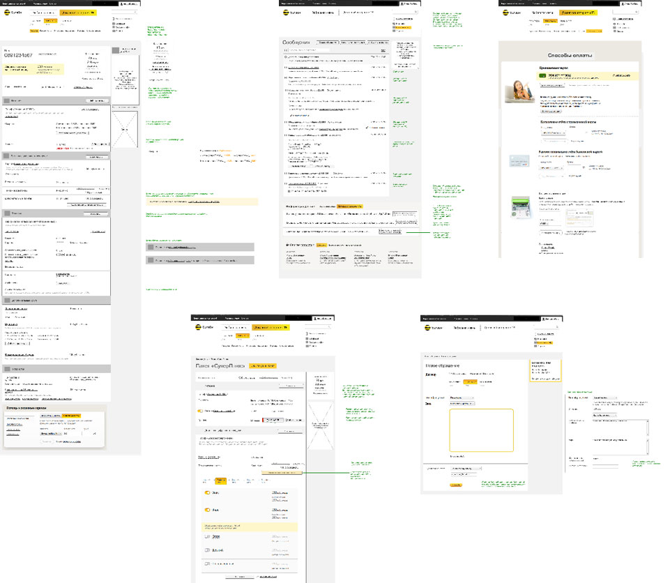
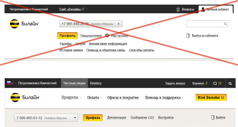
Getting the client to approve our ideas and starting to design the new interface. Starting with navigation. It has to be uniform for the website and user profile and allow changing the current account on the fly.
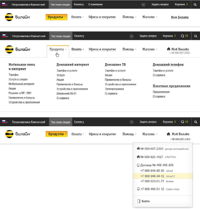
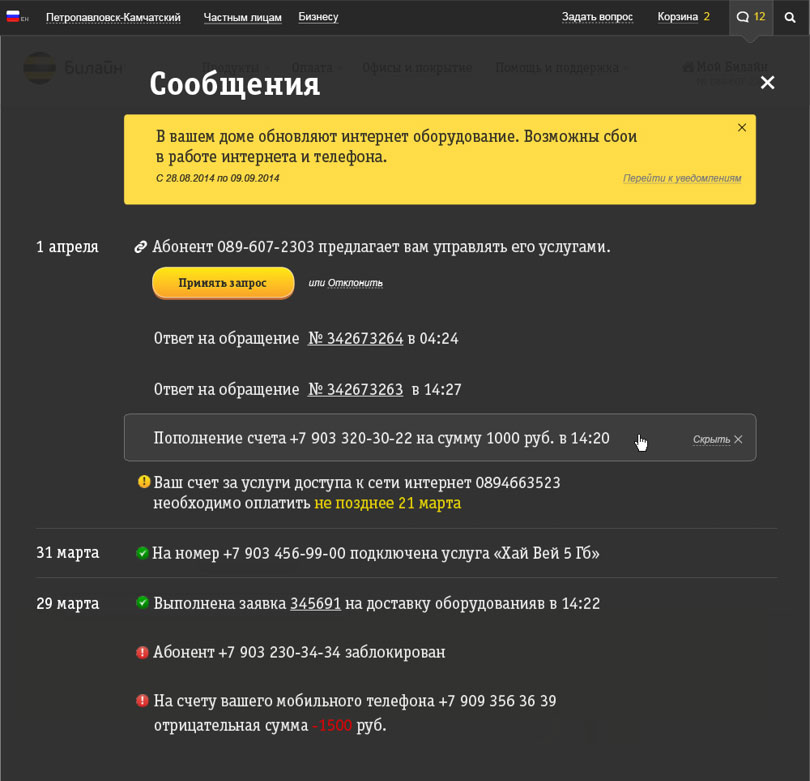
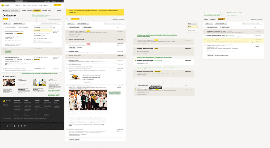
Messages and notifications for all of the user’s accounts are available in the website header.
Starting to migrate mobile and home Beeline services and plans into a single web environment. Users will be able to change settings of each product before enabling it in a couple of clicks. After that, they will manage their own customized plan or service. Scenarios for enabling and managing plans and services should be shared across Mobile and Home Beeline.
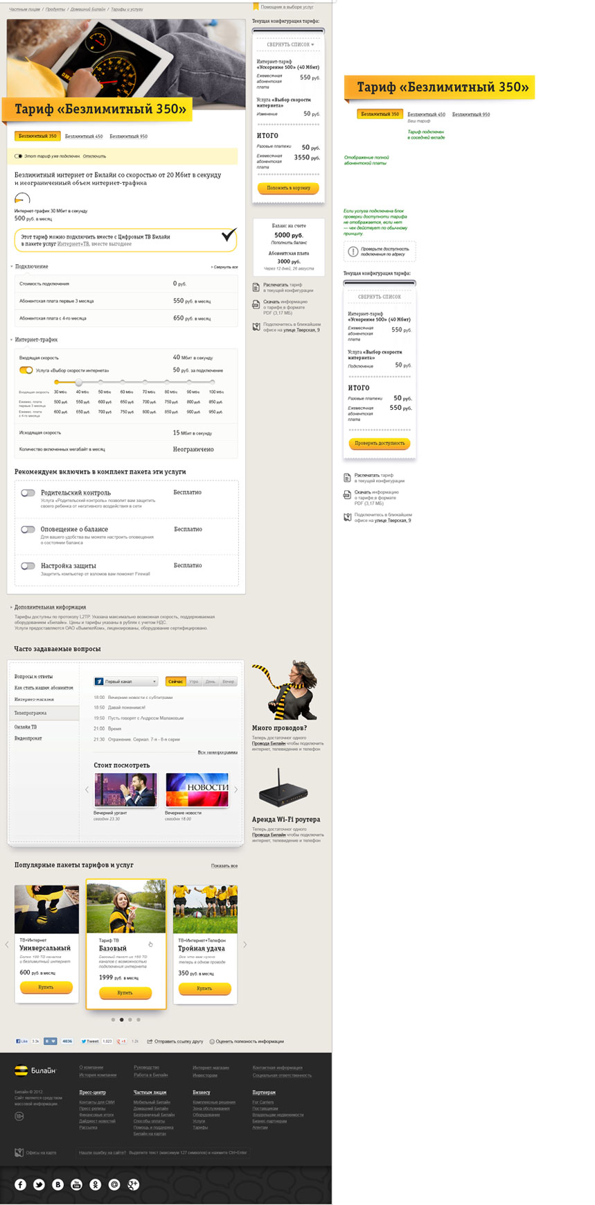
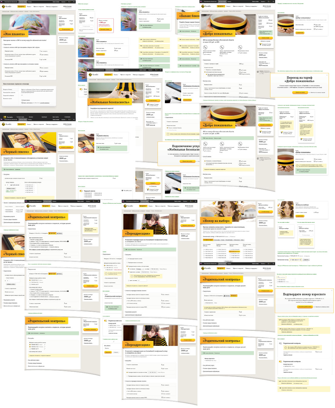
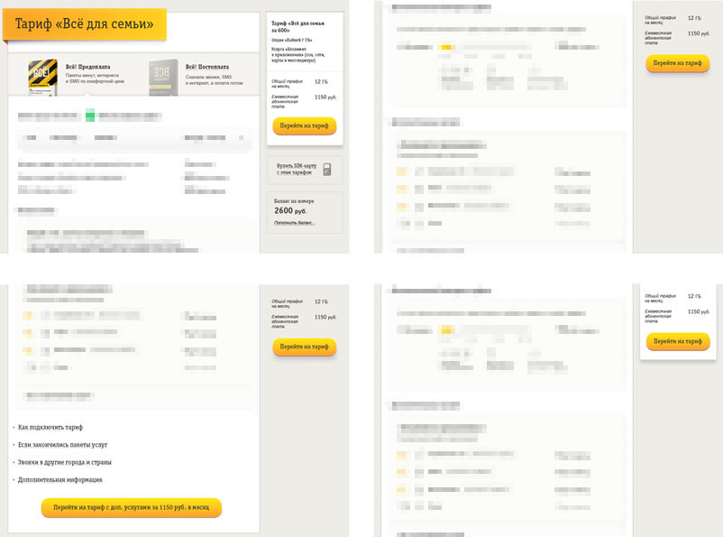
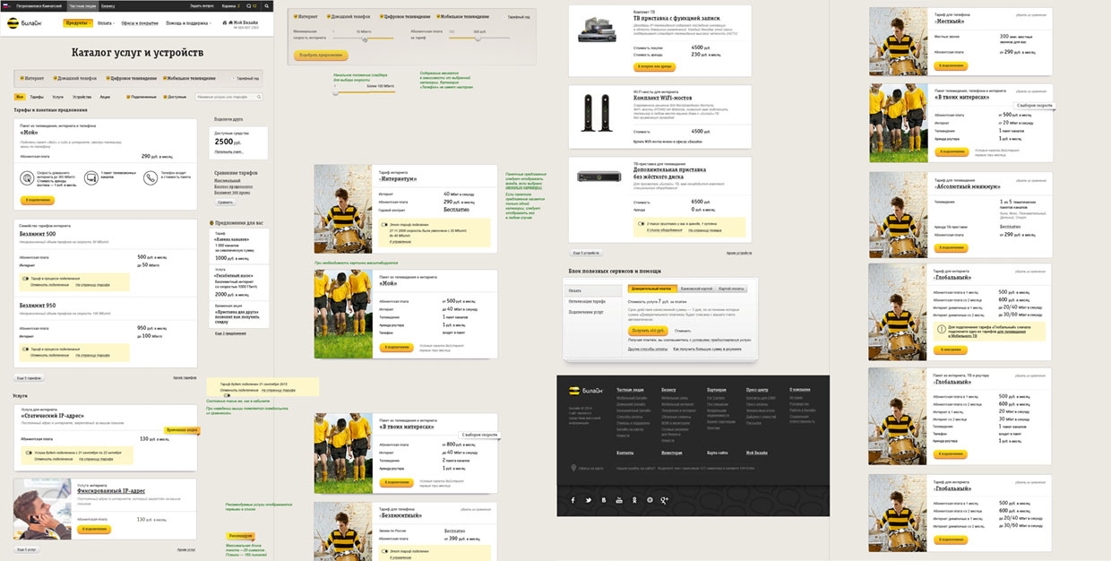
Redesigning all plan and service pages following the same principle.
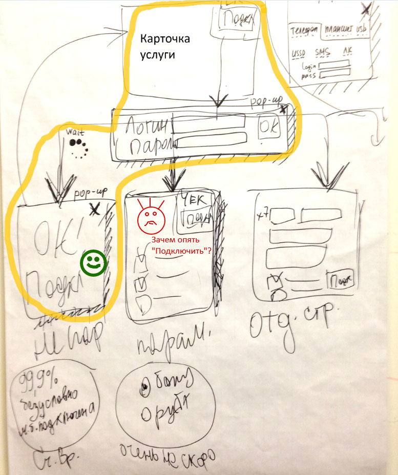
Creating scenarios for enabling new products. The Enable button will be in the receipt on the right which will remain fixed when the page is scrolled. Users will be able to enable most of mobile products in just two clicks. Elaborating the scenario.
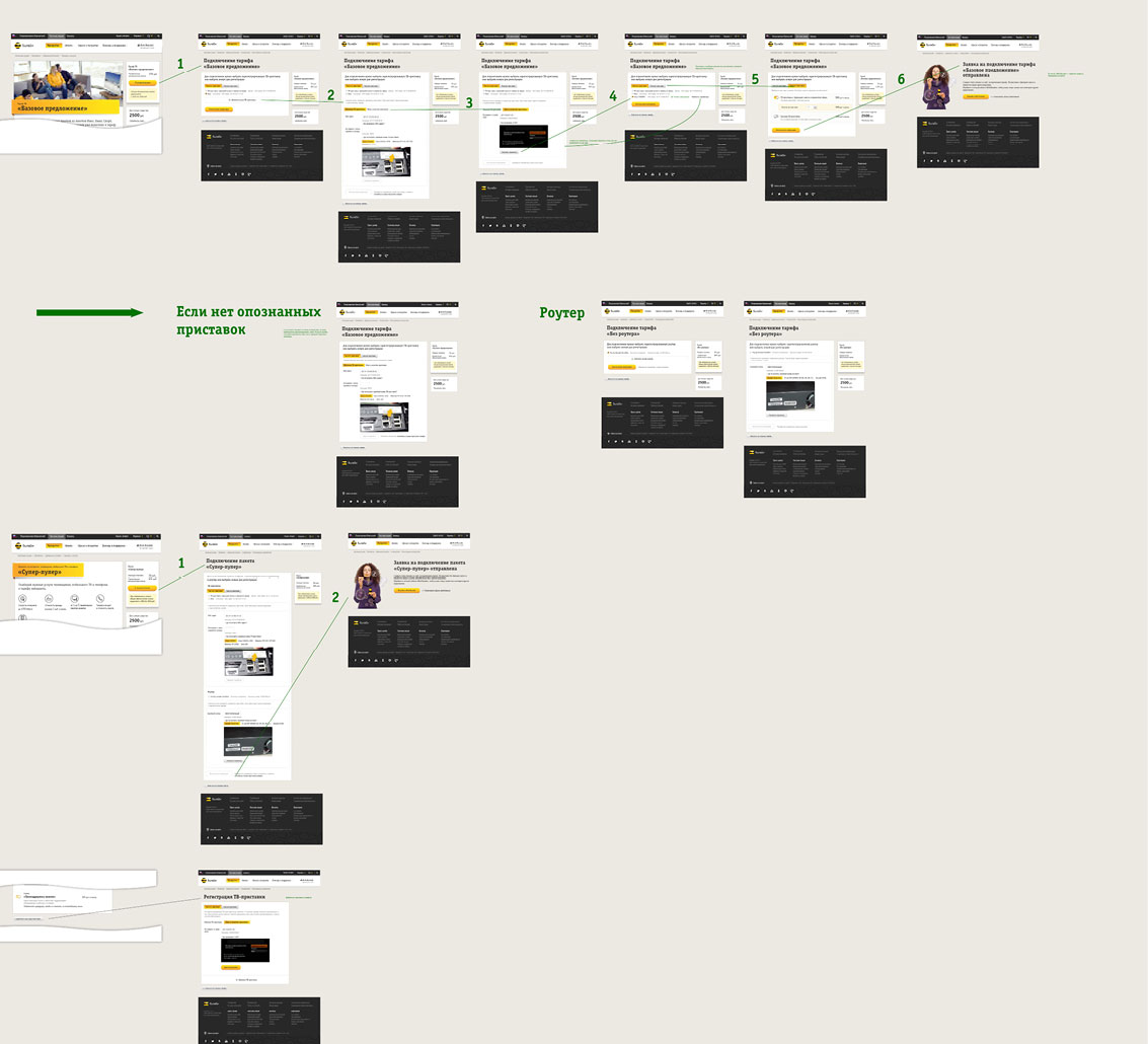
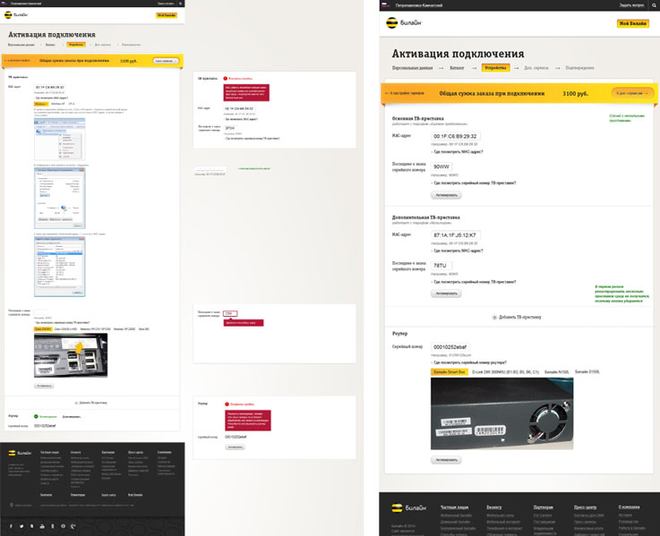
Home TV and Internet plans present slightly more difficulties as they require making an installation appointment.
Assembling all the updated pages into a large interactive prototype. Using it to test our ideas on groups of users with the help of Beeline’s usability laboratory.
Tests show that people don’t notice the Enable button in the right part of the screen. Suggesting several ideas to fix this and testing them. A large button at the end of the page proves to be most effective.
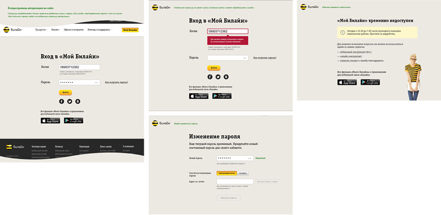
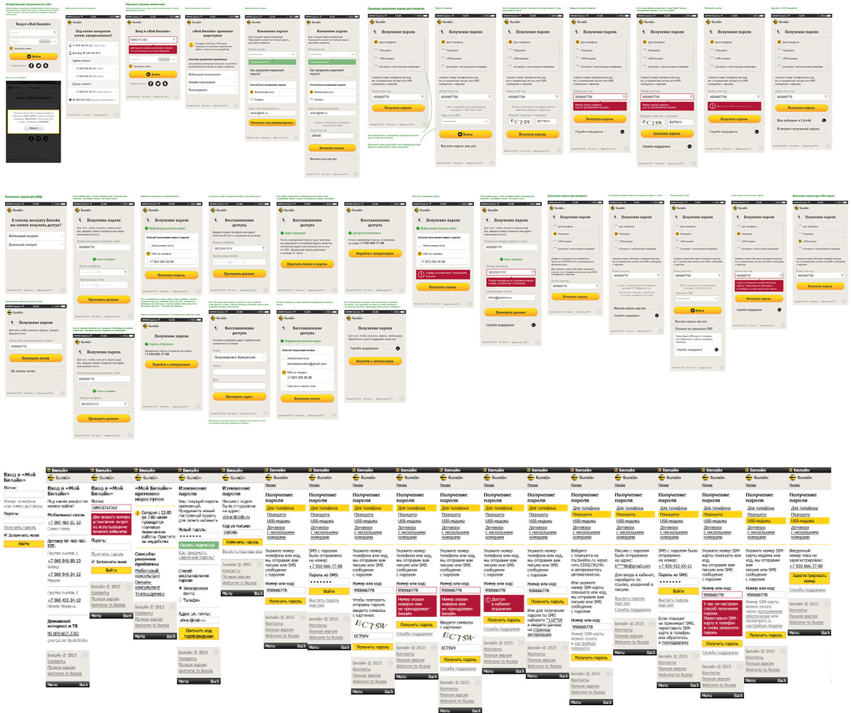
Coming up with authorization scenarios. New Mobile and Home Beeline customers will replace their temporary password with a permanent one the first time they log in.
After enabling home Internet and TV services, customers will need to activate their router and set-top box. Providing details on how to do this.
Links to pages for setting up and activating accounts often arrive to mobile phones as text messages. Creating mobile versions of all pages for all authorization scenarios.
Considering the catalog cards. Thinking of a way to highlight products already enabled by the client, those recommended to the client, and those that cannot be enabled for some reason. Naturally, all patterns should be the same across mobile and home catalogs.
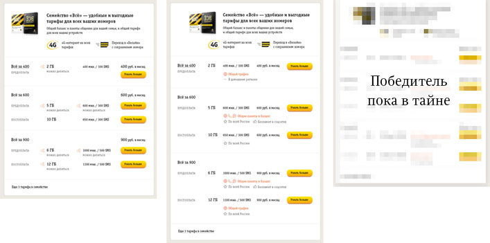
Updating the All plan group takes quite a bit of time. Visitors should be able to immediately see how service packages differ, understand the benefits of postpaid plans and additional features of more expensive plans. The card goes through multiple iterations. During one of them we get the idea of a radical rework of the product catalog. We select several final designs, test them on user groups and choose the winning design that ensures maximum conversion.
After updating all plans and services, creating a very long lorem ipsum page which will become very helpful at the typesetting stage.

Simultaneously updating user profiles for mobile and home services. Simplifying navigation.
In case of the mobile services profile we simply remove redundant sections and functions, while most of the work goes into the home services profile.
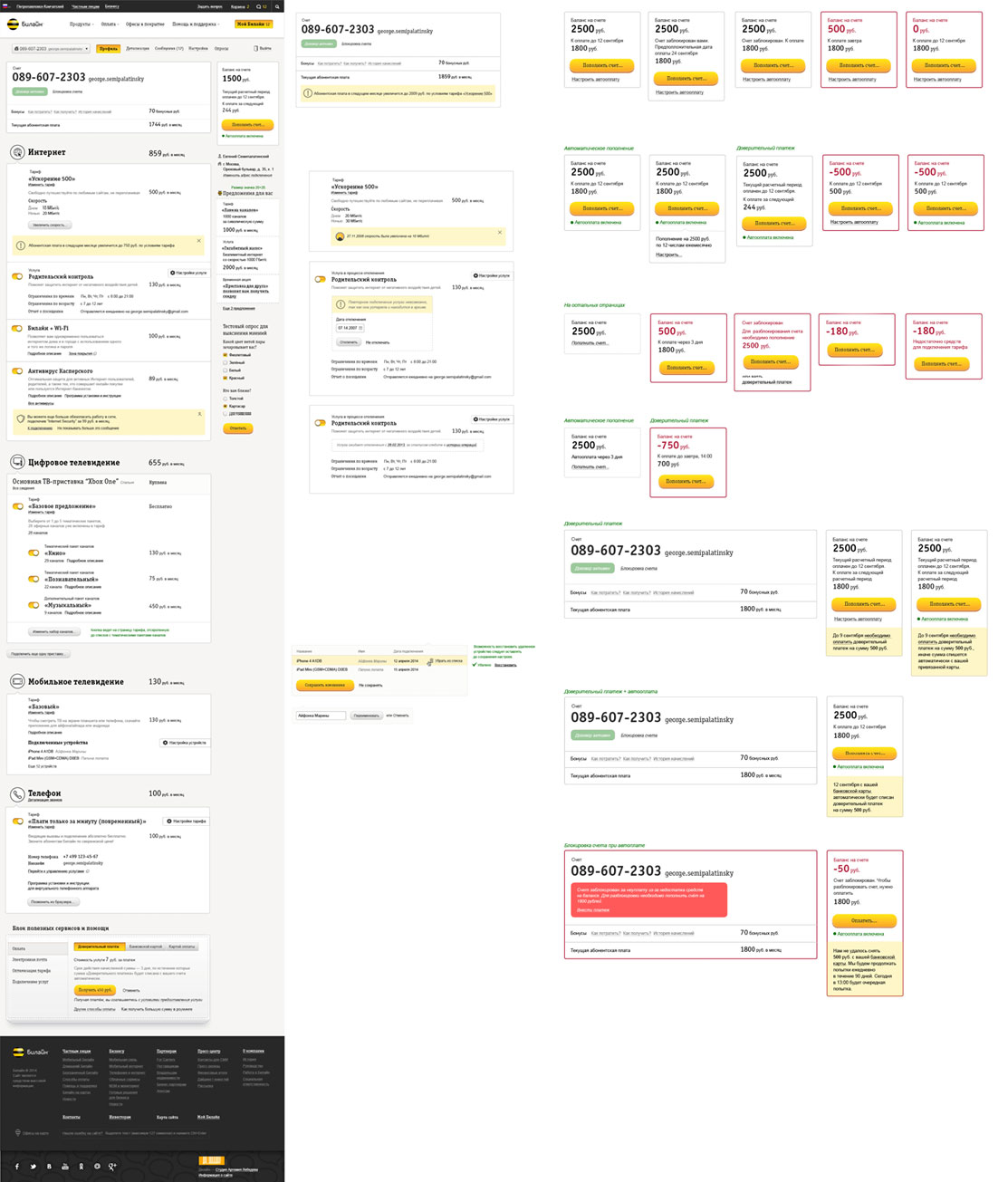
Designing sections shared across all accounts: Messages.
Manage Account.
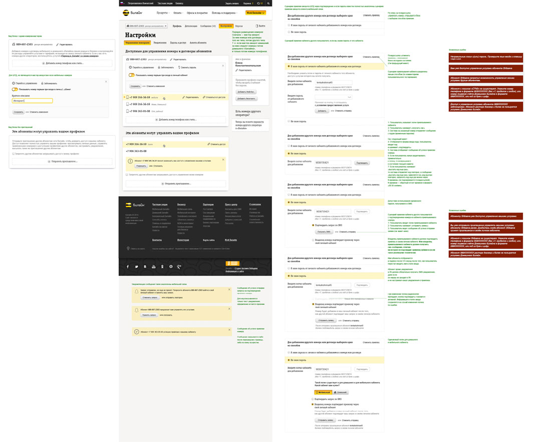
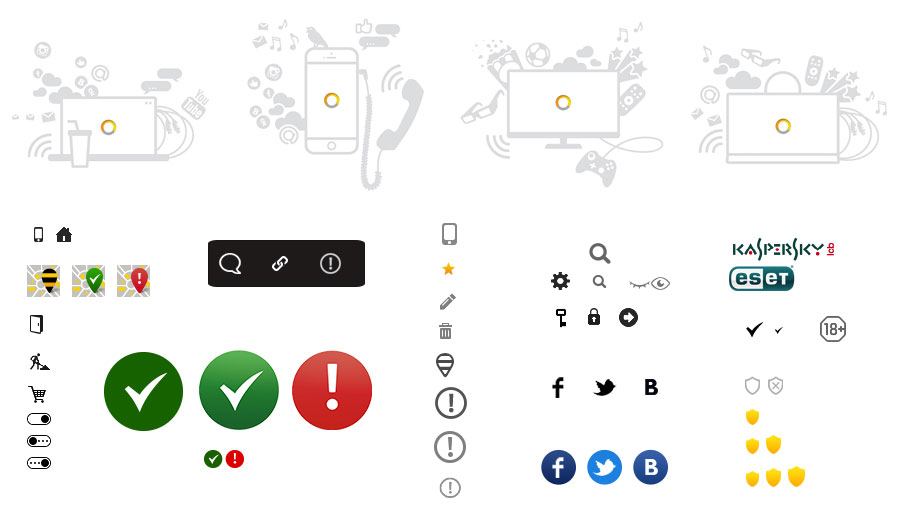
Drawing technical graphics for the home services profile.
Testing our interface solutions and global usage scenarios on real people as we go. After each test, Beeline experts create reports with information about successful and unsuccessful interface ideas.

Studying the reports and suggesting solutions which are tested again when needed. After successful testing, making the decision to launch the website.
Deciding to create a landing presentation of the new website to introduce its new features and gather feedback. We will provide links to the landing page on the website as well as in the old and new versions of account pages with a series of banners.
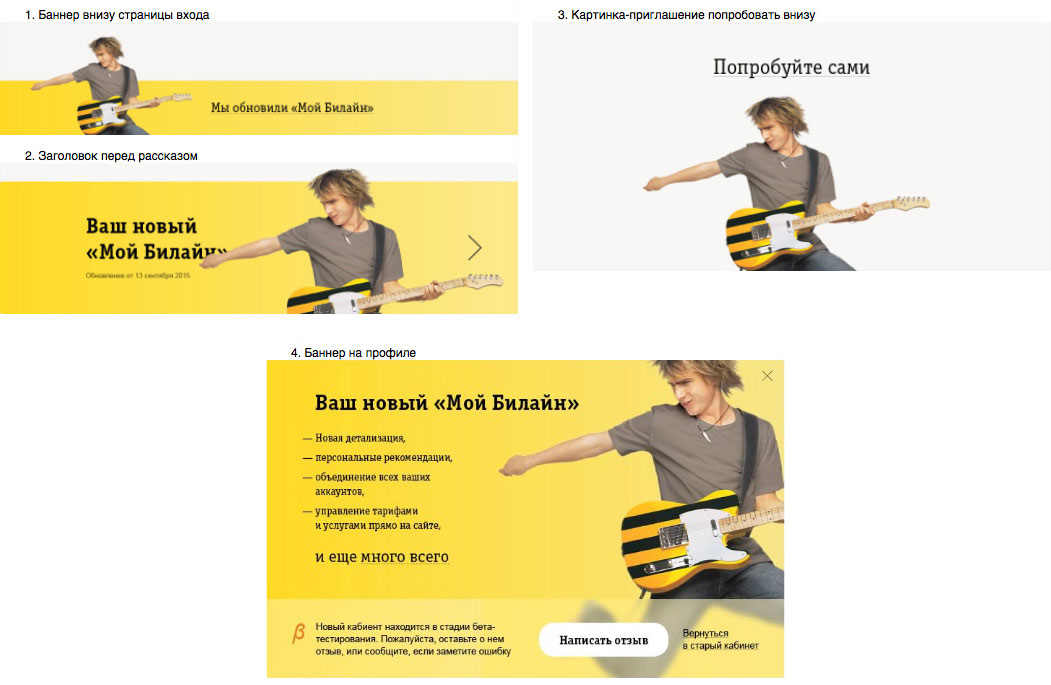
Holding a photo shoot of Beeline employees for the promo illustration advertising the new website.

Choosing the winner, preparing the final image, drawing technical graphics and assembling the landing page.
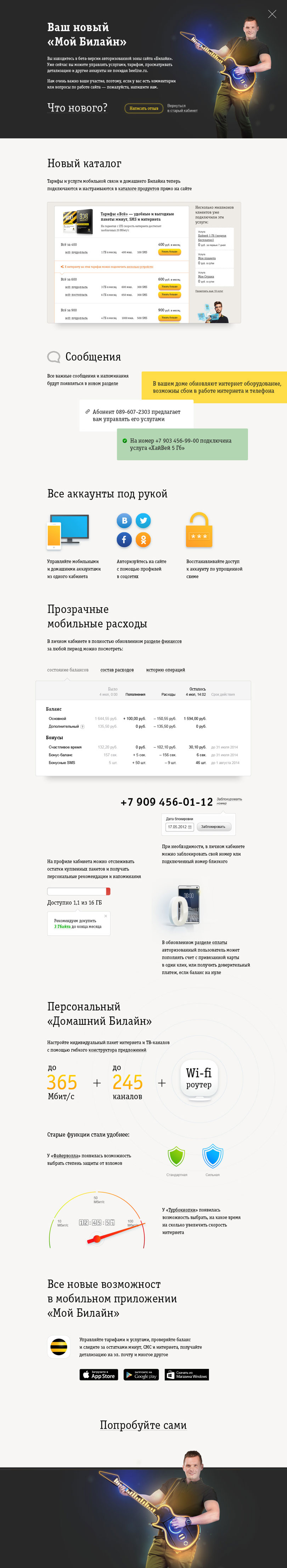
Beeline technologists typeset the landing page and the beta version of the single environment goes live. We are gathering feedback, accumulating statistics and working on the new product catalog.
