Studying the materials sent by the client to understand where the accents are and what aspects of the company’s projects it chooses to emphasize.
Sketching some of the openings. It’s important to decide on the depth of information and the level of detail of the future guide. Also looking for small-scale graphic effects.
Having decided on the presentation, starting to typeset the guide. The client asks to assemble it in a binder to make sure new sections can be added if needed. Marking the beginning of each chapter on odd pages by using color cardboard half-titles. Writing the section on using and expanding the guide while we’re at it.

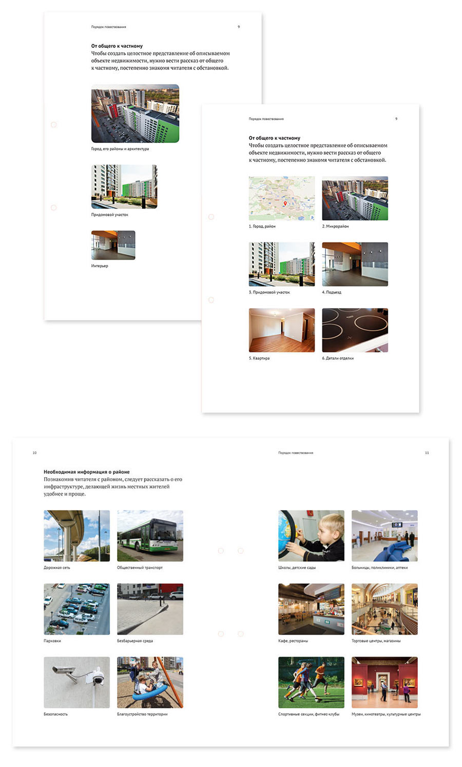
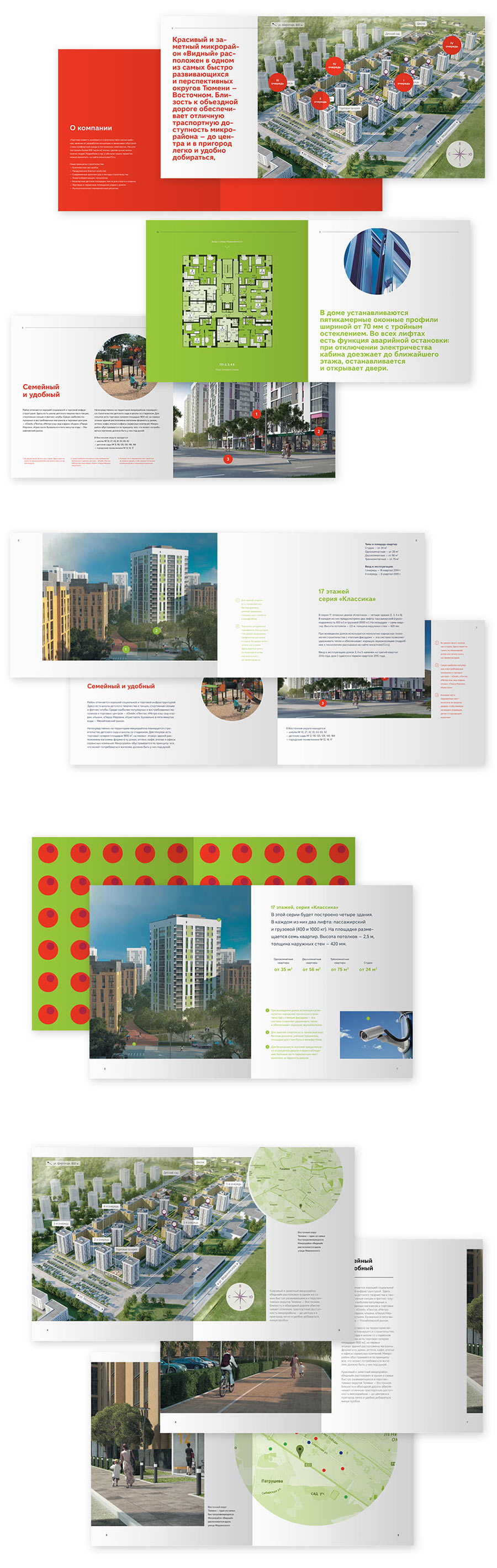
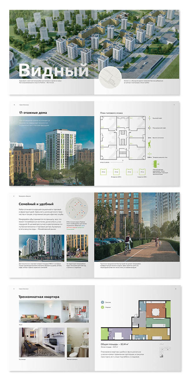
First of all, we need to show how to start presenting an object. Using the top-down approach: city, district, street, house. Pointing out important details that can’t be left out: transport in the area, nearest schools and hospitals, sports and recreation opportunities.
Using a recent brochure to demonstrate the stages of building an advertising publication and its section hierarchy.
Starting to polish the materials.
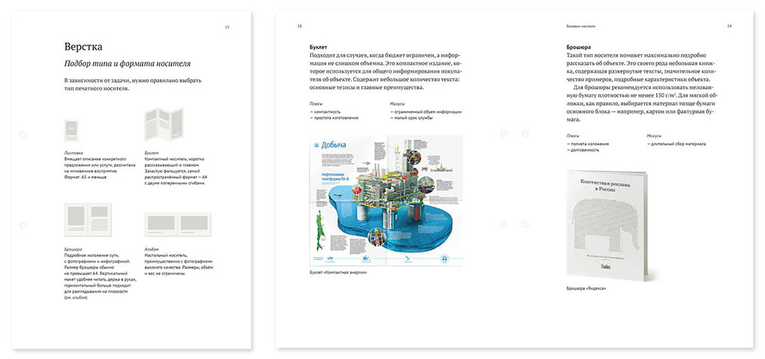
Thinking what the description of the most widespread types of printed materials could look like. We can’t use icons as they don’t demonstrate real properties of media. Deciding to use studio projects as illustrations instead.
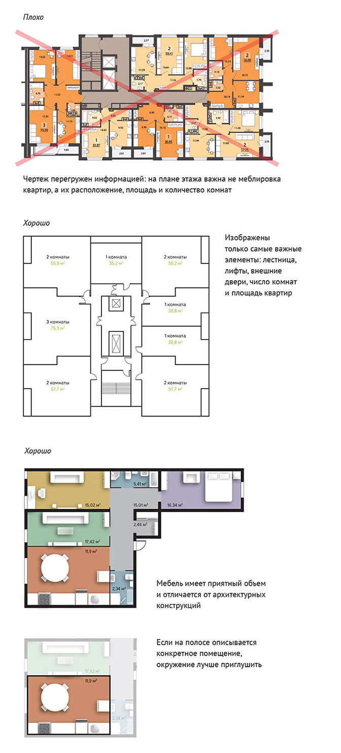
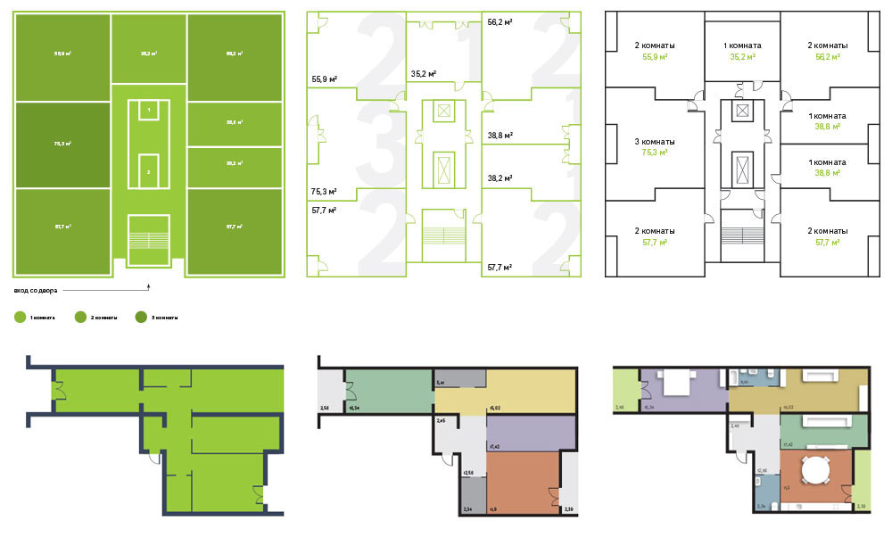
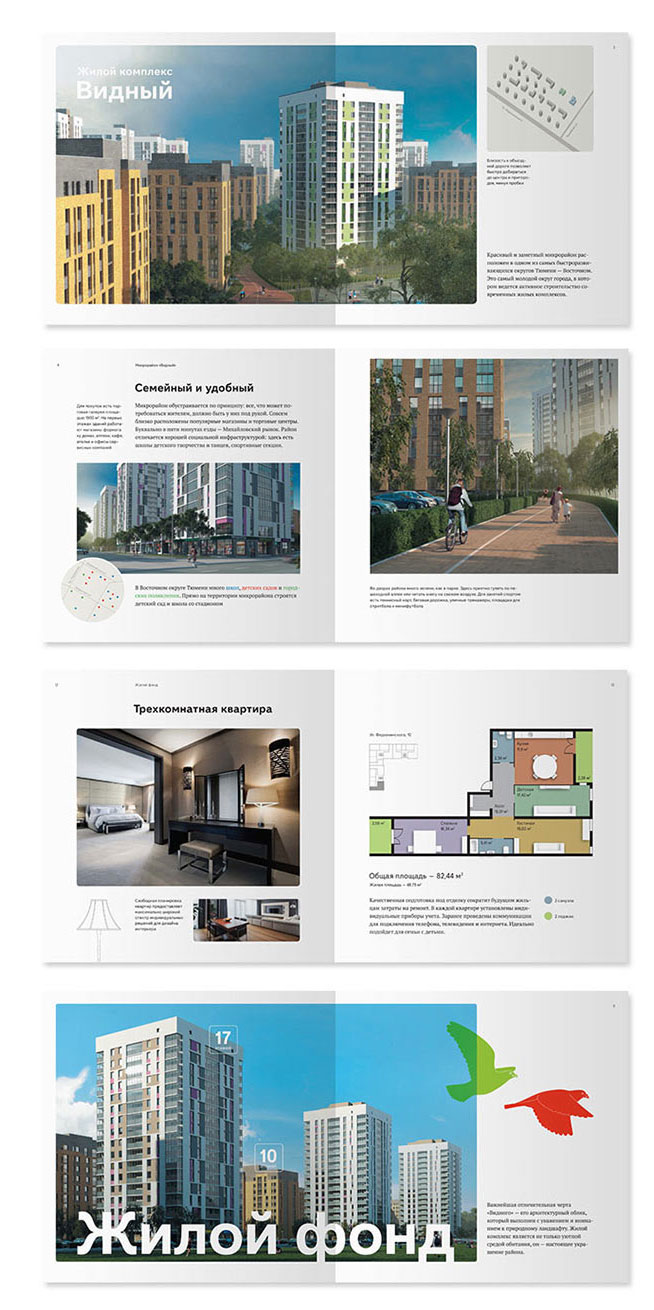
Drawing examples of floor plans for apartments and whole levels. Removing furniture and colors from level plans and at the same time using them on apartment plans to emphasize functions of the rooms.
Giving advice on typesetting.

More useful advice.
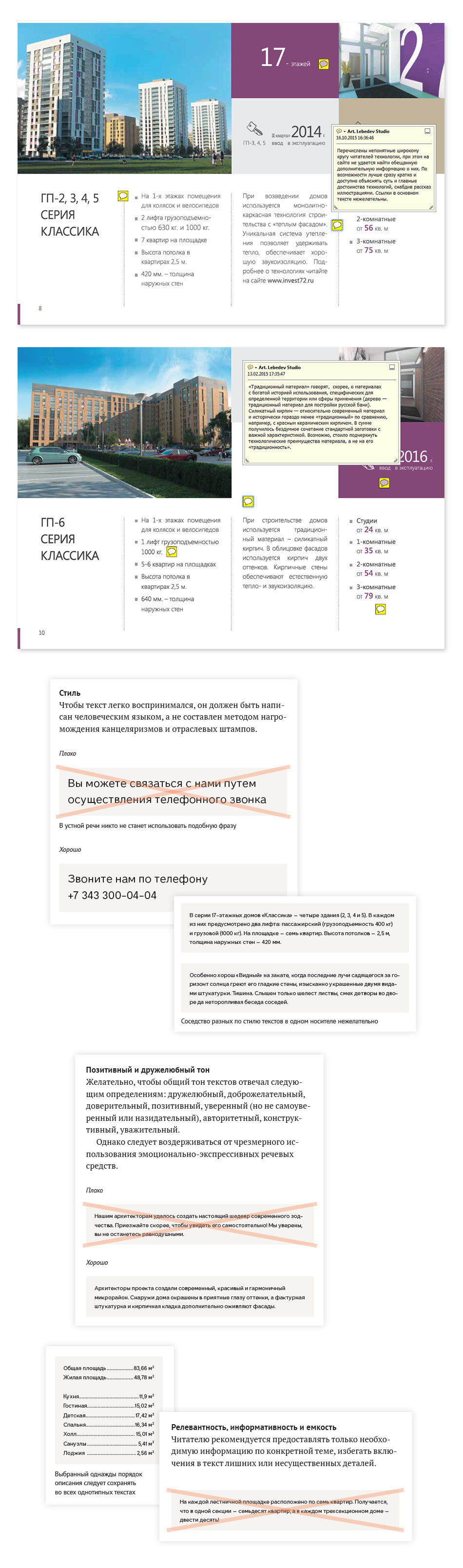
The editor studies Brusnika’s previous booklet and prepares detailed guidelines on writing and laying out text.
Simultaneously working on the brochure design grid. Reading Brusnika’s brand book, trying different formats and layouts.
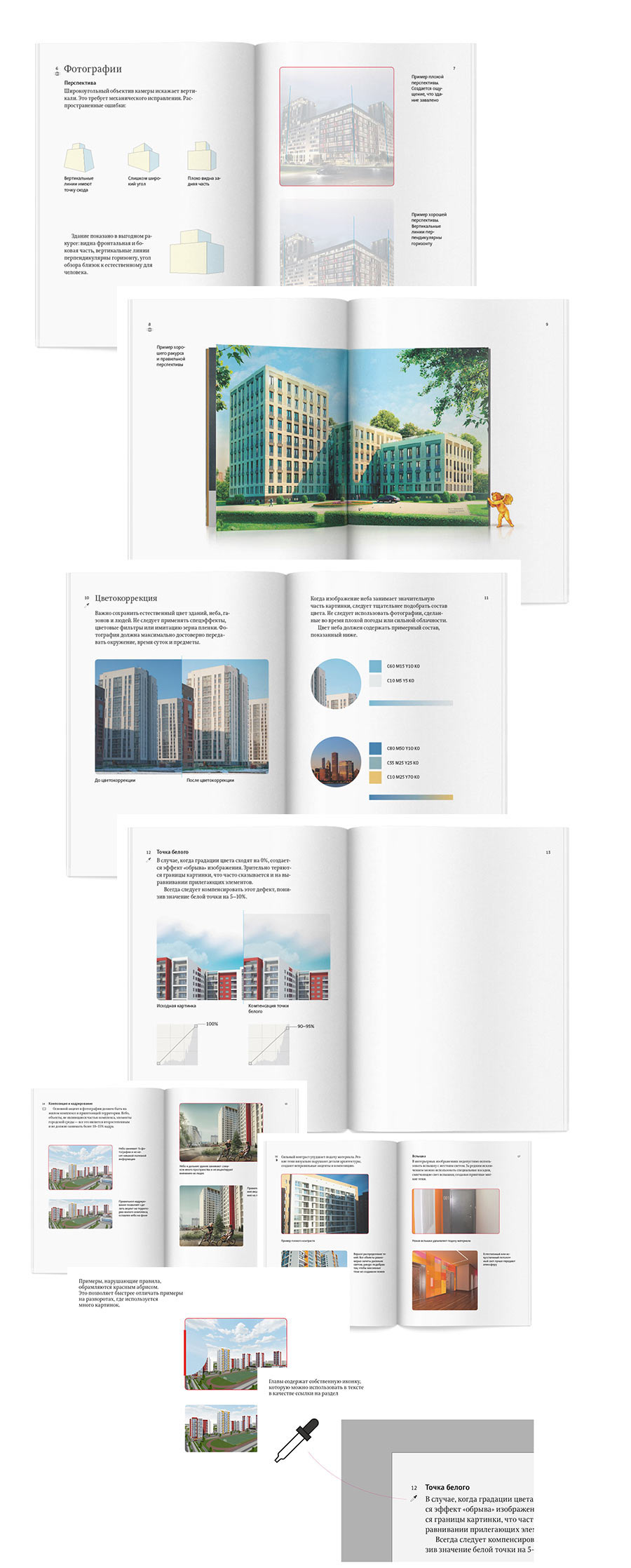
The results don’t look good, they all appear bland and formal. The design has no relation to the content and does not inspire careful reading. First of all, a brochure should present details about the object.
We need to put information first. Going over the available data about the district, its architectural, structural and infrastructure features.
Deciding to go with the dimensions of 210 × 210 mm (8,3″ × 8,3″), a brochure of this size can be easily carried in a bag or in a folder. Removing lengthy descriptive texts and moving the emphasis over to large photographs with captions and diagrams.
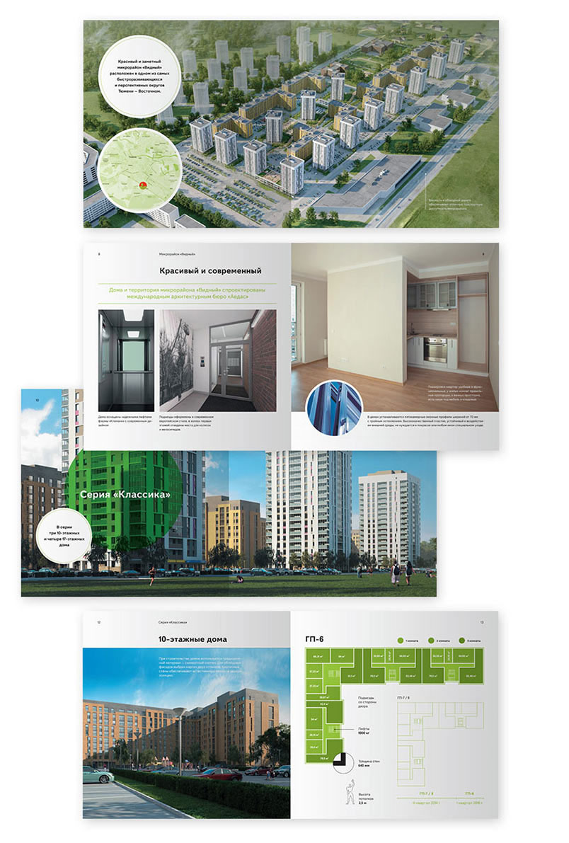
The result looks better but now has too many effects. Getting rid of meaningless color on diagrams, redrawing some of the details.
Putting everything in order.
Brusnika’s signature geometric grotesque typeface doesn’t work well as the main face. Deciding to use it only in titles and captions and going with PT Sans for the rest of the matter. Removing photographs with bleed and Windows 8 inspired tiles, replacing the grid with a four-column layout. Adding small illustrations for emphasis.
Art director: The first opening is bland and does not evoke any emotions.
Adding more warmth.