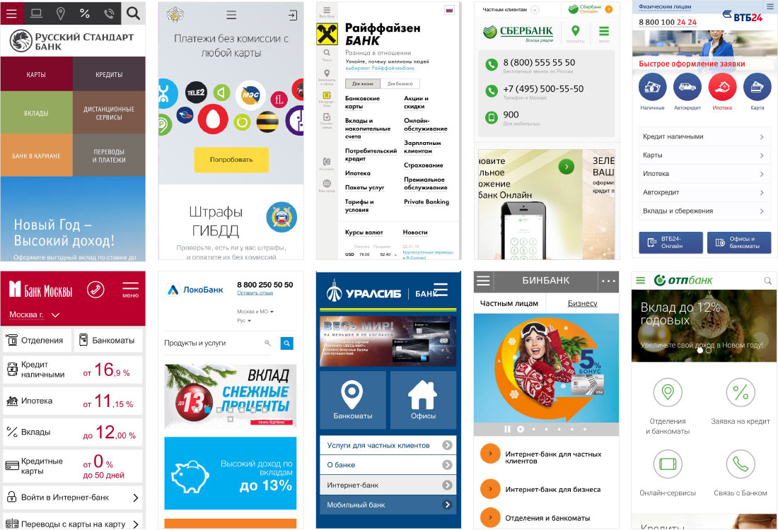
Opening various bank websites on a smartphone.
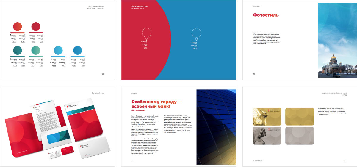
Going through the Bank Saint Petersburg brandbook.
Making the first attempt.
Not what we’re looking for. Looks like a traditional interface. Trying again.
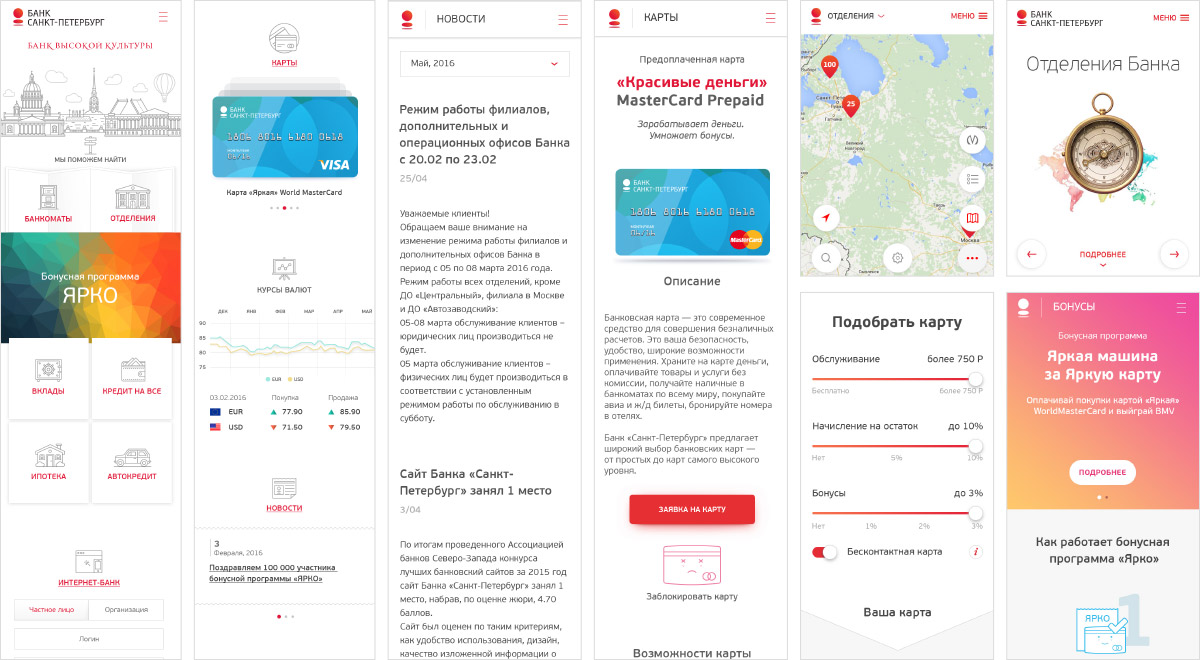
Still too much graphics, excessive texts and lack of individuality. Right now this looks like a generic website of any bank, change the logo and you’re good to go. Also, the interface lacks convenient features. Trying to elaborate.
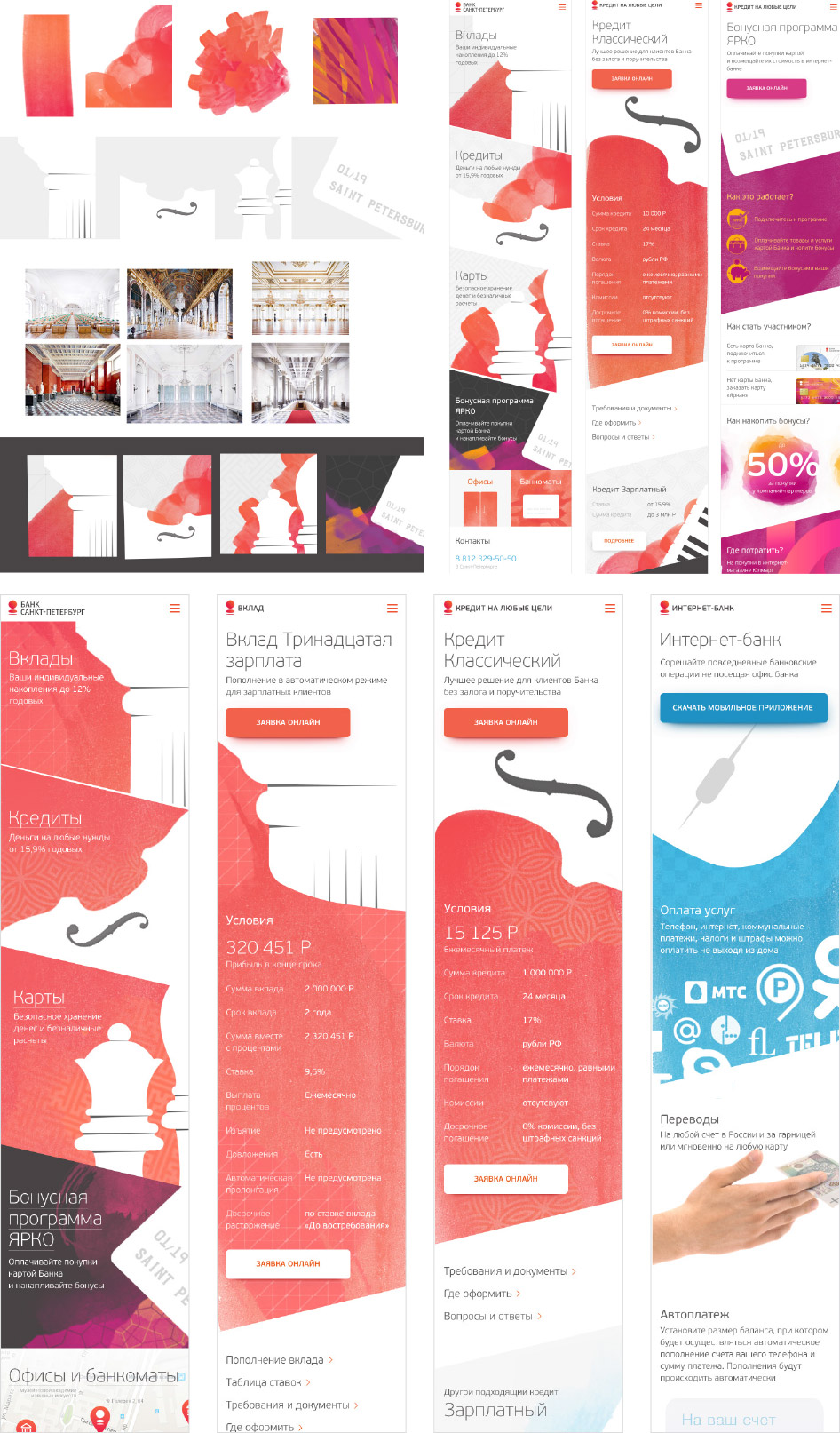
Simultaneously searching for images that would present bank products. Creating illustrations by combining images of things with watercolors.
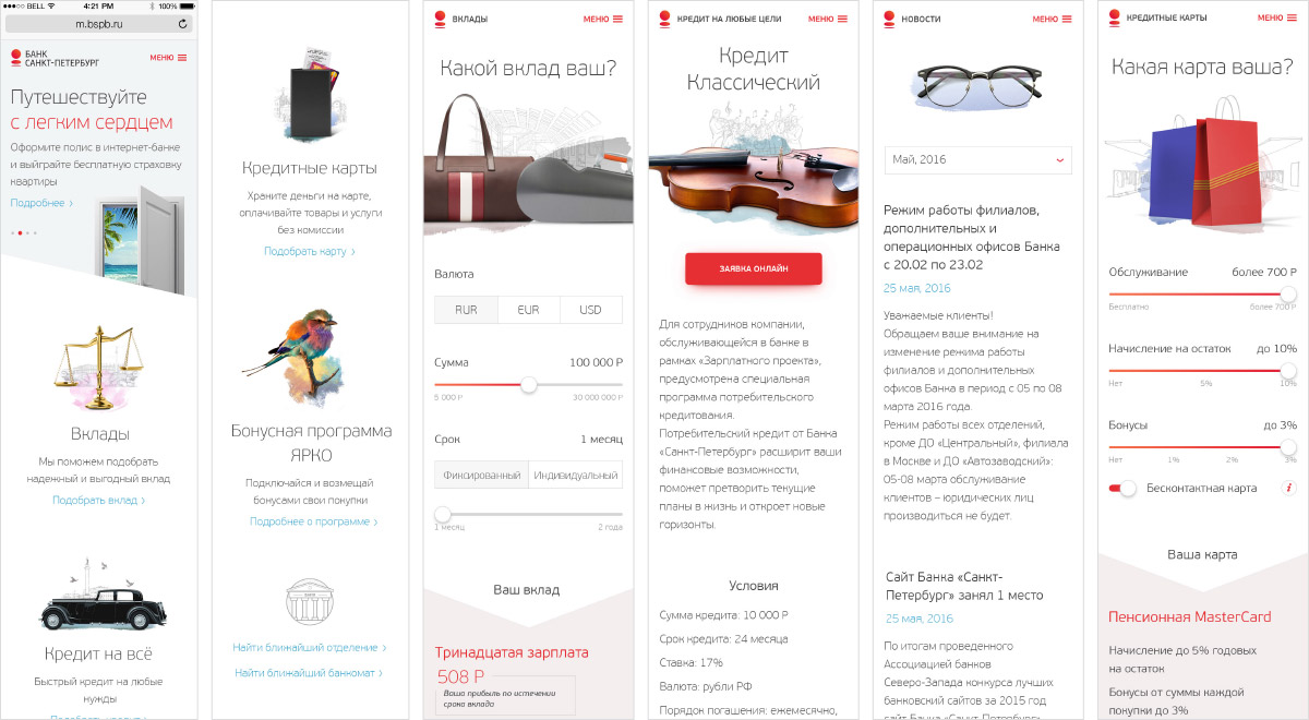
Too old-school and illustrative, no visual core that we could single out and use in other media channels.
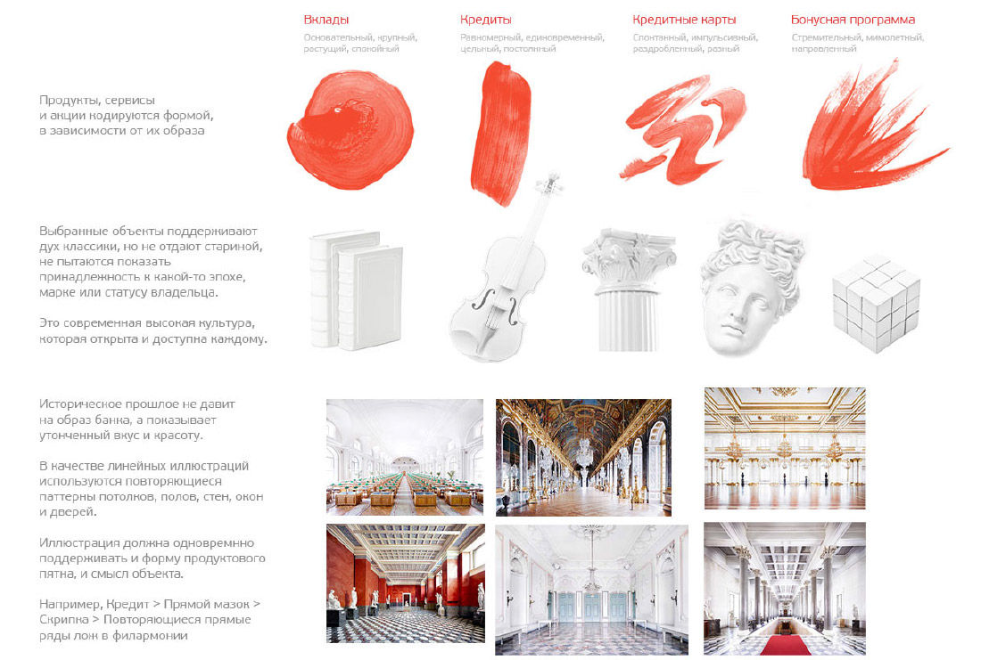
Changing the designer and trying to think of a way to connect images of a bank, Saint Petersburg, watercolors and metaphors for products. What if we code the products with watercolor stains of different shapes, add relevant objects and tie everything together with the city by using the repeating patterns of ceilings, floors and walls of Saint Petersburg palaces?
Art director: The brush aesthetics absolutely doesn’t work as a way to illustrate loans and savings accounts. Although you can try not to make the connection with the product so rigid and come up with something more evident. Or you don’t have to separate them at all, I don’t know.
Considering the visual language. Getting the idea to work with counterform. Quickly sketching.
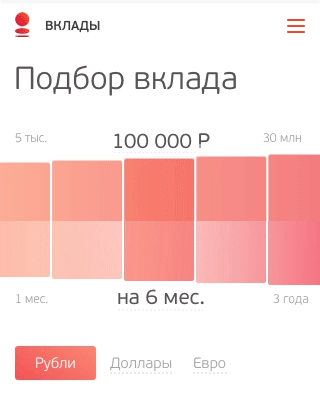
Getting deep into avant-garde in the process. Replacing product covers on category screens with calculators that support the image of the product.
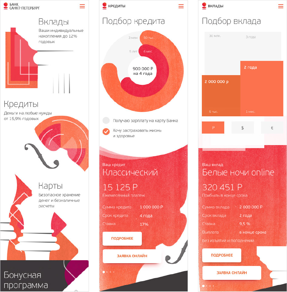
Art director: Too much shapes, too little content. Everything is too active. Reading the text takes a special effort. It’s because nobody’s writing the texts, so you introduce a lot of color to make up for it. Plus, the flat design is lifeless.
Paying attention to the text, getting rid of the flat design, finalizing the calculators.
The art director suggests not to use counterform so often: users will get tired of it after a couple of screens.
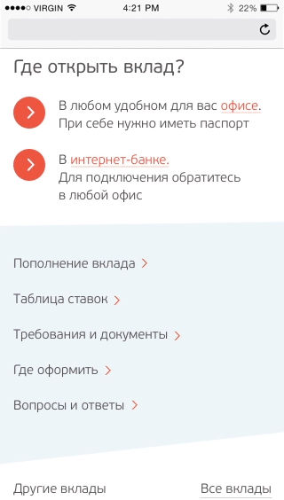
Starting to work on the remaining screens.
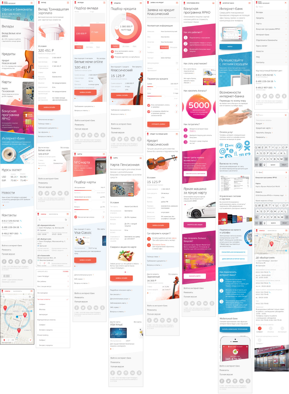
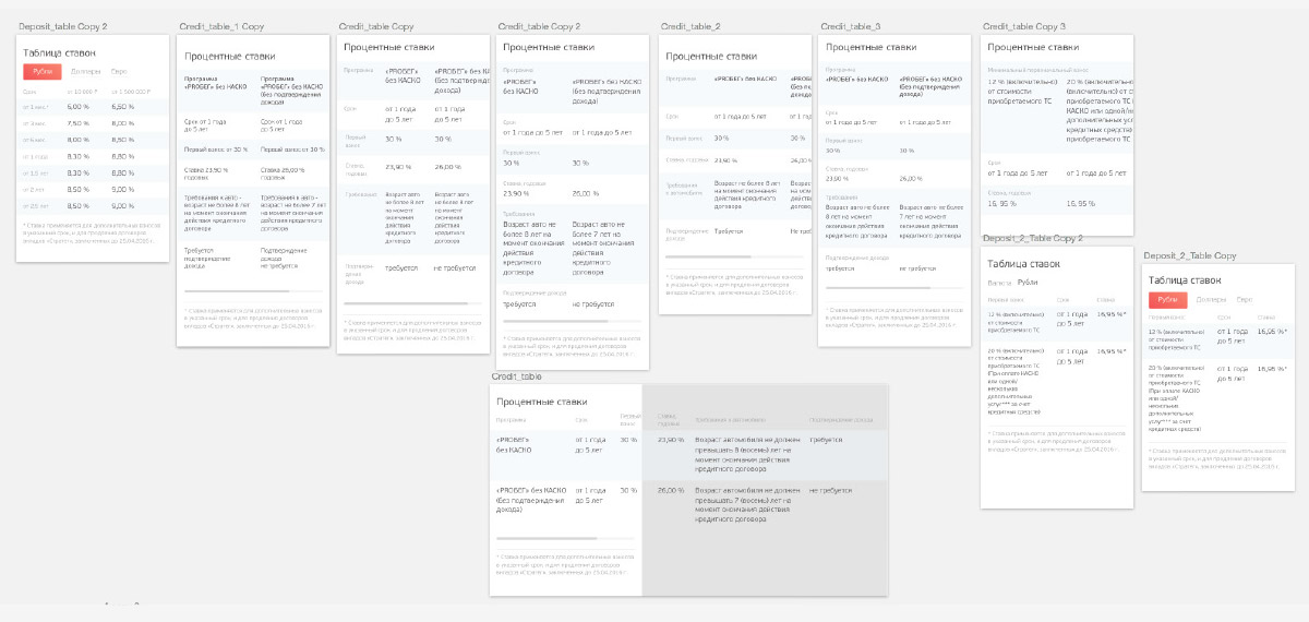
Working on the appearance of tables.
For the mobile version of the website we need to create convenient controls that would allow simple navigation. Coming up with a slider that would serve as a screen header and allow to quickly move through articles.
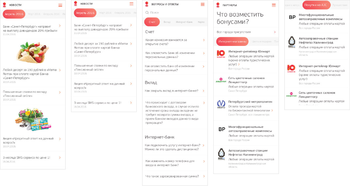
Assembling a lorem ipsum screen.
Showing the animation for additional information screens.
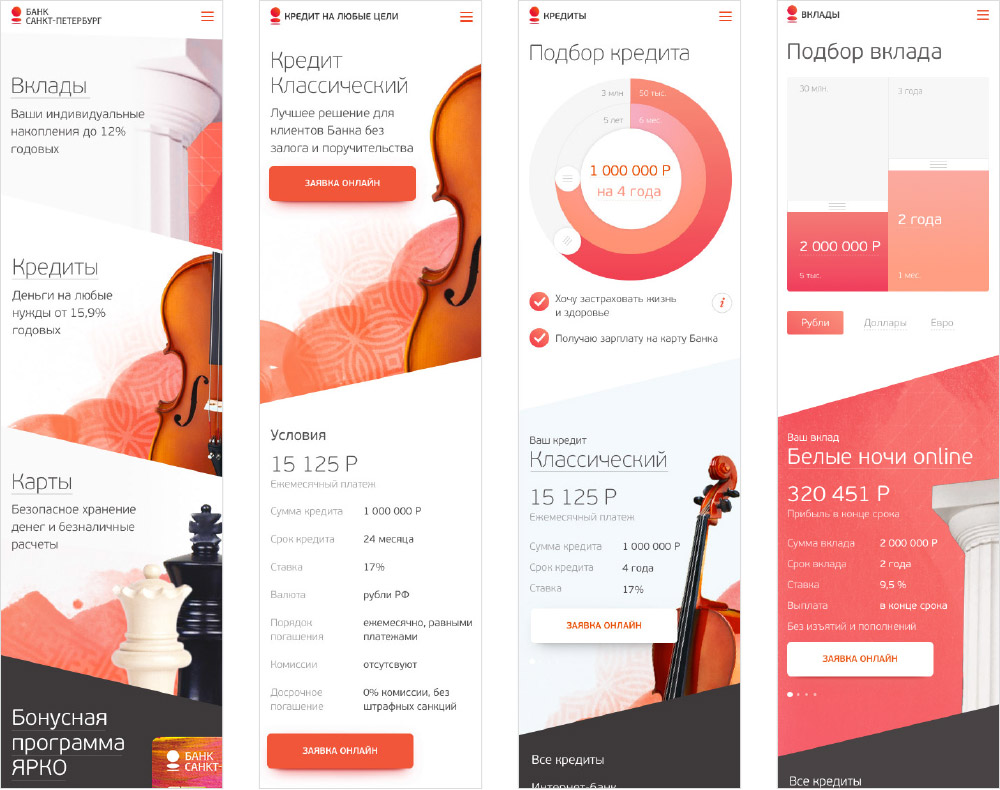
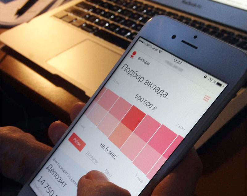
Client: We don’t like the savings calculator. Its confusing, inconvenient and unwieldy. We feel this way because right now it looks like two cubes that appear disproportionately big on a mobile screen compared to other elements. Too much empty space that doesn’t work. It’s massive. That’s how we feel.
Inventing a couple of other options.
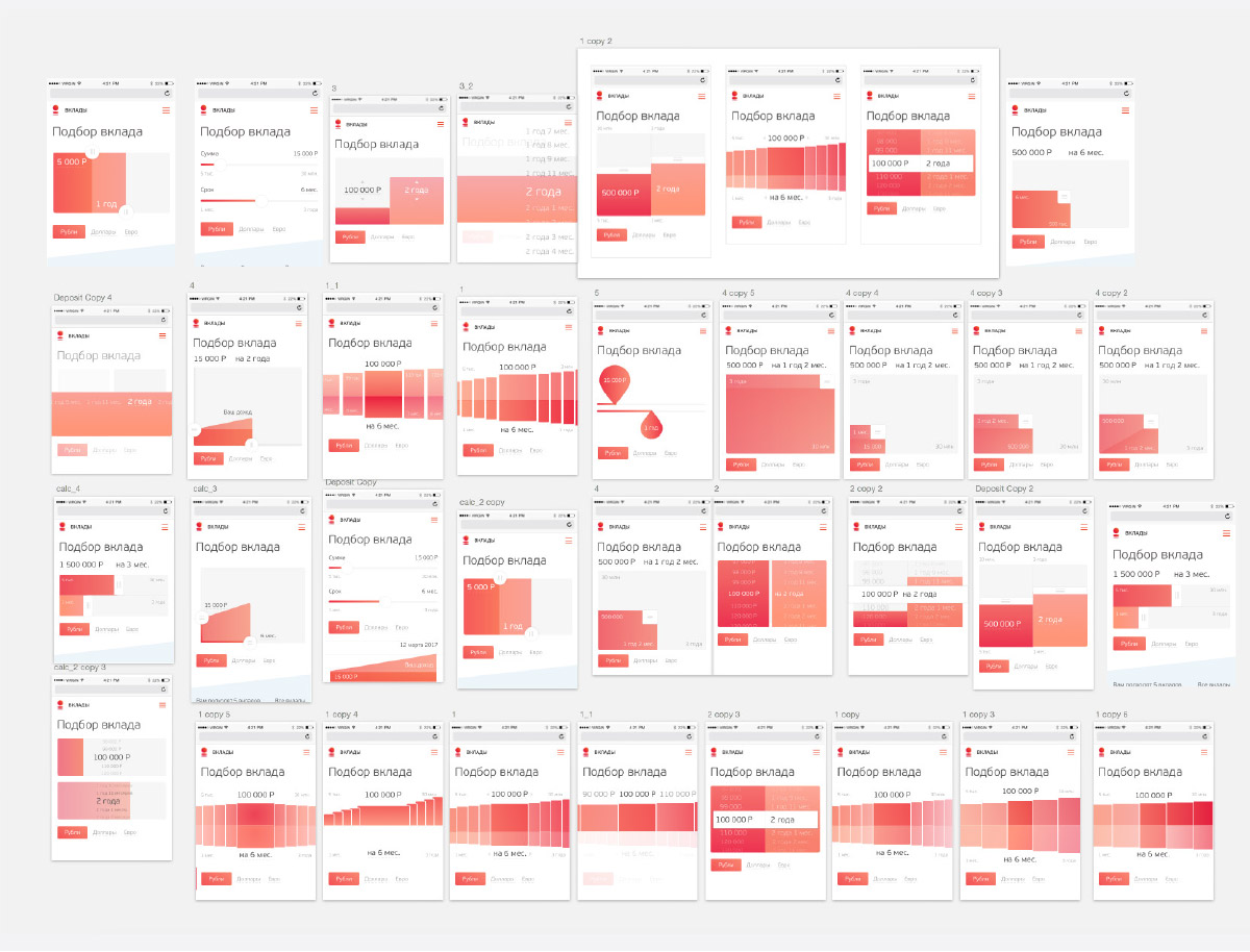
We like the horizontally scrolling solution. Testing the dynamics.
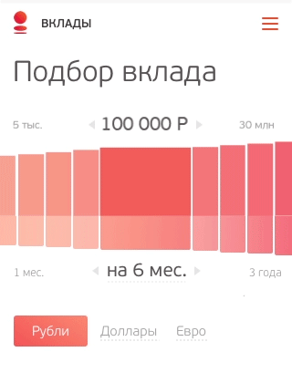
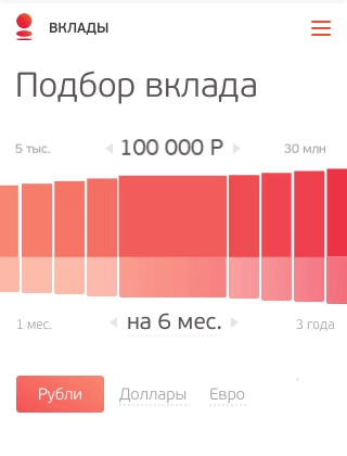
Choosing the third option. The client likes it.
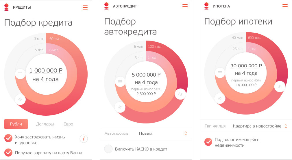
Unifying loan calculators.
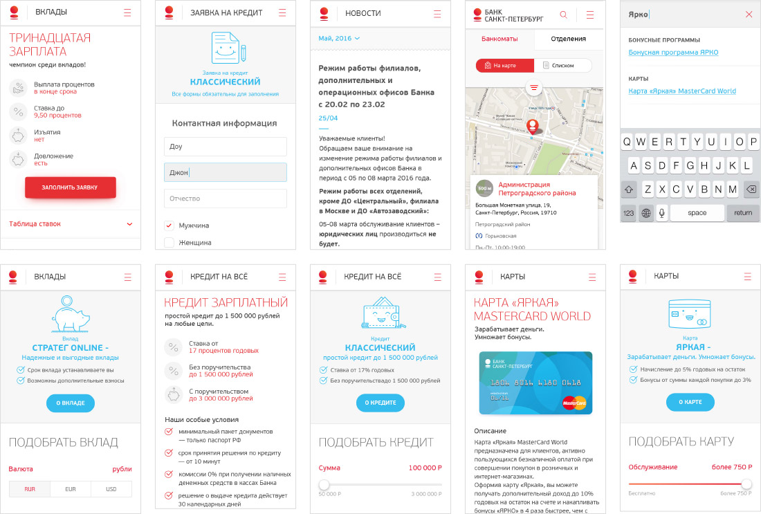
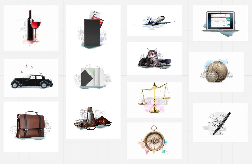
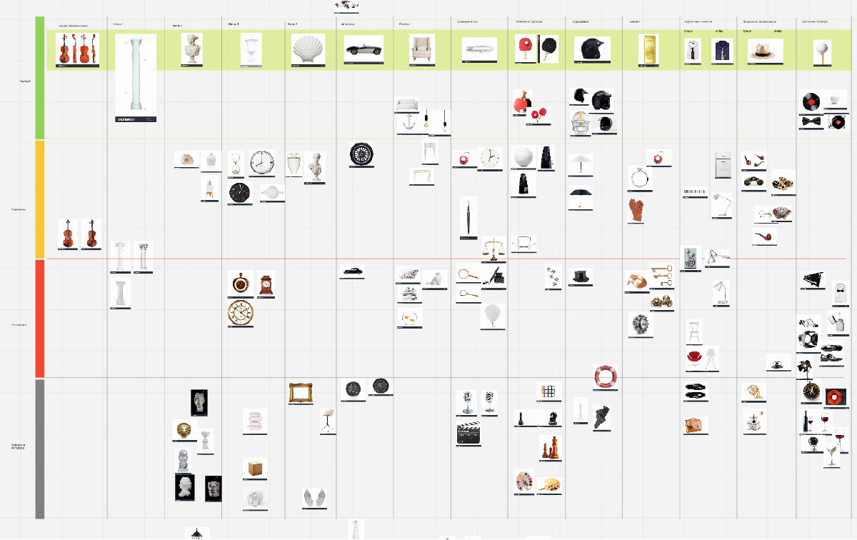
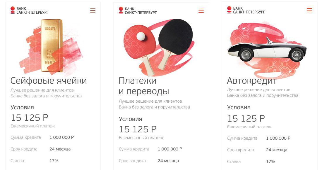
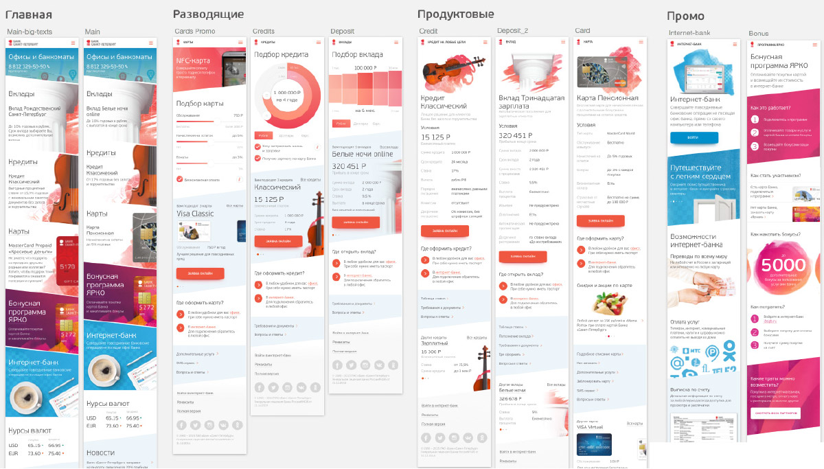
Time to prepare final images for product covers. They are made of objects, patterns and watercolors. Choosing objects aiming for contemporary classics.
Collecting images and sorting them by relevance.
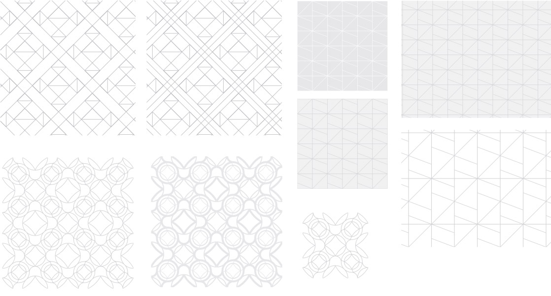
The illustrator draws patterns.
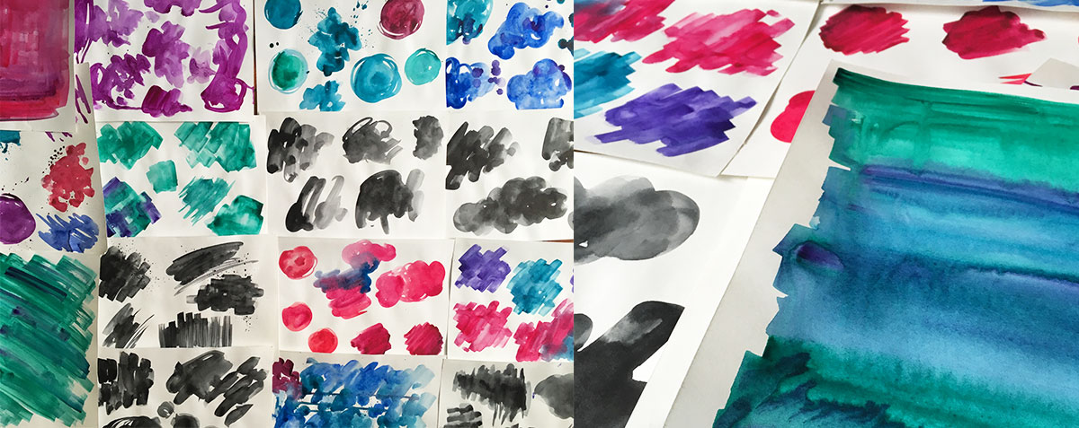
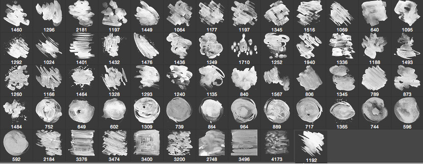
Creating watercolor textures and turning them into Photoshop brushes.
Assembling everything into pictures and testing them on screens.
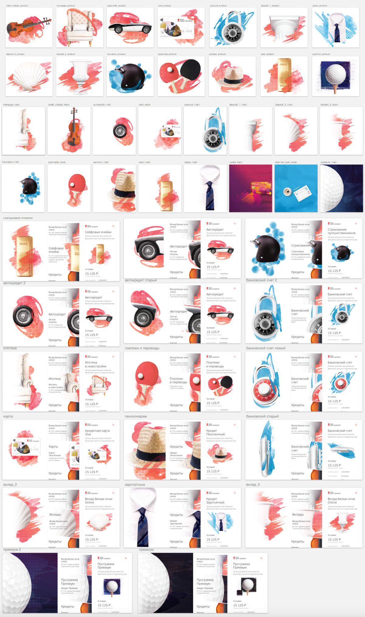
After the test, moving the covers to the top of product screens.
Updating source files with the images.
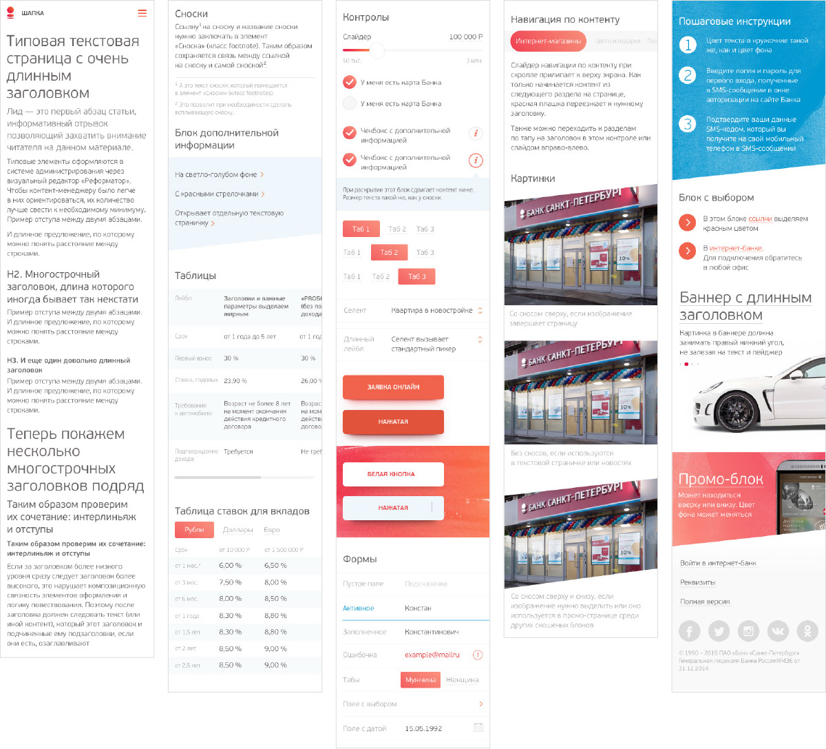
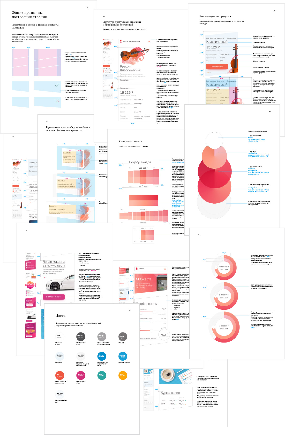
Creating a detailed guide for developers. Describing principles for building the modular grid including locations of all elements on all pages with margins. Covering general typesetting rules and specific cases of mutual arrangement of elements. Talking about preparing technical graphics and the contents of user blocks. Making sure to include information about custom controls.
Sending the documentation to developers and getting back the first version of the website.
Watching over typesetting, pointing out required improvements.