Receiving the task: we need to come up with a name and create a logo for BTI 24 central office’s superservice that the studio previously developed the 3D cadastral passport for.
Trying to find the name for the page where the passport will be located.
The first name that comes to mind is Plantator. It’s not about gardening but about word play. Plans, planning, land ownership plus a tool (service) for everything related as hinted by the suffix.
Client: The reference to names with the word plan is not entirely correct. A plan is a two-dimensional space, while 3D means volume, parameters such as building height, etc. So, 3D is a much broader notion which includes a greater number of parameters.
Making another attempt suggesting a variety of names.
Homnia
Obviously, we’re looking for pleasant short names with the root home. A free domain is also an important criteria. In this case, a domain in the .ru zone is available which is very good for a normally-sounding six-letter word. It also rhymes with mania, mania about houses, apartments and real estate.
Abrakadastra
The same idea but this time inspired by magic. Sounds like an incantation. Easy to remember. Hints that there’s a lot going on inside, similar to Habrahabr. Contains the word cadastre.
Nostracadastra
The same, but with a joke about Cosa Nostra: it’s a network, a system, a branched organization.
Kataster
A nice-sounding word with only one replaced letter.
Kubikator и Cubicator
The idea of play cubes, hinting at the isometric projection. Everything is simple as play cubes and similarly modular. Every one has their personal cube that they fit out.
Crnr, Cornerz
A house and its plan consist of a lot of corners. Do you have your own corner? Streets and the entire city are also made of corners. Combining geometry with the topic of living space and a “personal corner.”
Client: Homnia is a nice name but it seems too informal. It’s hard to imagine how we can say to some serious people in the city administration “Here’s our service, it’s called Homnia.” And again it has nothing about volume.
The client sends their own versions. Discusing.
Studio: Electronic addresses—the name reflects the idea but is much closer to email. When someone mentions an electronic address, they most often likely an email address.
E-add can work but there’s no fun in it, it’s too formal. Which is not to good for a people-oriented service. It sounds similar to a government service or an internal corporate one. It’s also hard to pronounce as a word in Russian: “Go visit E-add?”
ECPO (electron cadastre passport object)—the same, very dry and formal. People won’t know how to read the acronym either.
Home page—it will be hard to register a domain for this. Plus, it’s too generic and dilutes the brand.
Trying again.
—celloplan
—obloplan
—cuboplan
—isoplan
No, none of them work.
Art director: There’s a test: we can try saying to a governor, “We will give you electronic addresses” and the response would be blank.
Domains are in a DNS table.
IP addresses are in a network.
Electronic addresses are in email.
??? are handled by BTI-24.
It’s definitely not electronic addresses.
Meanwhile, the copywriter goes on vacation but continues to send in letters.

Making further attempts. Getting closer this time around.
—3D pool of addresses
—3D address pool
—Cubic addresses
—3D addresses
—City 3D-scope
At the end, the copywriter informs that the art director decided to go with Stereoaddress. Phew.
The client is ecstatic.
We come to realize that a Stereoaddress is just a representation of a property item online, one page, a part of the great plans to create cloud storage for cadastral passports.
Art director: Let’s call the service Stereocadastre and a single item a Stereoaddress.
Trying this scheme on the logo.
To find a good solution for the Stereocadastre logo, inviting two designers to work on it simultaneously while Vasily Dubovoy creates a logo for a Stereoaddress.
This is about volume and a point in space. Putting it aside for the conversation with the client.
The first designer makes an attempt at the Stereocadastre logo.
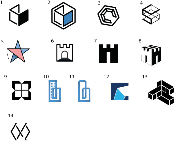
Art director: 5.
The second designer suggests his ideas.
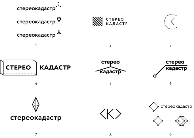
Art director: 7 and 8.
Showing to the artistic director.

Artistic director: 1, 3.
Putting together presentations for each of the chosen designs.
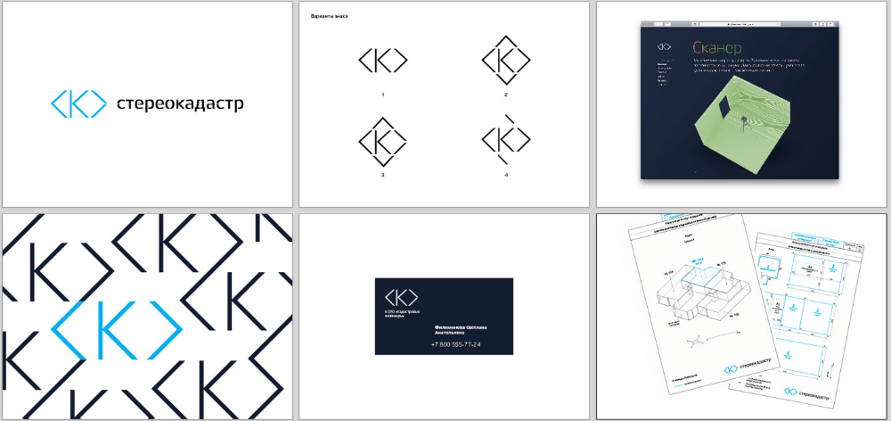
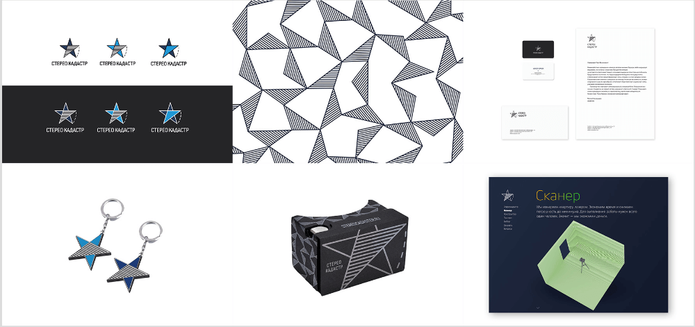
Artistic director: Let’s show the second concept and Vasily Dubovoy’s Stereoaddress logo.
Client: I can’t help but see the Christian fish symbol in Vasily’s logo. The star for Stereocadastre is interesting, but our project is about volume and technologies but the star is flat. Plus, the typeface isn’t too good.
Improving and assembling a new presentation.
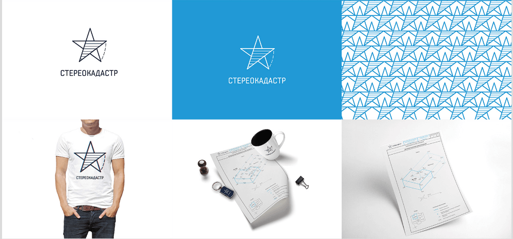
Client: No, this isn’t about 3D and technologies either. Let’s try again.
Meeting to restate the task. Deciding that we need some sort of an abstract solution, not necessarily related to cadastre.
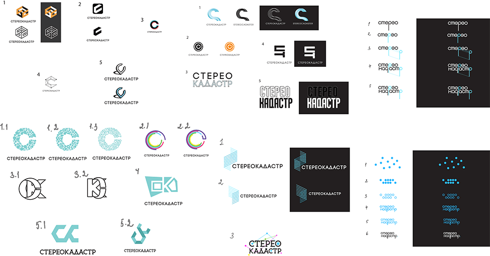
Art director: Nothing suitable yet. Let’s show the process to the client.
Showing the process and going back to discussing the initial task with the client. Coming to conclusion that the logo should be about a place, a point in space and about volume. Going back to the star.
Improving the existing logo.
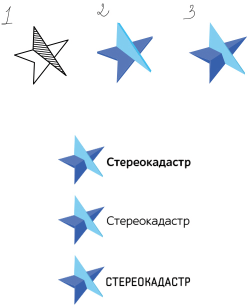
Art director: 3. Looks good with the edge.
Working on it some more.

Art director: Make the arrow thicker. And make some more variations.
While the final version is being finalized, we come to realize together with the client that the current cloud service that we plan to release in the nearest future is not going to be about cadastre.
Going back to Stereoaddress that better reflects the current state of the project. Adding a modified text portion.
Launching the cloud promo website.