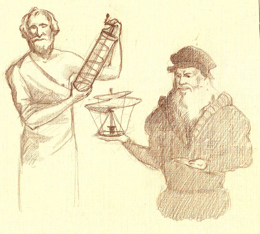
We start our search for ideas by looking for associations related to the fact that innovation means invention. Leonardo and Archimedes present their inventions as benevolent salesmen.
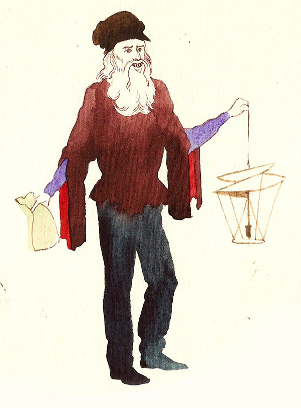
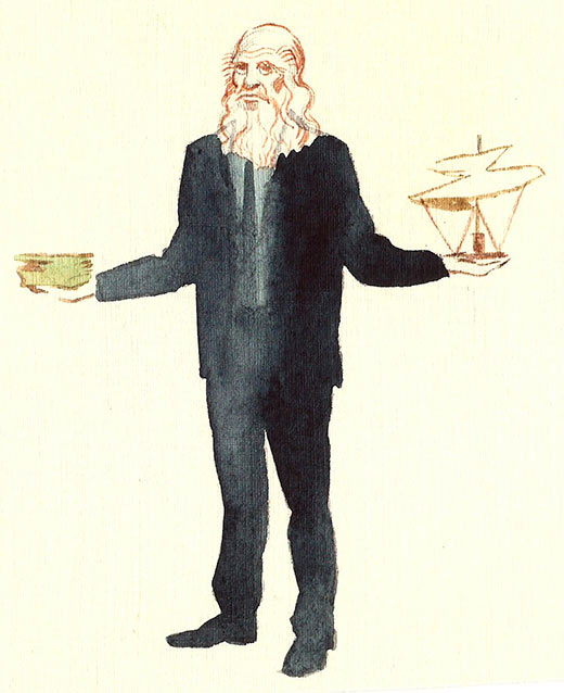
Leonardo as a manager.
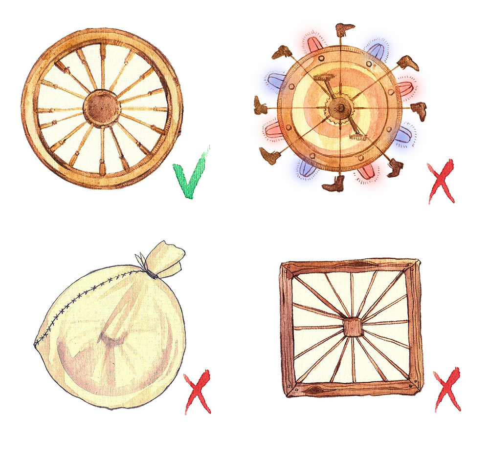
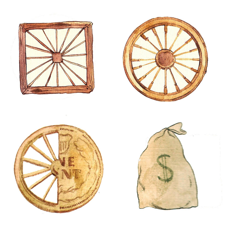
Four wheels symbolizing an idea from the book that a wheel with flashers or a square wheel would not work effectively, even though both shapes are an update of the classic circle.
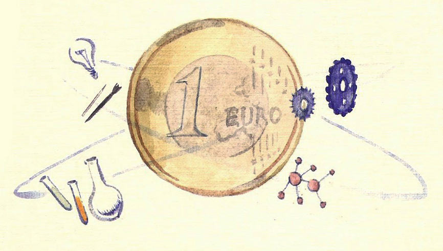
The client asks not to concentrate on inventions but to come up with a metaphor that would also explain the first part of the book’s name, monetization. Which is why in the fifth sketch we bluntly put a coin in the center. Orbiting around it are symbols of innovations.
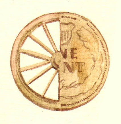
A wheel merged with a coin, a literal straightforward illustration of the name.
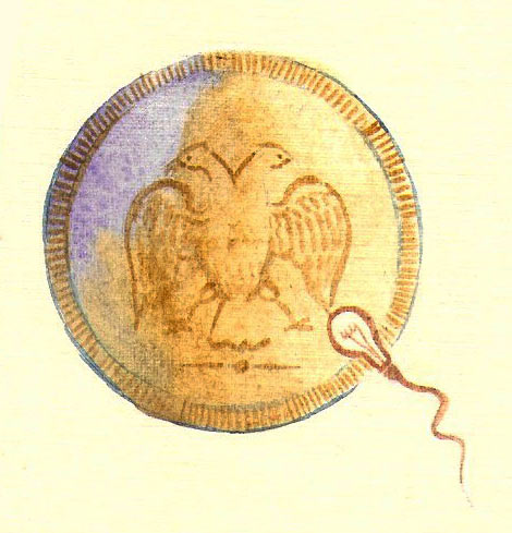
Conception of an idea.
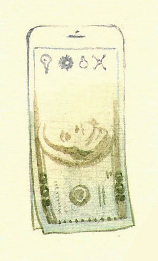
Smartphone as an obvious symbol of modern technologies, turning into banknotes.
Niches created by new demands, are filled with inventions combining several functions.
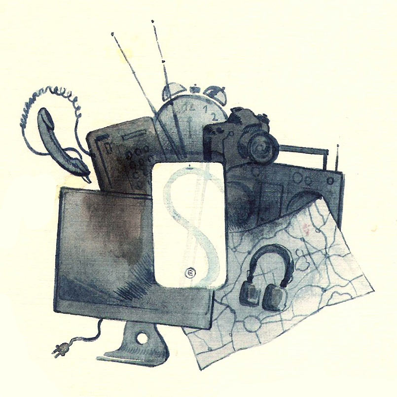
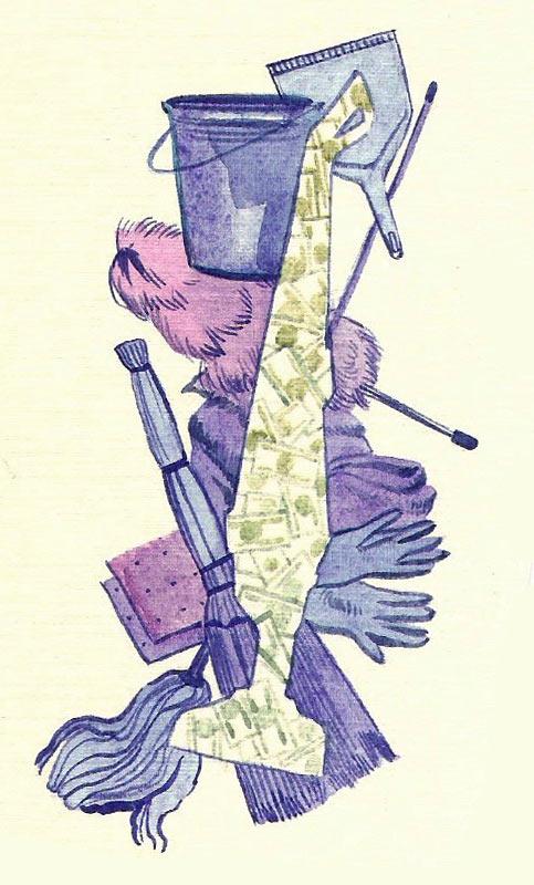
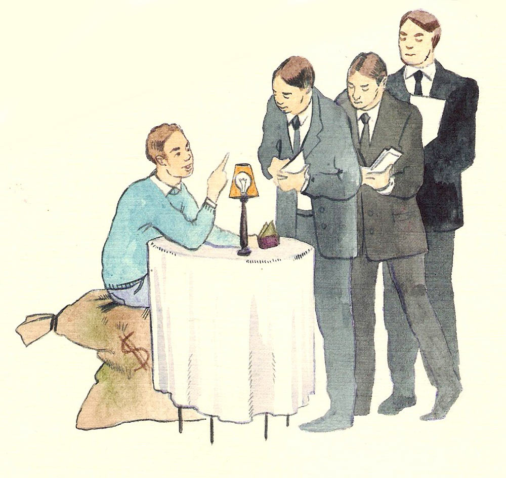
Marketers write down consumer’s wishes.
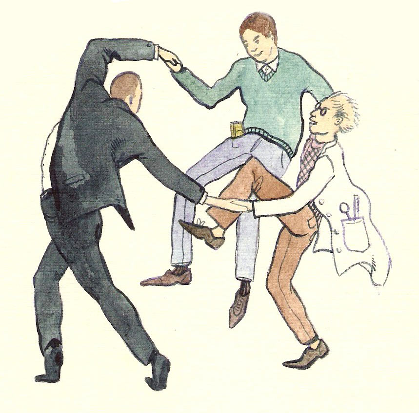
Interpretation of Henri Matisse’s Dance with consumer, marketer and inventor dancing in a circle.
Interpretation of Siqueiros’ The People to the University, the University to the People, interaction between a marketer and a consumer.
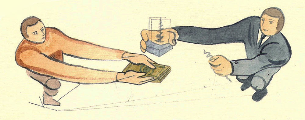
Illustration of the progression from invention to monetization.
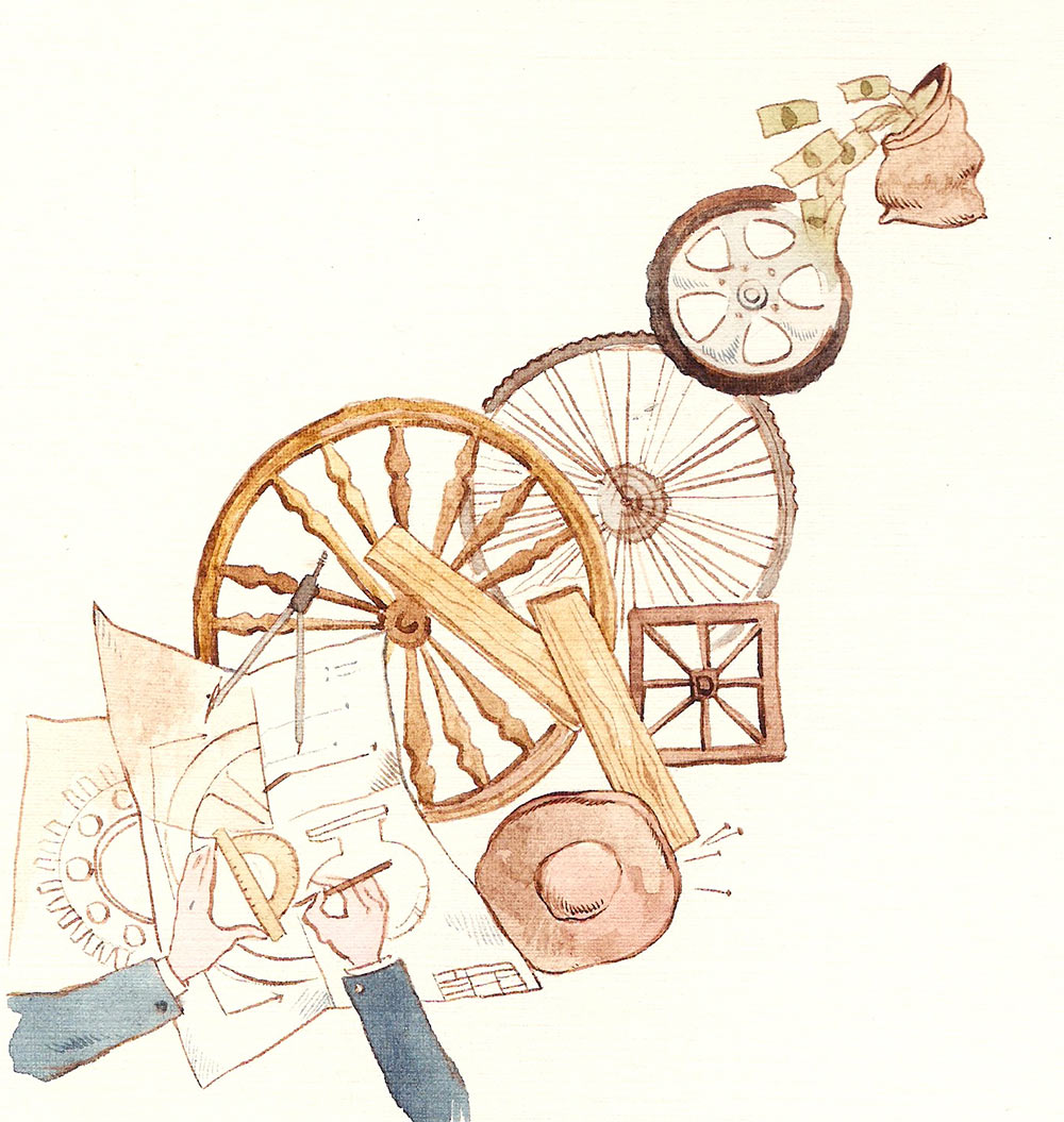
Combining several sketches into one by the request of the client.
The idea of the sixth sketch looks acceptable, but all pictures have a retro feeling to them, which is unsuitable for a book targeted at people doing and studying business. The client asks to make the wheel modern by adding some shine and chrome.
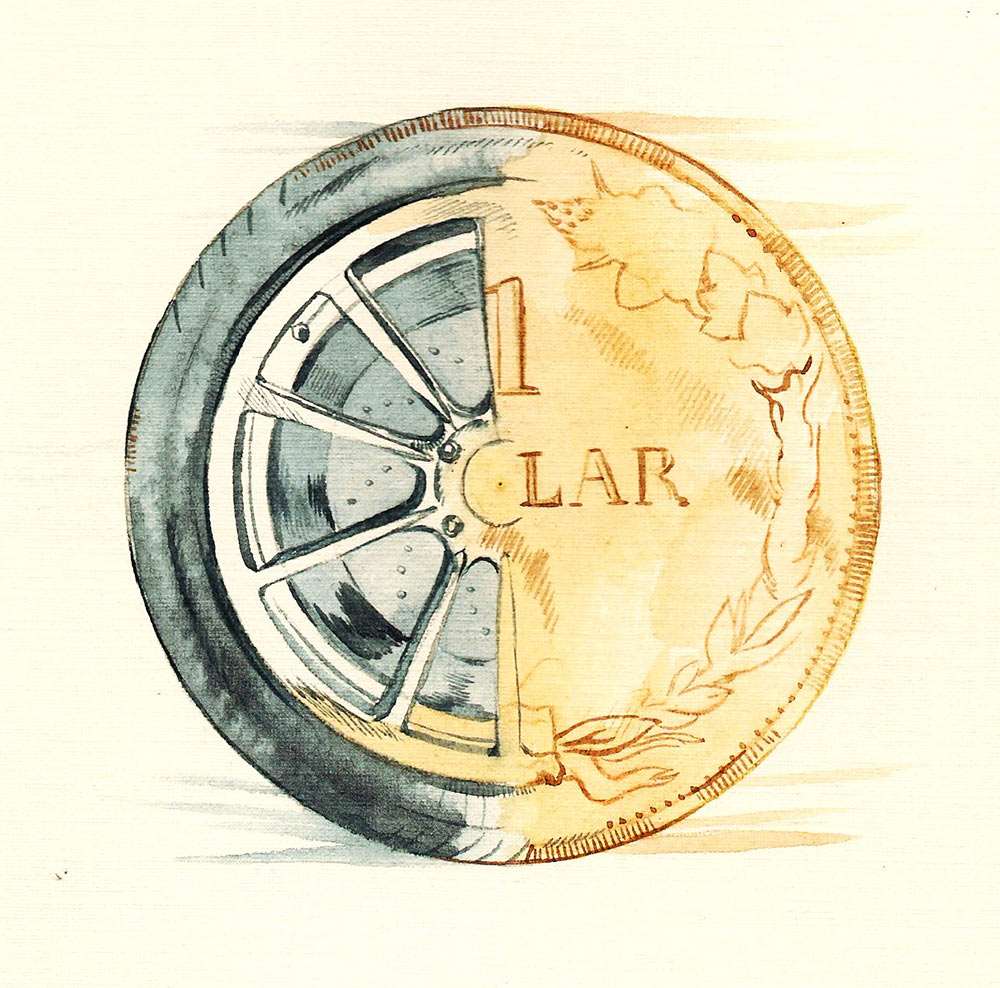
The art director suggests to make the number larger.
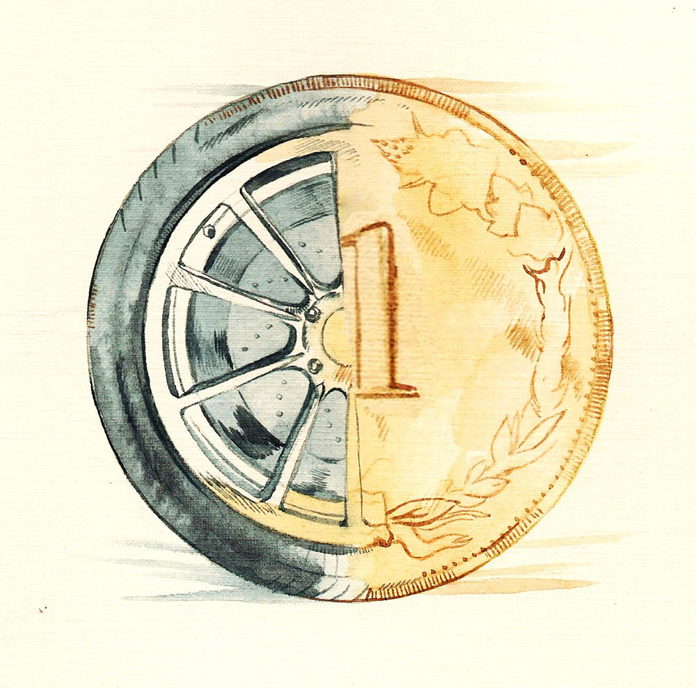
The sketch is approved. Starting to work on cardboard implementation.
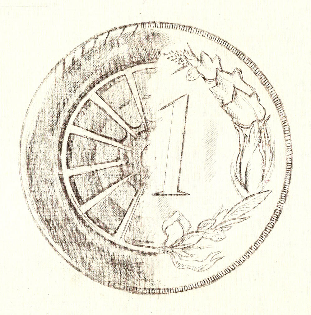
The client points out errors in proportions: the tire width is more suitable for a regular car rather than a sports car. The number’s slant doesn’t look nice and it’s angles should be softer.
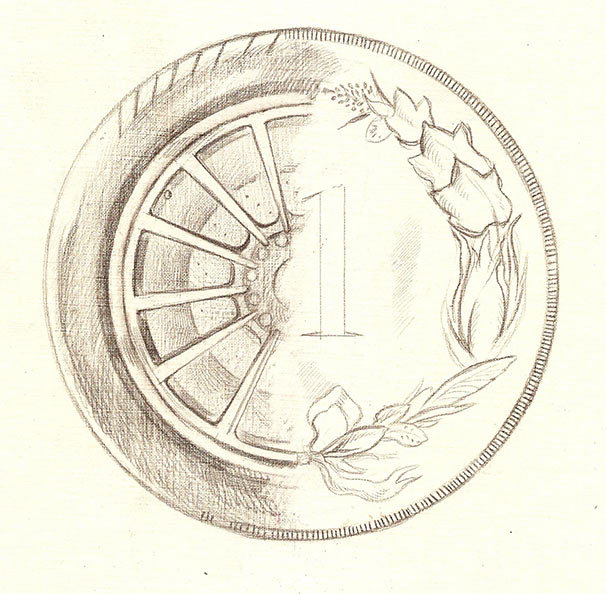
The cardboard is approved. Drawing the first variant of the final picture.
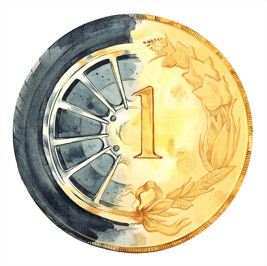
The imperfect transfer of the picture from cardboard results in the wheel having two brake rotors which is pointed out by the client.
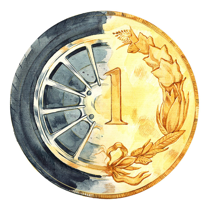
Done. Sending the typesetter the sketch of the illustration, sketch of the cover and a short brief underlining the importance of the critical review and its position on the cover.
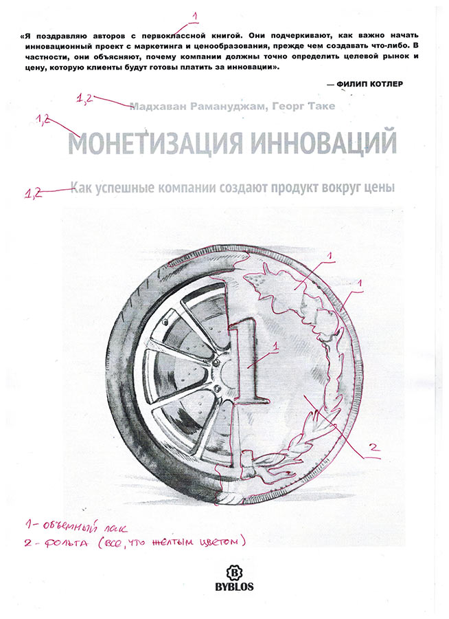

No. The review coming before the author’s name or the book title would work on a magazine, but book covers have their own rules. Moving the review to the bottom and rounding the text block to give it more expression. The wheel now rhymes with the review, the review is embedded into the illustration, everything is by the rules and everyone is happy.

Adding the final illustration, typesetting the remaining text, the editor fixes errors, the chief typesetter watches over typesetting, adding volumetric gloss and foil stamping for the title, getting the art director’s approval and sending to the press.