We need a bright and lively logo with broad opportunities for application and transformation. Inviting several designers to participate in the search for ideas.
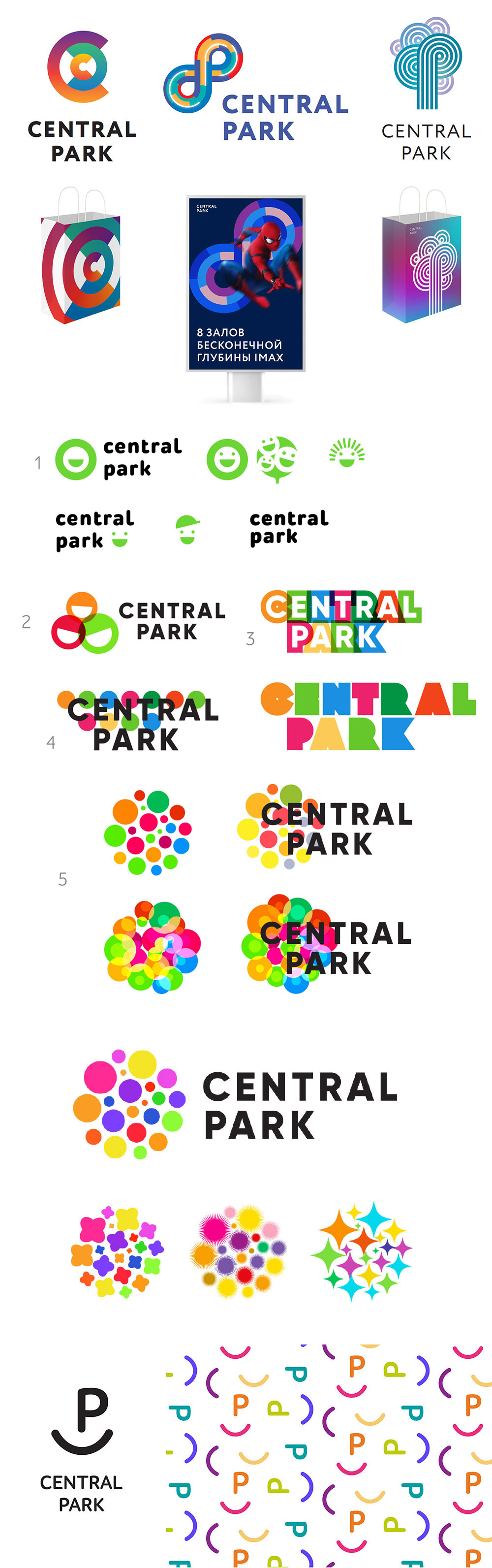
Choosing the most promising ones, showing to the client who likes two of them.
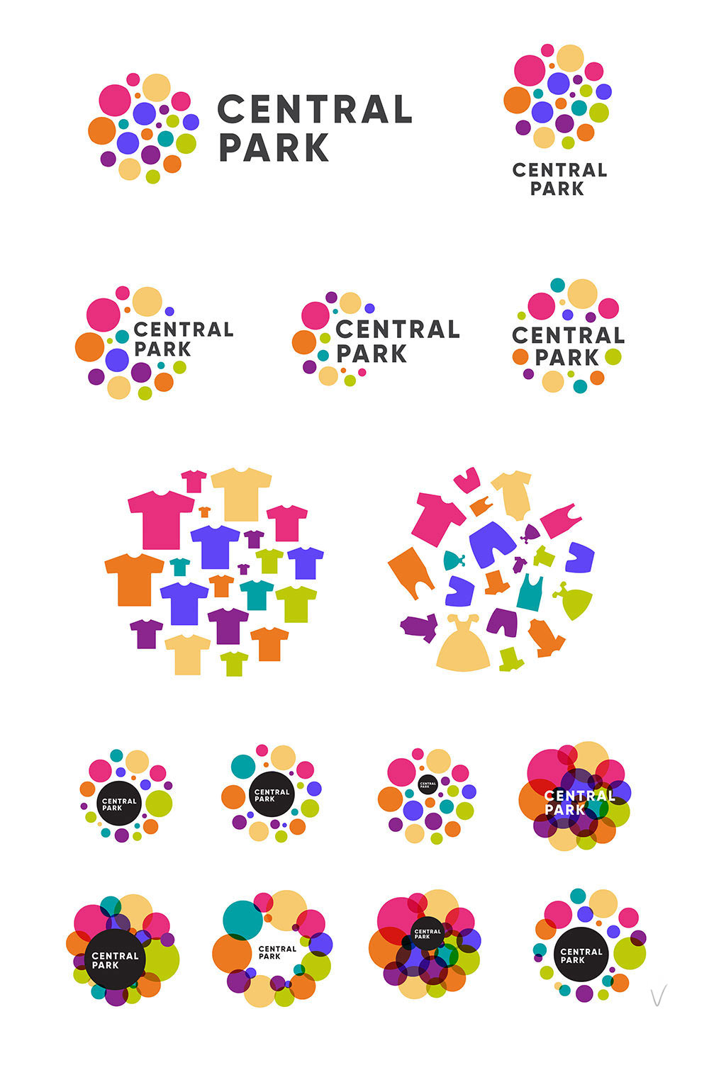
In the first concept we try to enhance the illusion of rotation by smoothing the angles and adding transparency.

Art director: No, we better not. Let’s keep the shapes clean.
OK. Considering ways to incorporate the text.
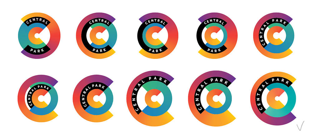
Suggesting various options for the development of the logo.

Demonstrating animation for advertising and LED signs.
Developing the second concept.
The client likes both, but leans towards the second one.
Asking the type designer to help with the text. A geometric symbol demands geometric text that is sharp and clear.
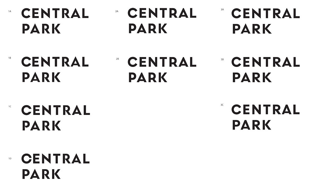
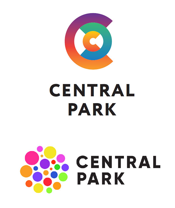
Choosing the design with the moderately closed C and R and a low waist.
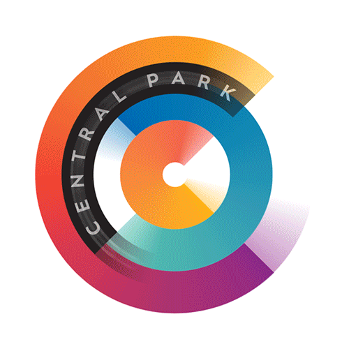
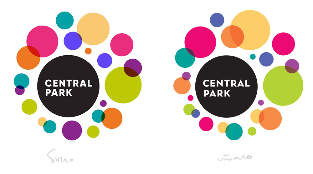
Adjusting colors and proportions of the elements of the logo.
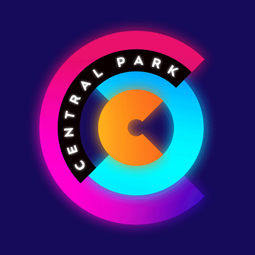
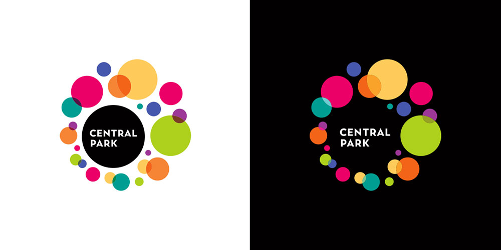
Logos for dark and light backgrounds use different blending modes for black and white backgrounds.
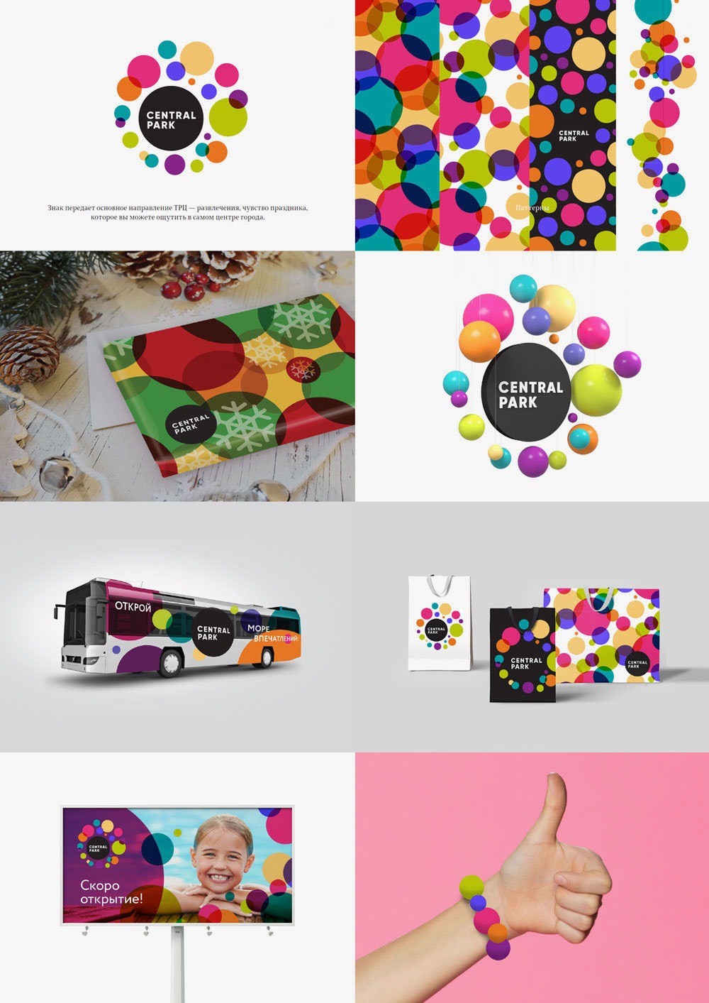
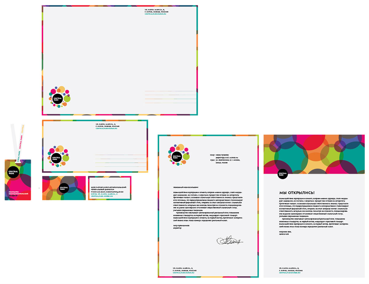
Starting to work on stationery. Trying different layouts, color effects and cutouts.
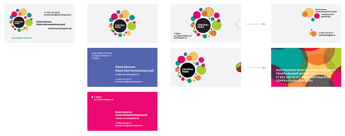
At the end deciding to go with a combination of large white areas, bright accents and dense text blocks.
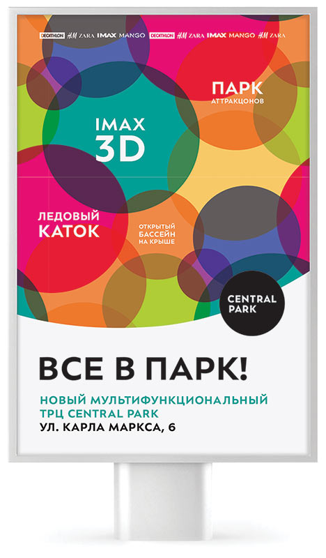
Applying the same principle to advertising.
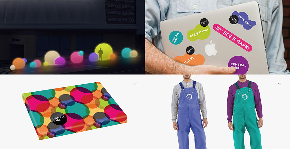
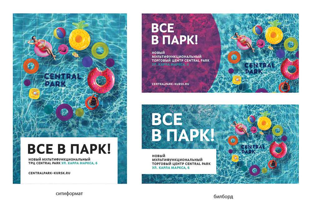
We get the idea to place the logo on branded media as a motif referenced in series of photos. The logo is assembled of various bright objects.
Art director: The transparent colored background is better.

The client likes it all.
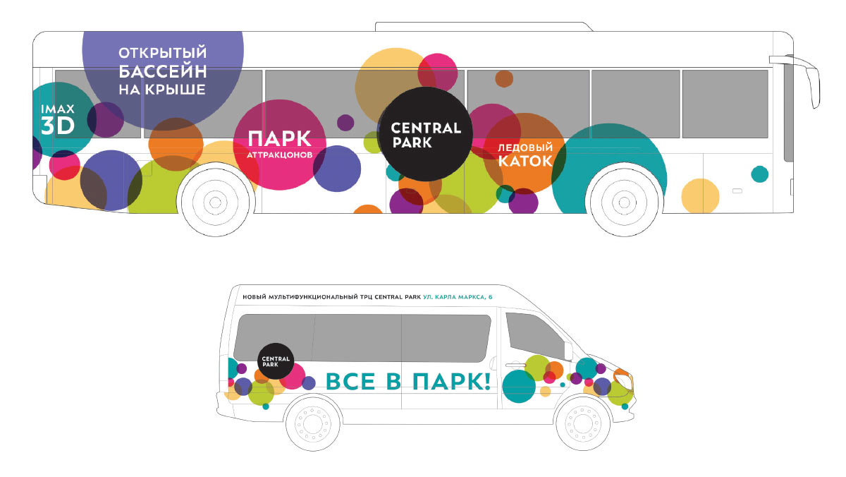
Creating transport liveries, offering designs for souvenirs, the shopping center’s territory and employee uniforms.