The client asks us to develop a taxi booking app without looking at the competition.
Exploring the subject area. Reading articles, reviews and websites.
Analyzing statistics, the most popular features and the most frequent complaints.
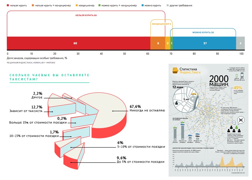
Holding a survey at the studio to find out the employees’ experience with taxi services. “Quiet driver” turns out to be the most popular option by far. We also learn that many apps don’t allow to add more than one child seat which is a pain for many parents.
After reading and listening to a lot of opinions, we take some time to think. What makes an ideal taxi service? What can it offer? For example, we want to be able to select a driver from several options or take friends’ reviews into account when choosing one. Or just go with the same driver all the time. What if I want to use the taxi on schedule, for example to have it take me to work every day?
Or how about convenient payment for corporate accounts? The account administrator should be able to add employees to a list using their phone numbers so that when making a booking, an employee would be able to pay using the corporate account. This would remove a lot of hassle with reclaiming travel expenses, etc.
And of course the app should be able to divide the cost of the trip between several people or send an offer to pay for the trip to someone else.
It also needs to have the option to share a trip, so that you can see the location of a friend who is late or make sure the driver didn’t take your wife to a different city.
Or instead of choosing the time they need a cab, passengers should be able to set time of arrival to the destination. For example, if you need to make it to the train that leaves at 4 pm, you can let the driver worry about all the traffic jams and how long it will take him to get to you.
Also, if a passenger is quiet, it does not necessarily mean they like everything: the poor music choice, the chatty driver, etc. And the driver doesn’t even know something isn’t right and later gets upset at the rating he receives. Which is why it would be great to set preferences in the personal account, for example a favorite radio station, driving style, chattiness of the driver, air freshener fragrance, etc. The driver would be able to ignore all of these wishes, but in an effort to get a higher rating he would most likely try to follow the hints.
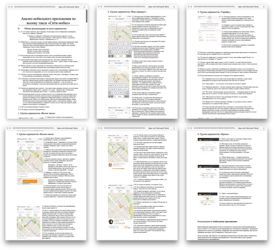
Analyzing client’s current application.
Asking the client about the underlying mechanisms of operation of the service and the cabs, future plans and competitive advantages. Discussing all our utopian ideas and whether they can be implemented. Discarding some of them immediately, leaving others for later.
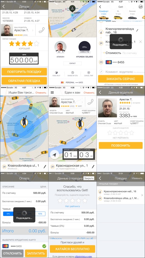
Getting promo codes from the colleagues and taking lots and lots of taxi trips carefully making screenshots of all apps.
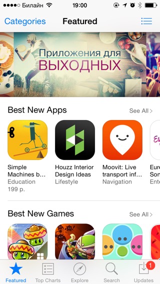
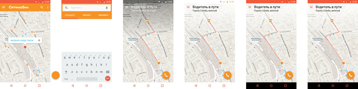
Studying the best mobile applications and the current trends.
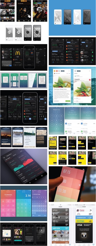
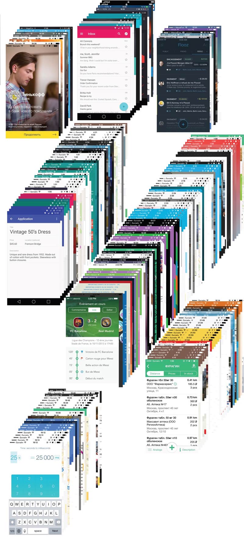
Installing as many taxi apps as iOS will fit.
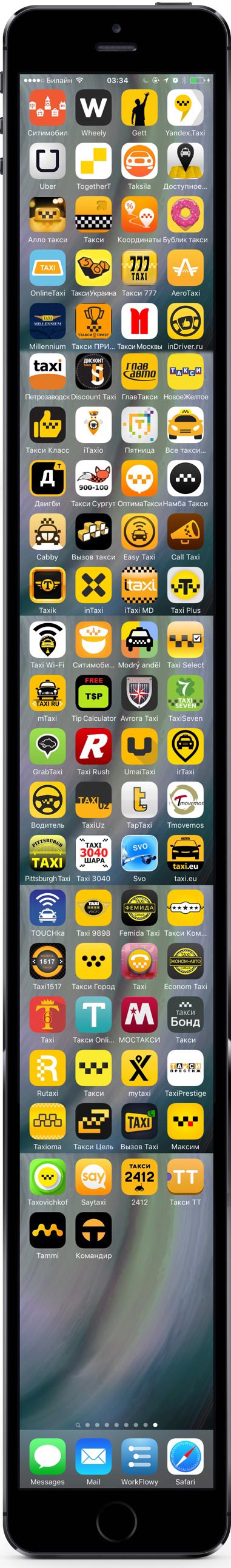
Studying every single one of them, comparing features and the ways they approach similar tasks.
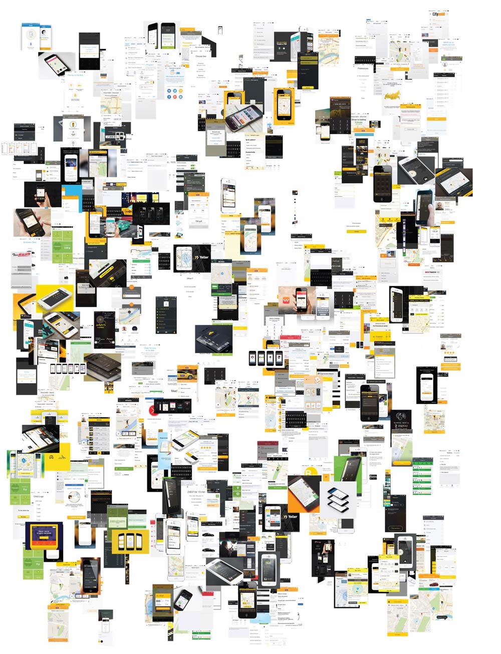
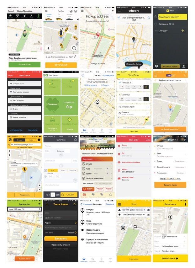
Discovering three distinct approaches to taxi booking interfaces currently that currently dominate on the market:
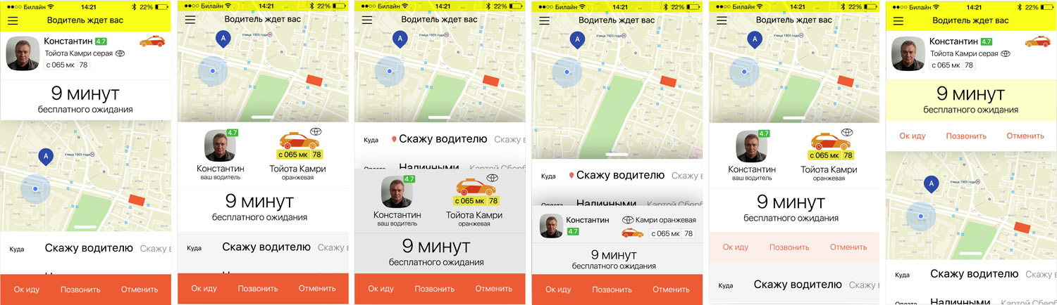
—A questionnaire or a booking wizard. Used for example by Yandex.Taxi. One by one, the wizard asks the client to choose every major parameter of the booking. Pros: no distractions, one parameter per screen, minimalism. Cons: customers need to work they way through the questionnaire before making each booking even when they select the same answers over again.
—Control center. Used by the majority of apps. The client is presented with a list of chosen booking parameters, tapping one of them opens a screen with possible options. Pros: a booking can be made with a single tap, no need to confirm all options every time. Cons: changing a parameter requires opening a new screen which annoys and breaks the seamlessness of the interface.
—Previous two approaches combines. Used by Uber and Gett. The app starts with a quick questionnaire usually asking the address, then moves to the control center. The pros and cons are inherited from both approaches.
Setting a limitation for ourselves: we need to find a solution that would allow to make a booking in one tap and does not take the customer through a myriad of screens to change a parameter.
Assembling all the ideas and thoughts into a single document so we don’t forget anything.
Thinking.
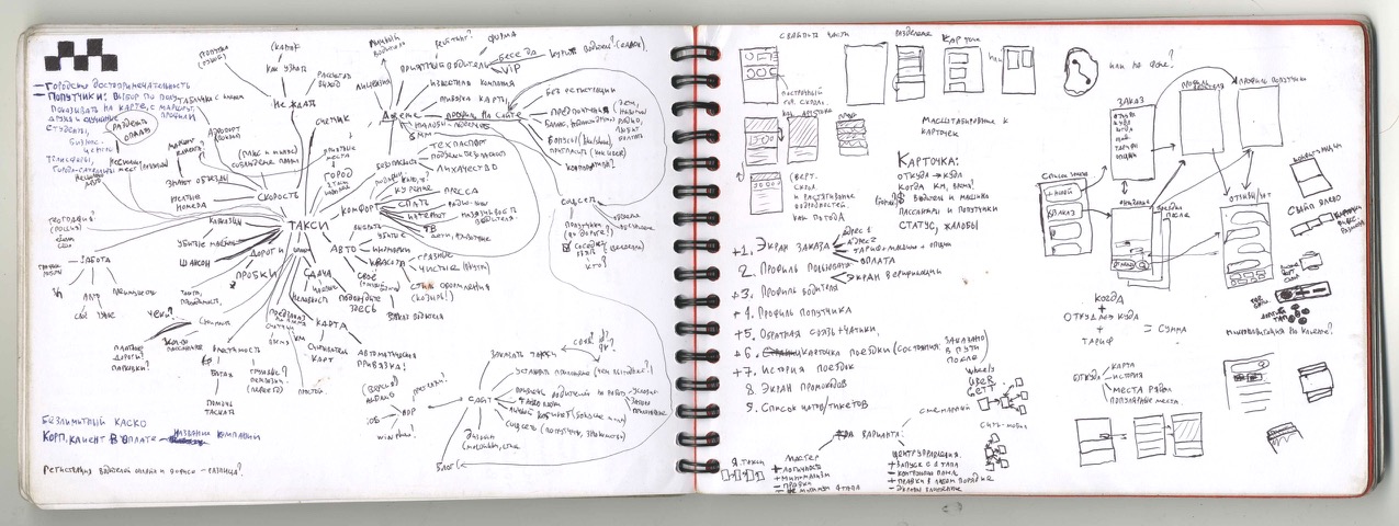
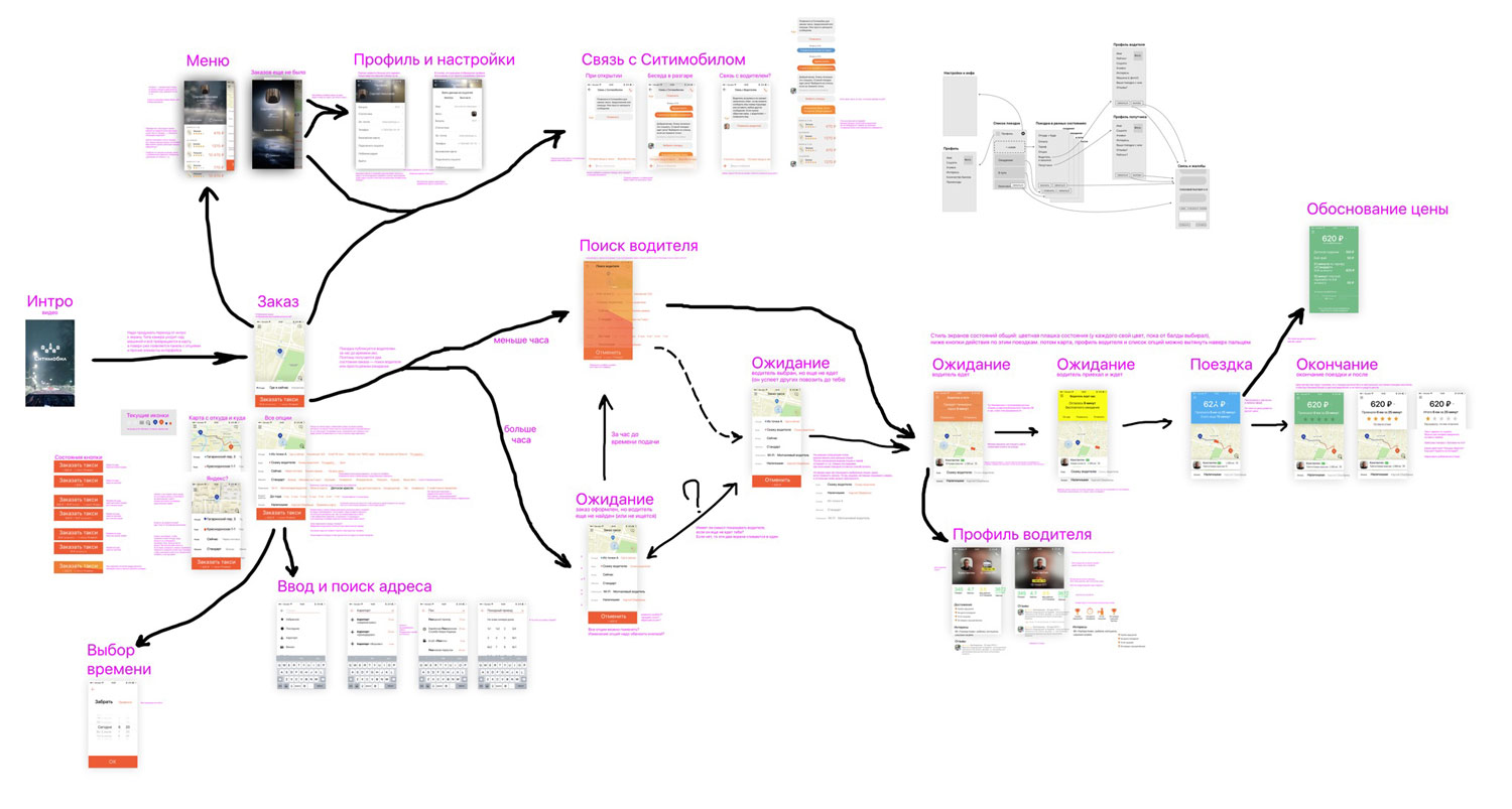
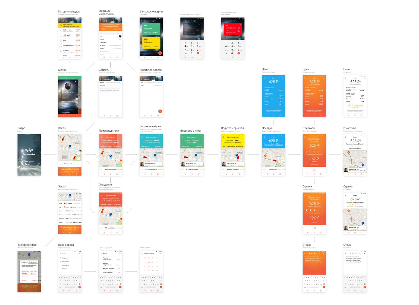
Putting together an approximate screen map.
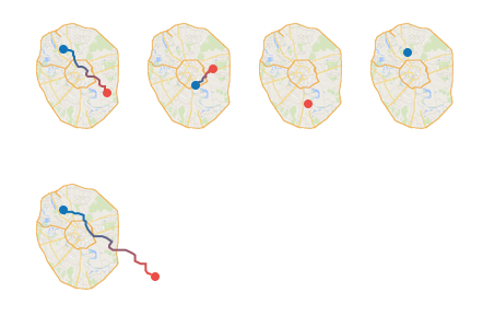
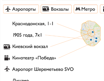
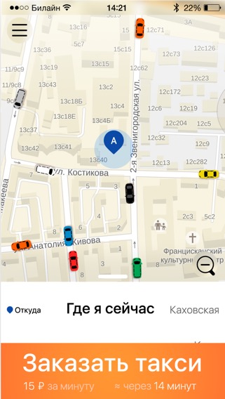
Getting excited by the idea to show routes and addresses as lines and dots on a minimap. The addresses are usually long and hard to remember, this solution will allow to instantly see their visual representation.
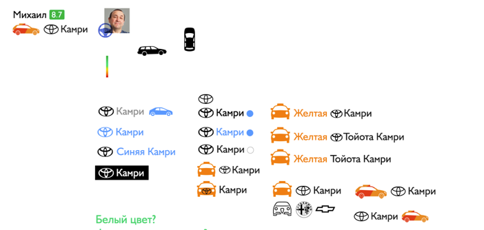
Not every customer knows every car brand there is. For some, Mitsubishi Lancer Evolution X 2.0 is “that red car with the three red diamonds,” and we can’t make those people suffer when making a booking. Which is why we decide to add a brand logo to the car description which the customers should be able to easily match with the real car when they see it. And of course not using a car icon colored to match the real car would be a shame nowadays.
Thinking about a trip as a semantic unit of the app, trying to implement it as a card.
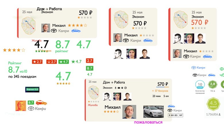
The result is too small, too web-like and looks nothing like a mobile interface. Making changes. Trying to use color coding of trip statuses.
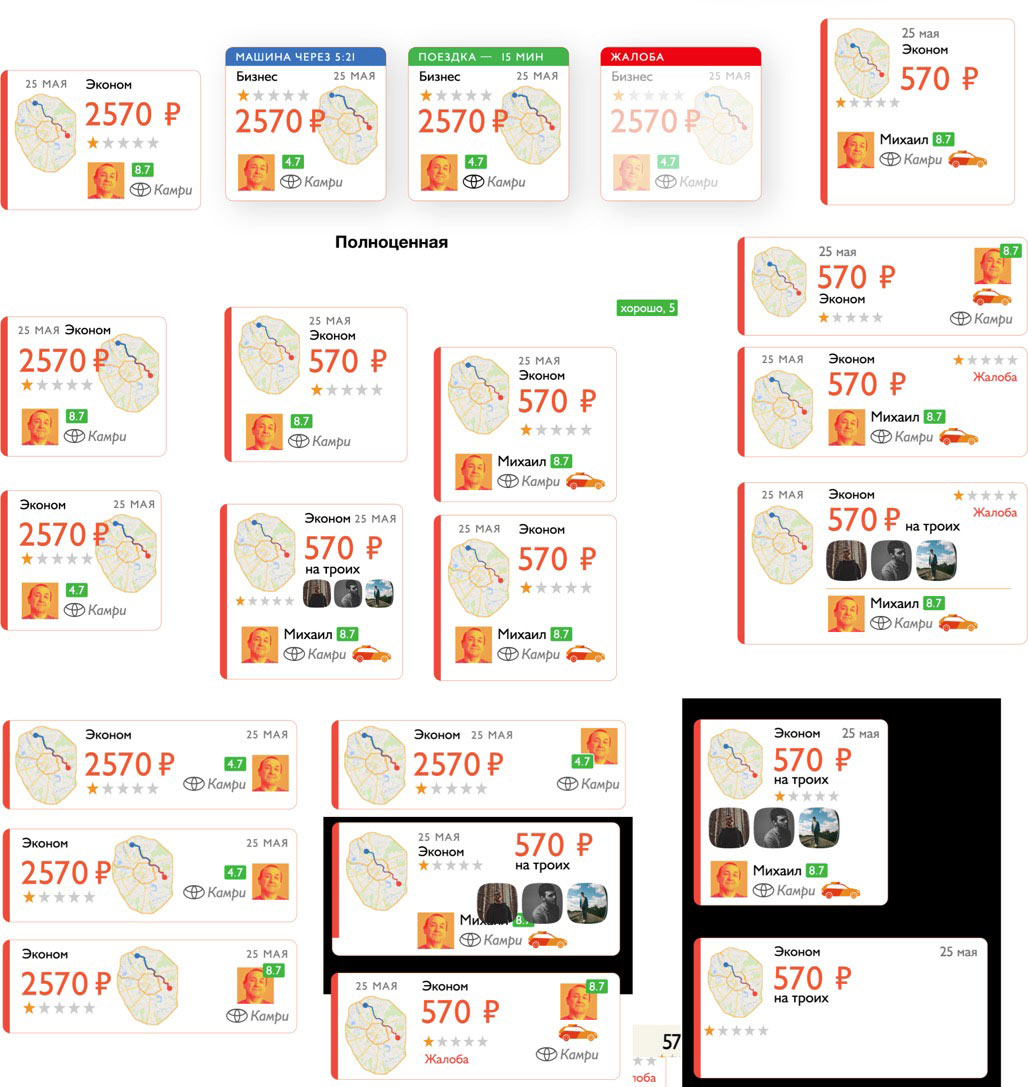
Trying on a screen mock-up.
Something like that, it’ll do for the start. Now that we’ve warmed up we can move on to the important part, the booking screen.
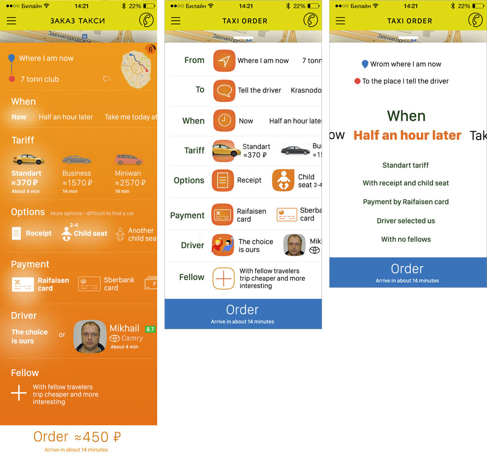
First, we put together a list of fields and possible actions, defining their importance at each trip stage.
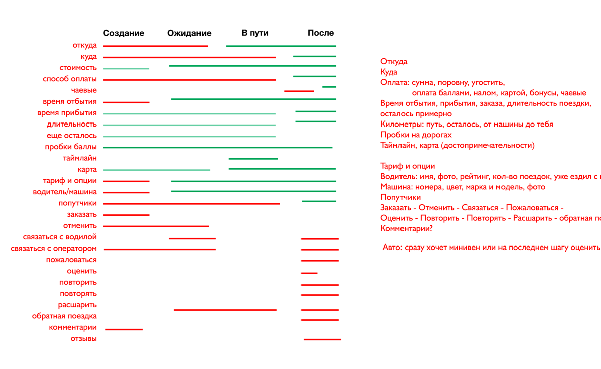
Distributing all this information over screens and mixing up, looking at the result.
Right now it lacks clear structure to connect all data together to make sure customers don’t need to guess the way each element works.
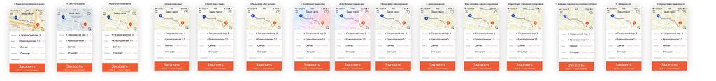
Choosing the App Store interface as the most promising implementation: the vertical layout with horizontal scrollable areas would allow us to fit all booking parameters on a single screen.
Trying it out.
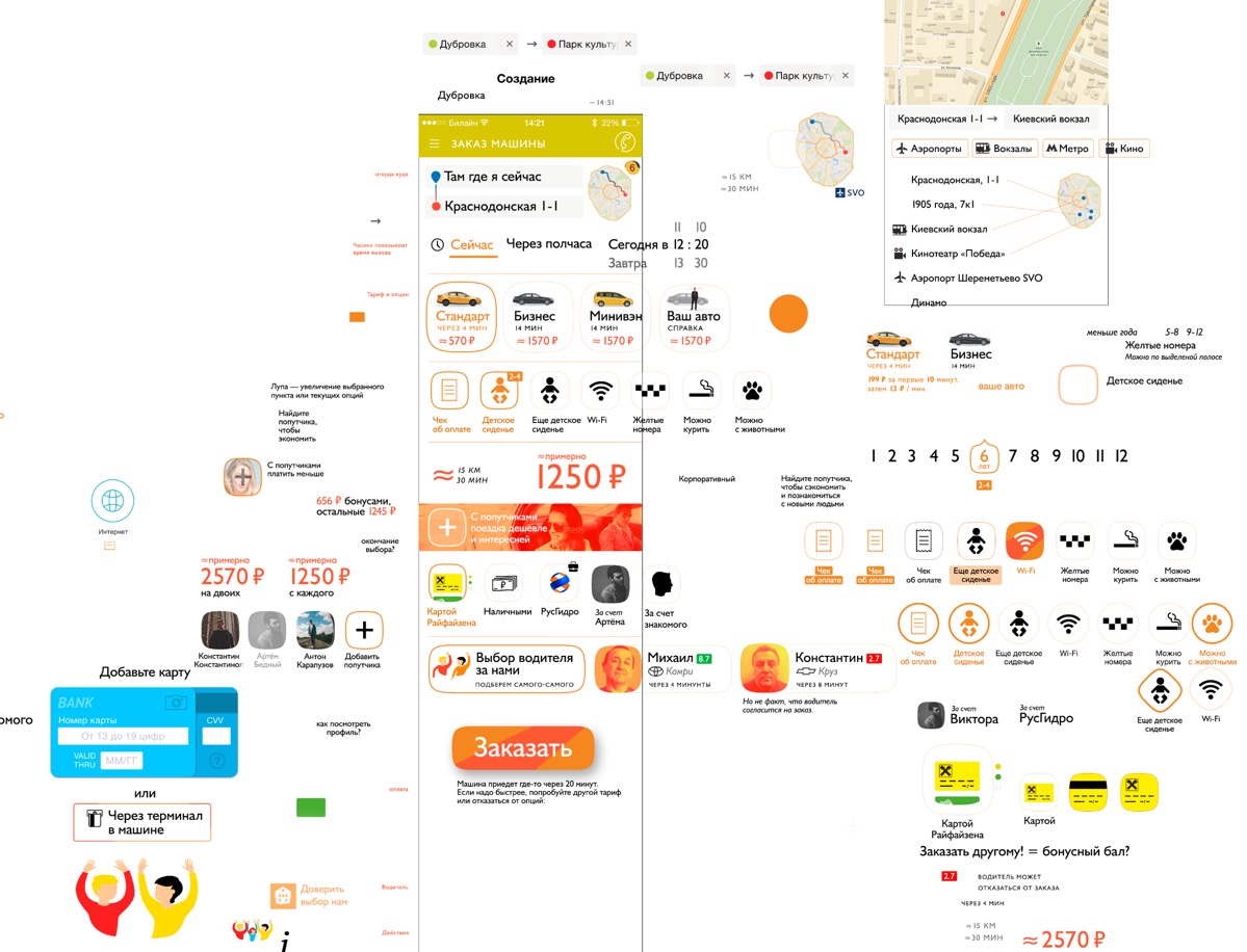
Still too noisy, no emphases, everything’s mixed up.
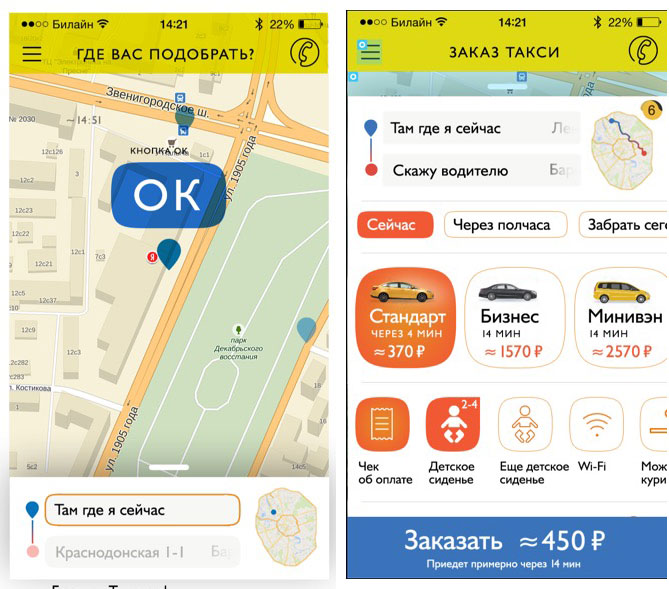
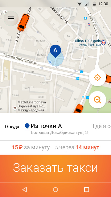
Tapping the address field opens up a map and possible options.
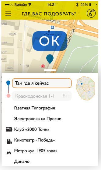
Or we can introduce filters and show addresses as points on a map to make it more fun.
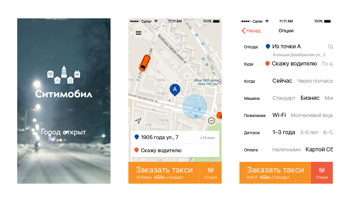
All right, that’s enough to demonstrate the basic principles. Assembling a prototype to demonstrate to the client.
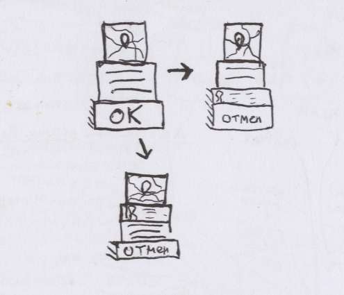
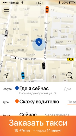
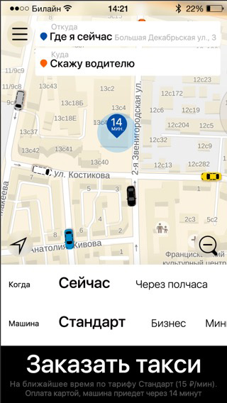
At the very last moment the hand trembles: our instructions were not to hide the pick-up location in the menu and to show it on the map. Deciding to break up the booking into two stages: choosing the pick-up location and setting the parameters.
Showing to the client. They like the idea of a single multipage menu but have doubts about the overall appearance of the app which they think looks too complicated. Plus, they ask us to try to find a way to make a booking in a single tap.
Realizing that right now it’s difficult to see the underlying functionality principles behind the draft appearance. Assembling three more implementation alternatives just to show that the chosen mechanism does not depend on the design which will be chosen later.
The client accepts our arguments. Time to start working on the style.
Starting with a blank slate: radically cleaning up the screen, removing all icons, bright spots, stripes, pictures, photos, dividers and outlines.
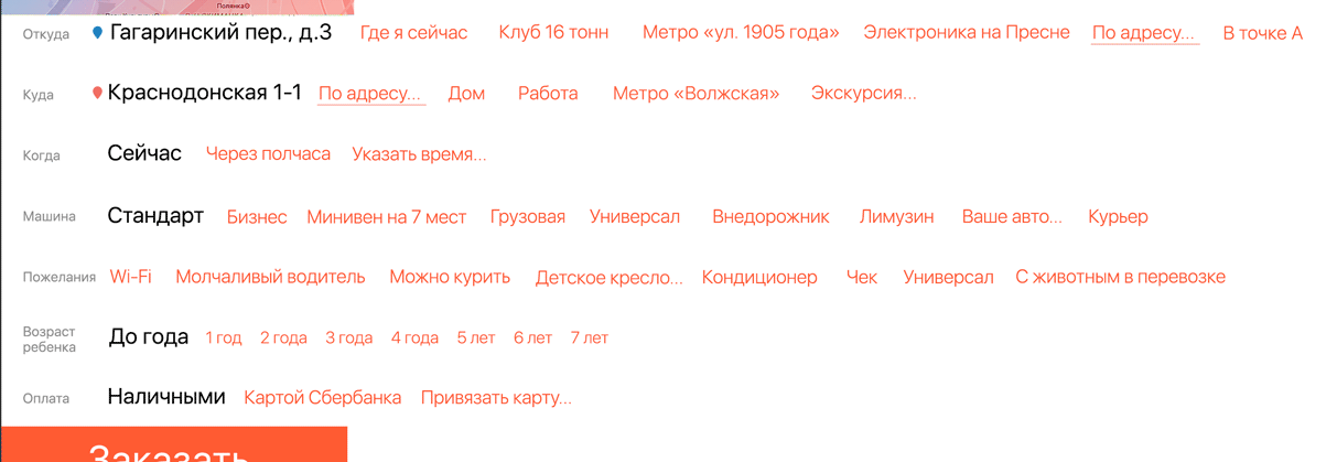
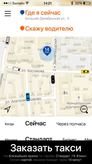
Combining icons with text doesn’t work, the result looks noisy. Keeping the text only. Putting the map and the parameters on a single screen, including all parameters at once.
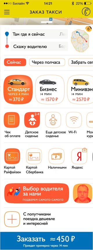
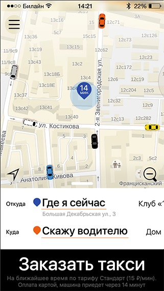
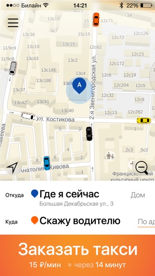
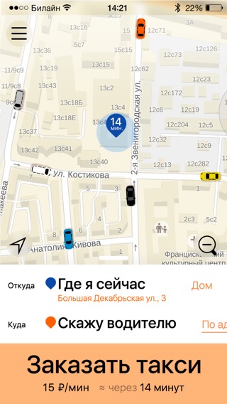
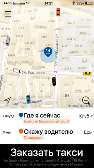
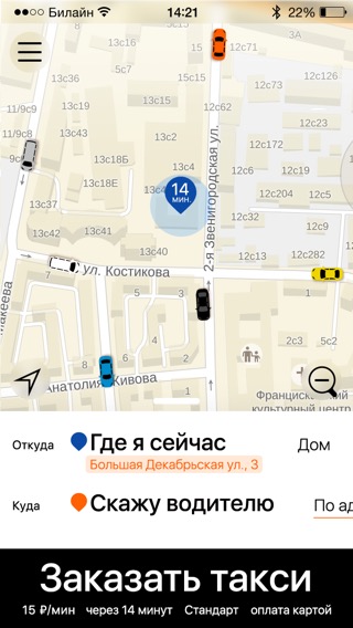
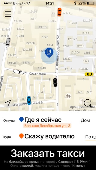
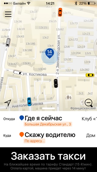
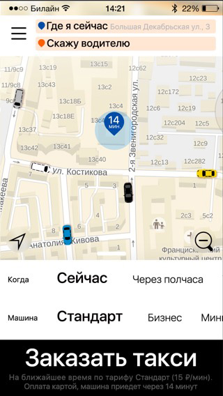
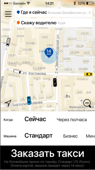
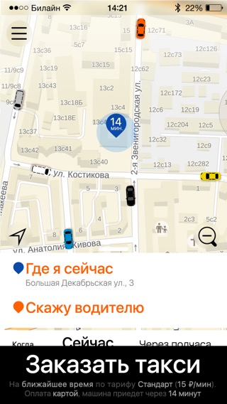
The result is a super simple and universal start screen: a map, several scrollable parameter lines and a button to make a booking.
We just need to tone down the colors somewhat.
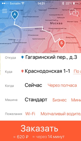
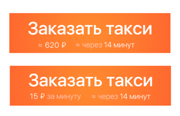
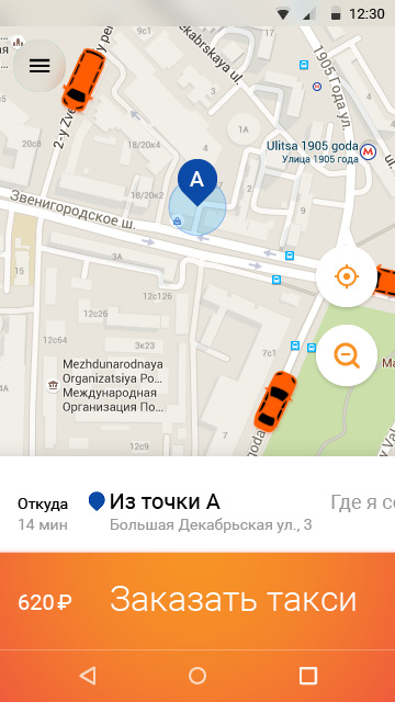
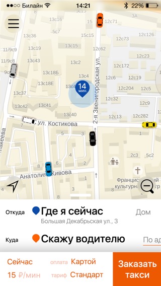
Instead of giving fare information we decide to put the total trip cost right on the booking button. If we know the destination, we can give the approximate cost of the trip, if not, we can give the fare instead.
What we have now is a nice scrollable screen. Introducing some ground principles for menu elements appearance: parameters that take the customer to a separate screen end with an ellipsis, those that imply entering text are underlined.
The client doesn’t like the color toning of the map. Trying other alternatives.
This screen is roughly done, moving on to the next ones.
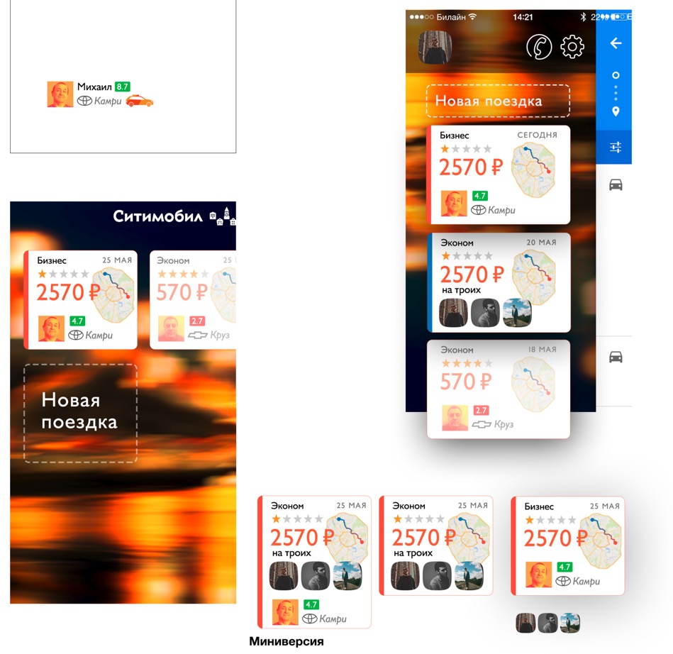
Starting to work on the side menu. Trip cards did not survive, going with a list instead. In case of no previous trips the menu is expanded in full height.
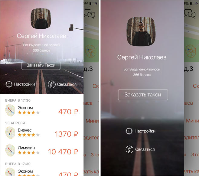
Back when we were working on incorporating trip cards into the menu we got the idea to replace a regular background photo with one that would be connected to the current time, weather and place. An evening rain on a road or a snowy sunny morning by the Kremlin. This would help us set the mood and establish an emotional connection with the passenger. It’s not just a taxi booking app, it’s your personal guide to the city streets. Tying it in with the advertising campaign.
First, the idea develops into a looped video, then we go one step further: what if we make an intro video that would show up when the app is launched for the first time? Putting together references, coming up with the content. We want to show how a car travels through a very diverse Moscow.
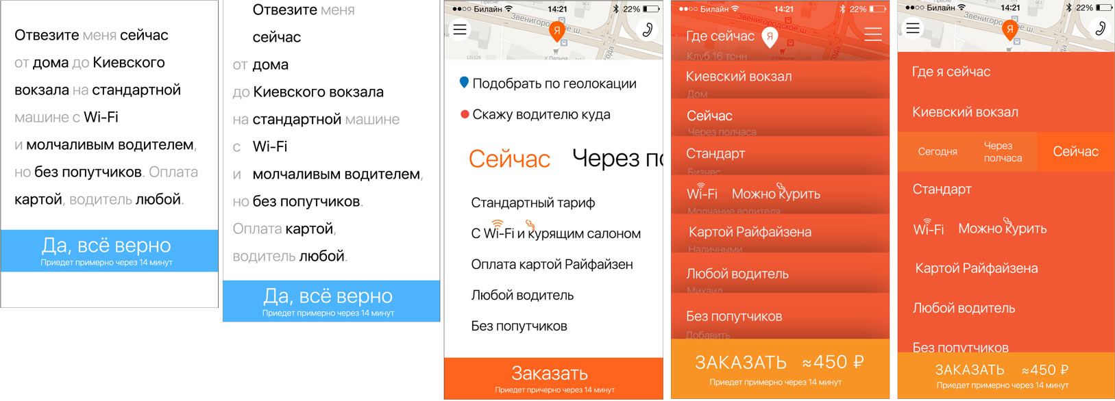
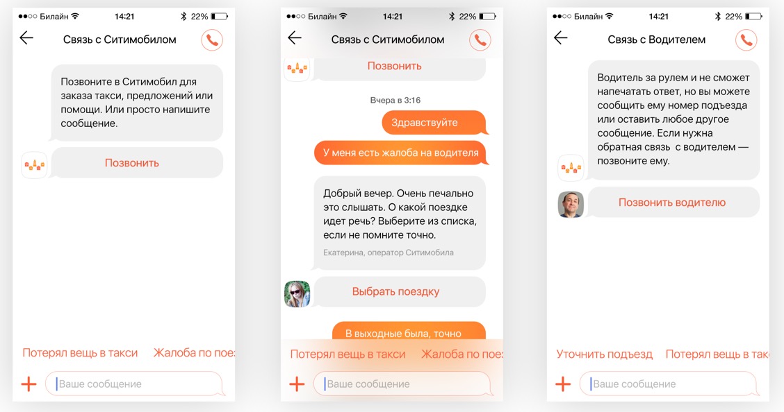
Well, maybe later. Moving on to other screens. Next one up is the support chat. Looking at all existing messenger apps and drawing conclusions. The chat has to be smart, with interactive elements and ability to attach a photo or a location to a message. The standard questions and answers should be available in a list: entering text is the most painful part of all mobile interfaces, we need to minimize it if we can.
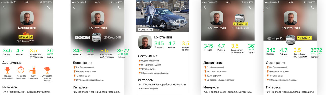
Now the driver’s profile. Coming up with the contents.
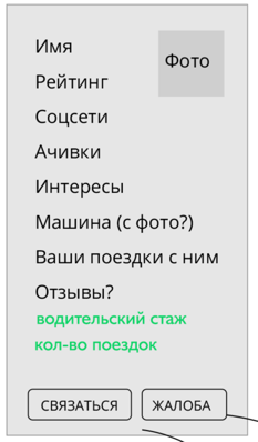
Making the first attempts.
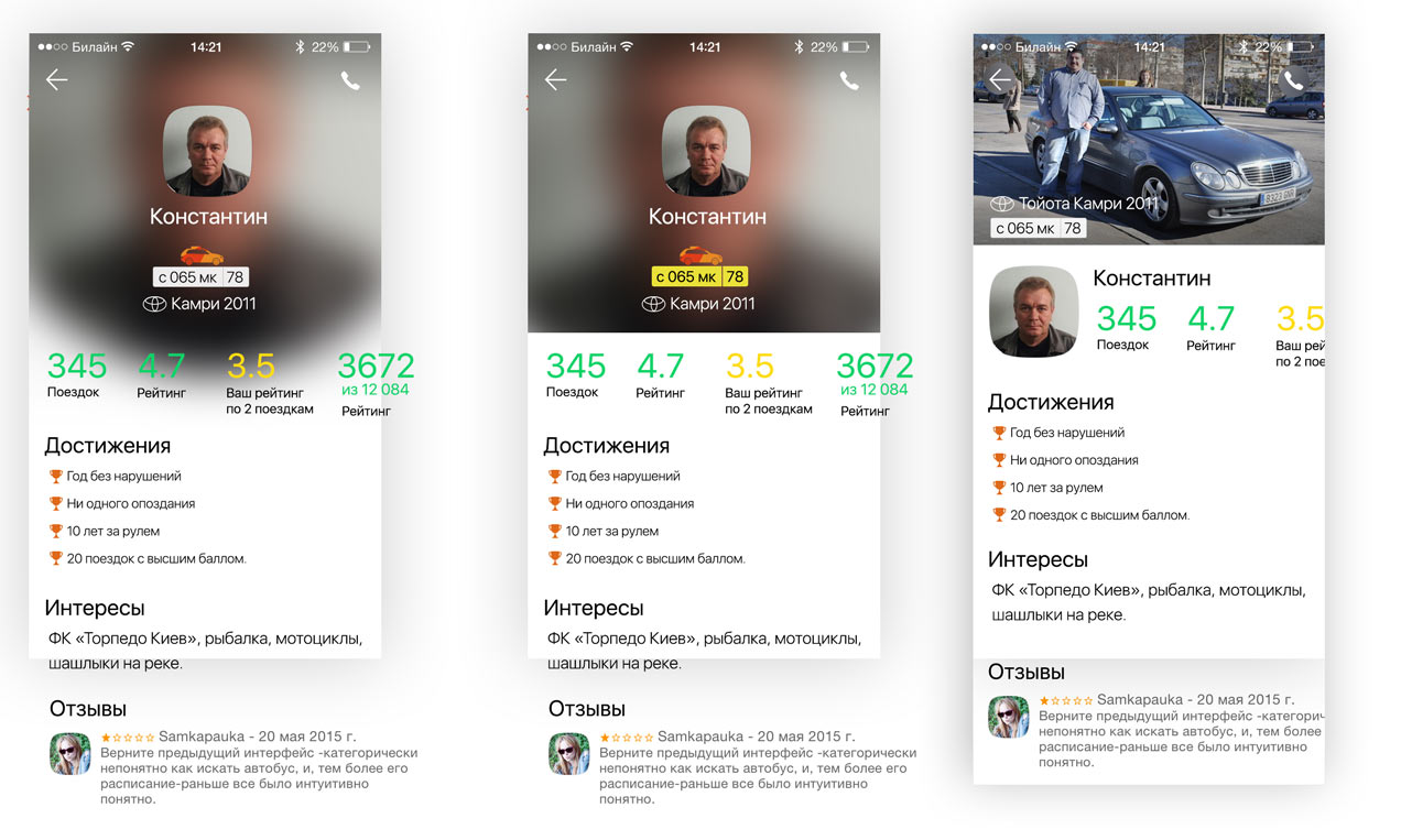
Deciding that we need more achievements.
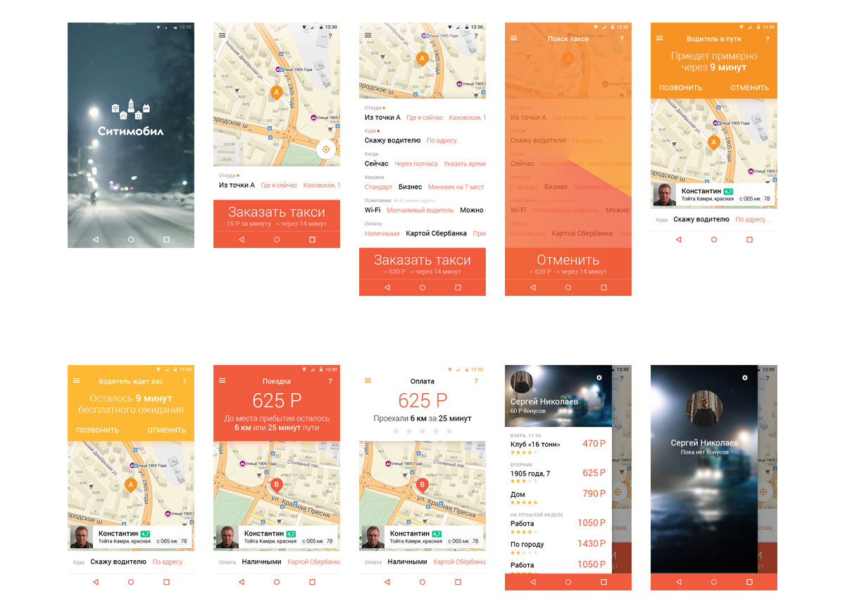
Showing various trip stages.
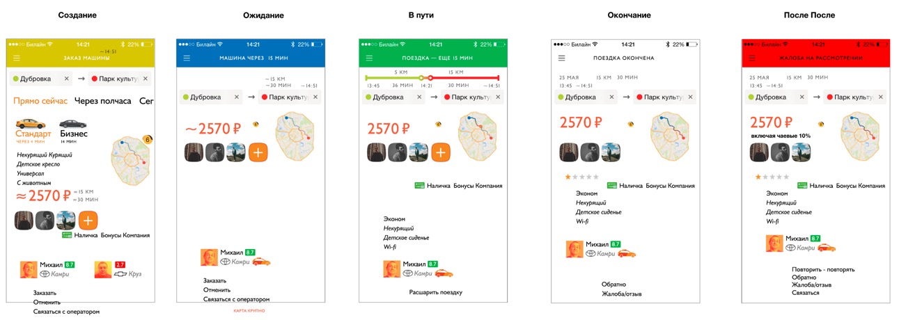
Not what we need. When looking at this screen it’s hard to see what the real message is. Remembering about the color coding, trying to use large bright color bars.
Now it’s all mixed together. To smooth it out, switching around the button panel and the driver bar.
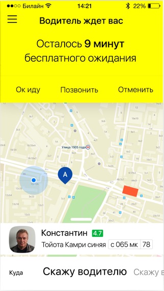
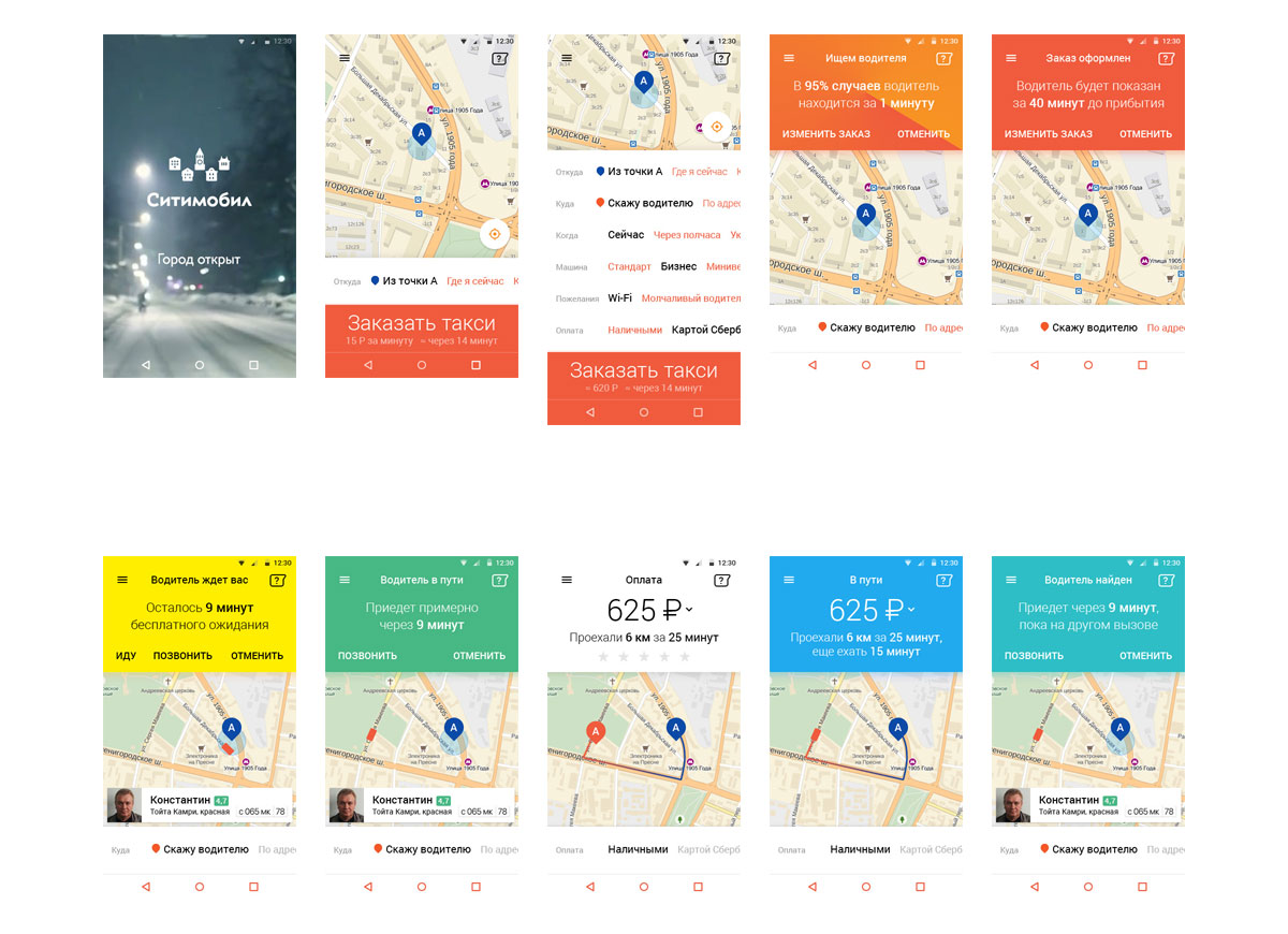
Choosing colors more carefully. Gradients of Citymobil’s signature orange or strikingly different shades?
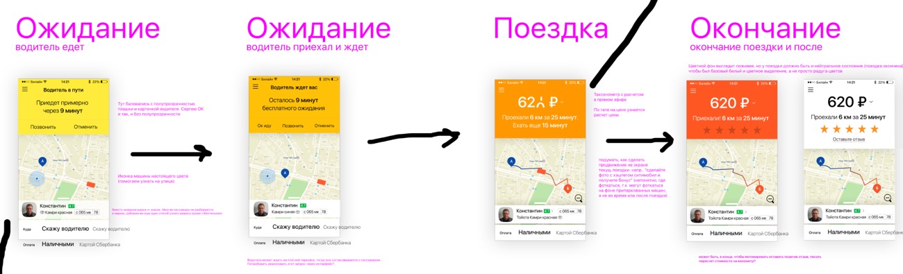
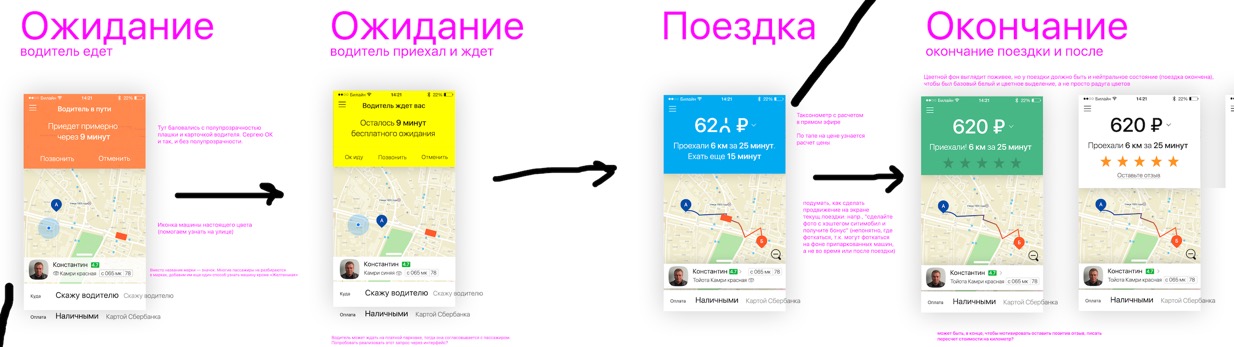
Different colors win. While we’re at it, creating transition animation between various stages.
The technical designer brings icons for different car types, with the top view for the map and the side view for everything else. They can be easily rendered in different colors.
Trying them on, they look great!
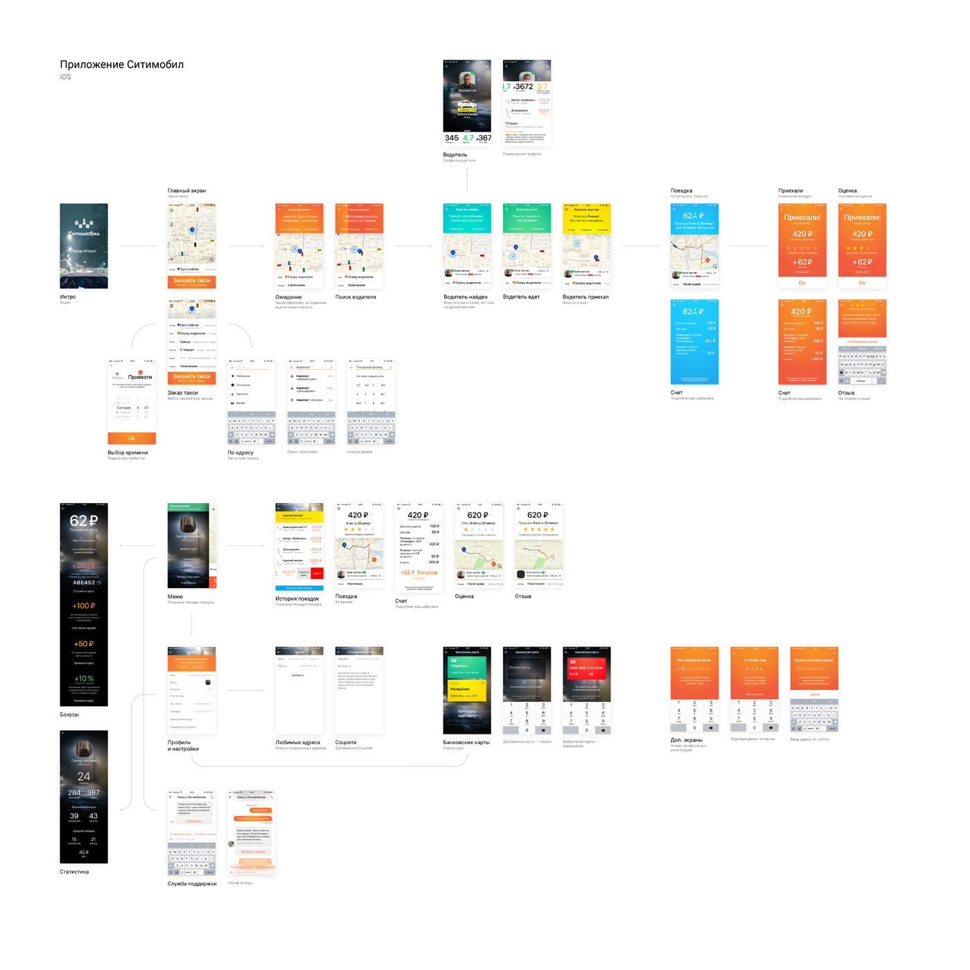
Time to clean everything up and assemble a full application diagram with real mock-ups.
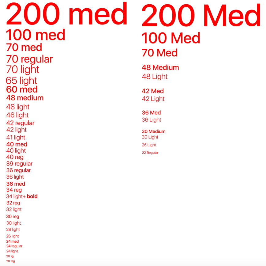
Going over the typography: creating a list of all text styles we used during the hectic prototyping and rehashing them. Thirty-four styles become thirteen.
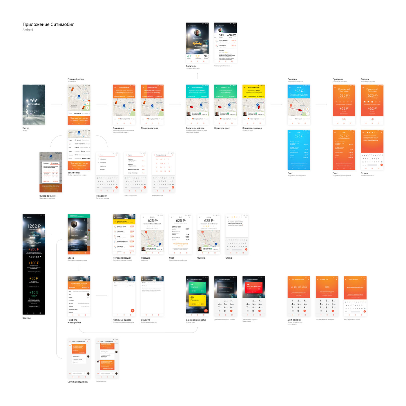
Now that the appearance of the iOS app seems to have stabilized, it’s time to work on the one for Android. We start by reading the most recent Android interface guidelines and Google’s material design recommendations. Making the first sketch.
No, we simply need to adapt the current design.
Even closer.
Gradually, the application gets additional screens.
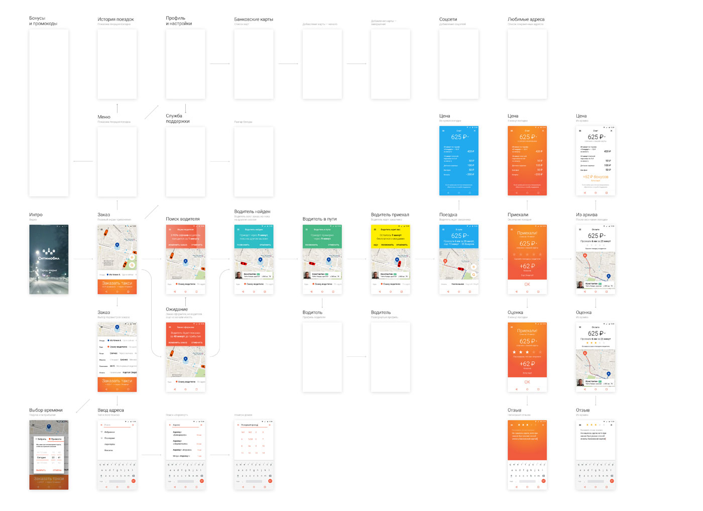
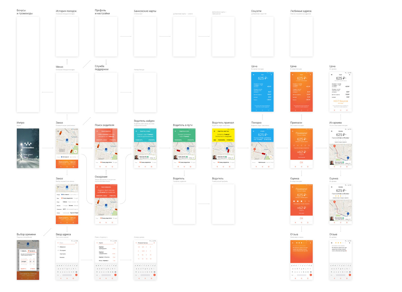
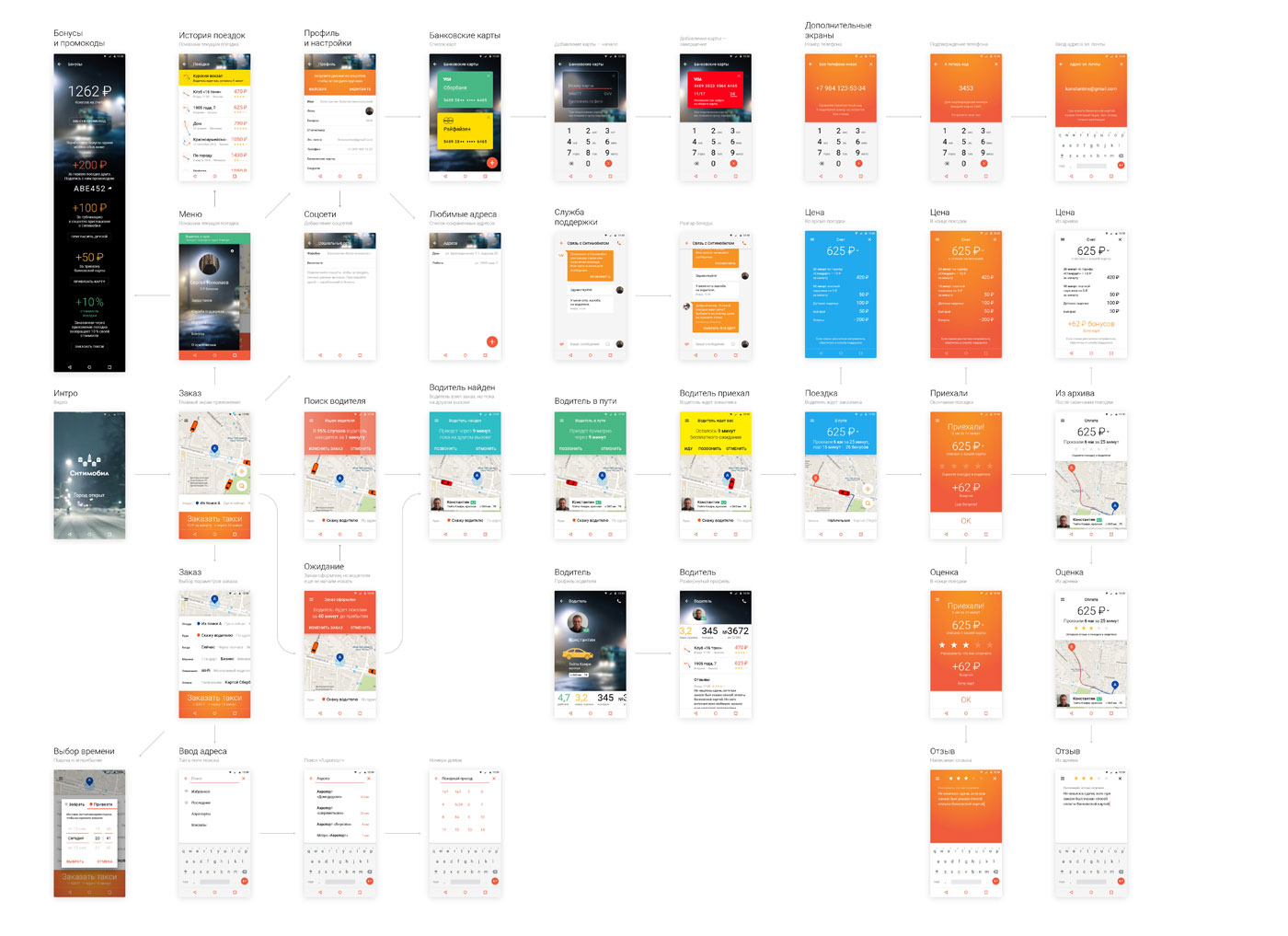


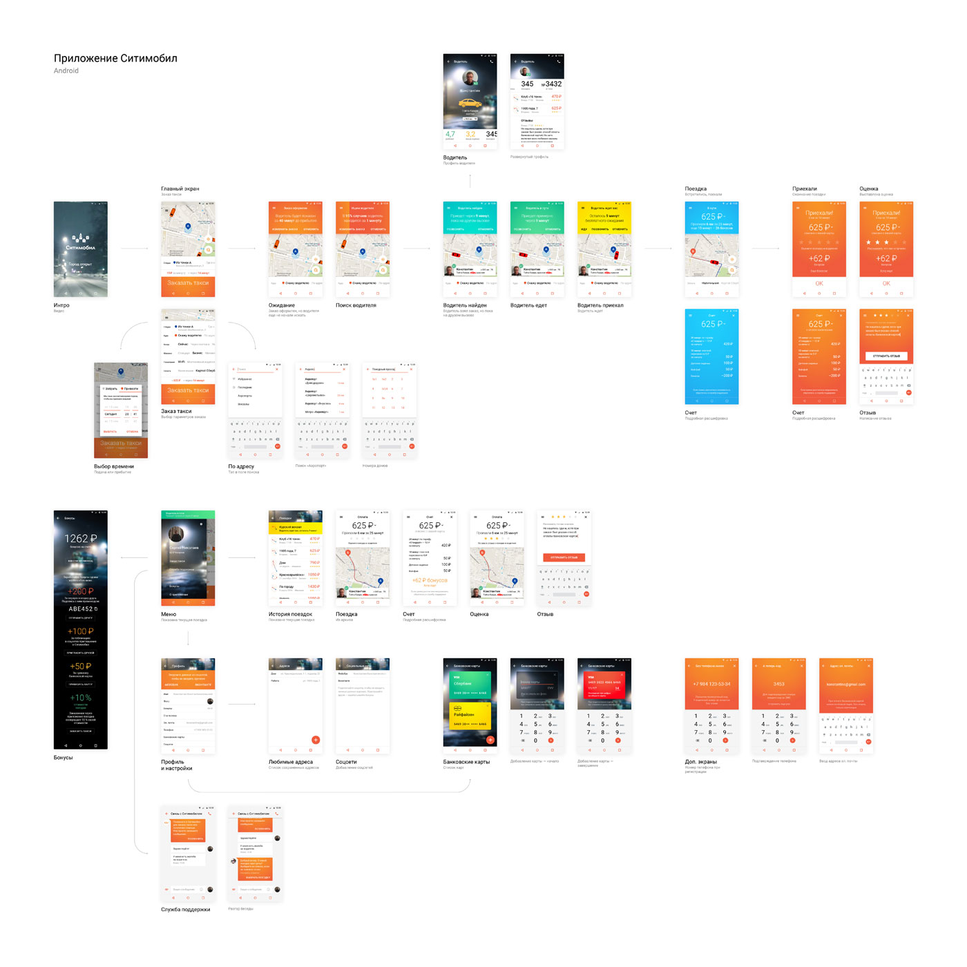
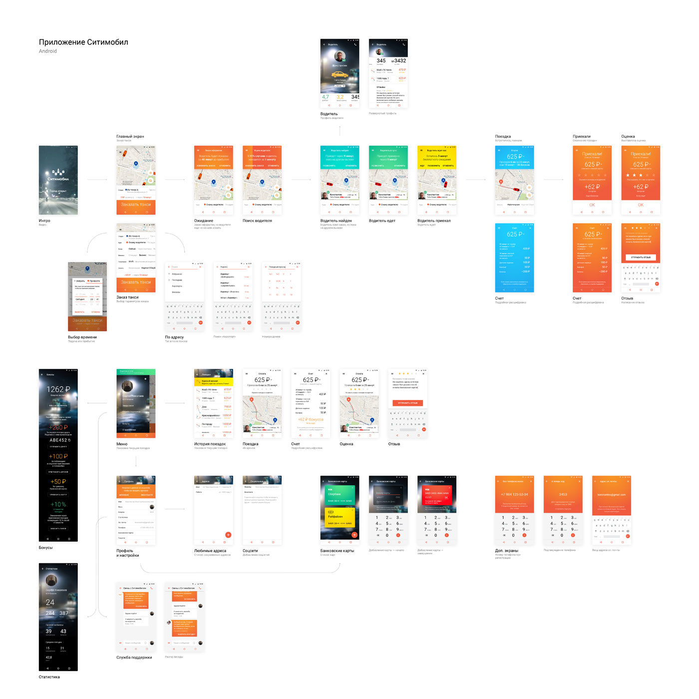
Making matching changes in the iOS app diagram.
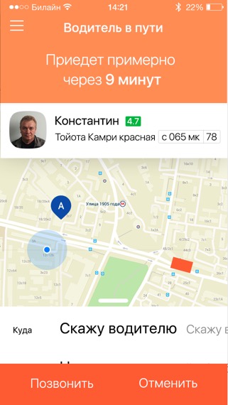
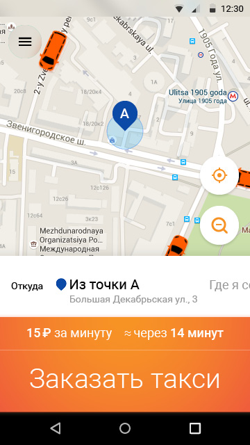
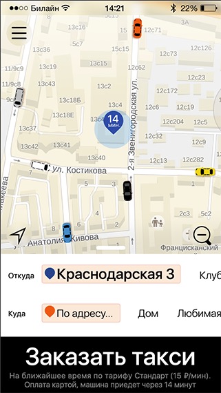
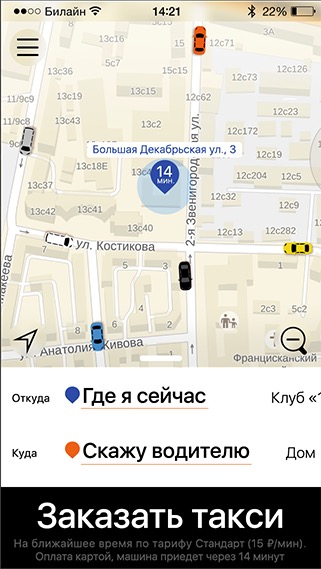
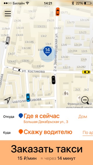
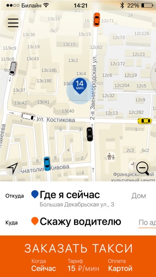
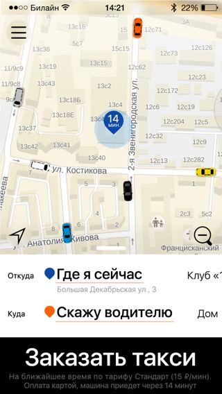
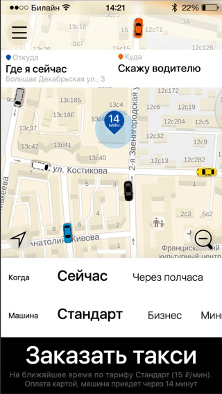
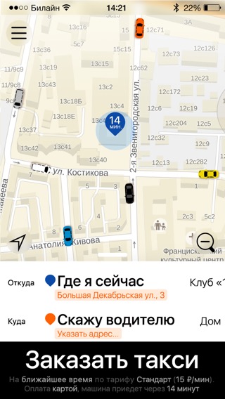
The artistic director asks to add address to the current location mark so that customers can be sure it was determined correctly and to try other positions for the trip cost and taxi wait time.


At one point in time the client starts to worry that the new design is too different from the previous app and shows us their design idea.
Accepting the client’s concerns and going over all our designs once again to be absolutely sure we have chosen the best possible solution.
Ultimately deciding to create an interim solution that would help introduce the new design gradually.
Presenting to the client.
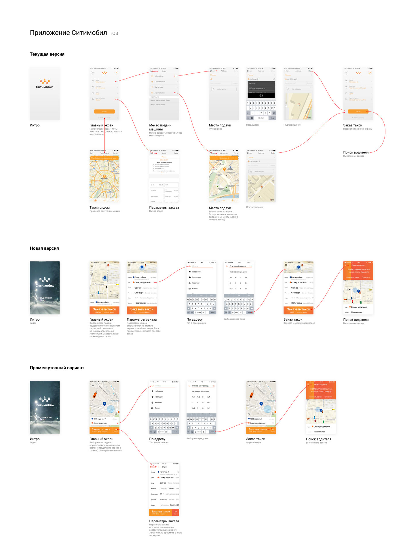
At the end the most daring design goes into production.
Assembling animations for developers.
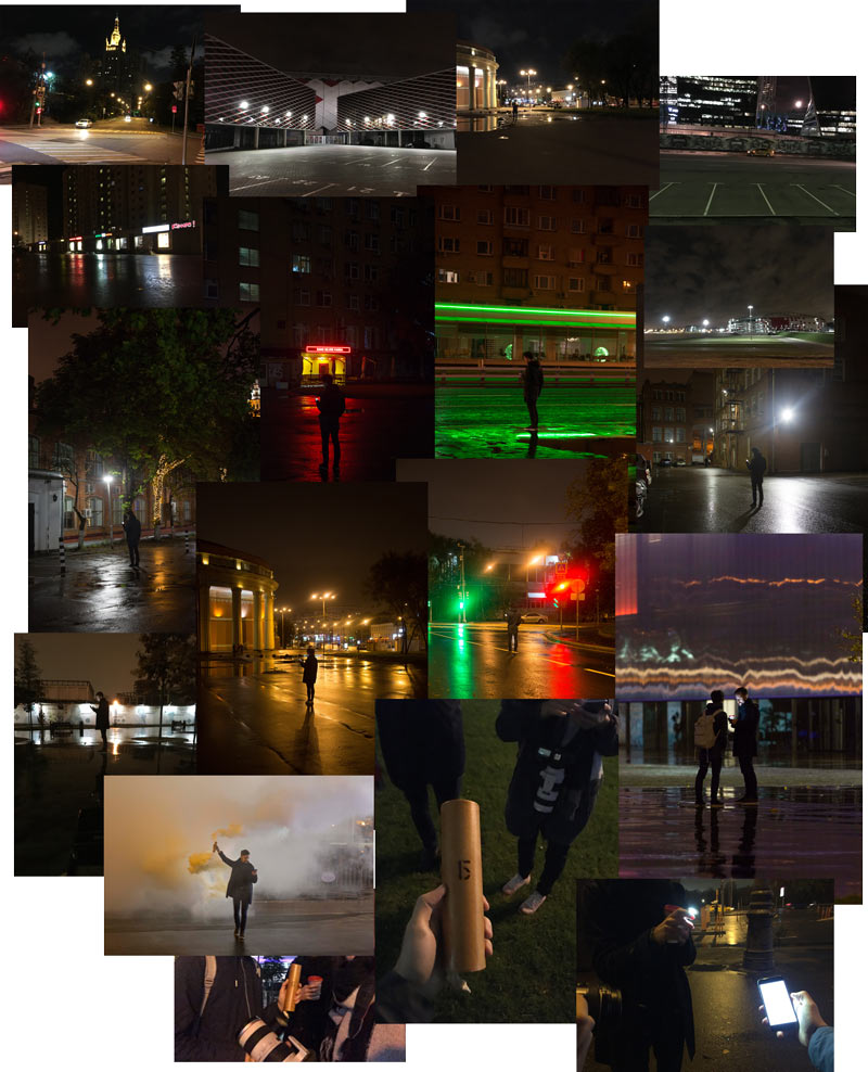
Preparing the announcement. Getting the art director’s approval for photograph ideas, searching for the location, waiting for the proper weather, making test shots. Getting disappointed in the result, searching for a different location and going on the final shoot with some pyrotechnics to create fog.
As the announcement is getting ready, looking at test app builds and sending our comments.
Done!
