The making of the logo for the Comfortable City series of events
Overview Process
Getting the task and the sketch of the client’s vision of the result.
Brainstorming and gathering the first ideas.
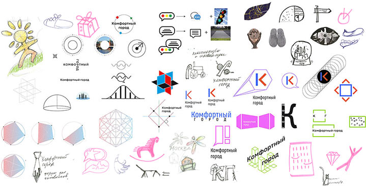
Choosing three concepts to be developed further.
The first approach. Green blocks in the shape of the speech bubble with arranged in the golden ratio as a metaphor for thoughts on urban design.
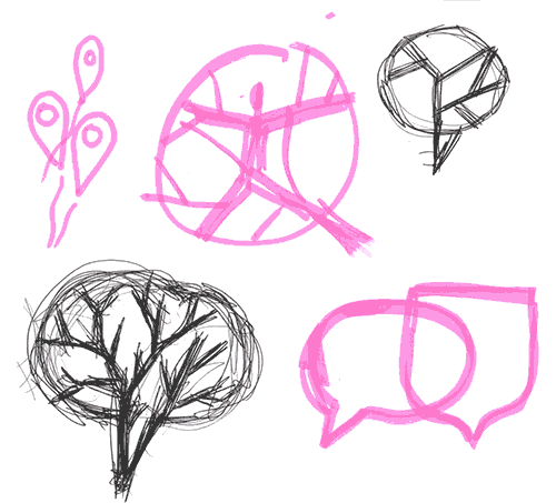
Art director: Let’s try to work on different versions of speech bubbles. For the one you made with the squares, we need to make an alternative like the bottom one (with white lines) as street lines (not only straight but probably arched as well). Maybe, we can make one of the lines diagonal (I’ve attached the approximate draft, it may look like a leaf).
The second approach is to add pictures to these squares, just like the ones they wanted us to use (like a bicycle, a bench, a tree, etc.). We can probably use squares of different colors here.
The third is to develop the “city bubble”. It’s important not to make it look like a tobacco leaf, maybe we should make the streets more pronounced or make one of them arched. I advise you to have a look at a map or maybe at how others show maps in logos.
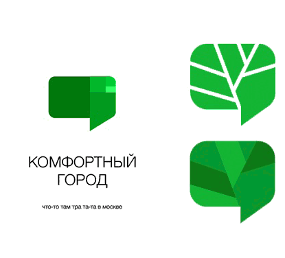
Designer: Three in one: a speech bubble, a tree and a map.
Art director: This sign has a shape of speech bubble, but the trunk should be in the middle like in a real tree. And it should be more circle than square.
Simultaneously searching for best map-related images.
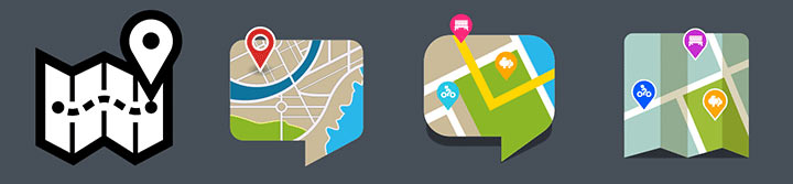
Art director: I gather this is the “city bubble” one. I like the ones that are easier to understand, that is the left ones (they have different shadowing). I’m still waiting for the “city tree” alternative, your idea with the apple will work really well there. And the one with the squares, like I mentioned before.
Designer: So many alternatives now, we need to sum them up.
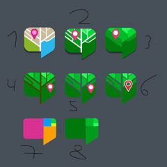
Art director: I suggest we concentrate on the following: Number 1. Lower the location mark so that it doesn’t look glued to the edge of the bubble. Number 7. Place different pictures—a bicycle, a bench, a tree, a location mark—into the colored squares.
You also need to make a tree similar to the one I drew. A green one, with a round silhouette, with a map inside, without an outline and with a trunk in the middle. And with an apple—a red location mark.
We now have three similar versions, time to invite the type designer.
Using the Schlange typeface as the base, getting rid of all the bracketing, changing the shape and thickness of certain characters.
Designer: I’ve given Numbers 1 and 7 some work.
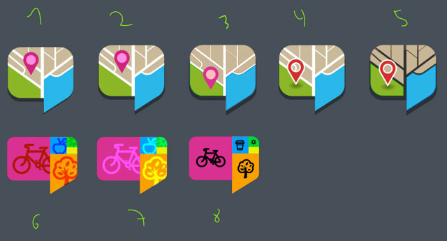
Art director: From the top row Number 2 is the best, just move the mark a bit to the left, right now it sticks to the central street. As for the bottom row, the pictograms need to be more sharp. I think this should be our last alternative, it will take too long to finish and there might be no time left. Also, you probably shouldn’t place the pictograms with bleeding. The color should be either white or a certain percentage of the color of the square.
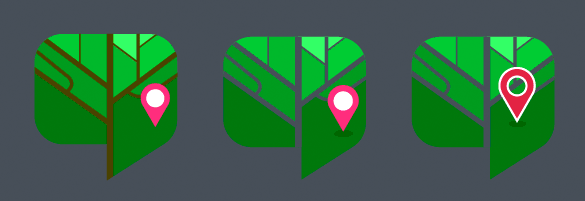
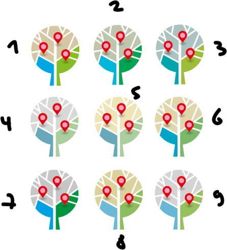
The trees are ready.
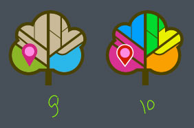
Art director: The tree has to be round: a circle, a trunk at the bottom, the circle is cut by streets. A location mark inside. Do as I ask please.
Done.
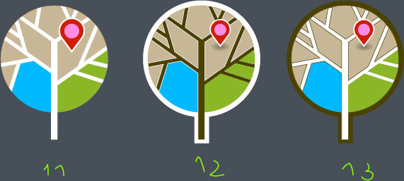
Art director: It’s best not to bend the trunk, but the lines can be broader towards the bottom.
Designer: I made a more delicate shadow for the bubble, also the trunk is now a bit longer and not as thick.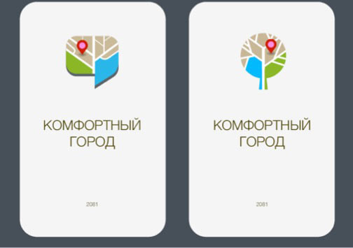
Showing to the artistic director, he suggests to hang three location marks that would look like fruit.
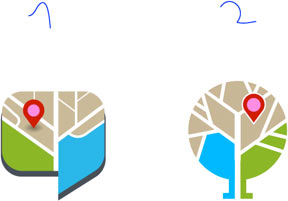
Showing the two final alternatives to the client.
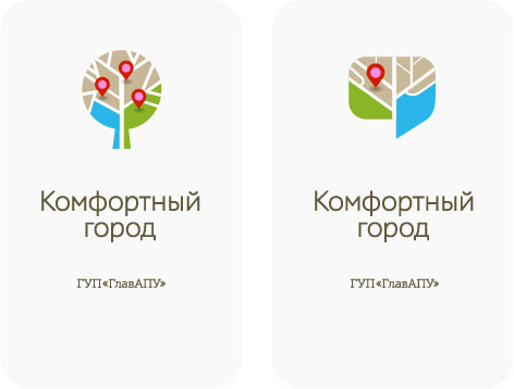
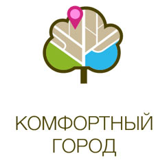
The client chooses the tree but asks to work on the colors.
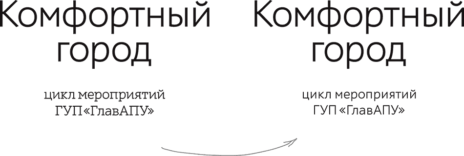
The artistic director recommends to remove the serifs in the text.
Art director: Thank you! I like the colors. We shall send the options to the client so he can make his choice.
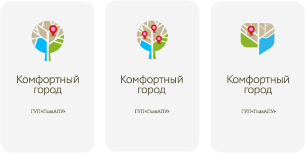
The client picks Number 3, slightly changing the text and submitting the result.
