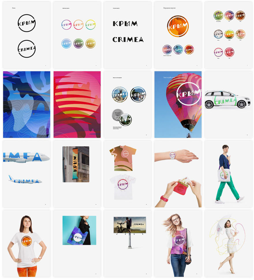
The making of the Crimea logo
It all starts with a letter, as is tradition.
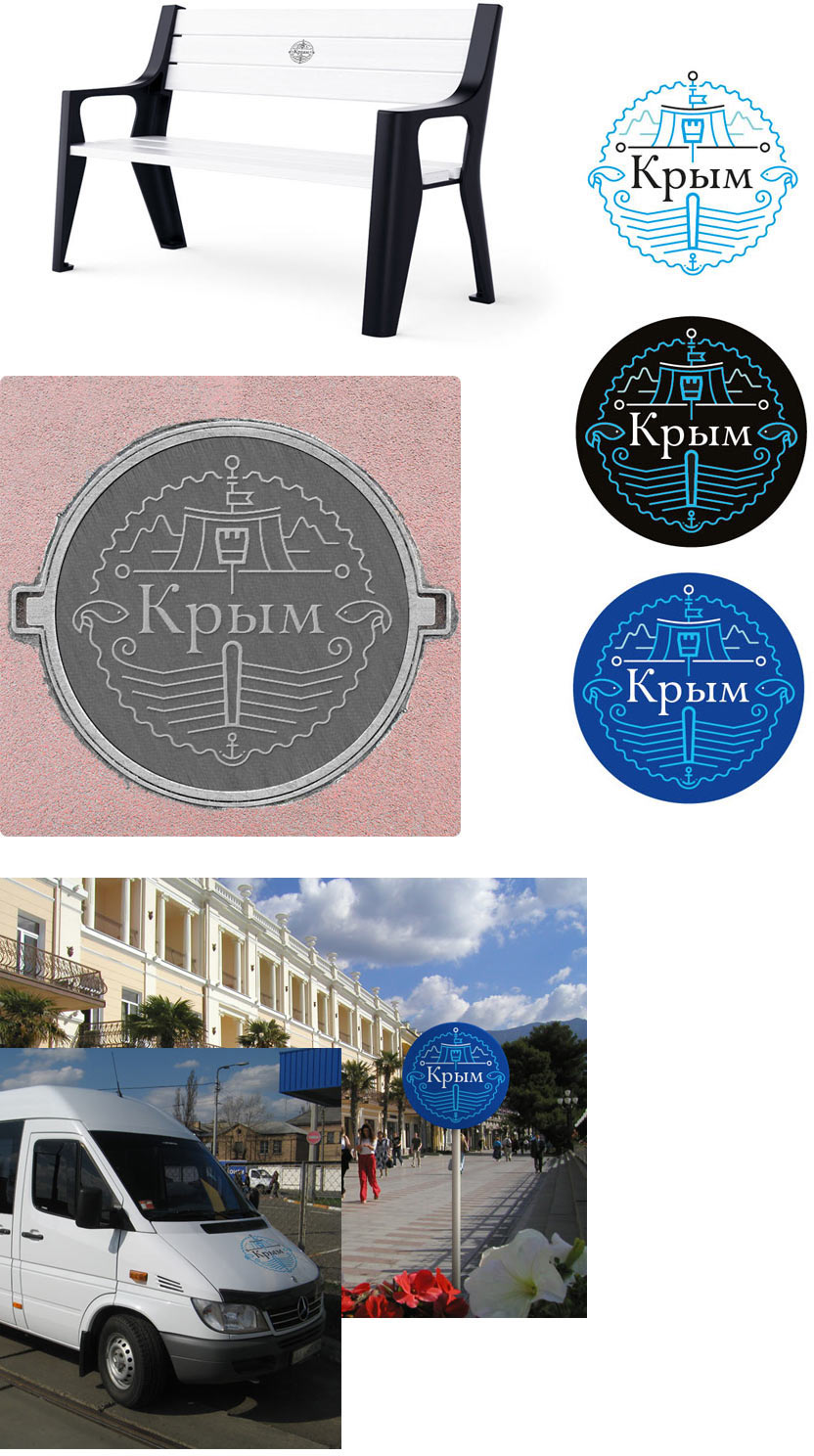
Generating the first ideas. Soviet charm, Tatar motifs. The coat of arms of Crimea also provides hints.
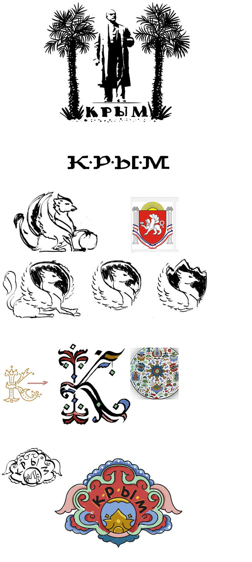
Art director: Crimea is about ten times wider.
Trying to work with natural motifs and Soviet lettering. We also need to try and tell about local architecture and the sea.
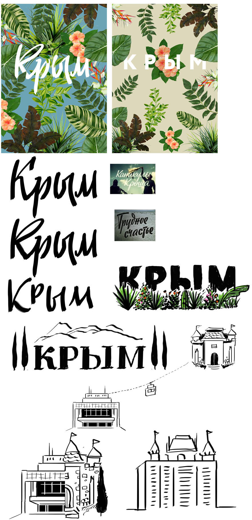
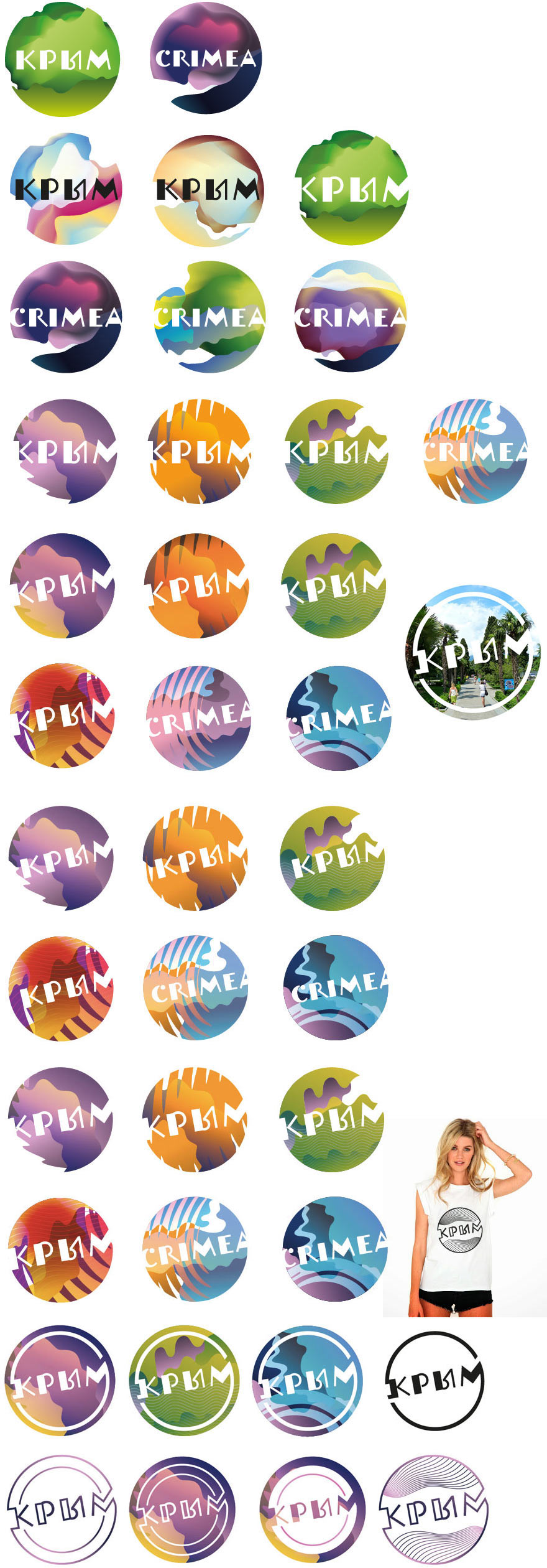
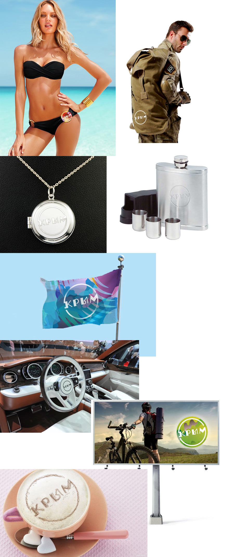
Deciding to see how the better designs look on media.
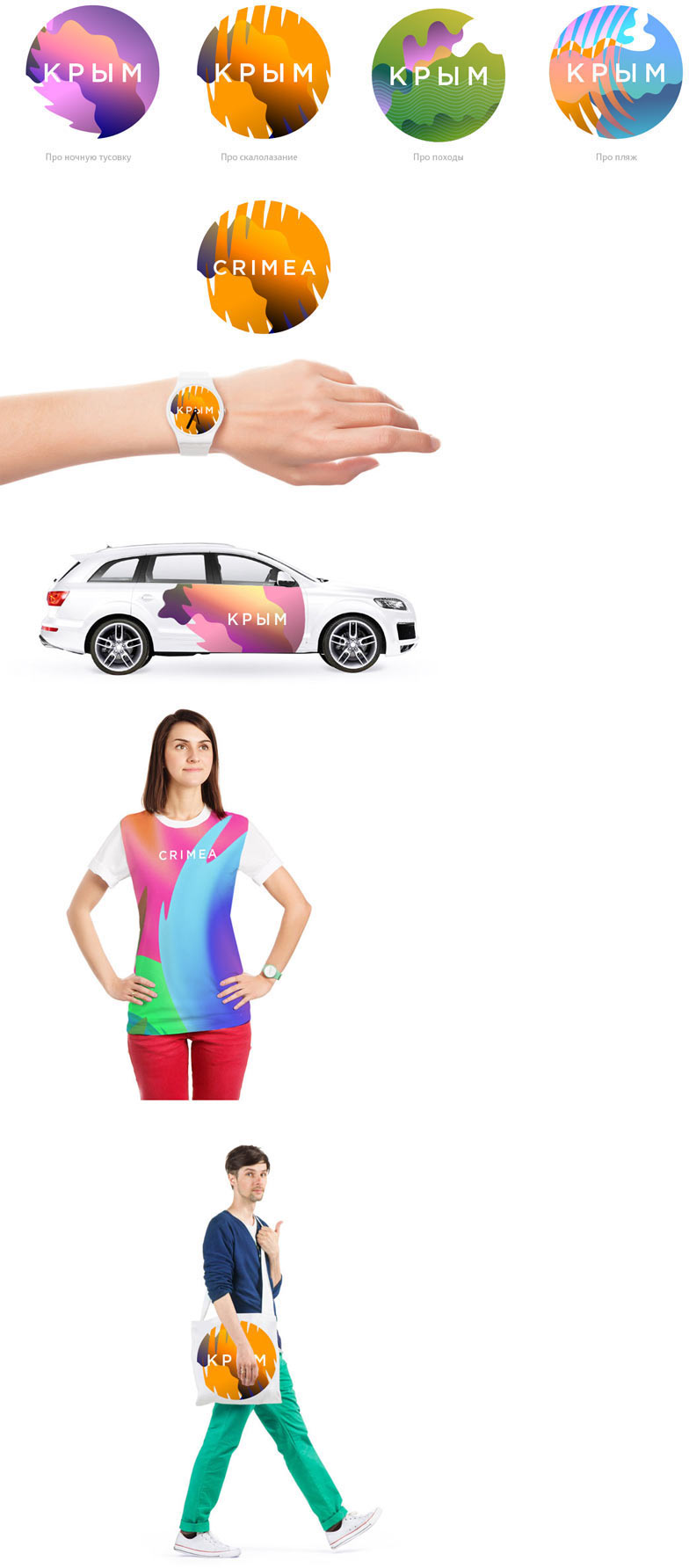
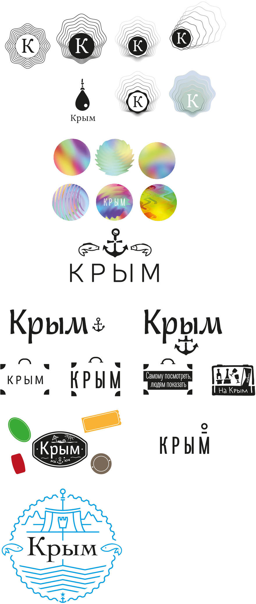
The colored circle idea seems interesting. It features a pearl and the sea and provides infinite capabilities for creating new variants.
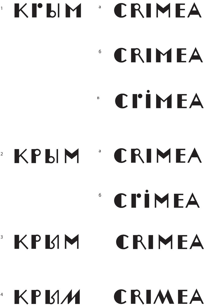
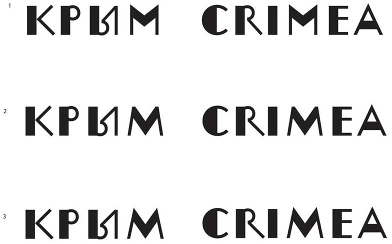
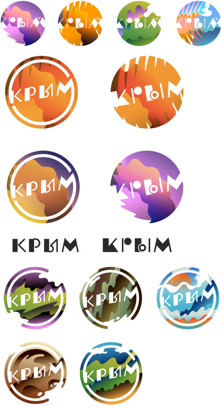
Now for the typeface. We need a modern grotesque with some oddities thrown in.
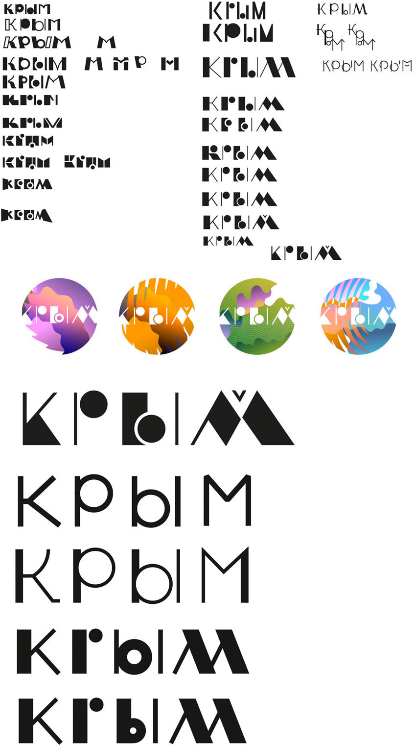
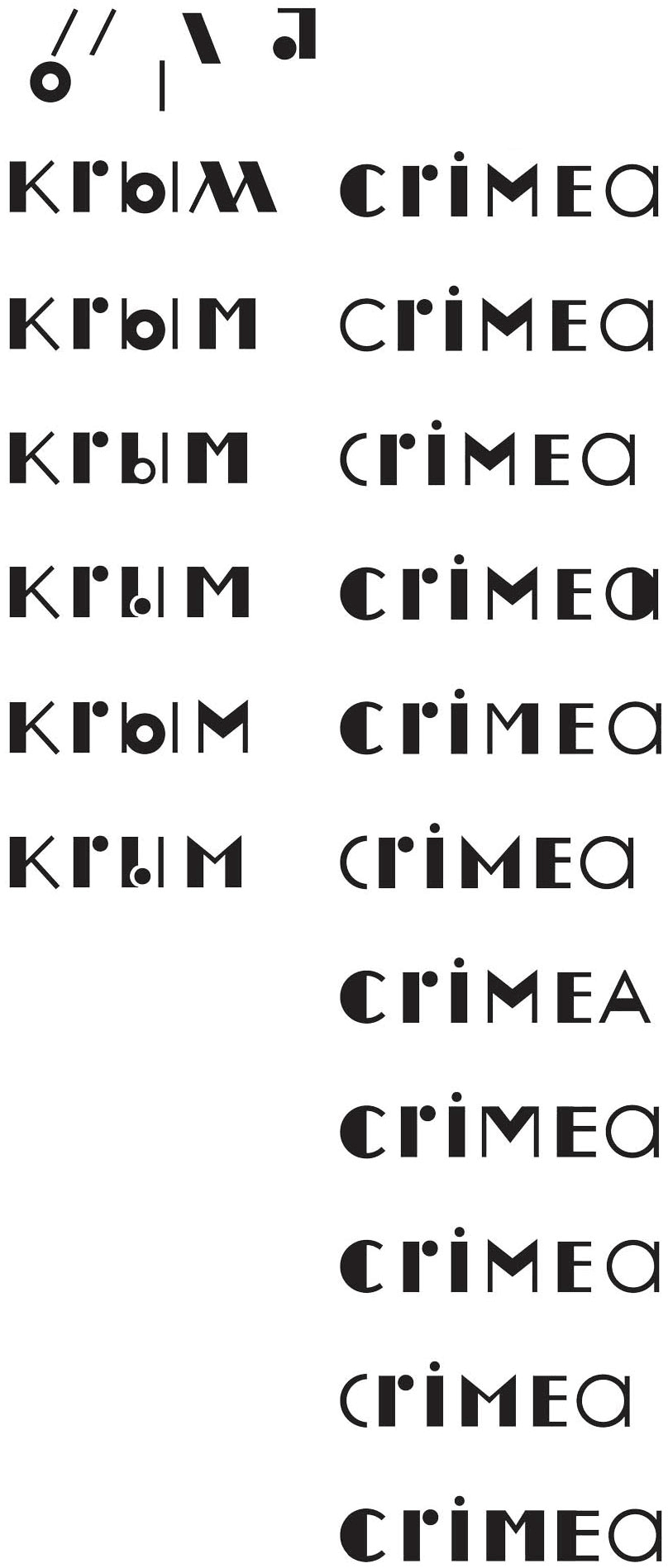
We don’t like the letter M, it reminds of the Marriott logo. Asking the type designer to find a better shape. We also need to work on the English text.
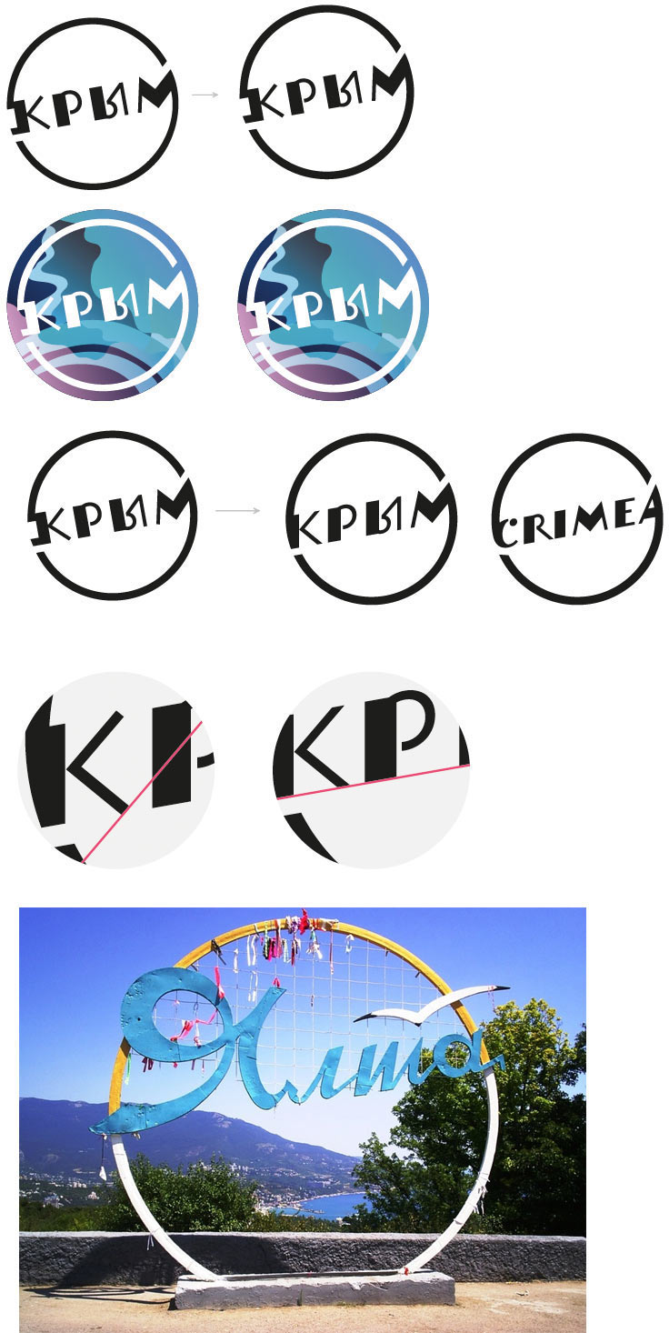
The art director liked the letter Ы with a diagonal stroke, using it for inspiration.
Art director: It’s a stylized design, so no.
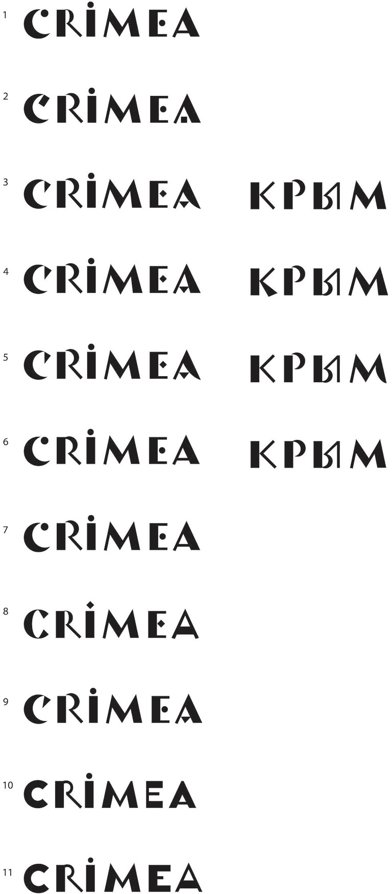
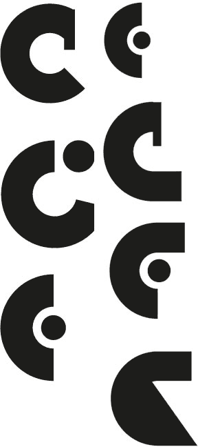
Choosing the letter M, but now we don’t like the C.
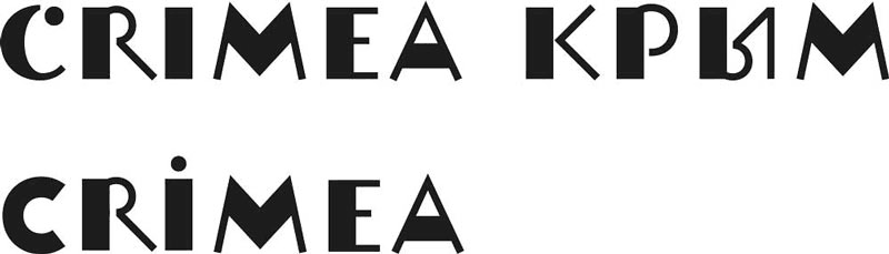
Choosing the C.
The designer walks by.
Going back to the logo. We need to experiment with the graphics. Maybe go with smoother contours or more active stretches.
Simultaneously working on the details of the typeface. Right now the text looks rough when placed in the circle, it also looks like the letter К turns into Ж. There is a problem with the slanted letter cut-off as well.
Preparing a presentation.
We should work more in the chosen direction. The art director suggests we go back to the plastic details. We can also try a more peculiar lettering while we’re at it.
Preparing more backgrounds and a straight text style.
