Deciding to take part in the contest to create a corporate identity for CSKA ice hockey club.
Reading the brief. Each participant has to provide three logos, a mascot and everything else (if they win).
The strange phrase “three logos” catches our eyes. Not “three variants of a logo,” but exactly “three logos.” Doesn’t look like a mistake. Googling.
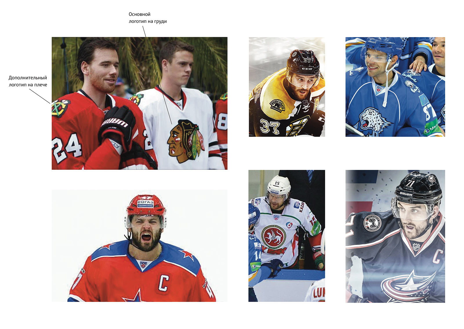
Indeed, according to an old hockey tradition (maintained first of all in NHL), hockey clubs usually have more than one logo. Most often, there are three: the main logo, the extended logo (made of the main logo with added text or lettering) and the additional symbol (often worn as a shoulder patch, but also often appearing on souvenirs). However, there can also be more than one logo, for example several additional logos. Finding the sportslogos.net website and spending a couple of hours there.
In KHL where CSKA plays this tradition is not as pronounced but also exists. Especially with teams that have recently had a rebranding.
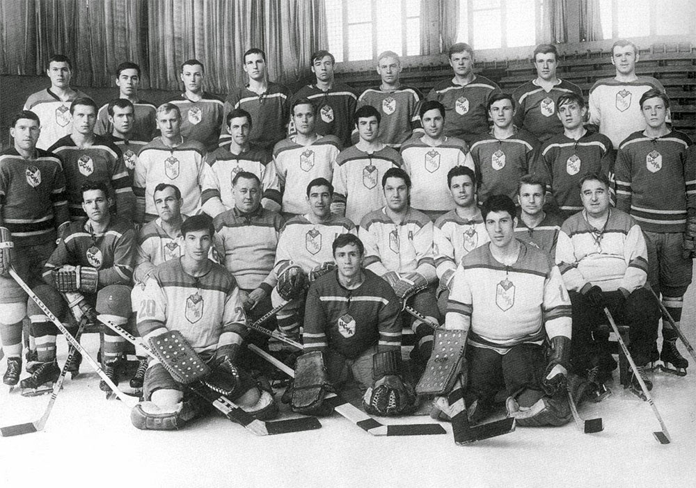
What do we know about CSKA? It was the most distinguished club in the USSR; Tretyak, Kharlamov, Petrov. Even those who don’t care about hockey or any sport at all know the classic emblem on the jerseys: a star with the letters CSKA below it.
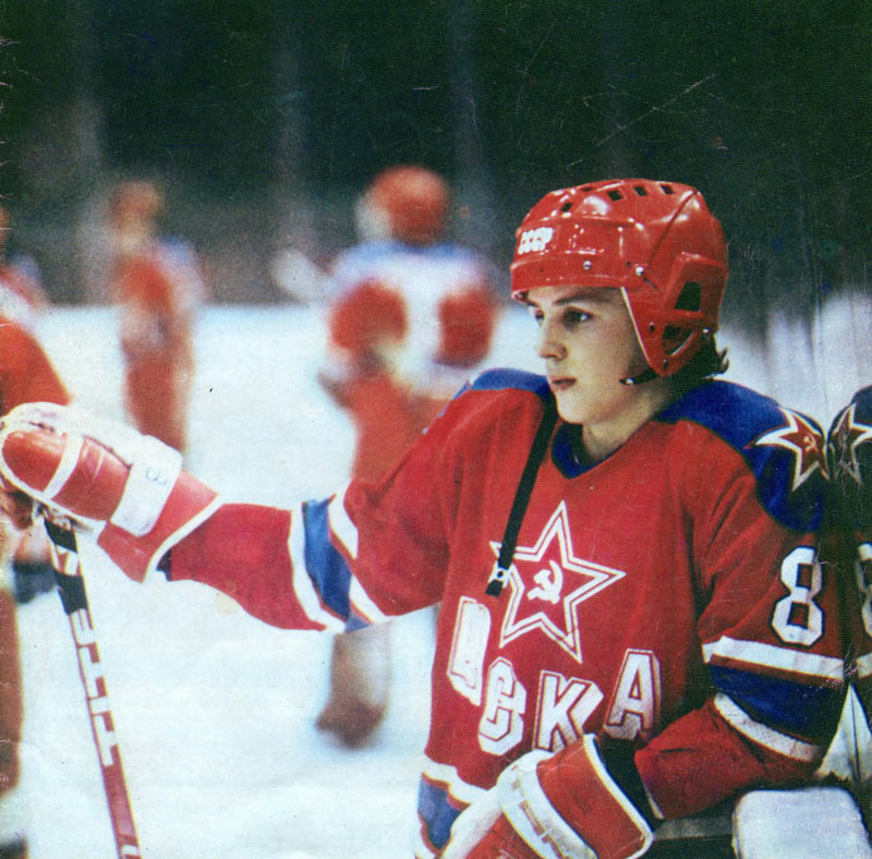
Interestingly, it was not exactly a logo in today’s sense. A star with letters is more like the word USSR on jerseys.
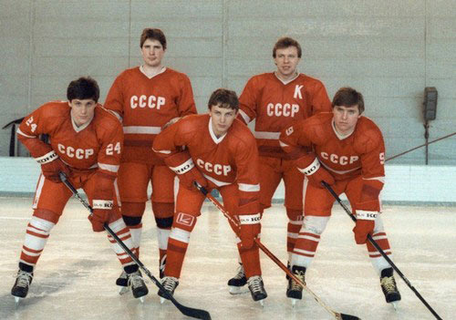
There were the USSR letters and there was the USSR “logo,” the Soviet coat of arms. In the same way, the CSKA jerseys had letters and a star, while the logo was the classic shield.

By the way, sometimes jerseys had the emblem on it.
Also, there is the horse. CSKA fans have mixed feelings about it: initially it was supposed to be an offensive nickname given to CSKA players by fans of competing Spartak. Officially, CSKA never had a horse mascot and the contest does not require us to provide it. The soccer club of the same name created their own horse during a rebranding in 2009, while the basketball and ice hockey clubs have always only had a logo.
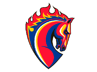
Why don’t we make the horse the third logo?
Overall, we now have exactly three ideas for three required logos: the legendary star, the legendary shield and the new horse. We know what to draw, now we just need to decide which one of them to make the main logo.
With NHL teams it’s very simple: most of the time the club’s name is made of two parts, the name of the city (or state) where the team is located and the name of its mascot. Mascots are usually animals: Anaheim Ducks, Pittsburgh Penguins, Florida Panthers. But it can also be a weather condition or even simply something cool: Carolina Hurricanes or Detroit Red Wings. This mascot is generally used as the main logo, often without the text, as the image is recognizable as it is.
Sometimes it’s the other way around: the mascot appears on the additional logo, while the main one is created around some nice graphic element.
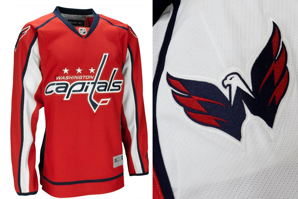
Of course, CSKA is not exactly Moscow Horses, but since we’re making the horse one of its logos, why not try making it the main one, too? Getting inspired by the soccer horse and trying to marry the shield and the horse’s head.
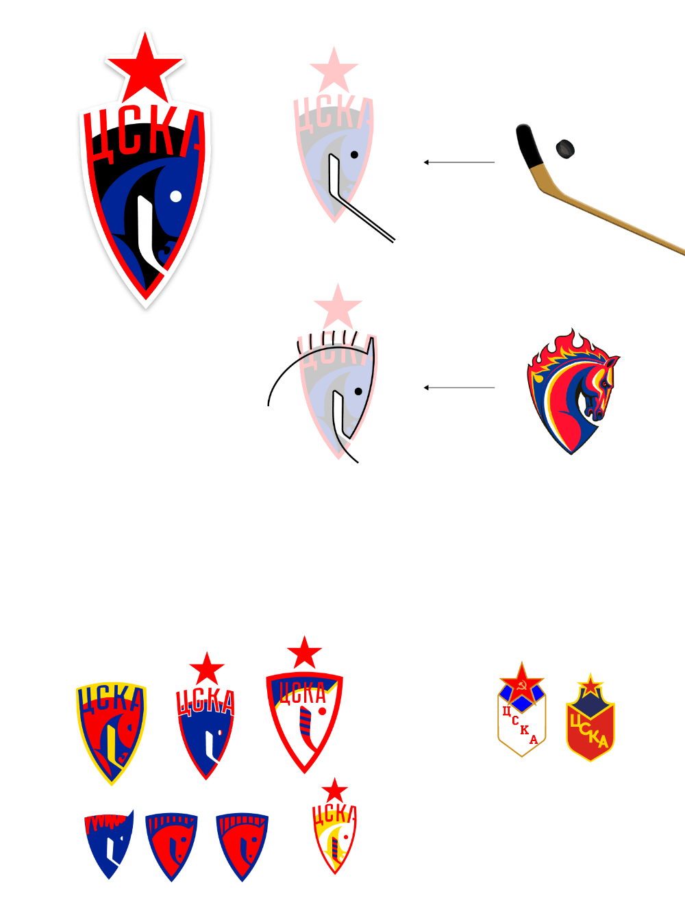
Unfortunately, the result is either a nag or a mare, but definitely not a cool-looking steed.
At the meeting for a different project the art director draws his variant of the logo with the classic star and five hockey sticks on a piece of paper.
He also sends in a sketch of the letters.
Starting to draw variations of stars and hockey sticks. Trying to make sure all three logos are in the same style from the start.
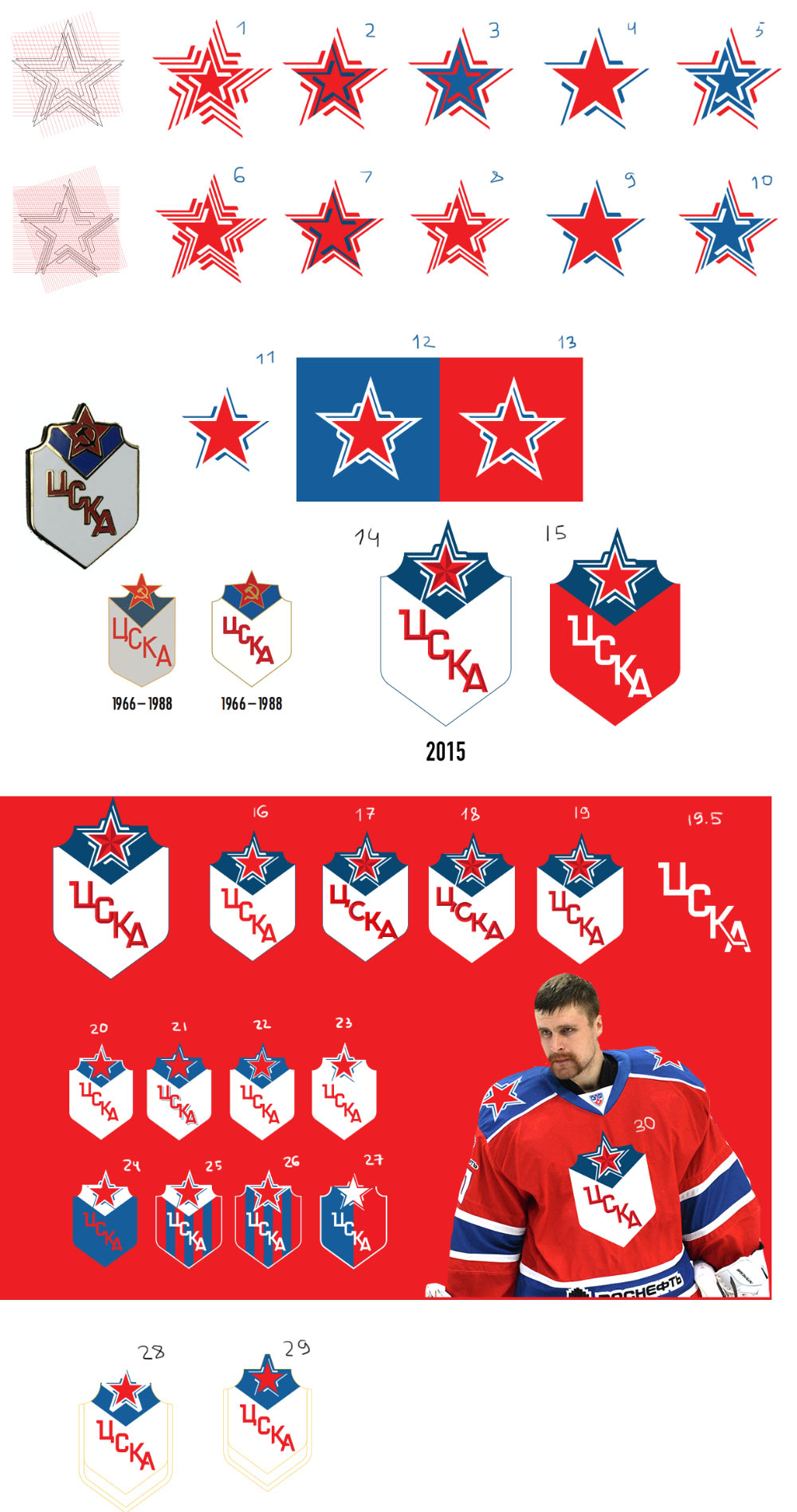
The big star already has hockey sticks in it, finding the version with the sticks on the emblem (51–56).
Using this design with the art director’s lettering.
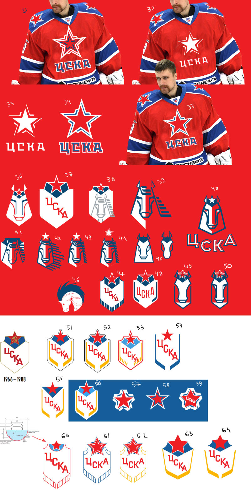
Now trying to draw the horse.
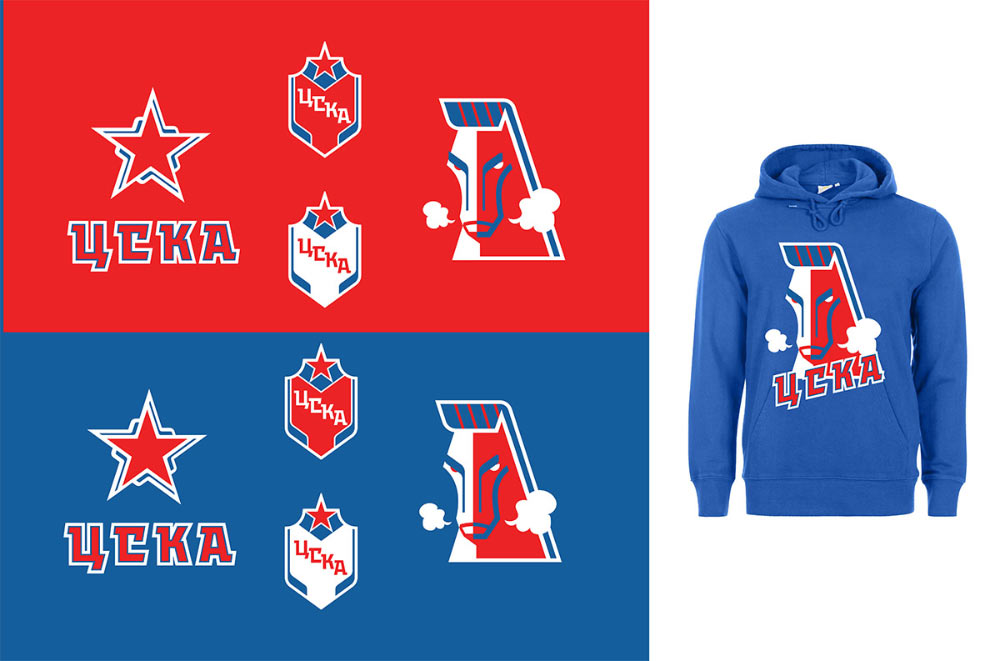
Nope, not what we need. Meanwhile, the art director submits his idea.
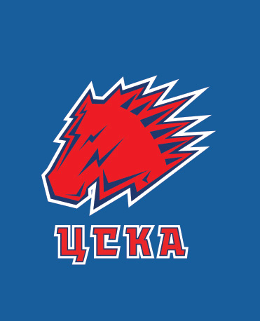
Drawing more horses, assembling a short list and sending it to the artistic director.
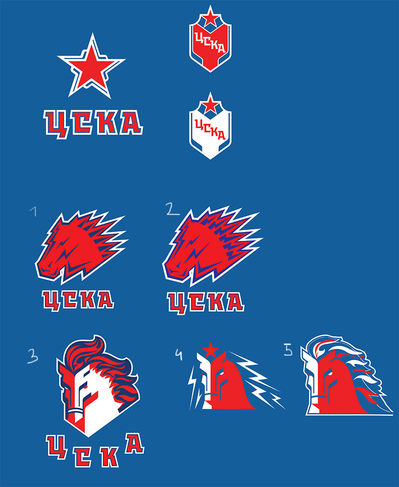
The artistic director chooses number 5.
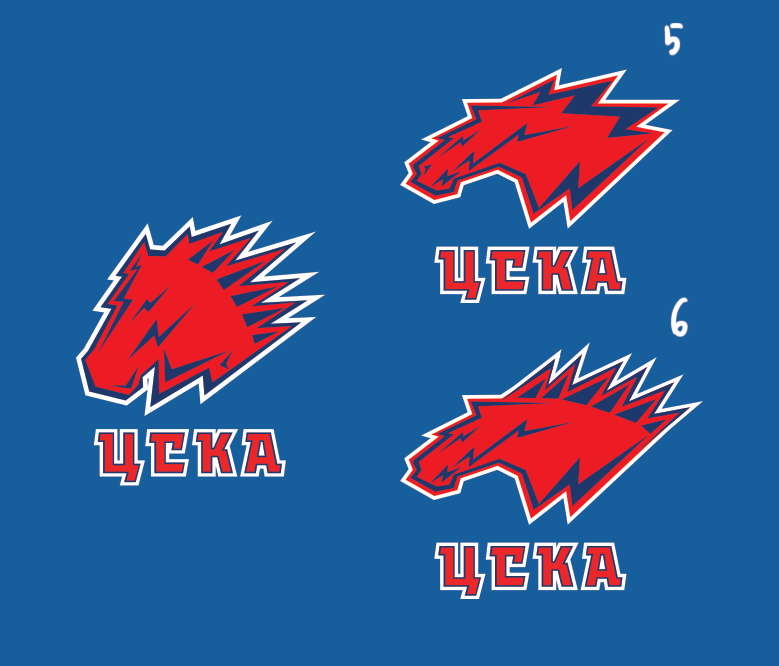
At the very last moment deciding to keep both horses, slightly changing the one chosen by the artistic director (adding nostrils and erasing the mouth) and redrawing the art director’s design. Including both designs in a presentation and submitting it to the contest.
Winning the contest.
Meeting the club’s administration and veteran players, presenting the concept of the logos. The result: we need to try using the classic logo without the hockey sticks around the star; the typeface was not appreciated (a more classic and reserved one is needed); the hockey sticks should remain on the emblem. The first horse out of the two is better.
Trying the star with and without hockey sticks, with and without the old typeface.
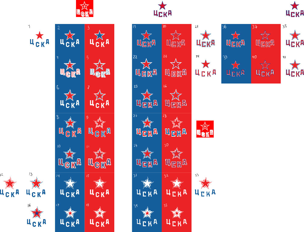
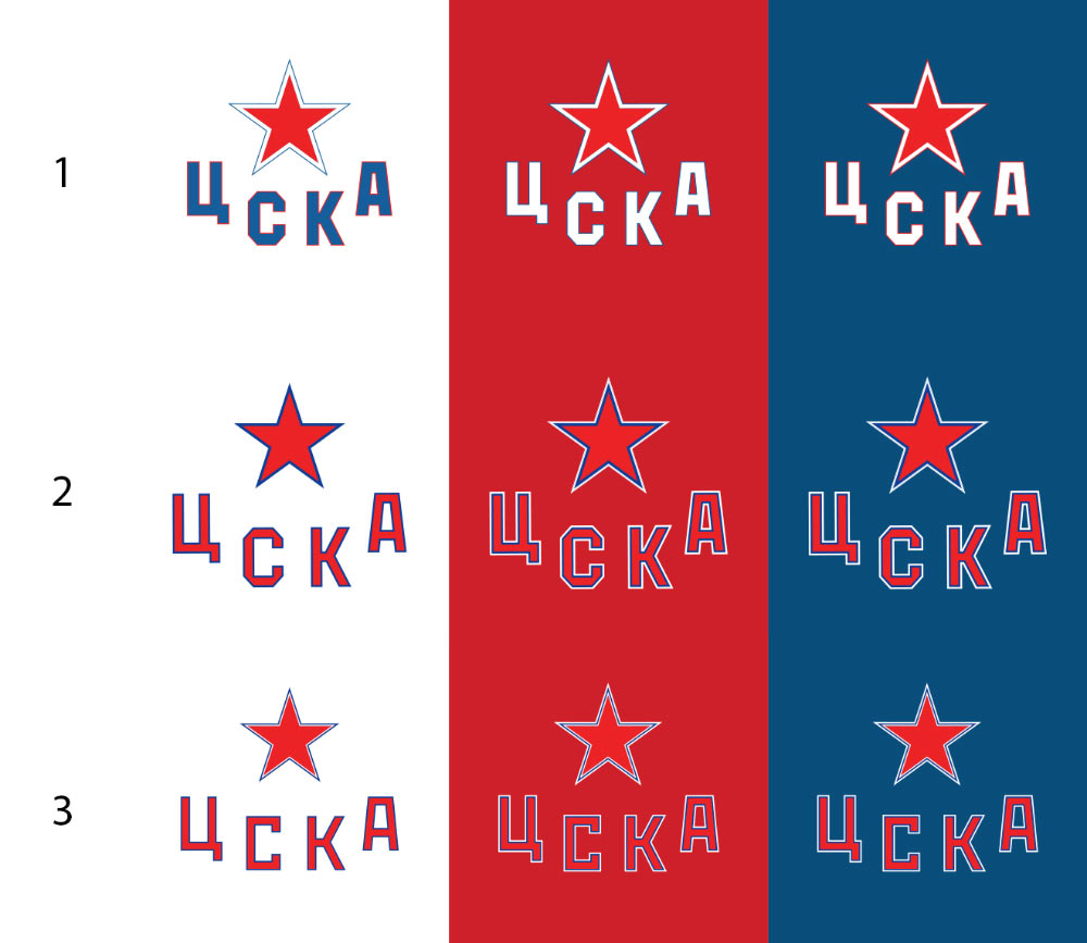
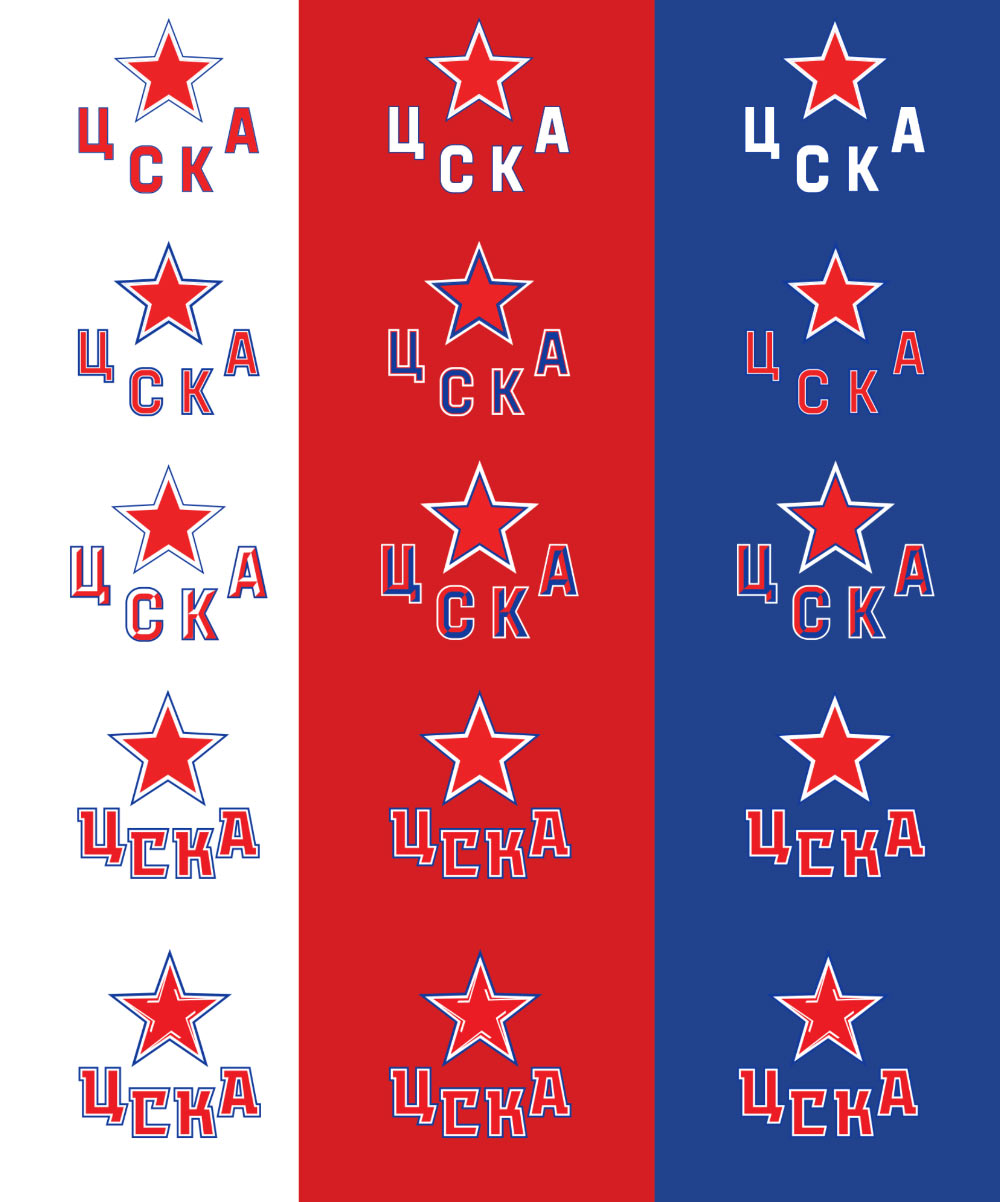
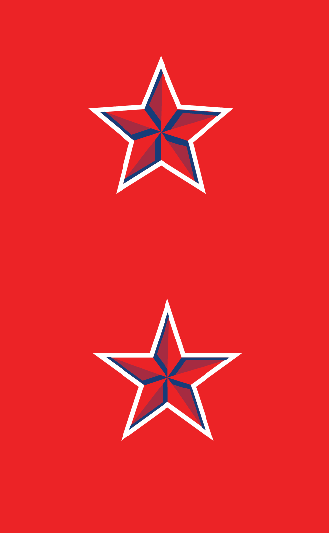
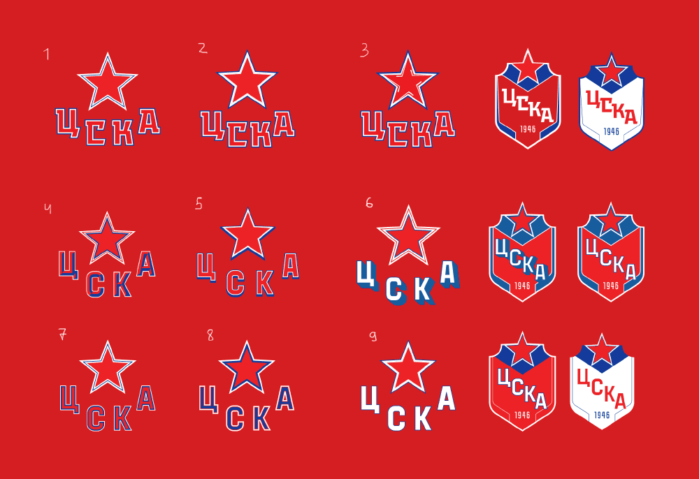
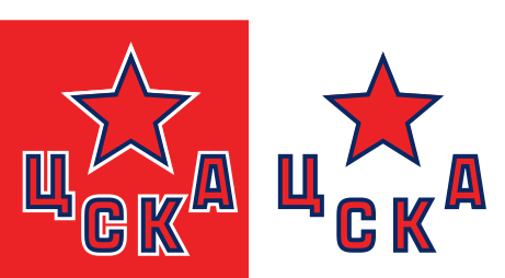
The client chooses the design with the calm letters and no hockey sticks and asks to make both the star and the letters red with double equally wide red and blue outline on all possible backgrounds, both light and dark. The idea is questionable, smaller sizes will inevitably show moire, but there is nothing we can do.
Trying to think of ways to convince the client to save the hockey sticks around the star. Remembering that in addition to the primary CSKA ice hockey club there are two farm teams: Zvezda and Krasnaya Armiya. Both will require a matching style update according to the contest rules. What we now have is a beautiful concept: Krasnaya Armiya with several rows of hockey sticks, Zvezda with one row, and CSKA with no sticks at all. Which creates a nice division: the younger players, the more experienced ones and the primary team which doesn’t need any sticks because everyone knows their star already.
Per the administration’s request, placing the letters at an angle for Zvezda and in a circle for Krasnaya Armiya.
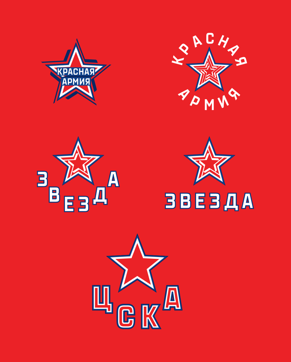
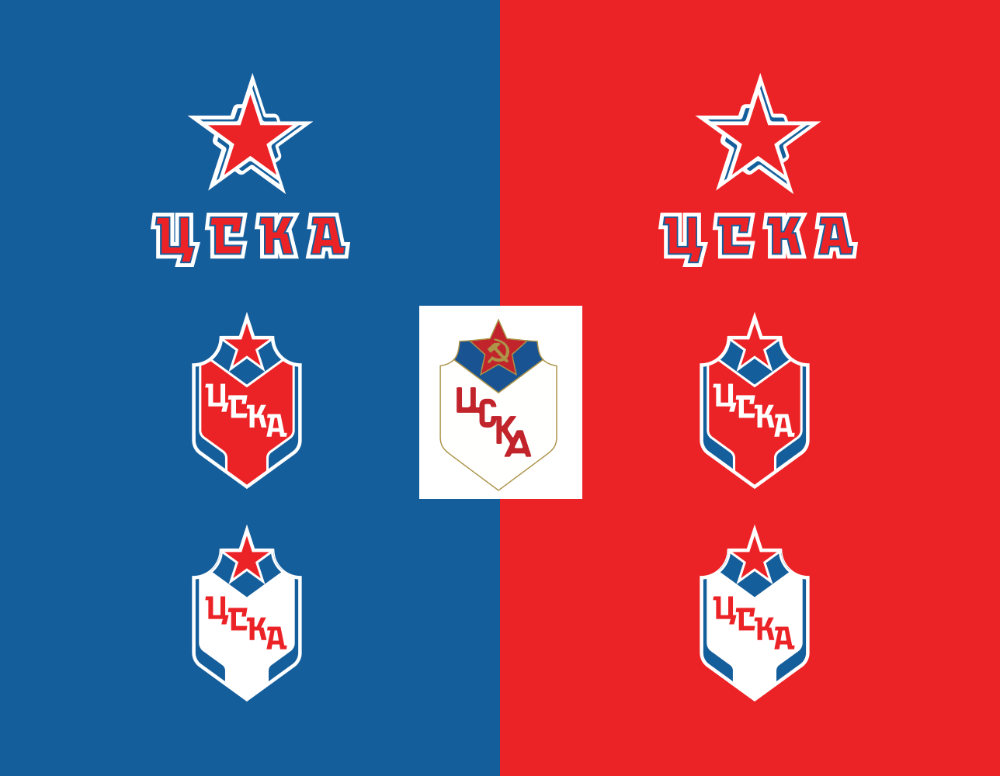
After short consideration the client gives the answer: remove the sticks from all logos, make the letters on all logos similar to how they are on the main logo, in three colors.
Uniforms
According to the contest we also need to provide sketches for uniforms. Beginning.
We want the uniforms to feature all three logos. If we make the star the main logo, then either the horse or the shield will become the additional one. It would be logical to place the shield where military uniforms normally have their chevrons.
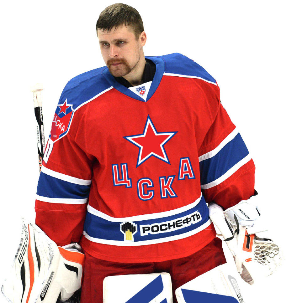
However, according to the NHL rules, this place is designated for the sponsor’s logo and the additional player number, which means we can’t put the shield there and in any other place it would look plain odd.
Thus, we now only have the star and the horse to work with. If we were in NHL, we would have done something like this.
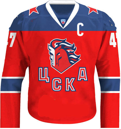
Or even like this.
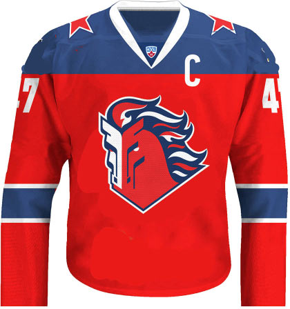
But we aren’t in NHL, which means we have to put the star and the letters on the chest. At the same time, everyone at the club really liked the new horse and it has to be featured on the jerseys in one way or another. Placing the horse on the shoulders and the star on the chest. The red (dark) jerseys are home, the light ones are away. Below the logo on the chest and on the shoulders are the sponsor’s logos.

As another option, trying to place the horse with the letters on the third set of uniforms, but ultimately deciding against it. First of all, it looks too much like the uniforms of Saint Petersburg SKA club (SKA has blue home uniforms, CSKA has red and it’s better to never mix it up). Secondly, the third set of CSKA uniforms is made in retro style and that’s not going to change any time soon.
Finding place for the shields inside the numbers on the back, piling up various ideas for the uniforms and meeting with the client to discuss the chosen direction.
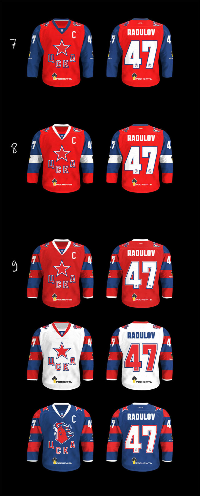
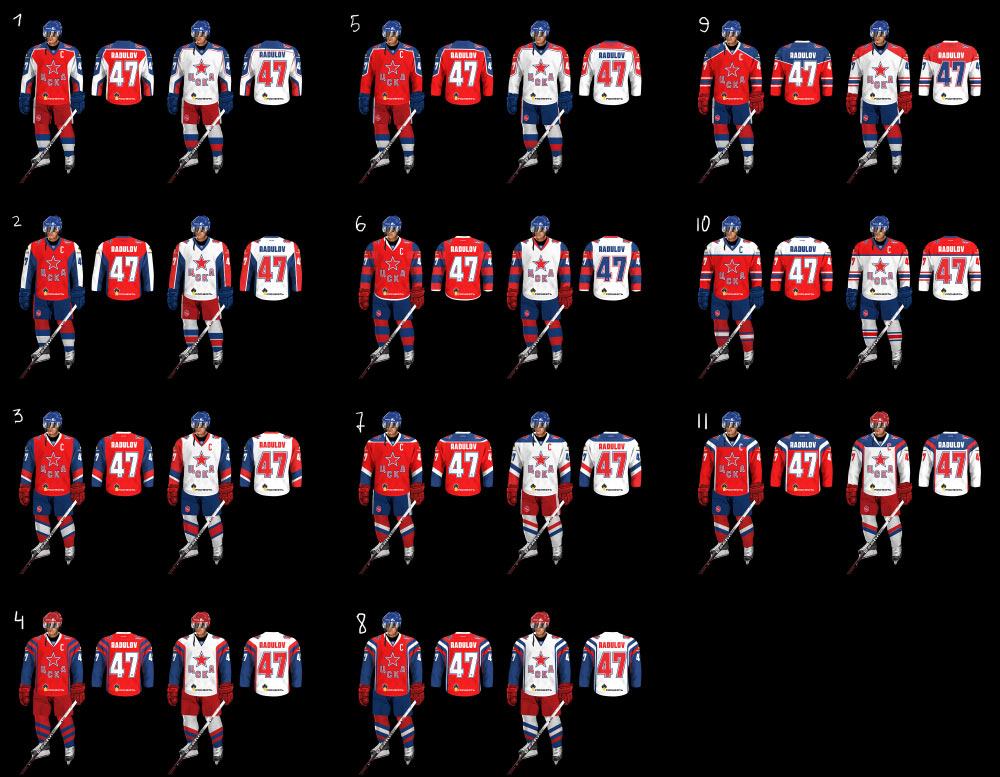
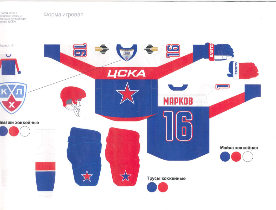
At the meeting we find out that the shorts, helmets and gloves of CSKA players can only be red (which is another tradition), which means that any of the designs featuring blue simply won’t work. Borrowing the manager’s laptop and recoloring all that’s blue into red right at the meeting. Ultimately choosing three directions: 1—with unusual chopped shapes; 9—the classic design with blue shoulders and stripes on sleeves; 4—with hockey sticks.
We are also asked to produce another design similar to one of the last season’s mock-ups.
Out of nowhere, we receive a letter from Gazprom, the founder and main sponsor of CSKA:
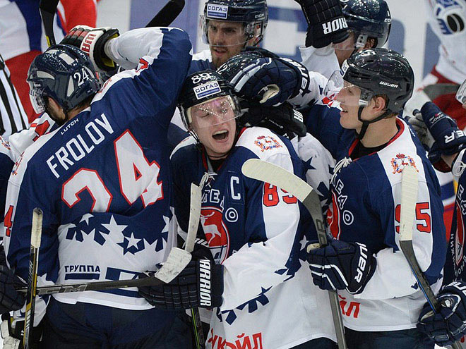
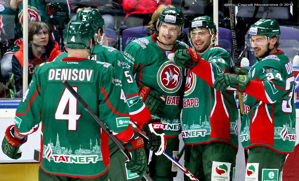
—Right now the Rosneft logo is barely visible and is not at all integrated into the jersey design. Please ask Art. Lebedev Studio to suggest ideas to make the logo more noticeable and better integrated. Please send them our brand book to make sure their design follows it. Also, please have a look at the attachment: logos of Tatneft, GAZ Group and Lukoil are much better integrated in uniforms.
Looking at the GAZ and Tatneft logos mentioned in the letter.
Now at the Rosneft logo on the previous season’s jerseys.
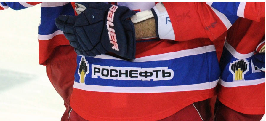
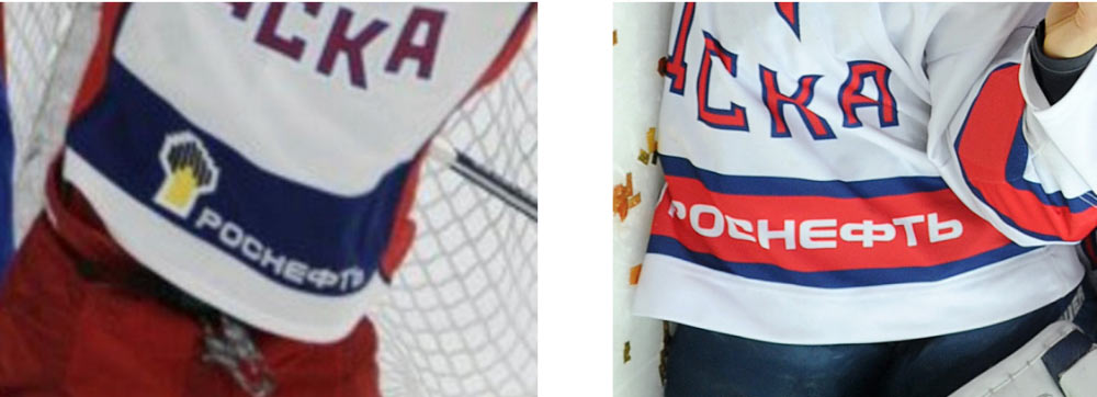
Sadly realizing that we will have to draw a thick white outline around the colored logo with black letters, but suddenly finding an interesting opening in the Rosneft brand book.
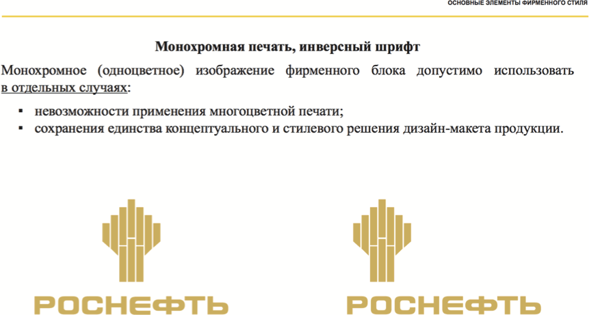
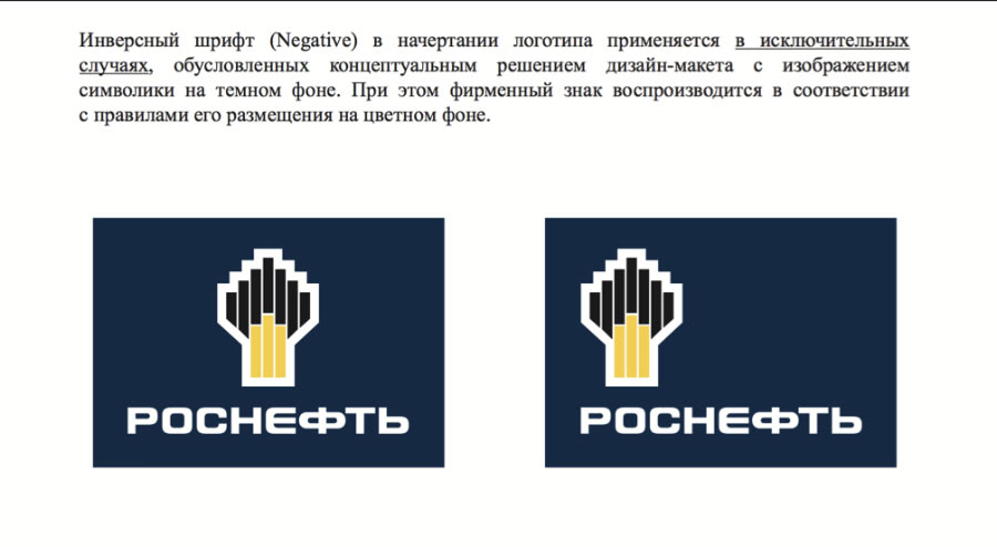
Uniforms of the country’s most famous ice hockey team, isn’t that an “exceptional situation?” Plus, we will surely be “maintaining the unity of the conceptual and style solution.”
Deciding to place only monochrome logos on the uniforms and even remove the logo from the chest. Preparing a presentation for Rosneft to explain why this is a good thing.
By this time, only three designs remain from the short-list of mock-ups presented to the client at the first meeting. By request of the client, making the colored stripe on the chest thicker on one of the versions which eliminates the uniform background under the star (later we will drop this idea).
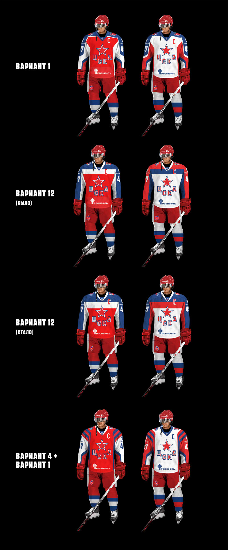
Later we decide to discard the hockey sticks idea as well. There are only two ways to implement such a complex pattern on fabric: either assemble it of many red and blue pieces, which would make the jersey a couple pounds heavier and very rigid, or by using sublimation printing which makes jerseys appear very cheap and glossy.
The designer still hopes to keep the more classic design of the uniforms.
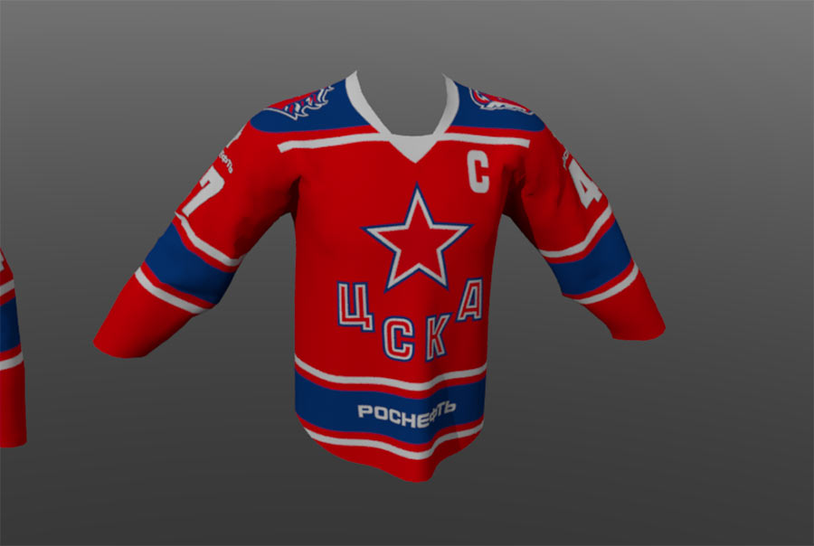
No, keeping the two chosen uniforms.
An answer comes from Rosneft:
—Keep only the text “Rosneft” (without the logo); the text should be white on red background and black on white background. Just in case, I’m sending you the excerpt from NHL uniform rules describing all advertising zones on jerseys. We need to fit the text “Rosneft” in the dimensions of the corresponding advertising zone. Let’s keep the logo on the shoulders the way it was in your mock-up.
Victory, it seems.
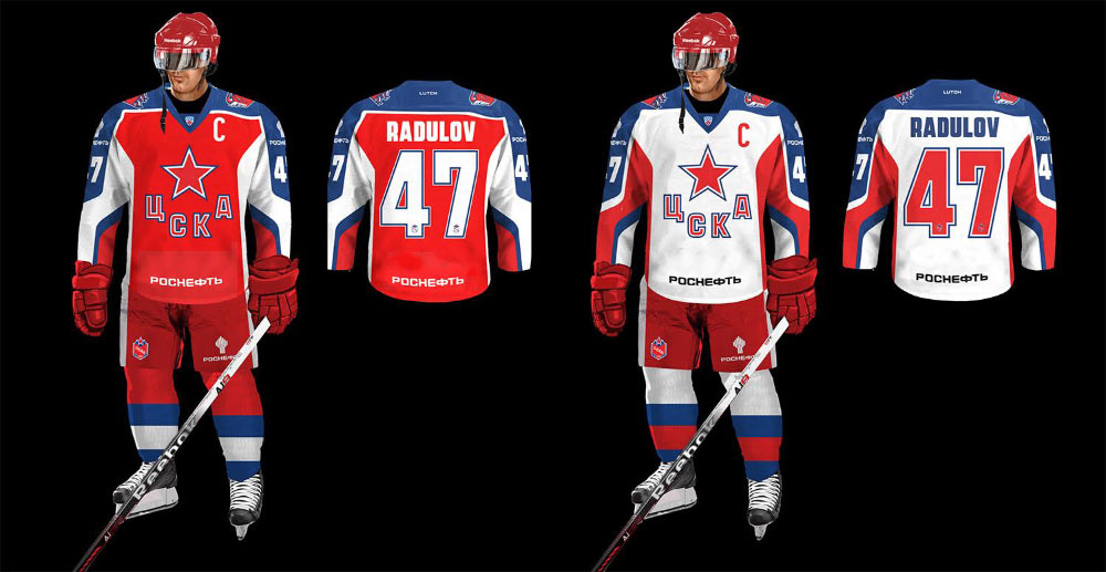
Nope, it only seemed so. A week later Rosneft asks to print all logos in color with a white outline. Suggesting to include both variants in the guide, monochrome (preferable) and full-color.
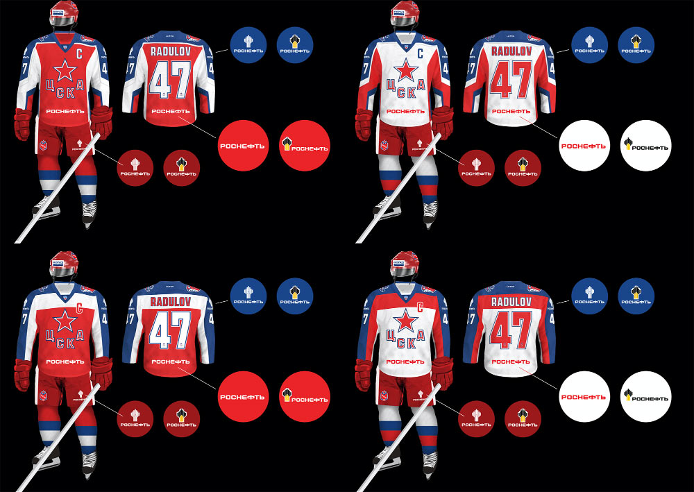
But ultimately receiving the final decision: a single-color text block without the logo on the chest, a full-color logo on the shoulders.
