Client: We are manufacturing metal doors and gates. We are working in the B2B sector. The door market is very competitive and if we are to speak of Russian companies, very segmented: each federal district has its own producers. But there are also foreign door brands that are recognized all across Russia: Hörmann, Zaiger, Doorhan. They are recognized among other things, by their logos. We want to be known in a pretty narrow circle of businessmen and builders working with doors. To make sure that a person holding our offer and looking at our logo can say “Oh, it’s the guys I saw at an exhibition! I want these doors.” Yes, we take part in exhibitions, develop our products and services and grow our knowledge! We carefully control the quality of our doors and listen to the feedback from our clients. We want people on the internet to remember our logo for a long time after they’ve seen it. We promote ourselves on the internet and most often people find us when they search for “doors delta novosibirsk.” In this market, price determines a lot of things, but now we have clients working with us not only because of our prices. We don’t want people to remember us as “cheap doors,” we want to be synonymous with “quality at an affordable price.” The doors themselves will be one of the media for the new logo on their packaging and plaques. We have no strong preferences for colors but right now blue dominates in our materials. No preferences with regards to shapes either. It has to be something memorable so that people can see the logo and think: oh, these guys make quality doors.
Designer: Discarding the delta triangle immediately. Thinking about the product.
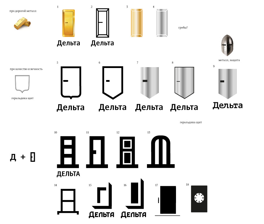
Art director: 11 is what they need.
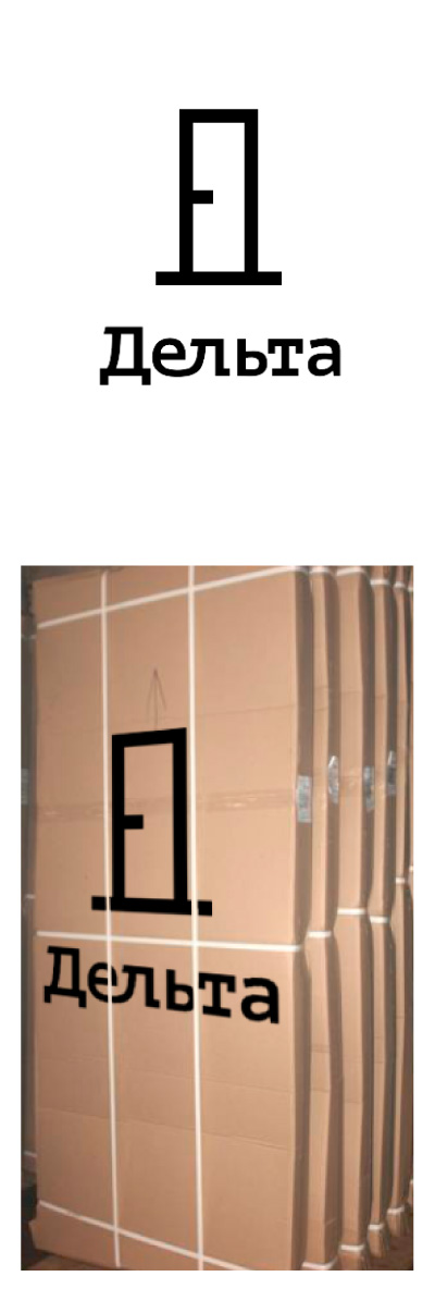
Art director: Yep, it’s OK.
