Client: Hi. We would like to get designs for a logo that would have the company’s name in Russian and in English on it. Our website will be at www.dentalcenter.clinic, maybe you can use that somehow. We have a request about the colors: please use orange and green (bright green) in the design. We would like to see colors similar to those on the Skandinavia clinic website at www.avaclinic.ru. I would also like to remind you that our clinic is located in Adler, not in Moscow)
Designer: How about we remove the extra tooth for the sake of a nice rhyme? Looks like a great Hollywood smile, but only in the Cyrillic version, the R still sticks out in the English version.
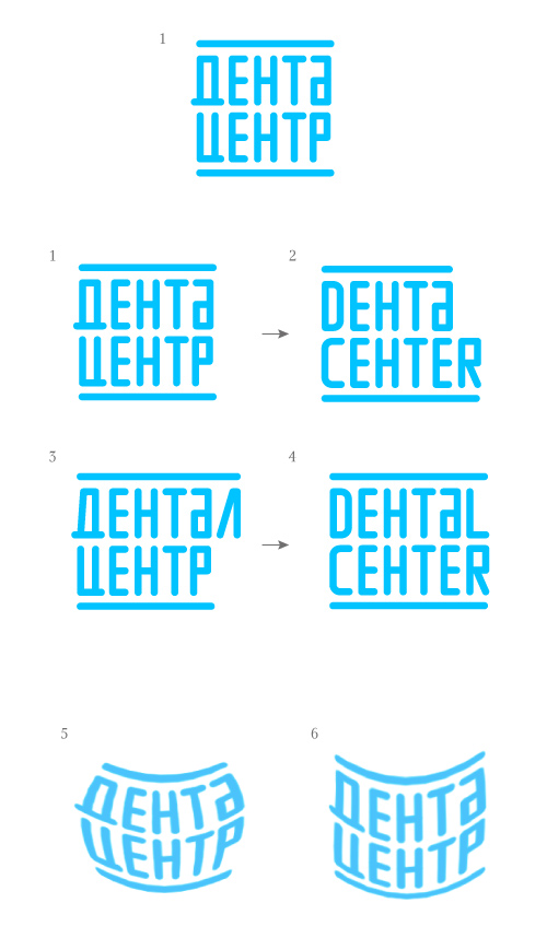
Art director: Looks simplistic.
Designer: Of course there is the N)
Designer: A bitten acorn, a brick and a chocolate bar made of reinforced concrete. Also, snow-white teeth with a shine in counterform.
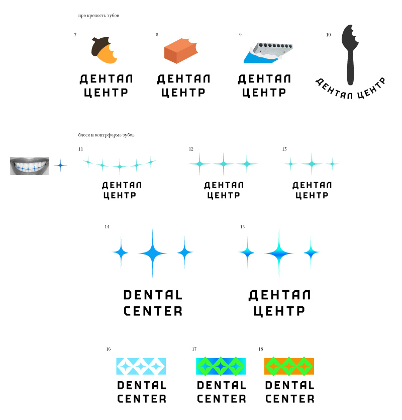
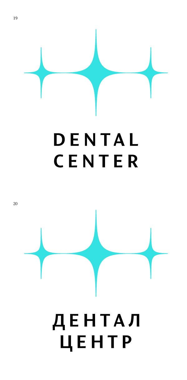
Art director: 14 is OK.
Art director: Kerning of ТА is poorly done. And the color sucks.
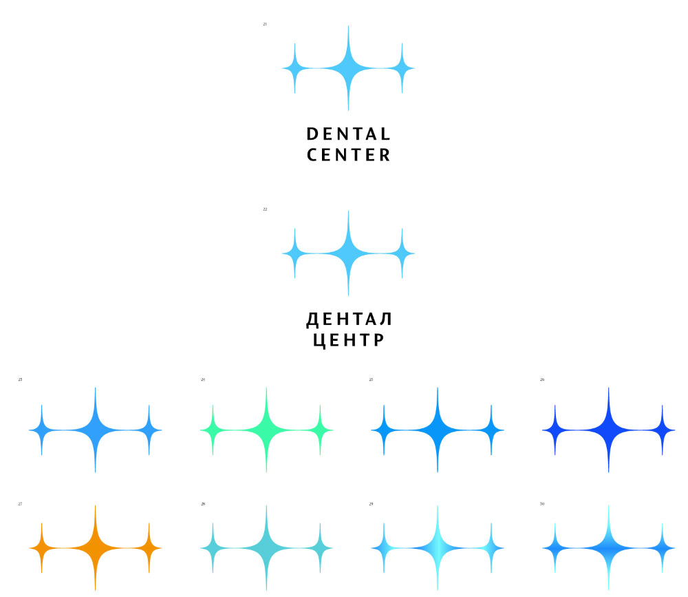
Art director: 22 is OK.
