The making of the Moscow parking signs
Overview Process
Getting the task from the client. Learning that Moscow Parking is in charge of two types of parking spaces in Moscow, street parking in the center and parking lots all around the city with gates and entry cards.
Starting with the street parking. Analyzing the current situation.
Drivers
Drivers come downtown and leave their car for several hours paying for parking with the help of one of the payment methods. The drivers care about payment mechanism only the first couple of times, then the process differs only by rate and zone number. Which means that rate and zone number is the most important information, while payment rules and additional conditions are secondary.
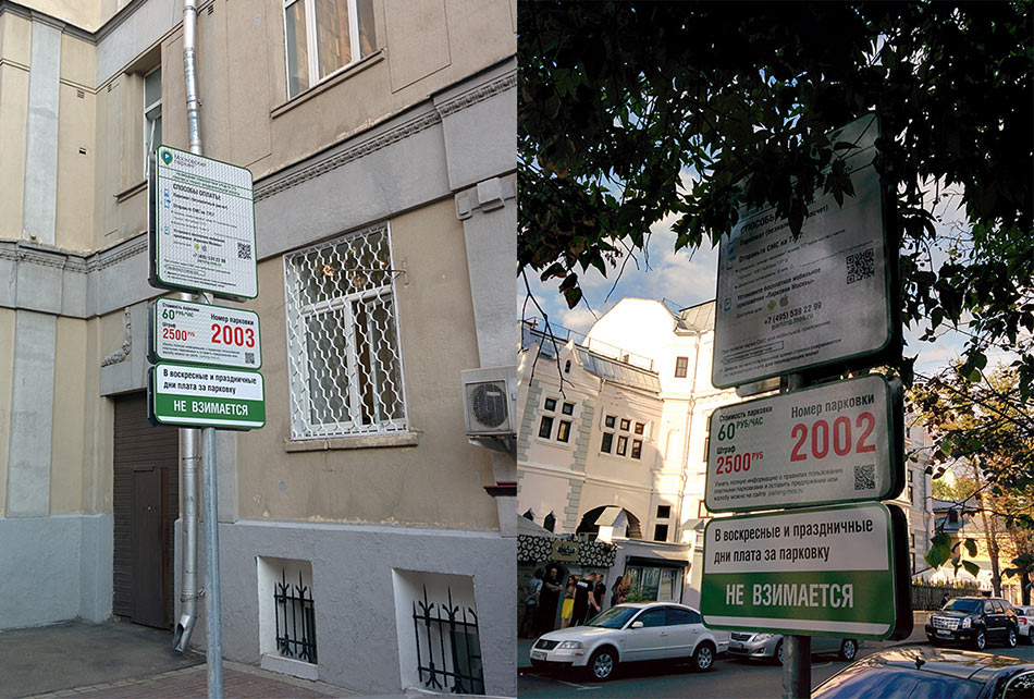
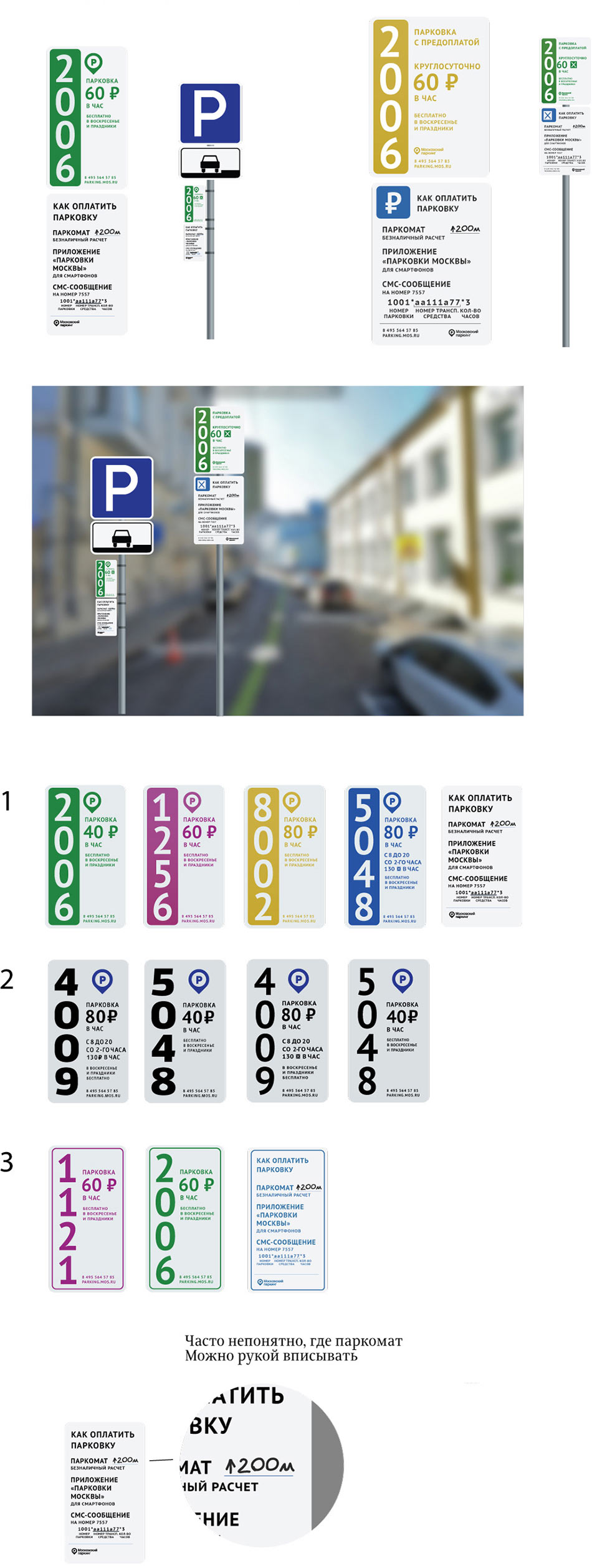
In the current signs it’s exactly the opposite: much space is wasted on instructions while the zone number and rate information are hidden somewhere in the bottom. Also lots of fine print that no one wants to read and understand. Black text on dark background is likely poorly visible during night time.
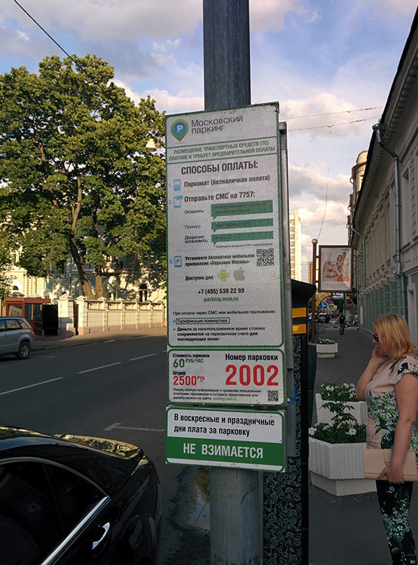
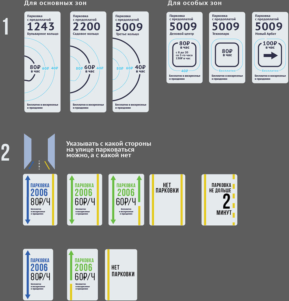
There are also large signs with detailed parking rules which probably shouldn’t even exit. They are hanging high, have small text and super large size. Their only benefit is that they display zone number and rate information in large type.
Pedestrians
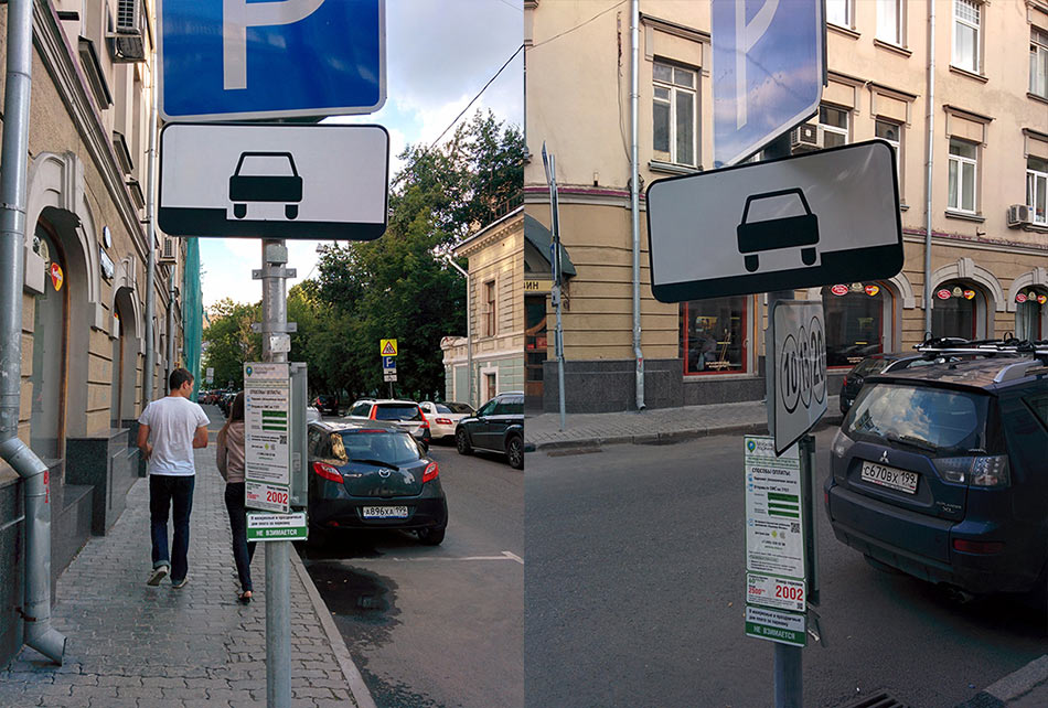
Pedestrians bump their heads into and tear their clothes on parking signs. We need to suggest a new way to mount the signs or at least rethink their size and hanging height.
City appearance
The signs are placed on every post in the center of the city and we want them to be pleasant to the eye. Keeping it in mind.
Putting together the first ideas on sign design.
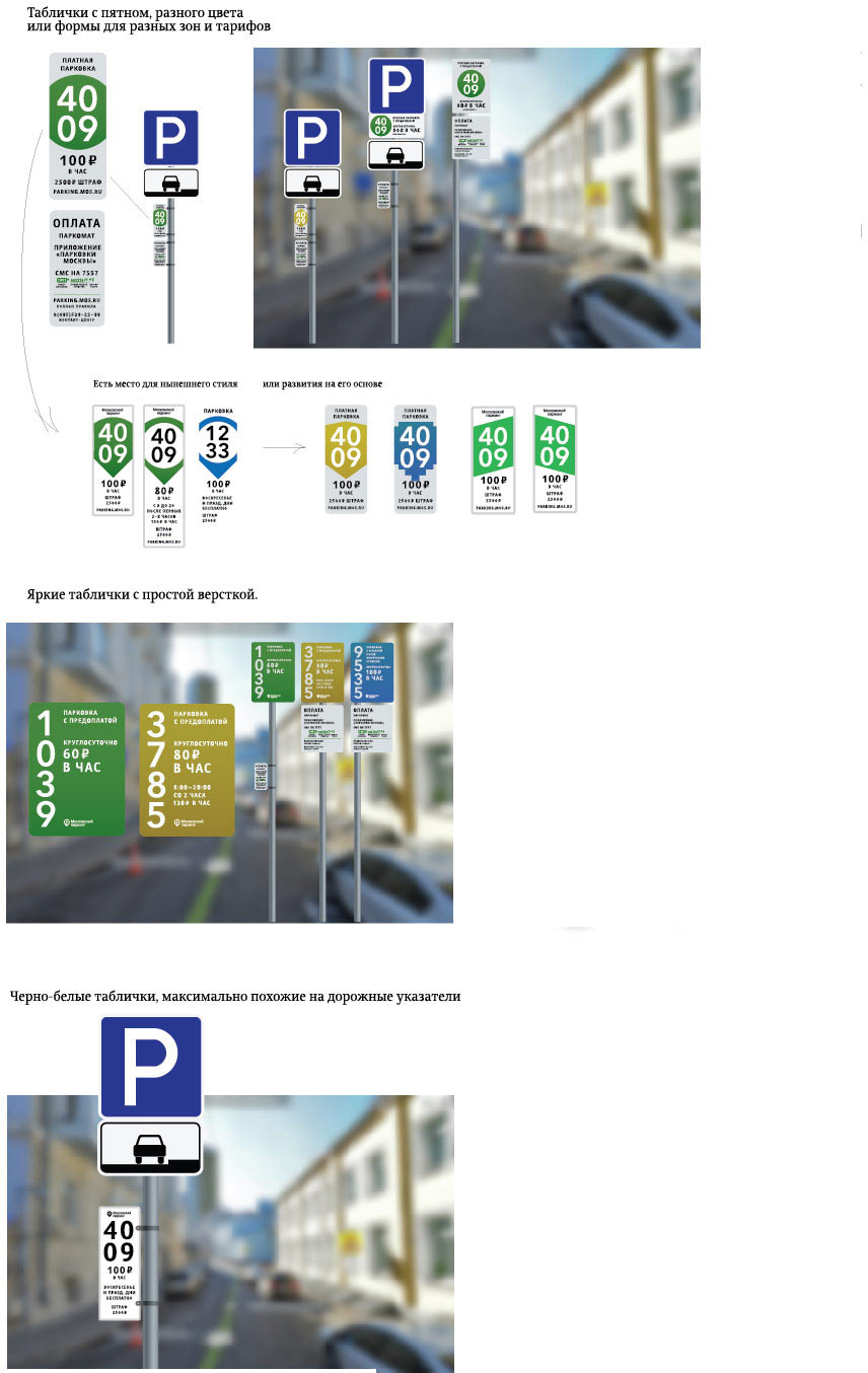
We don’t want to use colored backgrounds, they might come out looking like street advertising. The designer leans towards the road sign aesthetics with a super simple black and white design.
Art director: We need to aim for noticeable and recognizable neutrality of course, as these signs will be on every street in the city. We can’t break the number into two lines.
The ornate explanation means that the monochrome variant will not work.
The reason we wanted to put the number in two lines was that it would allow us to use a larger type to make sure the number is easily seen from a distance. Trying to write the number vertically. Using different colors for different zones.
Art director: The number has to be written horizontally. This is a must.
The fifth letter with the same boring pictures sent by the designer ultimately provokes the art director’s rage. We need a cool feature. Inviting two more designers to join the effort.
Designer #2 suggests two options:
Art director: OK, we can show that to the client.
Designer #3:
Art director: These designs must be at least 10 years old.
After taking some time to think, Designer #1 returns with two ideas:
1. To indicate rate zones visually, showing where the driver is now and which ones are nearby.
2. To show right on the sign which side of the street the driver can park on.
Art director: Cool, that’s great! We need to develop the first one.
Trying to add the river and make a dent in the Boulevard ring to make it look more like Moscow.
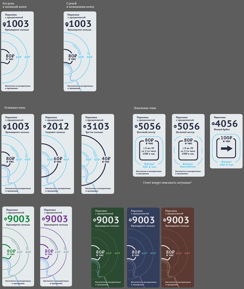
The river is OK. The colored backgrounds are not. It is also unclear how to apply this design to special rate zone signs.
Showing three concepts to the client.
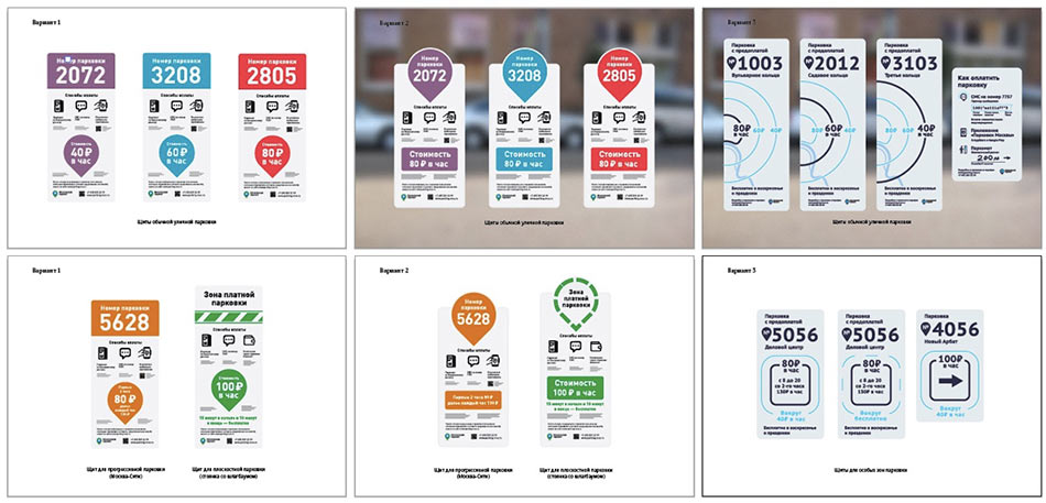
The client hesitates between the second and the third designs.
He likes the second one because it has a large colored location mark, there is also continuity with the the parking logo and style. The third option is also interesting but looks a bit dry due to monochrome graphics. It’s also difficult to envision signs for special rate zones in this style.
Trying to make it brighter. Maybe use zones to show parking zones?
Looks like crap.
Making a bold move. Marrying the two concepts together, circles and location marks. This gives the sign a splash of color while also retaining the circles. Maybe, we could count them, too.
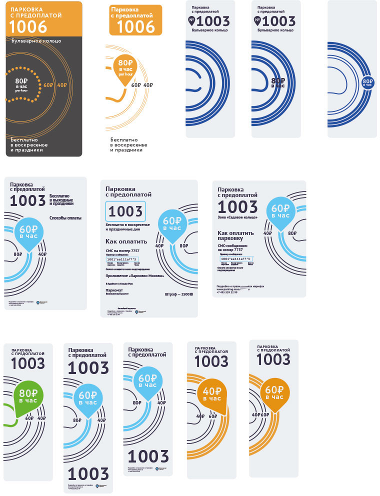
Designer: Another iteration of the signs. I tried them in large and small scales, added color coding. What if we show each zone with several rings according to their number?
Art director: No. Any driver can count to three, nothing justifies this Adidas bullshit. We need to cut down the number of elements in the design. It is enough to show the three rings and highlight the active one.
Art director: OK.
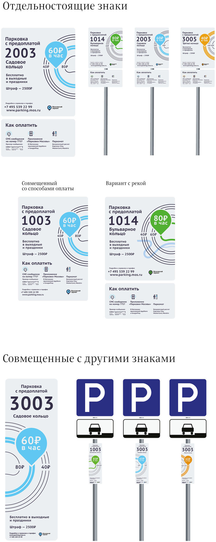
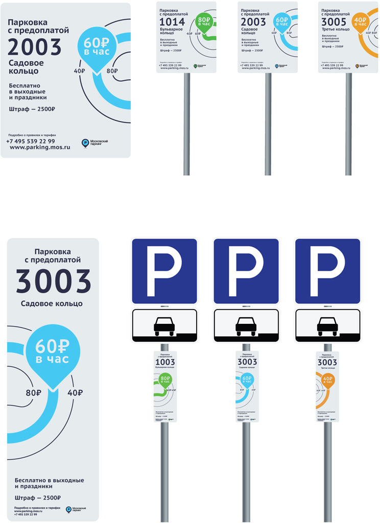
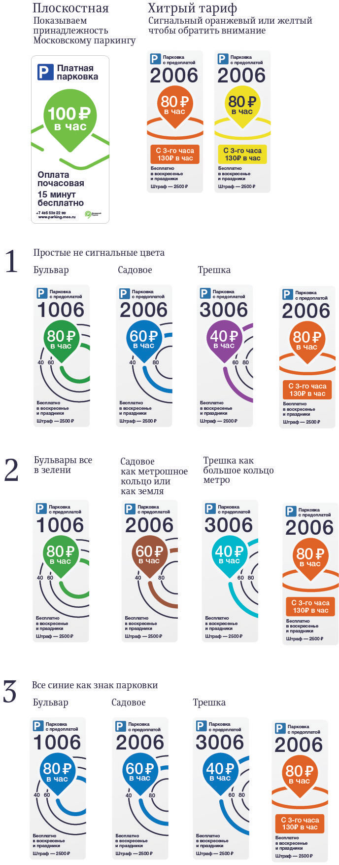
There are also signs for local zones and parking lots. Trying to use a square to designate parking lots. We want to show that this sign applies to a certain place, not the entire street.
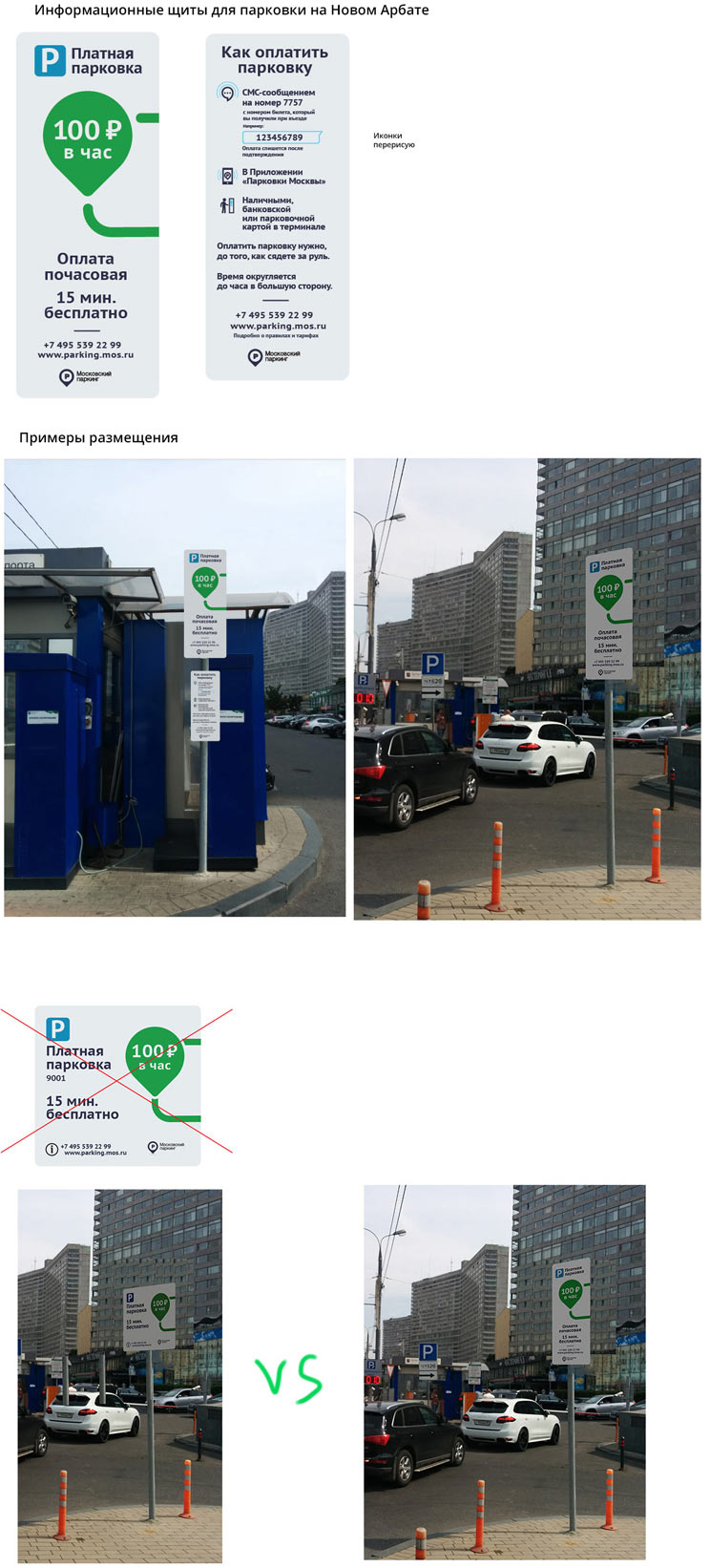
Using photos to try out the result.
Even fellow designers fail to understand the meaning of the square behind the location mark. The rest of the designs are simply crap.
Searching further.
Putting together a short list.
The first design is OK, it looks both like a parking lot and an enclosed area. The third one will be later adapted for special rate zones.
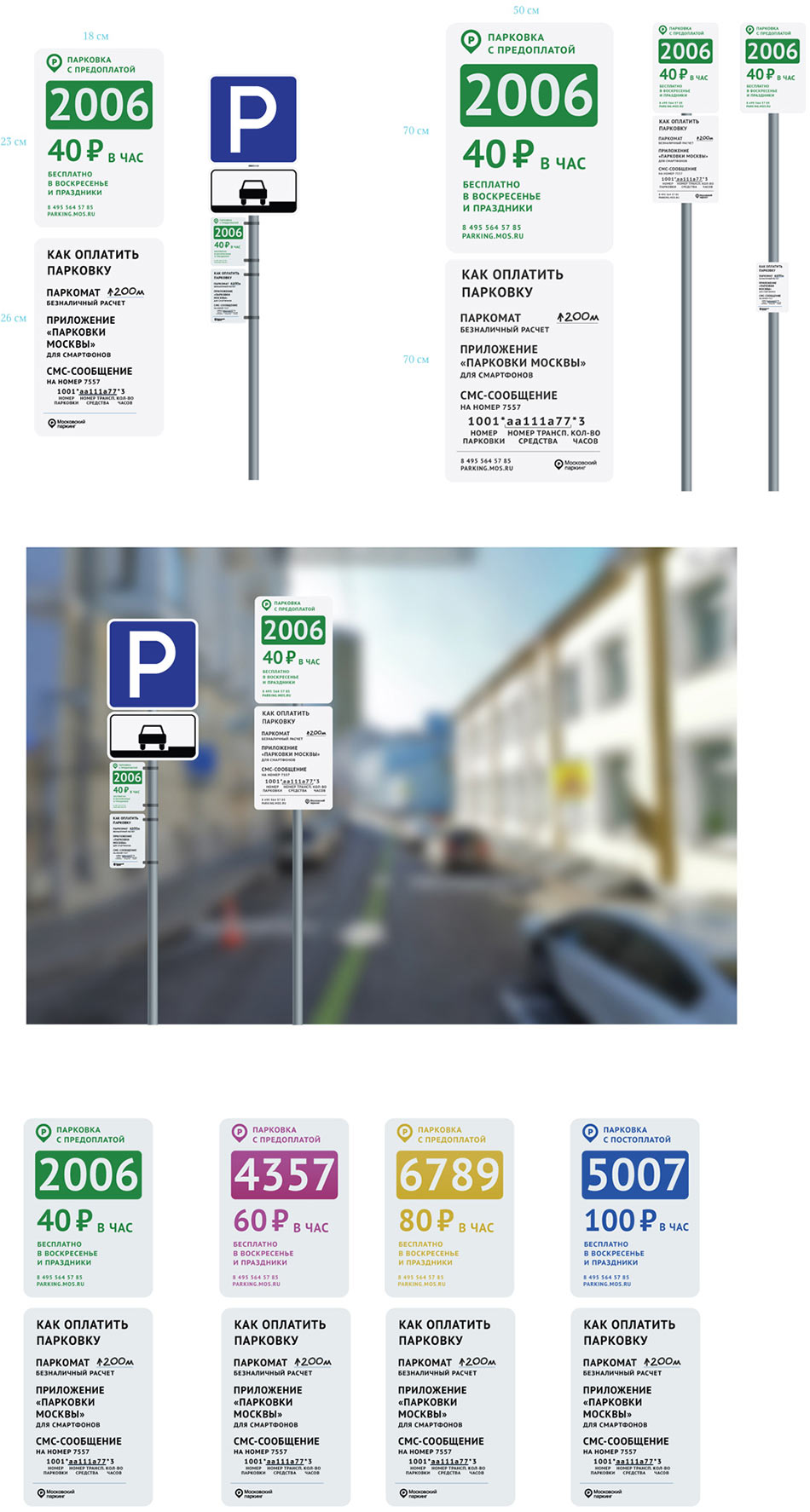
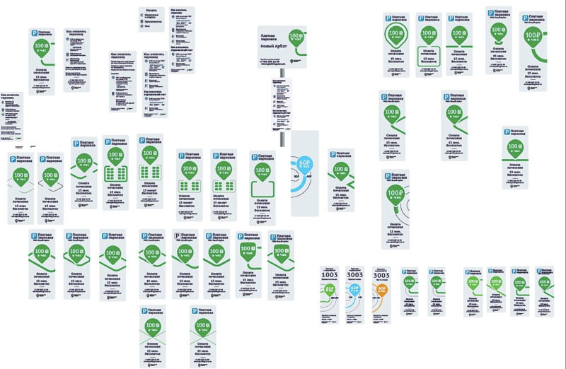
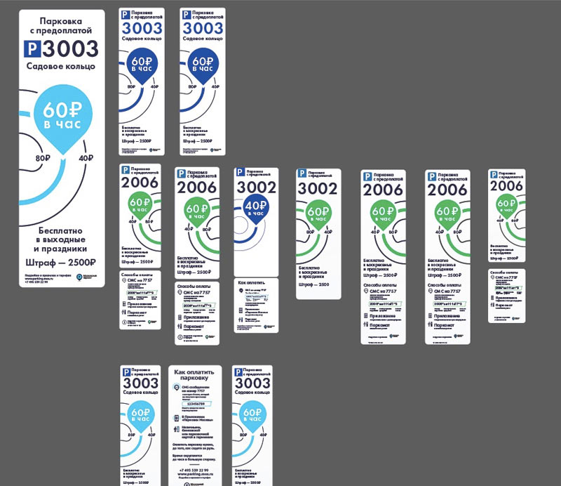
Going over the layout once again to make sure the information is placed as densely as possible to make the signs small.
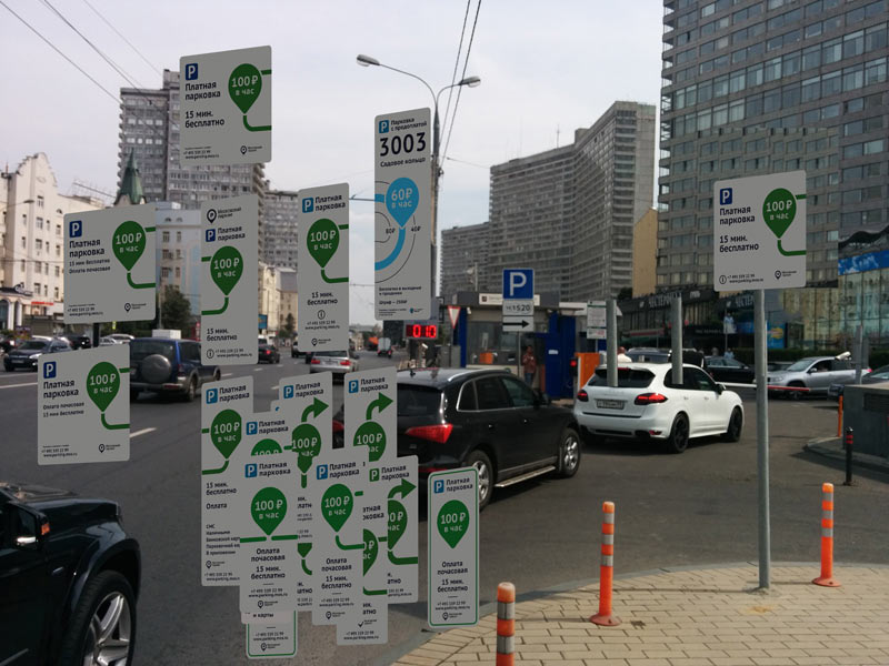
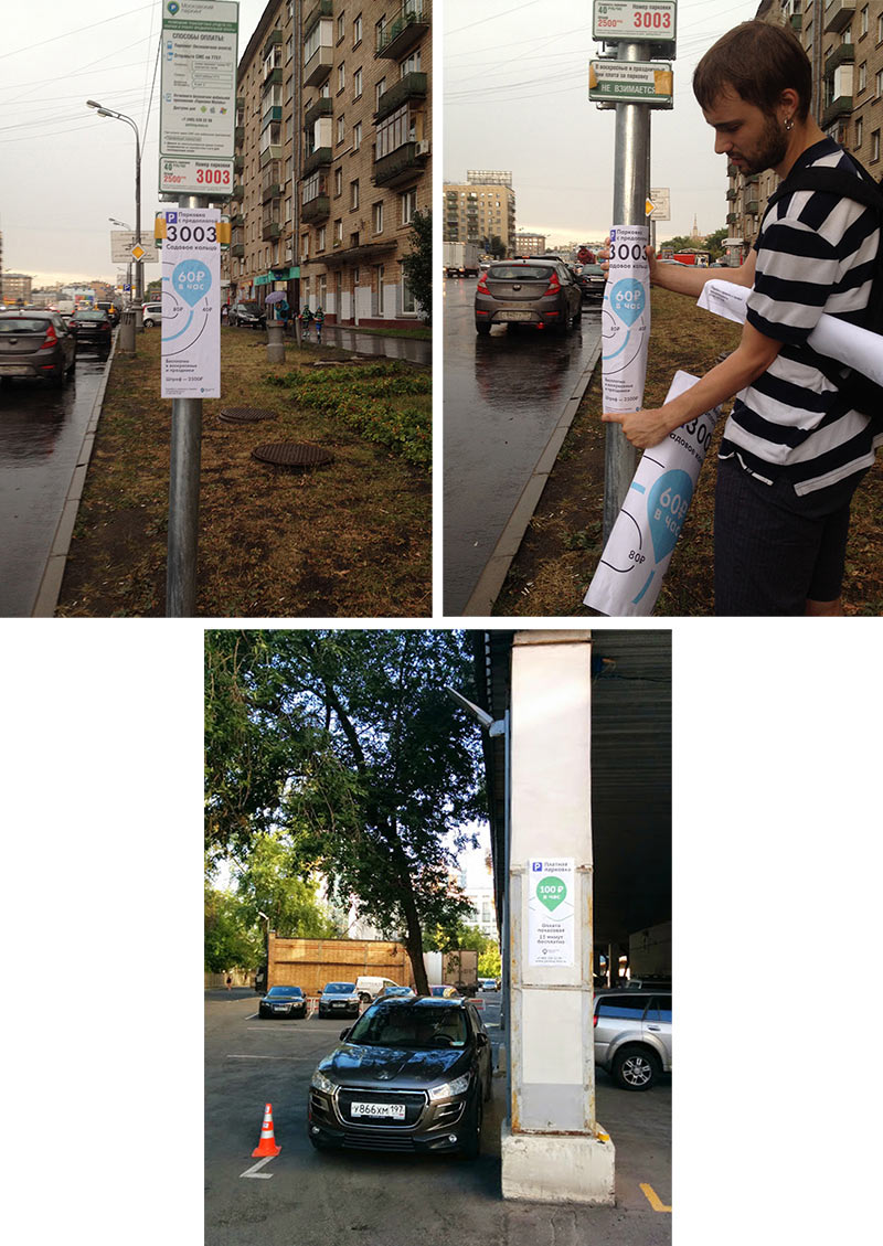
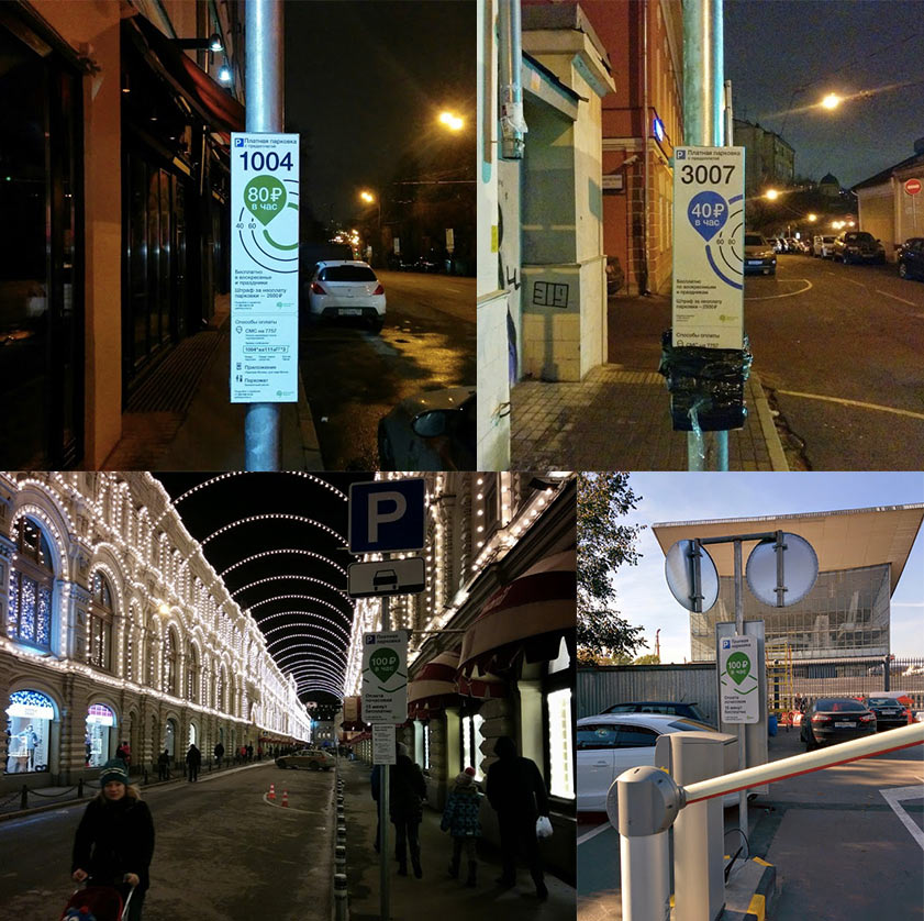
Trying the mock-ups in the city.
Overall it’s good, but we have a feeling that the rings take up too much space. The format is still too large. We need to get rid of the thin lines and make the layout even more compact.
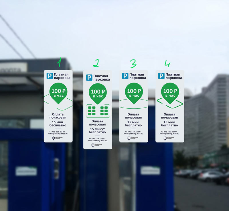
Making corrections and creating a couple more variants.
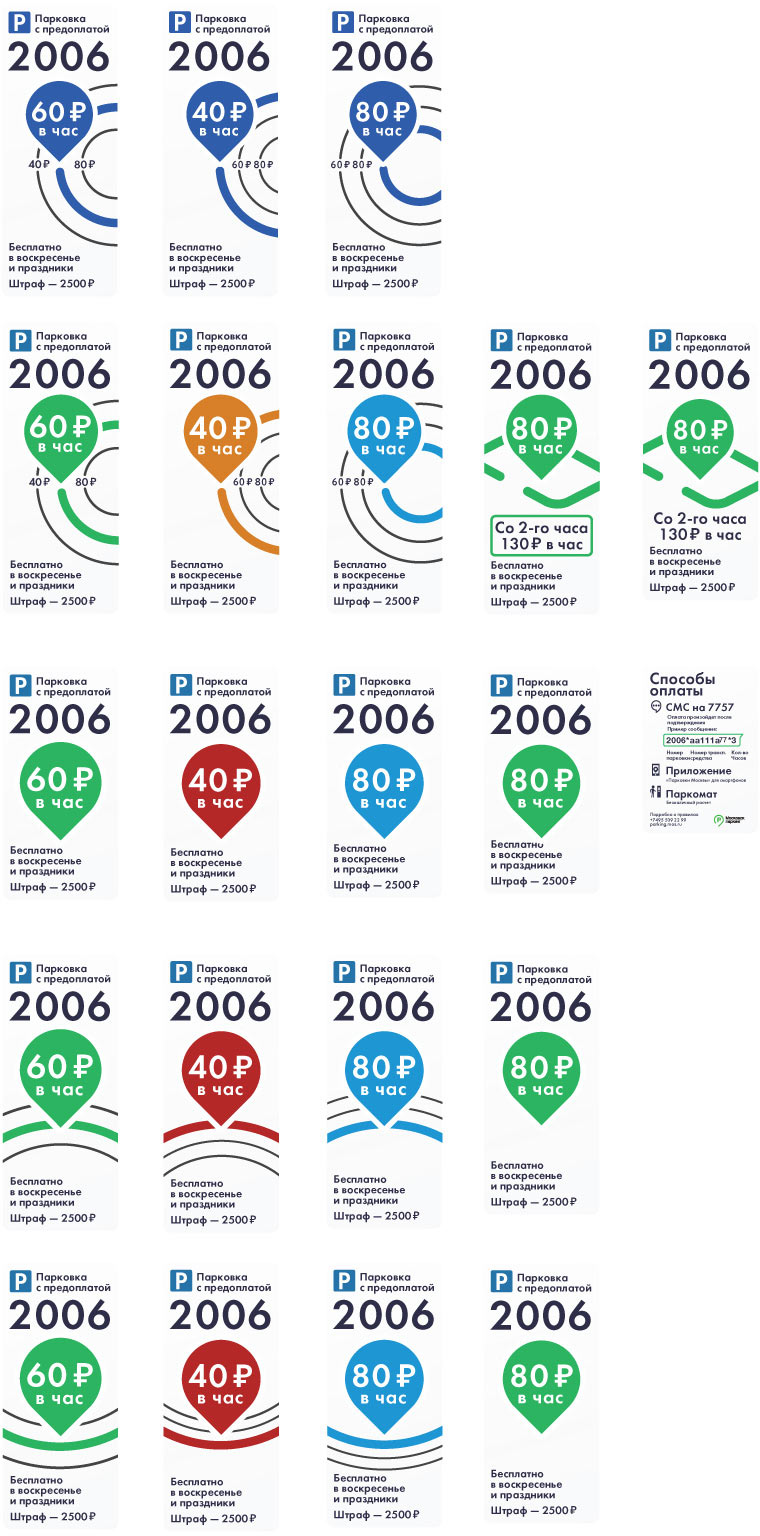
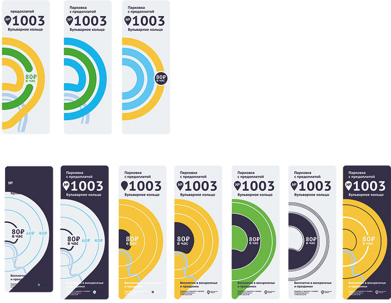
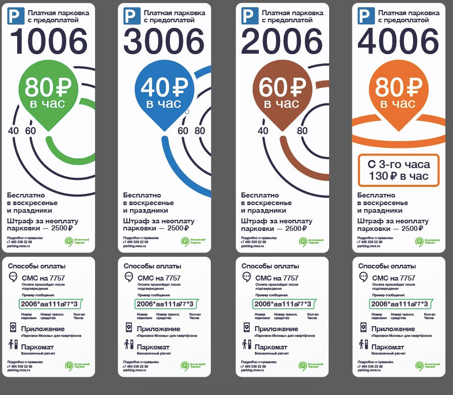
The layout and typesetting seem almost complete. Now we need to choose colors for different zones.
The client goes with the second option with meaningful colors.
Assembling it all together and sending for real-life testing.
New signs start to appear in the city.
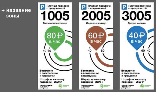
Together with the client going over formats and texts. Deciding that we need to add zone names. When looking at the signs on a computer screen everything is easy to see, but in real life it might not be easy to understand which zone you are in.
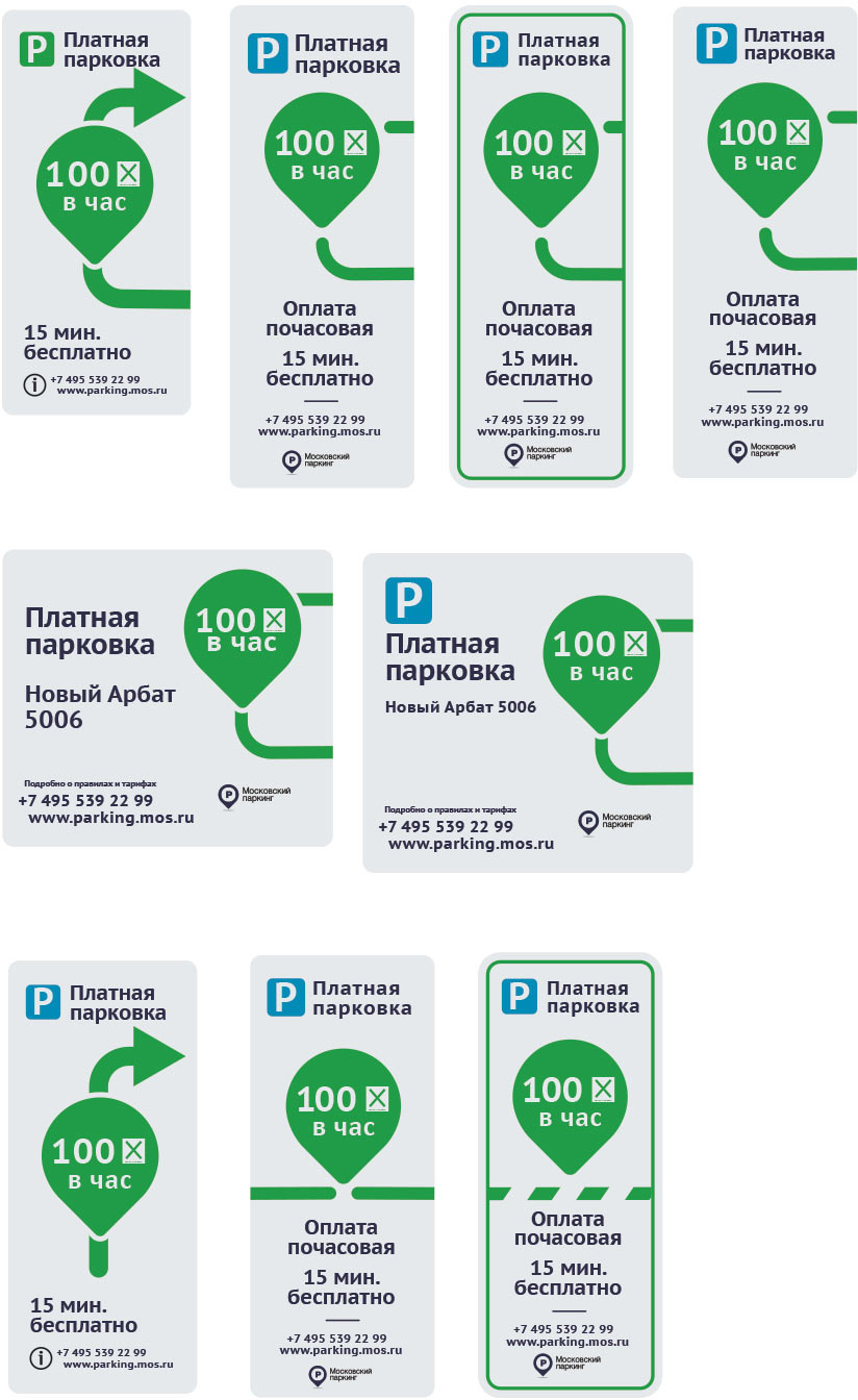
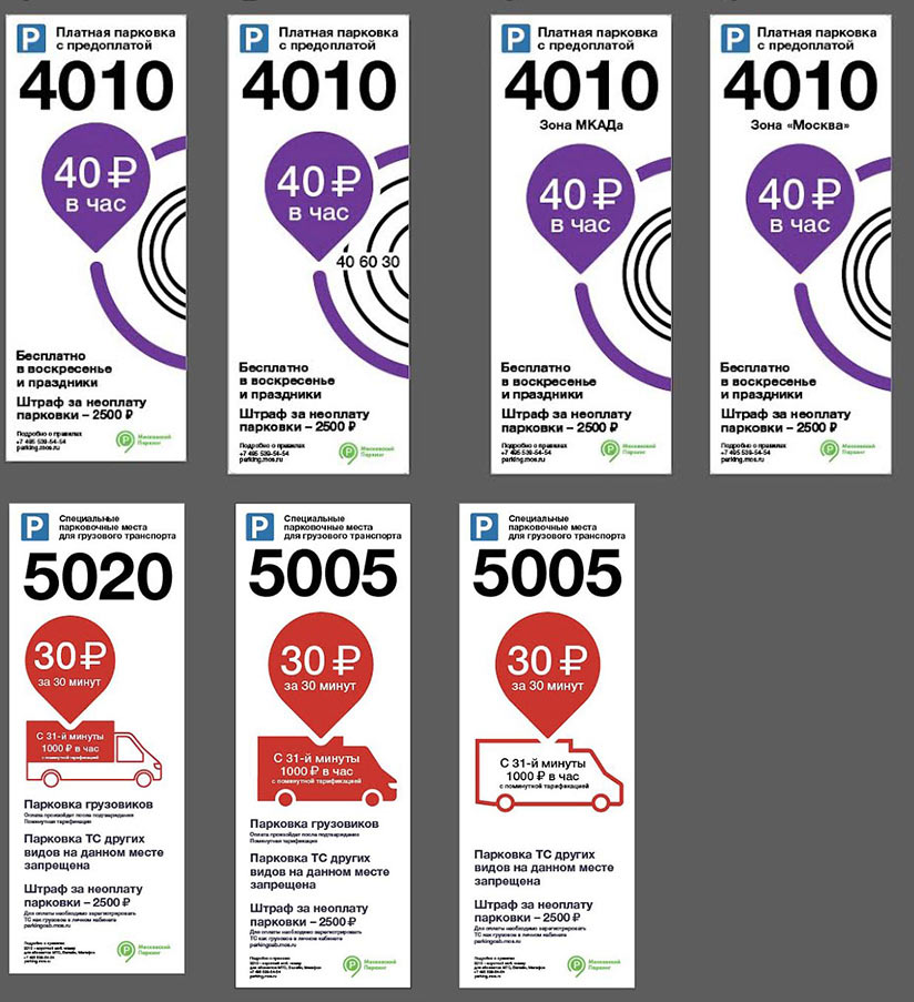
Making additional signs for special rate zones.
Typesetting rules, a guide and going over dimensions and texts several times again.
