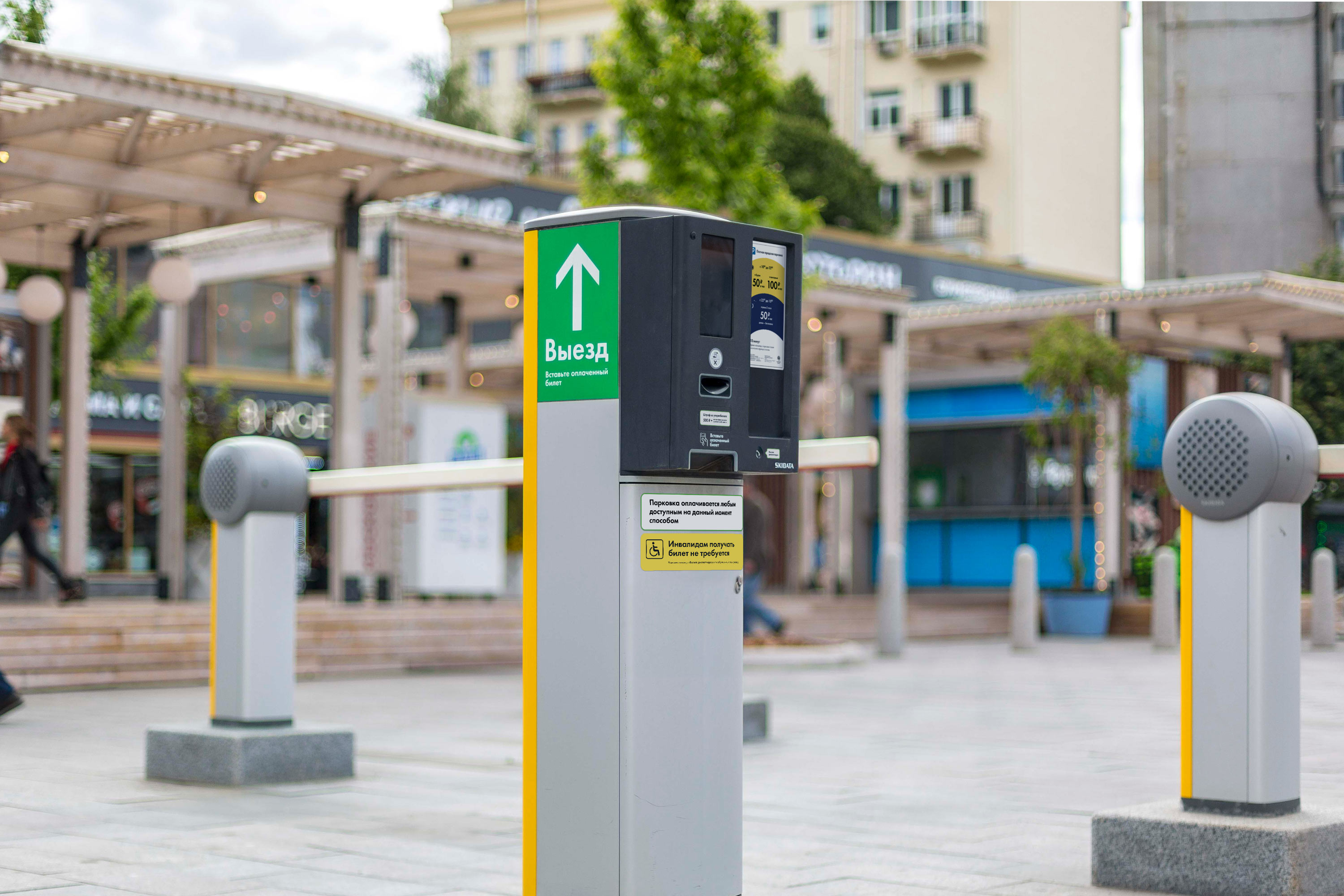
Moscow parking rules are hard even for seasoned locals which is why most drivers have to carefully study the information on signs every time they want to park. By the request of Moscow Parking we developed a flexible and smart system that made parking signs even simpler and easier to understand.

The main improvement is the text part of the sign which was retypeset and decreased in size allowing the graphic block to become larger. The parking zone number and the rate are now larger, plus the sign now includes the name of the zone, too.
The system includes color gradation that helps drivers easily read the rates.

The flexible graphics and layout can be easily adjusted when rates are changed or added.
The location marker has become larger in the new design turning into a recognizable signature element, an arc. The arcs contain rate information and their width can be freely changed. If Moscow Parking decides to introduce new conditions for a rate, more arcs can simply be added to the signs.
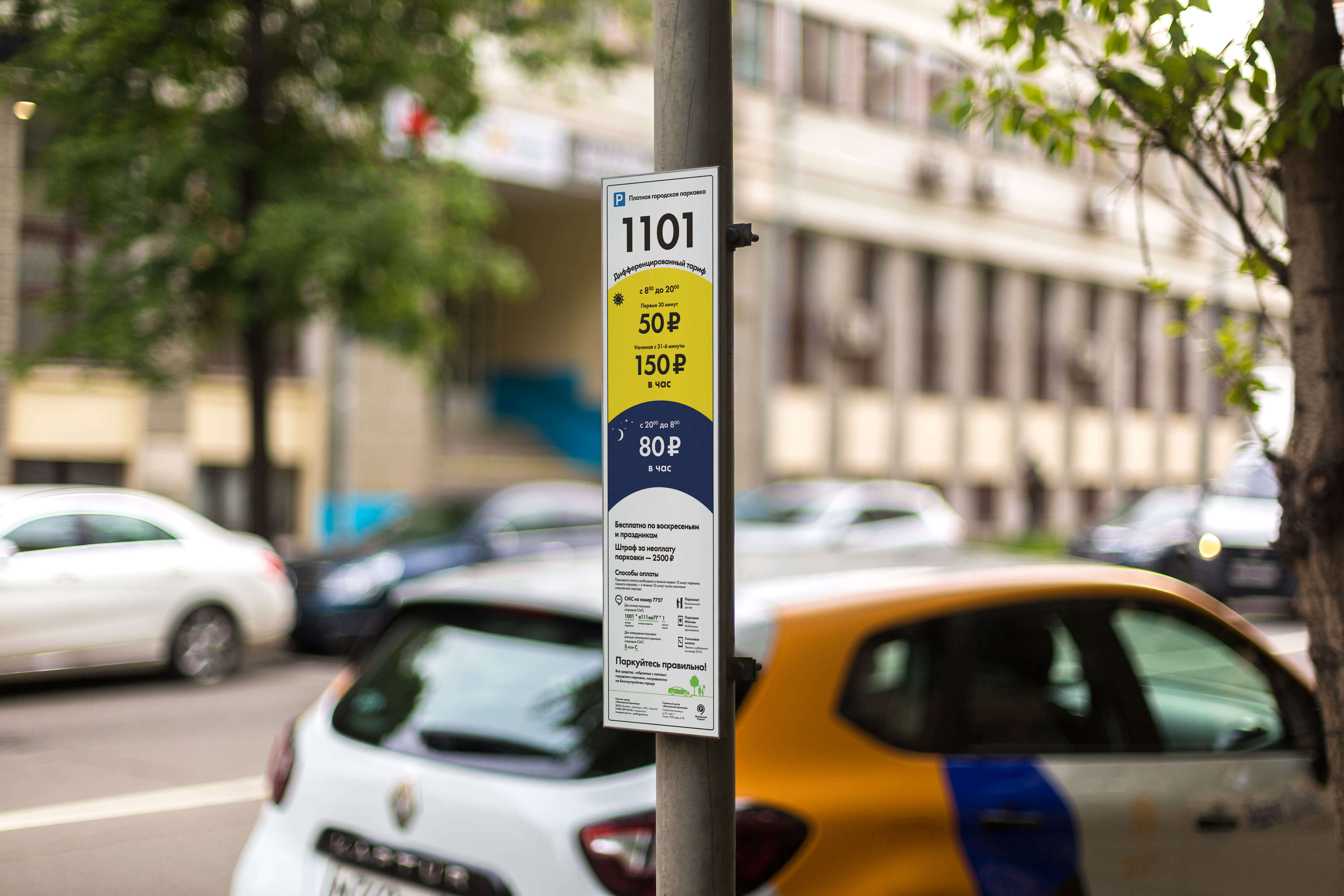
The arcs are used on all sign types, ensuring the visual style of Moscow parking lots has a smooth, round and friendly character.
Key information—parking zone number and rate—is immediately visible to the drivers. Bus or truck icons have the same size on all signs.
The icons have also been updated, becoming more modern and fresh.
The new parking signs already help millions of drivers park their vehicles on Moscow streets.