
The making of the Dynamiq corporate identity
Overview Process
Receiving the task from the client:
The logo has to consist of a symbol and a text. The text portion should read “Dynamiq” in English.
It should be possible to easily use the text in various media: websites, crew uniforms, yachts interiors and exteriors, business documentation, advertising materials.
The logo has to be sufficiently simple and recognizable, dynamic and modern.
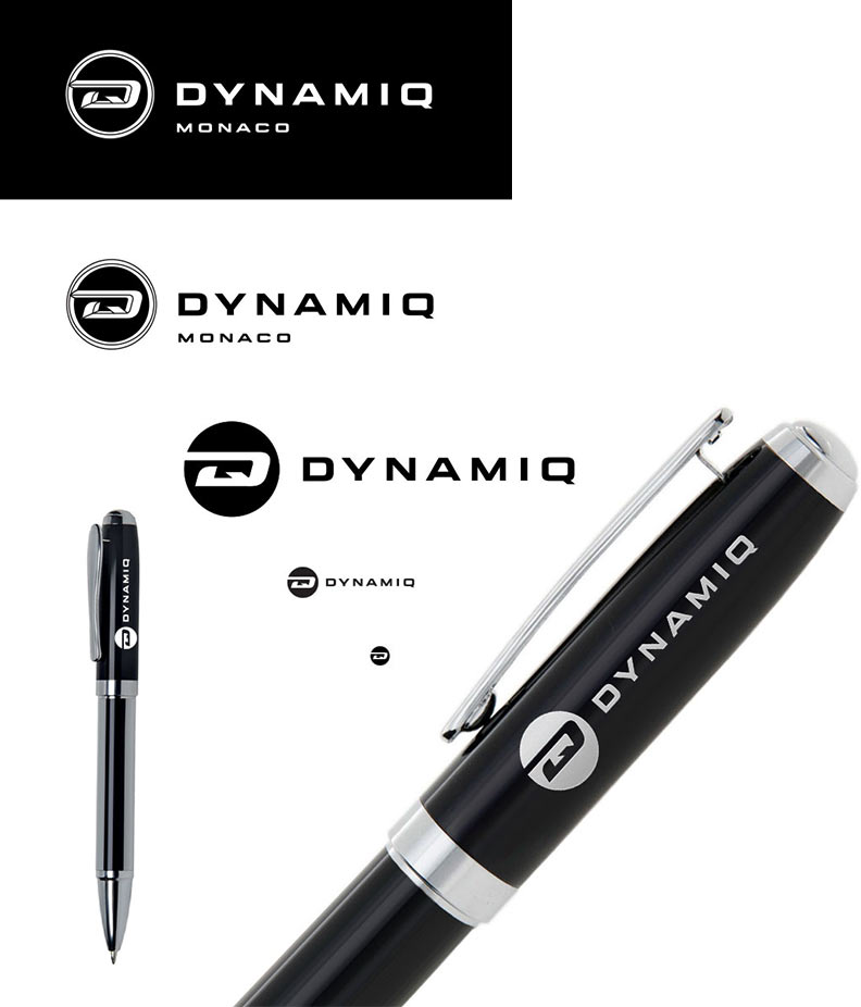
The logo will be used in yachts exteriors and interiors which is why the primary version should include a volumetric variant. The symbol will also be used without the text.
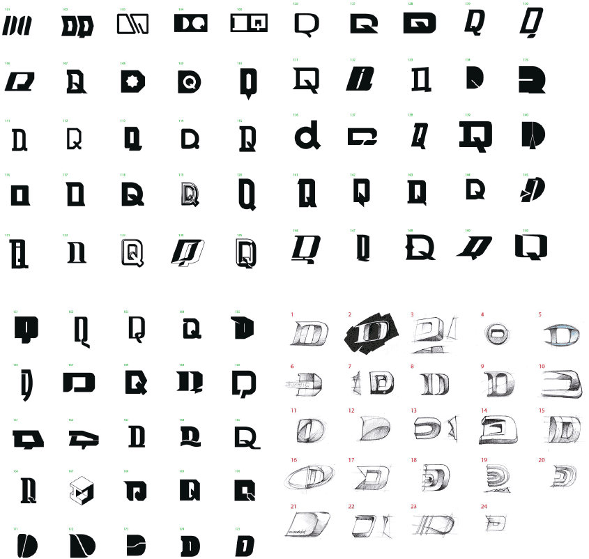
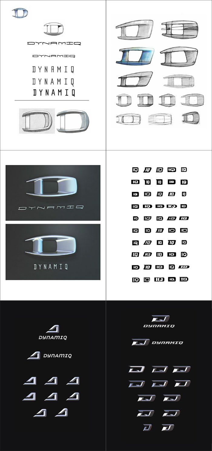
Making the first attempt.
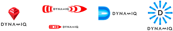
Art director: Numbers 1 and 3 are interesting.
Showing to the client.
The client likes neither of them. Thinking further.
Art director: Number 5. The rest look like mines or torpedoes which is bad.
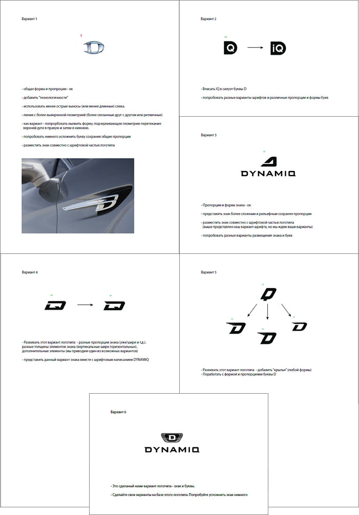
Showing to the client. The client says that the direction is absolutely wrong and that we have supplied too few variants. The logo has to feature the letter D and we should follow the brief more closely: the logo has to be modern, technologically advanced, dynamic and with hint of premium class.
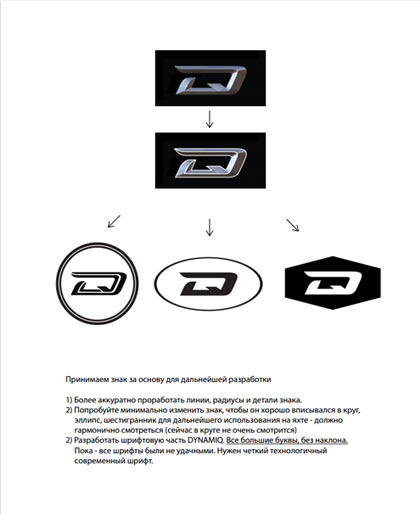
Inviting another designer to the project and generating ideas. Trying to mix the letters D and Q to achieve a more original shape, also trying to hint at IQ.
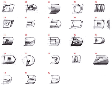
The client chooses several of the designs and sends back the comments.
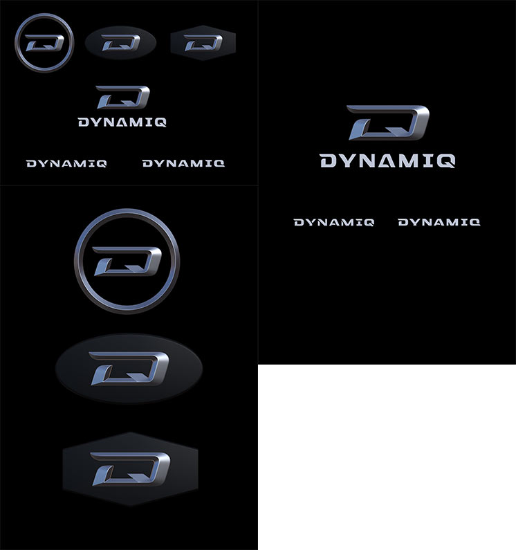
Inviting the type designer and elaborating the designs.
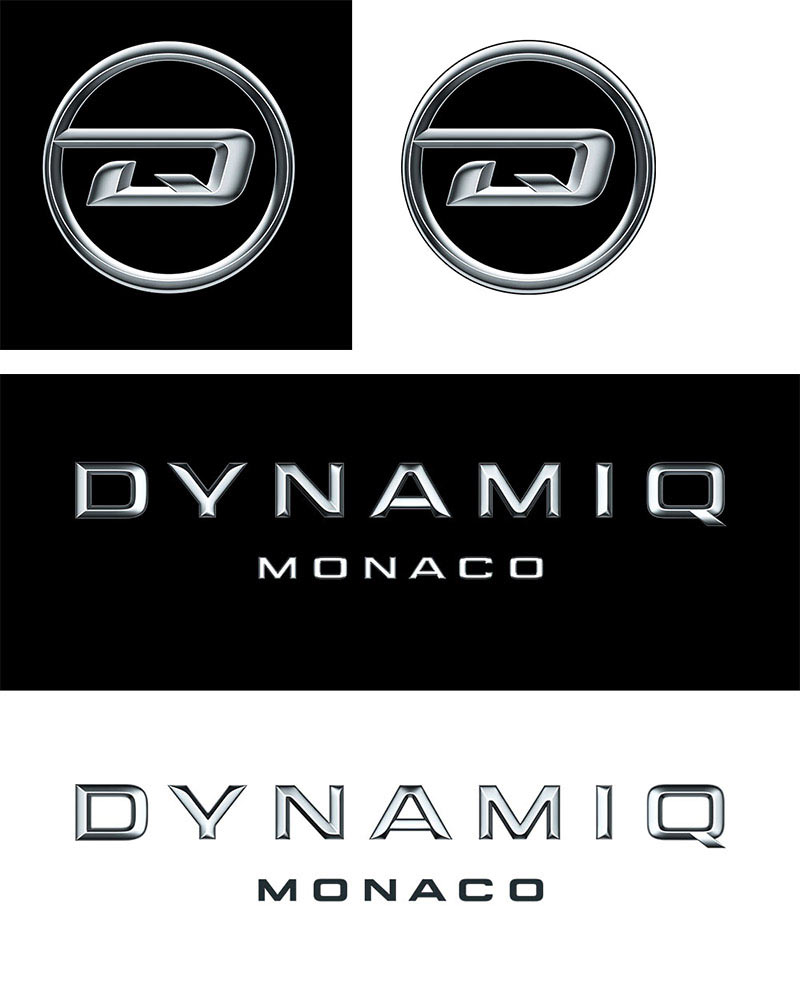
The client approves the concept.
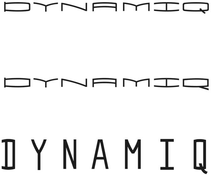
Working on the details of the logo, the type designer creates variants of the text design.
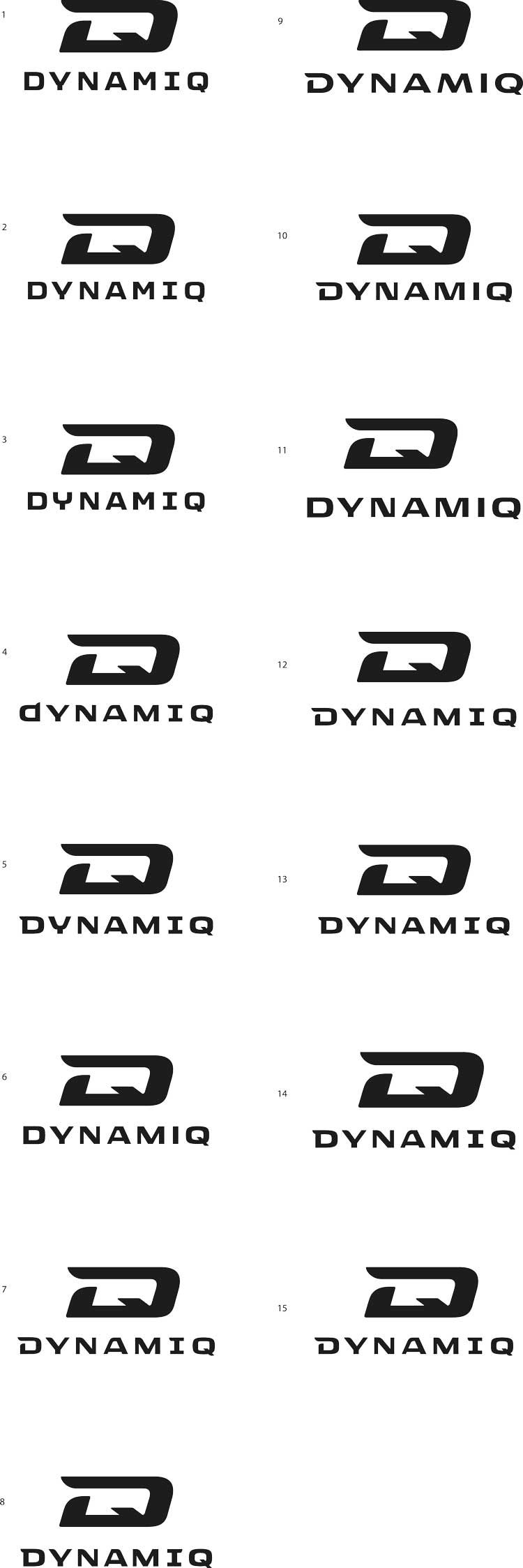
Client: All we need is simply a typeface that is both strict and modern. The solution you presented evidently employs stylized elements. We would like to see alternatives that are close to the symbol but are less similar. You need to create variants in the similar style but without using the elements of the style or the symbol.
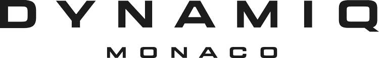
The client chooses one of the designs but asks to add the text “Monaco” to it.

Creating an additional style of the text with increased letter-spacing for use in smaller scales.
The text should look good with increased letter-spacing, this version will be used on the stern. Reference images from the automotive world:
Increasing the spacing:
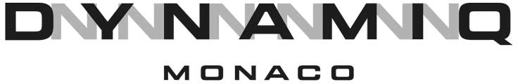
Now “Monaco” as well.
Working on the shape and adding volume.
Choosing the amount of volume for the text.
Art director: The letter Q should be more legible on black background. Right now the tail almost can’t be seen.
Trying to make the tail longer.
Art director: It’s worse, now it looks like a magnifying glass.
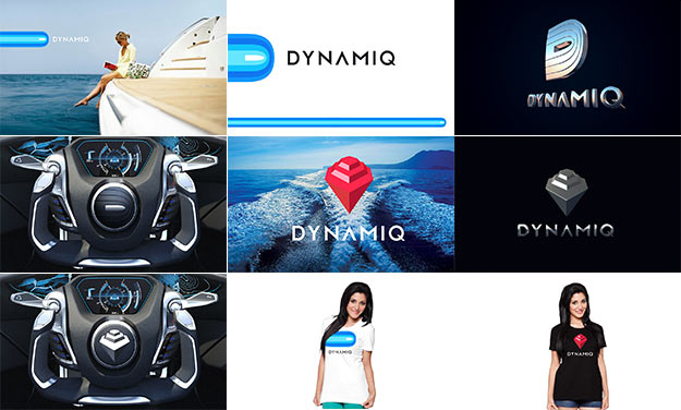
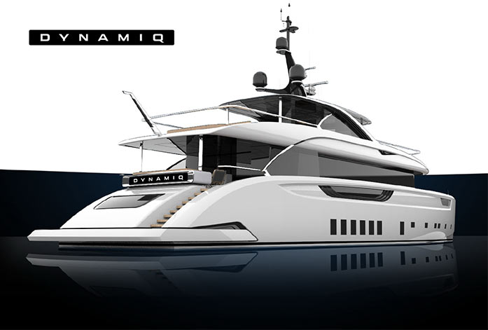
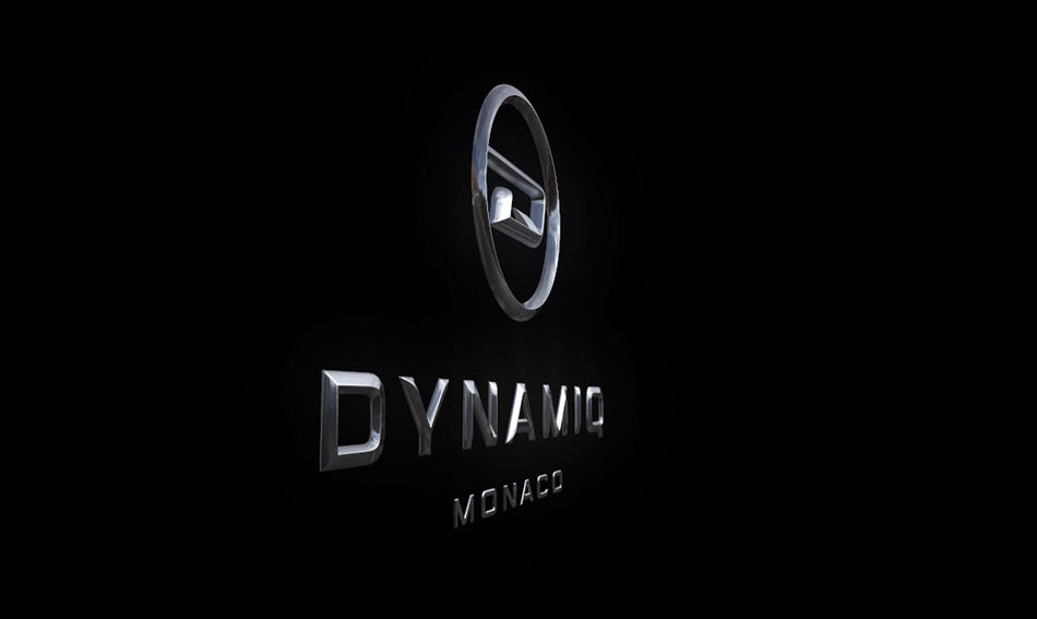
Trying the logo on a yacht.
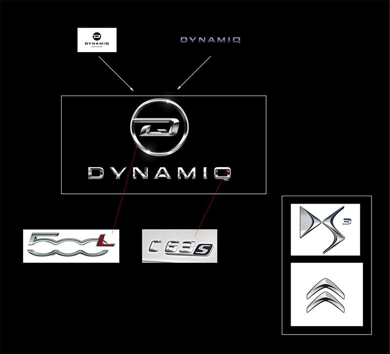
Client: As for placing the logo on the yacht (the volumetric version). Currently the bevel of the circle around the letter D and the text portion of the logo with the edge or facet in the center looks rather primitive and does not match the more interesting and fluid letter D. You need to be more careful with the volume.
In the attached document we have illustrated the following:
— There is a more elegant solution for the circle around the symbol which will allow to maintain its thickness and size relative to the letter D.
— All surfaces in the circle and in the DYNAMIQ letters need to be smoother with softer edges.
— The volume of the text needs a more elegant touch which would emphasize its complexity and modernity.
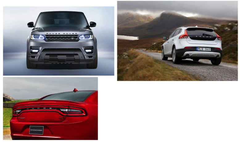
We have also provided the examples of modern cars: Mercedes-Benz, Citroën DS and Fiat.
While working on the volumetric solution of the text and the circle around D you need to draw inspiration from the automotive logos, not our illustration. The only reason we provided it was to demonstrate the existing capacity to make elements more interesting.
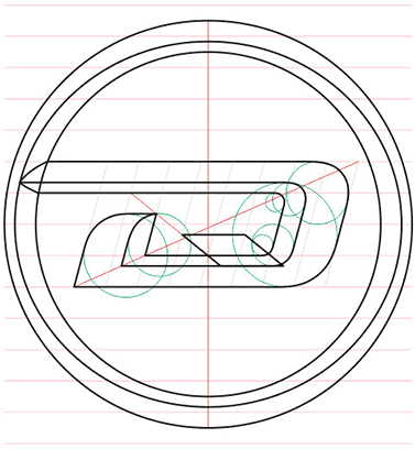
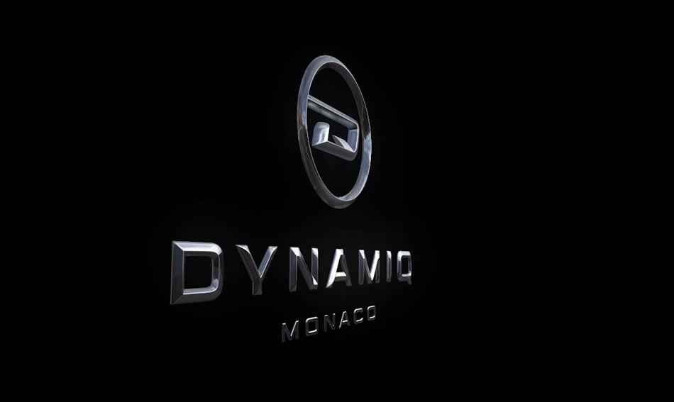
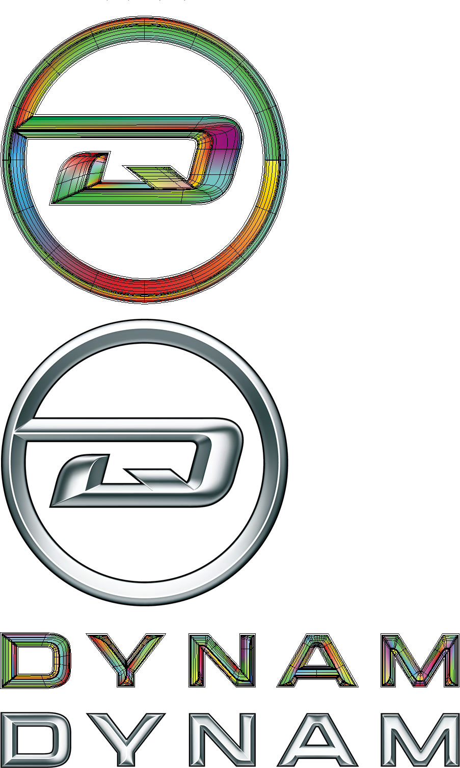
Searching for proportions.
Creating a 3D model and visualizing.
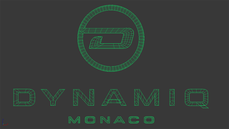


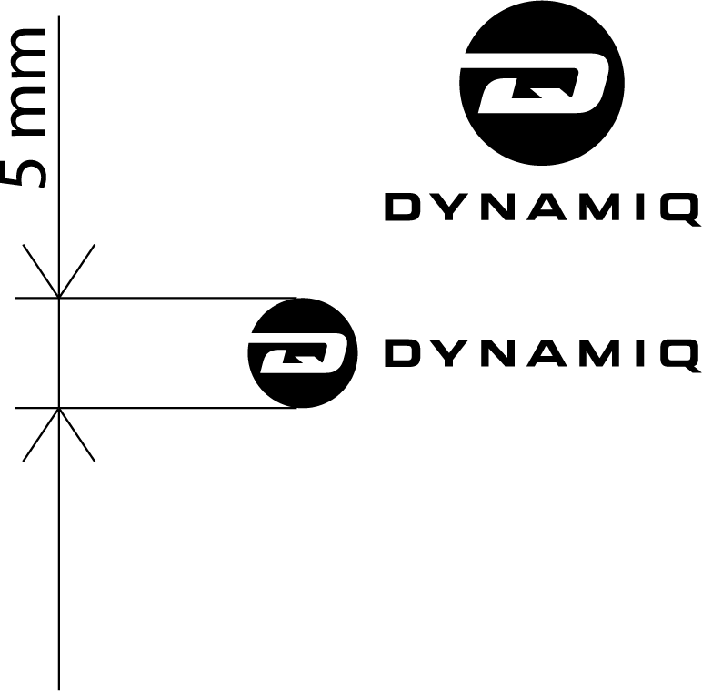
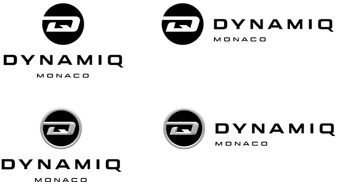
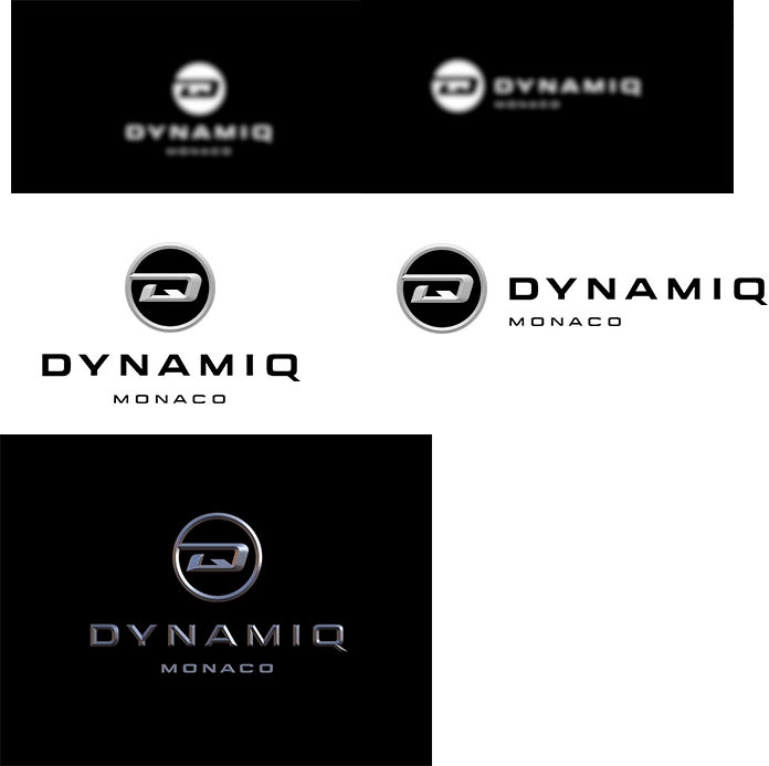
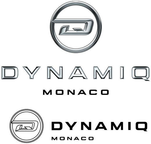
Drawing a monochrome and a small-scale versions of the logo.
The client asks to create a variant of the circle with a uniform edge. And to change the letter A in the text. And to remove the black filling in the design with the circle against white background.
Making the changes.
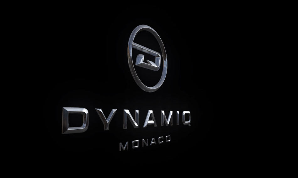
The client approves the logo.
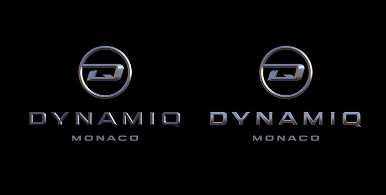
Creating a gradient mesh that would allow to create more accurate reflections and print the chrome logo in any scale.
Sending the guide for typesetting and inviting the illustrator to join the effort.
Looking at the client references for the pattern. Trying to build it based on the logo.
The art director chooses the bottom right design.
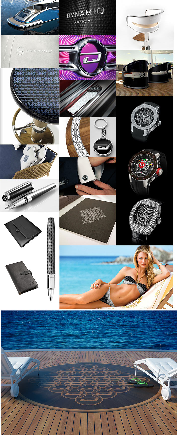
Simultaneously inviting another designer who creates “real-life” pictures featuring the logo.
Beginning to typeset the guide.
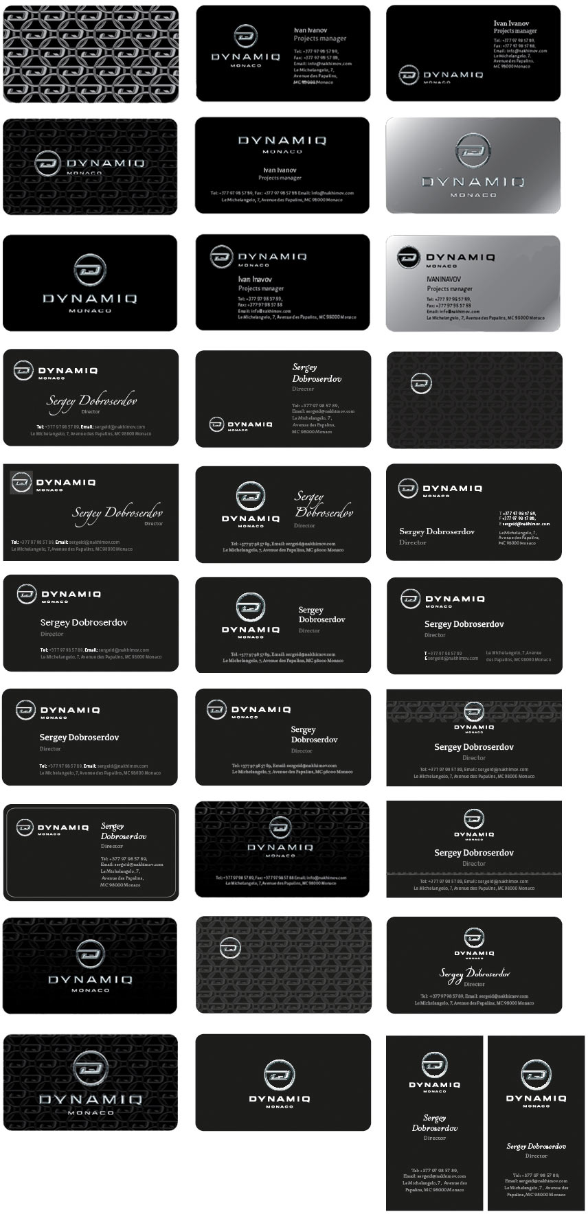
Starting with business cards, piling up ideas.
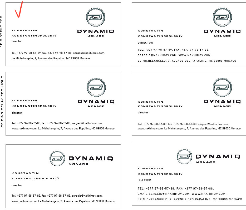
Simultaneously searching for a suitable corporate typeface.
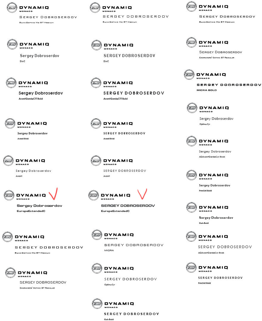
Choosing Europe Ext as it matches the text portion of the logo best of all.
Creating new business card designs using the new typeface.
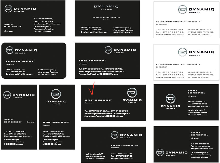
Choosing one of the business card templates. The monotonous layout doesn’t look good.
Looking for an additional typeface.
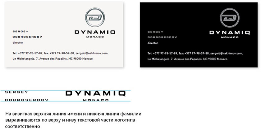
Creating final versions of business cards with white and black backgrounds.
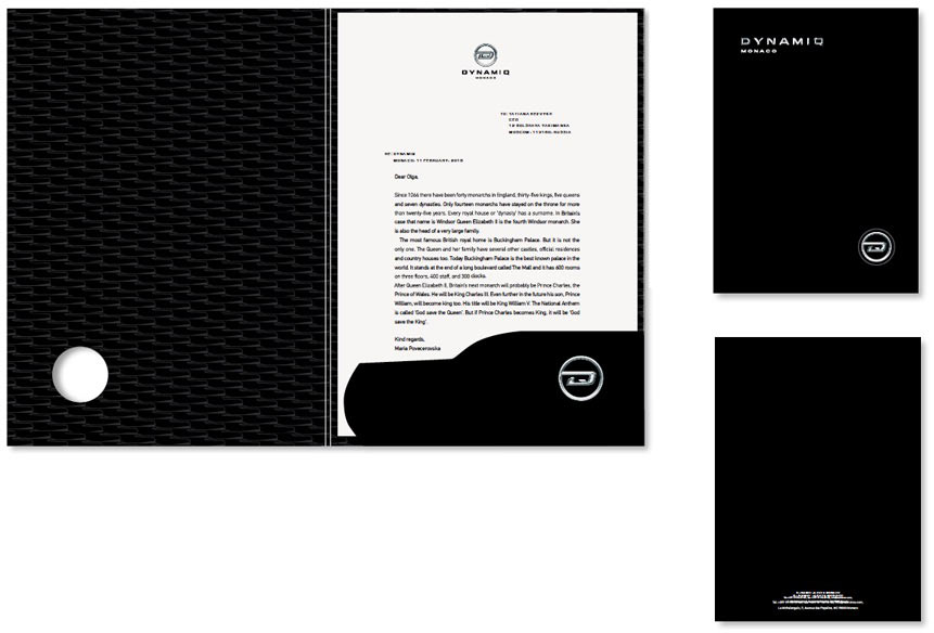
Simultaneously working on letterheads, envelopes and folders.
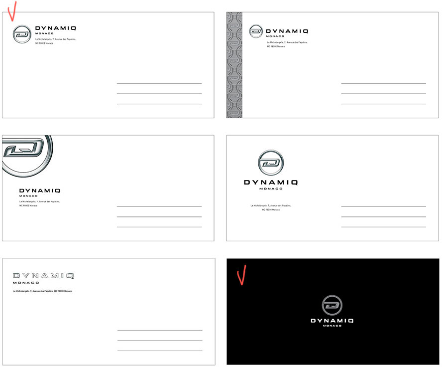
Choosing the designs: a white envelope for mailings and a black one for internal communication.
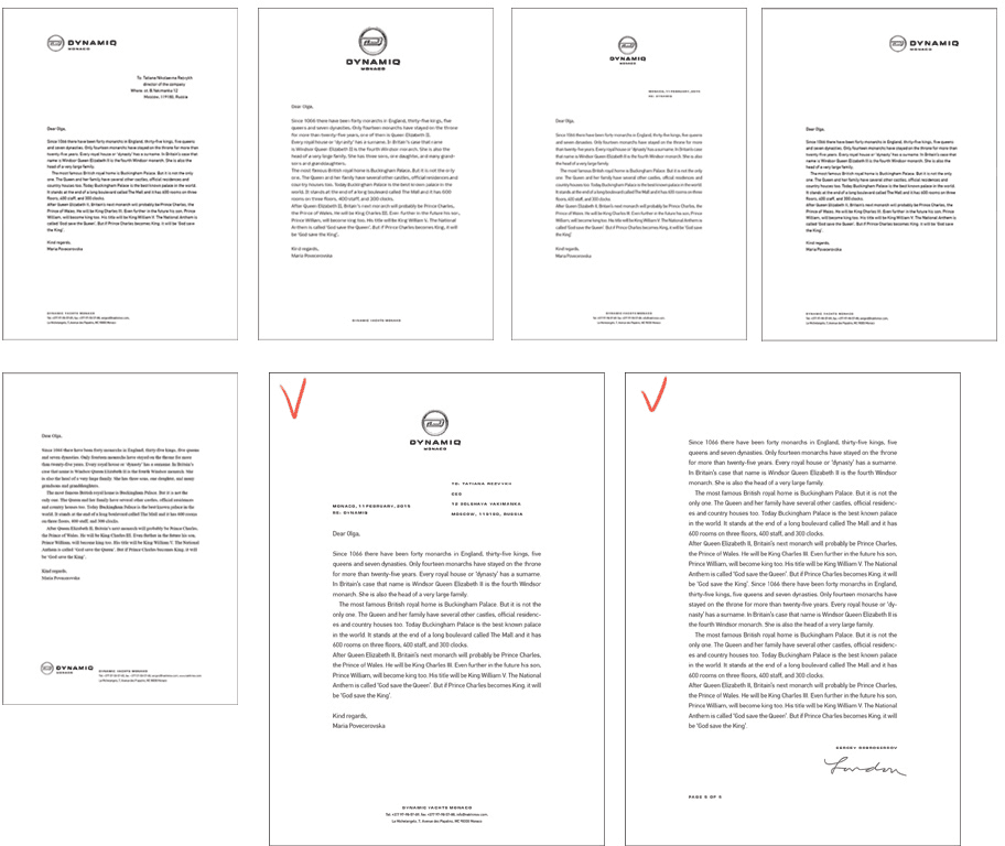
Creating a template for the first and the following pages of the letterhead.
Starting to work on the folders.
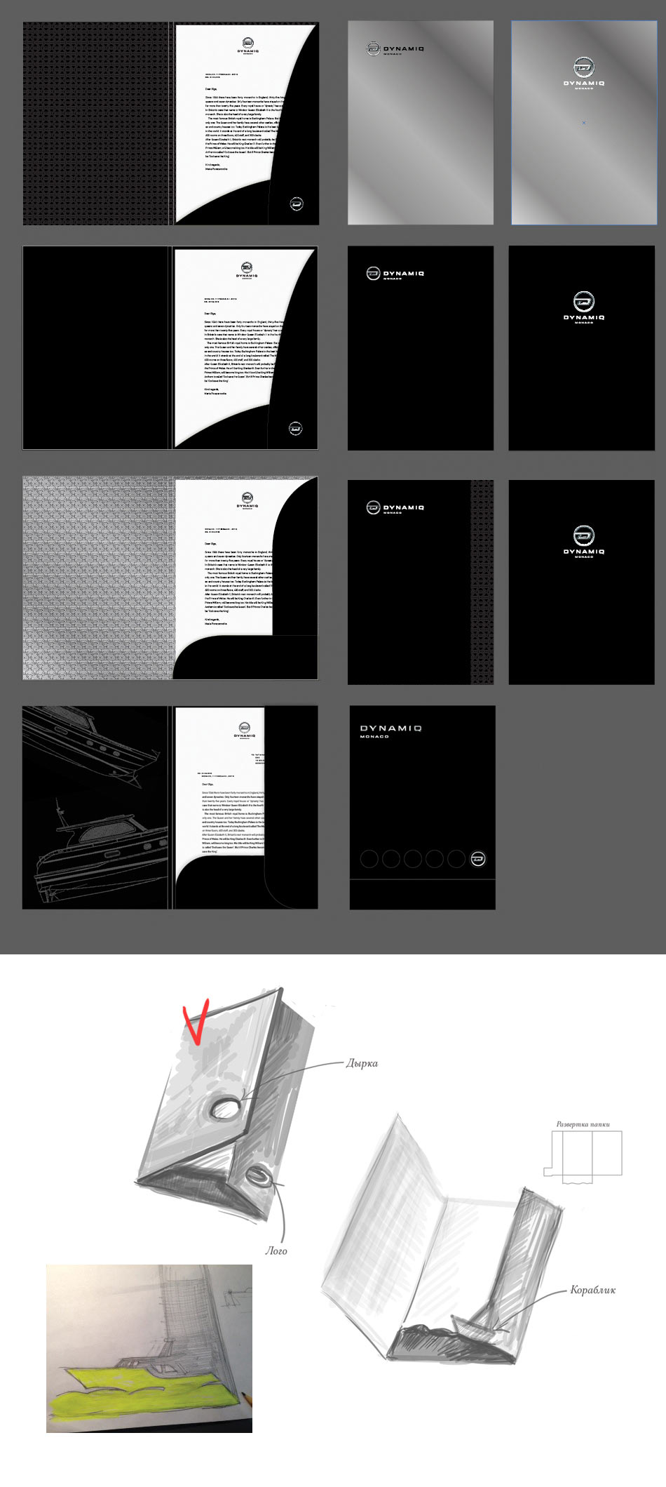
The art director chooses the design with the cutout. Adding an internal flap with a cutout in the shape of the unique Dynamiq yacht bow.
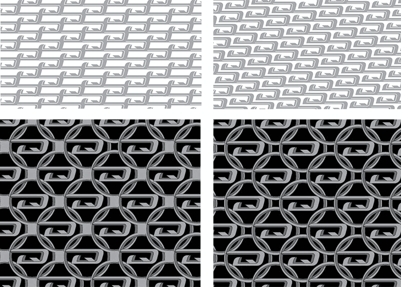
While typesetting the corporate identity, we realize that the pattern looks like chain mail. Mail and yachts don’t mix, moving on.
The illustrator tries to construct the pattern of circles and slanted elements of the logo.
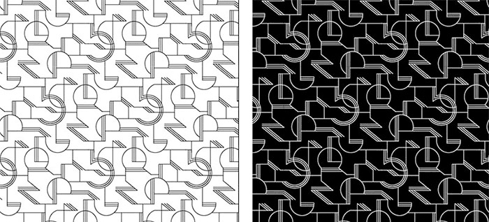
Art director: Too much Art Deco.
Yachts... It would be great to make a pattern using boat trails. But it also has to be strict. Getting this.
Art director: Too brutal, it almost looks like a fence.
Well, that’s hard to argue with.
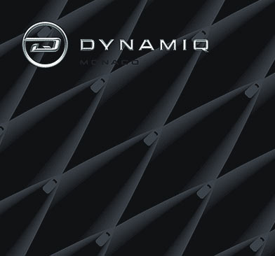
At this time the manager shows yacht projects to the illustrator. Turns out, all of them have an unusual profile of the bow which is an original invention of the company. The illustrator connects yacht profiles together.
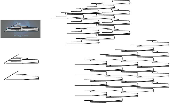
It has to be simple, with no hints of any style except classics.

Art director: Let’s show it to them.
The client likes the result but asks to correct the shape of the bow.
Making changes, creating the pattern module and looking at how it behaves on different surfaces.
Recreating all the corporate documentation with the new pattern.
Showing the results to the chief typesetter and the art director. Everything is OK.
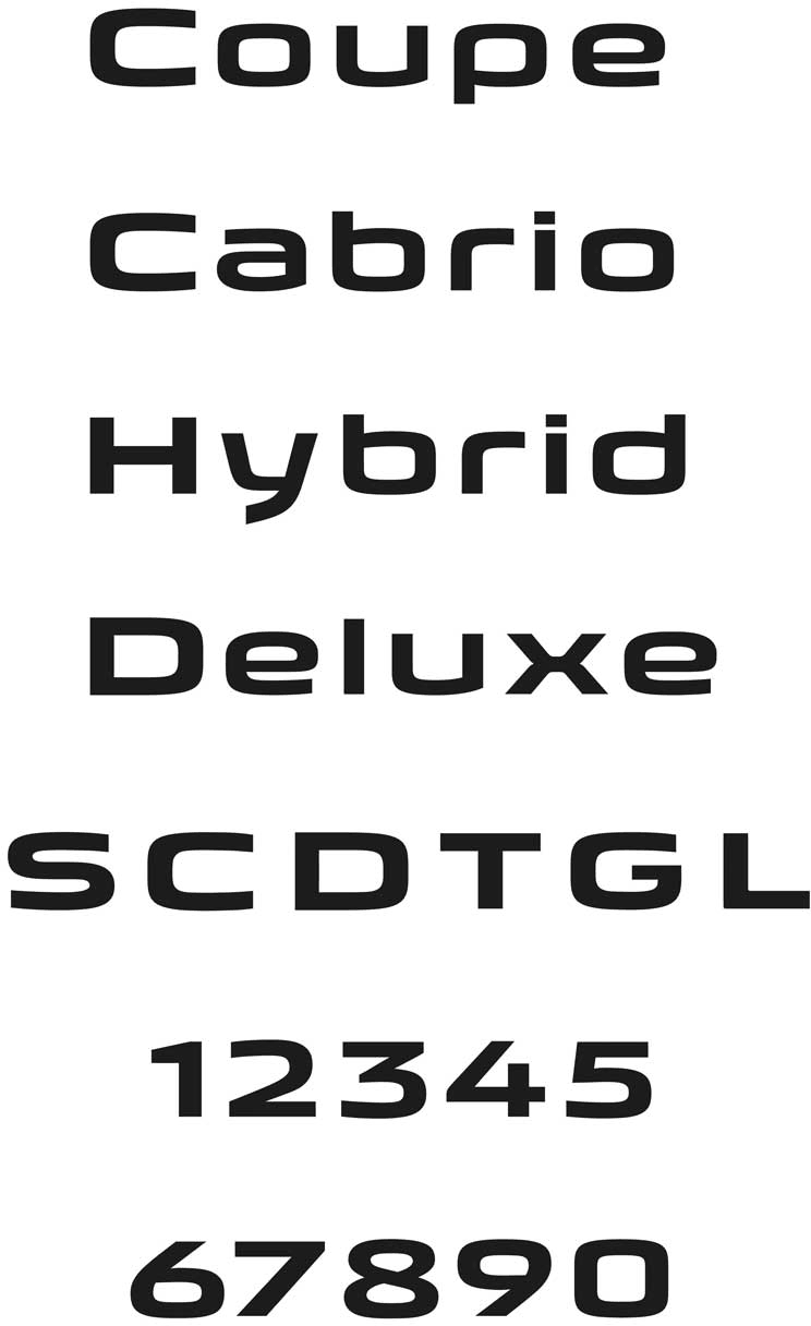
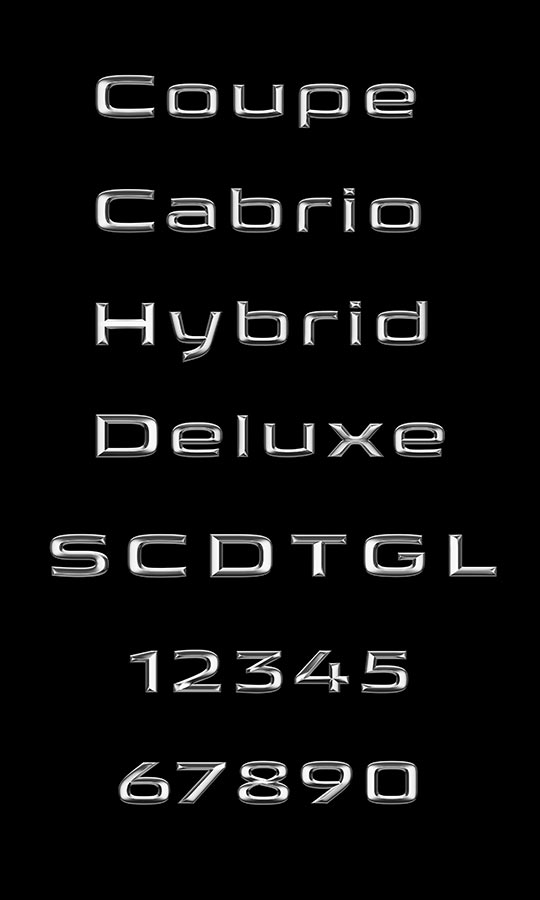
Creating additional elements of the corporate identity: letters and digits for yacht series and type names.
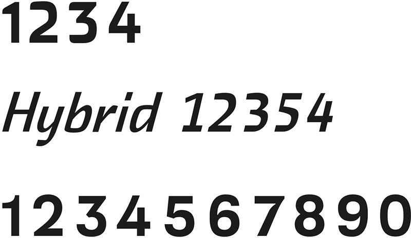
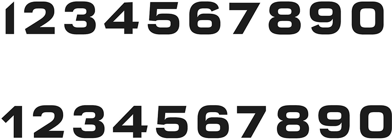
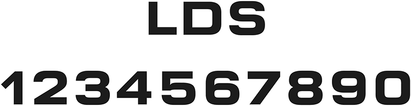
The art director doesn’t like the style of the digits. Drawing new ones. Trying them side by side with letters.
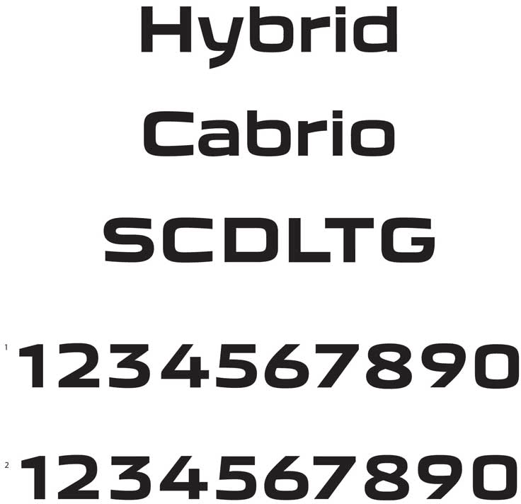
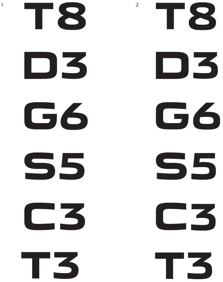
The client asks to make all letters and digits wider.
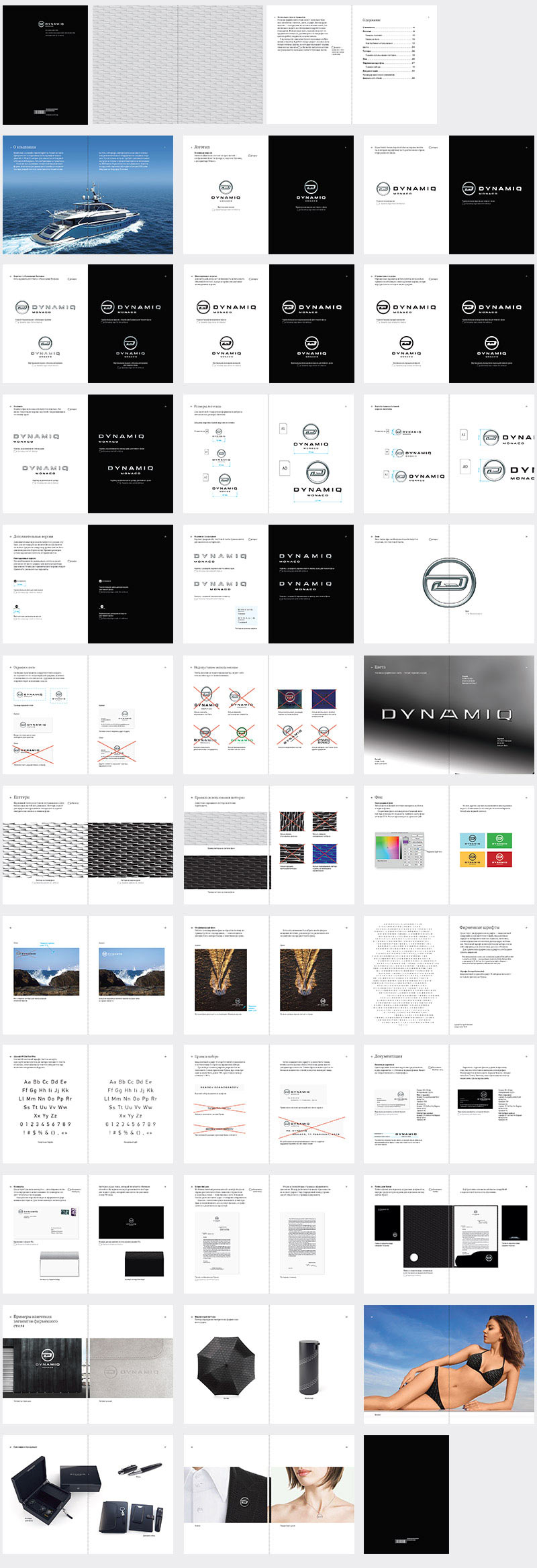
Preparing the brand book and sending it to the client.

Order a design...