EMIAS logo and corporate identity

Overview   Process  

Task: to develop a logo and a corporate identity for a city information project.

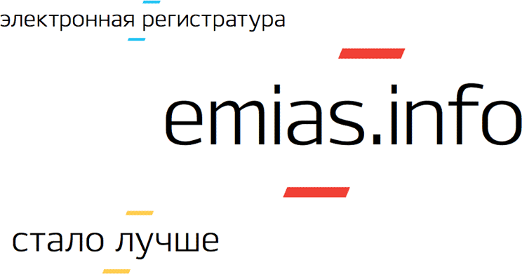
EMIAS is a unified medical information and analysis system that allows patients to make appointments and receive referrals to see other doctors in the comfort of their home, while hospital management can evaluate the patient flow to their facilities. The system which will include all state hospitals in Moscow was created by a decree of the Moscow Government and developed by the Department of Information Technologies. A logo and a corporate identity for EMIAS were created at the studio.


emias logo main
The main logo


In the logo, the word EMIAS is surrounded by two horizontal stripes to create a ladder, symbolizing order and upward movement. The main logo with blue stripes is used in corporate documentation, while the versions with yellow, red and green “steps” are for less formal occasions.

Release date: November 07 2013

Cast:

art director and designer
designer
typesetter
type designers
project manager
The studio wishes to thank Vyacheslav Yentinzon, EMIAS brand manager, for his help and assistance with the project
emias logo color
Informal versions of the logo

emias logo background
Logos on color plates for use in advertising and souvenirs


The colored steps of the logo are the core of the EMIAS identity. They easily add corporate style to headlines, titles and slogans and can be used to create decorative borders and patterns.


emias tagline 2

Guidelines for the use of the logo, corporate colors, typefaces and basic style elements are given in detail in the brand book.


emias bb logo
The opening on layout of the logo and explanation of the name of the system

emias bb pattern
The opening with patterns


emias shirt

Order a design...