Editions: Second Third
The making of Calligraphy for Everyone
Overview Process
Calligraphy for Everyone was first published in 1990. A number of significant changes have taken place since then, so republishing the existing issue from the nineties did not prove reasonable.
Mid 2008
For a start, we ask the author to make necessary additions to the text and choose a fresh set of illustrations. While the author and the editor are busy, we are revisiting the old volume.
After all the material is collected and has passed the initial reading we fit it into a layout of a book by Gordon. Studying the results.
May 2009
A PDF with a test layout.

Until June 22, 2009 the book is in hibernation mode, while we are saving the world from the crisis and focusing on commercial projects.
June 22, 2009
An idea to change the book’s format pops up. The landscape format looks too wide with the margins orphaned without expected footnotes. Trying to trim it width-wise.
Taking the golden ratio for a guideline. The advantage of using it is to support the book’s “art” feel plus it adds a certain visual interest.
Experimenting with the grid. Testing the “album” version. Namely, just trimming off a part of a standard album sheet (220×290 mm), leaving the same margins.
The margins turned out quite marginal. The whole thing does not look right. Deciding to change it to nine-columns. That results in a page that is vertically too symmetrical. Bringing back the top and the bottom margins from the album format.
June
Running through the whole book again, placing the illustrations properly. Fixing the captions that got separated from their images by all the manipulations with the format and the grid. It’s time to touch base with Tema Lebedev.
June 29, 2009
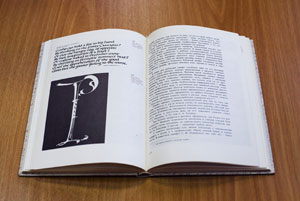
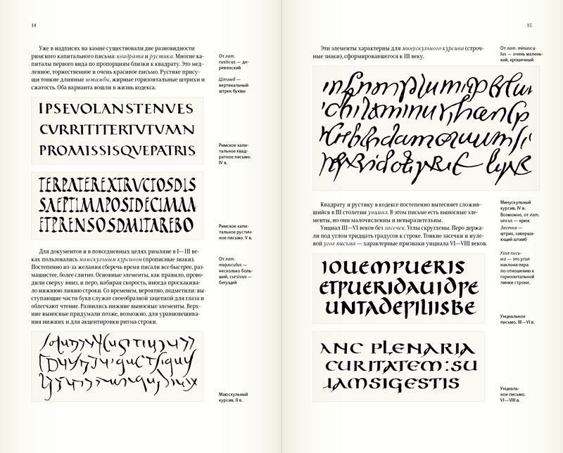
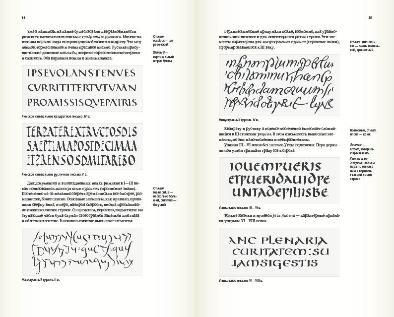
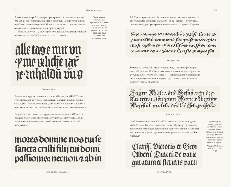
Pages 14 and 15 reveal a problem: footnotes become undistinguishable from captions. While they are logically the same, we need to try to separate them by moving all under pictures. It reduces the top and the bottom margins, but does solve the previous problem. The spread looks crisper — a sure indicator of the right direction. Leaving it alone for right now, since the margins can be fixed later when we have the final version of the text.
Trying another trick: downsizing all the comments on margins by two points, while leaving the captions size untouched.
Comparing. There is something to it, yet it looks messy. The previous version is much cleaner and nicer.
Writing to Tema:
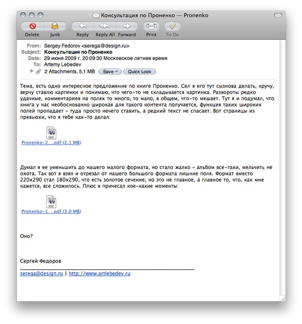
Receiving a short response “looks cool.”
Combing through the book once more. Bringing the background colors back to original and placing captions under images, while keeping footnotes at margins.
The book looks suffocated. Starting all over again.
Before:
After:
Thinking of putting references in blocks at the bottom of the page to separate them further from the commentary footnotes.
Bad idea as there is not always enough room at the page bottom. Lack of air and margins from Tchichold’s book come to mind. Expanding the bottom margin and adjusting the top one. Bingo.
Pictures. Setting them centered on a page. Does not work. Making it more dynamic by spacing it out with the text. Seems right. Leaving it like this for now.
Two-weeks break for other projects. Back to the book. Still something just is not right. We’ve got the look and the studio guidelines, but it falls apart. Some spreads are true gems, but not the book as a whole. :-(
Maybe, we got stuck on following the rules? Separating text from illustrations and “decorating” the page.
End of 2009
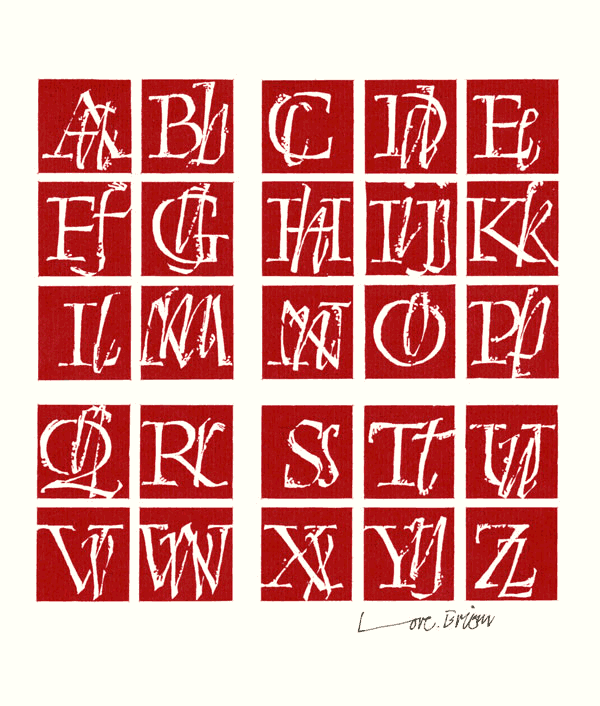
Stepping away to clear the focus. Drafting the dust jacket. The author wishes to see this beautiful artwork by Gunnlaugur Briem on the DJ:
Adjusting the dust jacket according to the studio style, trying on different colors and materials.
Exploring other ideas for the DJ, including the author’s work as a base.
Moving on to typesetting. Comparing the effect of the text flush left vs. centered.
Practicing our caption setting.
Our studio has its custom typeface Artemius that is used for all our paperwork and books. The type itself is in a constant process of improving: new characters are added and the lines are refined further. For “Calligraphy for everyone” and all the following volumes, Artemius got new modifications: the lines became rounder and softer to work better in books.
Breaking the monotony of the text by setting artists’ names in bold and ditching quotation marks for italics.
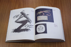
Adorning titles with a hand-drawn script that Yelena Novosyolova just started to design. So far we only have lower case characters and the kerning does not work yet, but all we need at the moment is the pattern in general.
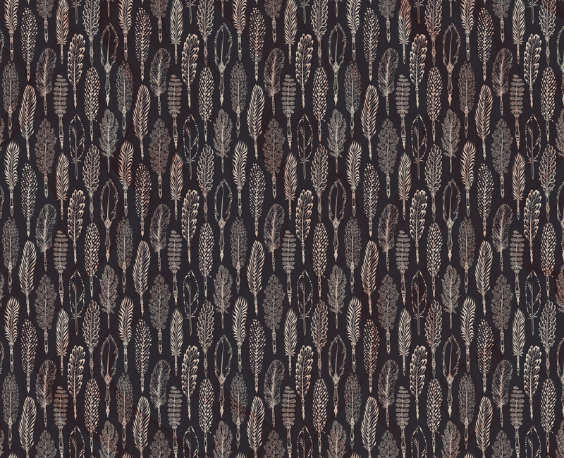
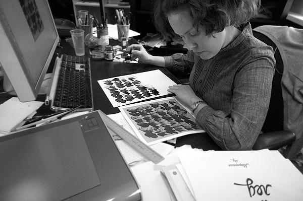
Illustrator Lisaveta Romantseva prepares different images for the endpapers.
They all are beautiful. Picking the last one and slightly altering its texture.
Mid to end of 2010
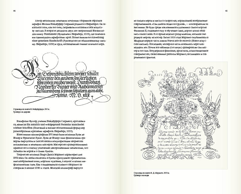
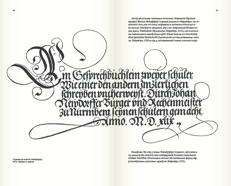
Either it takes us forever or the book really does not “sing.” Making captions justified. No showing offs.
Klementina typeface for titles acquire Cyrillic character set.


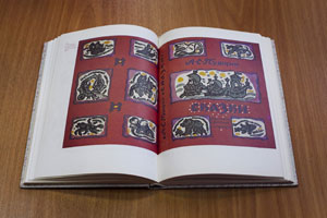
In attempt to make the book more expressive we design it with a fabric spine, embossing, pictures at the end, laid-on front and back plates, and color-coded chapters, so you can see the whole structure from the edge and study all the illustrations in one place.
Beginning of 2011
We want to support good binding structure throughout the book. So we make the whole inside stronger and more solid, which by contrast brings out the delicateness of the art better.
A tiny error in format reveals itself at this point. We should’ve started with 2/3 proportions, just like regular-size books have, and enlarge it to the height of an album. The illustrations are better presented now, without the format calling attention away from them.
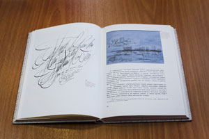
All footnotes move to the end of the book. The bottom of the page gets reserved for captions only. We spread pictures one per page. The blue-tone paper highlights the “white” background on illustrations. Adding texture to the page by splashing upsized accents in copy text and in margin text. Now it “sings.”
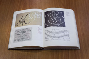
Framing all the pictures with white background and setting captions in Artemius Black.
March—May 2011
Art director says no to everything. Stepping back. Conventional layout with a touch of experiments like narrowing text blocks to accommodate illustrations. Margins shrank, but still contain captions. Collecting unfairly forgotten artists from all over the world and incorporating their work into our layout. Proofreading.
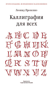
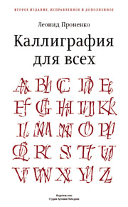
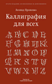
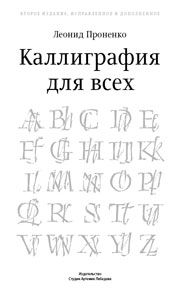
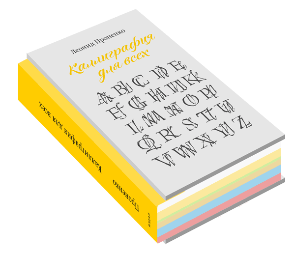
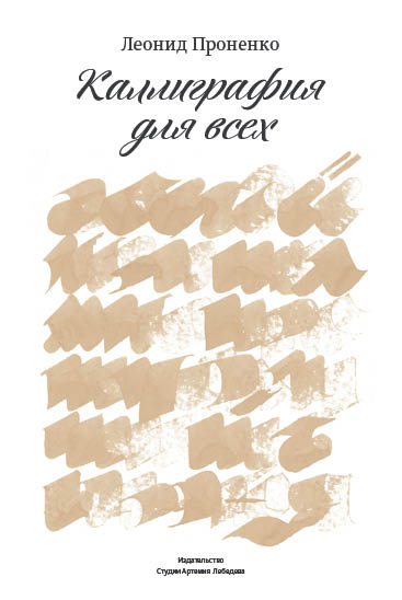
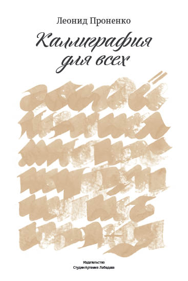
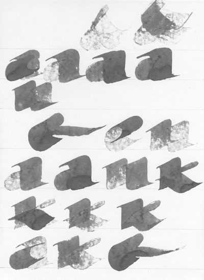
The dust jacket does not scream “calligraphy.” Drawing alphabet for the cover. First attempt.
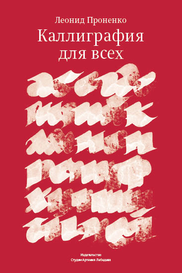
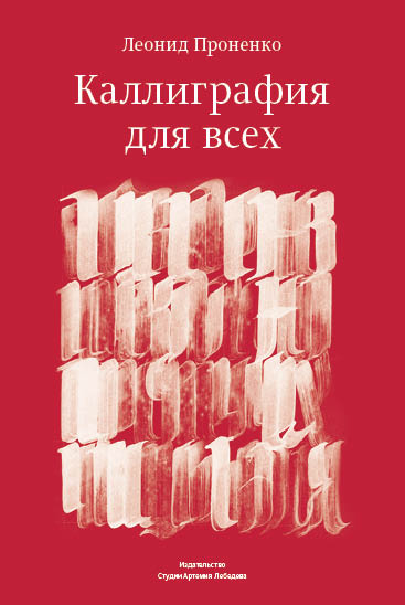
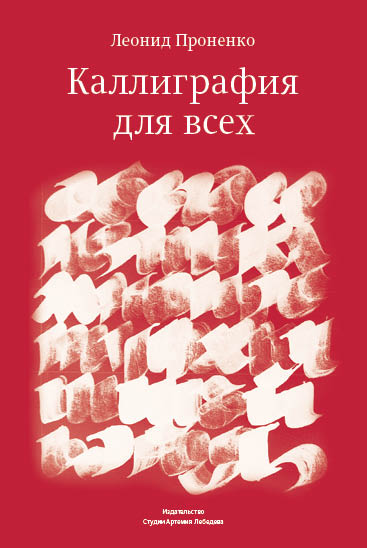
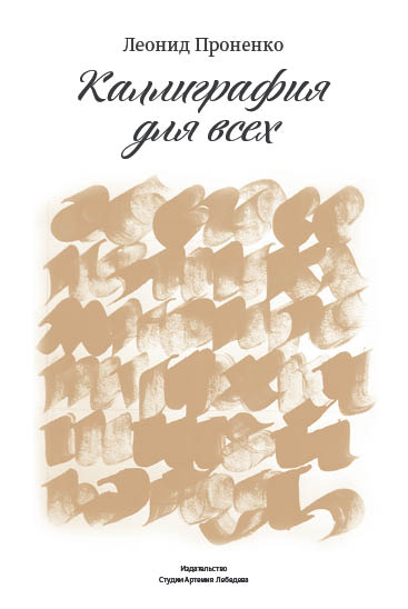
Picking the last version, redrawing it, and polishing details to avoid any gaps.
Placing the picture in the cover layout and painting it light golden-bronze pantone.
Drawing letters for the spine.
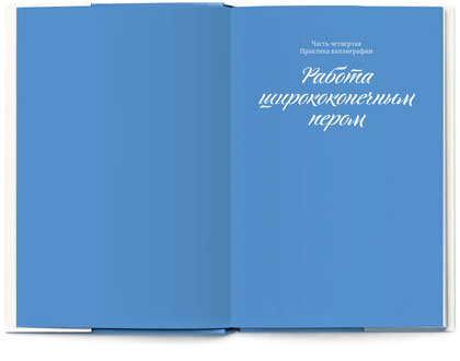
Choosing blue for half-titles to bring out the color of the binding.
Planning to print it in pantone metallic. Running a color test.
Sending the book to printers.
Aaaah.
