The making of Objects of Desire by Adrian Forty
Overview Process
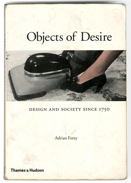
We decided to translate into Russian and publish Adrian Forty’s Objects of Desire, which tells fascinatingly how design reflects and changes culture.
We obtained materials from the original publisher, translated the text, edited it, and got down to book design.
We experimented with image positions. It was important to keep them relevant inside the text.
This way?
Or like that?
With less layout constraints for images, we gained more freedom in arranging them on the page.
Working on headlines, looking to achieve more contrast.
Black and white illustrations went well with bold headings.
Styling multi-paragraph quotations.

As the information in the footnotes appeared supplementary rather than explanatory, we moved them to the end of the book to make it easier for readers to digest.
More editing, improving layouts and line mismatches, fixing visual gaps and endnotes.
Putting together endnotes and index.
Considering whether page numbers should be there.
Sorting out levels and styles in the index.
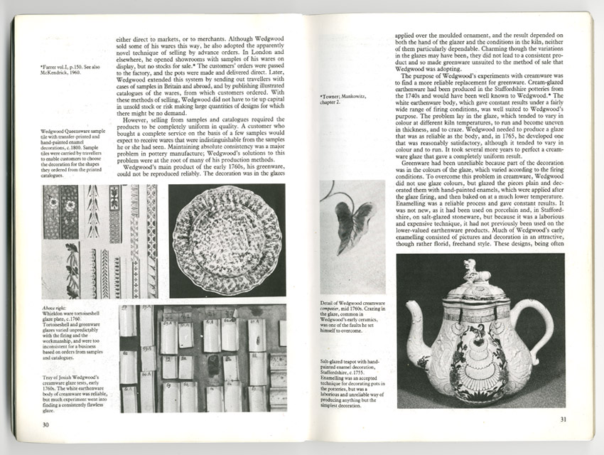
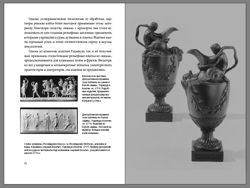
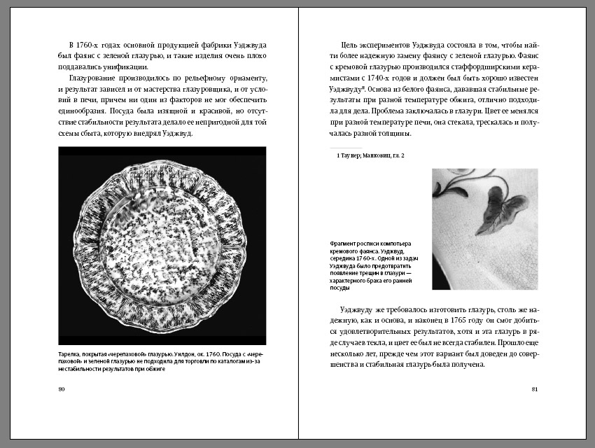
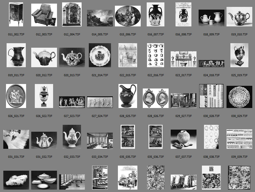
Preparing original images for print.
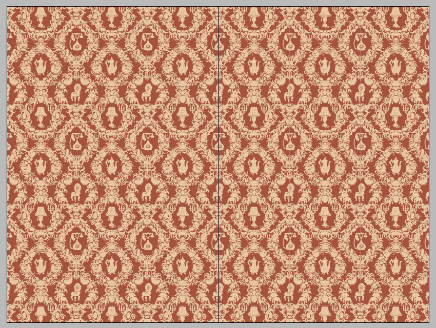
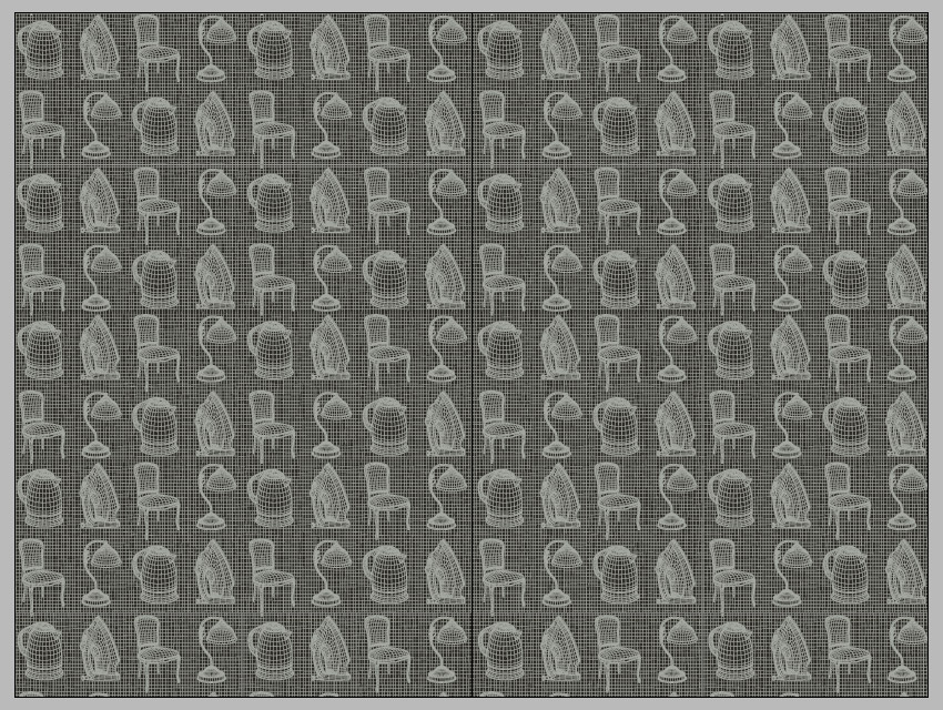
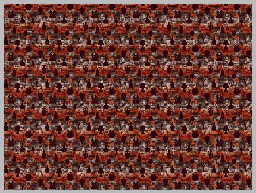
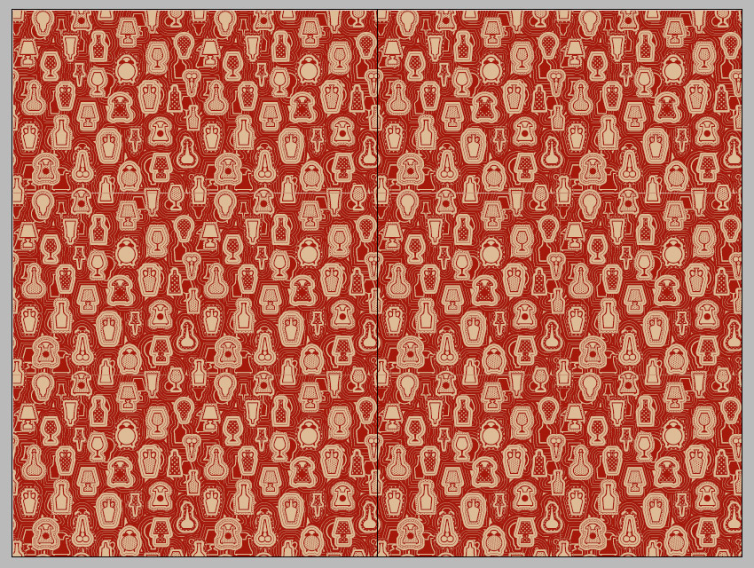
Creating the flyleaf design.
Formal.
Beautiful, but too different from the book itself.
Too high-tech.
More like it.
Perfect, just a bit refinement needed.
Designing the dust jacket.
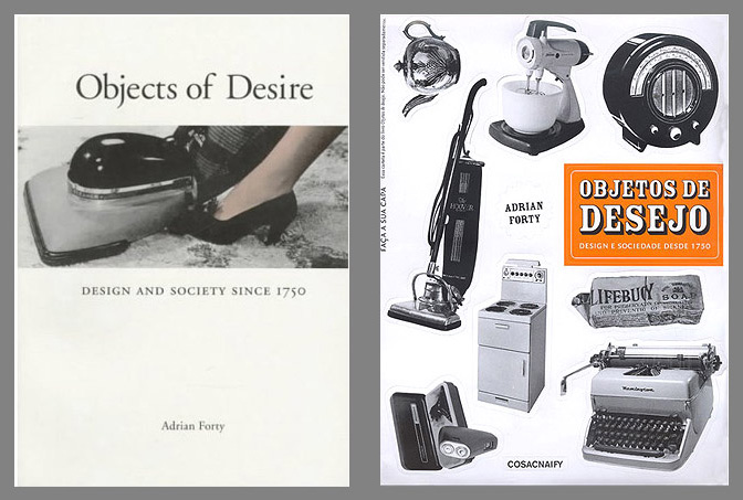
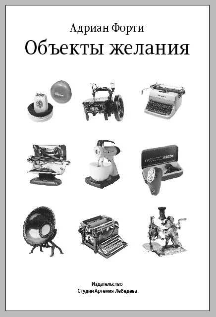
Predecessors’ covers.
Our regular approach first brought dull, stale results.
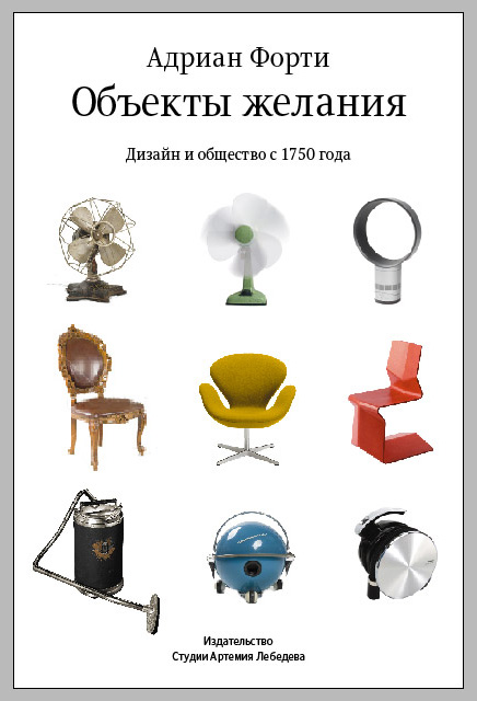
The dust jacket was meant to reflect the book’s main idea, so we selected things to illustrate different design eras, and added some vivid colors.
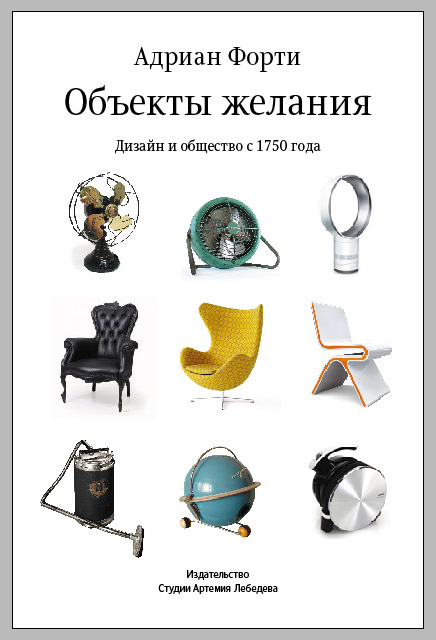
Finding appropriate products and images, some of them right here in the Studio.
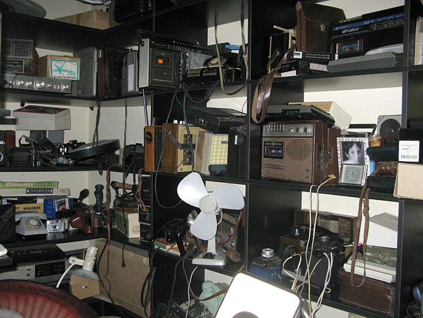
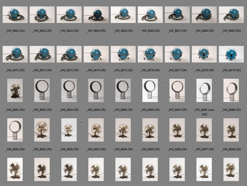
Shooting and editing.
Almost ready.
Finally we chose a headband, a ribbon bookmark and binding color, and sent it to print.
