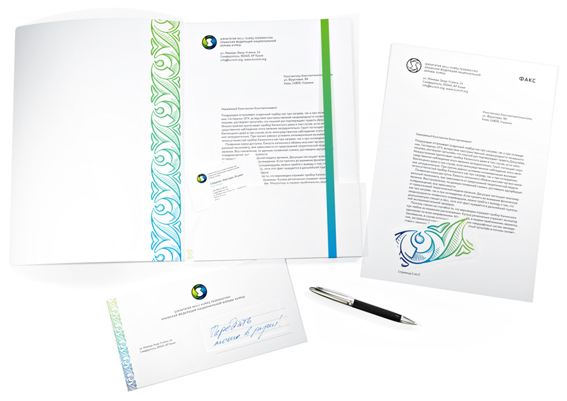
Kuresh is a classic martial art with a Crimean Tatar twist. Opponents’ uniform features long sashes for the goal is to grab your partner by his sash and throw him on his back. The Kuresh Associaion was founded in 2010, its visual identity designed in the studio.
The sashes whirl up in a wrestle
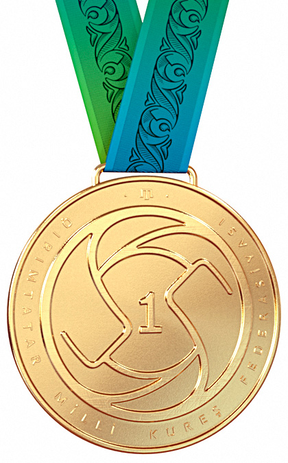
The logo stands for the partners’ equality and pursuit of victory.
Black and white logo version
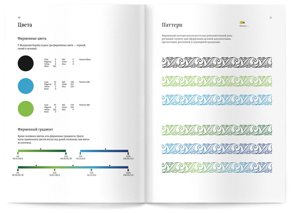
A forty-page style guide contains rules on the use of the logo, corporate typeface, colors and patterns, instructions on creating different documents, and recommendations for designing flags, pins, and medals.