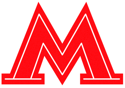
Moscow Metro logo

Overview   Process  

Task: to develop a unified and modern logo for the Moscow Metro.

The Moscow Metro opened for passengers in May 1935. From the outset, its emblem was not standardized and over the years was repeatedly subjected to spontaneous and uncontrolled transformations: it changed its shape and proportions, acquired contrasting contours and a tunnel-shaped outline, lost serifs and was illuminated by neon. Only one thing remained constant: the Moscow Metro was always symbolized by the red letter M.
metro logo
Moscow Metro logo 2014

A large-scale research of the history and development of the Moscow Metro logo was carried out in the studio in order to understand what the famous letter should look like today.
Release date: September 09 2014

Cast:

art director
designer
secret advisor
type designers
project managers
The studio wishes to thank head of the Moscow Department of Transport and Road Infrastructure Development Maxim Liksutov and deputy head of the Moscow Department of Transport and Road Infrastructure Alina Bisembayeva for their trust and comprehensive assistance with the project

It led to the development of a distinctive, modern and universal symbol for consistent use on any media associated with the Metro.

metro logo holiday
Festive version

metro logo photo infosos
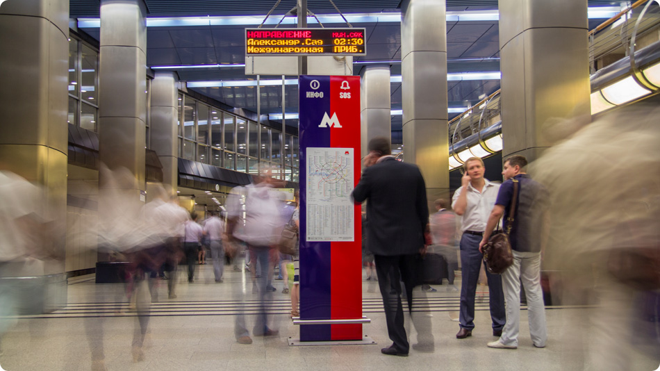
On an information column
metro logo photo street
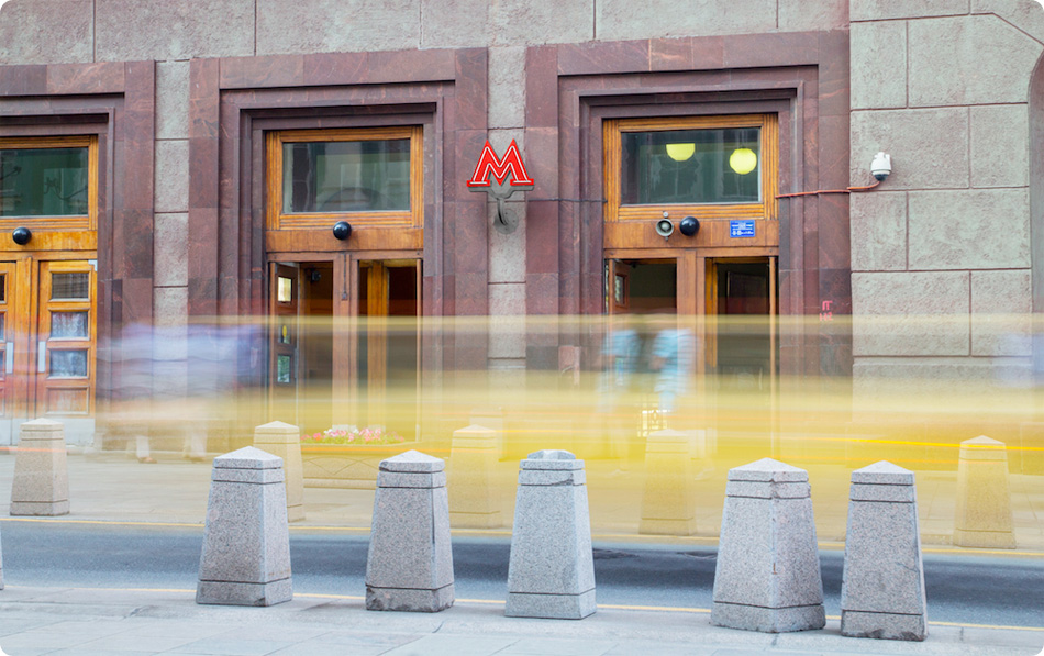
At station entrance
metro logo photo train
On a car
metro logo photo map
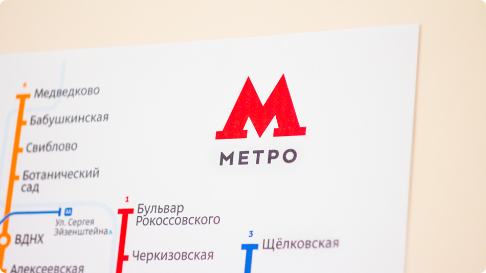
On a map
metro logo photo iphone
On screen

Moscow Metro logo is one of the elements of the Moscow Transport corporate identity.

metro logo mt

Order a design...