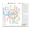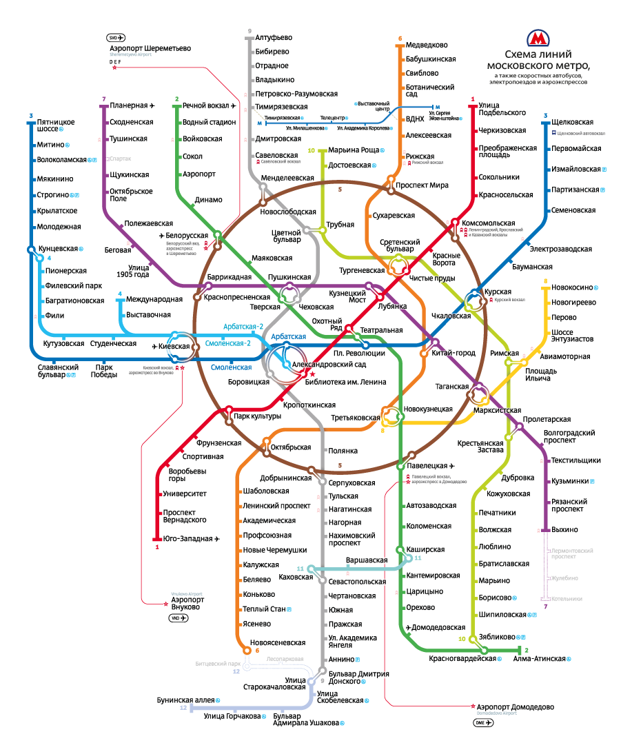
25.6″ square (65×65 cm) adhesive poster for the inside of a metro car
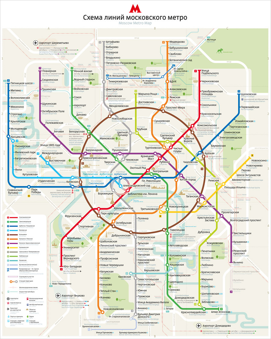
The loop line represented with a geometrical circle is the most recognizable, the signature element of the Moscow Metro Map and is to be preserved for as long as technically possible.
Second language
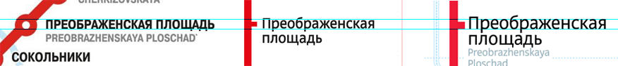
Traditionally, the Moscow Metro uses apostrophes for the station names in English. The studio’s map brought this practice to an end.
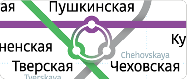
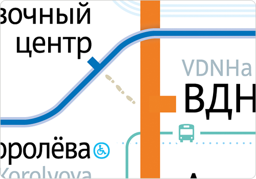
All English “subtitles” are printed in the same grey blue for an instant identification. The exact low-contrast shade was selected together with a smaller size type to avoid competition with the main text in Russian since in the Moscow subway there is only one passenger from abroad per thousands of Russian-speakers.
Text in different languages does not clash
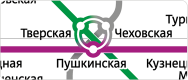
The station names in Russian were meticulously placed in the nearest proximity to the stations themselves while the auxiliary names in the Latin alphabet had second priority.
The Russian text is always closer to an object and the subs—farther
The second edition of the map features two indexes instead of just one, allowing foreign visitors to navigate it with ease using a familiar A to Z order.
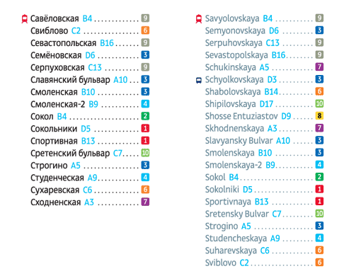
Note the sorting difference in English index
Obviously, publishing two separate maps in Russian and in English is just a question of time.
Ground transportation
On top of other improvements, the map 2013 sets a groundwork for bringing forth the Moscow city rail system. Moving traffic to the rail means relieving the metro and quite often it also gets you there faster and in a more convenient way. For instance, take Rizhskaya and Dmitrovskaya stations: in the metro system they are 4 stops and two connections away from each other, while taking a direct train from Dmitrovskaya rail station to Rizhsky rail terminal takes only nine minutes.
The map shows both: the rail platforms connected to the metro and rail lines going each to its terminal.
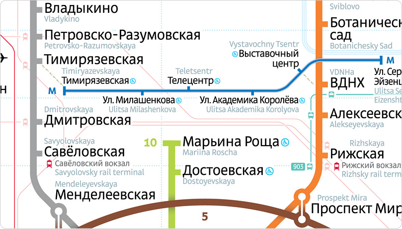
from Dmitrovskaya to Rizhskaya by train
Express buses and transportation to airports are treated the same way, so that all ground transportation has a consistent look throughout the map and different points are anchored to their geographical locations.
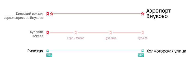
Train, express bus, and airport transportation lines
This map makes finding your way from any airport to the city and back a breeze.
Station connections
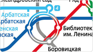
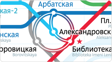
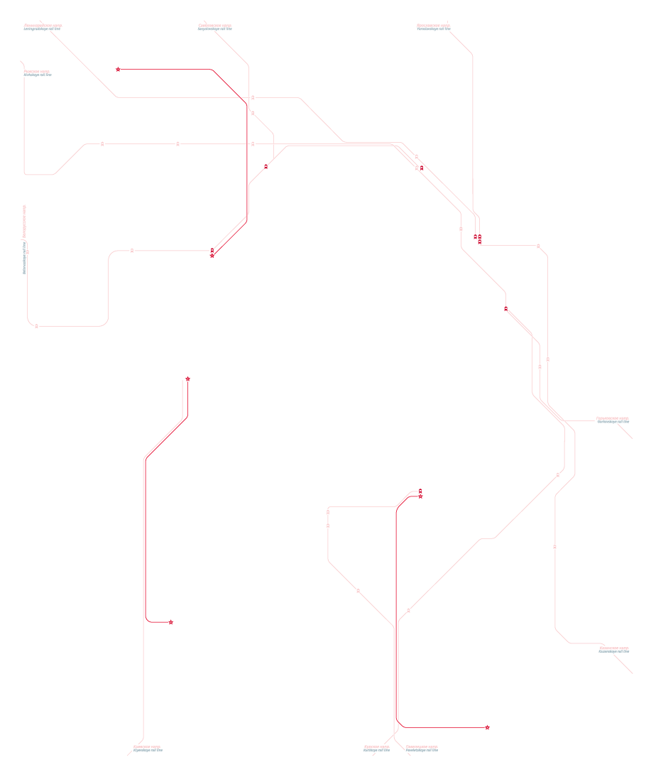
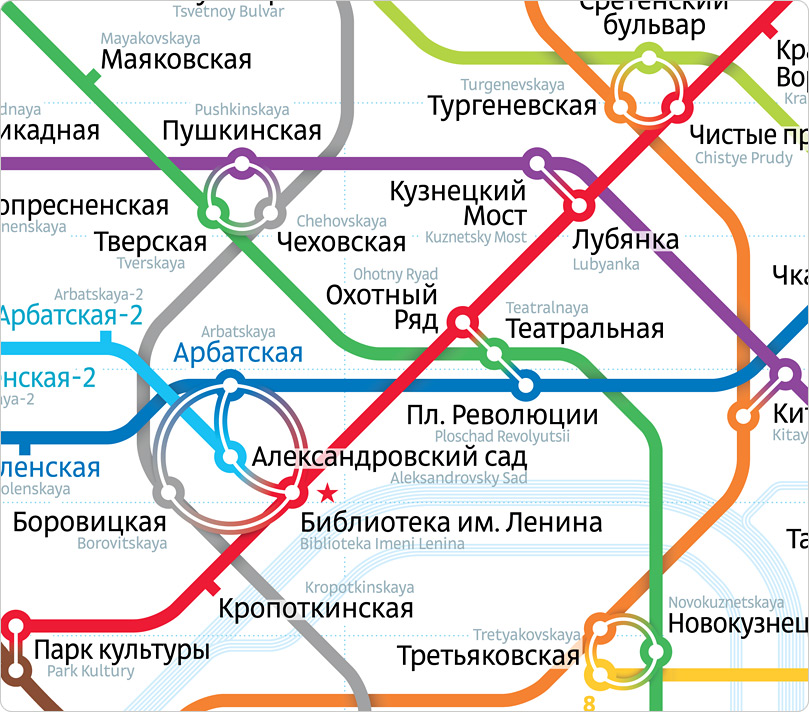
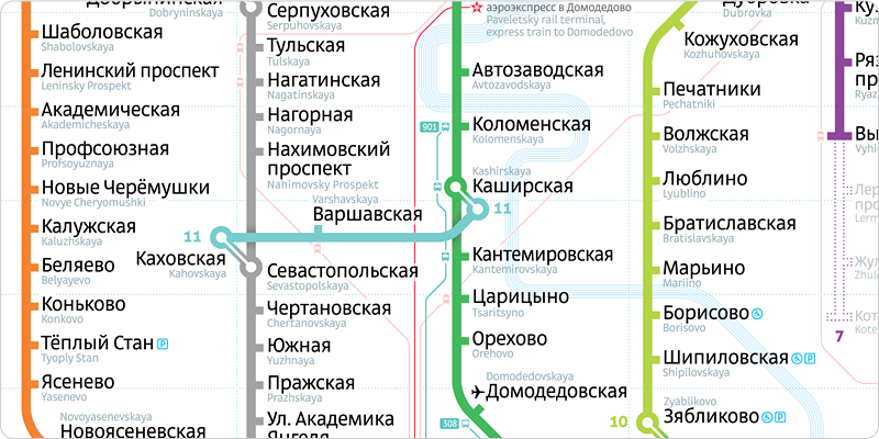
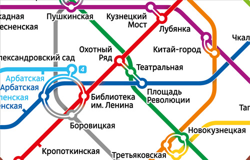
The tricky connection between four stations—Biblioteka Imeni Lenina, Borovitskaya, Arbatskaya, and Aleksandrovsky sad—deserves a closer look. This connection has an annoying peculiarity: you can’t get from Borovitskaya to Aleksandrovsky Sad. There were attempts to show this limitation in the previous edition, but this time we found a far more clear and elegant solution. Now the absence of a direct connection is immediately obvious.
Map 2013 is completely free from confusing line overlaps at the most critical locations—the connections. Now there’s no lines inside the connection circles which contributes to map overall clarity and legibility.
The layout
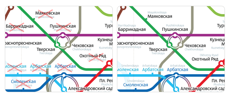
There are virtually no connections outside the circle line and the stations line up in uniform lists. As in the first edition, these lists are typeset in the simplest, most legible and proper way: as a column flush left.
It’s so easy to track stations with your finger and count them
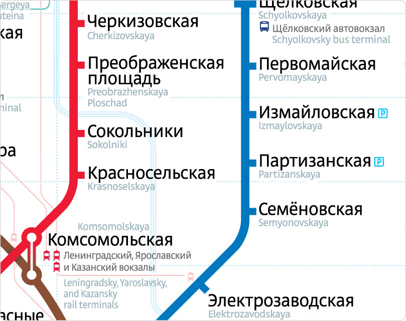
Station-marking «stumps» have grown and share a baseline with the station names, making it impossible to miss a station even when counting them from afar.
Typeface and large details
The type used in the map 2013 is lighter and thinner (Direct light) yet larger. The station names and other text is set in accordance with Russian grammar using lower and upper case letters properly. But despite a popular misconception it did not shrink the text, quite contrary, the lower case letters are now larger than the upper case on the “classic” metro-car map.
Legibility improved
The grid
In the current edition we’ve kept the same amount of horizontal sections of the grid and considerably increased their number vertically. By doing so, we’ve fit 2-3 stations per cell as opposed to 15-20 in the previous version (for example, most of the stations inside the circle used to inhabit the same grid cell). Finding a station you are looking for now takes a couple of seconds..
B3 cell on the map 2010
C12 cell on the map 2013
Color-impaired vision
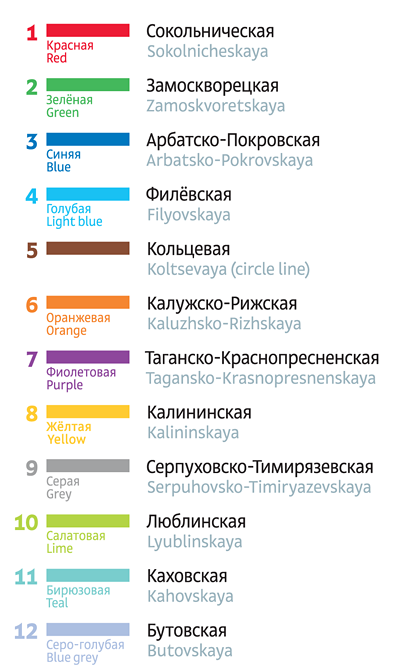
The map is suitable for passengers with color-impaired vision. About 5-6% of people have some grade of color challenge which translates in about 250 thousand Moscow metro passengers daily. Having these people in mind, the colors chosen for the map are very high contrast in relation to each other. For example, the certain shade for the red line is stripped of the unnecessary yellow undertone to clearly set it apart from the orange line; there is a better definition between the kelly green and lime lines; blue, light blue, and purple are also hard to mistake one for another anymore.
Additionally, the lines colors are named in the legend. People with color-impaired vision can’t make any sense of the common phrases like “at the top of the red line” or “let’s meet at the orange Oktyabrskaya.” The circle’s line color is the only one not named as this line is impossible to mistake with any other.
All colors of the Moscow metro
Since the line color name is set in smaller size type and a bad printing can make it difficult to read even to people with perfect vision, we’ve also marked each line in the legend with a number.
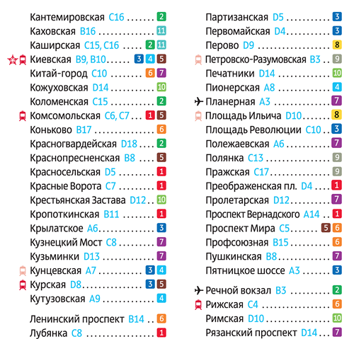
Secondary indexing
Little touches
Metro map 2013 is made with love for its users and to obscure details. Note how for the first time in the map history Vorobyovy Gory station is not sitting in the middle of the river, but on a bridge; how the line overlaps are executed with the actual tunnel depths in mind; and how it’s communicated that it’s quite a walk to the monorail.
Formats and variations
Just like its ancestor, the second edition of the map can accommodate any required format and morph into an endless number of variations: with or without the river, with or without the rail lines, with the major highways, sights, parks, Moscow signature Stalin towers, Moscow river ports, Izmaylovsky park, and many others. To switch to a particular version a designer simply turns on and off certain layers, better yet, neither the map’s overall visual density, nor legibility will be effected by such modifications.
The basic version in Russian
English
Rail lines Buses
River
Grid Sights
«ë» character
Parks Legend