Pizza Pi logo and corporate identity

Overview   Process   Real Life  

Task: to develop a logo and a corporate identity for a chain of pizza restaurants.

Pizza Pi is a chain of affordable city cafés where customers can enjoy thin pizza baked in wood-fired ovens as well as other popular dishes of Italian cuisine. A logo and a corporate identity for the chain were developed at the studio.

pizza pi logo main
The logo

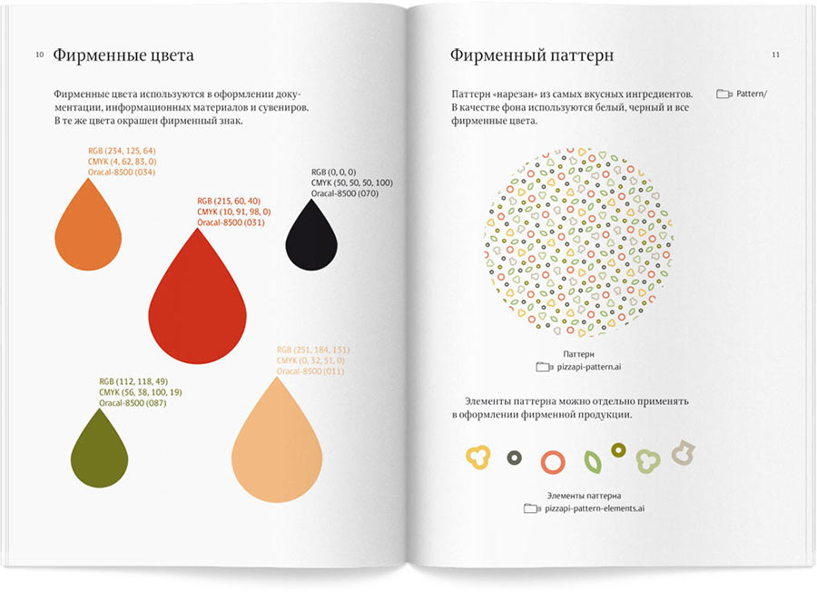
The logo combines a slice of pizza with the letter Pi, while its colors hint at Italian Renaissance. Fluid lines and smooth character of the letters highlight the hospitality and cozy atmosphere of the restaurants.

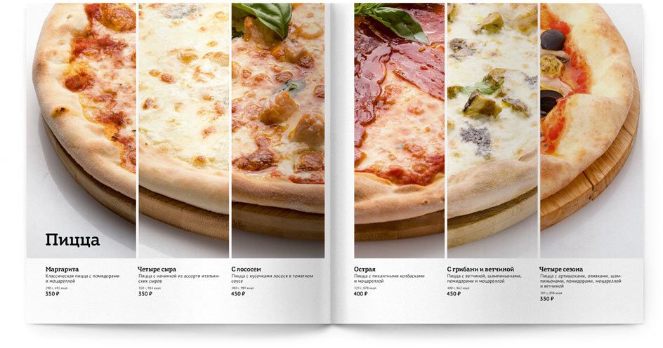
A bright pattern was created for various decoration needs consisting of popular pizza ingredients: tomatoes, olives, peppers, mushrooms and basil.

Release date: May 19 2014

Cast:

art director
designers
chief typesetter
typesetters
type designer
photographer
editors
project managers
pizza pi pattern elements
pizza pi pattern

The compact and carefully designed menu illustrates detailed descriptions of all dishes with large photographs.

pizza pi menu cover
Menu cover is decorated with the corporate pattern
pizza pi menu spread varieties
pizza pi menu spread snacks
Mouth-watering photographs help to choose from the menu

Café signs are made of plastic and polycarbonate with two types of illumination. The logo is manufactured by vacuum forming technology giving the text a pleasant volume.

pizza pi sign
For any façade

Rules for using the elements of the corporate identity are given in the style guide.

pizza pi bb colors
Opening on colors and the logo
pizza pi bb font
Opening on the typeface and the sign


pizza pi cook

Order a design...