Graphic design


Russian North


Corporate identity   Bottles  

Corporate identity for Russian North vodka

Overview   Process  

Task: to design a corporate identity for vodka

Russian North is a new brand of vodka coming in three flavors: Classic, Cranberry, and Taiga. We’ve created the brand name, developed the logo, visual identity, and bottle designs.

Logo is adorned with traditional northern motifs

A supporting role in style-building is assigned to a compass with an arrow permanently pointing to the Russian North

Release date: November 10 2011

Cast:

artistic director
Artemy Lebedev
art director
Timur Burbayev
designers
Vladimir Zotov
Vladimir Pavlenko
technical designers
Maksim Pomerantsev
Olga Pozharova
typesetter
Iskander Mukhamadeyev
Anna Golovina
type designers
Yelena Novosyolova
Nikita Kanarev
illustrators
Marina Novikova
Oleg Tischenkov
copywriters
Philipp Shprints
Tatyana Devayeva
editor
Alexander Nosikov
photographer
Yevgenia Filatova
project managers
Vladislav Kalkayev
Alexei Luri

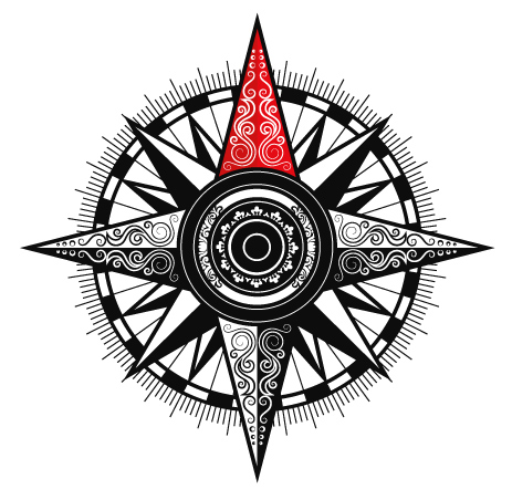
Each flavor gets its own color.
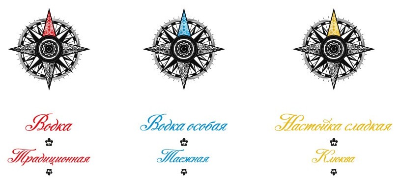
Color-coded flavors

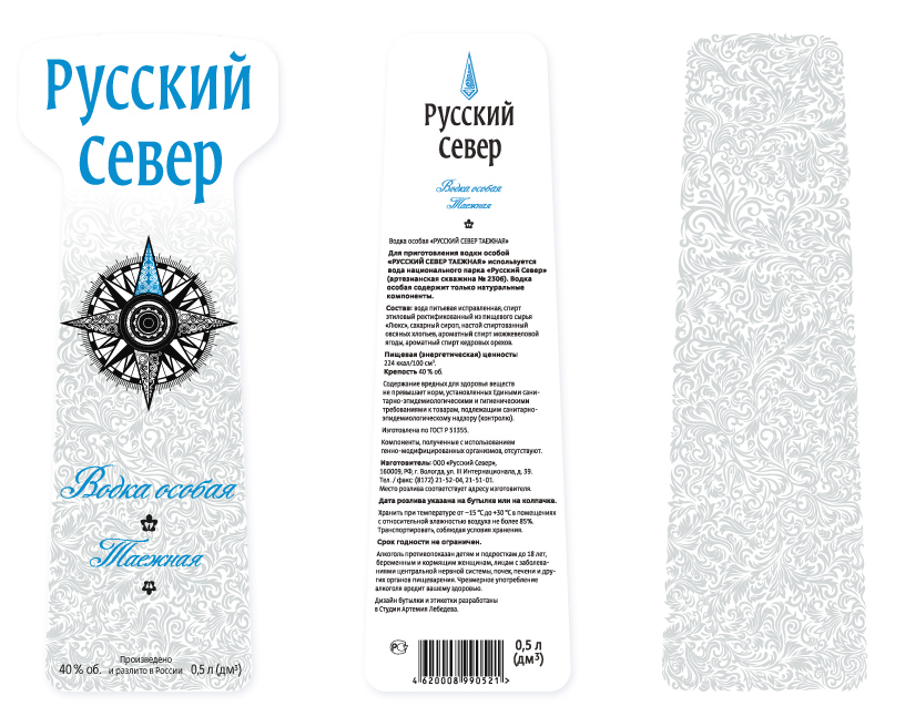
Front and back labels are frosted with corporate pattern

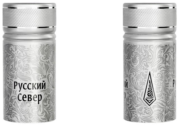
To cork up the chill we frosted the cap with the same “iced window” pattern

The style handbook contains all the necessary guidelines for the use of the new corporate identity.

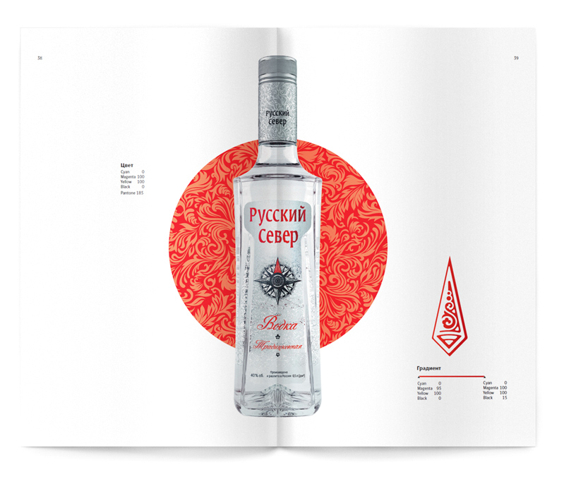
Pages from the style handbook describing the proper use of corporate colors

The original idea behind the Russian North bottle is in its unconventional facets refracting the light. The bottom is embossed with a compass to protect you from knock-offs. The “frosted window” pattern shimmers from the inside of the bottle out, making Russian North stand out on store shelves as in its private spotlight.

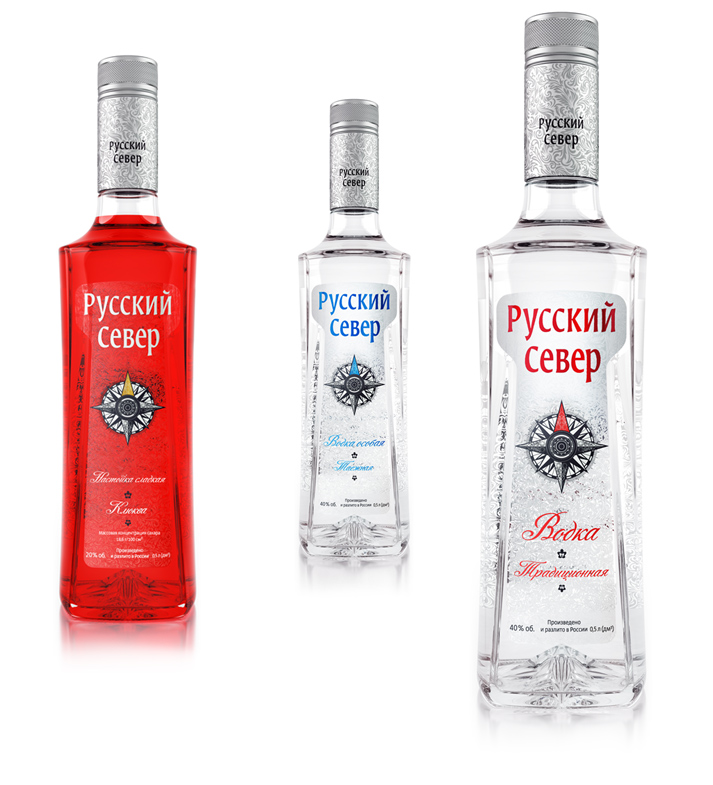
The bottle design truly shines thanks to all the style elements playing together


Share this page:


© 1995–2012 Art. Lebedev Studio