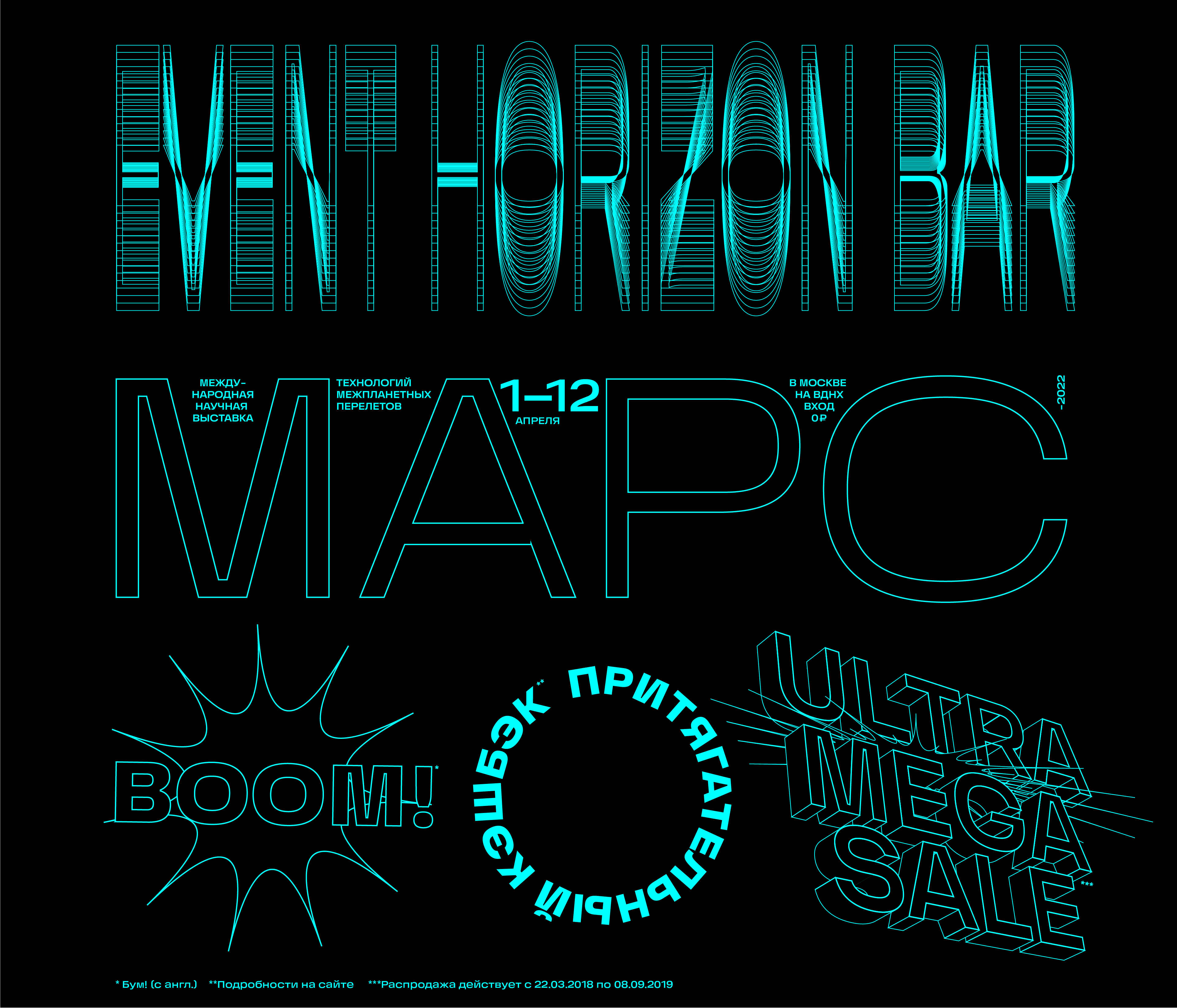
Horizon


The typeface’s aspiration to be monospace defined its two key features:

1. Horizon’s round letters are not ovals but rather rectangles with rounded corners. This makes the typed matter denser and more massive.
1. Horizon’s round letters are not ovals but rather rectangles with rounded corners. This makes the typed matter denser and more massive.

2. Exaggerated ink traps make the face look fresher and more modern as well as serve to maintain the uniformity of size when approaching monospace proportions.

As a result, letters stand close together like bricks, creating smooth dense rows with a diverting pattern.
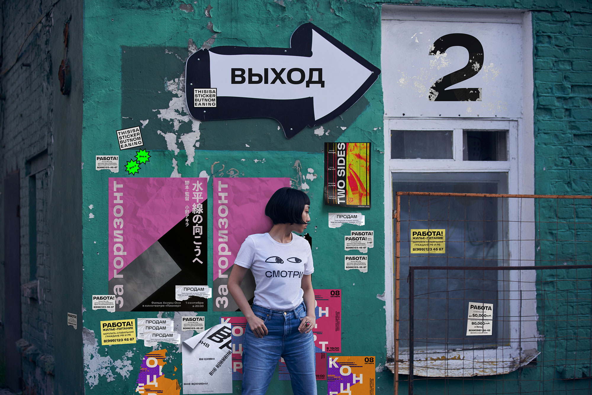
The typeface works well in smaller sizes. Any pair of the face’s characters can be used as favicons, avatars and logos.
One example of this is the use of Horizon in Art. Lebedev Studio Periodic Table of Elements for which it was originally created.
For more details see the table announcement.

The typeface contains Cyrillic and extended Latin alphabets, fractions, math and currency symbols. It’s a good and mature typeface.
art director
designer
- Taisiya Lushenko
