Ooze typeface

Ooze is a high-contrast antiqua with closed character shapes. It is well suited for large headlines and short text, a format that is especially appropriate for magazine publications. However, its high readability allows the typeface to be used with equal success in any matter.


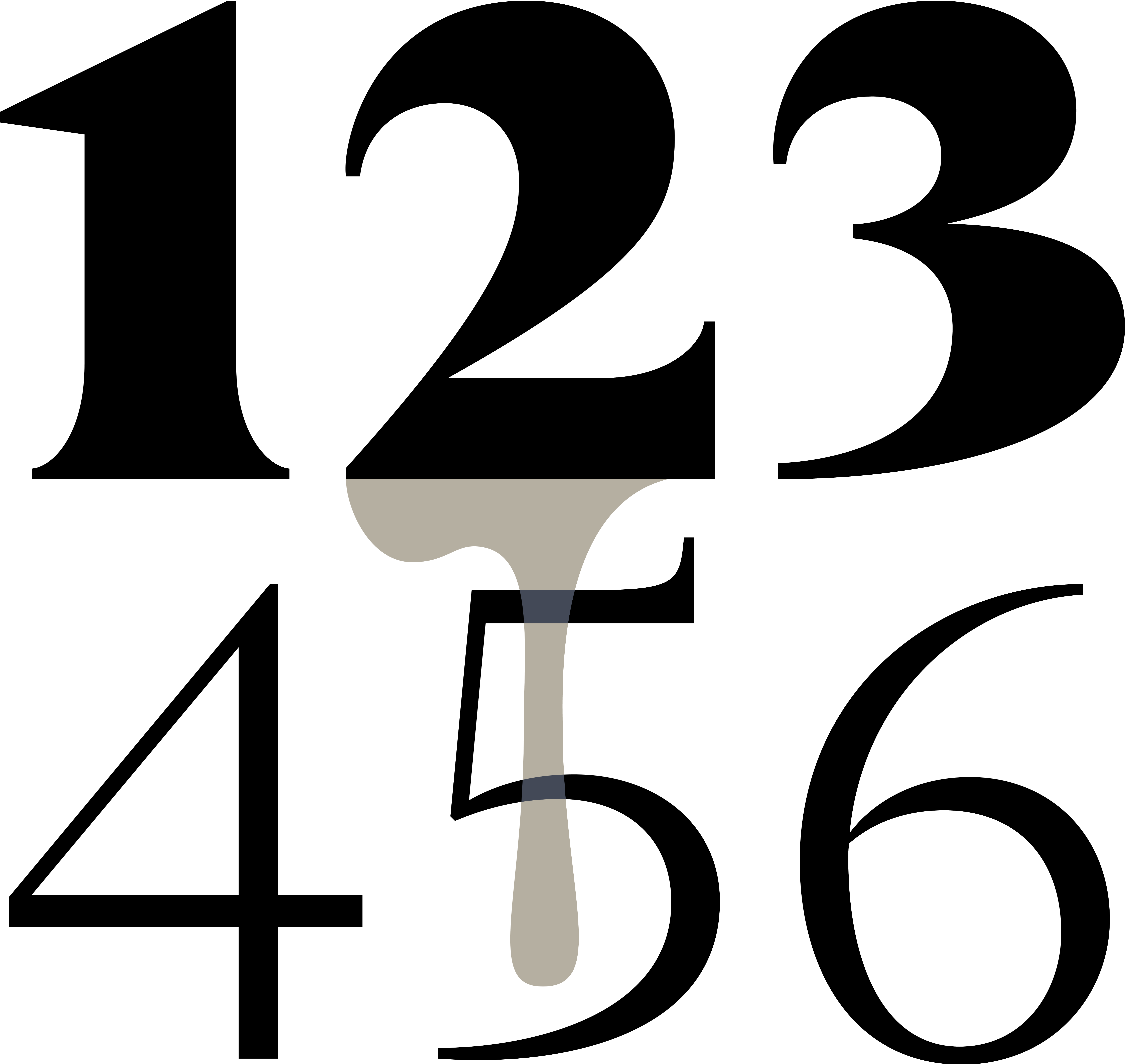
The design of the letters in Ooze’s straight lines is based on unified graphemes and rely on the logic of movement of a flat pen. At the same time, the symbols are distinguished by the unusual shape of the terminals: rectangular endings are used in place of drops. The result looks fresh and modern.

Classic sharp serifs flow smoothly into vertical and horizontal strokes. Although compensated, the apexes remain sharp enough to emphasize the jobbing nature of the typeface.


Classic antiqua shape of the letter g
Combination of statics and dynamics in counterforms


Ooze supports languages that use extended Latin and Cyrillic characters. The set also includes mathematical, currency and case-sensitive symbols, as well as arrows.


The family includes fourteen styles: seven straight and seven italic. In addition, two variable typefaces were created in which the saturation level can be smoothly adjusted from light to extra bold.
