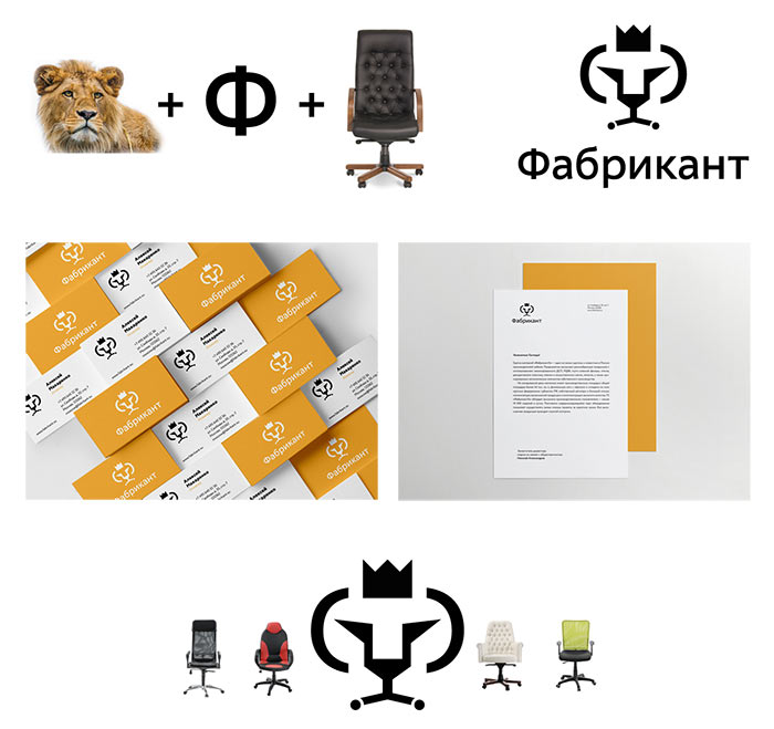
For a furniture-producing factory we want to draw a chair or a sofa. And to somehow incorporate the letter Ф.
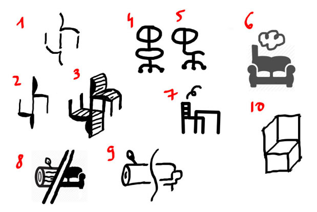
Art director: Maybe we shouldn’t search for a chair in the logo.
Art director: Give me more unique ideas.
Still, the chairs won’t leave us alone. A diacritic chair.
Art director: Not bad.
Also, factory number one.
Art director: That’s one for the shortlist.
Piling up more ideas. The contrast of soft and hard in furniture as well as the lion from the old logo which has been with the company for many years.
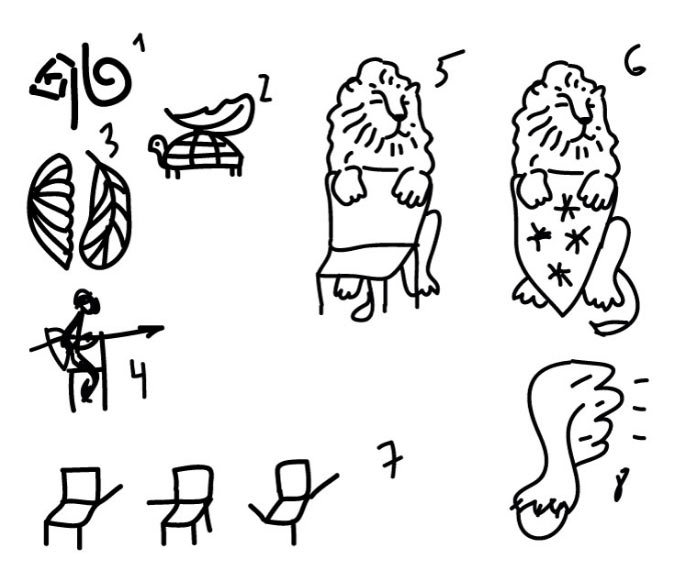
There are also impossible shapes, an ideal metaphor for furniture business in Russia.
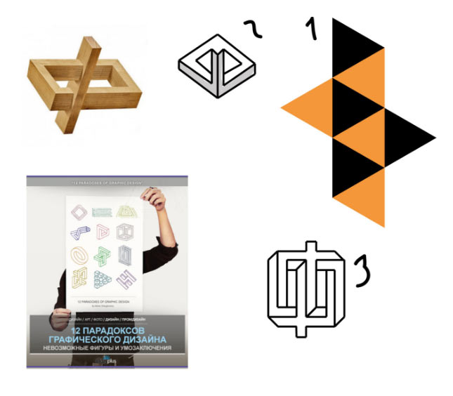
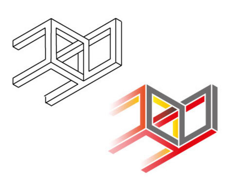
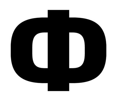
Here’s an impossible letter Ф.
Art director: Not bad.
Or an impossible rocket chair.
Art director: Nope.
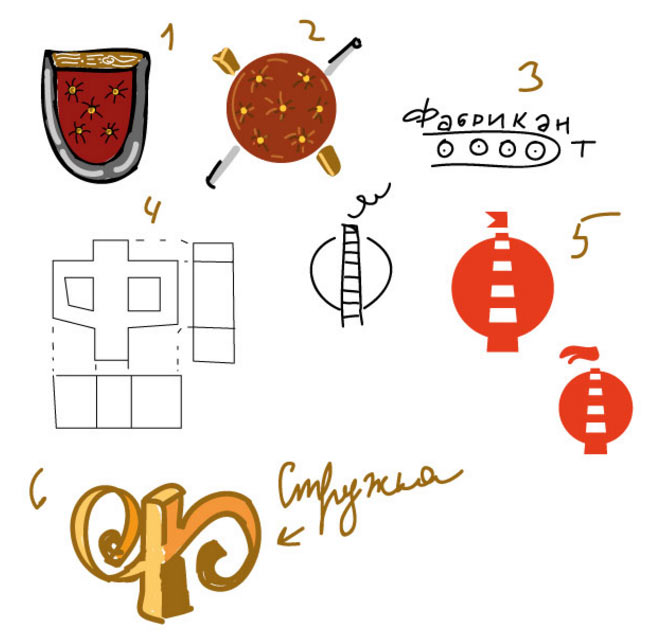
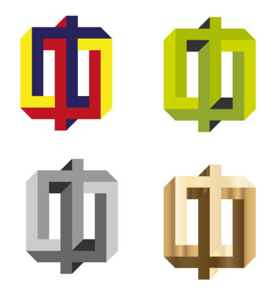
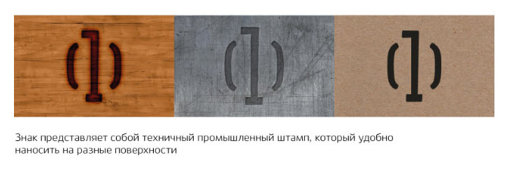
We learn that one of Fabrikant’s main competitors is also using impossible geometry in their logo, which means we can’t do the same. Checking out how the letter Ф would look in various materials.
The Ф-1 keeps reminding the art director of some sign he has seen before. Starting the search. Failing to find the exact duplicate, but realizing that the idea with broken letters is used so often that it reminds of everything at the same time. Dropping it as well. We also don’t like the diacritic chair anymore.
Going back to chairs and factories.
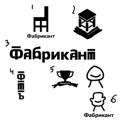
Art director: The factory-chair is OK.
Choosing the shape.
The simplest one wins. Showing to the client.
Overall, the client likes the design but has doubts: it looks too dissimilar to the old logo and somehow resembles a pharmacy cross. The client wants continuity and smooth transition.
The art director suggests that instead of trying to improve the logo based on the client’s comments we create a new one built around the letter Ф.
Trying to combine the Ф, the lion and the idea of furniture in an office throne.
The art director approves the second design. Developing and exploring the shape.
Deciding to show the last one. Assembling a presentation.
Approved. Sending for finalization.
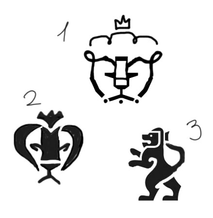
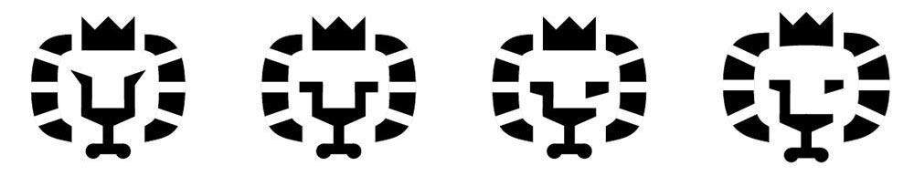
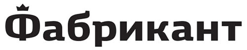
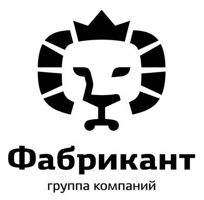
A lion’s head, especially with a crown, is a popular motif in logo design. Our lion will be different because of the chair hidden in the face. Which means it is important to ensure the chair can be easily seen. We should also turn the outer elements into a mane, after all that’s what makes a lion.
Something’s not right. The logo is too aggressive and unstable and even a slightest hint of the chair’s back inevitably breaks the lion into pieces.
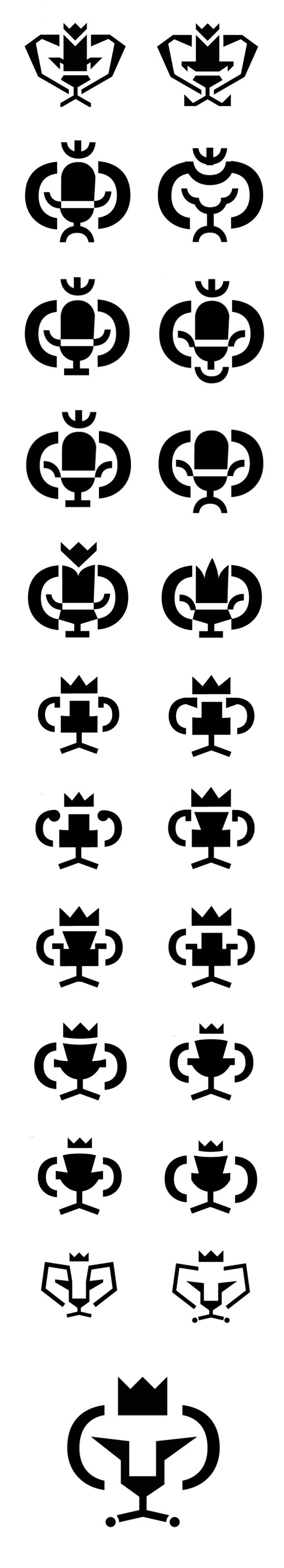
Using the squared letter Ф from Ekibastuz typeface.
The lion has calmed down, became more grounded and self-aware. Rotating the chair 90° and now instead of breaking the lion’s face into pieces it gives it volume, creating shading from the eye to the nose.
Showing both designs to the art director.
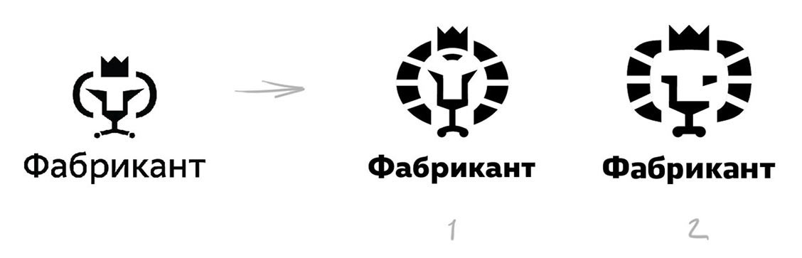
Art director: The lion in number 2 became very sad. And the chair looks like a shopping cart.
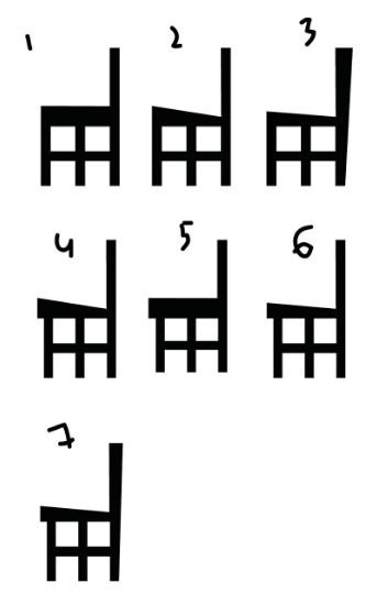
Great, it means the overall direction was chosen correctly. Searching for better shapes for the chair and the eyes.
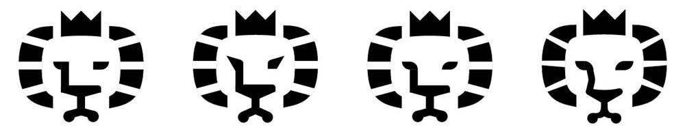
Smooth bends of the back and the legs make the chair instantly recognizable. Making the stripes in the mane slightly narrow towards the ends to improve the coherence.
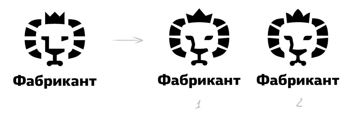
The art director chooses the first design.
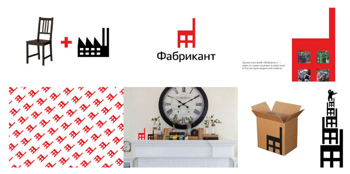
Getting the client’s comment that they would like to keep red as their corporate color.
Designer: All right, we can use it in backgrounds and interiors.
Art director: What if we add some red to the logo?
Designer: Adding red would deprive the logo of its pithiness making it more lightweight and cheap. If we were to color only some of the elements, it would remove the coherence of the image: the Ф would fall apart and the hidden meanings would become too apparent (the viewer’s eyes won’t be shifting focus from the chair to the lion, they would always see the chair and a piece of the lion). I would prefer to keep the logo entirely black.
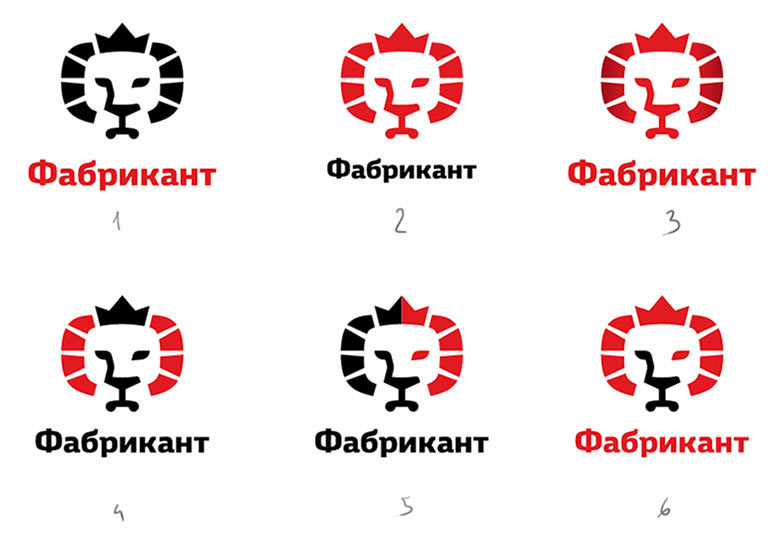
Art director: OK.
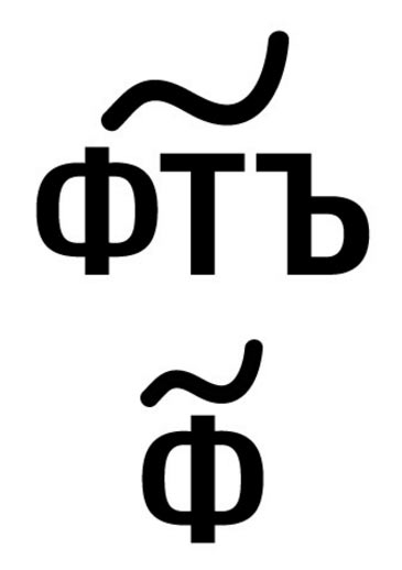
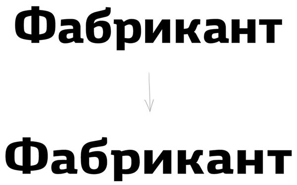
While the designer is working on all the small details, we are sending the sketch to the type designer. We need a massive and respectable square grotesque typeface, yet with interesting details that would rhyme with the bends of the logo, tails of а and б and legs of the к.
The type designer sends her design:
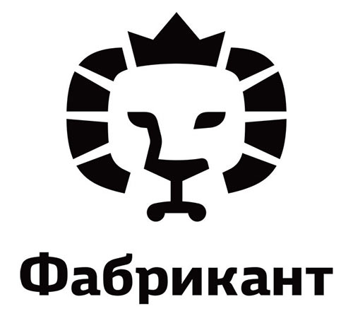
Assembling the presentation of the finalized version of the logo. The client likes it but has some doubts about the lion’s mouth which seems a bit too soft and round.
Trying to make it more tough.
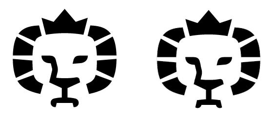
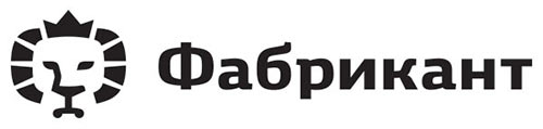
Fangs and swollen cheeks? No, thank you. The wheels stay round.
The type designer keeps working on the text. The letters have grown in width, а and р have lost their sharp angles, the tail of б became lighter to avoid blending with the rest of the text in smaller scales.
Just what we were looking for.
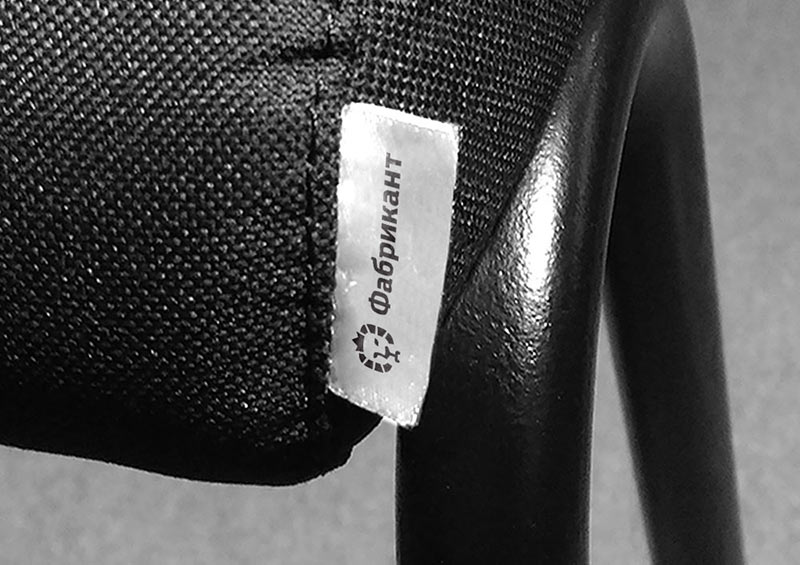
Now we need to create a horizontal version of the logo for use on furniture labels 4×1.5 cm (1.6″×0.6″) in size. What if we go with slightly decorated text?
Art director: No, put the logo there as well.
Choosing proportions, optically compensating the decreased line width.
Adding a version of the logo with caption for the official documents and showing to the client once again.
The client is happy. Assembling the guide and preparing files for handover.
