The making of the Flacon Design Factory map
Overview Process
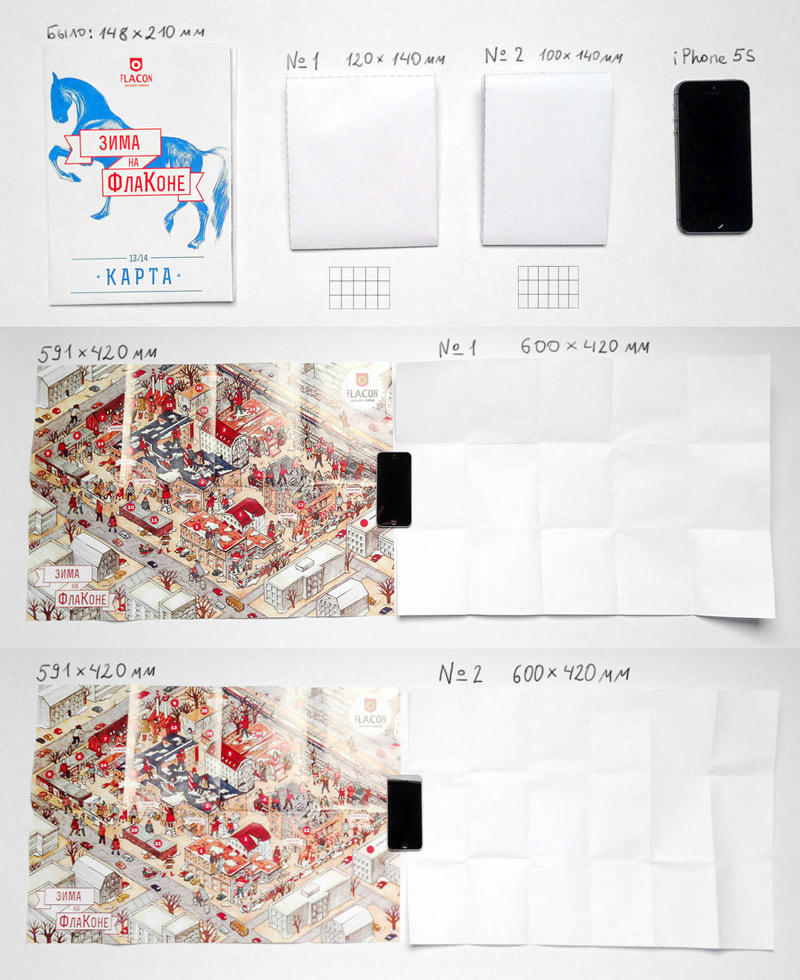
First we need to decide on the format of the map.
The previous version was too large and didn’t fit in a pocket. Trying two layout variants and choosing the second one.
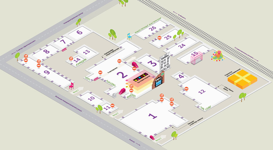
The main aim of the map is to be functional and easily understandable, which means we must show all the entrances to the territory and provide building and building entrance numbers. There are many art objects at the factory which we also want to show on the map.
The first approach. What if instead of buildings we only show their walls and entrances?
Art director: The isometric view is OK, the entrances are OK, but the pins inside are not OK: they look too noisy and can’t be read easily. I also thought the walls were too active. It’s better to get rid of the grid, it only brings more noise. There is an easy test for building numbers: try to locate building 3, entrance 4. Right now it’s not that simple.
Trying to calm it down.
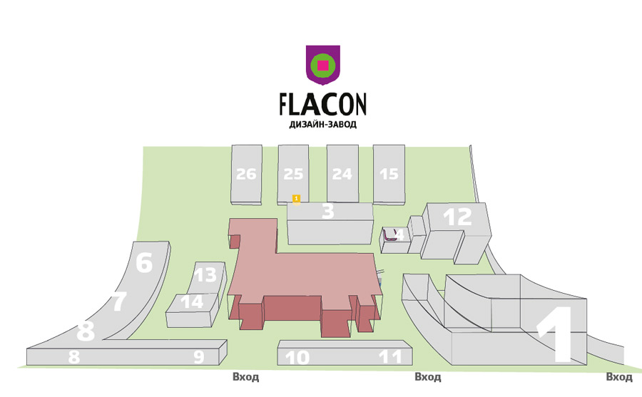
Or maybe screw the walls? We can keep only the building layouts.
We start with something neutral, gradually adding layers and color.
Designer: Or maybe like this? It’s like a special reverse perspective. You can see all the streets, all the courts and all the walls. We can show the entrances and even drawings on the roof (the white Flacon text). We can also show wall texture and colors.
Art director: It makes the doors too small and the trolleybus absolutely incomprehensible. And it looks like a dozen pyramids.
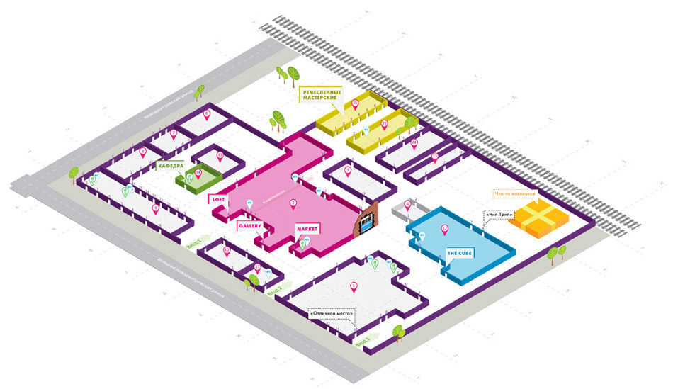
The designer continues to work on the isometric view with no walls and adds art objects to the map.
Art director: Not good enough right now. Letters with volume are a total no-no. The exits are too noisy, there are too many details. The green color is too active. I don’t like the icons.
Another alternative.
At this point another designer writes:
— It’s cool that all three entrances are in the front: this gives us the opportunity to experiment and do something like this:
It’s a thought.
Drawing a slightly more detailed draft.
Showing the isometric and the curved plane approaches to the client.
The client makes the right choice. The work continues.
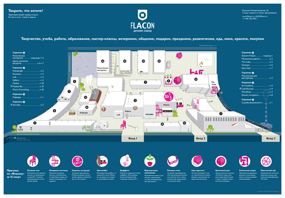
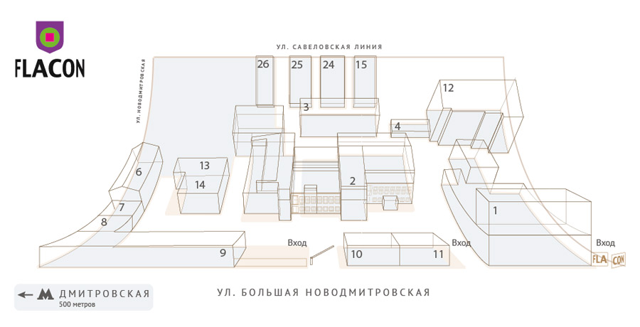
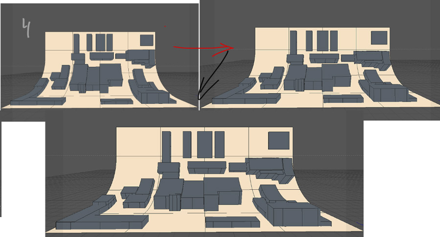
First we need to pick the right perspective so that the buildings don’t lean over the streets. Building a simple 3D model and making slightest top-down adjustments.
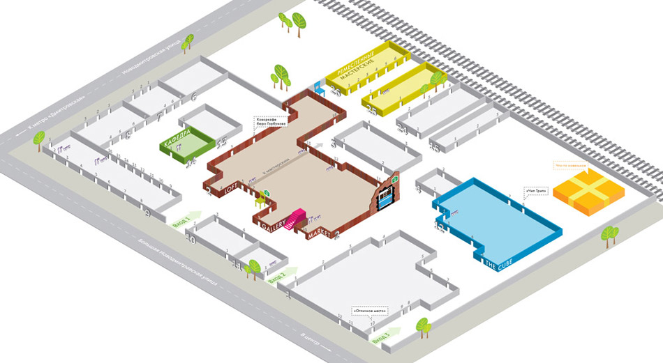
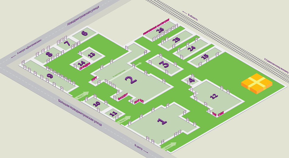
Drawing the buildings. Let’s keep the dark background, it makes comprehending volume and space easier. Marking the tenants who are the most difficult to find.
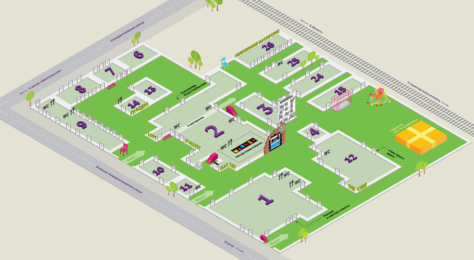
Adding the art objects, the café by the first entrance and the trees. As for the gray field, there will be a guy digging for treasure there.
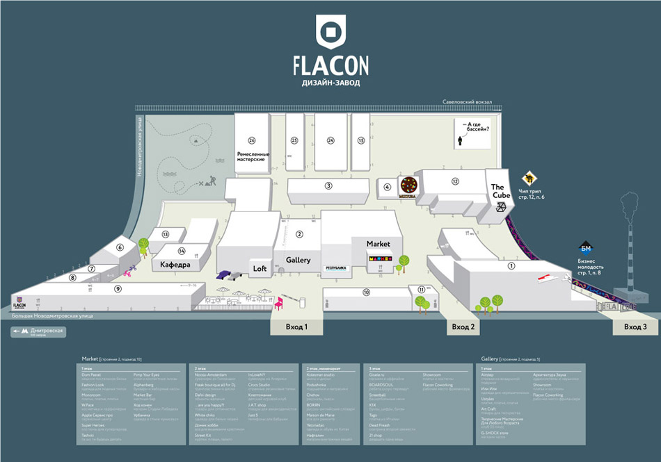
The client and the artistic director approve the chosen direction. The art director makes a bunch of comments.
Trying different ways of drawing the objects on the map.
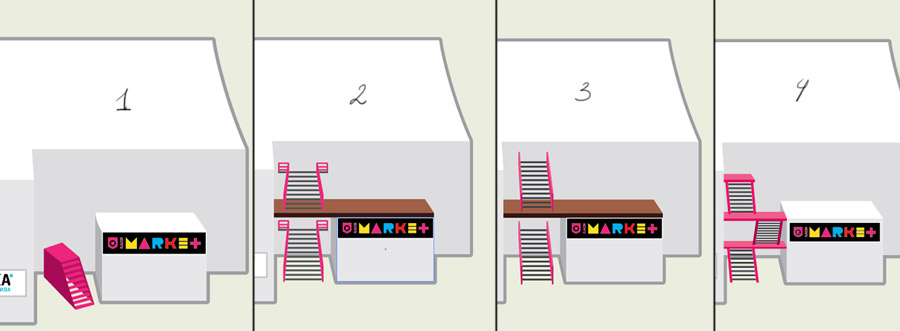
The stairs.
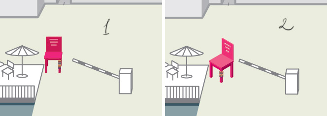
The chair.
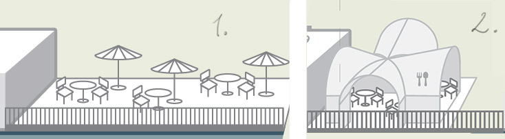
The café.
Adding description of the art objects and other details. Choosing the background color.
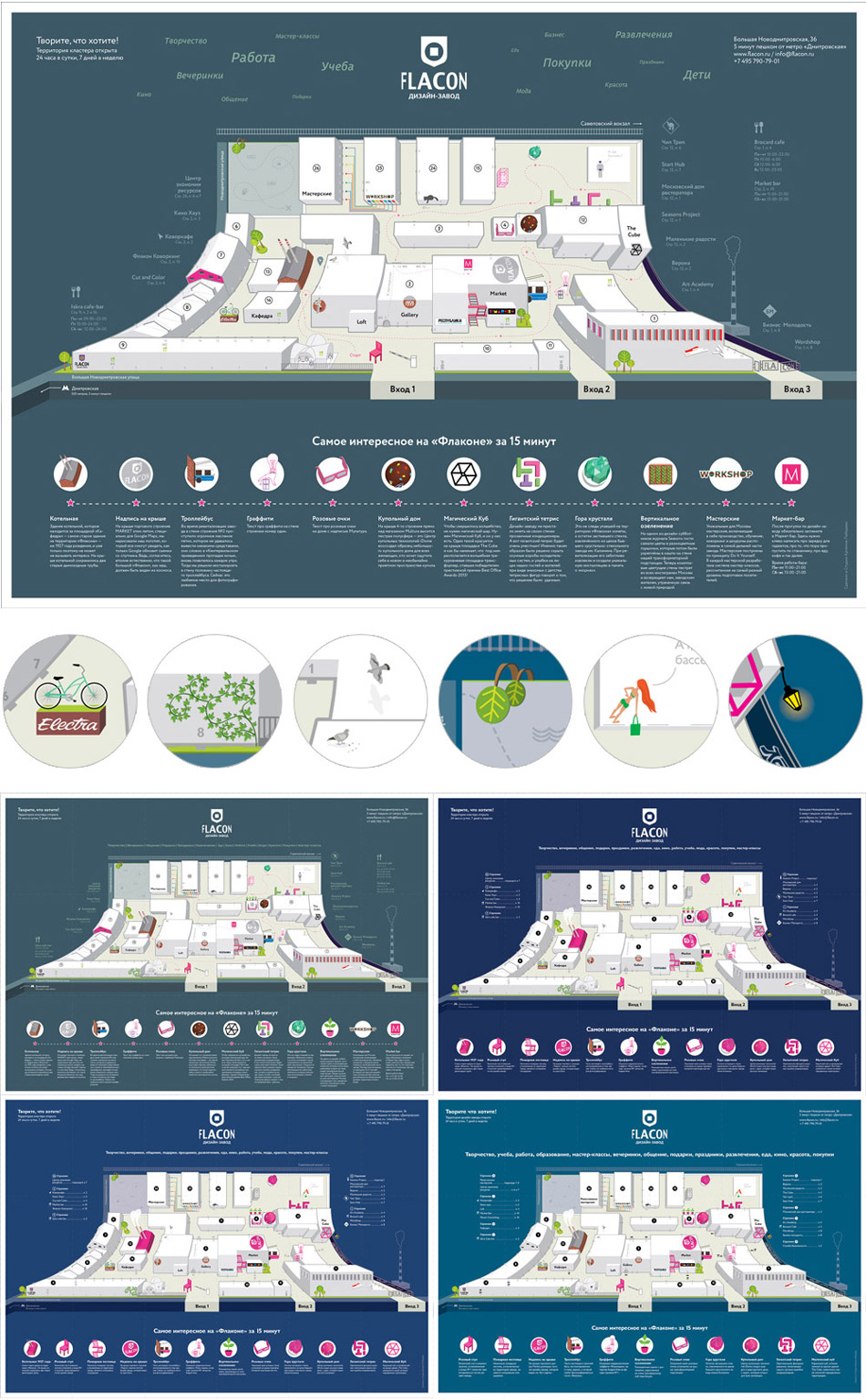
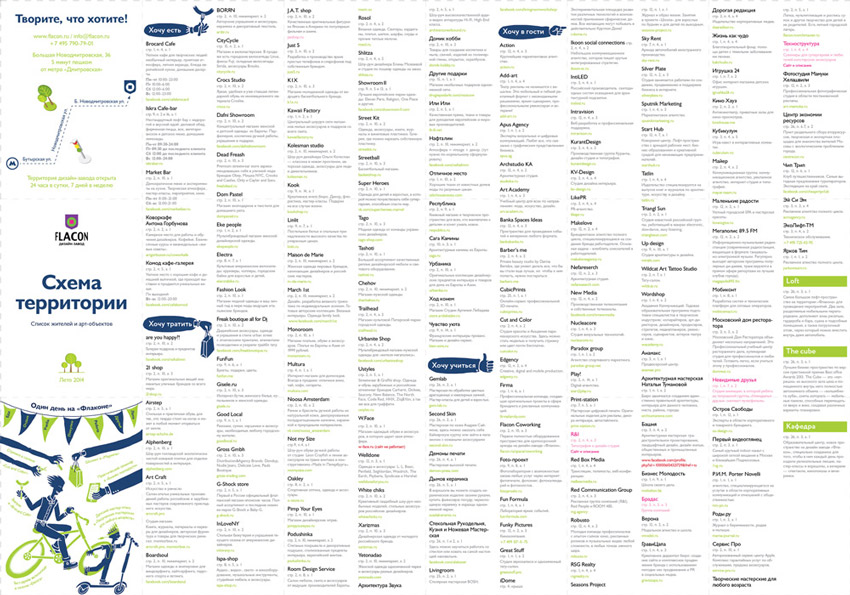
Time to think about the cover and the tenant index layout.
The cover has to be clean and simple: it’s a functional map, not an advertising booklet. Drawing a picture on how to spend a fun day at the factory on the back.
Typesetting.
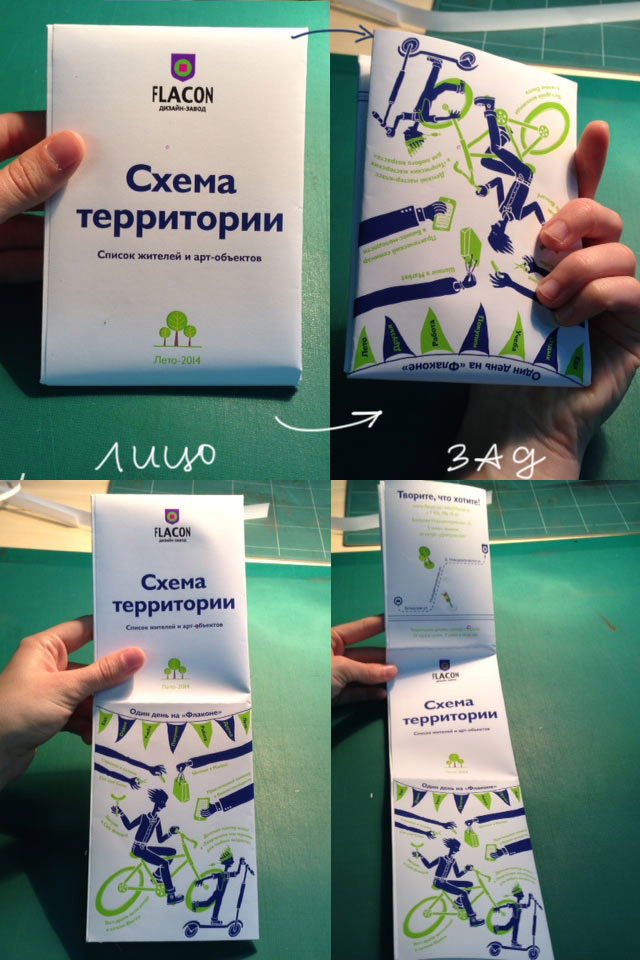
Checking how the map will fold.
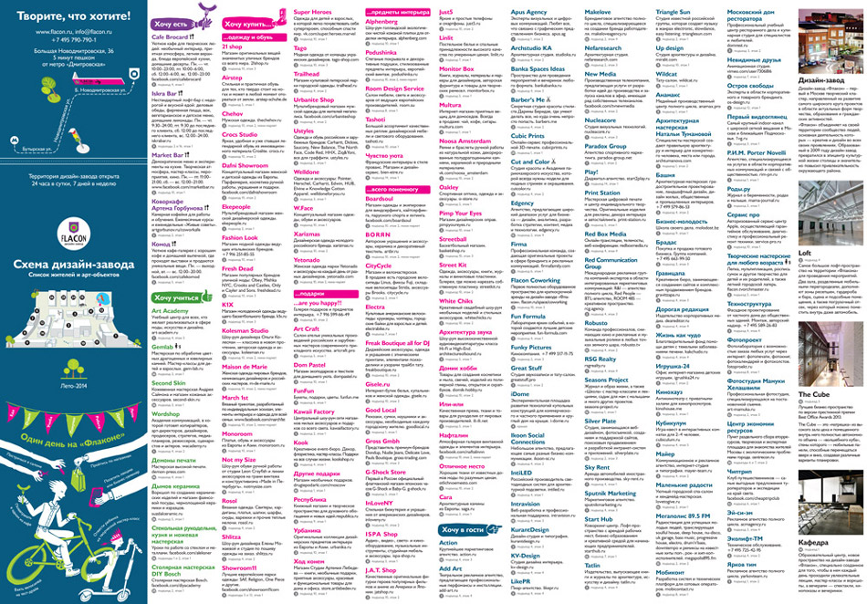
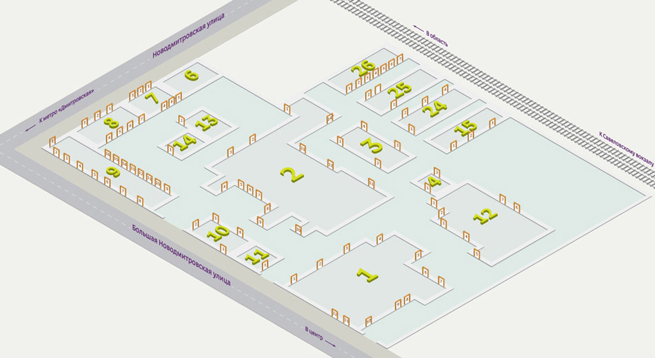
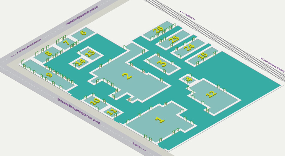
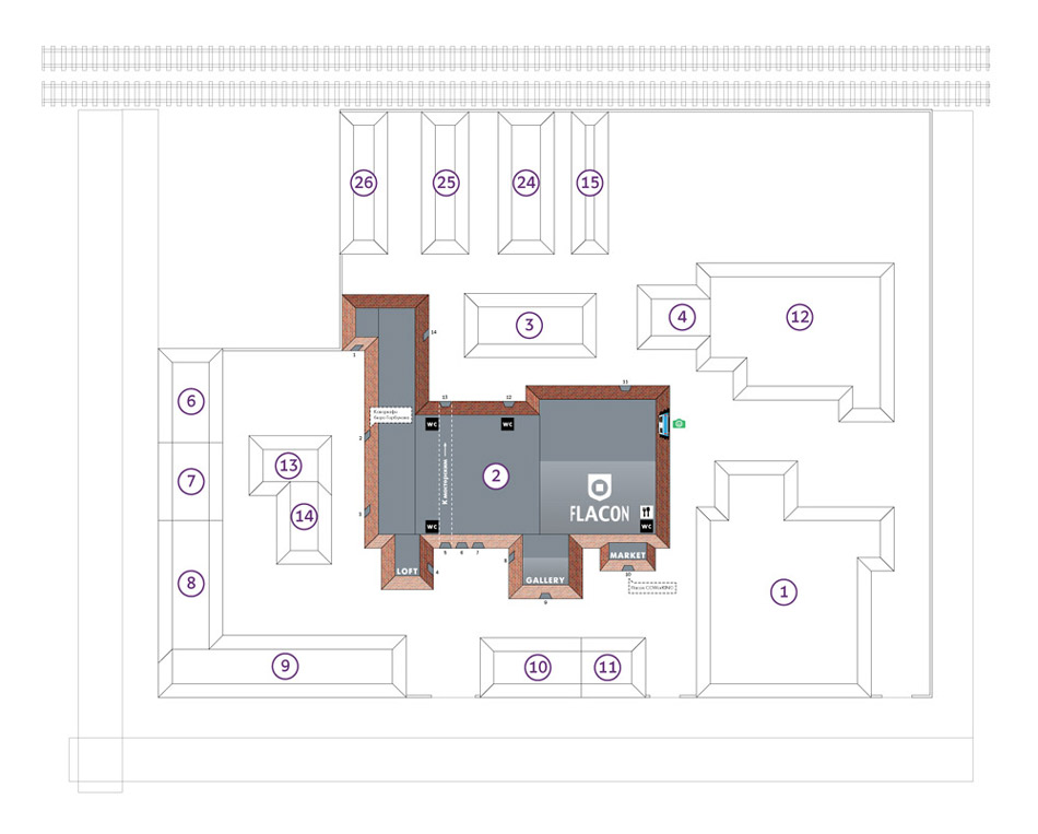
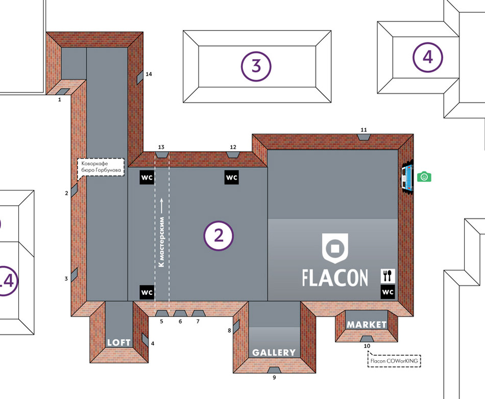
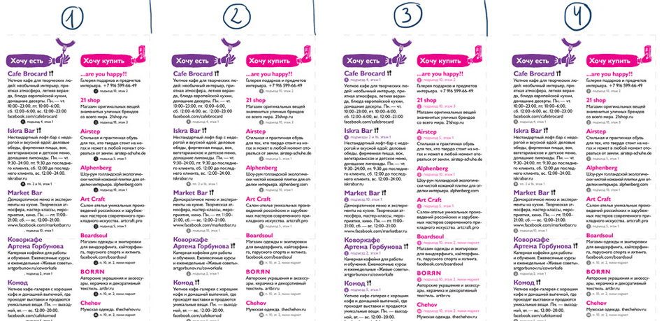
Trying to find the best way to display building and entrance numbers in the index. Obviously, we need to put them in circles, just like on the map. All that’s left is to make sure the circles are not in the way of reading the text.
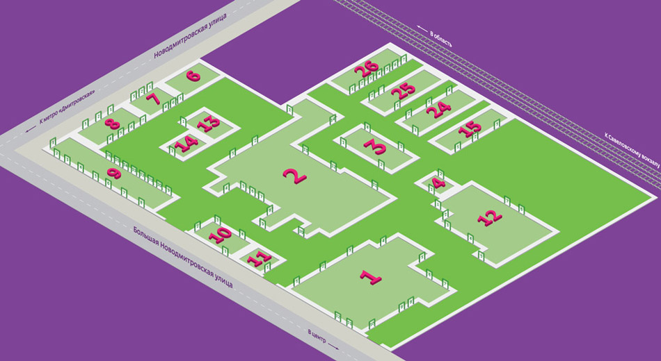
Playing with the color and position of the circles.
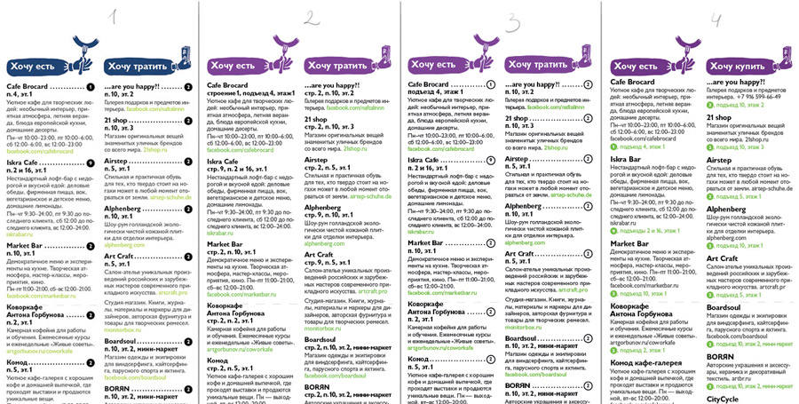
Adding color to the headings. Very good, the text is now divided into blocks which makes it easier to understand. Placing a miniature map with building numbers on the front cover. This makes using the index very easy: we see the building number in the text and can immediately find it on the mini map.
Still, the circles in the text create too much noise.
Some more layout options. The number four screams, “Choose me!”
Finalizing the text layout, changing the color of the cover, polishing the details, checking the main map. Time to print.