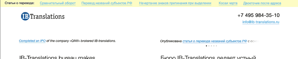
The making of the IB Translations website
Overview Process
We start by getting acquainted with translation services and existing websites.
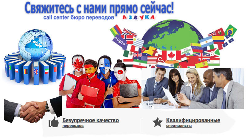
It’s all very bad. Flags, globes, handshakes, politically correct stock photos. Also, loads of bullshit: every freelancing student claims to have 20 years of experience and guarantees the highest quality.
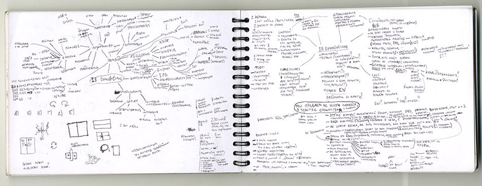
Analyzing the findings and moving further. We have a boutique translation agency, not a shady “one hour translation” bureau, which is exactly what we need to move away from. Writing down all thoughts and associations in a notebook grouping them by directions.
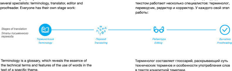
Instead of abstract slogans and sweeping statements we need to emphasize the facts: not “here are the logos of our clients”, but real deals and translations; not “a young team of experienced professionals” (which often turns out to be a loose group of unreliable freelancers), but a list of employees with a summary of their qualifications and work experience; not “flawless quality” but “each text is treated by five experts including a terminologist and an editor.” And the mood: the website shouldn’t be shouting to pull in customers and spilling out a fountain of lies as a TV shopping channel, it has to be reserved, calm and confident.
According to the statement of work, the website needs to be in two versions, Russian and English. But the English version of the website is exactly the result of the translators’ work! We get the idea to show versions for both languages at the same time so that clients can judge the quality of work by the quality of translated texts. Adding a slider to compare the translation by the client’s team with the results from Google Translate, by a freelance student translator and a sketchy “one hour translation” bureau. Moving the slider completely changes half of the text on the website.
Creating a sketch of a single-page website to demonstrate the concept.
The art director likes the idea. Getting ready to present to the client, brushing down the page, replacing the filler content with real text, adding explanations and videos on the margins.
The client approves the concept. Moving to the detailed design stage, incorporating the client’s comments.
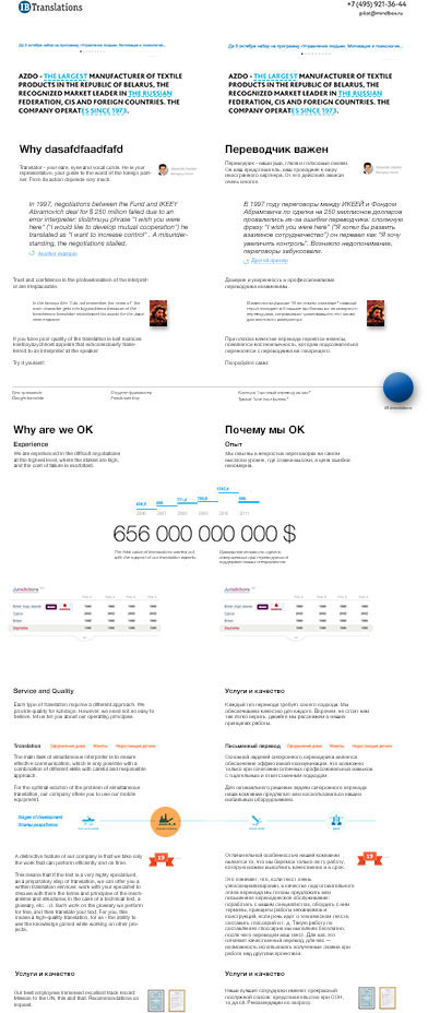
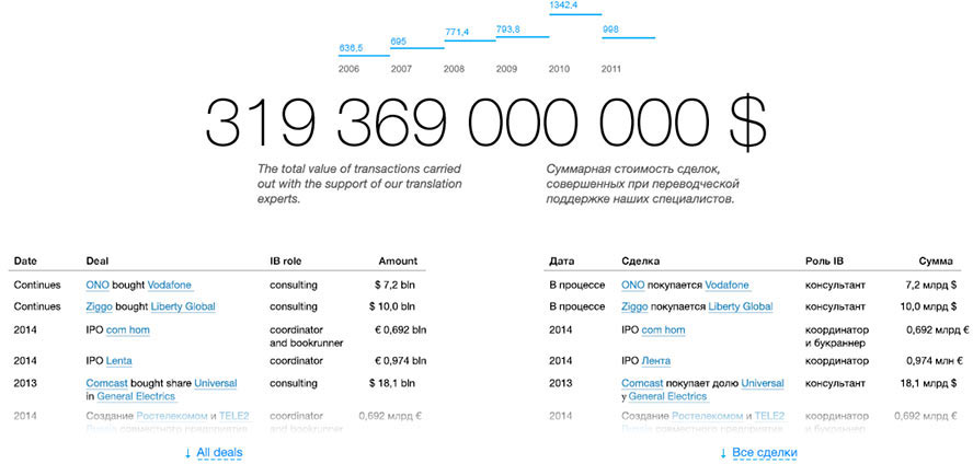
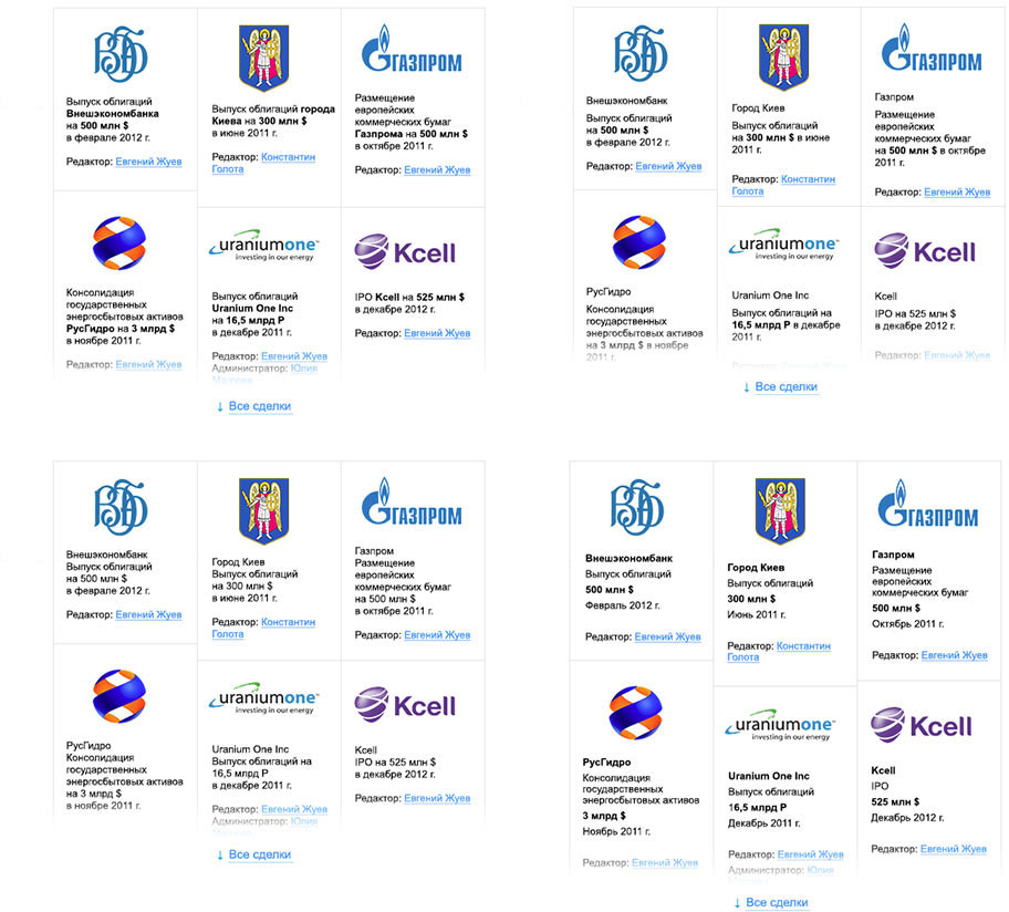
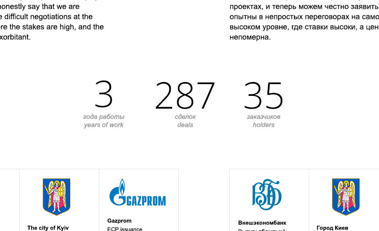
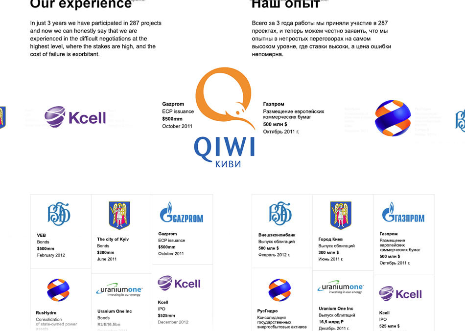
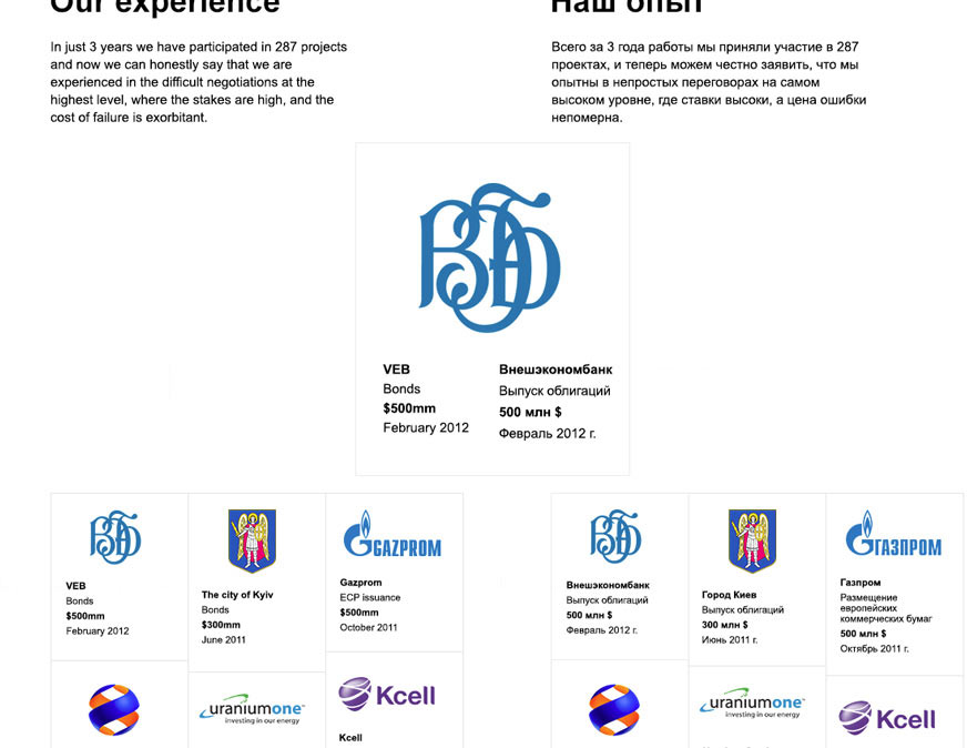
One of the features of the client’s portfolio is a long list of business transactions concluded with the help of the company. Singling them out and placing them in a separate section that starts with an impressive total sum of all contracts which speaks volumes about the professionalism of the company.
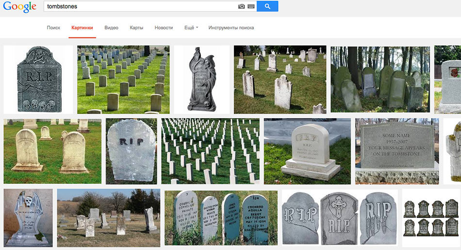
The client asks to arrange the list of deals as tombstones, which is a traditional business deals design format. Studying what tombstones are.
The second attempt.
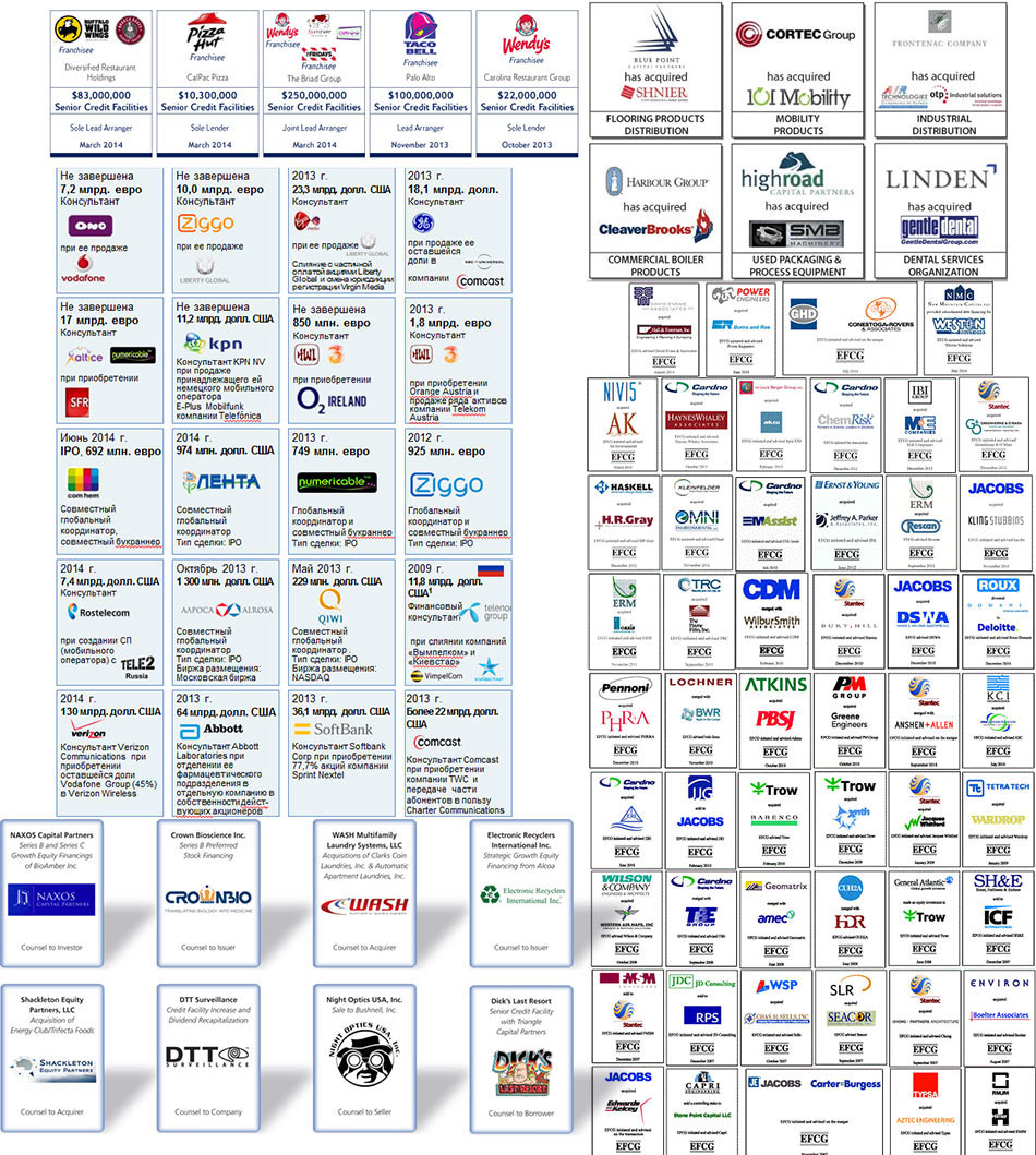
Yeah, they surely have their own way of doing things in the business world. Trying to maintain the standard and make it look pretty.
A color background will reveal the problem with company logos placement. Margins between company cards eat up the valuable horizontal space (let’s not forget, the site is only half a page wide) and too many lines create visual noise. Choosing the most effective distribution method and starting to typeset the contents.
Art director: Bottom right is OK.
Spending a lot of time trying to marry visual sizes of dozens of logos.
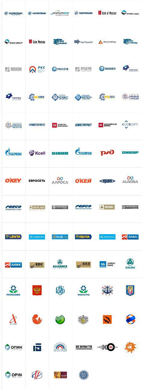
Sometimes using blur to easily see visual weight.
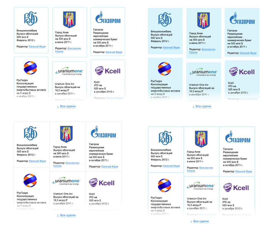
The client asks to maintain the format by aligning the cards by height and to remove the information about the editors. OK. The client also doesn’t want to show the total sum of all deals they handled. Trying to replace this information with other facts.
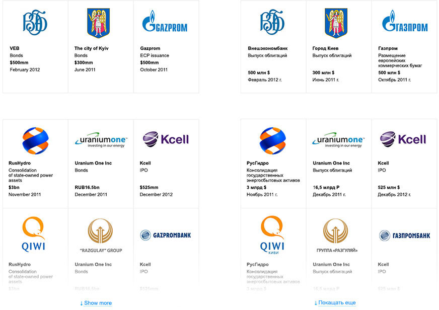
Much less convincing and not exactly relevant. Instead, deciding to show the largest deals. For example on a carousel.
The deals have to be presented in a tombstone format. Trying to use a huge deal card.
Ultimately deciding to simply put featured transactions on a separate line.
Typesetting the rest of the materials.
Art director: The list of translations looks like a design portfolio, as if they were the ones who designed these websites and reports.
Deciding to go with company logos. Then discarding type icons, too.
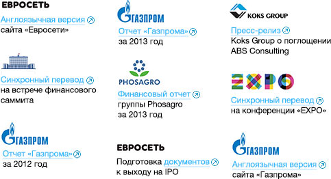
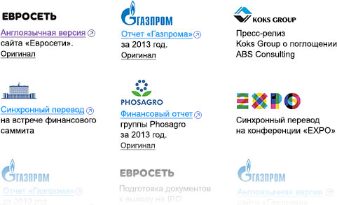
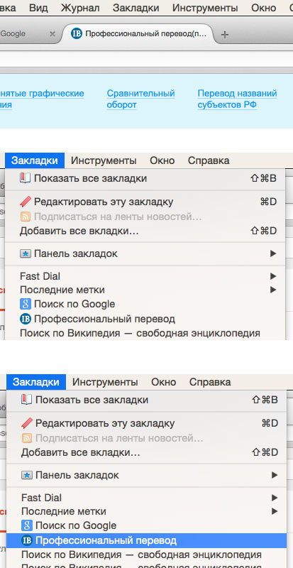
The client asks to include links to the original documents. Searching for ways to achieve this.
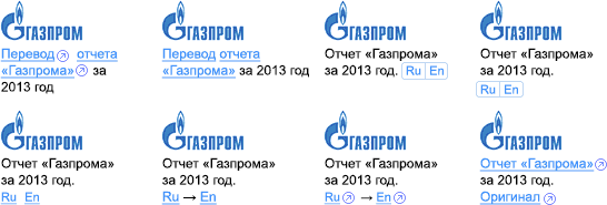
To make sure external links do not stand out too much, choosing the last variant and making it even more inconspicuous.
The Services and Quality section has too much text, trying to introduce some hierarchy. First we add a switch with a sliding frame to choose service types.
The written translations appear to have their own hierarchy. Trying to give it some structure. First, by using a pass-through menu.
Not OK, it can be confused with a slider and visually it’s not the best style anyway. Trying a different menu that scrolls along with the page. Choosing the best visual style.
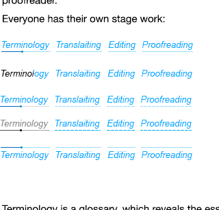
The “Karaoke menu” wins.
The client asks to add a careers section, a location map and some translation-related articles.
While trying to fit the new data we come to realize that the location map and employment conditions are probably not so important as to warrant overloading the website with content. To maintain the single-page layout we decide to use pop-up windows to show additional information.
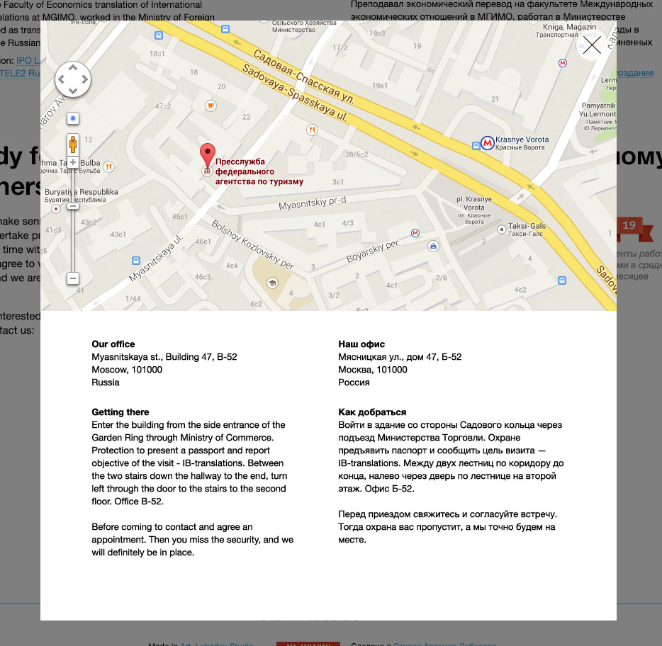
Deciding what part of this information is to be kept on the main page and what the pop-up links should look like.
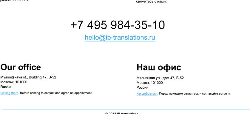
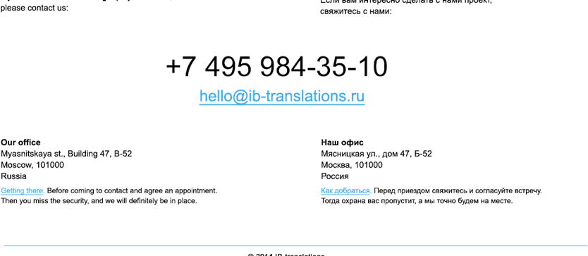
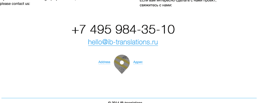
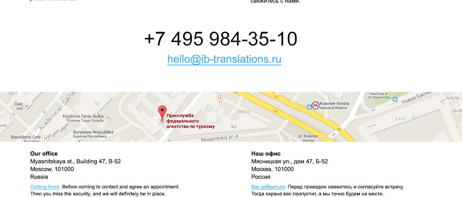
Combining the map and geotag variants together. There will only be a map preview with the nearest Metro station, while the exact address will be hidden in a pop-up window (you have to make an appointment before you can come anyway).
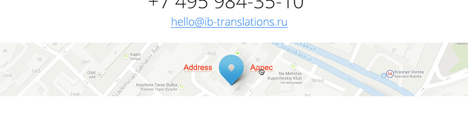
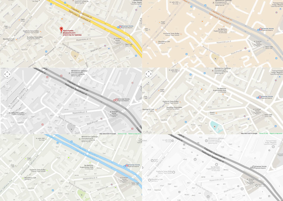
Choosing the map style.
Searching where to put the articles: they will be in Russian only, which means we can’t put them on the main page. Trying to put them in a bar on top.
Art director: Looks like a “Download our browser” bar. Don’t be afraid to use more space.
Expanding the panel, adding drag and drop scrolling.

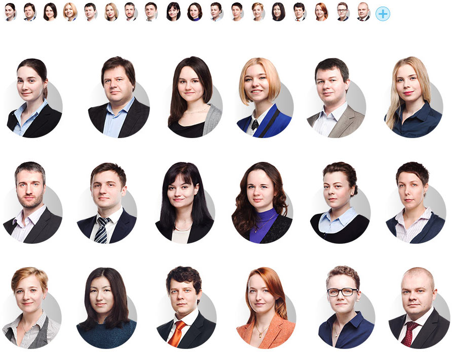
Retypesetting the team section, making the careers link look like a button to add yourself to the team, coming up with an animation.
Inviting the company’s employees to the studio, holding a photo shoot. Thinking about making a group photo but ultimately deciding not to use it.
Aligning portrait sizes. Beautiful!
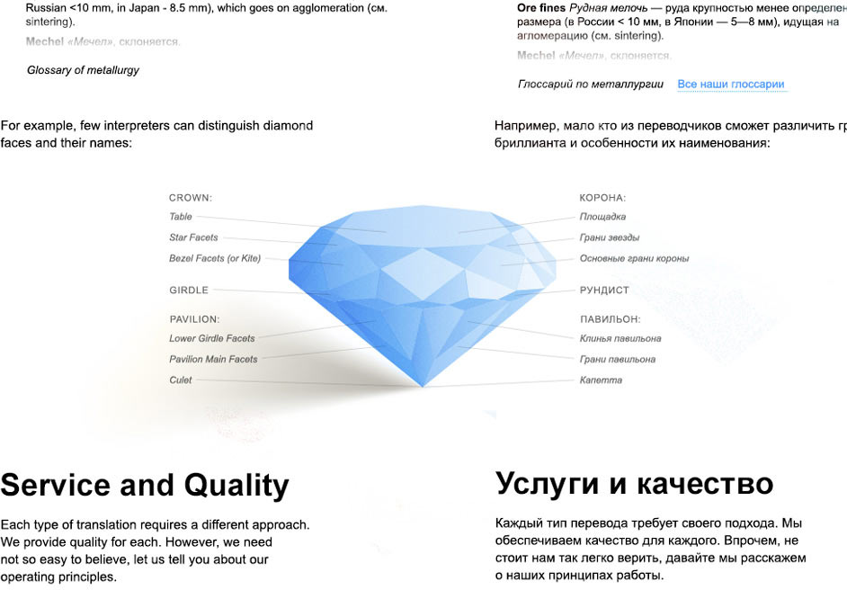
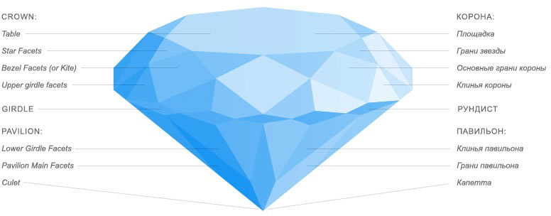
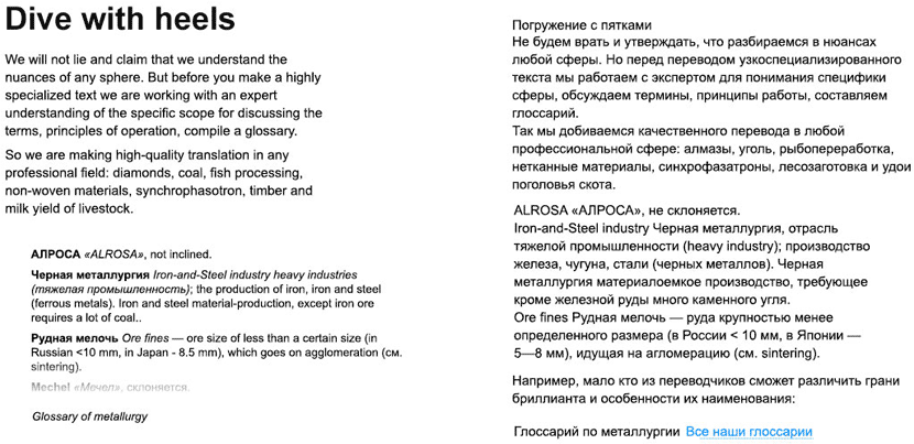
The client asks to add a section that would tell about their ability to understand any professional area, from cattle milk yield to tokamak part names. Coming up with a solution of showing an object with detailed break-down of its parts that have names no one knows about. For example, a diagram of a diamond.
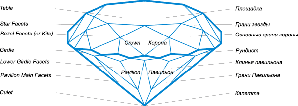
Art director: The diamond looks sad and noisy. Make me a tasty picture that I would want to pin on Pinterest.
Studying the art director’s Pinterest account. The very nature of our subject invites to draw it in a modern style.
Making an attempt.
Art director: You do realize that such style doesn’t match the flat look of the website?
Removing some of the volume, aligning the callouts, adding highlight on hover for the text.
Working on all the traditional stuff: a favicon, an error page, a preloader, a lorem ipsum page.
Making preloader animation in the style of the website.

Art director: Sure, very traditional. Want to make a really cool one instead?
Examining the latest development in the world of preloaders.
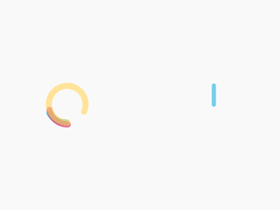
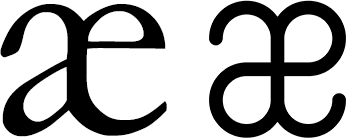
Deciding to make one based on a stylized æ ligature.
Trying to add a cool animation.

Nope. The ends run away from each other instead of going one after another.

Nope. The gap changes size.

Seems OK, but the result is not as we planned. Due to the overlay of straight lines the gap doesn’t appear to be traveling around the symbol. It looks more like a four-leaf clover with its leaves blinking. Expanding it a bit, making lines thinner, slowing down animation when the logo looks the most like a ligature.

Art director: Cool.
Now the favicon. First relying on Photoshop to scale down the icon.
Photoshop fails. Rasterization of the typeface in logo also gives pool results. Indulging our passion for scrupulosity and going down to the pixel level.
The technical designer makes the first attempt.
And the second.
Designer: It only made it worse. The letter ‘I’ had a clear stroke on the left and a semi-clear one on the right, but you added a semi-transparent stripe on the left and the entire letter became blurred. Also, send the results in PNG to make sure JPEG compression doesn’t screw up such subtle things.
Technical designer:
Designer: Make the letter ‘I’ slightly thicker and more crispy (i.e. make the right stripe of the main stroke more saturated). The letter ‘B’ has a slightly odd shape of the top hole and the bottom arch is blurry.
A couple iterations later the designer himself decides to have a go.

All that’s left is to make sure a circle is a circle, not a cut-out piece of soap.
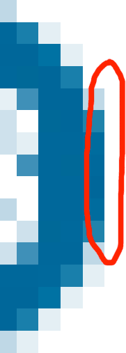
Working on the hinting of the circle. It is aligned along the pixel grid which gives harsh edges on the sides. Removing the “Snap vector tools and transform to pixel grid” checkbox in Photoshop and resizing the icon to achieve round edges (while staying within 16 pixels).

The final favicon.

Creating error pages at the first try.
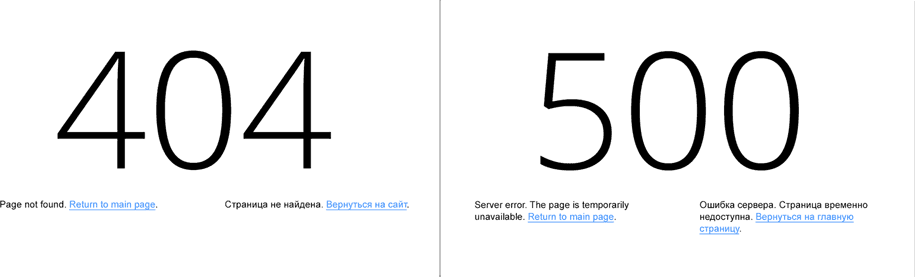
Trying to add some inconspicuous effects. Like slider highlight on mouse hover, the same as on tabs in Chrome browser. Creating two prototypes with different transformations: using transparency and dislocation.
Transparency wins. Turning the effect down a bit to make it less noticeable and implementing on the website.
To make switching versions of the translation fun, adding some interesting features. For example, the student fails to finish the translation in time because of the exams and the “one hour translation” bureau wants more money for translating glossaries.
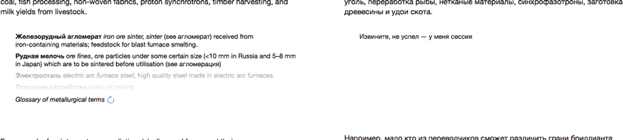
Breaking all formatting in the Google Translate mode as the online translator can’t accommodate “rich” text design.
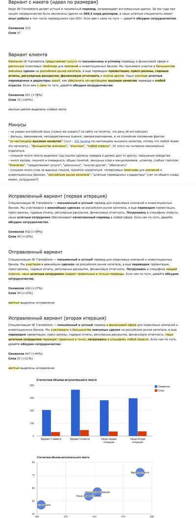
Choosing the introductory text. It will also be used as a menu as it will contain links to key sections of the website.
Trying to make it as effective as possible without looking like a SEO expert’s dream. Counting words and symbols, comparing different options.
Spending a lot of time positioning the portraits. They have to form a nice mosaic at any screen width and expand on click. The previously recorded video with expanding heads turns out to be unviable, coming up with a new solution. When the technologist gives up, the designer steps forward and together they achieve the right effect of the heads moving out of circles on click.
Finalizing and fixing bugs.
Creating a video for technologists with bugs and correct animation sequences.
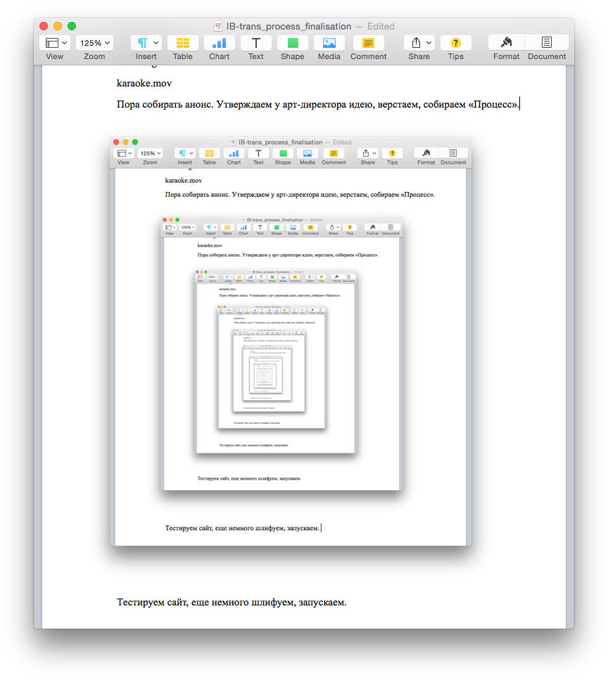
Time to write the announcement. Getting the art director’s approval, typesetting, writing the Process section.
Testing the website, polishing it some more, launching.
