Editions:   First   Second   Third   Fourth  

Book of Letters From Аа to Яя by Yuri Gordon, Second Edition

Overview   Process  

Chapter “Where Do Serifs Come From and Why” (in Russian, pages 44–51, PDF, 475 KB)

Chapter “About the Letter Аа” (in Russian, pages 122–131, PDF, 773 KB)

Task: to republish the book by Yuri Gordon.

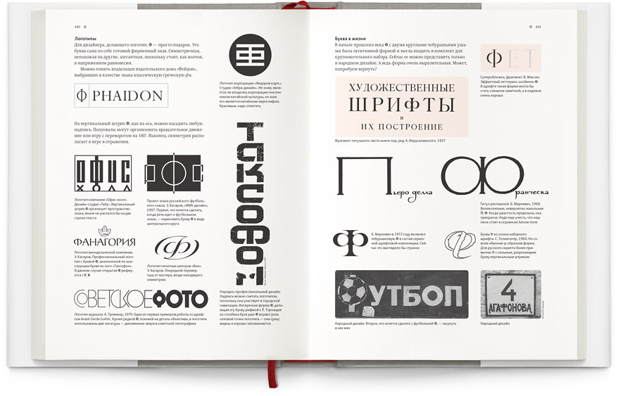
In the Book of Letters, its author carefully analyzes each letter of the Russian alphabet, talks about why our written characters are not as beautiful as their Latin counterparts, and what the designer (not necessarily a professional typographer) can do about it. The book focuses mainly on the Cyrillic letters, but in addition, it also touches upon the Greco-Roman roots of our alphabet.


kniga pro bukvy2 cover
Book in dust jacket


The second edition includes additions to the introduction and significantly expanded chapters on letters. These chapters include fundamentally new sections, such as “Form Clouds” and “The Experiments.” The number of historical examples was also expanded substantially. In addition to history, types, styles, individual properties and anatomy of letters, a lot of attention is paid to logotypes and different elements of typography and visual communication, so the book will not only be interesting to type designers and typographers, but to a wide range of designers and decorators.

«
This book is the second attempt to explain to myself, and to all those who are interested, what the letters of the Russian alphabet are and why they look the way they do. Since the first publishing of the book, its author has become three hundred fonts wiser, or at least sixty thousand letters, which he designed himself. »

From preface by the author

«
The time has come for me to update my views as described in the Book of Letters from Аа to Яя. In the six years since the first edition, there was a large increase in type designers, and therefore, typefaces. An exponential increase of both, the former and the latter.

<...>

My views have changed especially after the “Proteus” program came into fruition, which was used for series of experiments with fonts and form clouds. If before I thought of fonts as archipelagos, isolated from each other, now I see the entire variety of fonts as a single biological system, where everything is interconnected and certain forms smoothly morph into others. Styles, historical characteristics, unique examples seem to me but key points, all connected by an infinite number of common threads.

The experiments with form clouds convinced me that all the text fonts are, in fact, just one font. More precisely, all of them were derived from a single shimmering “matrix,” which seems to me as the bare, neutral font, perfect for reading but devoid of individuality. Therefore, the goal of a font designer is not to “disappear within the text,” as commonly believed, but rather, to give a unique face to nameless, archetypal forms.

Therefore, the second edition is focused much more on the letters for reading—forms closest to the statistically average. In my opinion, the comparison of similar forms can help one, on one hand, to find the widely accepted norm, and on the other—to notice the subtle deviations from it in any given solution. »

From preface by the author to the second edition

Release date: November 21 2012

Cast:

art director
chief typesetters
technical designers
endpapers illustrator
editor
index editor
proofreader
project managers
author

Yuri Gordon is a type designer, graphic designer, illustrator and printmaker. A graduate of the School of Arts and Technical Design of Printed Materials at the Moscow Polygraphic Institute. He is involved with fonts as a designer since 1976. He created his first digital typeface “FaRer” in 1996. In the last years, he designed over three hundred typefaces for different companies and organizations. He has an unusually wide range of working talents: works with display typefaces, lettering, calligraphy, font illustration, visual poetry, realizes art projects based on typography and creates type designing software. He is one of the founders of the Letterhead studio, which produces original Cyrillic fonts.

596 pages
Number of copies: 5000
Format: 22×29 cm (8.7"×11.4")
Hardcover
ISBN 978-5-98062-059-2

kniga pro bukvy2 title
The title page
kniga pro bukvy2 18 19
Pages 18–19
kniga pro bukvy2 48 49
Pages 48–49
kniga pro bukvy2 132 133
Pages 132–133
kniga pro bukvy2 204 205
Pages 204–205
kniga pro bukvy2 280 281
Pages 280–281
kniga pro bukvy2 336 337
Pages 336–337
kniga pro bukvy2 404 405
Pages 404–405
kniga pro bukvy2 440 441
Pages 440–441

Order a design...