First edition Second еdition
The making of The Secret Knowledge of Commercial Illustrators by Yana Frank
Overview Process
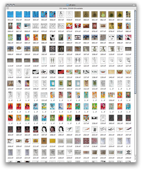
Materials from the author—lots of illustrations and text. Sorting out.
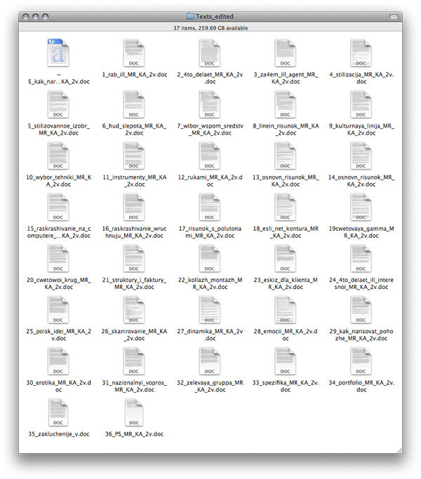
Editing text.
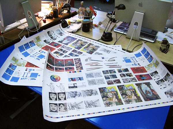
The book includes many colorful examples of illustrations, which is why we first chose 220 × 290 mm (8.7″×11.4″) format.
Then we realized that would be too large—people would carry the book around and read it while riding the subway—so we reimposed it to fit 145×217.5 mm (5.7″×8.5″).
For that the grid had to be modified to give more freedom in arranging the illustrations. Reimposing once again.
Picking styles for various headings. As we went, two kinds of headings became three. Choosing the right combination.
Trying left alignment and experimenting with third-level headings.
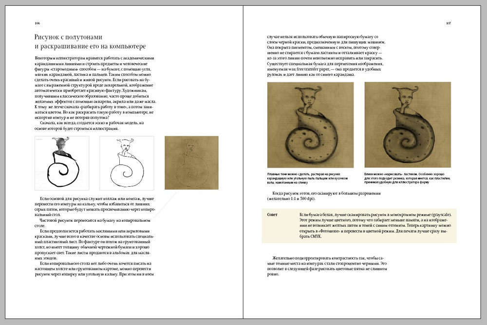
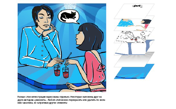
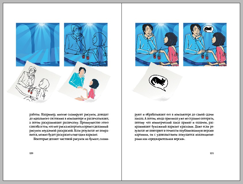
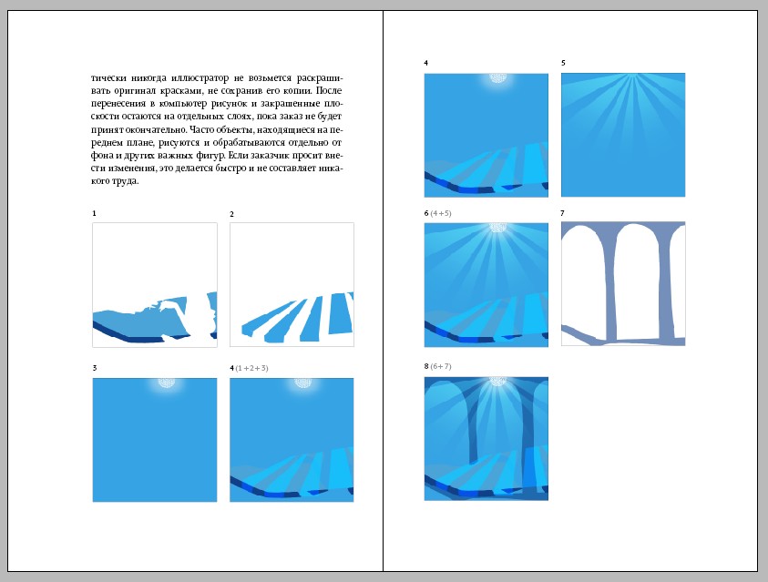
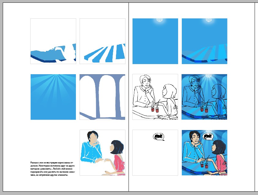
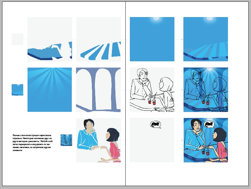
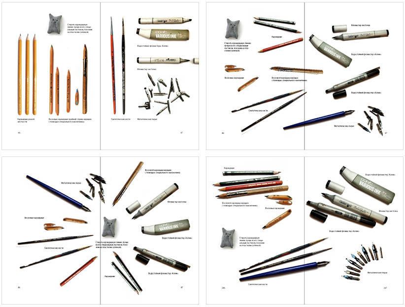
The book features an example of working with layers. Finding an elegant and easy-to-understand way to arrange the images that the author would approve of.
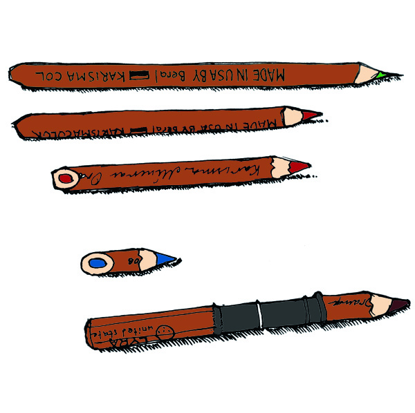
Thinking of how to show a set of tools. Photographs?
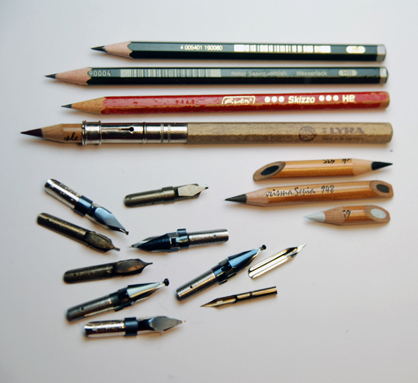
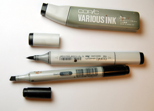
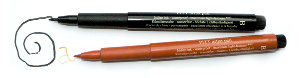
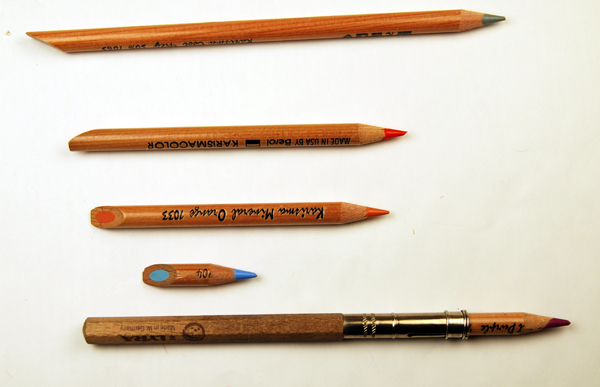
Or drawings?

Separately?
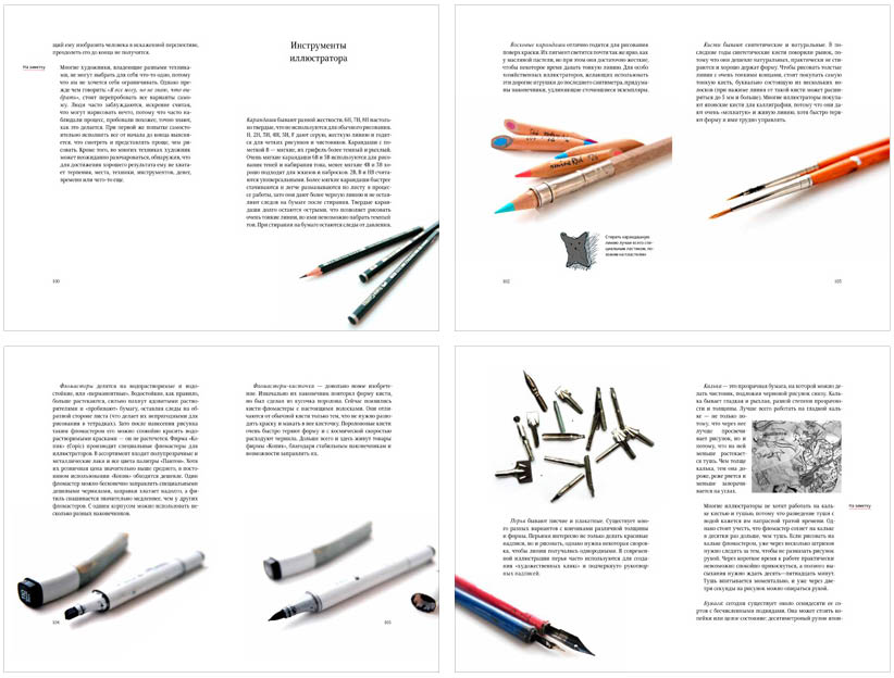
Or on a single spread?
Creating the flyleaf.
Designing the dust jacket. We considered relief stamping and varnishing.
Eventually we decided to go with just relief, no varnish.
Preparing files for coloring tests. Checking the results.
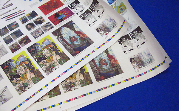
Correcting illustrations accordingly and submitting it for printing.
