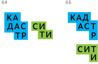
Client: Hello! Our company conducts cadastral and geodetic work. Which is to say, we measure land and real estate objects. We help people finalize a purchase for a home, get a cadastral survey for a land lot and the coveted building permit. It so happens that we already have (that is, had) a logo for kadastr-city.ru. Its colors are orange, blue and white. If possible, please use at least one of these colors in your design. We definitely prefer not to see yellow in the logo.
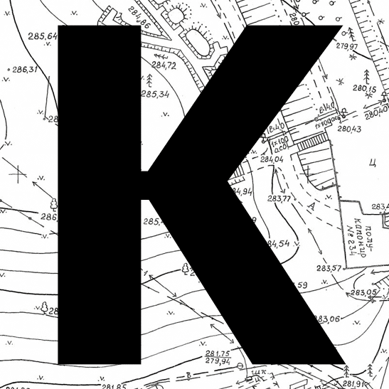
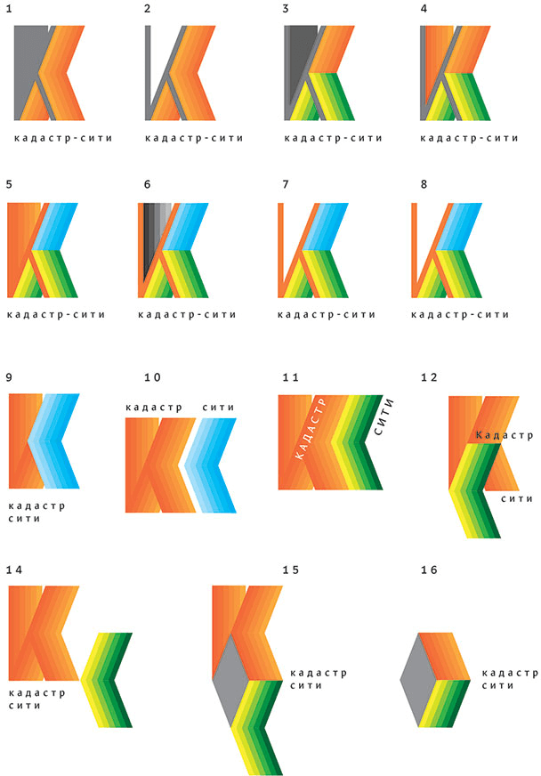
First designer: A very quick overnight design :-) Topographic maps and all that. The corporate identity can be made using the maps.
Art director: Well, it doesn’t look much like a logo.
First designer: I meant something like this :-) With different levels of detail for different sizes and variations of the map.
Art director: It’s not a logo.
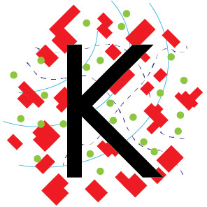
First designer: Another direction.
First designer: And a survey/tetris.
Second designer:
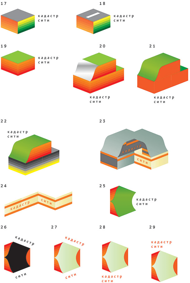
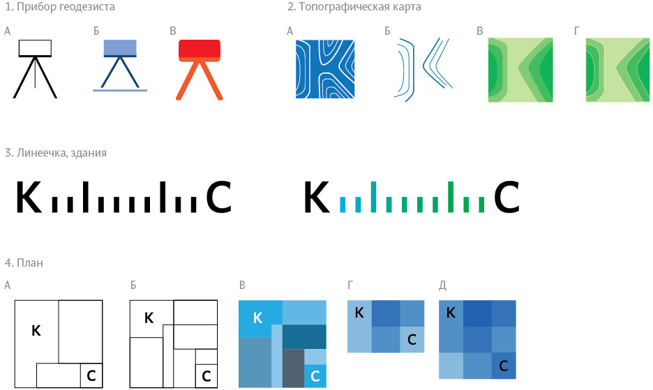
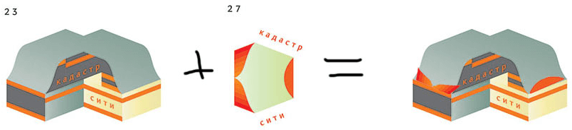
Art director: Can you combine number 23 as a base and number 27 as a graphic feature of its surface?
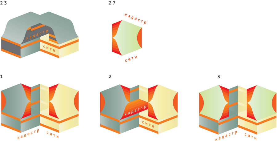
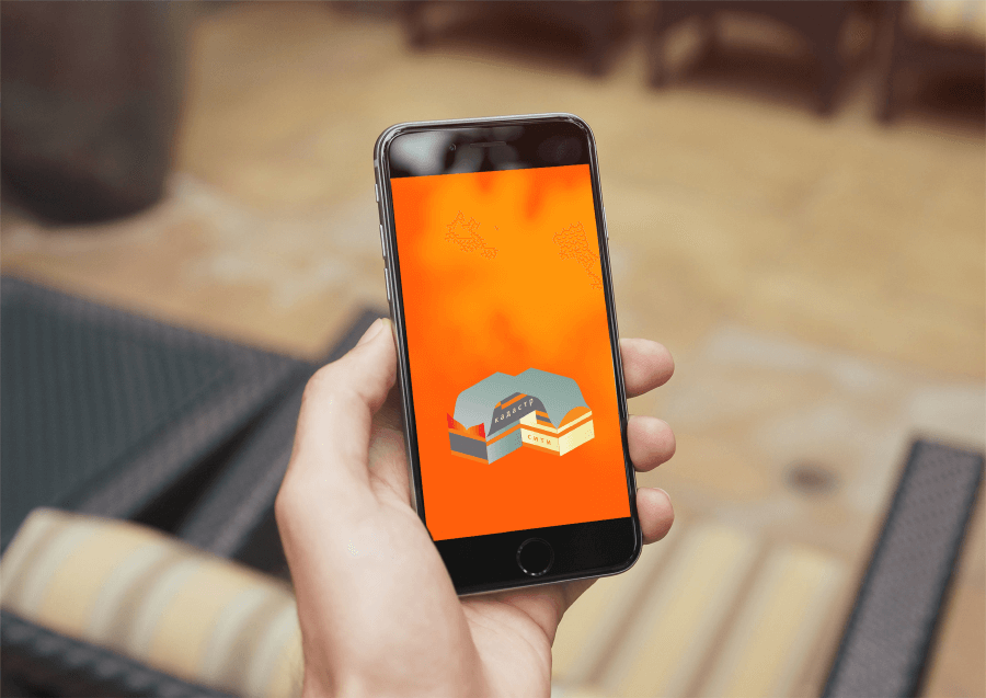
Art director: No, show the К in the left half and С in the right, on the top lid.
Second designer: OK! Here’s the result. I also tried to make the letter К straight.
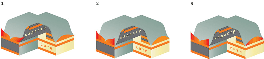
Art director: 2.
Second designer: Should I start thinking about the identity now?
Art director: Yes.
Second designer: Here’s an option.
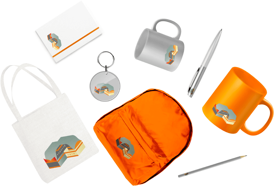
Art director: It’s not an option, its the same logo that you put on different things.
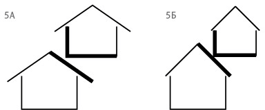
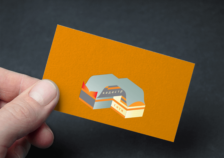
Second designer: What about this? (I’m also making media with text, right now I’m just showing how patterns work on objects.)
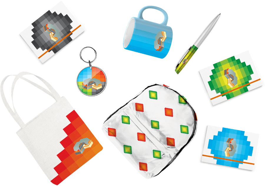
Art director: OK.
