The making of Kulikovo Polye logo and visual identity
Overview Process
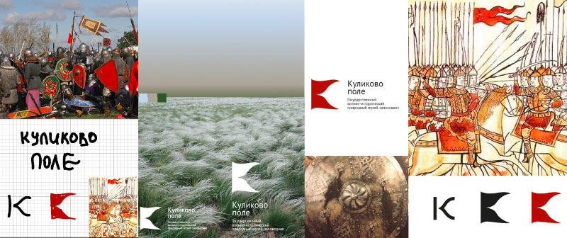
First attempt. Exploring the subject, looking for the main idea, producing first drafts.
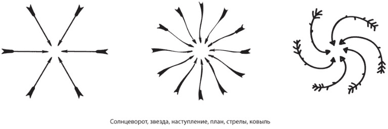

Trying other ideas.
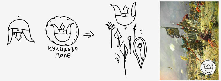
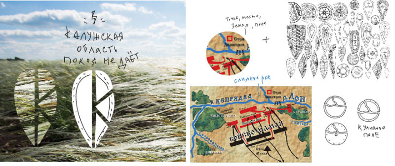
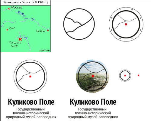
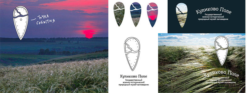
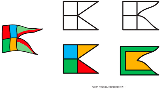
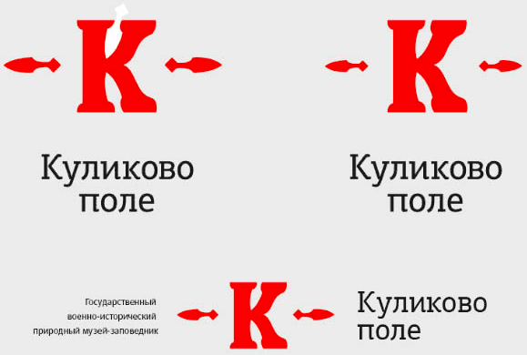
Not a bad combination: letter K+flag+a warrior’s helmet.
Adding an arrowhead (spear), developing the idea.
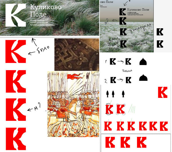
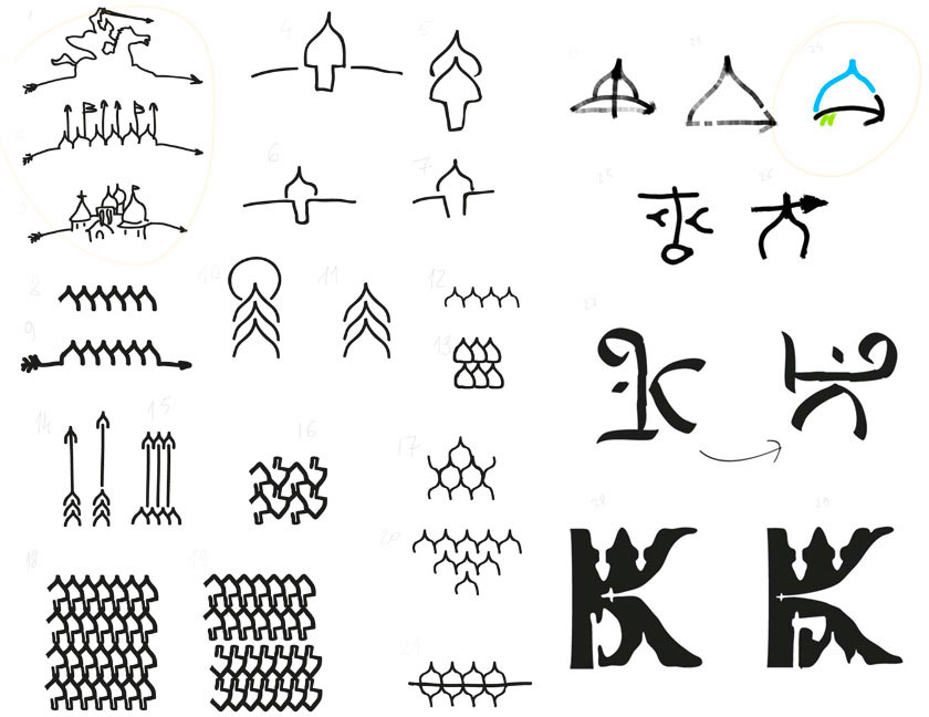
Drawing a sketch while thinking about the olden days, arrows, buried in the ground for centuries, the shield, folk heroes, etched markings, pointer signs, the historical site, archaeological excavations, and, of course—Russia.

Suddenly, another idea is born: the stone as a pointer sign, etched writing, a warning sign. The logo remains recognizable when placed on various shapes.

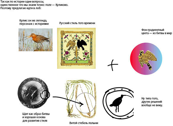
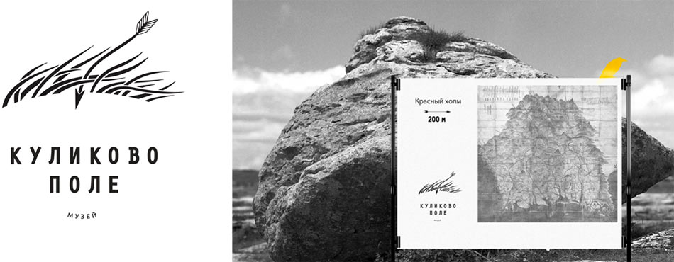
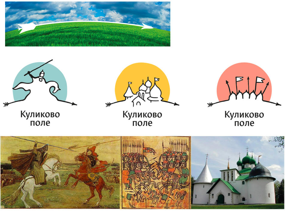
The Kulikovo field is covered with stipa (spear grass). Building on this idea by adding an arrow which also becomes a blade of grass.
The client doesn’t like it; the arrow can’t bend like grass.
Deciding to go back to the etched shield idea. Stylizing the inscription in stone, so that it brings about a third meaning. The client likes it, but he wants something more classic—a rider with a spear.

The search continues, without losing the focus on the spear.
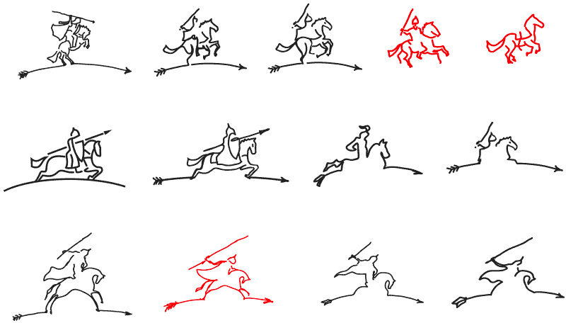
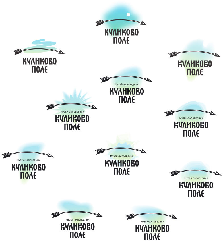
Trying different things with a spear. The client approves this, especially the sky above the field.
During the process we come up with the helmet symbol, which carries a meaningful message.
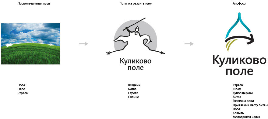
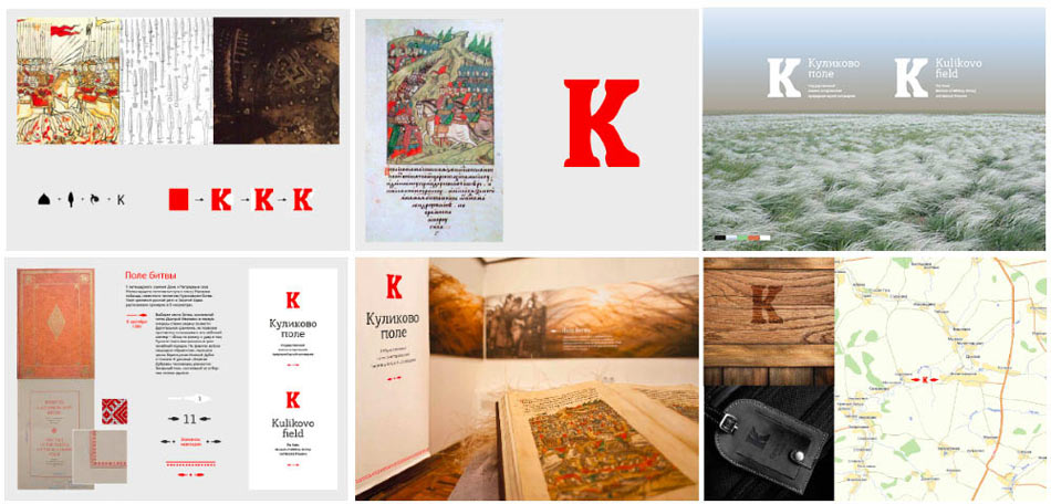
Working on the presentation.
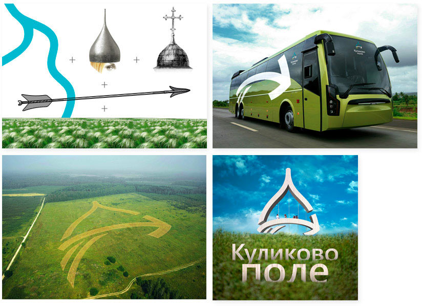
The client does not want to accept it, citing close proximity to a neighboring helmet-shaped museum. We like our idea, so we try to encourage the client to get rid of the hesitation.
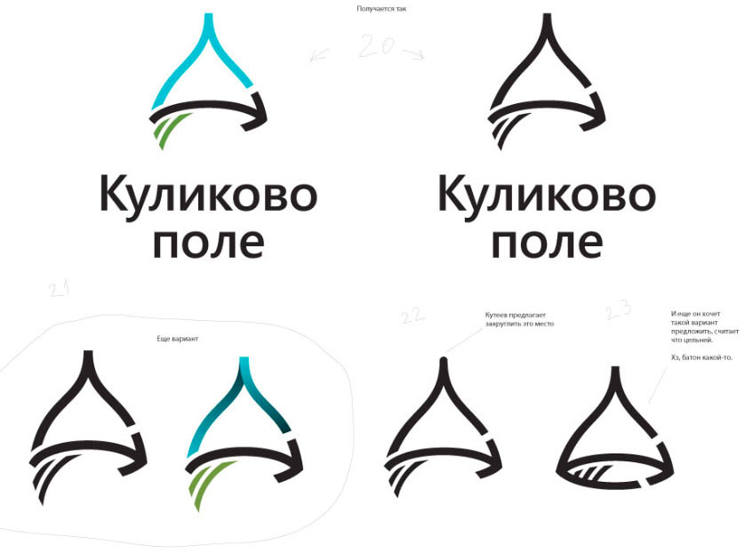
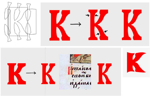
Focusing on the lettering.
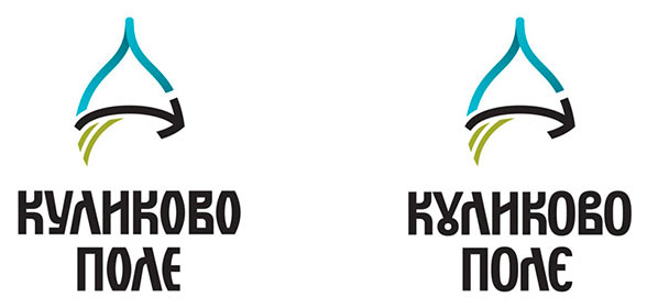
Working on the details.
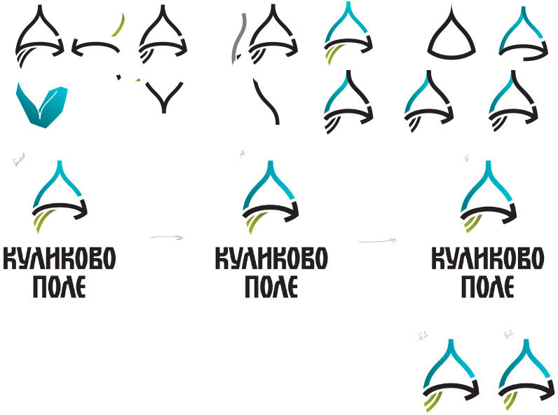
Despite our efforts, the client requests to go back to the horse, to remain consistent with the old sign.
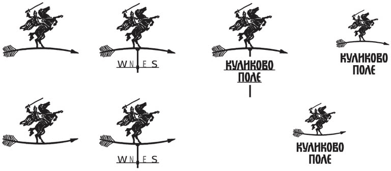
And off we go...
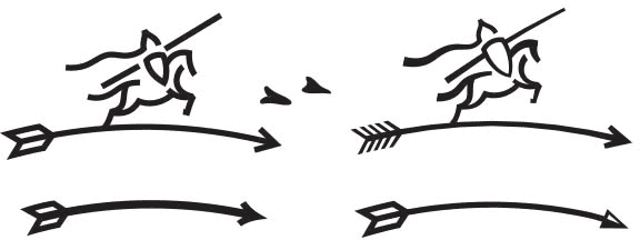
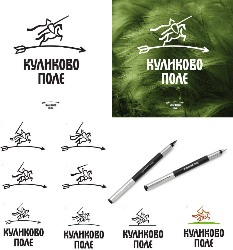
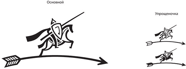
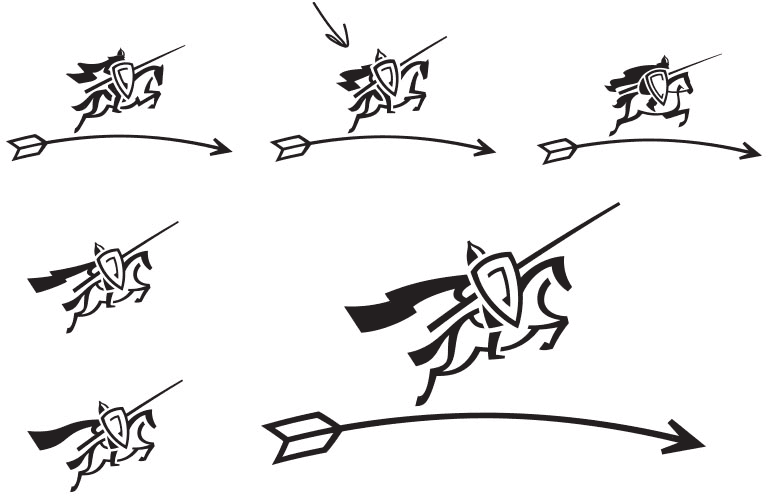
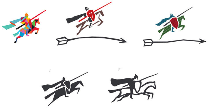
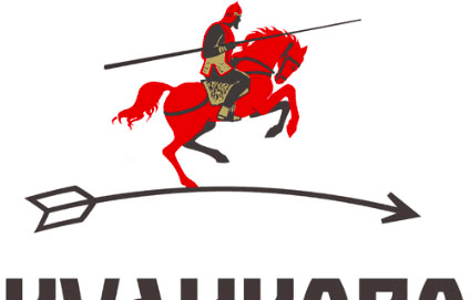
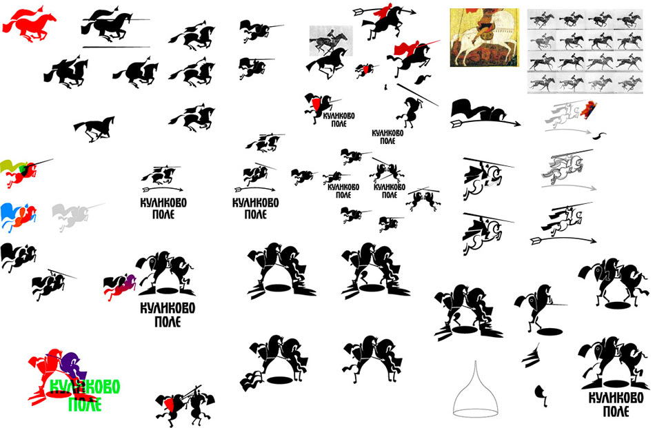

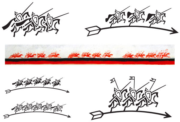
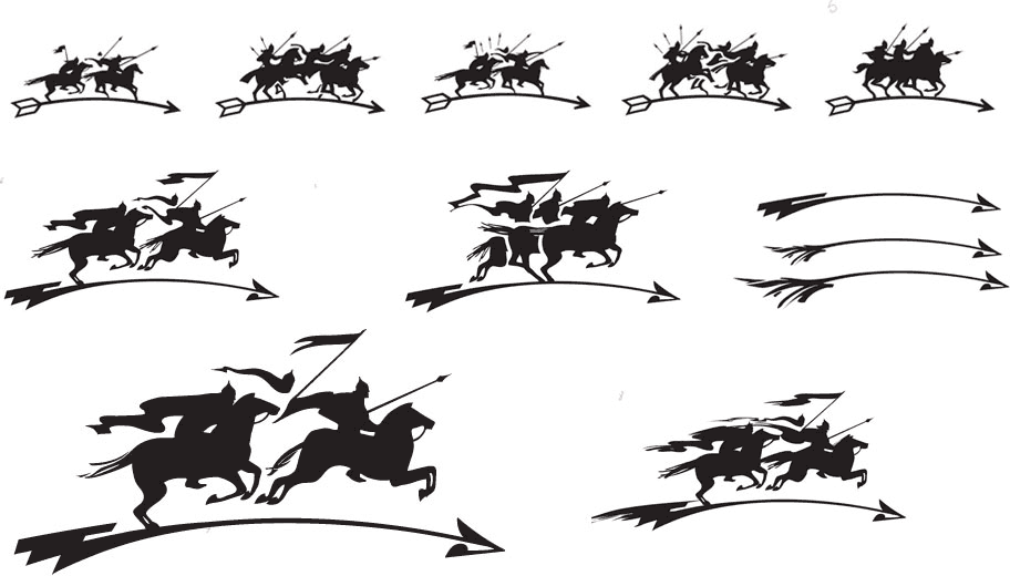
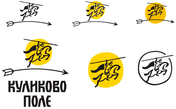
To avoid similarities with the logo of “Vernost Kachestvu” chocolate brand, trying to find fundamentally different image of the rider.
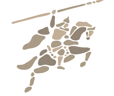
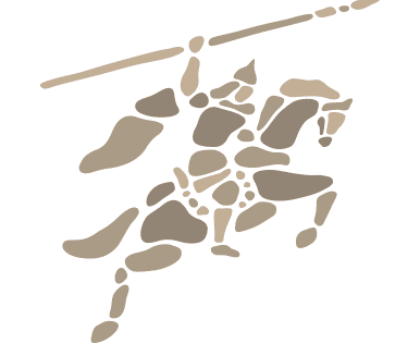
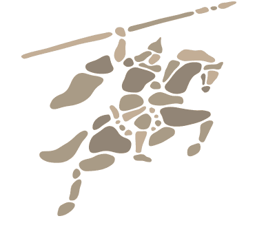
Putting together the logo with stones.
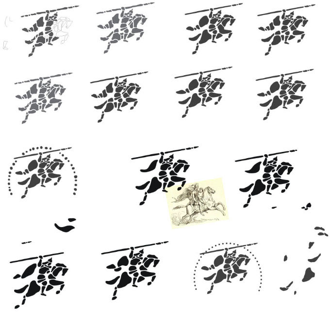
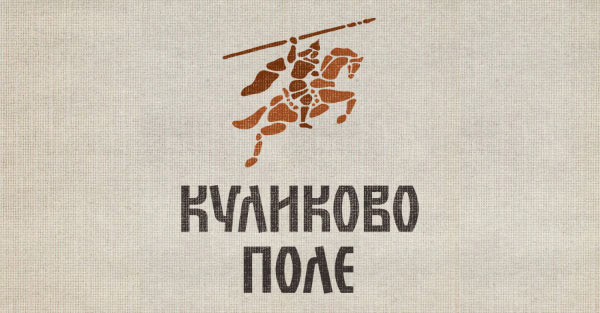
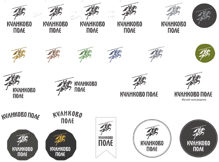
The symbol illustrates the unification of principalities into the single nation of Russia.
A legend comes to mind, which says that each prince brought with him a stone from his principality (the source is not known).
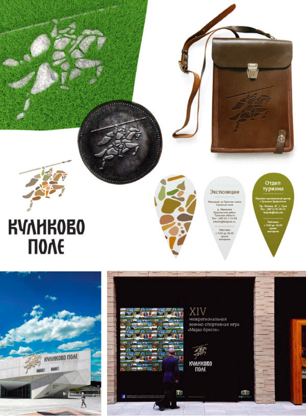
Working on the details.
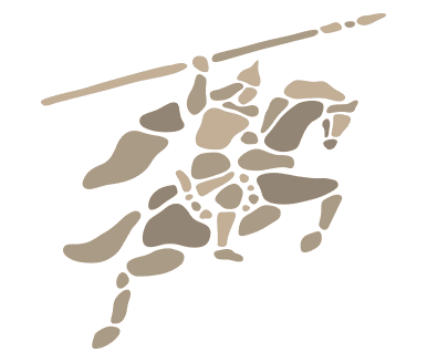
The client is wondering.
Lubok perhaps?
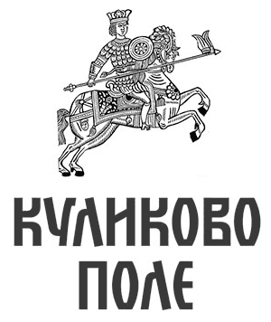
Nuh-uh.
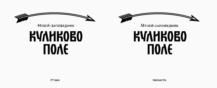
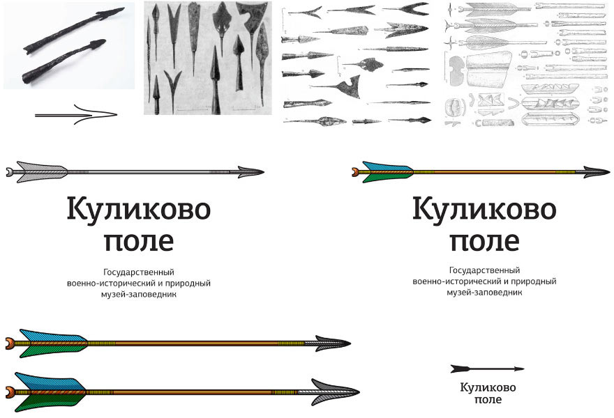
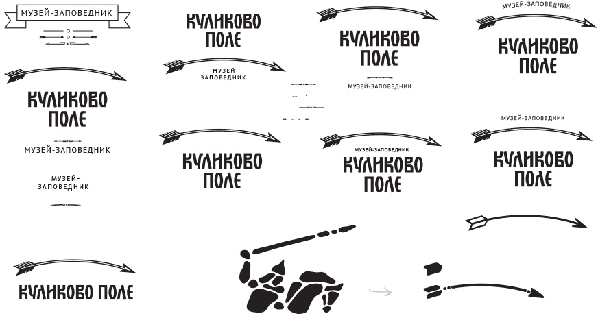
After a long period of hesitation, the client asks for an arrow. Just an arrow.
Going right back to where we started.
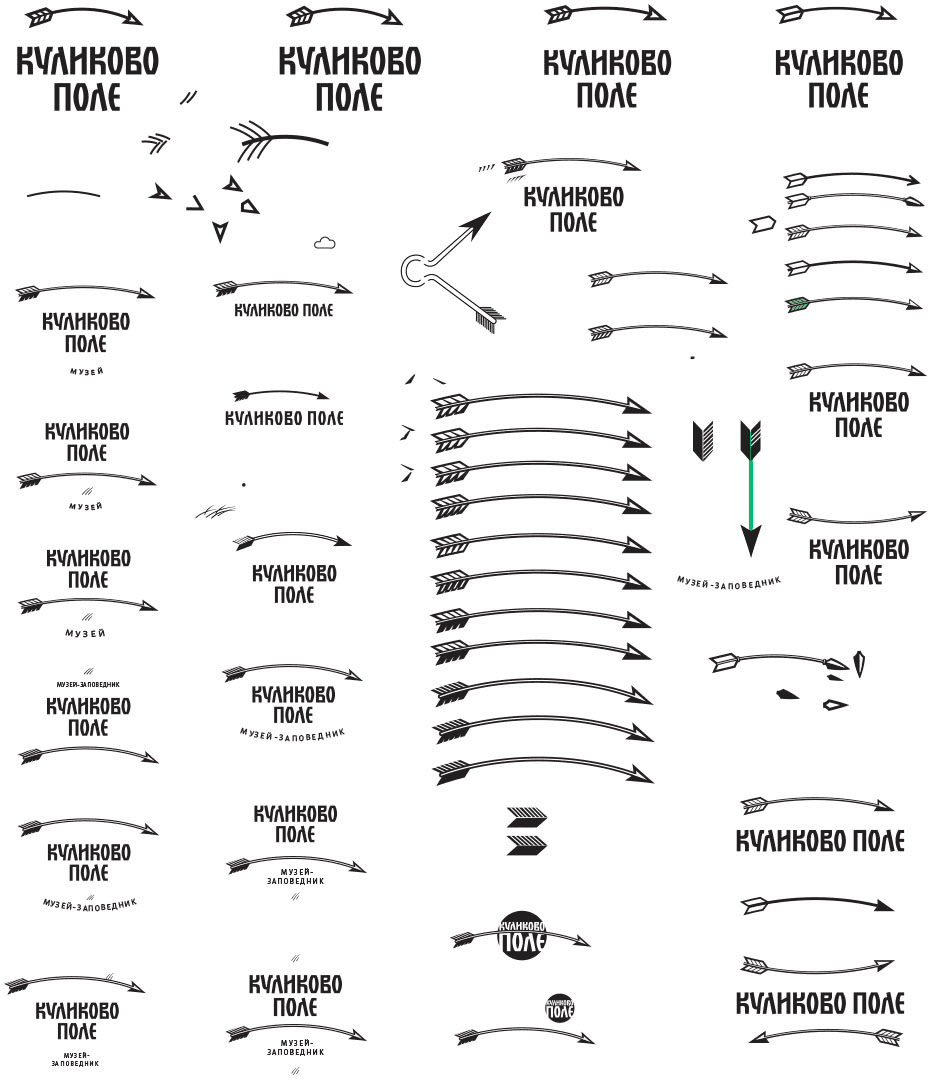
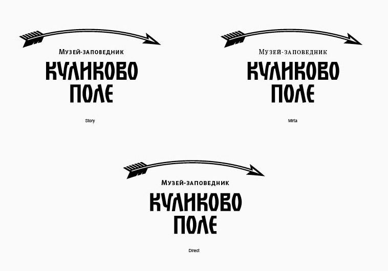
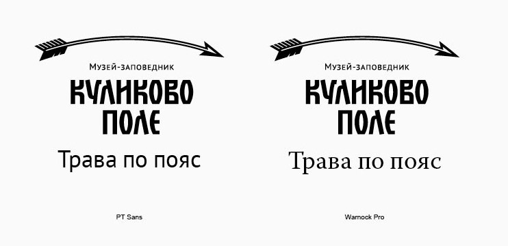
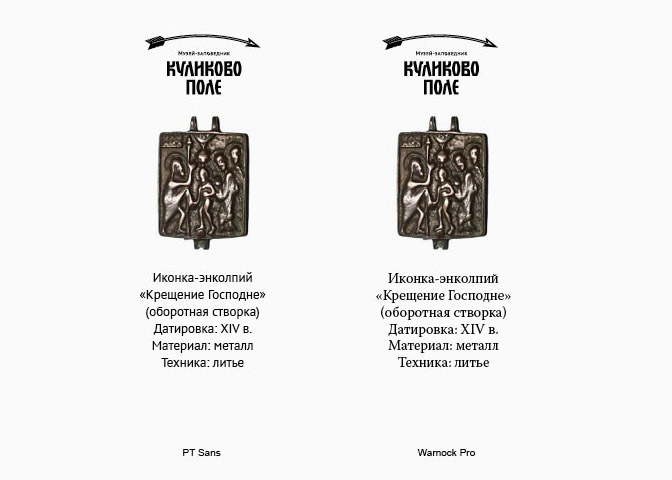
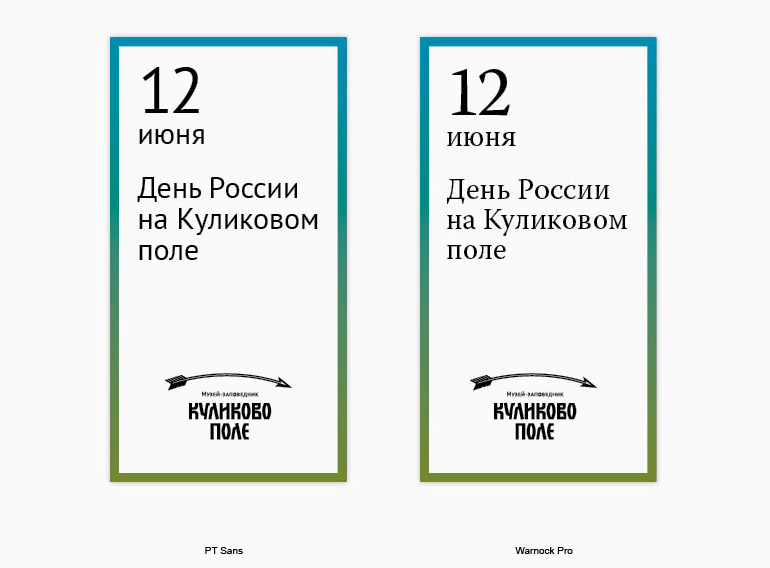
Selecting the typeface.
