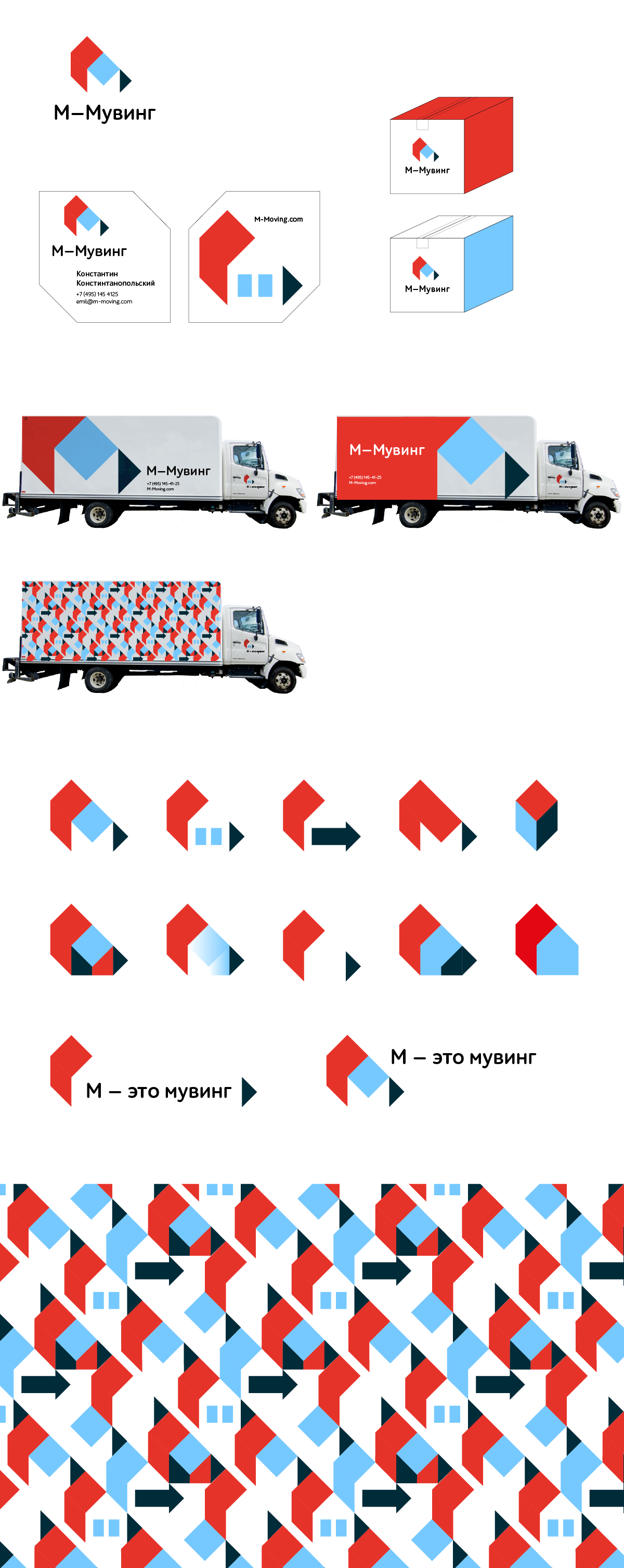
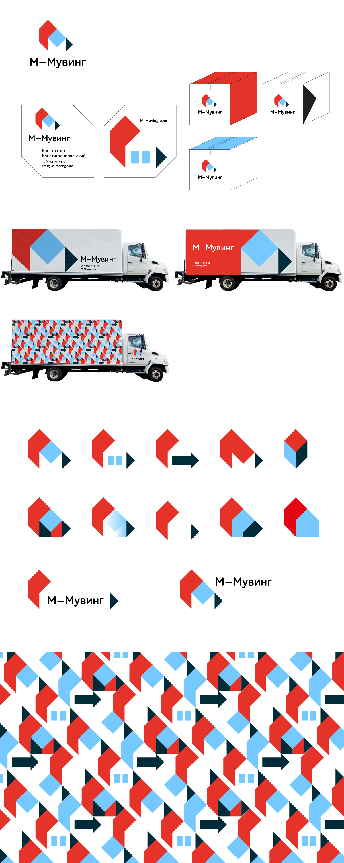
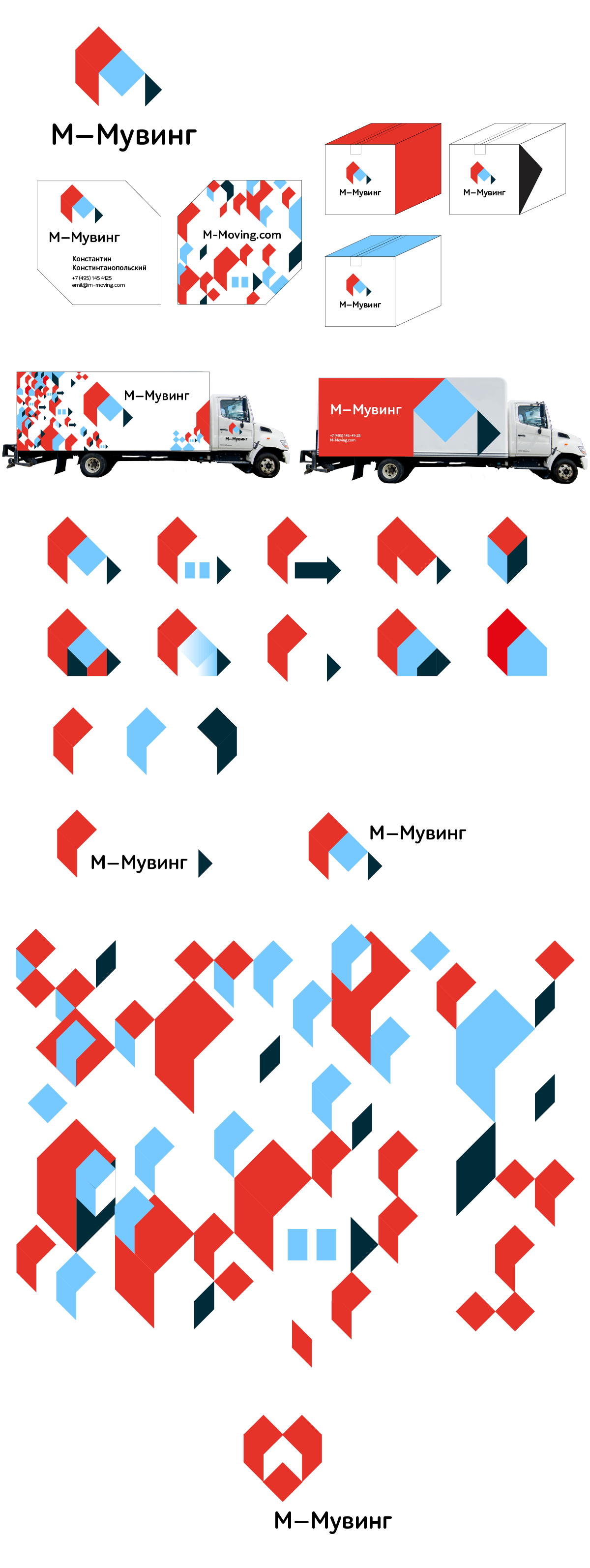
Client: M-Moving is a new moving company in Moscow with its own fleet of vehicles specializing in business and residential relocation of the highest professional level. Among the additional services offered is the sale of packaging materials and warehouse storage. Our target audience includes well-off Moscow residents and companies who require relocation and are ready to pay for professional services. The company is brand new but the founder has many years of moving experience in the USA. We are also planning to create our own Center of Mover Education and Certification in Moscow. Development vectors: 1) aggregator of moving services, lead sales 2) a franchise for truck owners.
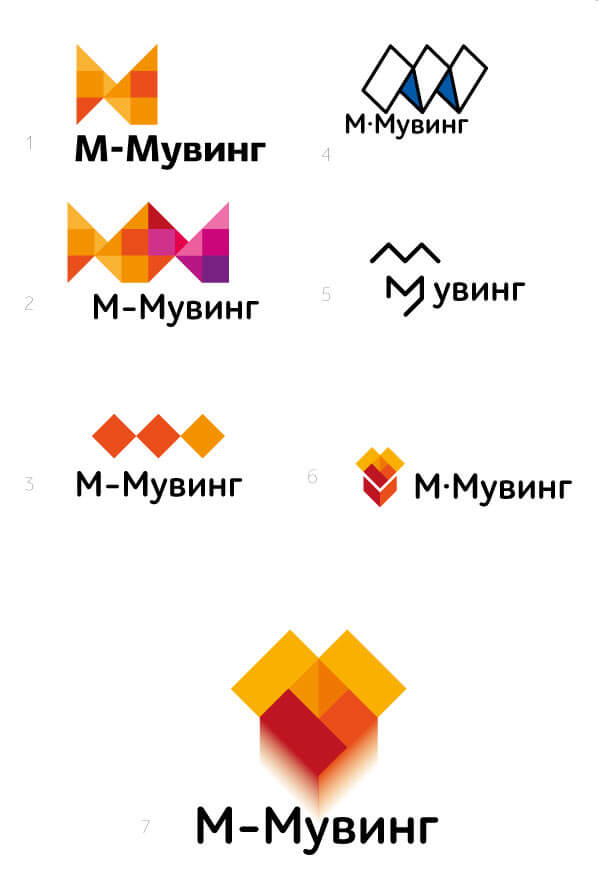
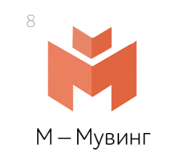
We would really like to see the letter M on the logo, the letter that symbolizes our main difference from the competition: we are providing comprehensive Moving services, not a man and a van. The company name is M-Moving. The slogan is “M means Moving.” We work for those who don’t want to trust their possessions to a guy with a truck and are ready to hire professionals that will carefully pack and move all their valuables.
Getting started.
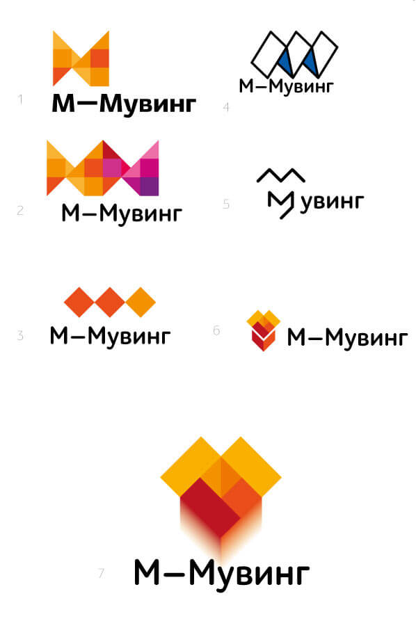
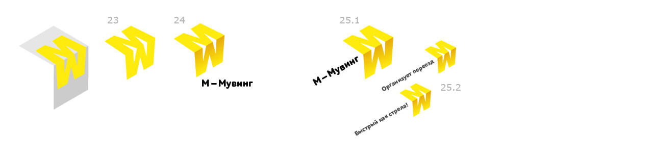
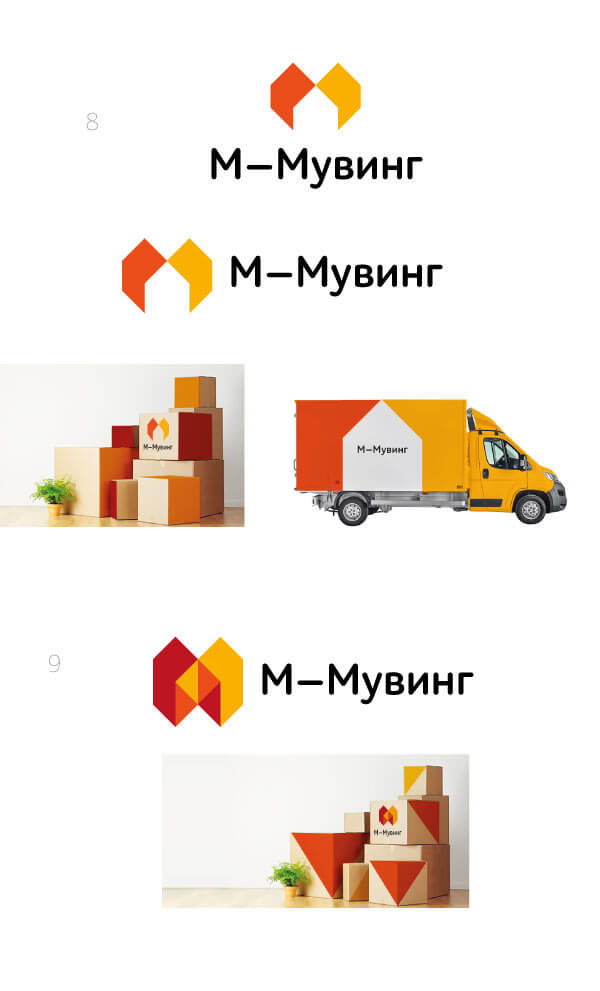
Art director: All designs need to make it clear: M—Moving. With a proper dash.
Art director: This is Dropbox, we need something else.
Second designer: Moving forward.

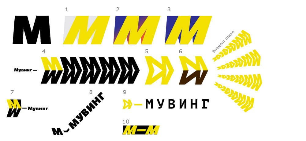
Art director: A bit weak right now.
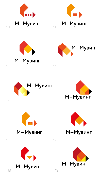
Art director: 18 is better but not what we’re looking for.
Second designer: Also considered an idea with an arrow.
Art director: Nice, but not what we need.
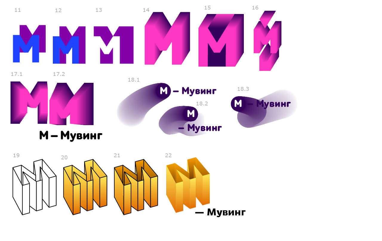
Third designer:
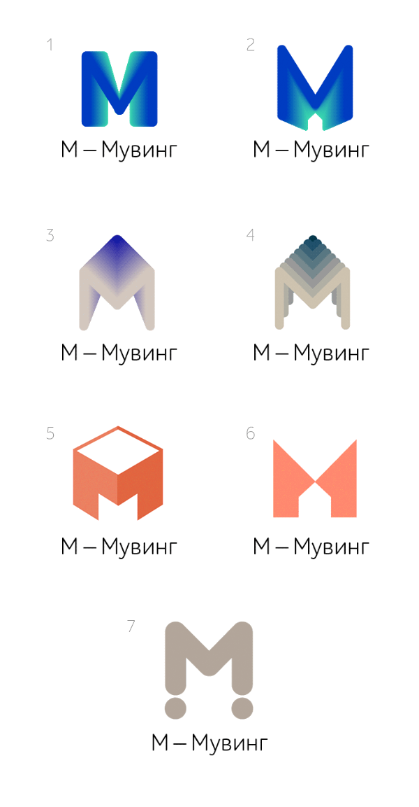
Art director: What if you play with the cube in 5? Maybe move it somewhere? But draw it first.
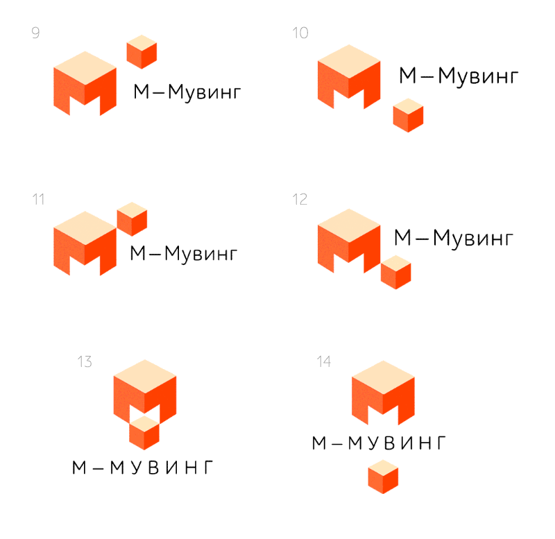
Third designer: Or maybe not draw the top edge at all, just hint at it.
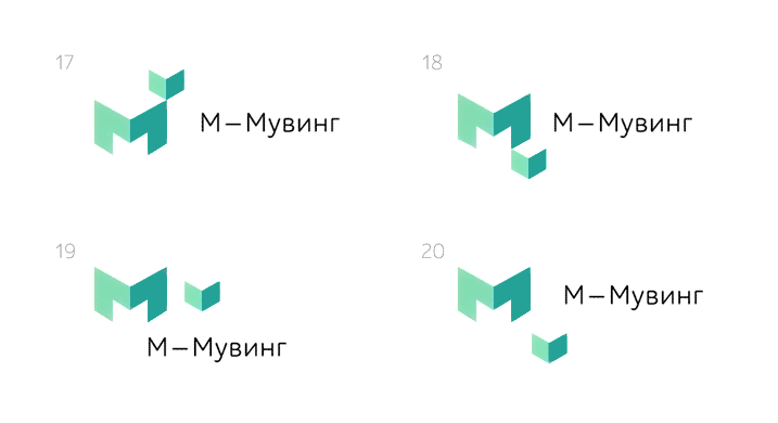
Art director: 18 is nice. Why is the cube coming not out of its garage but one of the legs?
Third designer: That was me trying to improve the edge effect. Maybe rotate the perspective to one side? I don’t like that it all looks like a bunch of arrows pointing down.
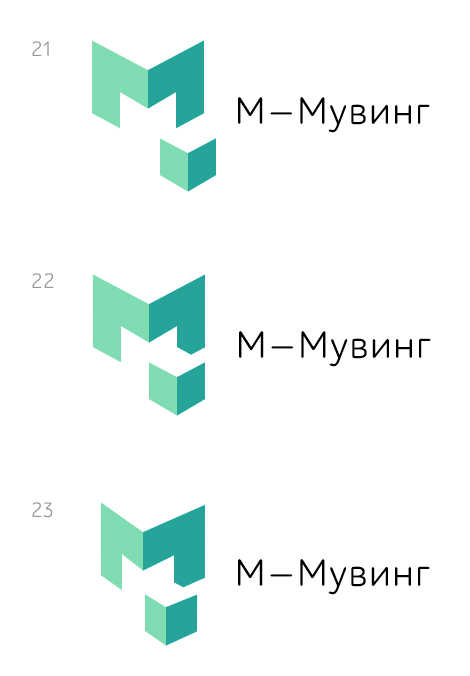
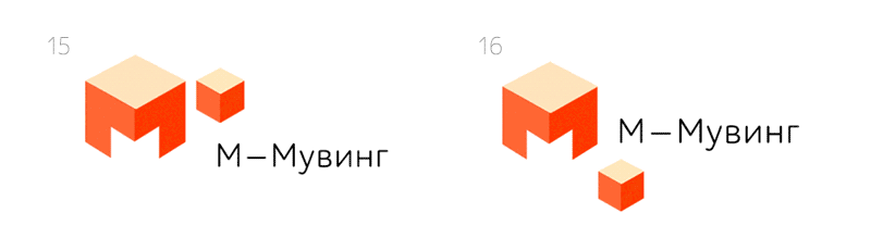
Art director: 21. Try to put the letter to the right of the company’s name. And draw the movement trajectory.
Third designer: I’m not too sure.
Art director: Yeah. But we can look for a way to make it work.
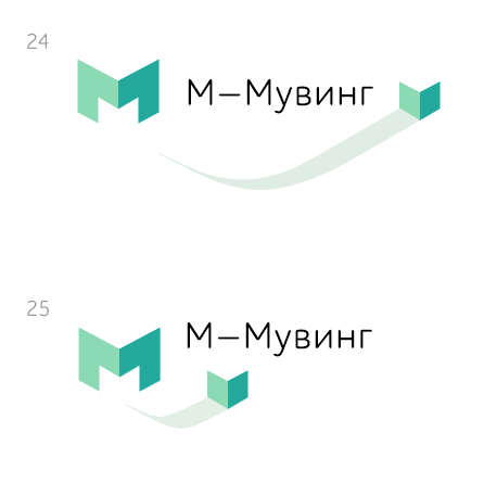
Art director: This is better. Although a softer trajectory would work better. And make it move in an arc.
First designer:
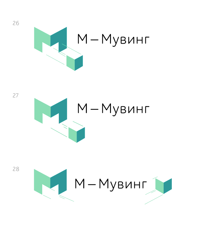
Art director: Not bad, but lacks movement.
Art director: 12 is nice. You just need to find better colors so it doesn’t look like the flag of Germany. Other color variations can be used in their identity.
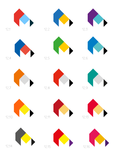
Art director: 121.
Art director: Where did это come from?
Art director: The geometry needs to be a bit more fresh.
Art director: OK.
