|
Artemy Lebedev
§ 117. GuidelinesAugust 15, 2005 |
Mother to a daughter:
“Honey, let’s show how you’ve learnt all the months of the year. Come on! Janu…”
“Ary!”
“Febru…”
“Ary!”
“Go on, do it yourself!”
“Arch, ril, ay, une, uly, gust, ember, ober, ember, ember!”
Anekdot.ru. The anecdote voted the day’s best on May 24, 2005
|
The rules and guidelines on using corporate identity are unavoidable, because once the corporate identity has been completed, it’s got to be described as soon as possible. With the ink barely dry on the treatise, one should proceed to sending it off to an advertising agency or a design firm where someone will retrace the mental steps of the corporate identity creators. |
|
During his or her lifetime every designer has to deal with guidelines compiled by other people. Guidelines are disliked because they are served garnished with the dumbness of a brand manager who believes in them as if they were holy scripture. In real life the poor quality of the text is a sin to be atoned for by unrighteous authors: the customer usually pays to see the guidelines are thick enough and doesn’t bother to delve too deep into the contents. |
|
The description of a corporate identity is always a one-percent solution of sense (e.g. the logo is round—the symbol of perfection, or the logo is square, which suggests stability), while the rules of using corporate identity elements are mostly described by a copywriter caught in a mental cramp. |
|
The problem is aggravated by the sheer impossibility to find guidelines writing tutorials. Those practiced in writing guidelines sit in silence, a smile on their faces. Those who are not collect every bit of guidelines they can lay their hands on in a special folder, in the hope to fathom the secret of writing them, or at least tack together a subject directory. |
|
Let’s take a look at the example below: |
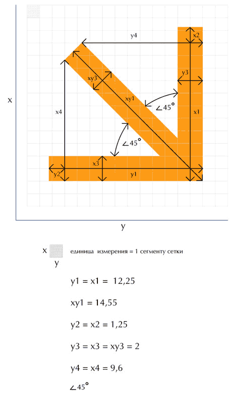 |
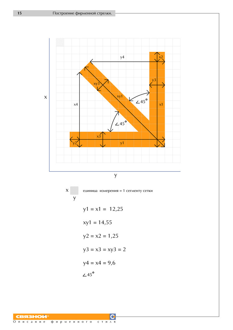
Fragment (see all of it) Netprofit communications agency. Corporate arrow construction // Svyaznoy. Corporate Identity Description |
|
This is a unique exercise in multiplying zero by infinity that takes up a whole page. You can peruse the elements of this instruction as the first lesson in cryptography. The cue that y1 = x1 is totally useless in terms of boosting the output of your work with the corporate identity. It is obvious that the person in charge of implementing the guidelines should get the arrow in a file, without a mention that a right angle is the sum of two 45° angles. |
See also § 110. Dividing by two as easy as changing channels |
|
Here’s another example: |
 |
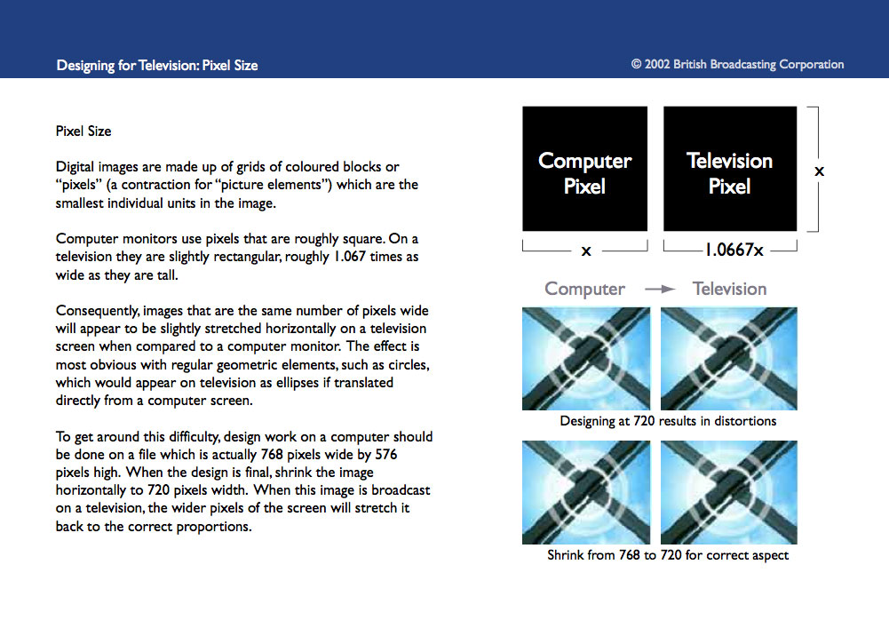
Fragment (see all of it) British Broadcasting Corporation. Designing for Television. Pixel Size // BBCi. Interactive Television Style Guide. 2002 |
|
A designer who didn’t know just a second ago that television pixels are not square is now informed. Guidelines have performed their function: the knowledge has been shared. |
|
Rule No. 1. A person writing guidelines should know what he or she wants to tell the reader. With this knowledge, all that’s left is to sit and get one’s thoughts down on paper. The crucial thing to remember is that the reader can’t guess what sort of information remains locked in the guidelines writer’s brain. So the writer ought to describe even things that seem banal. |
|
Rule No. 2. Reading guidelines is an important thing to learn. That’s why you can’t just give them to a designer and expect him to deliver results. Guidelines should be read by a person who can interpret them and who understands when and where rules can and should be broken. This is the person to assign a task to a designer. |
|
Writing guidelines without much thought and reading them literally is a waste of time. |
|
|
|