|
Artemy Lebedev
§ 151. Time makes things worseOctober 10, 2008 |
|
The author clearly sees that with time humankind loses efficiency (while progress is another thing). People wish to spend less effort and money to gain more and more in return. What they have in a hundred years they’ll find inferior to what we have now (and what we today think to be low quality). |
|
This is often proved by the elderly, who believe that the younger generation fails to work and act the way people used to. These generations will too mature and get horrified at the manners of the yet younger age. This shows us such worsening has no end. |
|
It seems that a hundred years ago everything was more durable and better quality—furniture, machine tools, clothing, food, architecture, parks, illustrations. |
|
Let’s take illustrations to medical study guides for example. A hundred years ago artists were incredibly skillful and publishers had much more responsible attitude to their work than they do today. At least, that’s how it looks from here, the early years of the 21st century. |
|
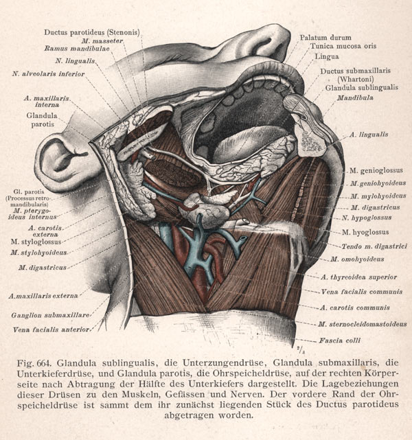
“Atlas of Anatomy” was published by Urban and Schwarzenberg in 1900. The book includes top quality illustrations made with great respect for the subject. The reader can appreciate the skillful way colors are used to present the information, the intelligent manner in which sections and volumes are shown and parts are labeled. |
 |
|
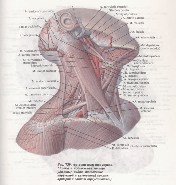
“Atlas of Human Anatomy” by Sinelnikov was published by Medicina Publishing House in 1992, the edition prepared during the Soviet era. It is the most popular study guide among medical students. You can notice that the dissected Martian alien looks almost flat, the colors are confusingly bleak, and names of the parts with extension lines turn the page into a huge visual mess pierced with needles. Compare how these lines were drawn a hundred years ago. |
 |
|
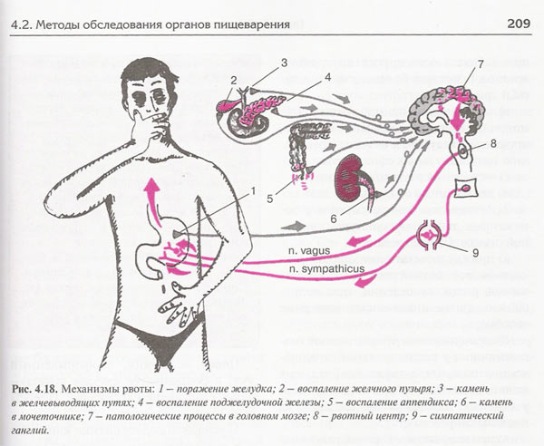
“Basic Semiotics of Internal Diseases” got published by Medpress-Inform in 2007. This is a special edition for future doctors. It is hard to say anything good about the illustrations included in it, all of them about the same quality—the artist has no idea of basic human anatomy. It’s curious how weak this chart’s design is—lines and arrows are horrendous, names and comments appear below the chart making it twice more difficult to figure out what they relate to. In this case, numbers have negative informative value, as they complicate understanding without offering any benefits. |
 |
|
It makes you wonder, what will it be like, when this illustration is considered brilliant comparing to the wreckage people have to face in a hundred years. |
|
|
|