Client: Mesto is a next generation courier delivery service. Everything is done online. You can track the courier, know where he is and when he’ll come. No papers, only electronic signatures on phone screens. Photos at package pickup and delivery. In the future, we will also implement sticker chips for envelopes and packages as a cheap way to ensure online tracking (own invention). Overall, a great service. Our main client is Tanya the office manager who needs to cheaply send invoices to her company’s clients for same day delivery. The logo and the corporate identity should reflect delivery from point A to point B. The logo has to be in two languages: Место and Mesto. Here are the current logo and a prototype of an idea:
Designer: That’s the third “from point A to point B” project in a row. This one is definitely not going to be red and blue. Maybe, a teleport would work for this one?
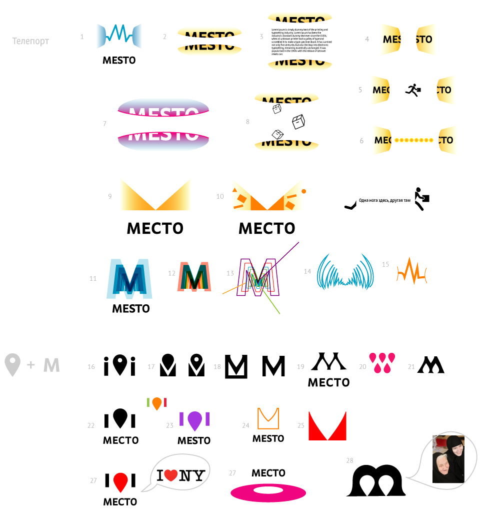
Art director: I would explore the “in both places at the same time” idea, just play with the word Mesto.
Designer: Here it is with legs.
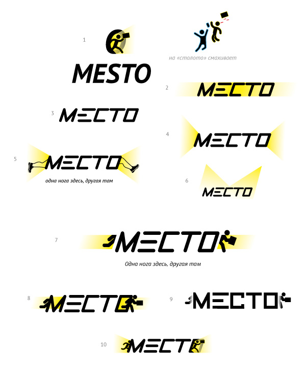
Art director: Something like number 10, only I don’t like the color, typeface and character style.
Designer: Teleport rays and courier tracking signal.
Art director: Number 22 is OK. What if the waves aren’t positioned on the ground but shine in both directions? The character still looks like he’s from road signs or the Gosloto identity, he needs to look entirely differently.
Designer: The character in a hat.
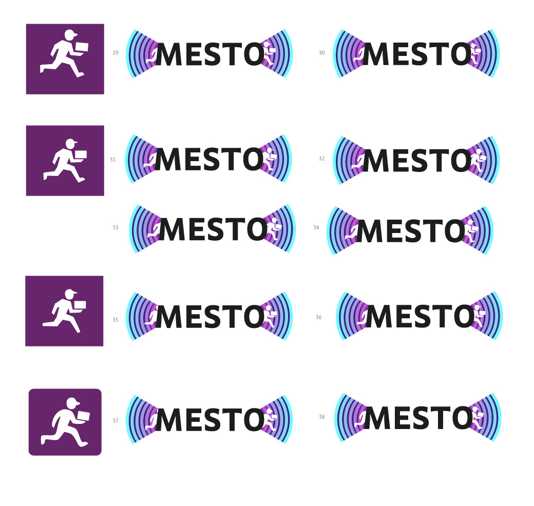
Art director: Number 34.
Designer: Larger.
Art director: No, I chose the one where the package rectangle is strictly parallel to the earth. Don’t slant it.
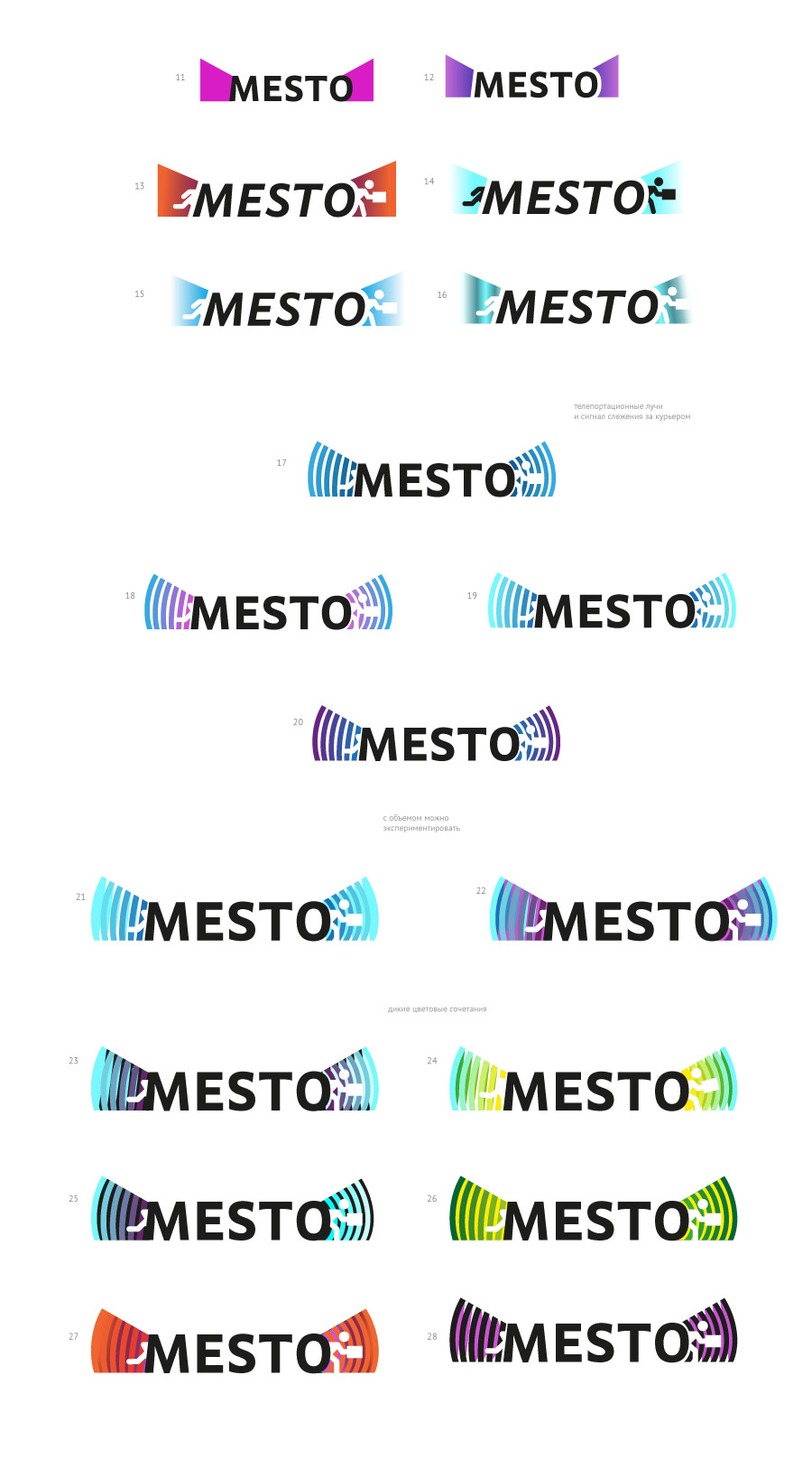
Designer: I see, so it doesn’t fall out of the courier’s hands)
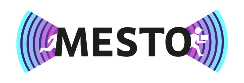
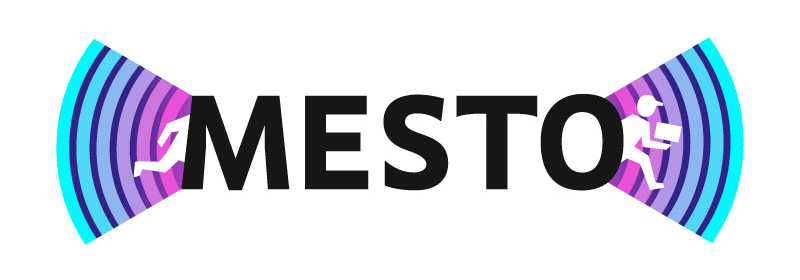
Art director: Yep. But the rays are now too simple.
Designer: Added volume.
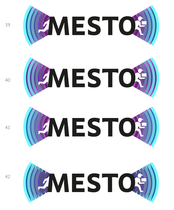
Art director: Number 39 is OK. It would be great to fight the feeling that the character is running with a laptop instead of a package. Maybe have him support it with another hand from the top?
Designer: Both hands make it look like calipers) If we center the box in his arms, then there’s just one leg remaining on the left side. Maybe, put the package vertically?
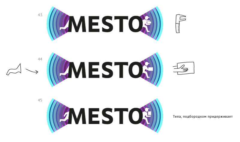
Art director: Go with number 45, only make the package a square, it won’t look like a laptop.
Designer: Done.
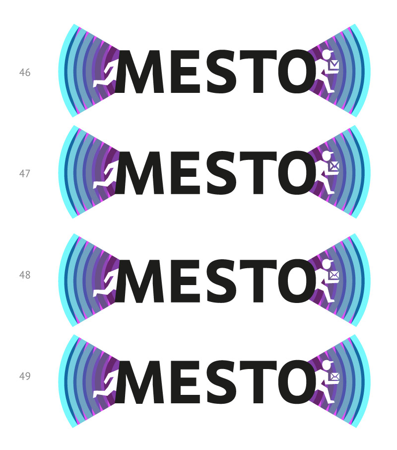
Art director: Stretch the arm forward a little bit. And let’s turn the square into a little envelope so it doesn’t look like a logo for an order delivery service.
Designer: Envelopes.
Designer: Cleaned up a bit.
Art director: Can you put the envelope in his hand? Right now he’s like a waiter carrying a plate.
Designer:
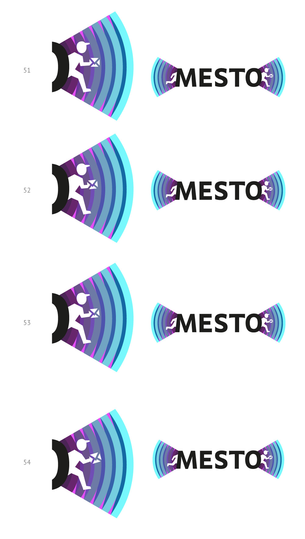
Art director: The envelope looks very rough. Not too sure about the arrow hand. Change the envelope to be more modern, not Soviet-looking.
Designer: Improved color contrast.
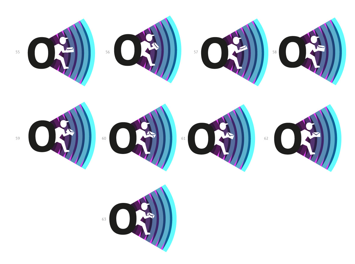
Art director: 62
Designer: Larger.
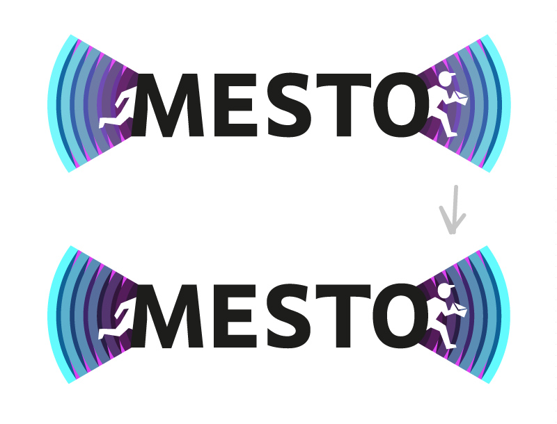
Art director: Everything’s great, but you need to finalize the hand. I mean, to make sure the envelope is attached to the wrist, not the hand.
Designer:
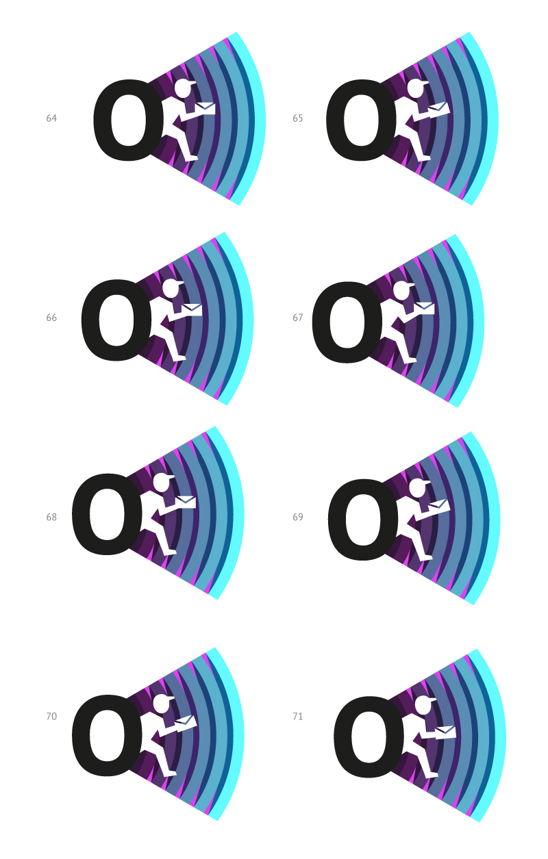
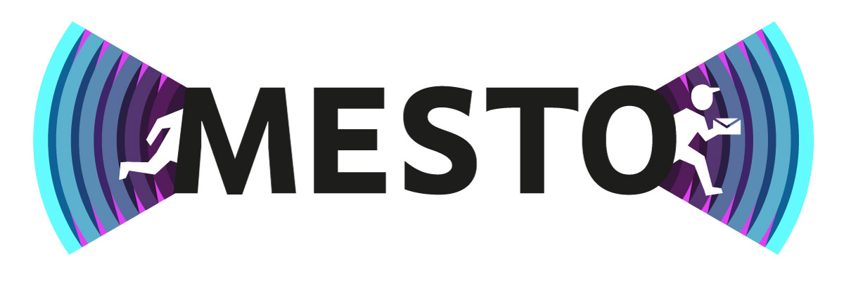
Art director: Number 70, but tilt the envelope further to the left so it doesn’t look like a continuation of the hand.
Designer:
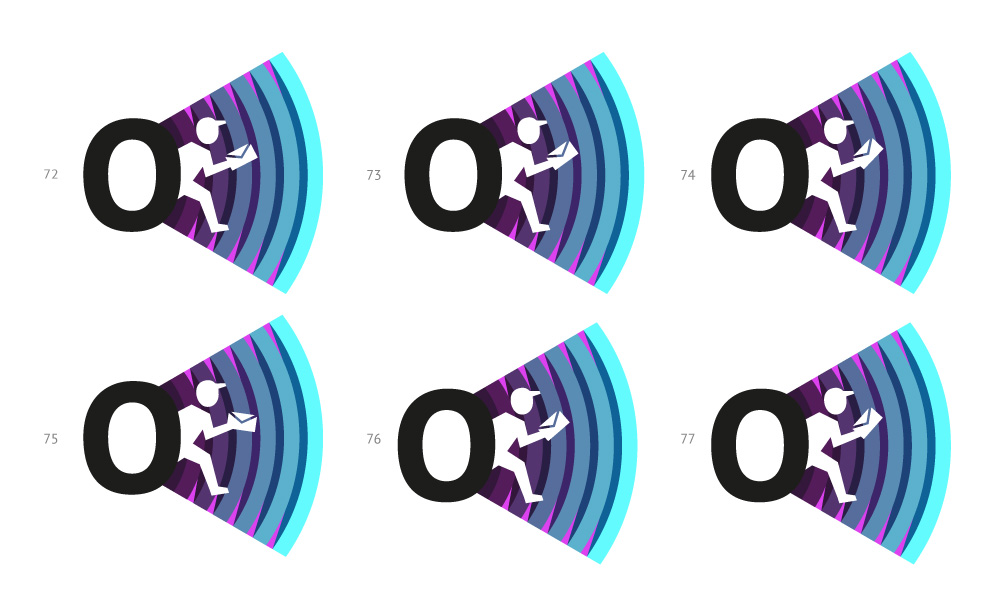
Art director: Number 77 and it’s done.
