The making of the floor navigation in Moscow Metro stations
The story by Ludwig Bystronovsky.
Well, dear reader, let’s get another peek into the process of designing floor navigation for the Moscow Metro.
The previous and next parts cover the working group’s reflections on the task, speculations on the general direction, overview of dramatically changing requirements and solutions. We have no final design so far, so spare the comments on how bad everything looks—relax, it’s probably going to be worse :-) It’s not a presentation of the final design, just a tale of the daily routine.
* * *
This part covers the beginning of January 2014. Let me remind you of what we had at that time.
In 2013, the Department of Transport started testing a pilot navigation project on three stations of Pushkinskaya hub. Navigation stickers were placed on the stations and platforms. Materials were tested and the impact on passenger flows studied. The reviews varied from positive to critical. The people in charge of the city decided that floor navigation should be introduced to 49 stations. The tender was opened. We decided to win it. We had the statement of work, polymer concrete as the material used by our partners, and nine days to submit a proposal.
At that time we couldn’t pose questions to the Department of Transport, so we had to fill in the lack of information by ourselves. On the one hand, we had to keep in mind that deep inside the Department a unified city navigation system was being prepared and Metro navigation was going to be just a part of it.
Navigation concept from the Department of Transport (9.1 MB pdf, in Russian):
Promo video:
On the other hand, we had no information on when the new system would be finished (let alone implemented), so we decided to start with the assumption that the current mess would be hard to get rid of and the existing navigation signs wouldn’t get replaced anytime soon.
So that’s it with the introduction.
Then we grabbed Filya and started to think what was the point of all this.
We had to figure out why the Moscow Metro needed floor navigation in the first place.
The politics behind the decision to introduce floor navigation is pretty clear: passengers liked what they saw on Pushkinskaya hub, the costs were calculated and the mayor decided that it was worth it. (If you want to speak out that the city should spend money on something more useful than floor navigation, you probably should address your deputy or support your candidate in the mayoral elections. We don’t care for politics, we’re talking about design).
As for navigation itself.
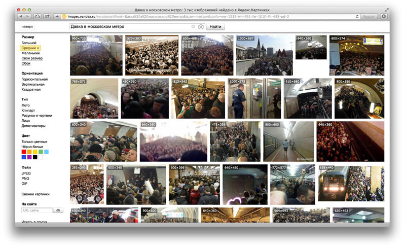
Let’s start with cons. If we think of floor navigation as the primary one, it’s hard to overlook its two fundamental defects. First, it’s hard to see it when the station is crowded. Below you’ll find images for the search query “crowded Moscow Metro.”
The second drawback incriminated to the subject is that well-designed navigation signs usually eliminate the need for floor navigation. There are a lot of examples of the world’s metro systems without floor navigation: there is no floor navigation in Madrid and Barcelona, in London it was introduced but never developed, and in Europe in general it doesn’t catch on.
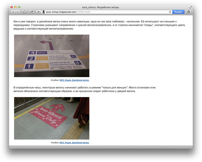
But there is floor navigation in Shanghai, Bangkok, Caracas, Beijing, Tokyo, Kuala Lumpur, Singapore and Dubai metros. (I don’t feel like searching for photos. If I am mistaken, prove me wrong: in some cities there’s more of it, in some it is less common, but I’ve seen photos of all these metros. You can find some examples on www.urbanrail.net—click on a city, then scroll down). There is also floor navigation in Nizhny Novgorod—on platforms, near trains, and in Novosibirsk—on Rechnoy Vokzal station. So it can be assumed that in Romance countries there is no need for floor navigation, while countries that use non-Latin alphabets need it. But let’s drop the subject for a while. I’ll only show you one picture—of Deli’s metro: http://sora-minus.livejournal.com/43042.html.
Let’s look at the subject from a different angle and try to figure out when floor navigation can come in useful.
The examples are not far to seek—I can be one. Here is a reconstruction of how I move around the metro.
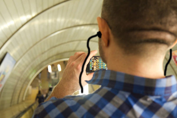
(I added the headphones because when transferring between stations I usually wear them, but in the photo I happen not to).
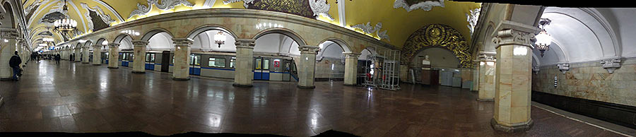
This is what I see when walking from one station to another:

So I don’t really care what happens above, because I look for other landmarks: a familiar escalator, kiosk, passage or stairs. For me, a simple spot on the floor will do.

(Let’s not forget that I am local. Foreigners, tourists from other cities and colorblind persons will need something more than just a spot on the floor).
To sum up: simple floor navigation that would help quickly find the way without having to stop and read would be a nice complement to good navigation signs. Key points: “good navigation signs,” “without having to stop and read.” There should be no need to stop and read. See the color, get the direction? Go ahead.
The locals instantly know where to go when they see an escalator at the end of a station, or a statue of a dog or trains going to or from the center. It would be cool if tourists also had such a tool for instant navigation. This is how I see the role of floor navigation—to be on the periphery of your vision, to rest under your feet and make you feel confident that you, a newbie to the metro, have picked the right way, have made the right turn and that you can do all this without reading too much.
But as for the beginning of the year 2014, the navigation signs in the Moscow Metro are terrible, so we won’t get away with just simple spots on the floor.
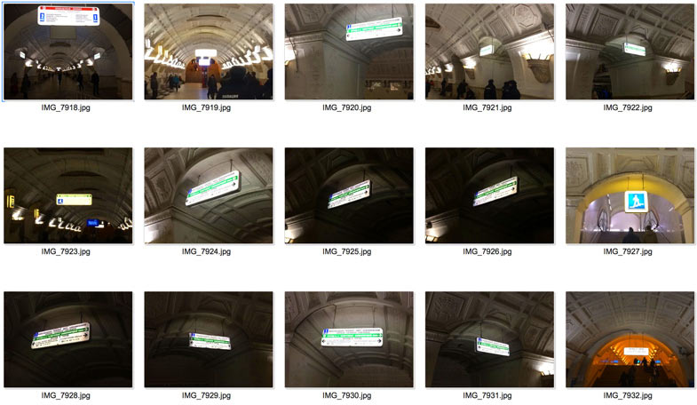
Here, there are no navigation signs (Komsomolskaya-Koltsevaya station):
Here, the signage is misleading: it is Belorusskaya-Koltsevaya station of the brown circle line, but almost all signs have a green line on them because they show the direction to the green Zamoskvoretskaya line:
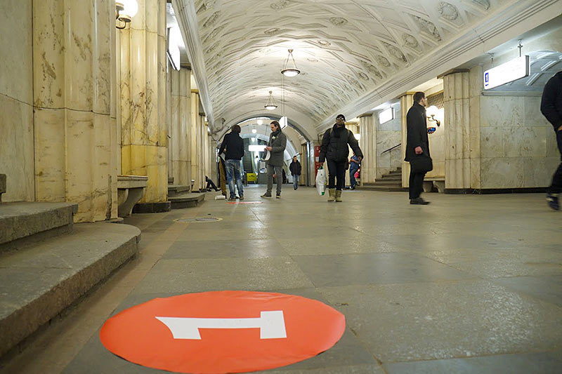
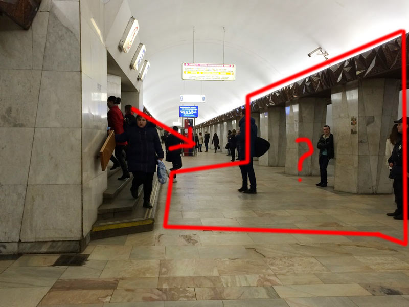
Or here, on Kitay-Gorod station: if you go down the stairs in the center of the station and see a train, how do you know whether to run for it or not? The red arrow in the picture shows the stairs leading downwards (although the people on the photo go up; we’ll talk about it later). While you go down, you hear a train approaching, run to it, enter the station and stop—you need to know where the train is going, but you can’t, as the nearest sign is too far away: far ahead, near the Info-SOS column.
Given all this, we decided that we need to make signs with text.
We started with studying the possible shapes of navigation plates.
All kinds of shapes:
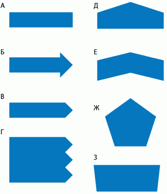
After consulting with technologists, we were left with the shapes А, В and Д.
Then we realized that passengers don’t know the numbers of the lines, so we don’t need to make them as large as they are on Pushkinskaya stickers.
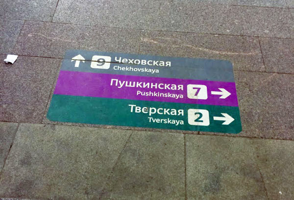
The line numbers are not announced in trains; people simply don’t remember them. If a transfer hub has two stations with the same name, each is announced together with the name of the line (“transfer to X station of Y line”) and the line number is yet again omitted.
So we decided to make the number small:

Then we realized that people spend a lot of time singling out arrows in a group of signs and decided to organize signs by direction: not to lump them all together, but put the signs that point to the left in one group and those which point to the right in the other.
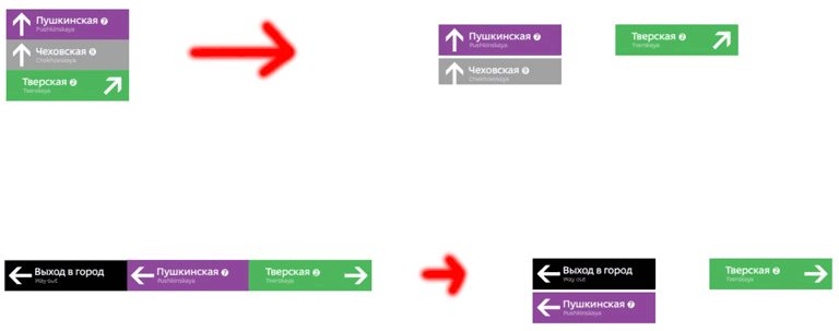
(In this regard, I recommend designers to read about Hick’s law).
Then we decided that signs have to be much bigger than those that are now on Pushkinskaya station.
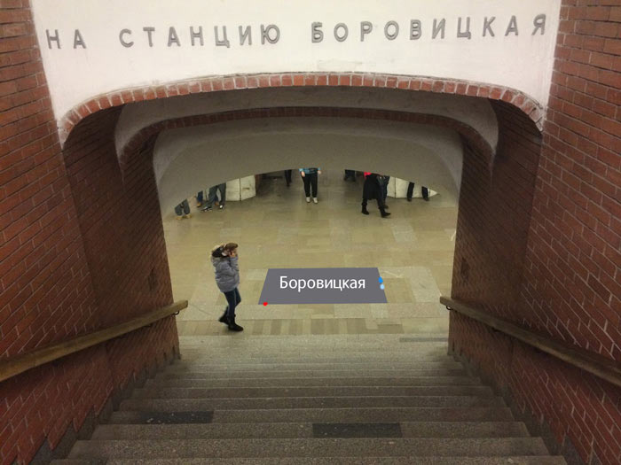
Then we invented “I’m Here” signs doubling as station plans with small dots for advance passengers indicating transfers to other lines.

The Borovitskaya sign, for example, shows transfers to the dark blue and light blue lines at the right end of the station and the transfer to the red line on the left. It’s pretty clear once you get it.
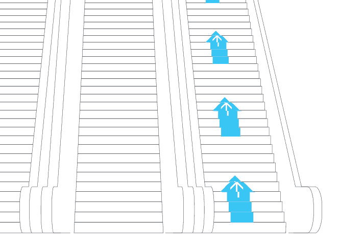
Then we noticed that people going down the stairs need signs showing where the trains are going.
It works like this: we go down the stairs at Kitay-Gorod station and see that the train goes along the orange line to Kurskaya station.
(Yes, I know that it doesn’t go there, but I don’t feel like changing the sign. Guess it’s easier to convince the metro authorities to change the trains’ direction).
These signs are also supposed to indicate the color of the line. They have to be placed deep inside the row of columns in order not to confuse the passengers going along the station to a passageway at the other end of it. They can be placed even closer to the train, if needed.
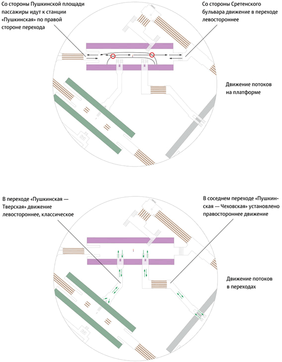
Then we decided to get rid of “Keep to the left” sign by correctly positioning the signs inside the passageway.
We almost missed that on Pushkinskaya station passenger flows are twisted and it’s easy to mess them up.
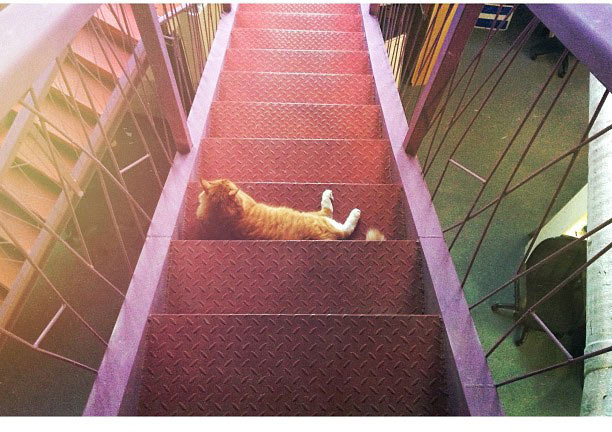
Lyrical digression about Filya the cat
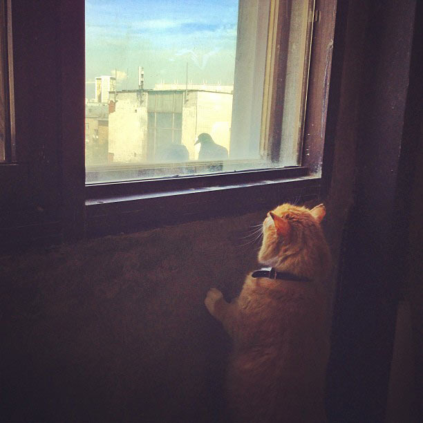
You can tell from his face that although he lives in the studio he always thinks about the metro.
Check it out. Here he dreams about the yellow line:

About Paveletskaya stations of the green and circle lines:

The passage from Tretyakovskaya station of the orange line to Tretyakovsksya station of the yellow line:

Filya thinking about Sokol (Russian for “falcon”) station:
About the passage to Trubnaya (Russian for “pipe”) station:

About the violet Tagansko-Krasnopresnenskaya line:
About the blue Arbatskaya station:

And about the light-blue Smolenskaya station:

Universitet station:

Filya at Medvedkovo (“bear”) station:

The turquoise Kakhovskaya station isn’t left out:

The grey line:

Here you can’t tell from his face. Probably, Tyoply Stan (“warm camp”) station.

We’ll end this part of the story with this picture. Here we are invited to paint the stairs so we could see where the escalator leads to from the other end of the station.
Although this one is better. Here we are suggested to print the text on the signs with a perspective distortion so that it would be more readable when going down the stairs.
This is roughly half of the ideas we had before submitting the proposal. We’ll continue the tour in the next parts.
And I'm going to answer the question “how did it happen that five weeks after deciding to make signs with explicit texts we were trying on a number in a circle on Teatralnaya station?”