The making of the floor navigation in Moscow Metro stations
The story by Ludwig Bystronovsky.
Phew, it seems the appearance is done for now (we are yet to receive the final approval from the Metro administration, but at least we can see the finish line).
I’ve assembled a brief outline of everything related to the concept. There can still be some changes, I’ll update this chapter if they happen. Here we’ll talk only about the design and changes in files and printouts, nothing is in concrete yet.
So, a short list of the stages we went through.
January 5, 2014
Started to generate contest ideas.
Read Floor Navigation: The Beginning. Laser Rangefinder and Benedict Cumberbatch.
January 10.
We made a bunch of test printouts and went out to try them in Kiyevskaya and Pushkinskaya stations.
Read Floor Navigation 2: Why we Need it, Theories, Filya the Cat.
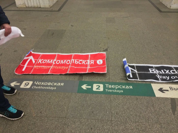
(The most interesting character in this blurry picture is not the policeman asking the Vimeo star for an autograph, but Mark who is trying to break out a concrete sign out of the floor of Chekhovskaya station.)
January 14. Tender concept:
Then we waited for contest results.
The second half of February. The concept changes.
We won the contest, we met with the workgroup of the Department of Transport in charge of future city navigation. Clearly, it makes sense to embed floor navigation into the general city navigation.
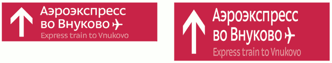
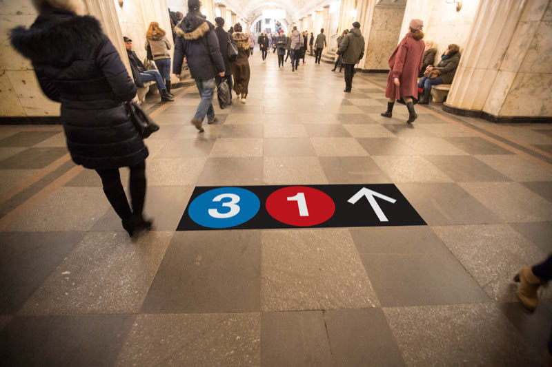
Since the Department of Transport plans to get Moscovites accustomed to Metro line numbers and since we are supposed to promote line numbers in circles, we rework the concept.
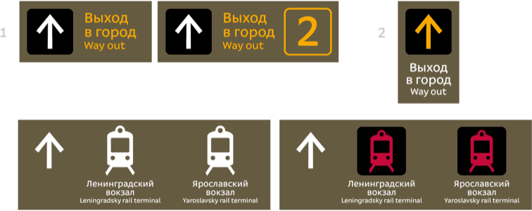
Line number circles, black and yellow exits to the city, arrows, black background:
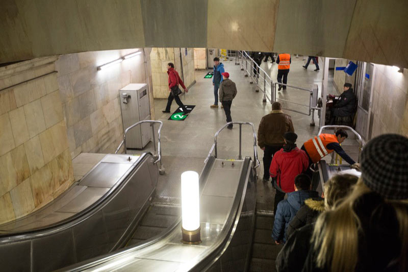
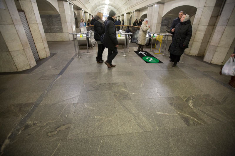
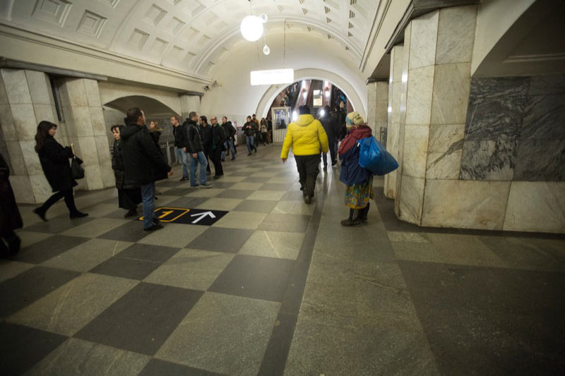
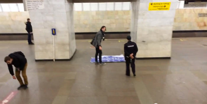
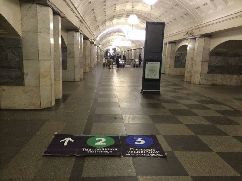
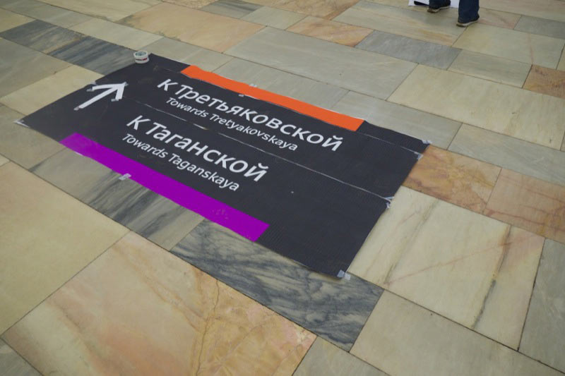
February 20. Trials in Teatralnaya station.
February 21. The concept changes.
Erken gives us the idea that instead of making rectangular signs with colored circles inside, we can make the signs circle from the start. Trying it out.
Finding descriptions of circle-drilling machines. If we place the circles where four granite slabs meet, we can avoid chipping.
Trying to keep in mind the future city navigation which is still yet to come.
February 27. The concept changes.
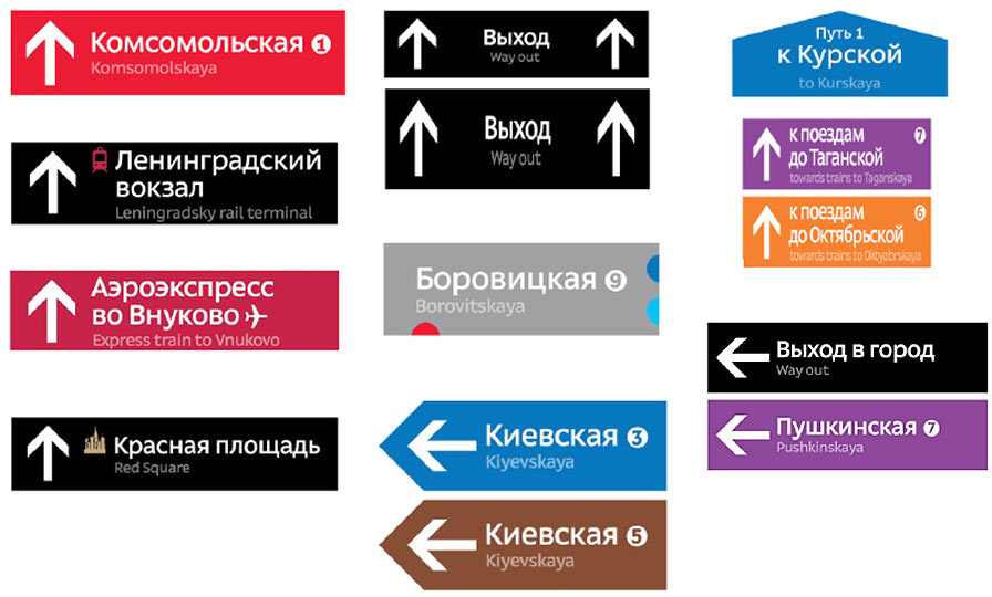
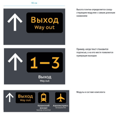
Two changes this time. First, the captions return as it’s required by the statement of work. It was quite confusing without them anyway. Secondly, we settled on the background color. We decided to make it not New-York black (it hurts the eyes on light-colored floors), not white (looks foreign on dark floors), but matching the color of floor tiles.
Yep, matching the color of every single floor. There are currently two options: either a) we are fucked or b) we are not fucked and will manage to match all the colors nicely.
Colorful bus terminal and black tiles for exits to the city.
Trying it in Puskinskaya and Teatralnaya right away. Starting to collect the floor colors while we’re at it.
Making sure that colored and white bars look horrible against the floor.
It’s not like we’re creating navigation for a car park, we want to pay homage to the underground architectural masterpiece.
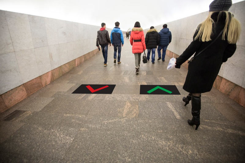
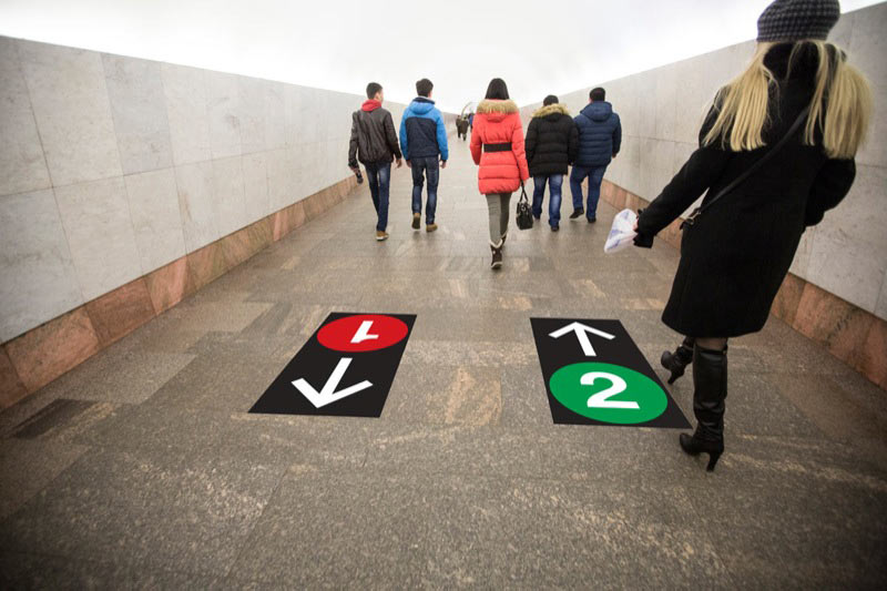
Thinking about travel direction signs.
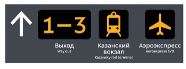
As a result, settling on sizes and layouts of exit signs.
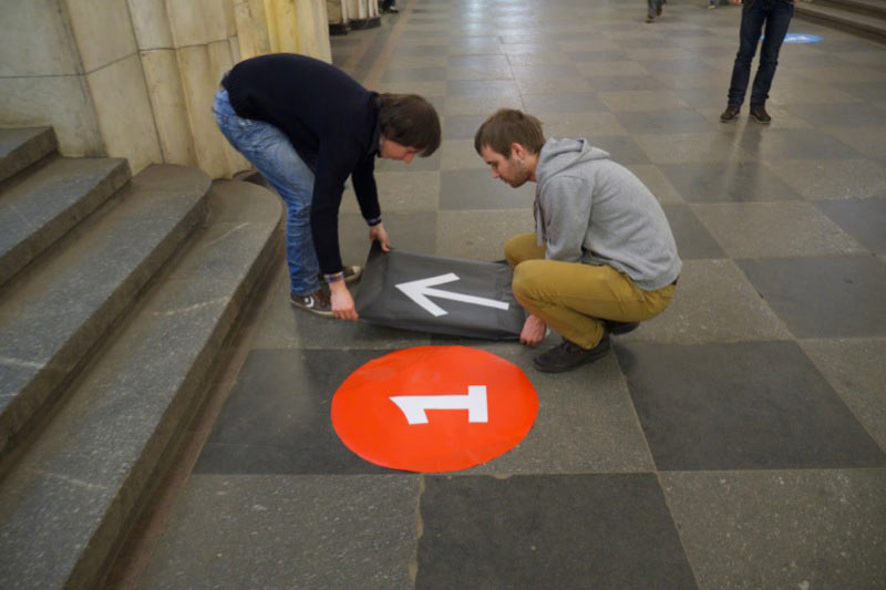
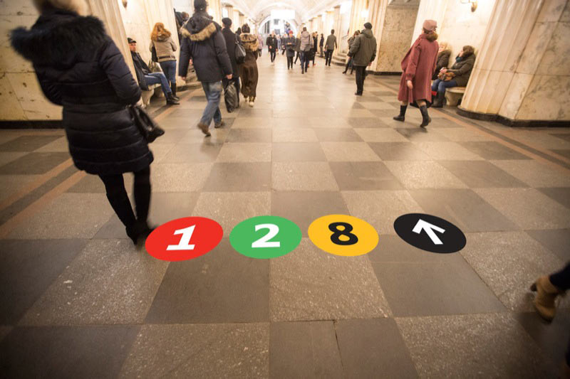
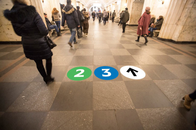
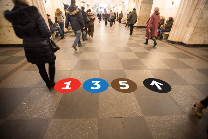
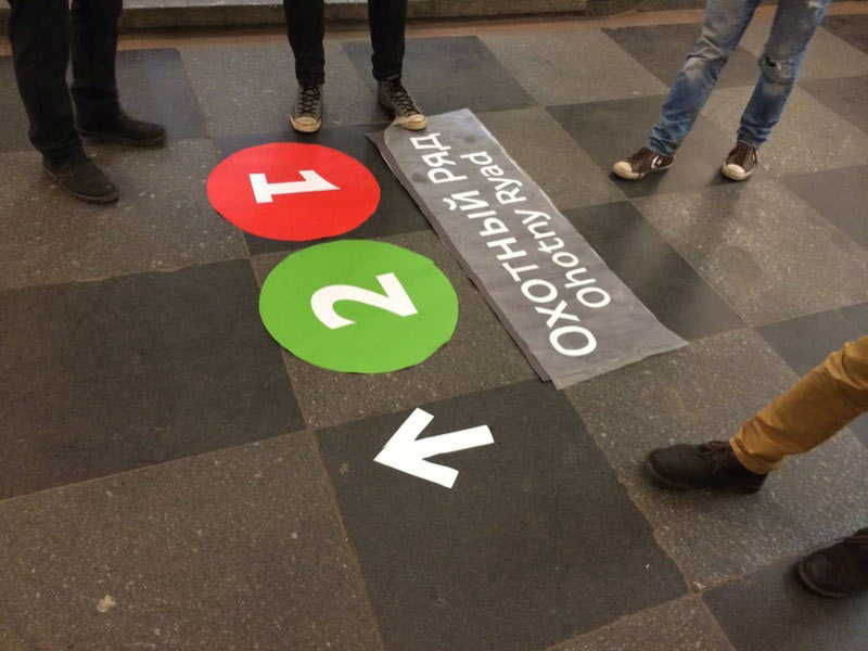
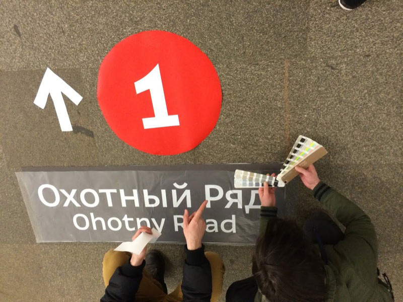
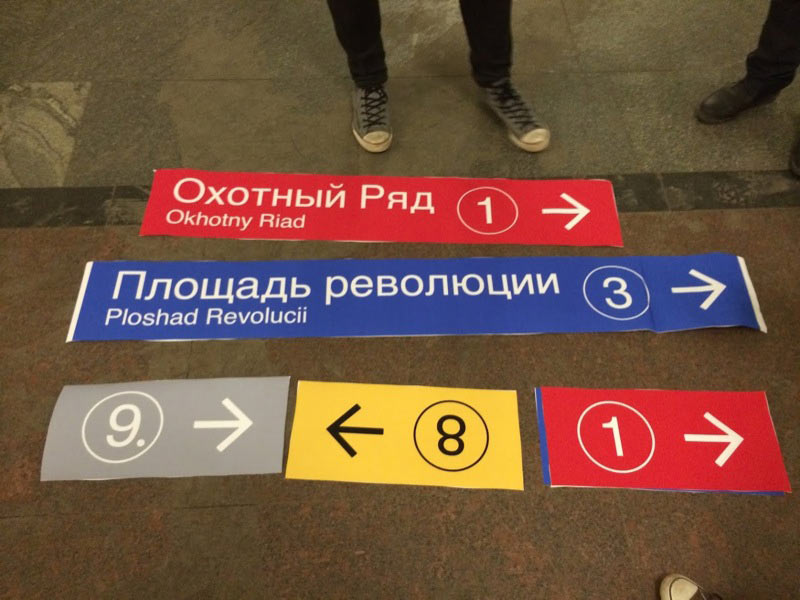
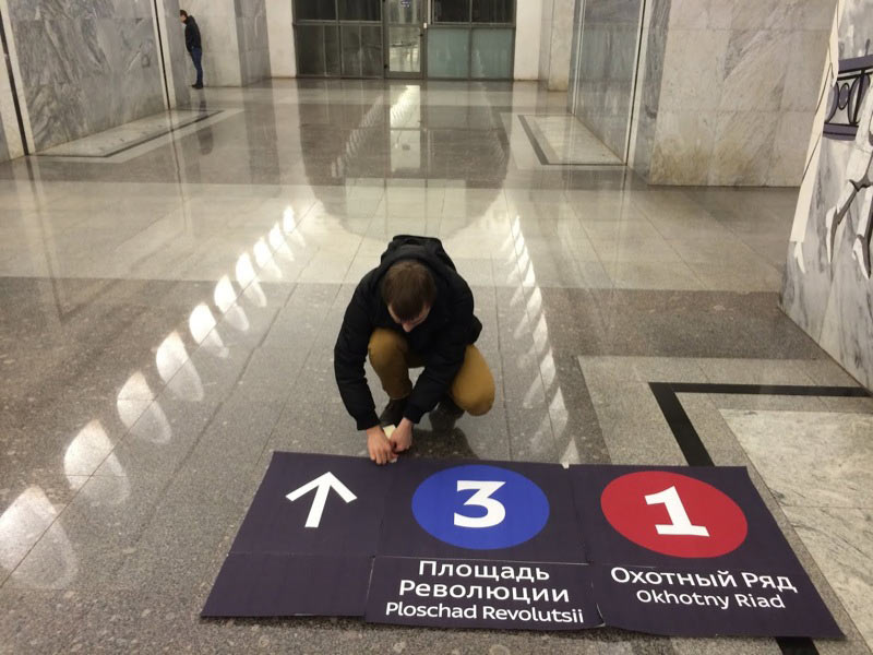
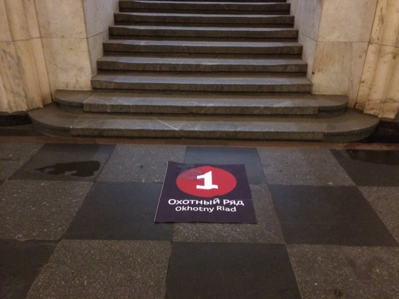
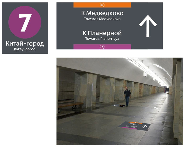
March 1. Trials on Dostoyevskaya, Kitay-Gorod, Okhotny Riad and Ploschad Revolyutsii.
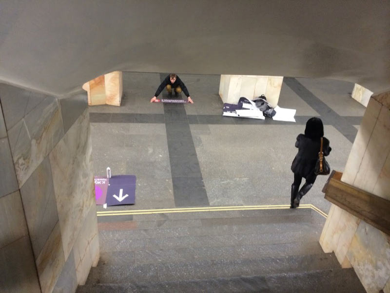
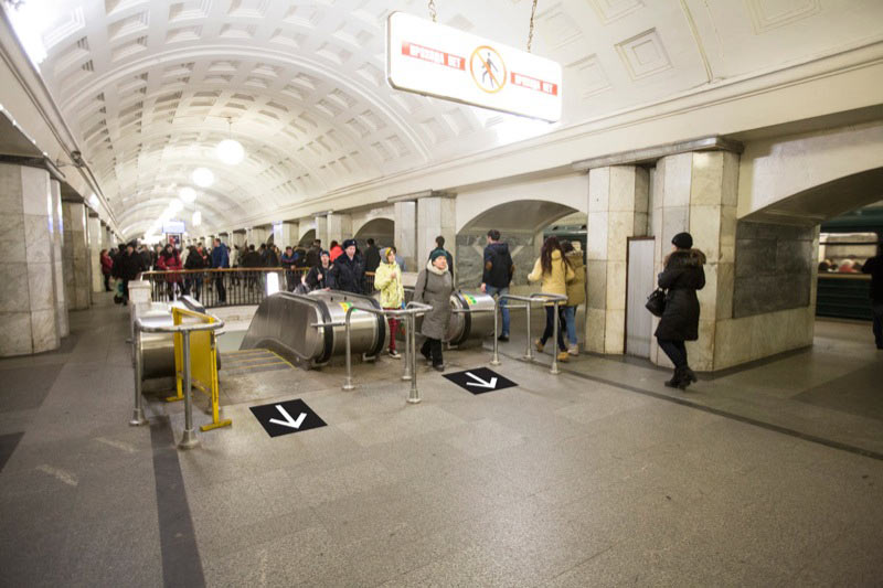
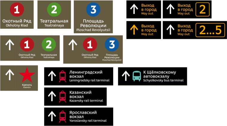
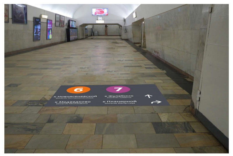
March 4. Remaking platform signs, all because of cross-platform transfer at Kitay-Gorod and the appendix at Teatralnaya. Writing the names of terminal stations.

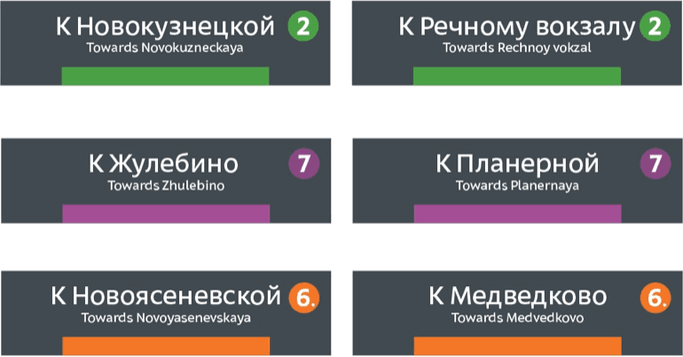
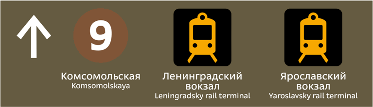
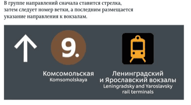
Adding dots to 6. and 9.
The text under the icons will be center-aligned. Choosing the sizes.
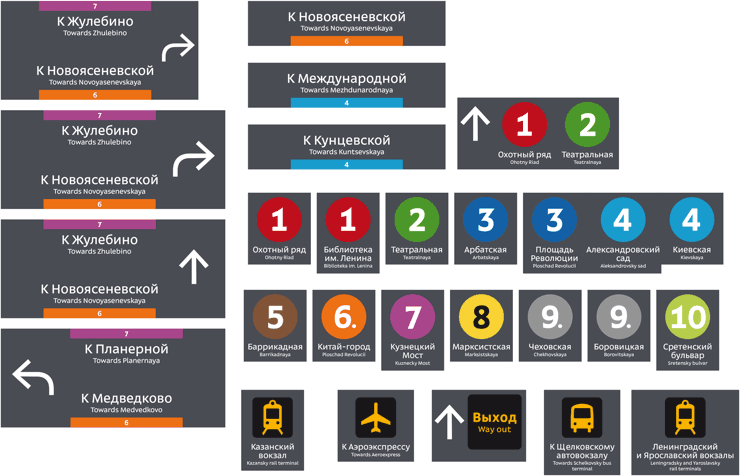
Trying out on Teatralnaya, Okhotny Riad, Ploschad Revolyutsii and Kitay-Gorod. Having a brain fart and instead of terminal stations writing the names of the stations closest to Kitay-Gorod.
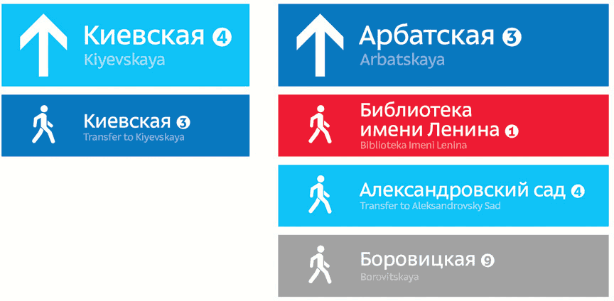
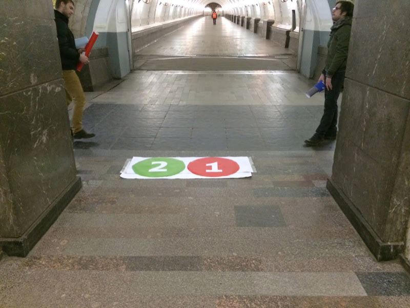
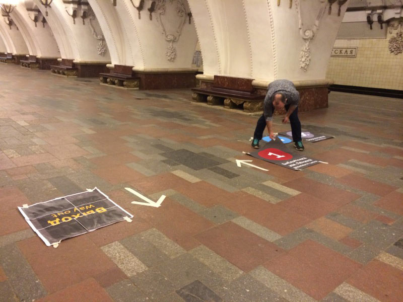
March 5. Going to Arbatskaya, Aleksandrovsky Sad, Borovitskaya and Biblioteka Imeni Lenina to hold the tests.
Assembling yet another draft of the concept and sending it to the authorities. Receiving comments from the Department of Transport, the Metro administration and the manufacturer.
Department of Transport: Discard the Way Out sign in favor of a yellow arrow; discard platform signs since they will be replaced by hanging navigation soon.
Metro: Do not use yellow and black color coding of exits, remove the Kremlin star.
Manufacturer: Add haydite rings to color circles (it’s a technological requirement).
Thinking how to satisfy everybody. Finding the solution.
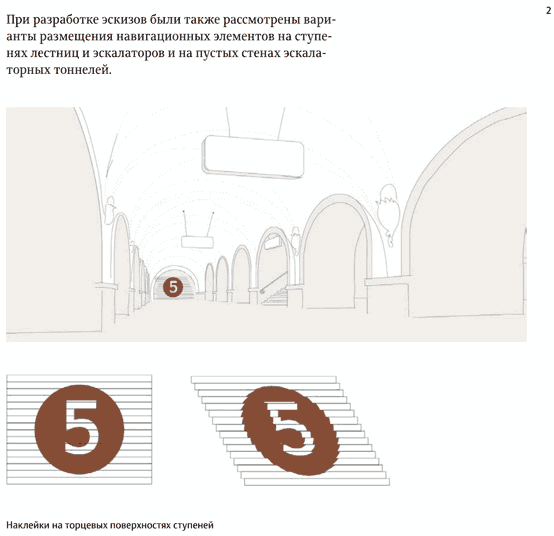
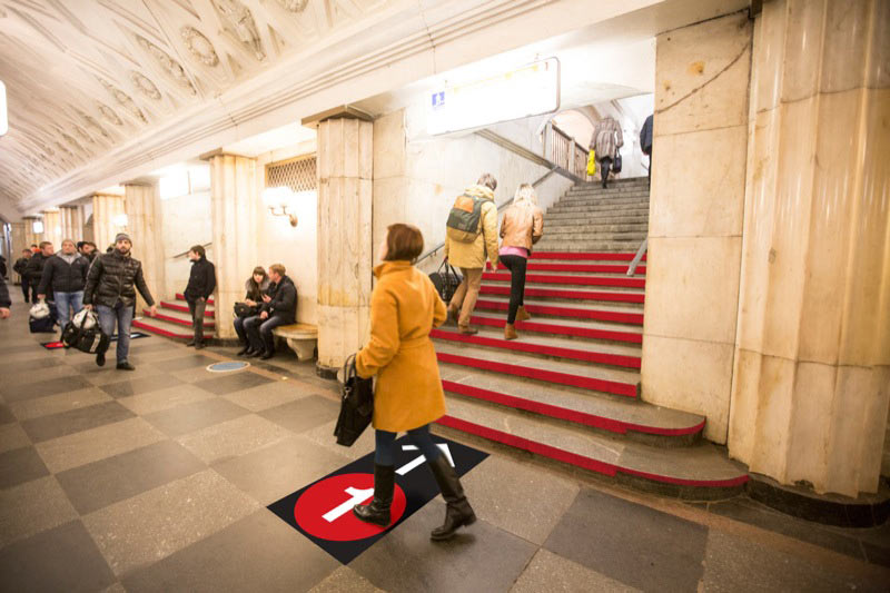
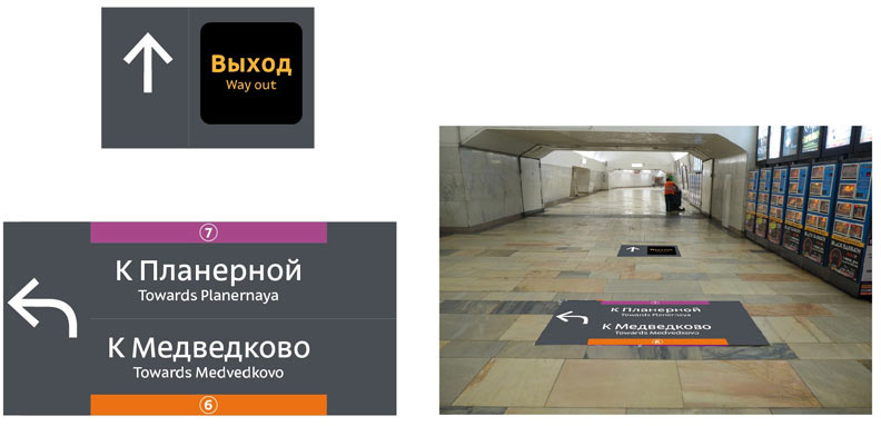
March 7. Making special Way Out signs that can be easily replaced as soon as the city administration decides on exit numeration.
Abandoning floor platform signs, asking to use temporary stickers on columns until the new hanging navigation is introduced.
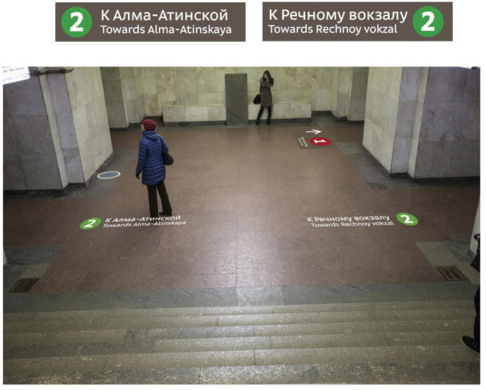
The appearance and size of the stickers will need some work. There are only four stickers on the picture right now, we want there to be more.
(In the next iteration the stickers will show transfer stations, too).
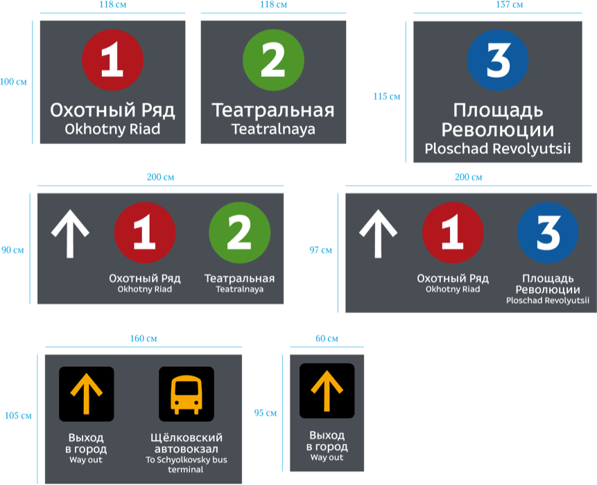
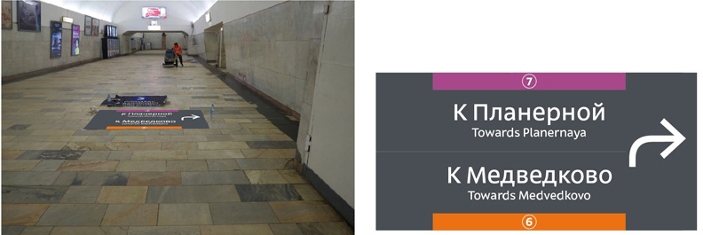
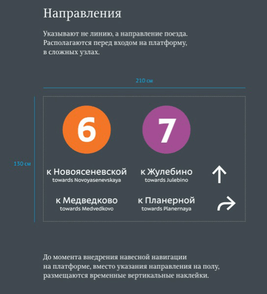
Another iteration of platform signs, but in a more customary paradigm:
Adding the technical haydite outline to the circles.
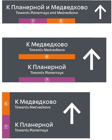
Another comment from the Department of Transport: we shouldn’t use bent arrows. Coming up with a way to make do without them, trying it out.
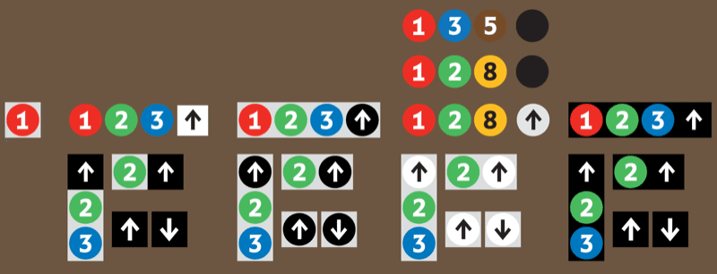
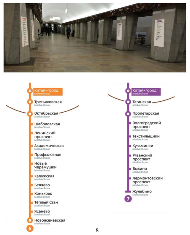
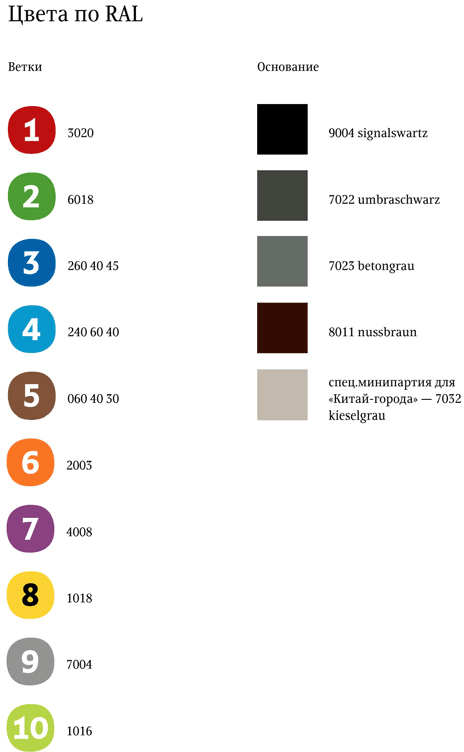
We now have pictures of all 49 stations and the colors matched. The gist:
The concept is approved in the Department of Transport and is waiting approval of the Metro administration.
The brief chronology of events bids us farewell. It was required to give you an overall glimpse at what was going on.
The next part will be on the atmosphere of the project. I’ll get around to explaining the design solutions some time later.
