Getting the task: we need to design a London Underground train. The train should introduce Russia but do it without the traditional Matryoshka dolls and balalaikas and rather by talking about its ballet, art and architecture. Also, the train needs a name.
Designer:
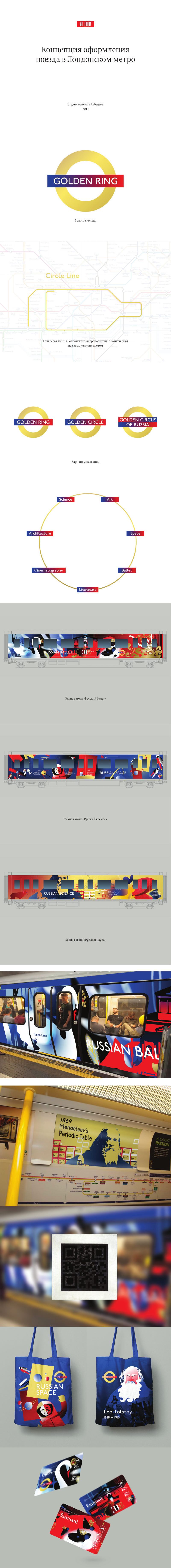
Suggesting to name the train Golden Ring. It will run on the Circle Line of London Underground that is colored yellow on maps. Thinking of a way to tie it all together in English. We want to rhyme it with Circle Line but there is a chance Golden Circle will be taken as just that, a yellow-colored circle. Keeping the issue open and suggesting to go with Golden Ring which is already well-known.
The train has seven cars, each car is devoted to a certain theme about Russia or the USSR. The first one will be about architecture in general and the Russia’s Golden Ring in particular.
Client:
1. Not about architecture in general, but about Moscow architecture specifically. Since the train is dedicated to Moscow, the name should be changed to Moscow Circle.
2. The themes of the seven cars have been generally agreed upon, but each has to feature a certain piece of architecture (according to its theme: the Bolshoi Theater, Russian Academy of Sciences, the Tretyakov Gallery, etc.).
3. The main colors are red, white, blue and gold.
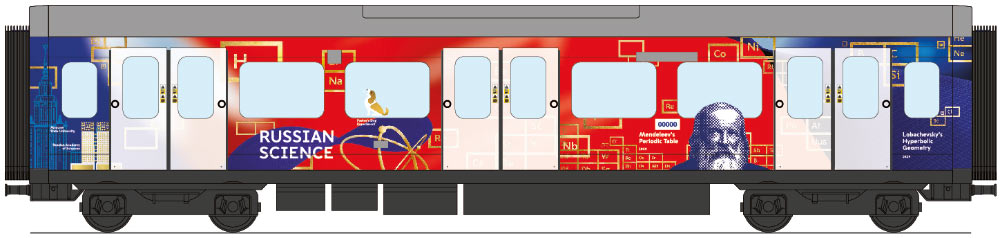
4. Remove the rats from the Theater car; the color scheme on the Science car will definitely have to be changed (yellow and purple are definitely not Moscow colors); the dog with burning eyes is dubious.
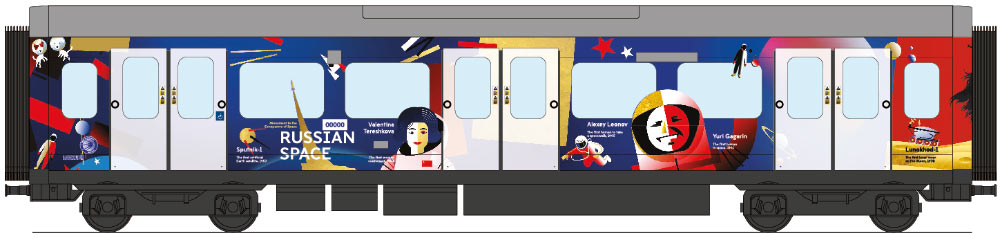
Project manager: Of all the cars there seem to be no issues with Space; in Ballet we’ll need to feature the Bolshoi Theatre more explicitly and brightly; the Science car is dubious: that thing about Lobachevsky is hard to understand, plus Mendeleev looks a bit too sad. Right now we need to draw the remaining four cars and start preparing the final designs.
Designer:
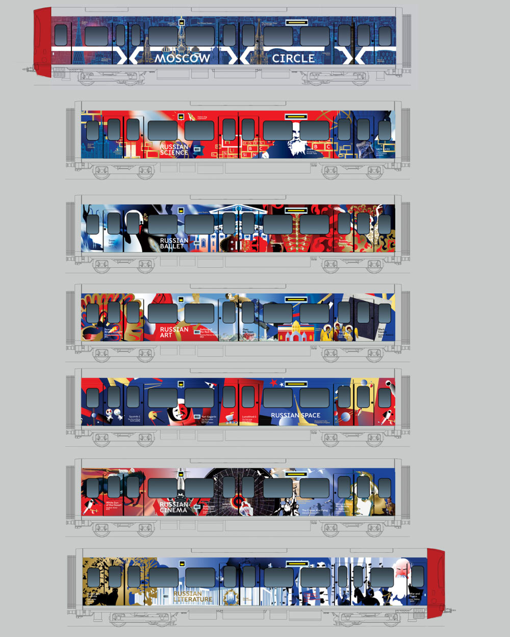
Sketch of the entire train, complete with seven cars.
1. Head car. The guys from the Metro would very much like to:
a. make it clear that it’s a Moscow train;
b. make it clear that it was prepared by the Moscow Metro;
c. make the entire car devoted to Moscow architecture.
Some of the buildings we can draw in gold, though I wouldn’t add any red accents (it immediately stops looking like a Moscow train car). However, the train cab which we can’t touch is red, so the red, white, blue and gold combination remains.
All cars have names like Russian Space or Russian Literature, but in this case writing Russian Architecture would be a bit odd since many buildings—the Bolshoi Theatre, the Tretyakov Gallery, the Moscow State University, etc.—will be featured on other cars. I suggest we simply put a large name of the train.
2. Russian Science. By the way, about the University. To make sure the train looks more coherent, I decided to overlap the themes a little bit at the gaps between cars. In some cases this is done semantically, in others graphically. For example, in this case the University is a building that we need to show on the Science car, yet it is drawn in the same style as all the buildings on the head car next to it.
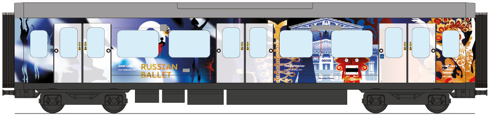
3. Russian Ballet. What has changed: the Nutcracker’s saber became darker, the Bolshoi Theatre became white so it should be better visible.
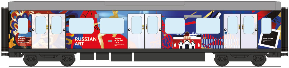
4. Russian Art. The left edge here starts with Natalia Goncharova’s Peacock which rhymes well with how the Russian Seasons are depicted (the right edge) on the car next to it. The right end of this car is about Suprematism, so the next car is designed in this style.
5. Russian Space. Here they liked everything at the last meeting so I didn’t make any changes. I only added a gradient to the red fill on the right to make sure it blends better with the next car.
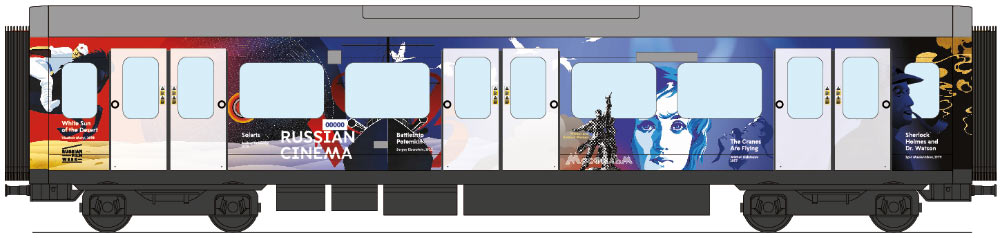
6. Russian Cinema. I really want to design the entire car in the style of Russian movie posters. First of all, it matches the overall style. Secondly, the aesthetic of these images is recognizable in Europe. The car will start with the White Sun of the Desert. The previous car was about space and this is the movie all astronauts on Baikonur watch before their missions. Next, Battleship Potemkin, Solaris, The Cranes Are Flying and Moscow Does Not Believe in Tears. The Moscow structure on this poster, the Worker and Kolkhoz Woman monument, is the Mosfilm logo, a recognizable Soviet image, so it seems to fit well overall. In the end we’ll put Livanov’s Sherlock Holmes drawn in shades of gold. It’s about Britain, about Russia’s contributions and about literature, which is the theme of the next car.
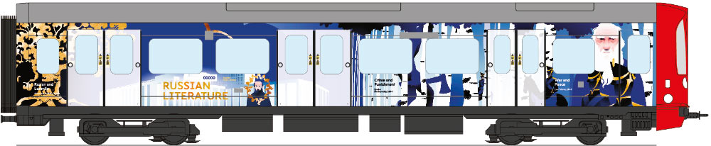
7. Russian Literature. Pushkin, Dostoevsky, Tolstoy. The obligatory Moscow building here is the Russian State Library. They specifically asked to put it somewhere on the train and we can rhyme it nicely with some birch trees. We also added a portrait of Dostoevsky by the entrance where the monument “sits” in real life. Anticipating the requests to remove Raskolnikov with his axe, we concealed him behind the birch trees. To make sure everything looks in the same style, I decided to use almost no red on this car. Similar to the head car, the untouched cab will remain red so the entire car will be seen as red, blue and gold.
Receiving the client’s feedback. We need to replace “ring” with “circle.”
Project manager: Here is the client’s argument against the word “ring:” it can have the meaning of “a gang”, “a group of people drawn together due to a shared interest or goal, especially one involving illegal or unscrupulous activity,” etc. This isn’t good for us politically, everyone will think: “Here they are, dropping hints of world domination, Russian hackers,” etc. As for the circle, the argument for it was the following: it matches the name of the Circle Line where the train will run and at the same time we have Moscow Central Circle. What do you think Tanya? I’m interested to hear your thoughts.
Translator: Wow! I simply based my reasoning on the fact that all our ring roads are traditionally translated using the word “ring:” Moscow Ring Road, Garden Ring, etc. Again, the old towns around Moscow are also called the Golden Ring. But of course it’s for the client to decide, we don’t know what kind of connotations this word may have for them. Let’s make it “circle.”
Receiving more feedback from the client. Making changes.
Sending the design to London. Receiving comments. Reading, thinking.
Designer: We got an answer from London to our train presentation.
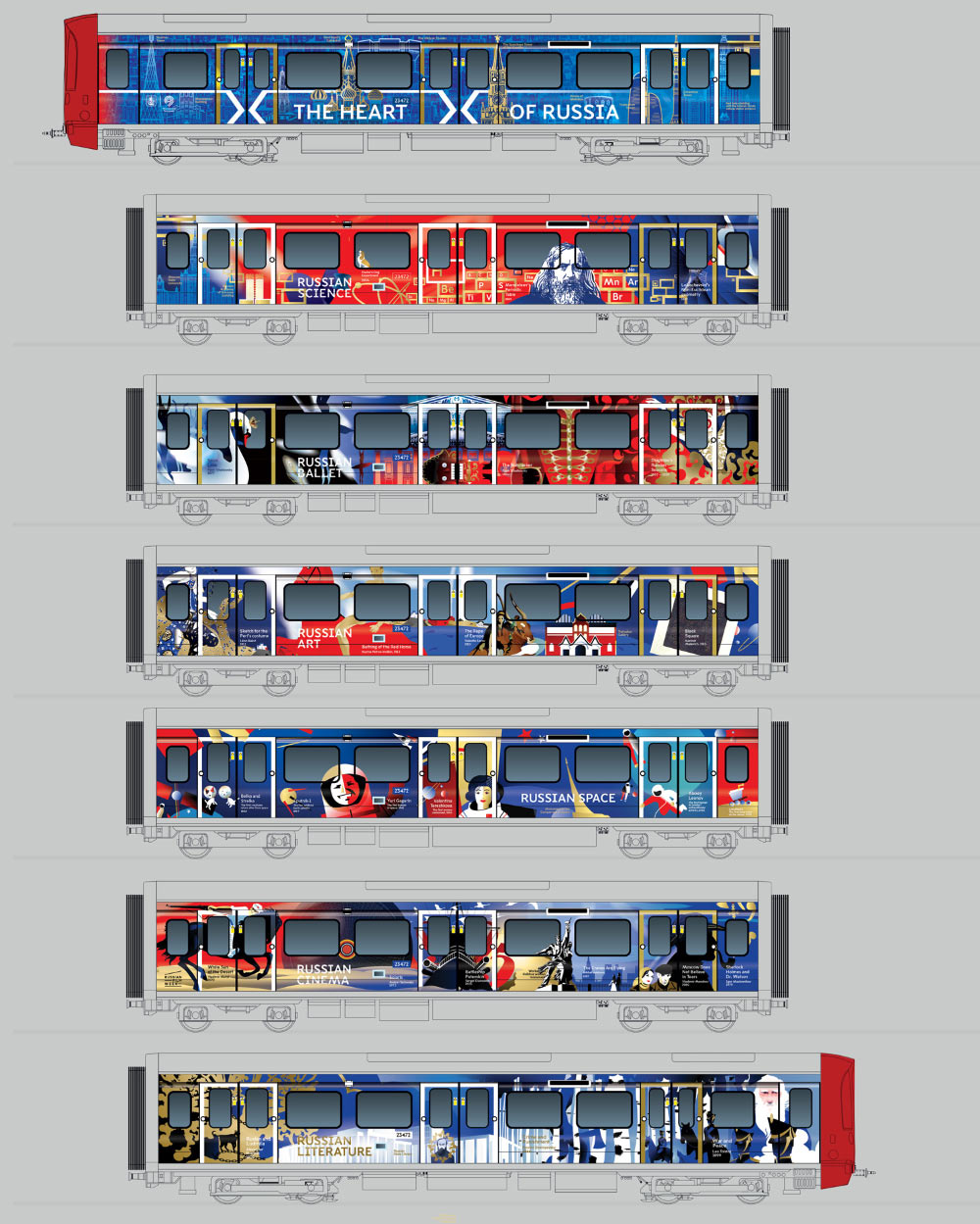
1. They don’t like the name Moscow Circle since the train will run not only on the Circle Line, but also on the District and Hammersmith & City Lines. They are afraid this name may be confusing for passengers. This was also the reason the last time they did not accept a design for the train’s logo that looked like their transport logo with a circle.
2. All doors should be clearly visible on the train’s “body” as they have a special law concerning visually impaired passengers. As for the name, I completely agree that the name Golden Circle (or Ring) was OK.
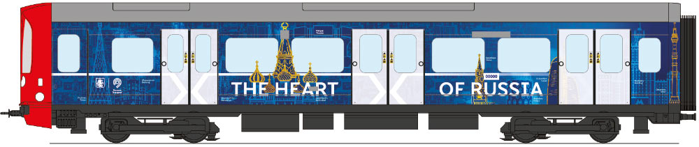
The entire train is about Russia, not Moscow, so I suggest to write The Heart of Russia on the first car, or something like that. On the one hand, the heart of Russia is of course Moscow. On the other, the first car will say Russia, not Moscow, which will mean that all the cars that follow it (with names like Russian Science, Russian Cinema, etc.) will make more sense. I outlined doors with frames similar to the rugby train (http://www.sportsmarketing.fr/wp-content/uploads/2015/05/image1-4.jpeg).
I also noticed that on that rugby train photographs slightly encroach on the transparent part of the doors. Looks like this isn’t forbidden so I introduced this on the cars where it was necessary, see Mendeleev on the Science car, the swan on the Ballet car, Gagarin on the Space car, etc. I’m sure there are certain rules about the area of the window that can be covered by a picture. We’ll wait for their feedback and fix it if it’s too much.
I also added the train number to each car. On all cars except Science and Literature it is placed on a contrasting blue bar. On the Science car I simply put it in a frame so it’s less conspicuous but still visible. We’ll need to ask whether we can do the same on all cars and whether they have any requirements for the size and placement of this number.
An unexpected discovery: Chagall was replaced by Serov’s The Rape of Europa. I wonder what they will think of this caption in London.
Getting comments from London that the doors are still not visible enough. Working to improve this. We can’t simply surround them with a frame, there has to be more contrast. Painting doors in various colors.
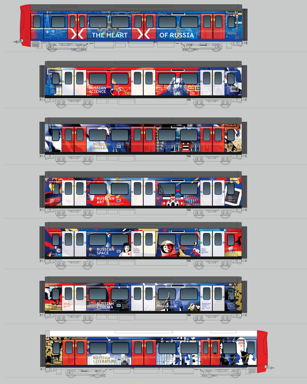
Designer: Let’s show them this picture so they can approve the approach in general. (Before I forget. On photos from the train yard the car number was below one pair of windows, then below another, so it appears to be legal to do so. I did the same).
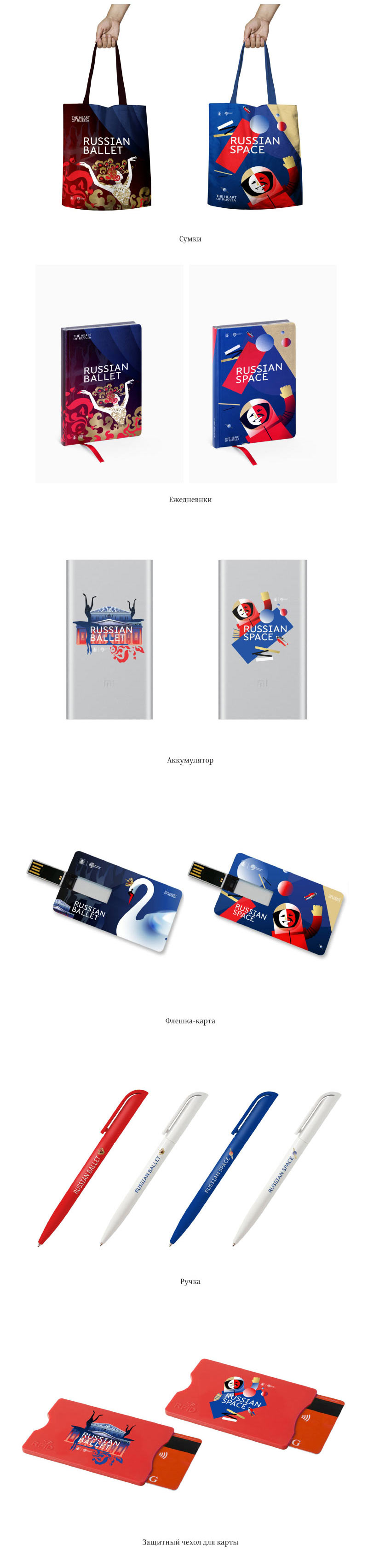
Meanwhile the second designer creates sketches for the souvenirs.
The manufacturer confirms we can use the ends for the design. They also ask us to double-check all mock-ups since some technical features, for example the emergency door release, are not whey the should be.
Designer: No-no-no, hold on a minute. The two sides of the train differ from one another, we knew this all along. I thought the only difference between them was the size of the windows on one of the cars (see the fourth car in the top row and the third car in the bottom row).
Now they are telling us about the emergency door release switches, that on cars 5, 6 and 7 they should be under the opposite (right) pair of windows. But in the top row which we used to create car mock-ups they are still located under the left pair of windows! Which means that at least one of the sides should be fine. Yet they don’t write about one side only, they simply write “cutout still needs to be moved.”
What is this crap? What if the numbers are also located properly on one side only and we should mirror them on the other one? Besides, there are no door releases at all on the first car in the bottom row and the last car in the top row!
In short, I rendered both sides as separate sets of cars: Side A (top row on the screenshot above) and side B (bottom row on the screenshot above). Let’s try to send this to London if we can. Here I marked all the things that we know about that can interfere with the design. On one of the layouts the door release is positioned right on Gagarin and is also in the middle of the Mosfilm text on the Worker and Kolkhoz Woman. But if we move Gagarin under a different set of windows, it is entirely possible the door release will again end up on his face on the second, mirrored side. We can create mirrored versions of the cars depending on the position of the door release (and car number) but it would be great to know beforehand whether we need to.
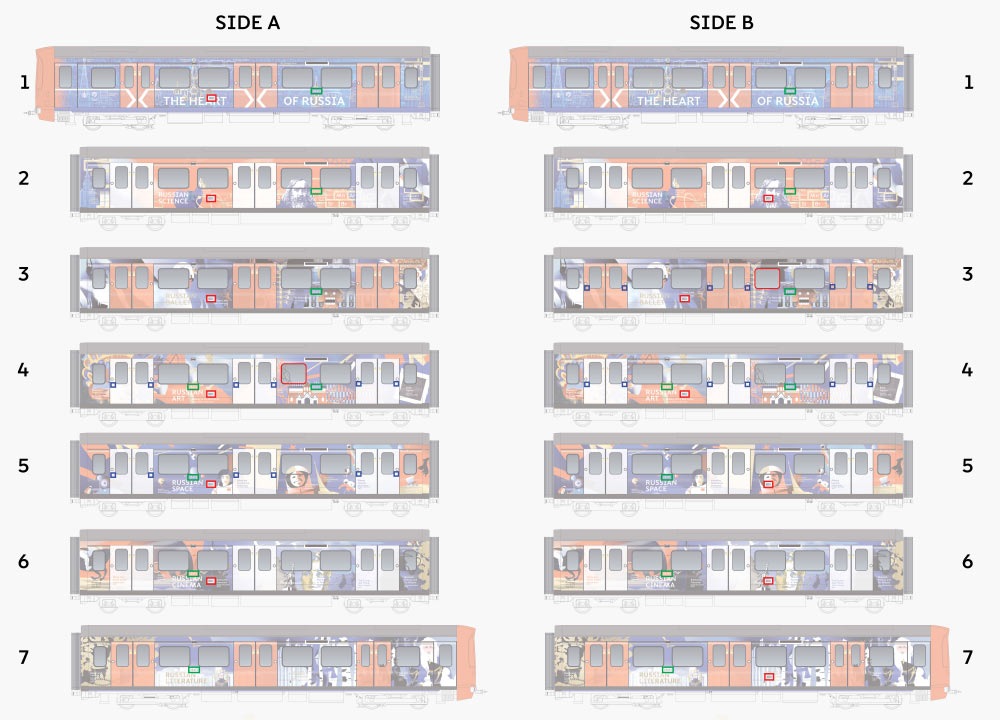
Side A
1. Door release under the left pair of windows, car number under the right pair of windows
2. Door release on the left, number on the right
3. Door release on the left, number on the right
4. Door release, number either on the left or on the right; disabled passengers; one of the windows more narrow than usual
5. Door release on the left, number on the left, disabled passengers
6. Door release on the left, number on the left
7. No door release, number on the left
Side B
1. No door release, number on the right
2. Door release on the right (and ends up on Mendeleev face), number on the right
3. Door release on the left, number on the right; disabled passengers; one of the windows more narrow than usual
4. Door release on the left, number on the left or on the right; disabled passengers
5. Door release on the right (and ends up on Gagarin), number on the left
6. Door release on the right (and ends up on Mosfilm), number on the left
7. Door release on the right (and covers the Crime and Punishment caption), number on the left
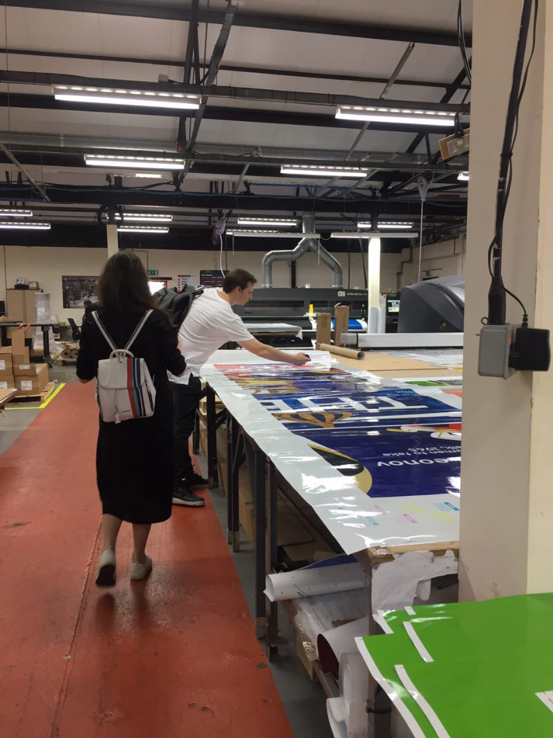
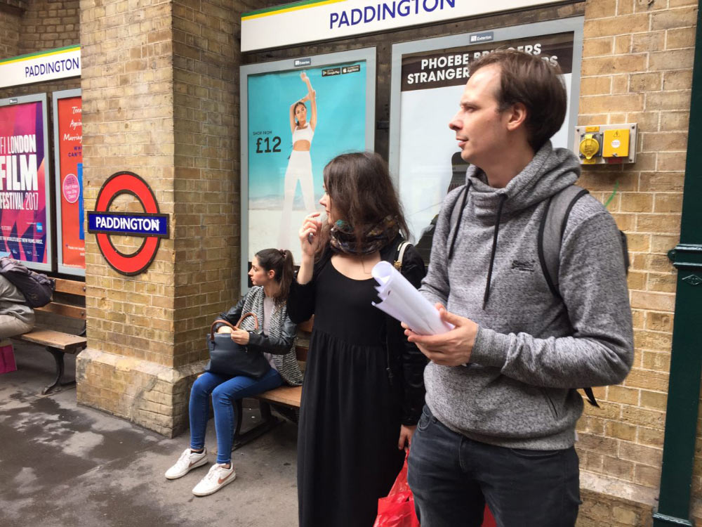
There are too many questions. Going to London to meet the manufacturer.
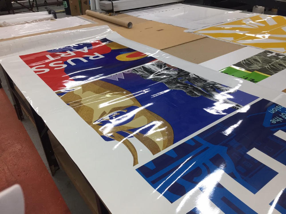
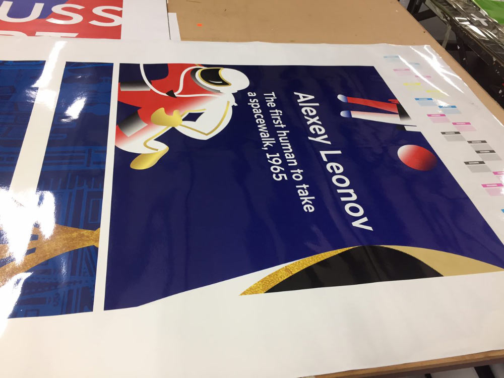
Looking at color proofs and discussing technical details of the mock-ups.
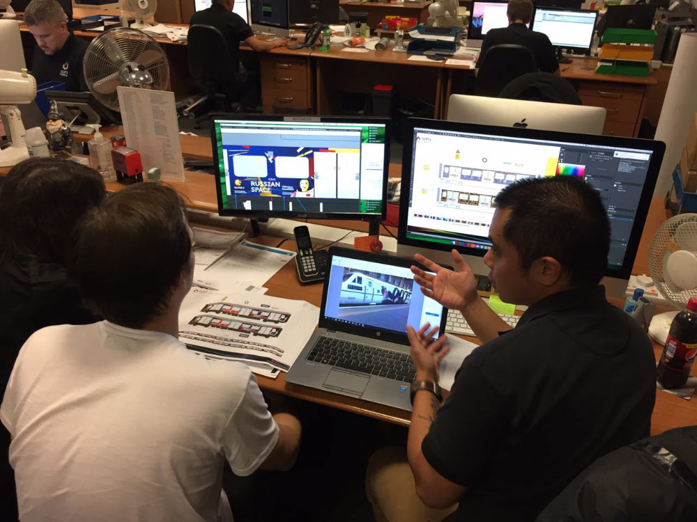
It’s hard to believe but we still don’t know where the emergency door release switch should be on each car. It turns out, there are two mock-ups of the train and no one knows which one is the correct one.
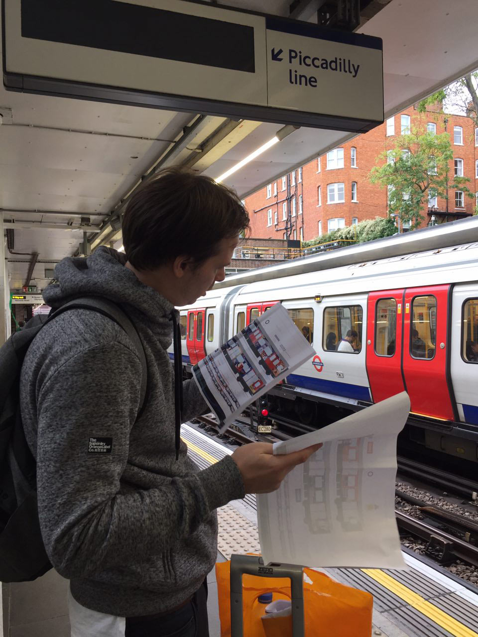
Going to the Underground to look where all technical features are located on real trains. Recording a slow motion video of a train passing by for the colleagues.
Going back to Moscow to finalize the designs. At the very last moment we are told that red doors on all cars need to be painted white: the red ones are still not visible enough for visually impaired passengers.