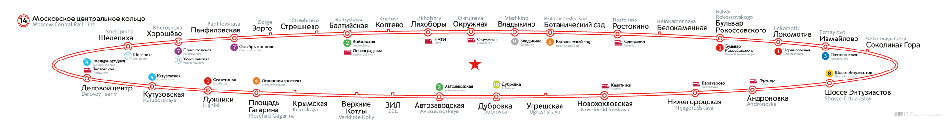
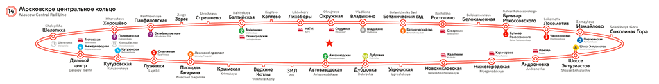
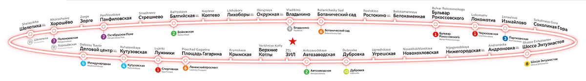
Moscow Central Circle line map
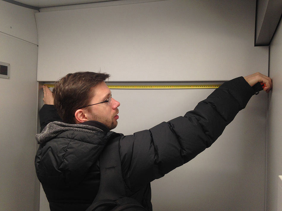
Before we start working on the map, assembling a group of designers and visiting the rail yard to have a look at Lastochka type trains that will operate on the Moscow Central Circle. Lastochka doesn’t look like a regular Metro train and desk research won’t be of much use here. Location of the map, its dimensions and proportions—all of this we can find out only during a face to face visit.
Measuring almost everything inside the train, from window dimensions to the width of space between the washroom and the exit.
Using the Metro line map and the power of imagination to estimate the look of the Central Circle line map if it were placed on a lamp above the exit.
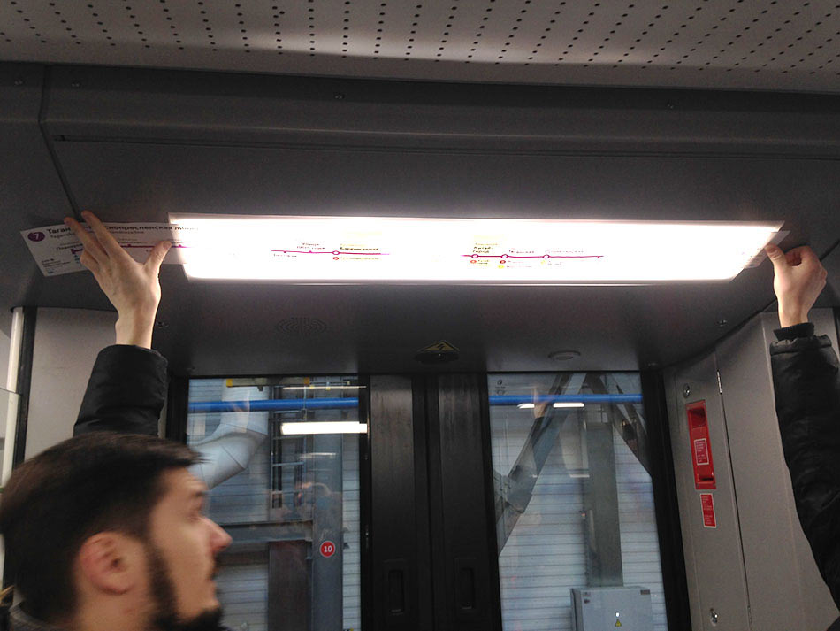
Or if it were placed above the luggage rack.
After the measurements are complete, coming up with placement ideas for the map.
We start by exploring two options: above luggage racks and on glass panels near exits.
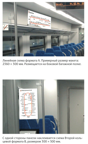
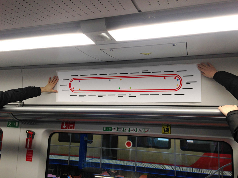
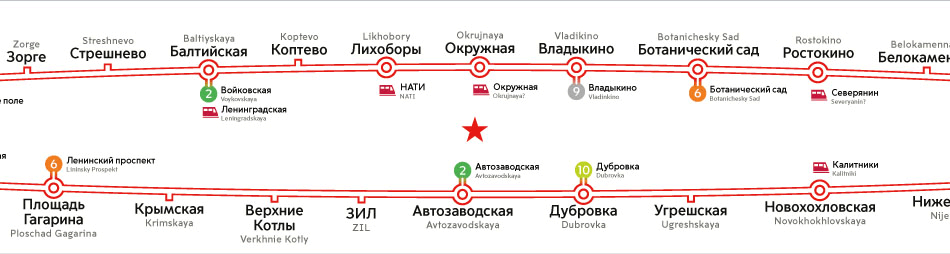
Later we drop the idea of a small map by the doors: the opposite panel will already have a Metro map which has the Central Circle on it.
Birth of a map
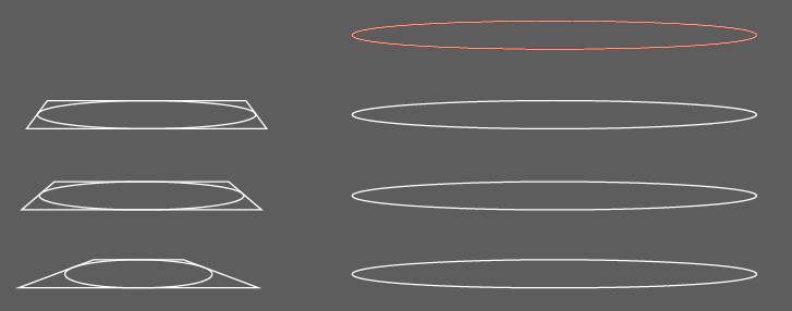
First we need to define the shape of the Central Circle on the map.
The art director chooses the first design. So does the client.
If we simply squish the circle, the edges will become too narrow and to hold all the stations. We need to be smart here. Inscribing the circle in a square, applying some perspective distortion and adding the stations.
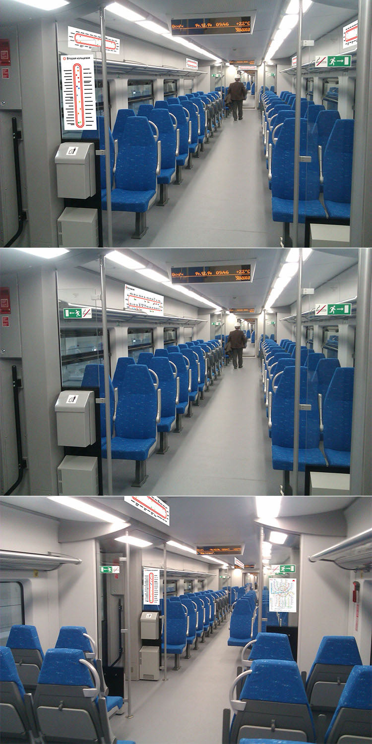
After the first draft of the map is done, visiting the rail yard again to try it out.
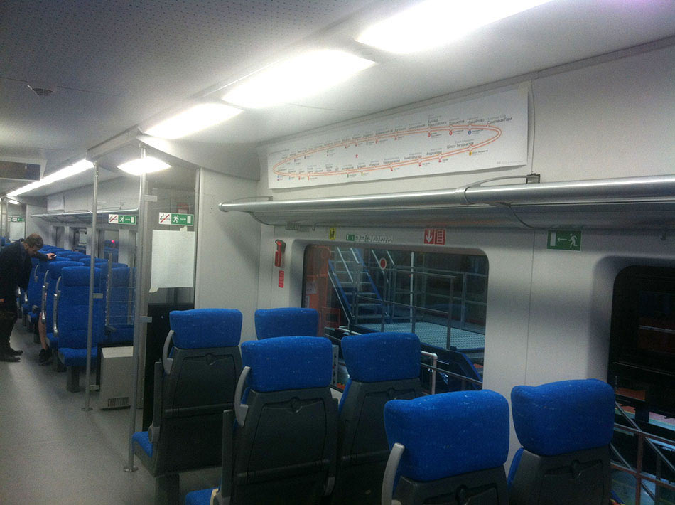
During the test realizing that the format needs to be changed. The map will be attached above luggage racks and will sometimes be partly obscured by luggage. It’s also possible that the rack will obscure the bottom of the map from sitting passengers. Which means the map has to be more narrow.
Looking at two options for station name placement: always above the line or along the external edge of the circle.
Placing the labels above the line looks better since the test reveals that the map will be partly covered by the luggage rack. However, we don’t rush to make the final decision just yet.
Realizing that the ellipsis on this map looks like a circle in perspective rather than a flat ellipsis. Trying to enhance the feeling of perspective. Testing different ideas.
The version with the text above the circle still has too many issues that we need to address before we can make the final decision. Getting distracted by the style of the graphic elements. We need to marry the existing line maps with the chosen style of the Central Circle on the car map.
It’s time to make the decision on elements placement, we can’t postpone it any longer. Putting together a short list.
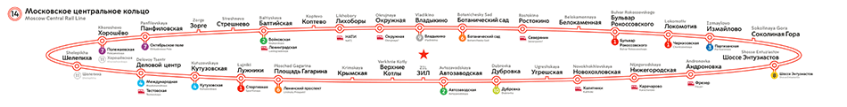
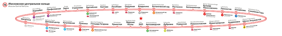
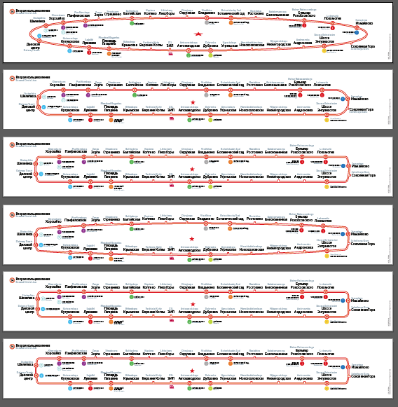
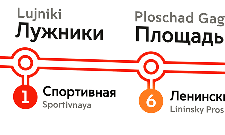
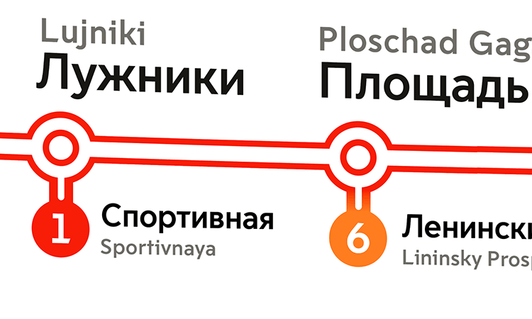
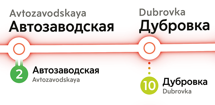
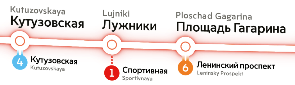
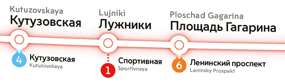
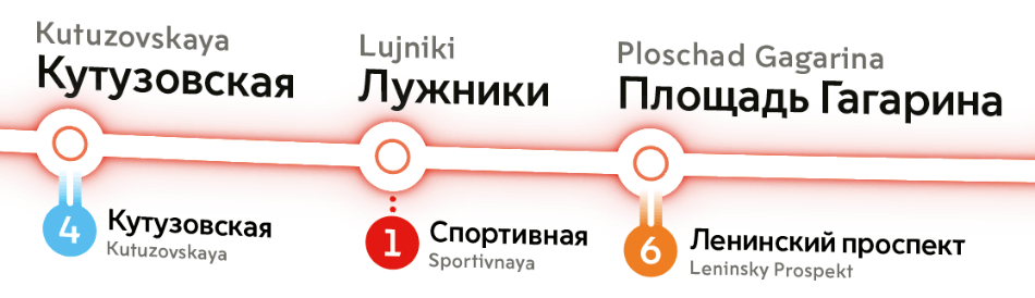
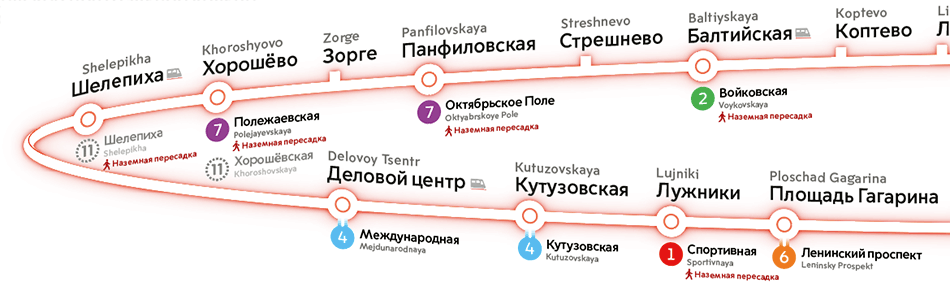
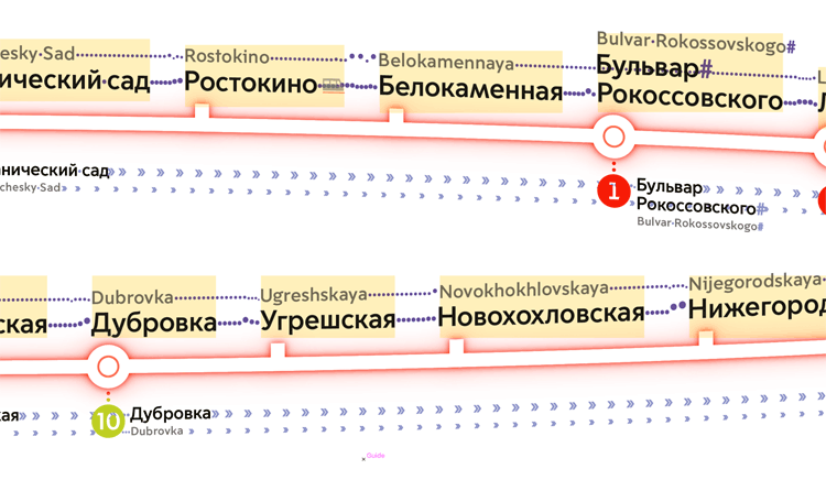
We like the idea of putting everything on top of the circle more and more. This way the location of station names has more logic: there is the Central Circle with station names above and transfer information below, plus slanting of the elements makes it clear which segment of the circle they relate to. Maximum slanting at the edges is only 6°, so readability hasn’t suffered.

Art director: The left edge is shit.
Hooray, it means that overall the map is OK and perspective wins! We need to carefully work on the stations at the edges where names get really distorted.
But for now we need to find the best way to show transfers.


An argument flares up about highlighting the Central Circle similar to the way it is highlighted on the car map. On one hand, the reason for highlighting is to attract attention to the new line, acting as a NEW! label. Informing a Central Circle passenger that the Central Circle has opened is a doubtful idea. But the style uniformity wins: the line has to look the same everywhere. Highlighting is the way to go!
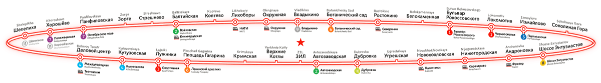
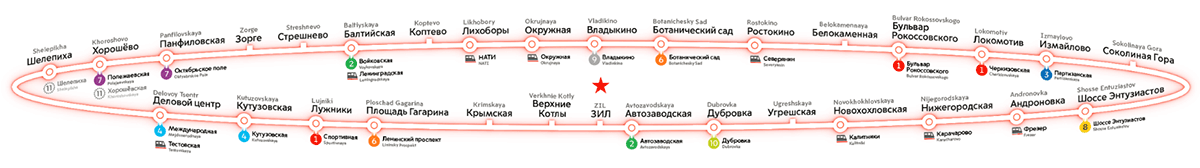
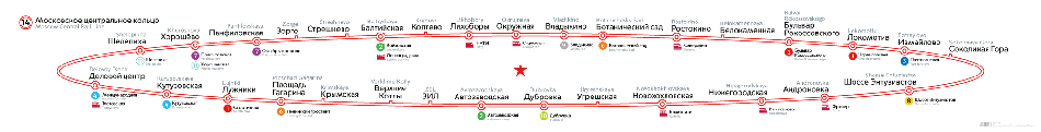
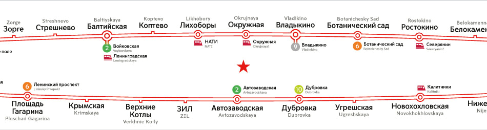
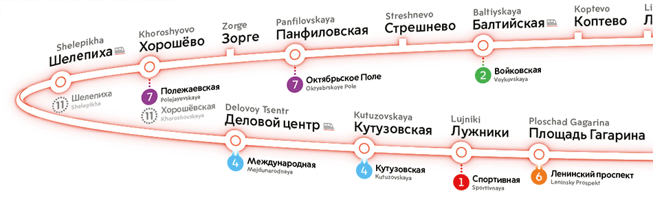
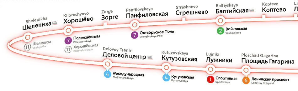
Suddenly noting that we failed to show which transfers are indoor which are overground on the map. Trying out various ideas.

We don’t want the line to jump around, but a single dot is also a poor way to show a transfer.
Leaving transfers of varying length for now. Working on the grid, making sure all elements are uniform in size.
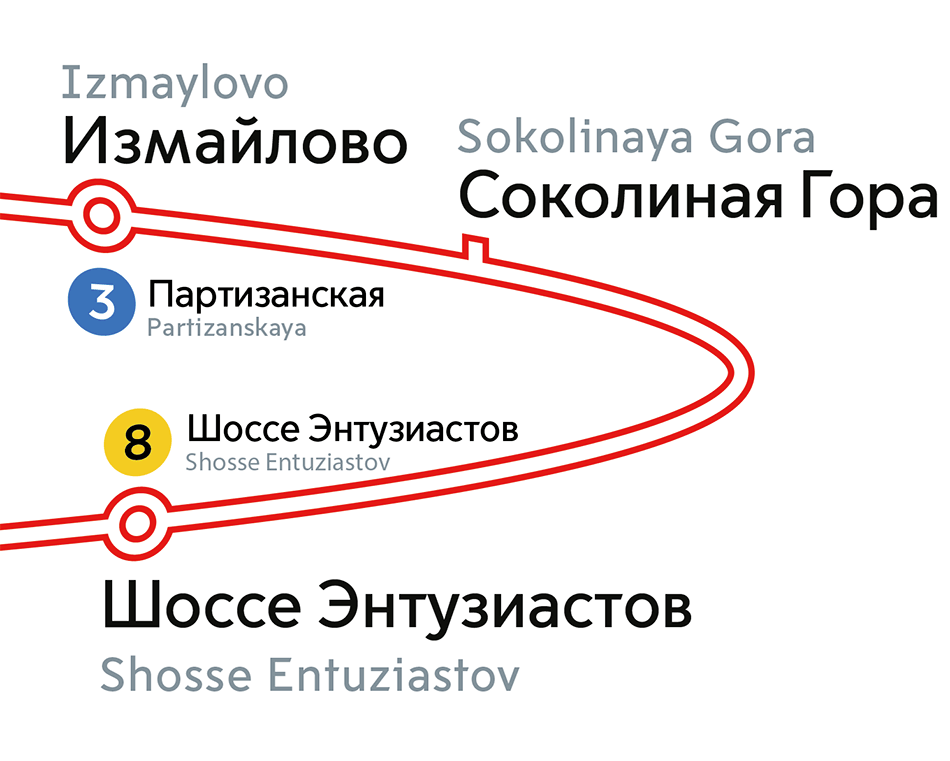
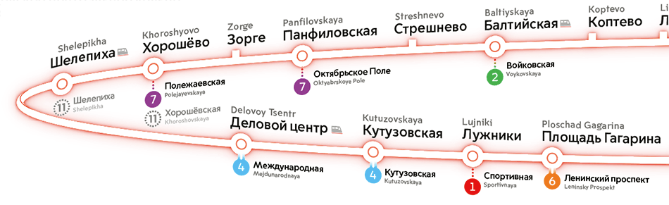
Shortly before the handover, the client asks to add a railway transfer near Shelepikha, but there is absolutely no room for another station there and there’s no time to shuffle stations around.
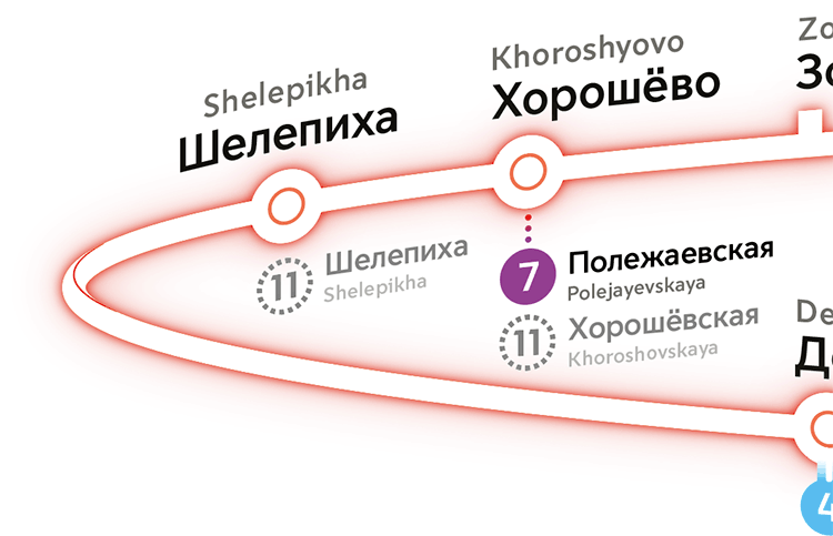
Instead, we borrow an idea from the regular line map and show the railway station using an icon next to the station name.
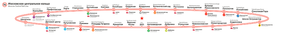
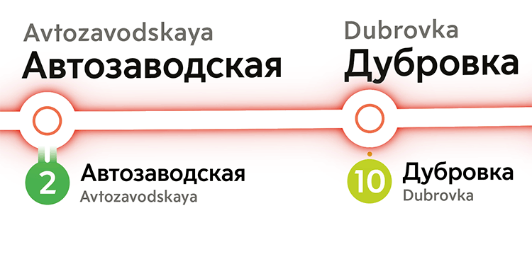
The client doesn’t like the fact that the transfer names are uneven. Trying to hold them near a single baseline.
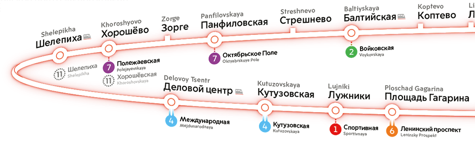
The last design wins. Checking everything once again and making sure all names have the same alignment.
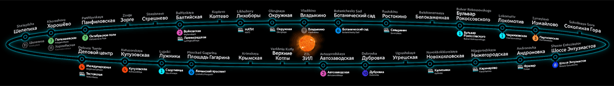
At the very last moment deciding to make the glow more intense.
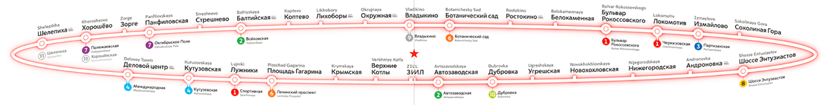
Done.
