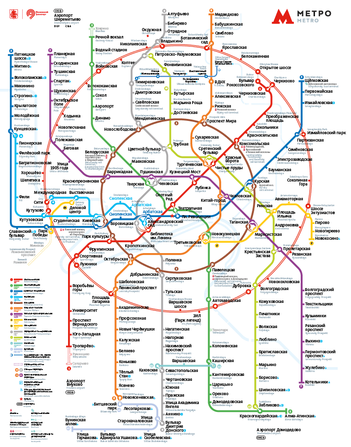
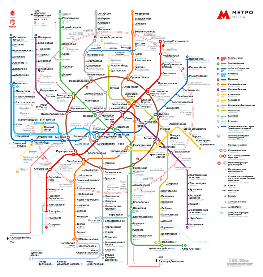
Receiving the task: the new Metro map should include the new circle line, working name: Little Ring of the Moscow Railway.
Starting the project using the studio’s sketch of the 2025 map (a slightly different variant of this map is probably known to the reader as the combined Metro and railways map).
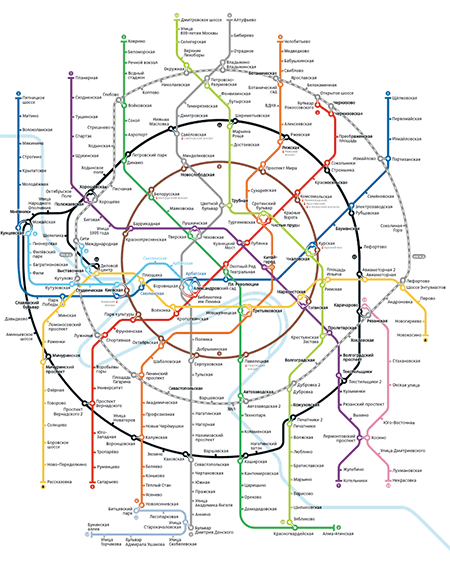
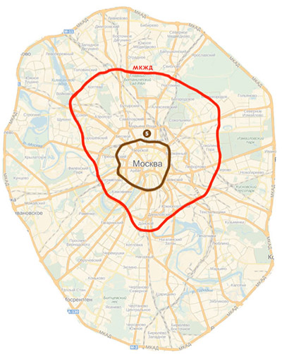
The thing is, by 2025 the Third Transfer Contour, another circle line, will be launched in Moscow. The Moscow Central Circle and the Third Transfer Contour can be seen as being symmetrical to the original Circle line: the Central Circle is shifted north almost as much as the Third Transfer Contour is shifted south.
Both new circle lines will interact with each other and other lines around them and cross each other many times. Overall, experience tells us we won’t be able to draw them both as circles: we’ll have to bend and break them. Deciding to prepare for the future by bending the Central Circle the way it will be bent some time later.
On the other hand, the Third Transfer Contour will become a closed loop in 10 years, opening over time in small portions of several stations each (Kakhovskaya line, for example, is one such portion that is already operational). The Central Circle, on the other hand, will be opened all at once and thus will be called a circle from the beginning. It’s more important to maintain the traditional look of the Moscow Metro map. A broken line is less aesthetic than two simple circles.
Remembering that during the last iteration most of the maps grew in size physically (they lost the index, paper formats became wider and taller which resulted in adding white margins to avoid the map looking too large in train cars) which means that if something doesn’t fit, we can always expand other lines. Creating a quick sketch and deciding to draw the Central Circle as a circle.
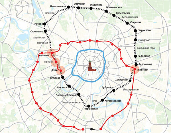
Geographically, the Moscow Central Circle spans far north from the center of Moscow.
The first sketch takes this feature into account. This approach allows to easily place many stations between the Central Circle and the Circle line at the top of the map without creating too much empty space between the circles in the bottom.
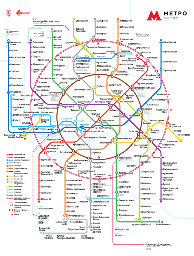
The idea with shifted circles is slightly confusing but we still decide to develop it due to geography and a convenient way of placing stations that it provides. We start by making broad strokes not paying attention to any of the details: adding the Central Circle and the new stations along with key transfers, straightening the navy line inside the circle.
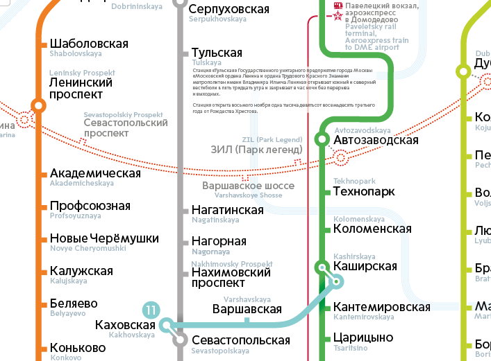
This rough sketch is needed to evaluate the overall picture and see any problematic areas. Despite the fact that the Central Circle will open in the fall of 2016, we make sure the map has all of its stations marked as already opened: the typeface of opened stations is larger and if we design the map with smaller typeface, we might not be able to find room for new labels later. Otherwise, we can simply enable the stations at any later time.
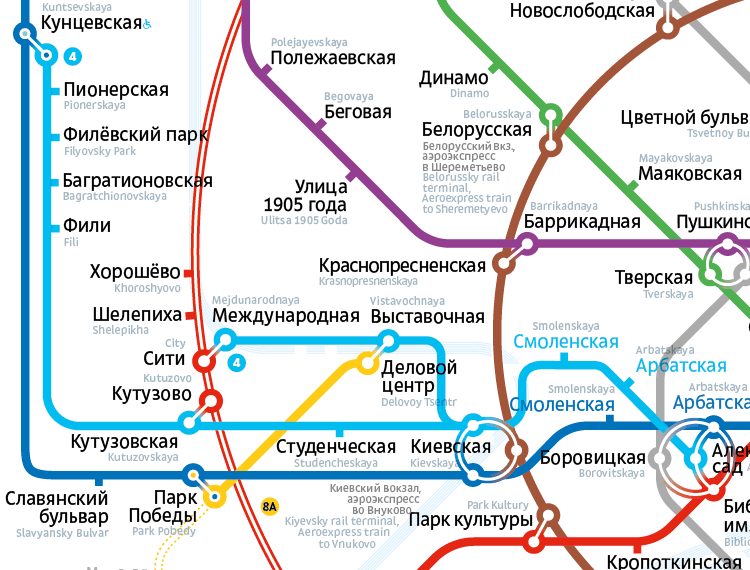
Looking at the sketch closely reveals three major problems:
—the top of the Sokolnicheskaya line bends near the Central Circle and breaks the map grid;
—the western part of the map between the blue and purple lines is very dense;
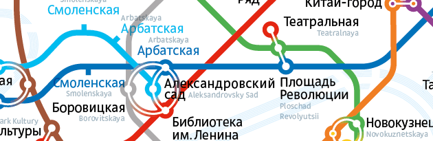
—right now it’s unclear how to separate Aleksandrovsky Sad and Ploschad Revolyutsii (the transfer at Ploschad Revolyutsii has separated from the green line and moving it further left will result in text overlapping).
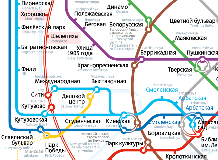
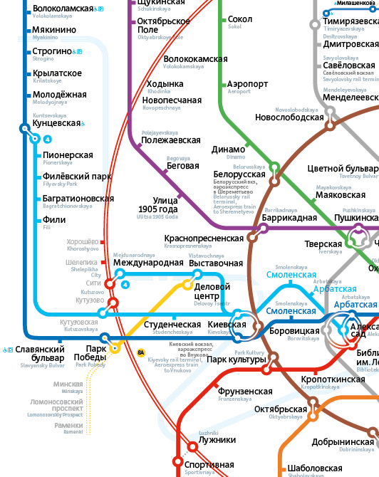
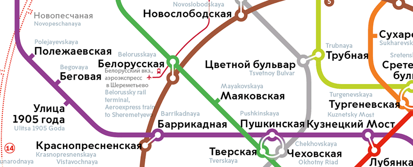
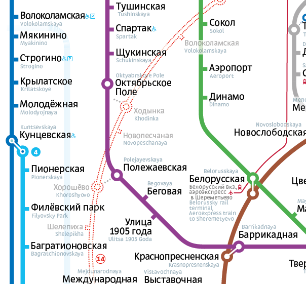
Starting to work on the western part of the map. To find space for stations between the Circle line and the Central Circle, we bring the blue and navy lines down. There is now more space between the stations, but the blue and navy lines are still too close to the circle. This results in the label Khoroshevo applying both to the Central Circle and the Filyovskaya line, and Shelepikha—to Begovaya.
Trying to solve these problems by moving the Metro lines to find a nice way to bend the blue and navy lines inside the circle.
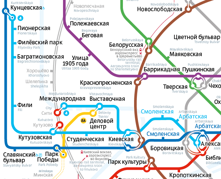
Seems OK: the text is now uniform. But we need to remember that the Central Circle is still under construction. Disabling its stations only to see an empty hole between the Moscow Central Circle and the blue line.
Rearranging the labels keeping in mind that we also need to find the best position for the blue, navy and yellow lines inside the circle.
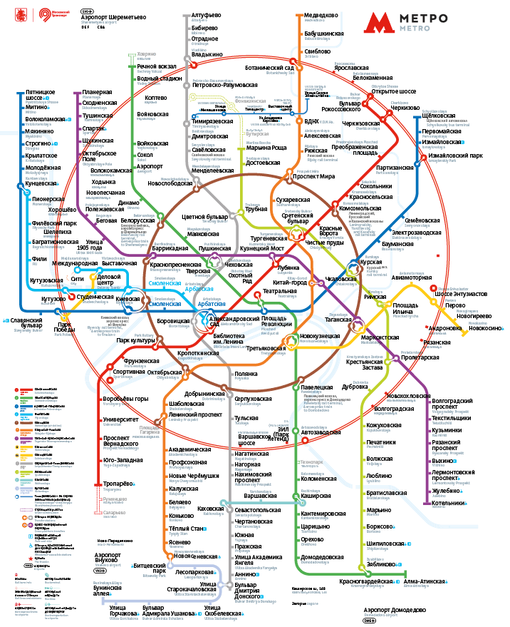
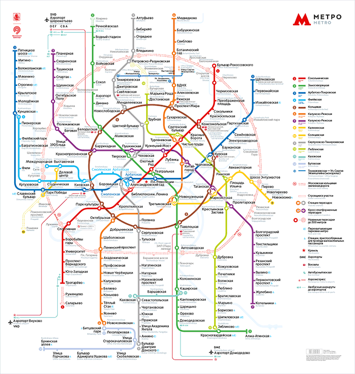
This leads us to a new variant of the map.

Of course, it’s too bad that the center of gravity is no longer at the center of the Circle line. But there’s no way around it, or so it seems at the time. There are so many stations at the top, near the Petrovsko-Razumovskaya line, but only Serpukhovskaya and a few more at the bottom. Continuing to work with the current arrangement.
The top of the Sokolnicheskaya line bends and takes odd shapes. Initially it used to bend near the inner edge of the Central Circle repeating its real-life geography, but in the current version of the map this would look odd.
Straightening the line and adding the Otkrytoe Shosse transfer at the end.
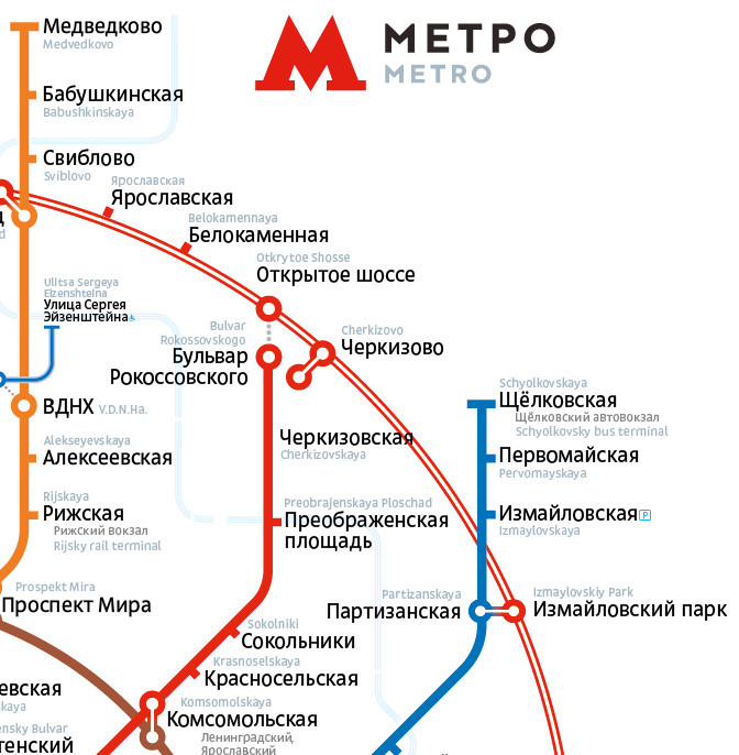
The solution doesn’t work: we can’t show the transfer between Cherkizovo and Cherkizovskaya this way. Bringing back the bend, trying to improve it.
Yet when we disable Yaroslavskaya, Belokamennaya, Otkrytoe Shosse and Cherkizovo stations of the Central Circle by making their labels smaller and making them gray, we see a hole outside of the circle in this area and the same density inside. Pulling out the end of the line, inverting the order of the stations.
It turns out that the Cherkizovo—Cherkizovskaya transfer will be an outdoor one. Our designation of an outdoor transfer, two circles with dots, takes more space than the designation for an indoor transfer, which means we need to search for another solution.
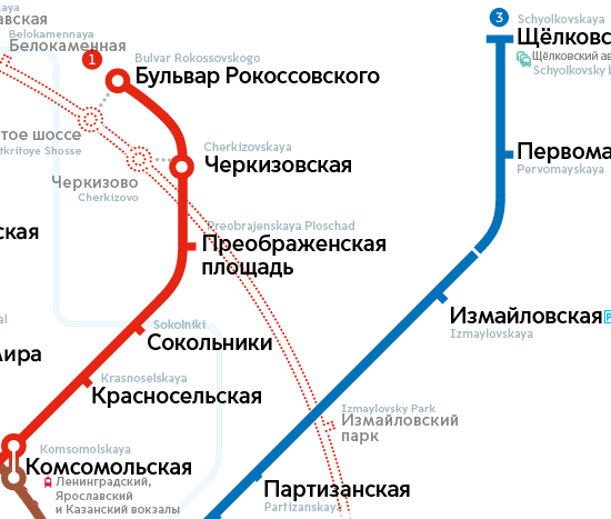
Finally, the line looks good.
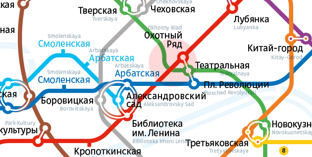
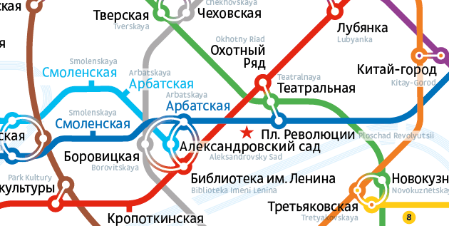
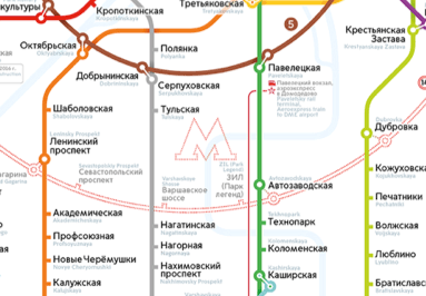
Deciding to remove the bend above the star in the center.
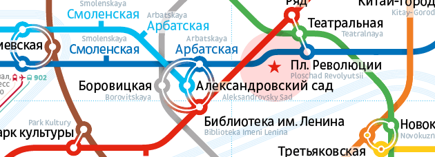
If we simply straighten the line and try to separate Aleksandrovsky Sad and Ploschad Revolyutsii, we need to resort to using “cheat codes” by rotating the “steering wheel” and stretching the transfer.
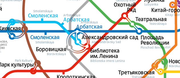
After getting kicked for doing this, the designer brings back the original transfers and starts to look for proper ways to arrange the star, Aleksandrovsky Sad and Ploschad Revolyutsii. He almost succeeds, although there’s not enough room for the star and Okhotny Ryad ends up separated from its line.
To return Okhotny Ryad to its proper place, adding a new bend to the green line.
Realizing that it’s a poor way to solve the problem. Removing the second bend of the yellow line by moving the first one to the left.
The green line pulls the Tverskaya—Chekhovskaya&Pushkinskaya transfer along with Belorusskaya and also slightly changes the grid.
This slight change of the grid and a few others that weren’t noticed in due time will later lead to an unforgettable night right before the map handover deadline. Right now we don’t even have a clue.
As we are hard at work, a client request comes in: we need to change the typeface to Moscow Sans to make sure the map matches the style of the rest of the Moscow transport navigation. Moscow Sans differs from ALS Direct that we have been using in character proportions: words typed in the new typeface become wider which leads to another modification of the map.
For example, to make sure Pushkinskaya on the picture fits between the lines, we suggest moving the green line to the left. Then we need to move down the transfer at Belorusskaya and decide what to do with Begovaya. Also, Kuznetsky Most doesn’t fit. Neither does Trubnaya. What if we move the orange line to the right? It’s the same for the rest of the map.
Overall, changing a typeface is hardly a one day task. The client gives us another week.
The gif provides a nice illustration of the process.
Replacing the typeface, solving most of the major problems, showing the map to the art director.
Art director: The round Circle line is a recognizable symbol of the Moscow Metro map, we need to maintain its beauty. All circles should be centered.
Preparing three new maps by the next morning to evaluate options and choose the best one.

The art director immediately discards the idea with the cut circle: Moscow Metro can’t have a flat tire as its symbol. The shifted circles were criticized the day before. Centered circles win. But there’s a problem with them, too: the top near the Petrovsko-Razumovskaya line is densely packed with stations, but the opposite side near Serpukhovskaya is so empty that even a hippo can fit in it.
Filling the empty space by moving Nagatinskaya and Nagornaya inside the circle. This would work as a temporary solution for a couple of months, but we will definitely need to work on this later.
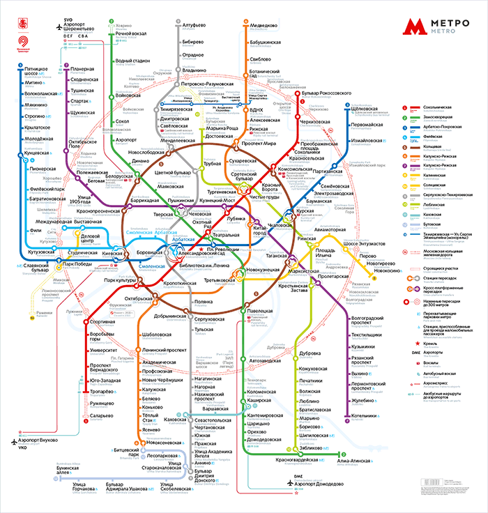
The night before we need to hand the map over to the client we get decide to fix the grid.
It immediately becomes clear that the night will be long and unforgettable. Taking a break, making some tea and redrawing the map. By sunrise the map breathes in, spreads it shoulders and transforms completely.

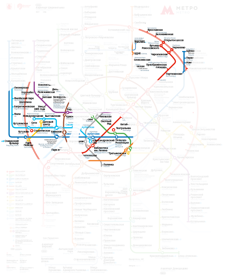
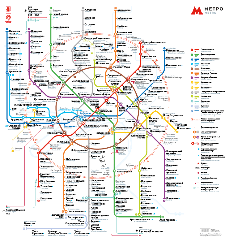
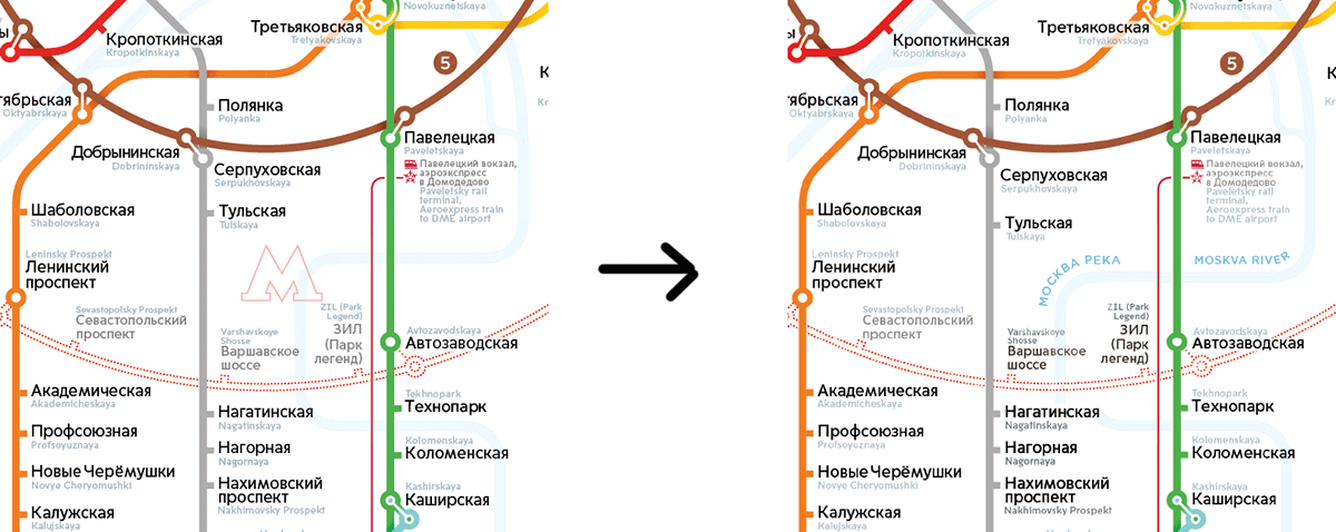
In the previous version the bow was hidden in the river.

In map 3.0 it is tied over the river.

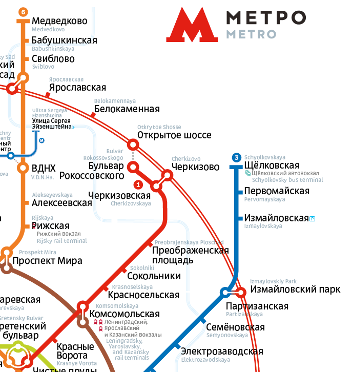
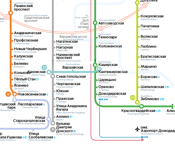
While we are busy preparing the announcement, news come in: three new stations, Tekhnopark, Rumyantsevo and Salaryevo will soon open. We need to make the following changes to the map before Salaryevo opens:
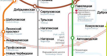
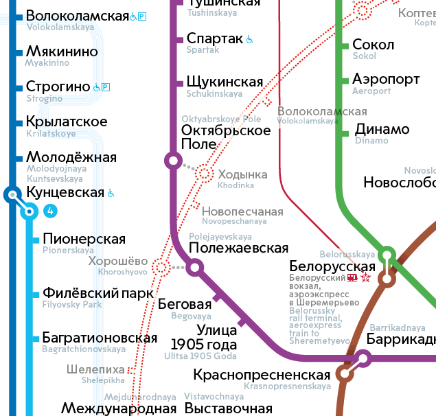
—move Nagatinskaya and Nagornaya outside of the Central Circle;
—rename the Central Circle into the Second Circle line;
—add Sevastopolsky Prospekt to the Second Circle line.
We get some more time to add the new stations which also gives us a chance to work on some of the problems.
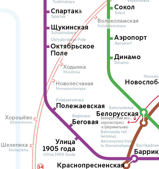
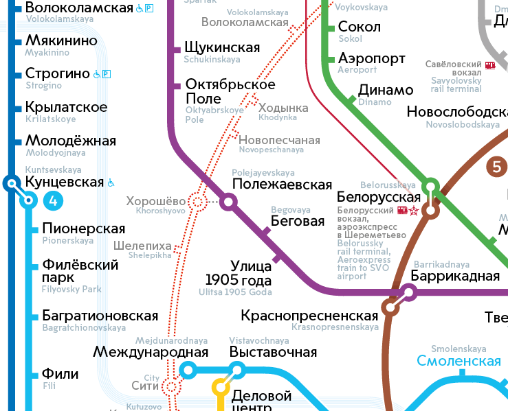
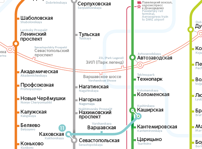
The Polezhaevskaya—Khoroshevo transfer was longer than other transfers.
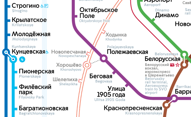
It is, in fact, the longest: 850 meters. But there are only two types of transfers on the map, indoor and outdoor, we do not rank them by length. It was a compromise we had to implement because we were running out of time.
Chronological digression
The first versions of the map with shifted circles had enough space for five stations with two transfers.
We used to think that we don’t need to show transfers if they are longer than 300 meters and removed all transfers from the intersection of the Second Circle with the purple line. No need to squeeze anything in, the stations fit nicely, the result looks beautiful.
Later we learn that we need to show these transfers, too. This means we need to bring back the connections between Khoroshevo and Polezhaevskaya and between Khodynka and Oktyabrskoe Pole. And also fit Novopeschanaya between them.
Even though the transfers are at different angles, everything seems to look good. All five stations fit in nicely, blue line labels don’t push up on them. However, this results in Volokolamskaya moving towards the green line which we can’t allow, especially since it’s still under construction.
We can solve this, too: adding space between Schukinskaya and Spartak to place Volokolamskaya between them and adding moving Novopeschanaya above Khoroshevo.
But after a sleepless night of redrawing the map, the stations become too crowded, especially Novopeschanaya.
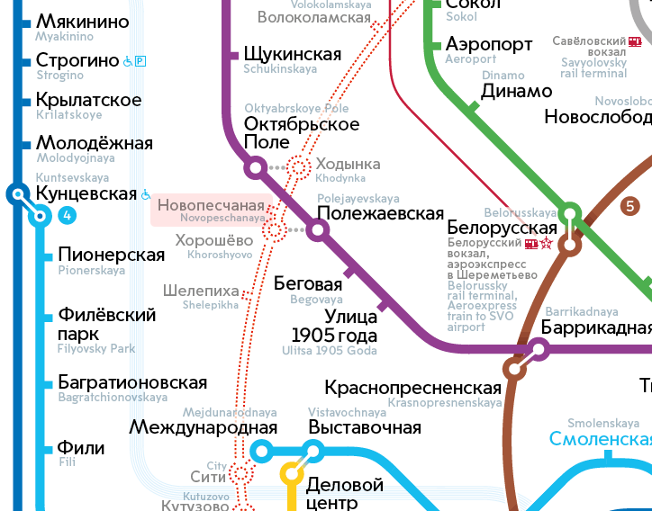
And to give it more air, we resort to stretching the transfer.
Back to the present
We found a way to shorten that infamous transfer.
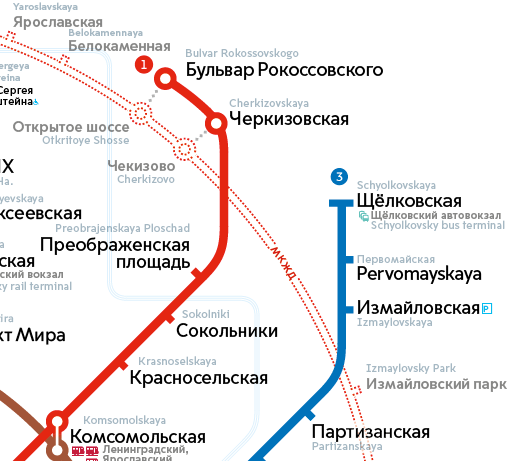
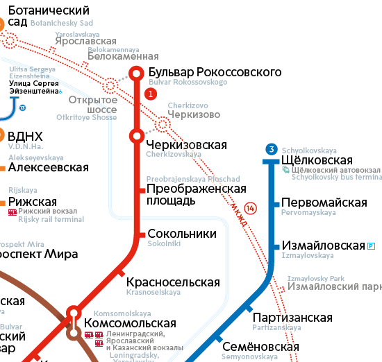
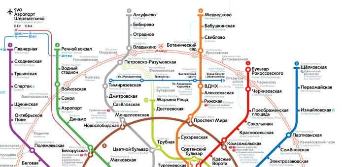
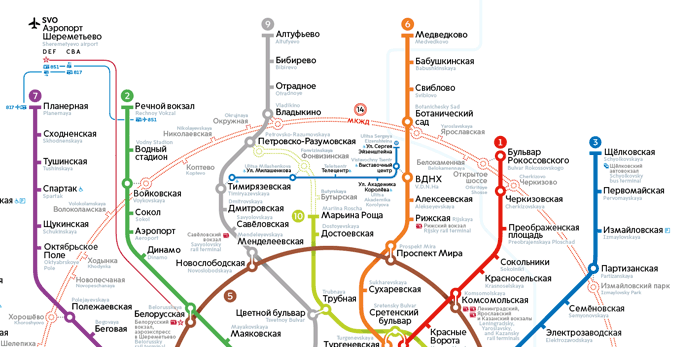
Also fixing the top of the map. Distributing Petrovsko-Razumovskaya stations uniformly and rotating the monorail towards the top to give space for stations on both sides of the Sokolnicheskaya line.
Before:
After:
After that we move on to rearranging stations. At first it seems that moving and adding a new station to a map that was designed with different specifications in mind would open a gateway to hell. First we simply move the stations. The result isn’t as bad as we expected.
To fit all the stations, we carefully stretch the southern lines. But only a bit: the map needs to remain within the dimensions of its format. Now we just need to find a way to organically fill in the empty space.
Deciding not to use the extra text.
While the map is being printed, the Universe sends us new icons.

The art director suggests to fill the empty space with the Metro logo.
Or maybe we should add the Moskva River name?
No, let’s go with the logo for now.
