Lesoparkovaya Troparyovo Rumyantsevo Salarievo Seligerskaya Solntsevo Novoperedelkino Aminyevskaya Michurinskiy Prospekt Prospekt Vernadskogo Novatorskaya Vorontsovskaya Zyuzino
The making of the type design for Rumyantsevo Moscow Metro station
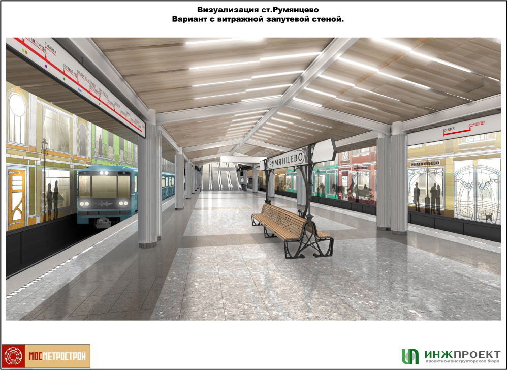
The station’s interior reminds of a beautiful street at the turn of the 20th century. It’s nighttime, which means that people and horse carriages are silhouettes in front of lit-up windows and doorways. Doors and windows are decorated with an Art Nouveau ornament.
Designer: I see two options for the station name here. One in Grotesque typeface, the other in a ribbon-like Antiqua. The Antiqua would work better in the interior, but station entrances are so minimalistic that Grotesque might be better for them.
Art director: All right, let’s put sans-serif on the façade and use the Antiqua in the interior.
The bench looks too pretentious.
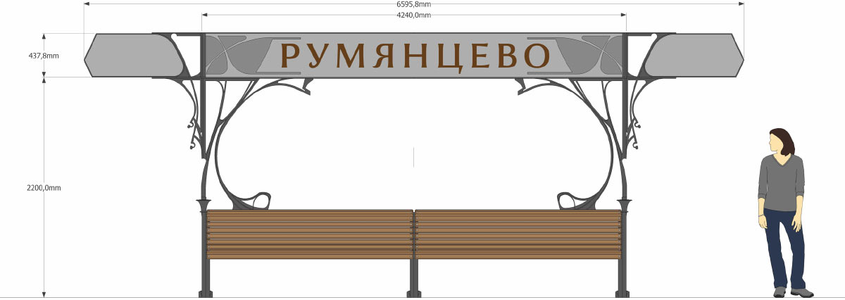
Illustrator Lizaveta Romantsova creates a sketch for the bench.
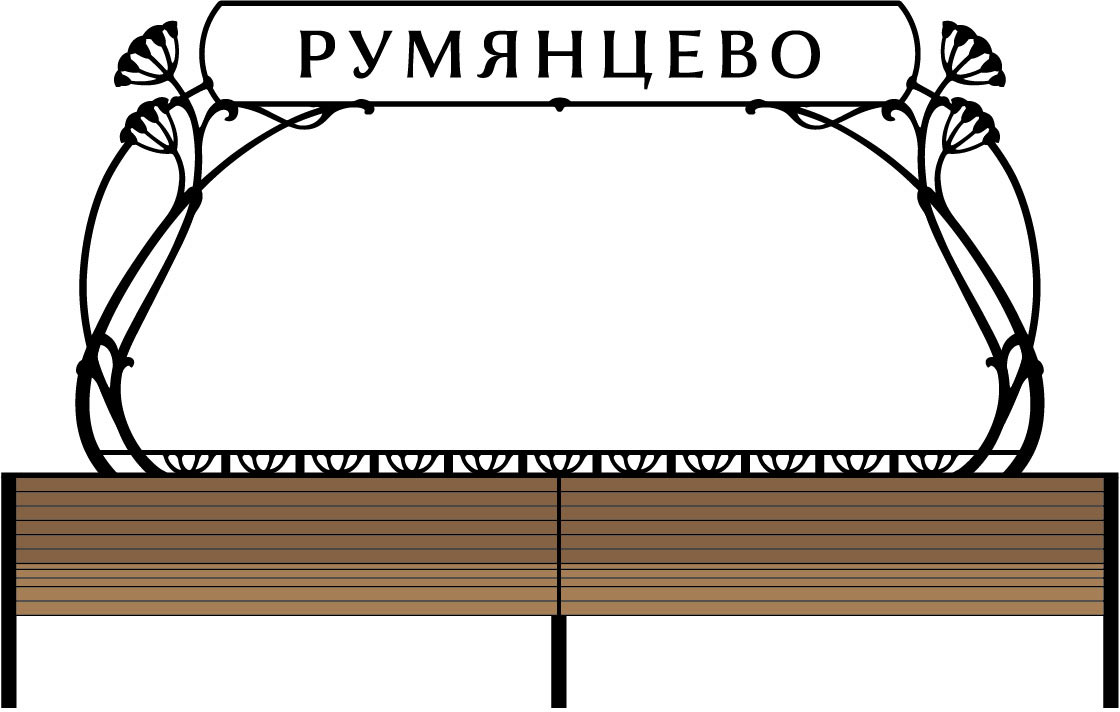
There is no space on the walls for the station name. The client suggests putting it on the benches and on the ceiling instead.
If we were to put it on the ceiling, it has to be very light.

Putting the name on the ceiling and also trying to very tastefully add it to the station wall.
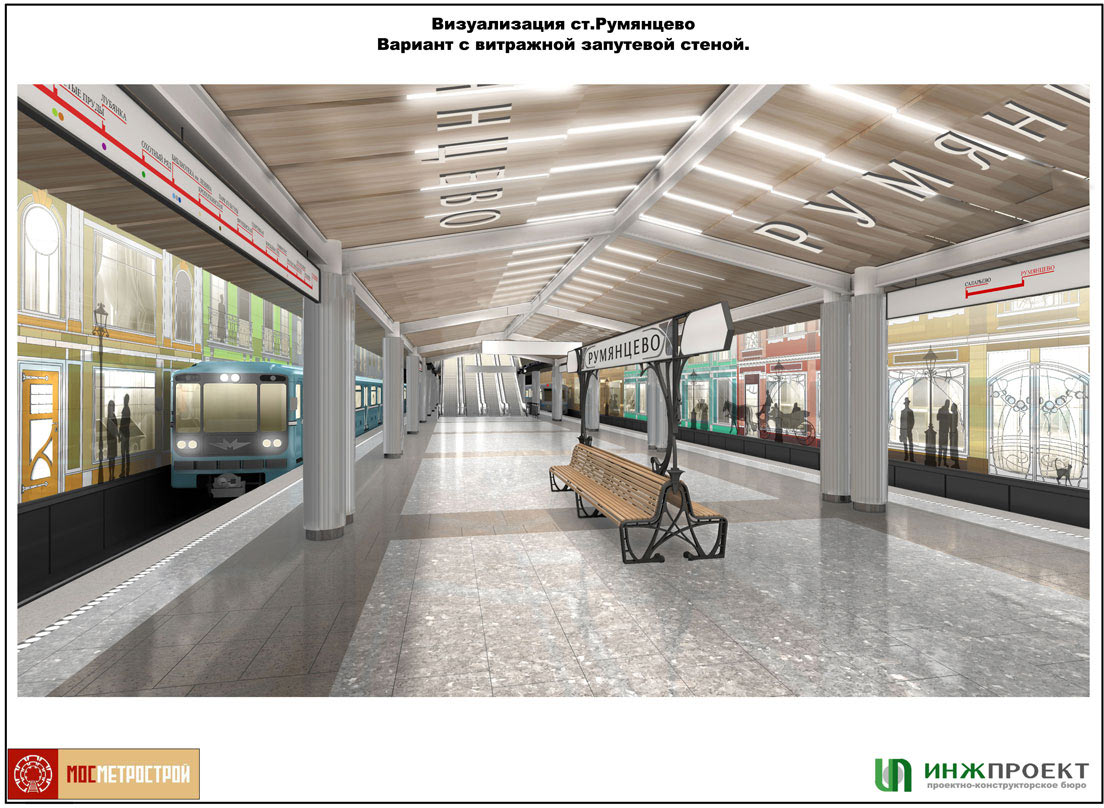
The art director decides to go with the wall placement.
With the station wall being busy as it is, the client asks to move the station name to the ceiling.
The art director chooses the third design.
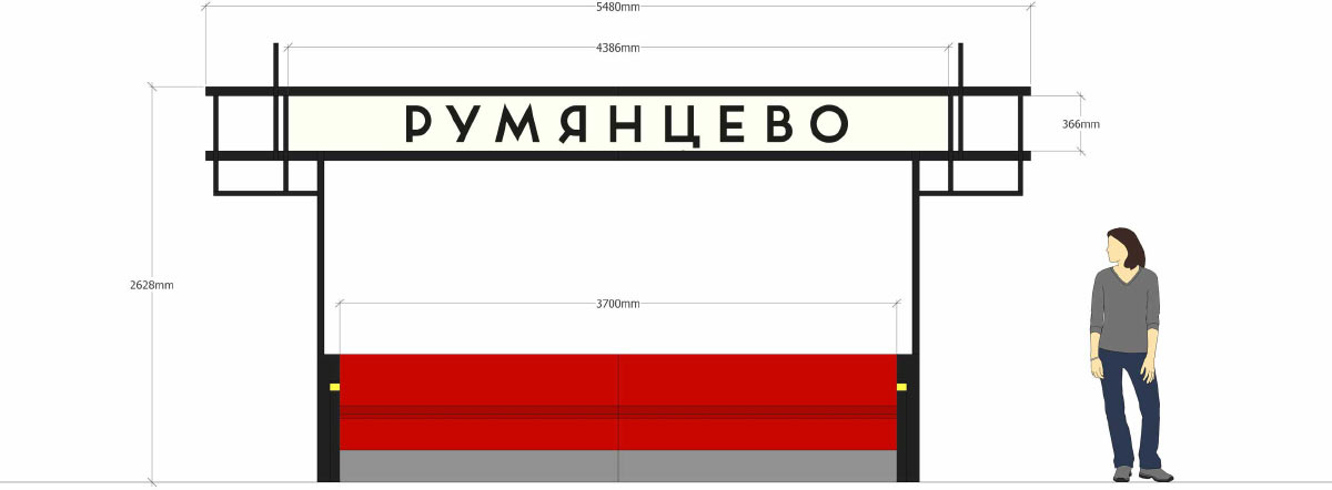
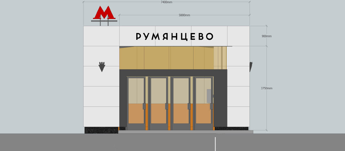
The client asks to prepare full text for station entrances by adding “Moscow Metro” and “Rumyantsevo Station.”
Six months go by. The client lets us know that the station interior has changed and sends over an entirely different design concept which takes us to 1920s and 1930s. Walls and benches are now inspired by De Stijl movement and remind of Mondrian’s paintings.
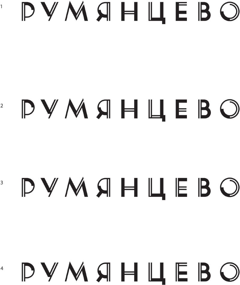
Suggesting new ideas. The first one is an ornamented text in Art Deco style, the second and the third ones are geometric, the fourth and fifth ones are in the spirit of De Stijl movement and the sixth one is an old-fashioned closed Grotesque.
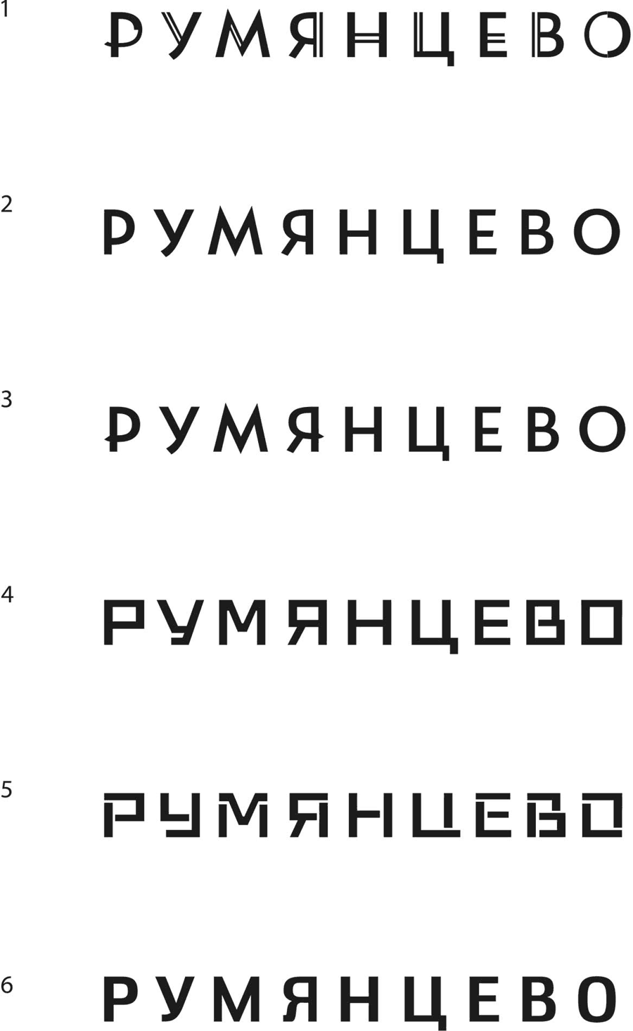
Trying out the designs in the interior.

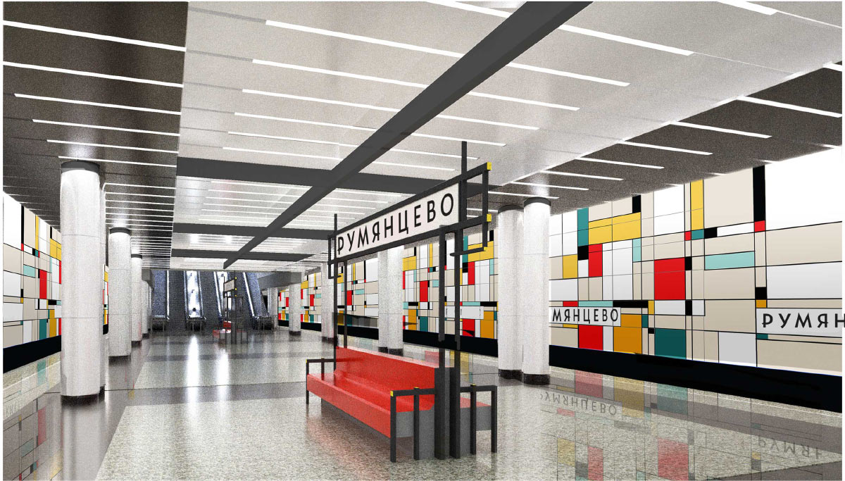
Another couple of months passes, the client informs us that the choice was made in favor of the decorated Art Deco style. This is where the work starts.
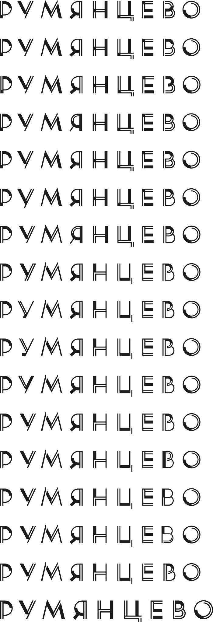
Giving the letters ideal geometric shapes.
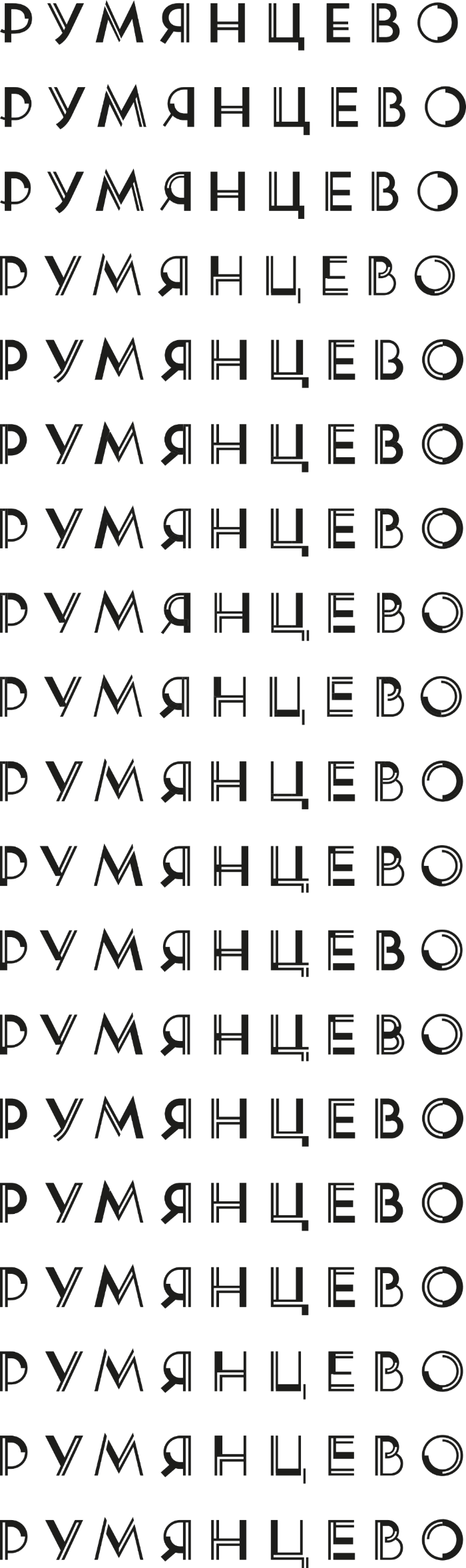
We need to maintain uniform distribution of the elements. Ideally, each letter would feature every element. Also the entire word should have a uniform color as opposed to some parts being too dark and others too light.
The secret advisor suggests adding squares at the intersection of double lines in lighter letters.
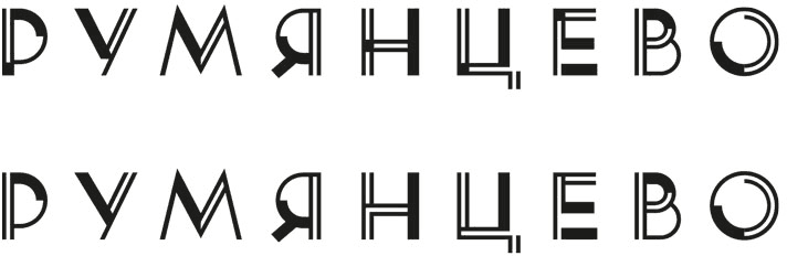
Showing two designs to the client.
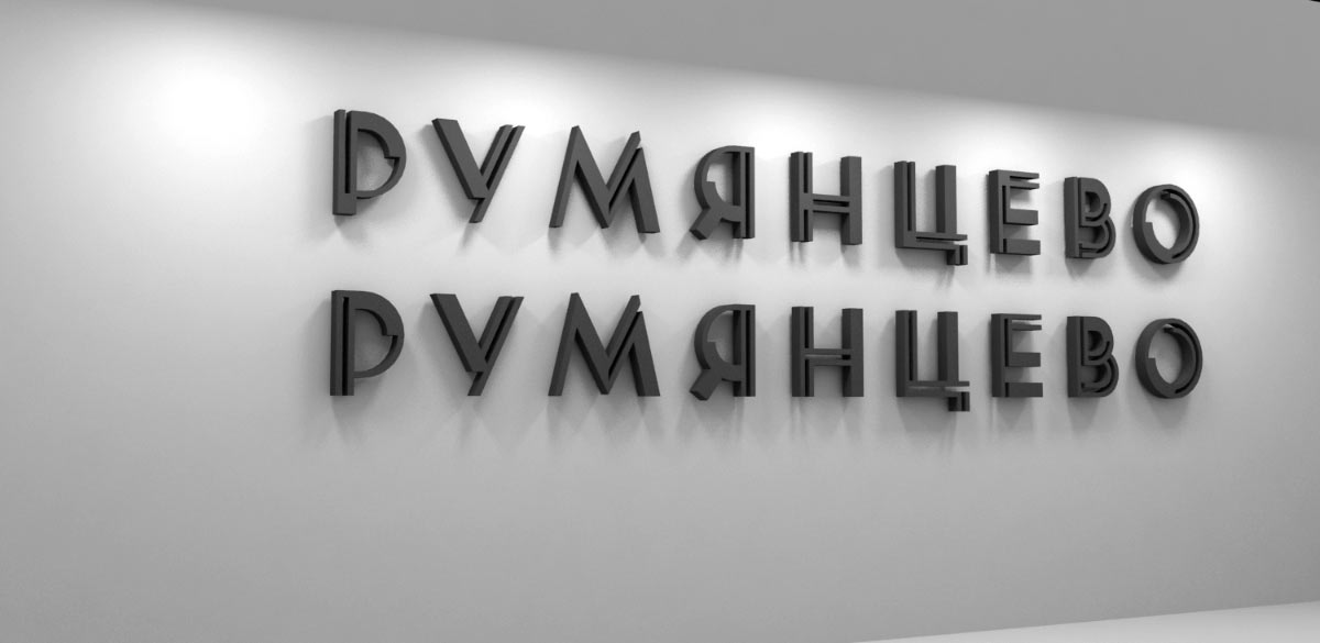
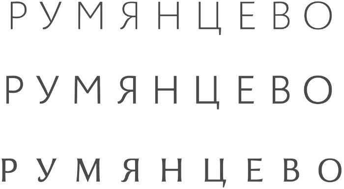
The secret advisor recommends making the text on the bench different from the text on the station wall.
The client sends over a letter: “We believe the designs of the text on the station wall and on the bench should be identical, as both of them belong to the same field of visual perception. We would prefer the typeface as it is on the station wall, but would ask you to make small changes if possible: the letters У, Е and Ц were better in the draft version. Then again, you as experts have the final say.”
Replying with our comments.
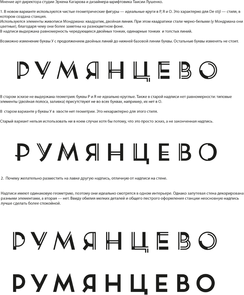
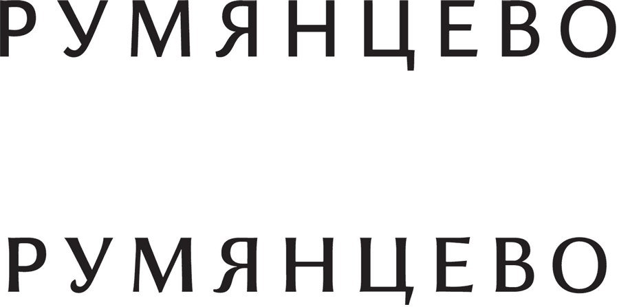
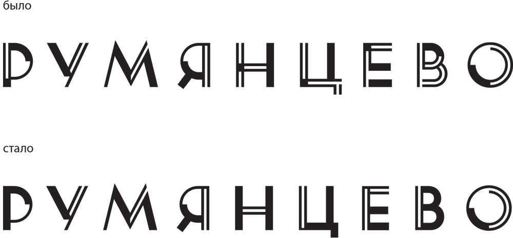
Receiving a reply from the chief architect: "Your comments related to the design of the suggested typeface (geometric figures, ideal circles in the letters Р, Я and О, uniformity of lines) are clear and understandable. There is also nothing surprising in the fact that any sketch needs to be finalized, polished and brought to perfection. It’s all part of the standard creative process. But it is a shame when the elegance and beauty of a design are lost as a result of elaboration. Despite all its shortcomings, the initial sketch had a certain elegance to it and was more legible. It had more life yet was sufficiently strict. The final version looks dry and somehow “overworked.”
The idea with “Mondrian’s square” is clearly far-fetched and cannot be easily recognized (should it even be so evident?). Here is what I think (the final design):
The letters Р, Я, О clearly became better.
The letters У, М are acceptable.
The letter Н: the improvement is not evident (the old design was more expressive, laconic and better followed the rhythm of the text, especially given the uniform alternation of thin and thick lines, as the letter Н is located between two parallel verticals of Я and Ц.)
The letter В does not follow the character of Р and (or) Я. It has different radii, the geometry does not match, the circles are not ideally round. It lacks purity. It requires more work using the same radii (radius).
Letters Ц, Е became visibly worse. They acquired separate elements of varying scales (letters consisting of separate, incoherent elements definitely will not work in our case). In the sketch the horizontal elements of Н and Е were matching, now it’s all a mess. This also requires more work.
In conclusion: now, the text clearly is made of two distinct parts, as the НЦЕВ part you have right now is inferior in graphics and density to РУМЯ. These parts differ so much that they appear to be made of separate typefaces (try to see it yourselves by covering one half or the other)."
The comments are well-founded. Remaking the text and bringing it closer to the initial sketch.
Designer: I like the first one.
Art director: I agree. We need to work more on Р and Е. I would fill the vertical stem of Р. Take the Е from the fourth variant.
Comparing to the previous design.
Making sure the text on the benches matches the text on the walls. Making adjustments to the entrance text.
By the request of the client, going back to the initial design.
