The making of the visual identity for Moscow cultural centers
Overview Process
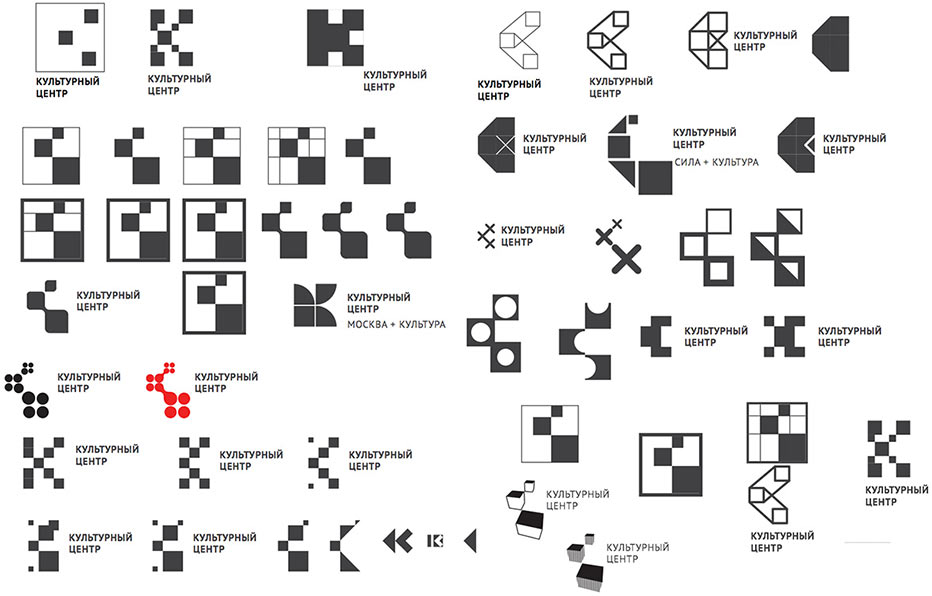
Starting to work on the logo. First round.
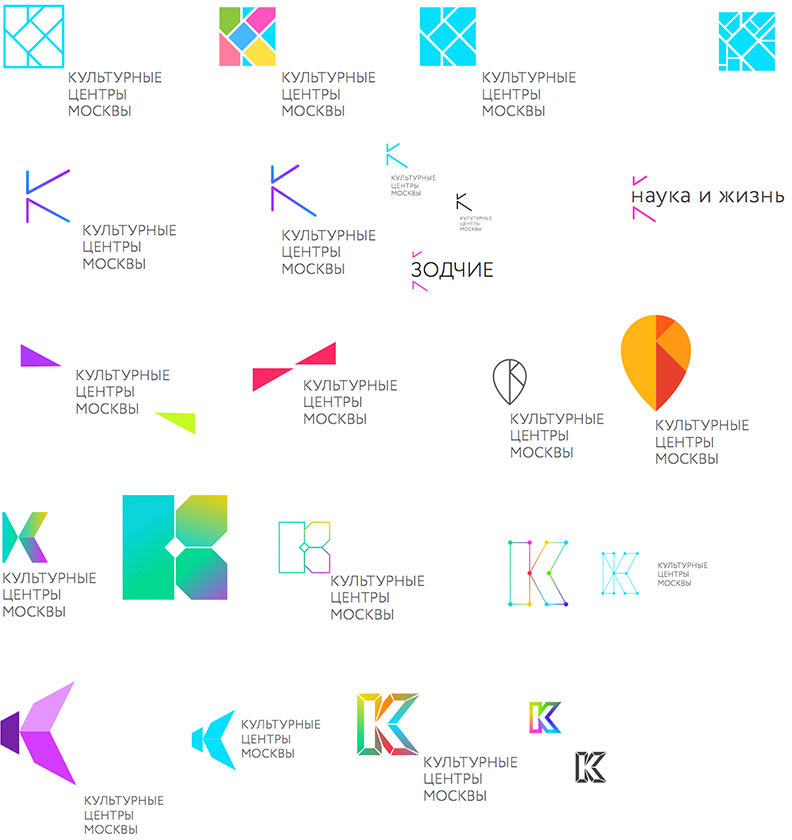
Choosing this one:
Preparing a presentation.
The client likes the direction. Working on colors.
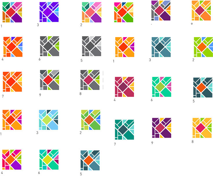
Looking for a shape.
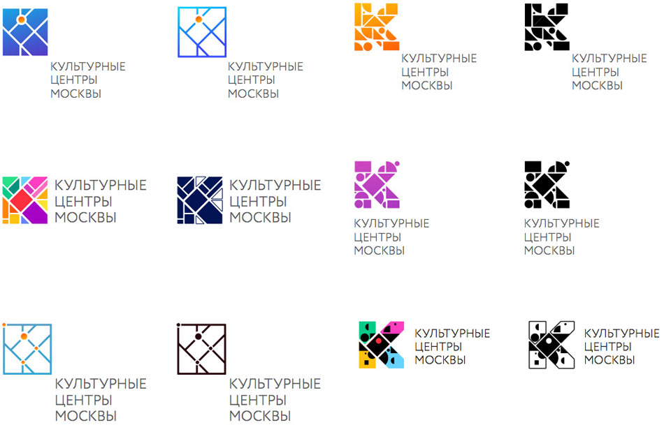
Showing the designs to the client.
Client: I like the direction, but it doesn’t connect with the overall concept of Moscow cultural centers development. They are supposed to be contemporary, not folk art centers.
Second round.
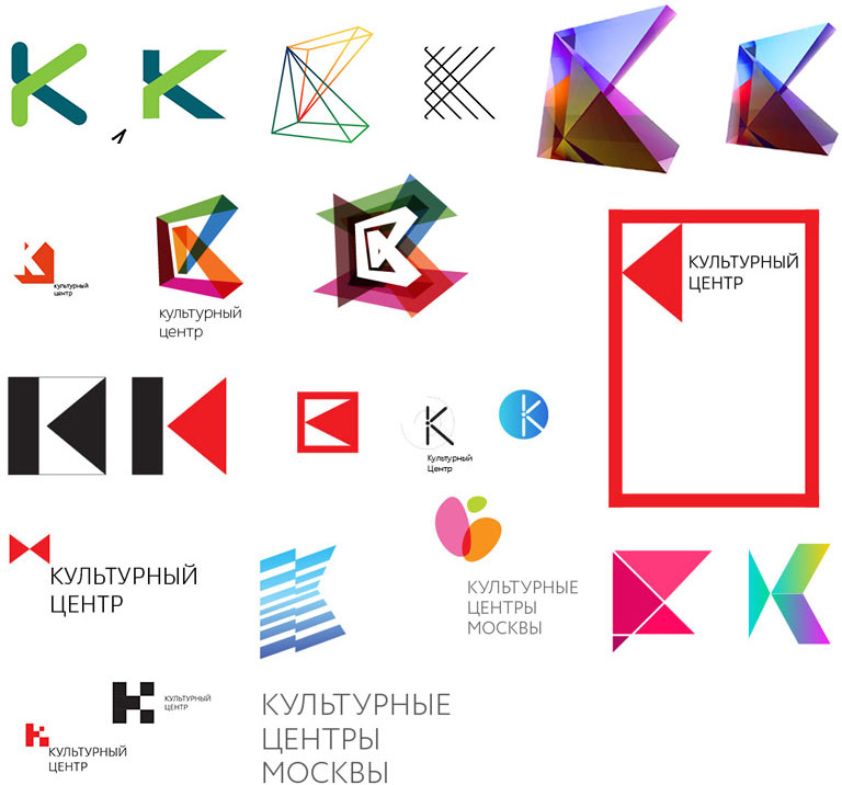
Keeping the old direction and working on a couple of new ones.
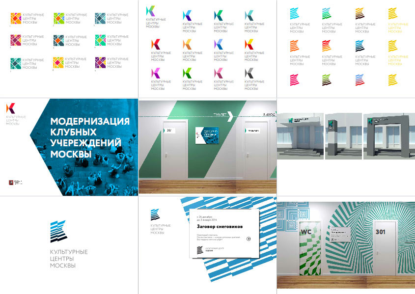
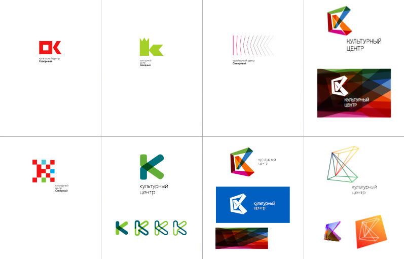
Showing them to the client.
Choosing two concepts.
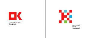
Developing the second one.
Putting together a presentation. The client asks to make the design as simple as possible, both in form and function. In other words, we need to develop an identity without identity—it should emerge naturally when following a set of simple rules.
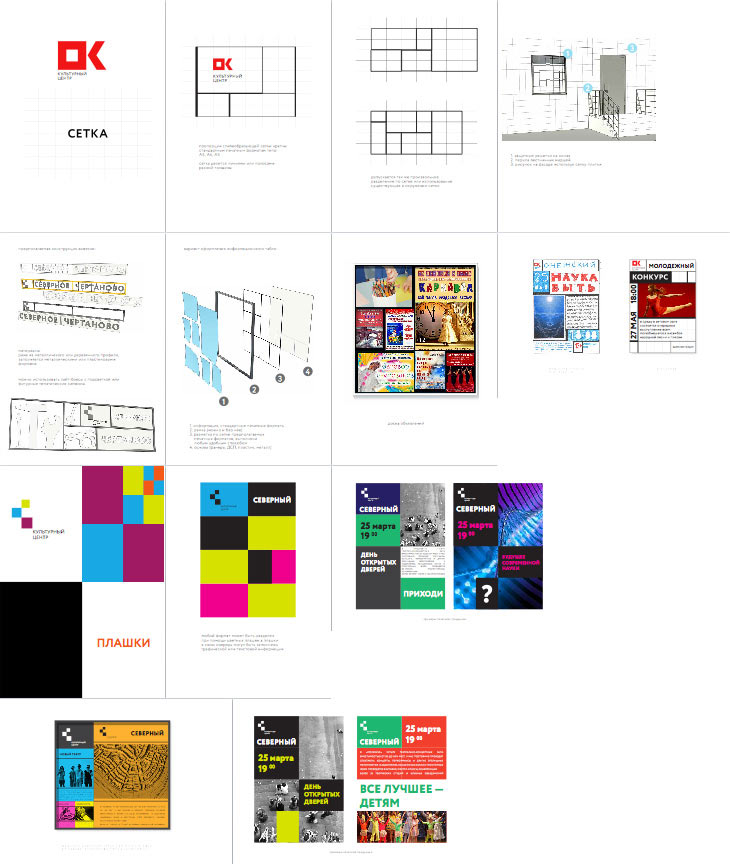
That’s it. The grid will be the main design element and will help each center express its individuality. Working on the logo.

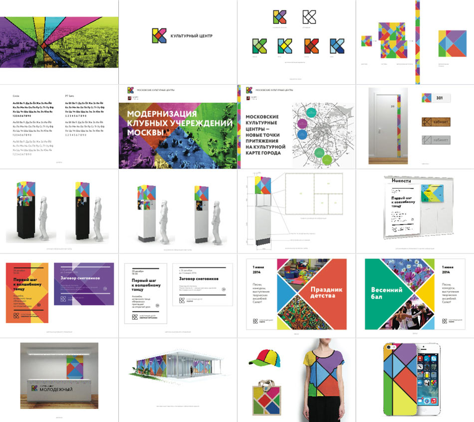
Making a presentation to illustrate the concept.
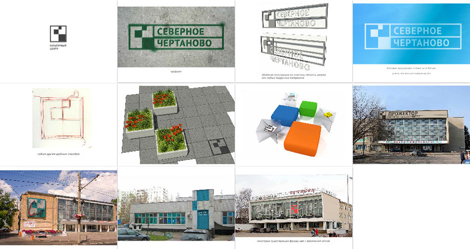
Working out the concept in detail.
The client approves the logo and identity. We need to further develop the identity and come up with the rules for its use. First we typeset informational materials of different formats and put them on sample information boards. For simple self-made advertisements we suggest using colored paper.
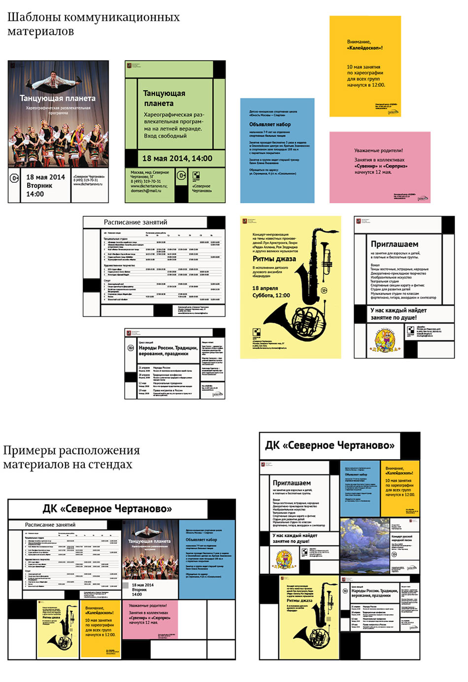
The client asks to abandon the colored paper and simplify the posters’ layout so that any amateur designer could repeat it.
Putting together a brandbook with simple rules for poster design—how to typeset, where to put the logo, what type and point size to use. At the same time, adjusting the grid.
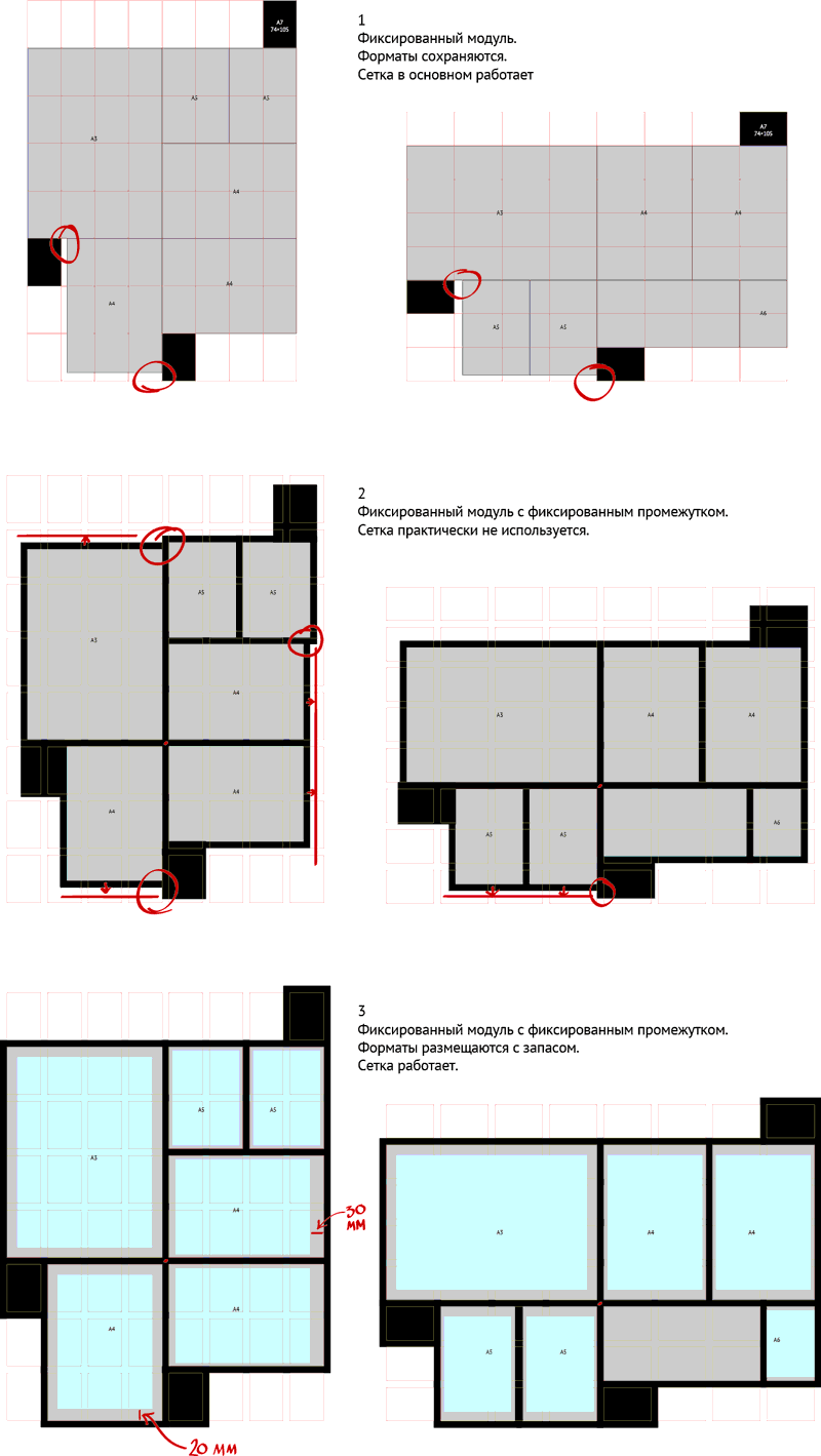
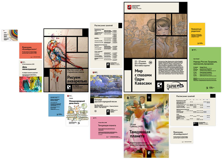
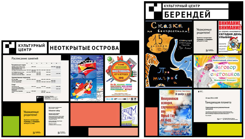
To test whether the identity is usable filling the grid with real-life ugly advertisements.
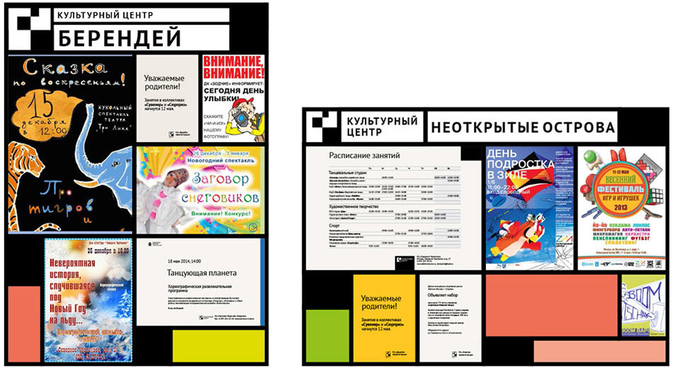
Ok, it works just fine.
At the same time, setting out rules for the signs placed on facades of cultural centers’ buildings.
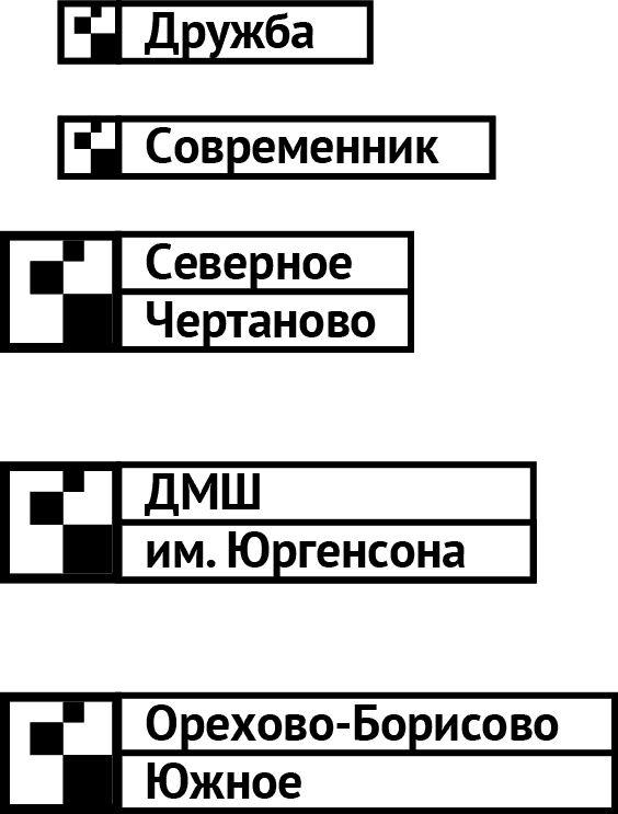
The art director suggests printing all texts in capital letters to make them look more natural in boxes.
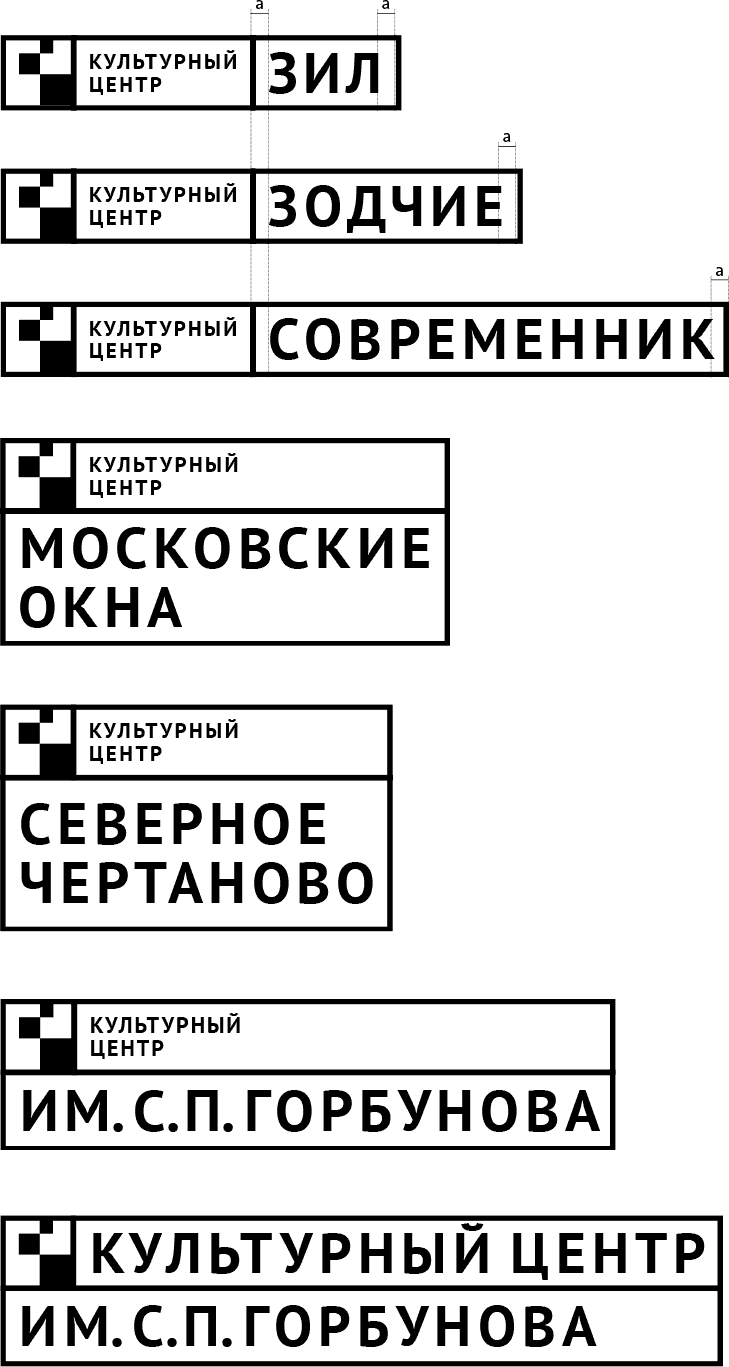
Then information boards should have the same headers.
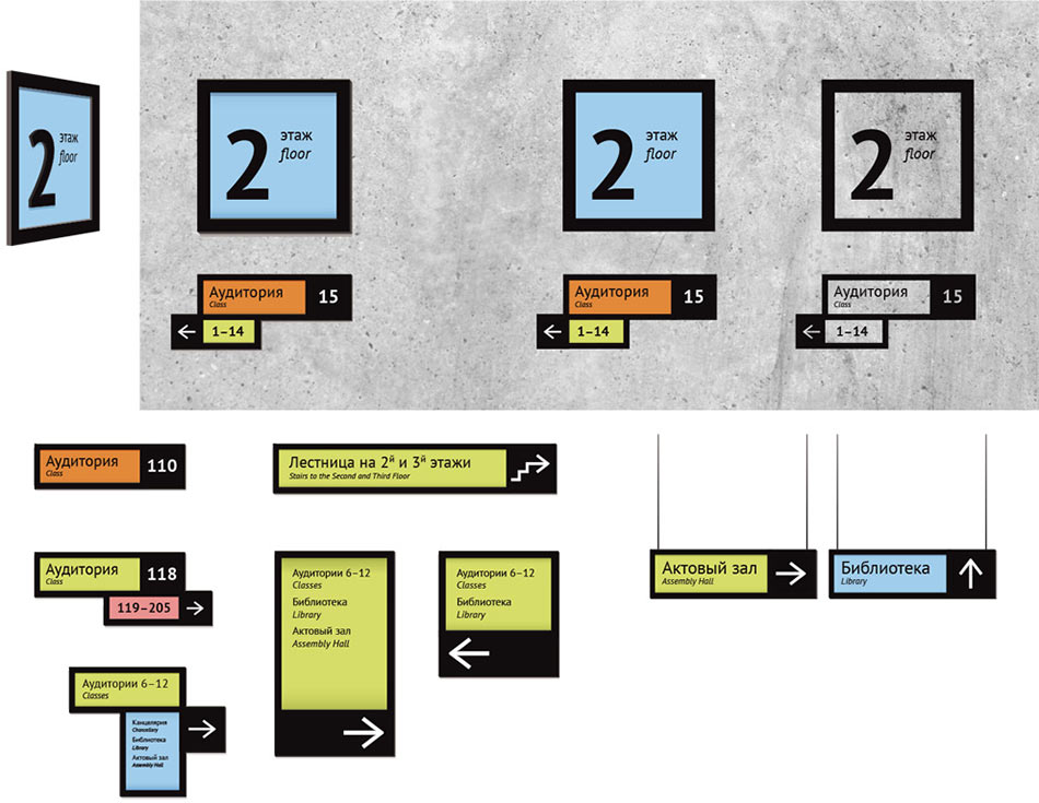
Meanwhile, the designers have developed a system of navigation elements for cultural centers: arrows, frames, colored and black boxes, materials, production and placement methods. For future use, we have also incorporated signs in English for foreign visitors.
Almost everything is ready. Deciding on the thickness of lines in grids, corporate colors, width of margins and mesh size for grids in all formats, from A6 to A0, and typesetting rules for posters. And, finally, the typesetter puts all the rules together in a 104-page brandbook.