2014 2015
The making of the visual identity for New Year celebrations in Moscow 2015
Overview Process
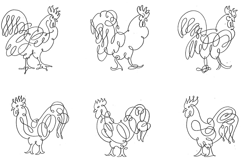
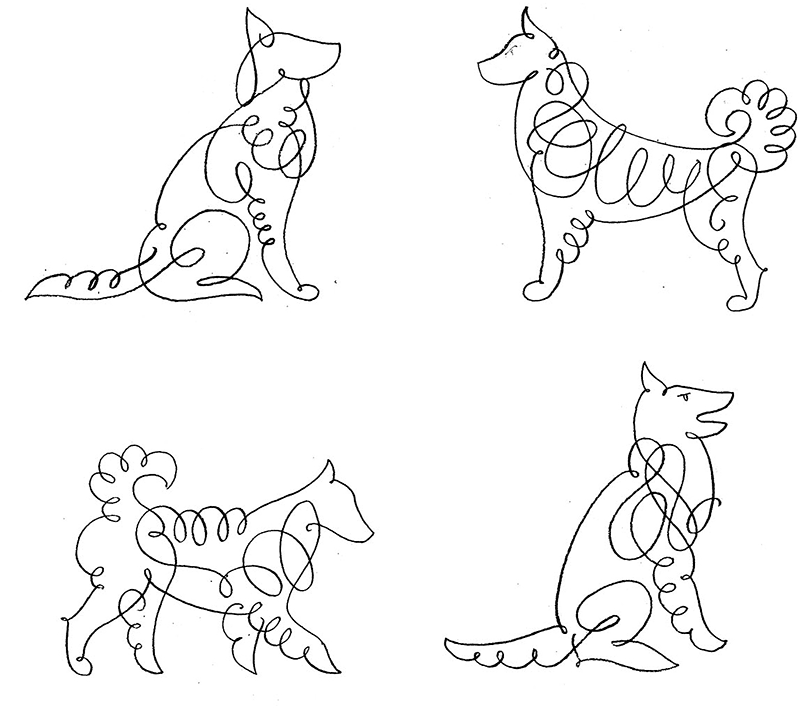
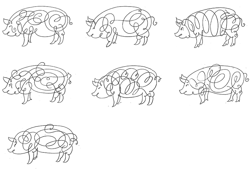
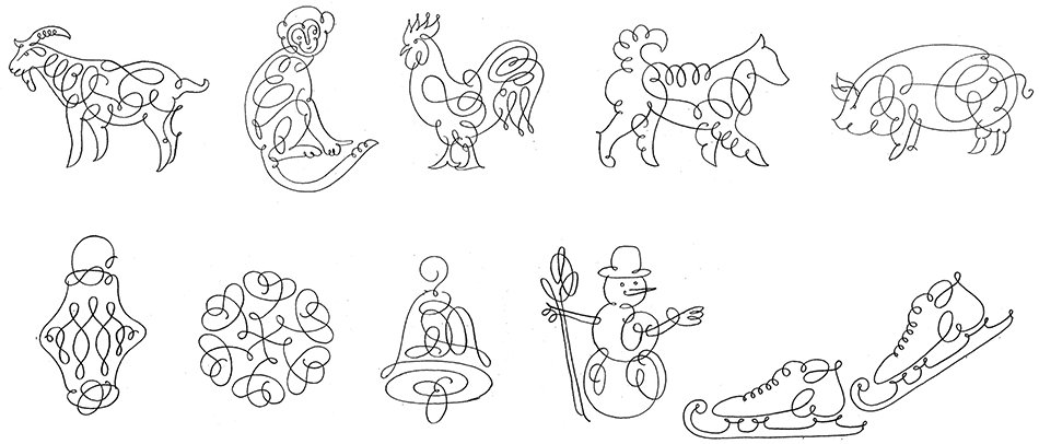
Starting to draw sketches.
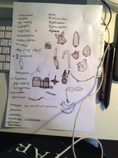
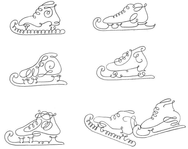
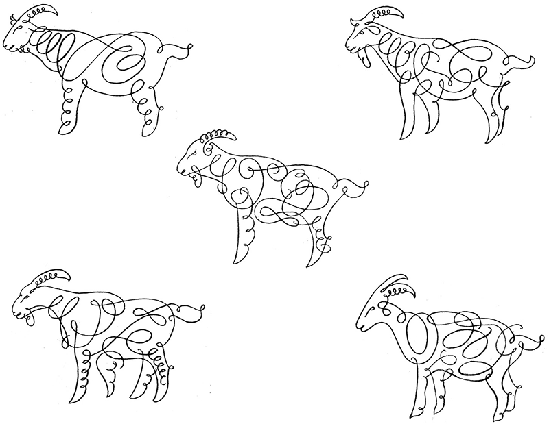
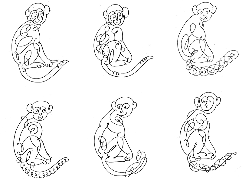
The first pictograms.
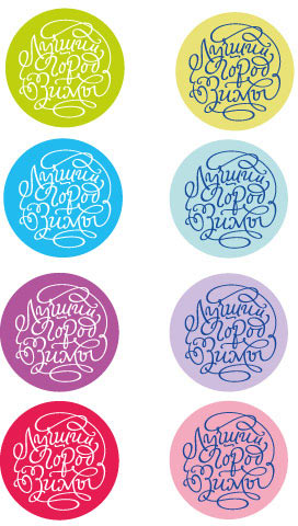
Sending to the art director, he has to pick five.
Designer: The beads can be put straight on the curls.

Art director: The squirrel, the sweet, the bell (with the tongue?), the house. And let’s draw the star as a silhouette (it can have normal edges, maybe a bit thicker overall). I like the beads as well, but that’s something we can leave for the next time.
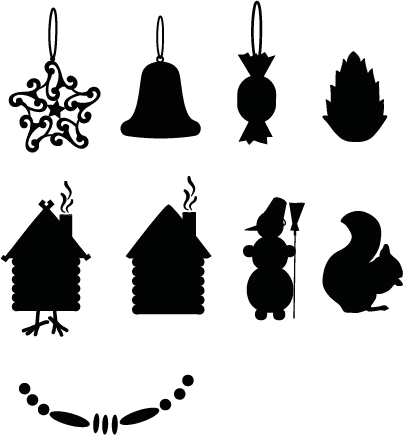
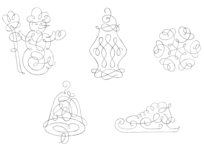
Drawing the pictograms.
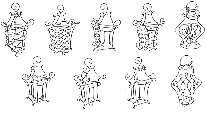
Meanwhile the calligrapher creates the vignettes.
Putting them next to the ones from the last year to make sure the style is matching.
Working on each one in detail.
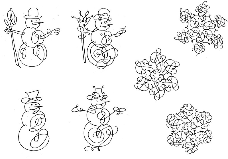
Showing the drafts to the client.
Client: Can you make the animals more plump and cartoon-like?
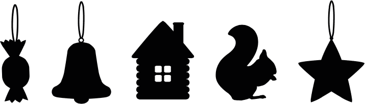
Drawing with a pencil.
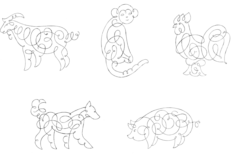
Art director: I like it all, the only thing I want to change is to make the external edge of the snowflake more pointy.
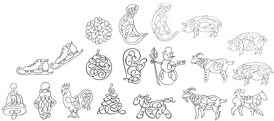
Drawing in Illustrator.
Simultaneously working on the color.
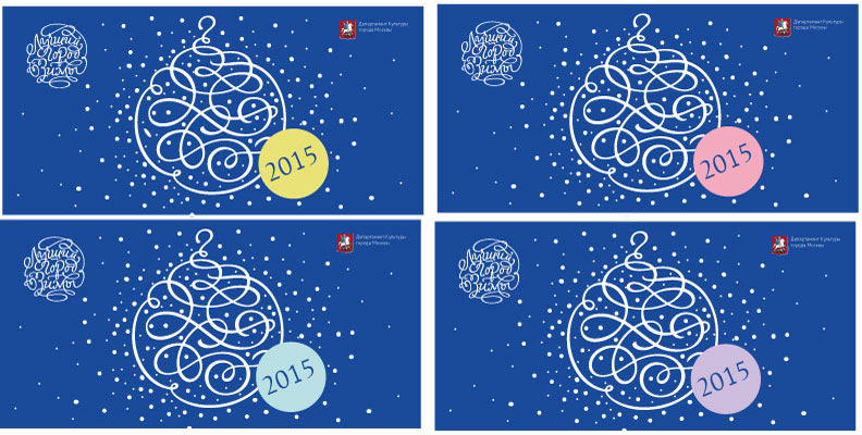
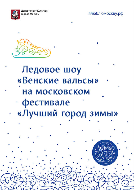
We need to find an alternative background color to compliment the original black one. Also, the client asks to make “The Best Winter City” text more noticeable on lighter backgrounds.
The designer chooses a light-blue color.
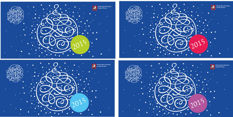
Designer: I suggest we work on the brightness of additional colors to make the white text more readable. Or use a pastel background with a dark-colored text.
Art director: I like it all. But to make the final selection, I would like to have another option for backgrounds. Not as traditional as blue, but more like purple-violet. Maybe it can be not a single color, but two or three (purple and light-green) for use on different media.
The new options.
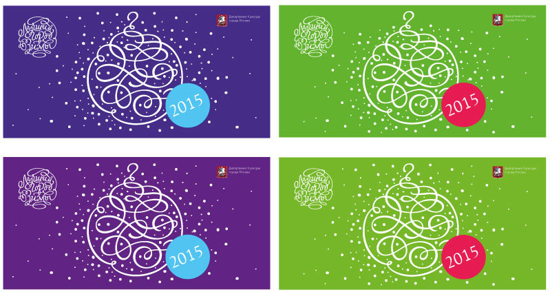
Client: The green is a summer color, the purple we don’t like. Let’s go with the blue. Also, can you color the text and the ornament?
Art director: We can try to use a gradient.
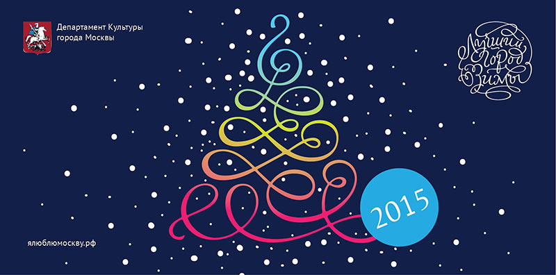
Client: The background is too dark again.
Reverting to the previously chosen light blue.
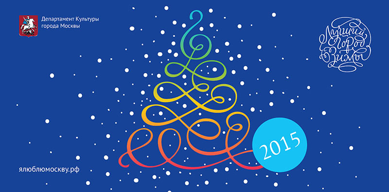
And suggesting to use white as well.
Voilà!
