The making of the Moscow outbound routes improvement standards album
Studying the documents, maps and blueprints.
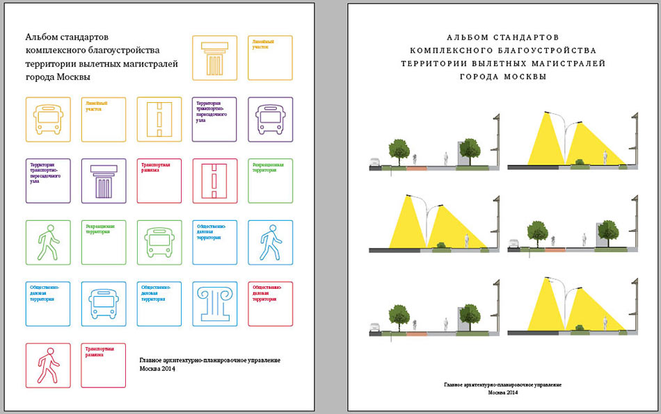
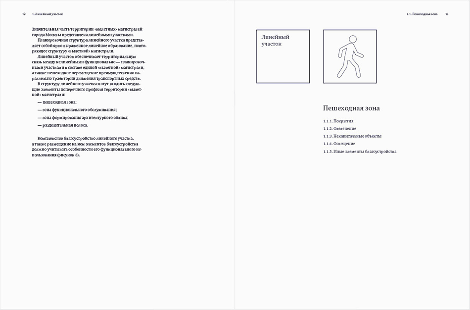
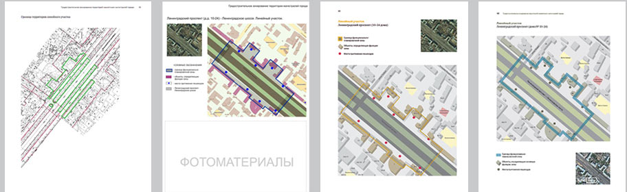
We want to make all designations clear from the start and get rid of the legend so that the readers wouldn’t have to go back and forth looking them up.
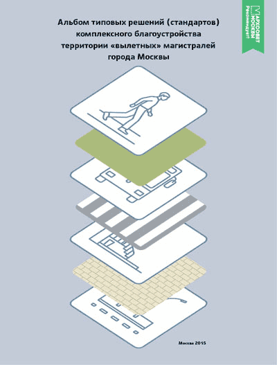
Working on the layout. Thinking of ways to arrange sections and subsections. Using numbers for chapters and icons for zones that repeat from chapter to chapter.

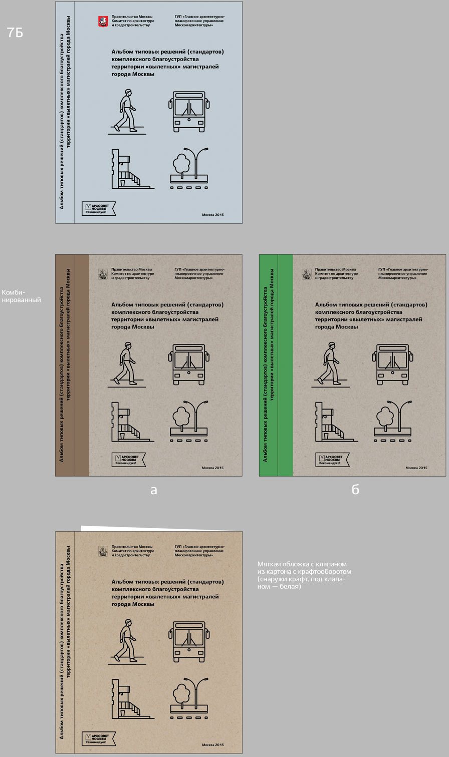
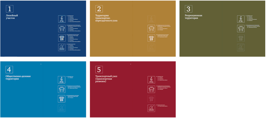
The album has five chapters. Deciding to color code them.

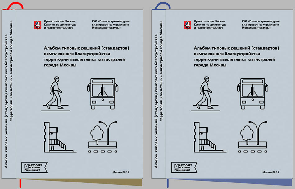
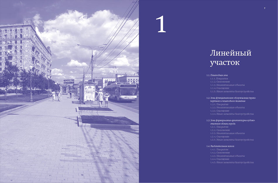
Creating designs for half titles.

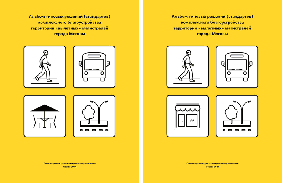
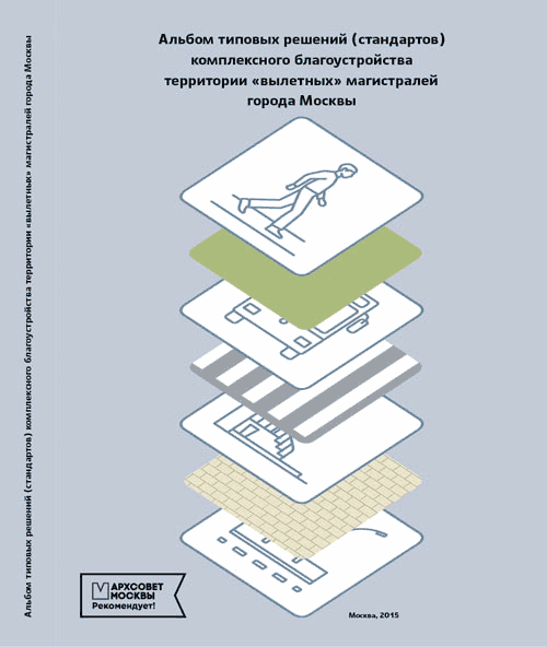
Choosing the suitable design and creating the rest of the openings based on it.
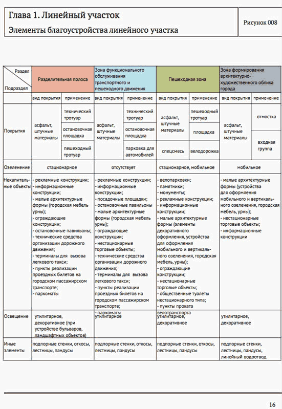
As we go, we realize that the first chapter makes up almost two thirds of the album. Which makes us search for a single color for the entire book, including half titles, running titles and diagrams.
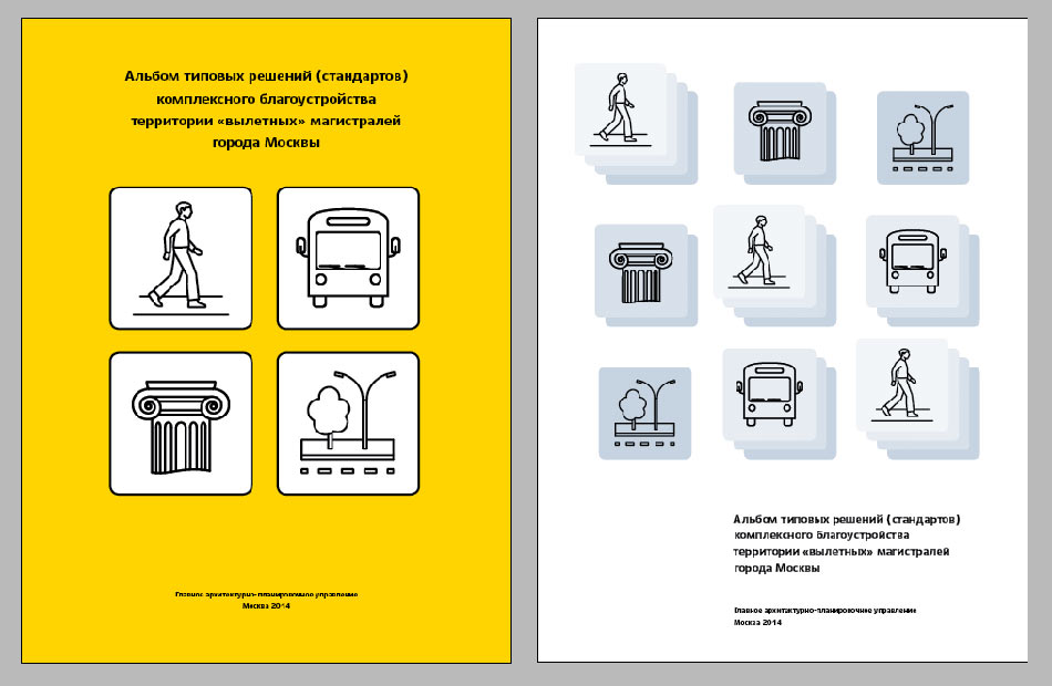
Choosing the third design.
Creating continuous navigation. Placing half titles at the beginning of each chapter and each section dedicated to a specific zone.
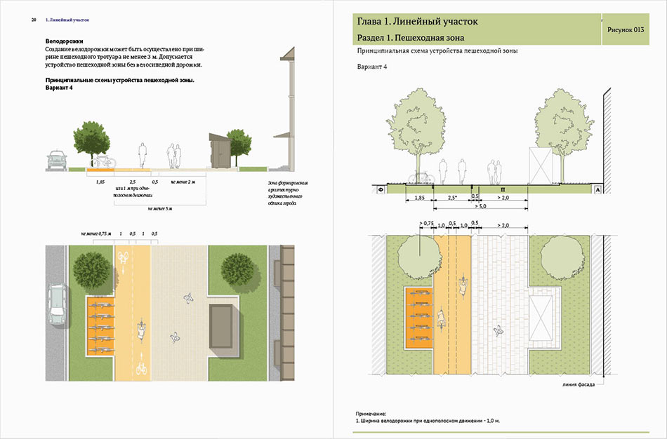
Half titles clearly show what zones are covered in the chapter.
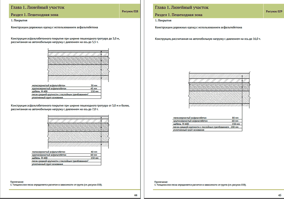
Creating styles for the main text, diagram captions and table headers.


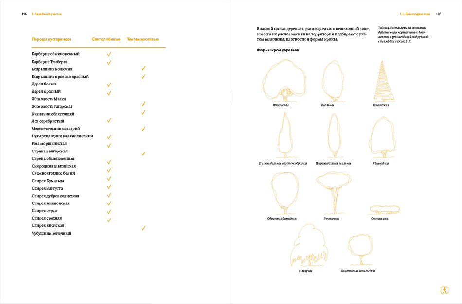

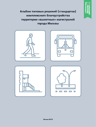
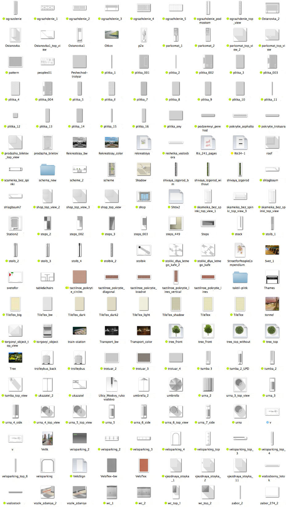
Simultaneously starting to work on illustrations. Searching for a suitable style.
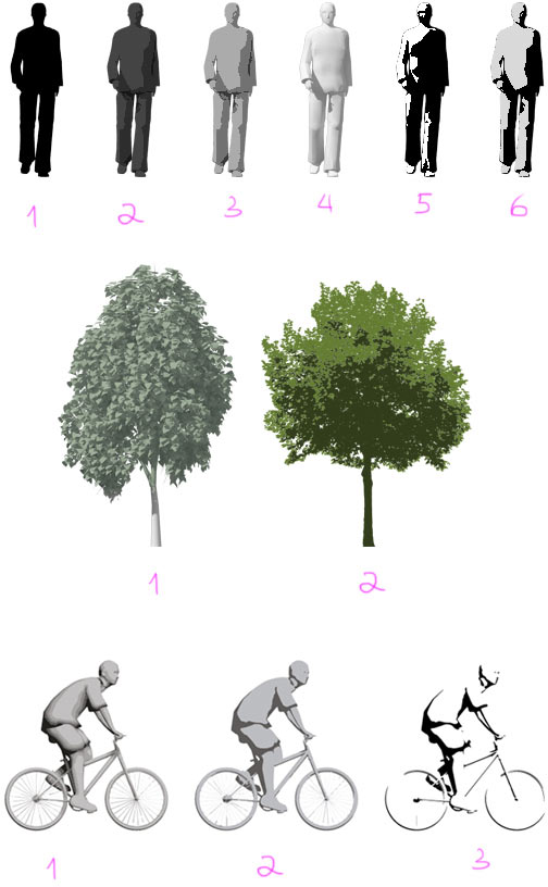
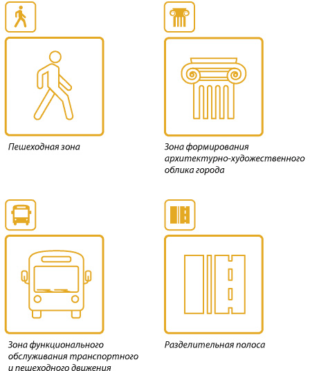
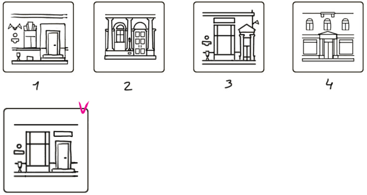
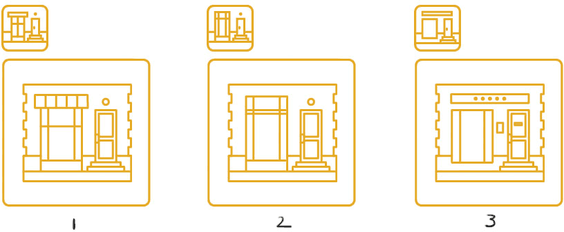
Going with numbers 4, 2 and 2.
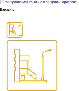
Drawing all the required elements from various angles.

Having decided on the overall style, starting to work on a library of illustrations.
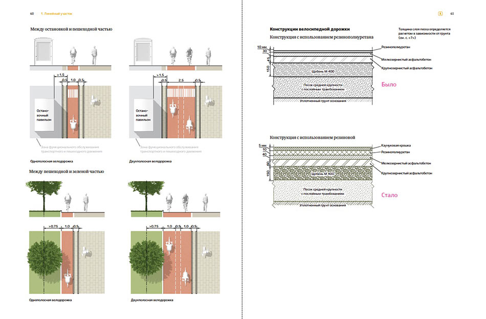
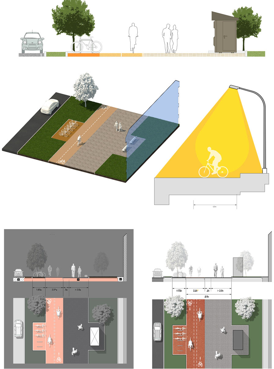
We will often need to make an emphasis on a part of an illustration that is discussed in the text while toning down the inactive zones.
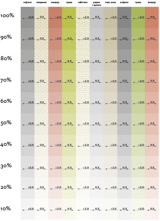
Looking at how different textures look when made lighter. Printing and realizing that we shouldn’t go below 60–70%.
Making a copy using a copier and seeing that bicycle lanes and lawns are indistinguishable in black and white. Making their textures more pronounced.
Working with textures and lighting style.


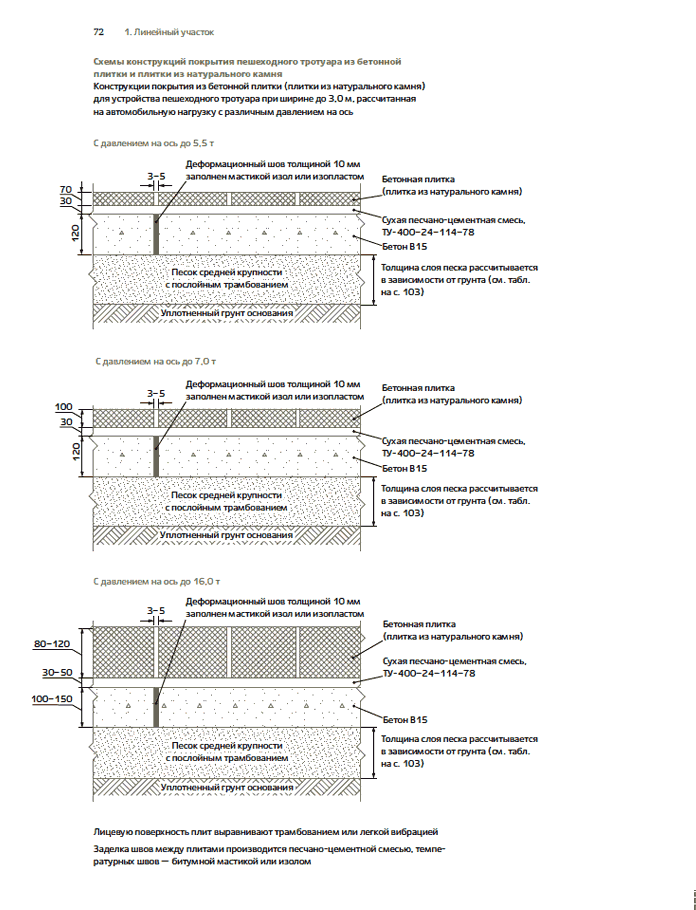
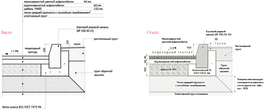
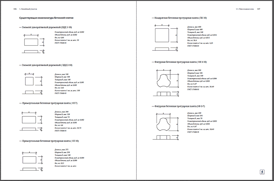
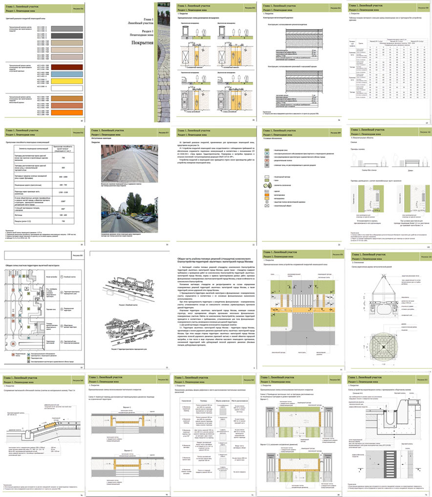
Redrawing all 170 illustrations. Making them more clear and visually appealing.
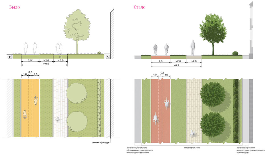
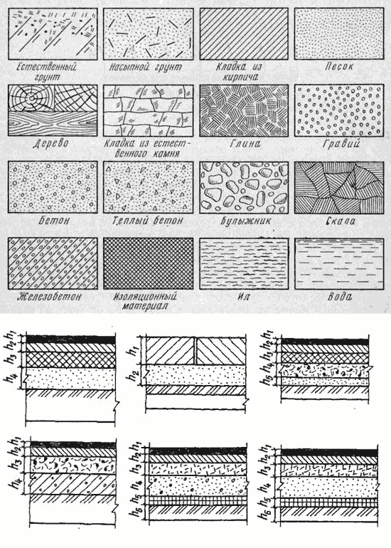
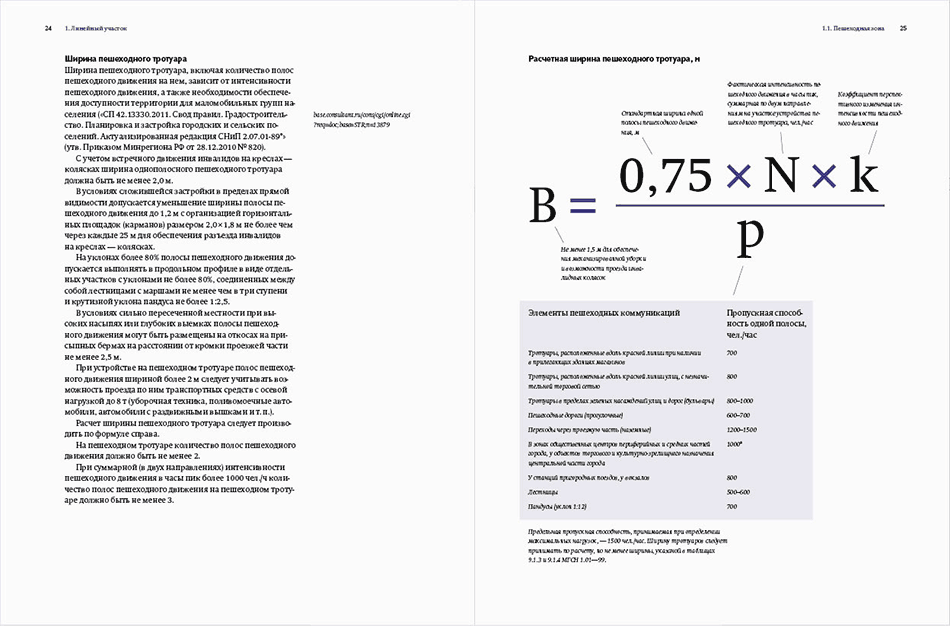
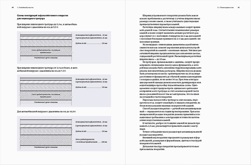
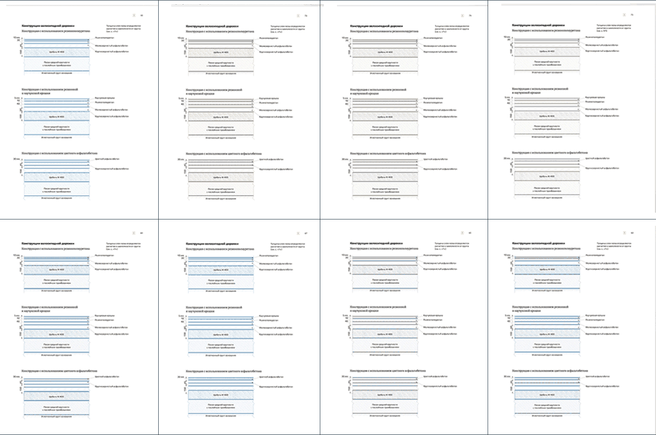
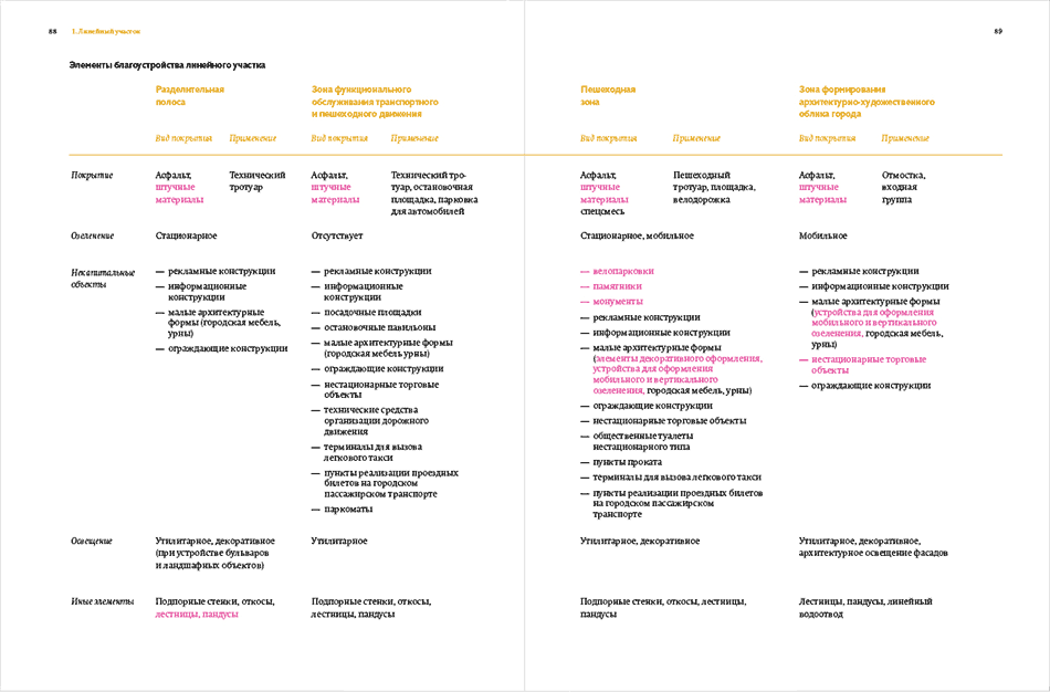
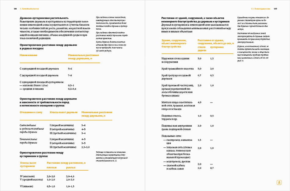
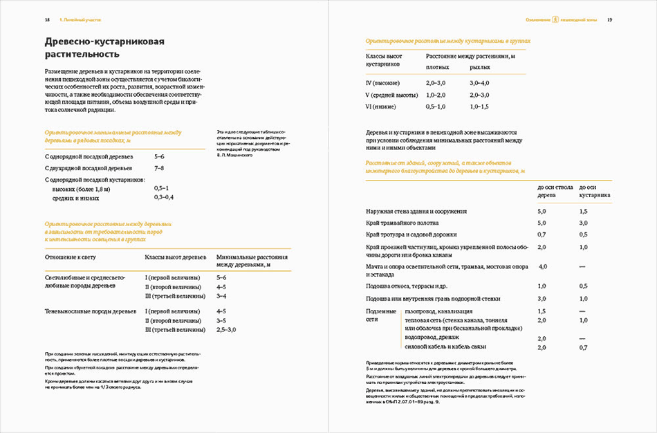
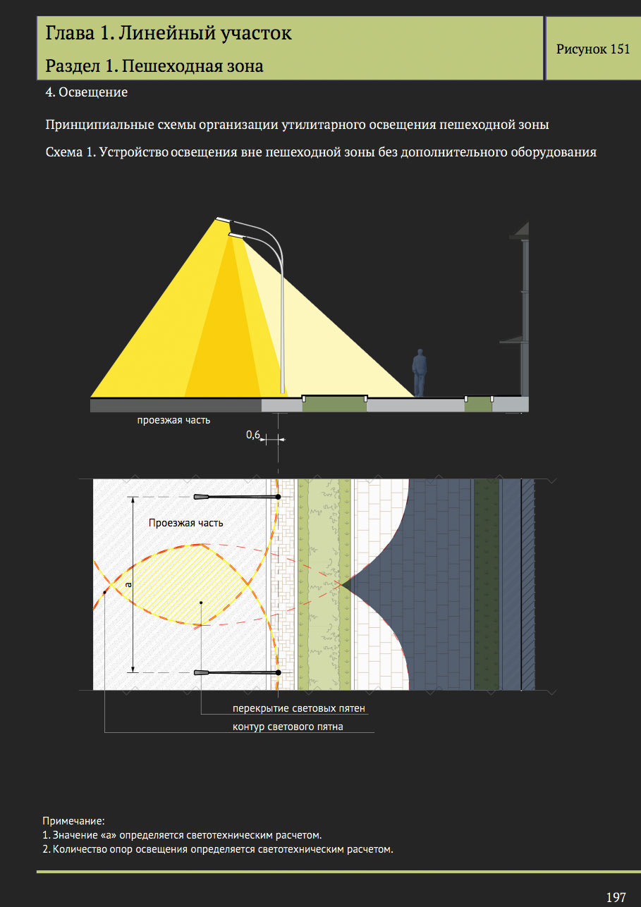
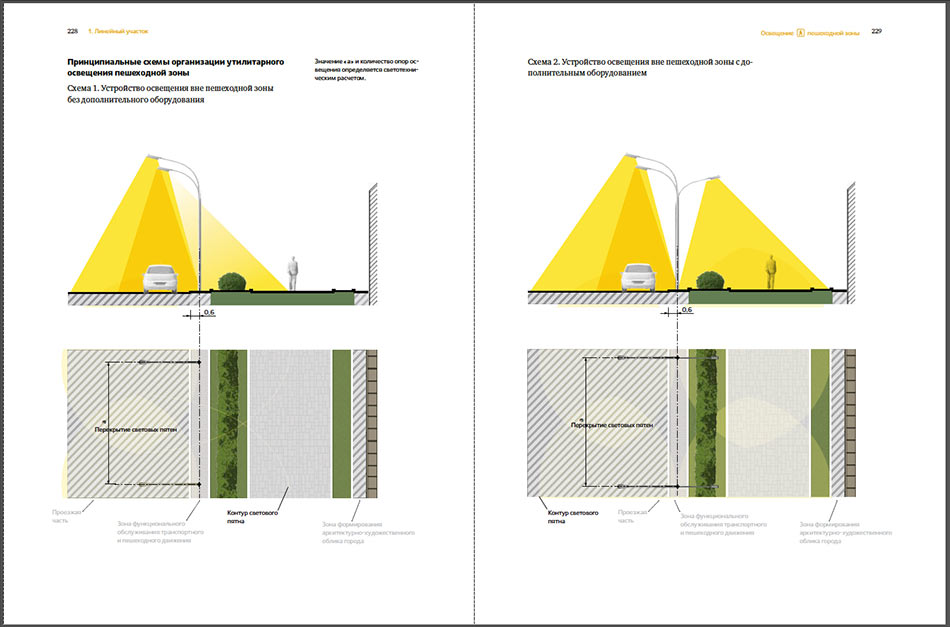
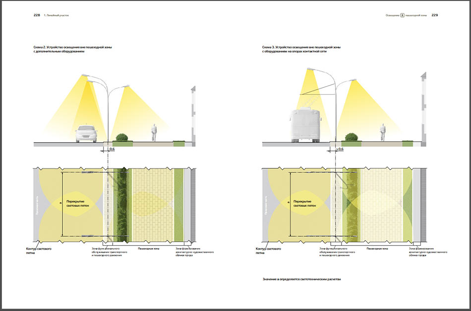
Apart from illustrations, the album includes a huge number of diagrams that also need to be retypeset. Making sure one can easily see each type of texture and its width.

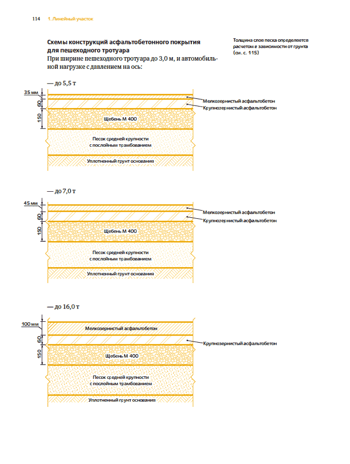
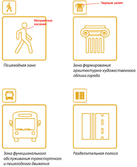
The art director notices that the patterns are so gentle and similar that their differences are not immediately clear. We need to make easier to distinguish.
Studying GOST designations.