Navigation in Nash Supermarket

Problem: Create a full set of design and navigation elements helping customers find required products, alert them to Christmas prices, and pep them up.

Nash Supermarket is a new 9000 m² store launched by Seventh Continent.

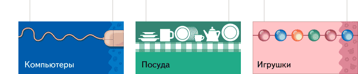
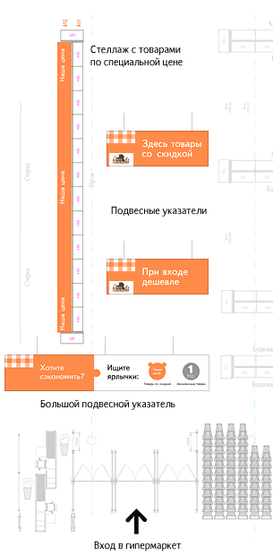
We got started with studying the products layout (which was not to be changed) and customers’ possible routes. The following crucial zones that needed to be designed in view of their function were determined: the discount zone at the entrance, main alley, and peripheral walls.

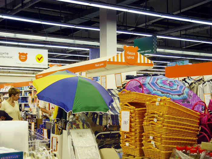
Hanging signs at the entrance
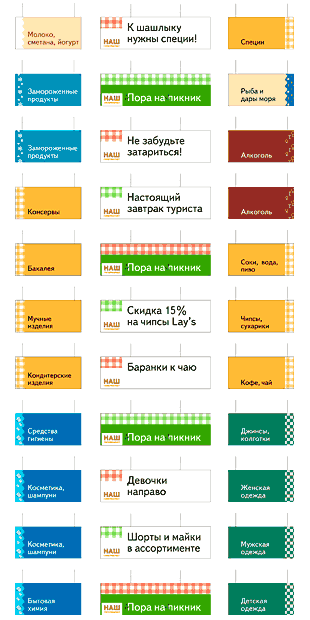
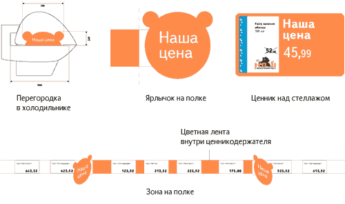
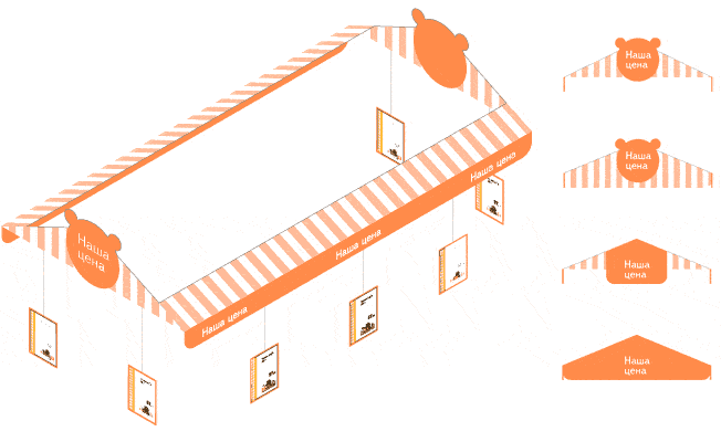
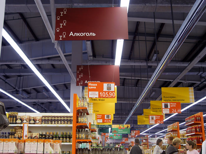
Signs hanging along the main alley refer to the rows of rack stands on the right and left hand sides. Context advertising is in the center

Release date: May 21 2005

Cast:

artistic director
art director and designer
illustrators
imposer
managers


Ornaments became part of the design


Even text can be used as an ornament

Signboards were drawn for every department


Food departments


Non-food departments


Round signboards

Using the orange silhouette of a bear cub’s head (bear is Nash Supermarket’s symbol) for special offers and discount signs was our idea.


Similar products offered at a special price are placed under one roof.


Variants of designing the side of the suspended structure


Service signs stand out both in form and color


Main alley


Special offers under one roof


Order a design...